
300 essays about design, culture, and Jim Watson. According to StrengthsFinder,
Jim's number 1 strength is Ideation - a fascination with and propensity for new ideas.
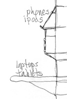
Things to add to a sling to hold stuff.

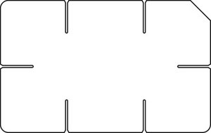
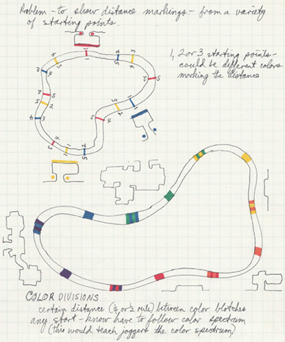
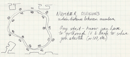
The shape of the board matches the way the game is played.

Enhance existing games and add new games.

Easier to use with logical layout.

Setting text flushcenter improves clarity and comprehension.
Flushcenter layout and typography to save lives.
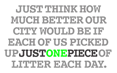
A simple anti-litter campaign.

Hands-free dog leash

That makes so much more sense.

Observations, tips, and improvements.

They don't have to be difficult.

The ultimate system.

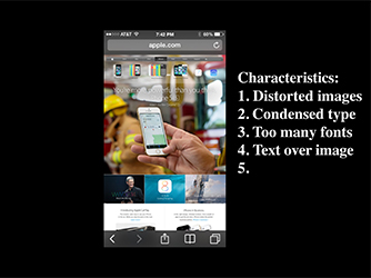
User-friendlier app screens, especially Apple.

A direct route from Texas metros to the Rockies

Let's just spell the way we talk.

A smarter hierarchy of pertinent information.

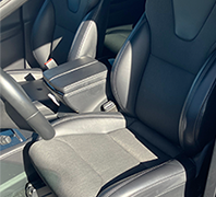
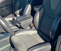
Accessible pockets while sitting or standing.

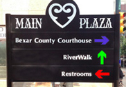
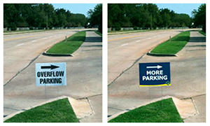
And, while we're at it - better branding and signage.

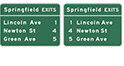
Arrows convey direction - colors could help.
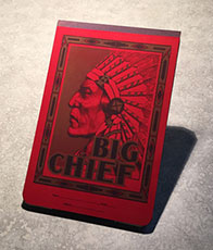
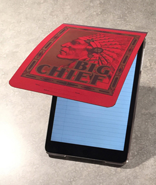
The cover would make a great case flap for an iPad or other tablet. Included - the Big Chief notepaper app:

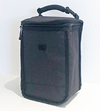
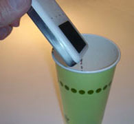
It is common to use a shoulder strapped bag, but there are many instances when the case is carried like a briefcase. A case whose strap retracted into the case would simplify use and be more convenient and stylish. 2006
Most television remotes are poorly designed - a grid of identical shape and color of buttons. There's often very little that distinguishes one button form another. Of, course, the number/letters on the face are different, but that usually requires having to look at the device. A more User-friendly remote would allo9w the user of move around the grid of buttons just by touch.
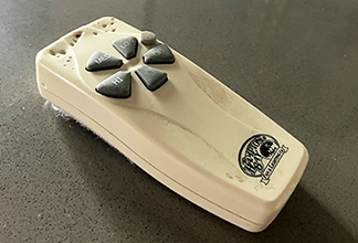
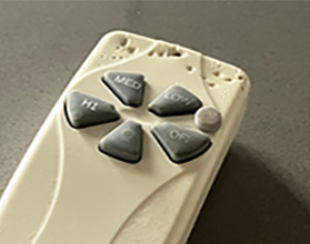
For this remote for a ceiling fan, there is one off button and four speeds. Better: a raised disc separates the off from the lowest speed. In the dark, I can feel for the disc and know that one button down is off and one button up is on low.
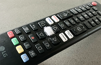

I often use tv remote in dim lighting. An important function is to move the cursor up/down or left/right on the screen. I stuck a small fuzzy button on the home. I can feel that button and can then move my finger/thumb in the desired direction.
The button on this car charger was denoted by a slight change in color. It was tough to find dim light in the garage. I added the clear disc to allow me to find the command by feel.
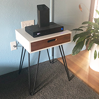
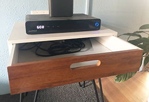
I have tried several ways of hiding the cords and cables of electronics: a hollowed-out book, a basket, and a table top. I wanted something simpler and maybe with a mid-century look. Ordered this end table online, drilled some plug holes in the top, and cut the back of the shelf off so it can slide in and hide the cords inside.
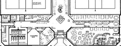
The Choctaw Casino near Durant, Oklahoma, is quite impressive. IT reminded me of a Vegas casino, primarily due to its proximity to 8 million people in North Texas. The architecture and interiors were well designed.
But, not so with the Casino Map: very poor readability, unnecessary color coding, awkward shapes of restaurants and shops, and busy chaotic contents and layout.
Sketched a proposal for a Casino Guide, not a map. Maps should have detail, accuracy, and information for a wide audience.
Objective of the Guide:
Rapid communication of location of places, to help the user get from where they are to where they want to go.
That's it. Simple.
Target audience:
• Users in the casino seeking how to get somewhere.
• Users that are planning activities for later.
The user is not interested in the building shape of the casino, size of a restaurant, shapes of amenities and restaurants, and parking garages (most will get the guide inside the casino and would have already parked).
They are not seeking details, just a guide of where to go.
Improvements:
• Rotated the casino so that the familiar orientation places 'north' is at the top.
• A more orderly and simple orthogonal orientation - all lines vertical, horizontal, or angled at 45 degrees.
• Conference rooms are not included. The target audience is most likely not going there. There can be notes under the Guide List of amenities: 'All conference rooms are on the Grand Theater level'. Once at that level, signage and wall maps could direct the attendee to the meeting rooms.
• Delete Compass symbol. People often lose their orientation when inside a casino. Concession: with North at the top.
• Simplifying all shapes.
• Arrowheads convey entries (and exits) from hotels and parking.
• Familiar symbols: rest rooms, no smoking
• All text is set larger and with greater contrast to its background. White on light blue does not work in a dimly-lit casino.
* Remove color coding of 3 areas within the casino. Again, very few people care.
Nobody ever complained that something was too easy to read and understand.
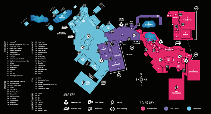

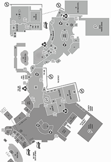
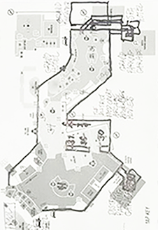
Above draft shows layout concept only. Final Guide might have color, different typefaces, and more symbols (cashier, high limit areas).
Below: Sketches from Chaos to Order.

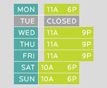
Avoid making an appointment or placing a business phone call before lunch on Monday or after lunch on Friday. Most people just don't want to deal with you and your issues during those times:
• Monday morning is set aside for changing the rhythms from weekend to the workplace.
• Friday afternoon is the reverse transition time - changing mentality from work to play.
• Too early in the morning (before 9a) or too late in the afternoon (after 4p) can often be inconvenient and unappreciated.

After many years of having things roll around in the car and having to search under the seat for the rolled items, I sought a solution. I needed a method to secure bags, papers, and books. I already had a flat bed in the back of the car (I had removed the back seat and built the bed to transport two dogs and building materials). The area right by the rear door was easy to access and convenient to the drivers door. I laid items there on the bed, but they would slide around on the carpeted surface.
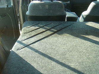
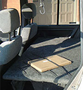
The problem of having items slide around was solved in by installing bungee cords. I put these at an angle - to provide convenient access and to allow the holes in the bed to be along the perimeter rather than out in the middle. I used a 45 degree angle since that matches the angled walls in the house and the car was loaded or unloaded while in the house (in the garage - that is in the house). I drilled holes, threaded the bungee cords through and knotted them underneath. Since they're at an angle, they are of varying lengths and tension.
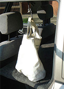
The bungee cords worked great for flat things - papers, books, most packages; but not so great for shopping bags and grocery bags (most often I use a canvas bag that I keep in the car). So, I installed a plastic hook right above the bungee cords. The hook has a an opening large enough to make it easy to hang bag handles in it and it is attached with a short length of bungee cord to provide some give. I attached the hook to the handle that would normally be above the rear passenger seat. The hook hangs down low enough to be easily accessible and low enough that the bags rest on the flat bed but are held upright by the hook. Because the hook and the bags hang right behind the driver's seat, they do not interfere with the view in the rear view mirror. Now, its very easy to hang grocery and shopping bags on the hook right inside the door. Problem solved - bags stay upright, in place, and in a convenient location. 2001
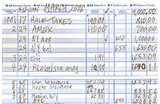
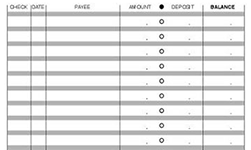
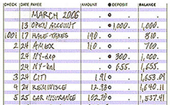
For decades I had accepted the standard issue register and mounted it in the checkbook cover just like we're supposed to do. Then, Eureka, I realized I didn't have to do that. I didn't have to use the register provided with the box of checks. There would be no blemish on my Permanent Record if I replaced it with one of my own creation.
I determined the columns I would need - check number, date, who the check was to, the amount, and the balance. I spaced them to be appropriate for the size of my handwriting (the previous spaces for dollar amounts were a bit too small). The lines of entries are separated by thicker bands. These allow room for writing yet show a distinct division between the lines. I made them grey so they wouldn't overpower the page. The column for putting a check mark from the monthly statement was replaced it with a column of circles. These provide a symmetrical distinction between the columns and make it easier to fill in to show checks in the statement. I added the decimal points for each entry line to help guide the location of the dollar amounts and help to order and neatify the page. The Balance heading is set in bold to denote a hierarchy of importance. Designed: April, 2006
Sew a battery-powered string of lights into a pet sweater - moving Christmas decorations. 1996

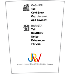
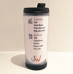
Back when I was a regular customer at Starbucks, I usually ordered the same drink every time. I wanted to simplify the process for me and for the staff. I observed the process of ordering from the employee's points of view and saw that it was pretty much a formula - same procedure every time. The process dealt with two Starbucks people: the first rang up the order and marked the cup to give to the second, the barista, the one making the drink. I prepped the answers to their questions and the specs for the drink I was ordering. The design above was printed on an insert and slid inside a travel cup. The all-cap grey headings and icons denote which person reads which part. To order, I just handed the cashier the cup when it was my turn to order. 2000s
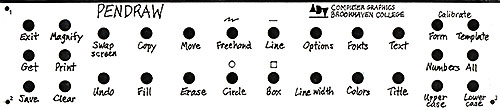
Basic design courses teach the Elements and Principles of design. But, no two sources agree on what those are or in which group they belong. A better way is to not segregate a principle from an element, but to group them all (and more) in a single and more appropriate categoory of Components.
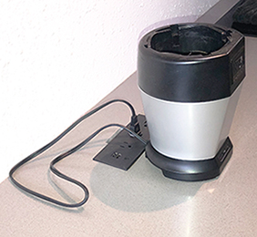


A simple way to hide countertop cords - next to the outlet panel is a slot cut into the countertop. The excess cord can be stuffed into the slot.
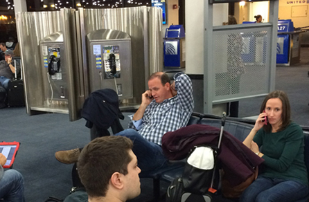
If you've flown much at all, you have likely searched an airport waiting lounge for an outlet to plug in your charger. Some new airports and remodeled lounges are installing more outlets. At Newark airport there are a few charging stations, but each one only had 4 outlets and each was occupied. Then I noticed the ring of pay phones - there were 4 or 5 of these kiosks in this lounge. I walked around several times to check - never was a single phone ever in use. Not one. Of course not. People were standing nearby using their cellphones.
So, it seems quite easy to replace the phone banks with a similar circular structure that contains banks of outlets above a worksurface. The electrical power is already there which, I assume is one of the main deterrents to adding more outlets in an airport lounge. No waiting area or floor space would be lost as the new structure would not be any larger than the existing one.
Class Handouts
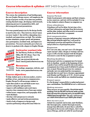
Each class project included a handout with an explanation of the project, the purpose, objectives to meet, specs (specifications) to meet, grading criteria, and resources. I designed the page with clear communication and a hierarchy of info.


Lecture slide format
Instead of one image or line of text per slide, I grouped elements together on one page. Students are used to perusing, scanning, and pickin' & choosin'. This web-style format allows students to take notes at their own pace.
Influences: web layout, shorter attention span, varying learning styles.
The slide format was set reversed so that the content would stand out in a darkened room.
Lists: Each item was shown highlighted as the last item on the list. This kept the previous items on screen after introduced and discussed.


More men might help with household chores if they could keep their beer handy. The holder should be the kind that is used on boats - that swivel in all directions so the beer won't spill. 2006
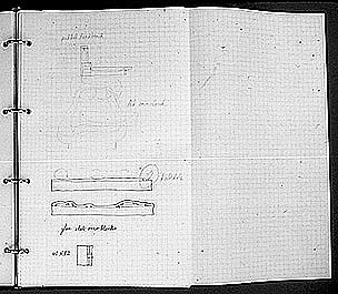
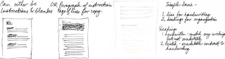
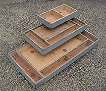
I had a good time designing the round backgammon board (see its own story) and was seeking other innovations. While sketching, I would make notes but ran into some issues:
1. Sketch paper had no lines to facilitate writing.
2. Lined writing paper wasn't great for sketching - the lines became subconscious design elements.
3. Graph paper had lines that were too dark and intrusive.
4. I wanted to keep archival records (having applied for a patent and learned the value of documentation) so I wanted this new paper to be hole-punched so it could go in a binder.
5. I wanted paper bigger than standard letter size, 8.5" by 11" or legal size, 8.5" by 14".
Solution concept: July 7, 1977
• Sketch paper - just drawing
• Note paper - just words
• Design Paper - both drawing and words
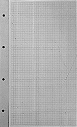
A paper that had light blue lines as guides for both sketching and writing and in either landscape or portrait orientation, grid lines of .25 inch for easy measuring and scaling, with holes for a binder, a good working size - 16.5" by 14", and folded so the archiving filing dimension is standard legal size. The paper would be for sketching and notes, not for preparing comps or camera-ready copy.
In October 1977, I explored numerous detail options: the dimension of the paper, the spacing of the grid lines, corner shapes - rounded or square, border or bleed, weight and texture of the paper, ink color, had a batch printed and used them for quite a while - probably until the computer made archiving a different and easier matter.
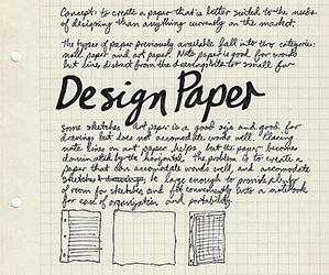

Slogan Design Paper - because to design you need both words and sketches.
Could the paper be marketed? I made notes, but never pursued selling them. I considered binding a stack of sheets into a packet, with an explanatory cover sheet, and shrink-wrapped. Since 1977, I have seen similar attempts at solving the issues stated above. Many are quite satisfactory.
• New names for both parks at the Disneyland Resort
• Rename two hotels in the Walt Disney World Resort
• Remove Disney from hotel names
• Improve the Resort experience without Annual Passes
• WDW master plan layout
• FastMap in the parks
• Disney Resort in New York City
We read by taking a picture of a group of words - not letter by letter. When scanning a phone book or any directory, we find the name and then have to scan to the right a ways to get to the phone number. There is no advantage to setting the info with justified margins. We are not reading a block of copy like prose, we are reading only one line of info. To aid this horizontal eye movement, a line of dots has been added to help us stay on the proper line of info.
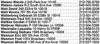
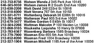
In the example above right, the numbers are aligned to the immediate left of the names. One scans down the column to the desired name and then sees the number right next to it - no having to move along the line. As shown below, this method saves enough space to allow more letterspacing for clarity and easier reading, to allow setting the phone numbers in bold, and to allow a slightly narrower column width. Conceived: mid-1990s. Designed: May, 2003.
Below top: 4 columns of existing directory page. Below bottom: 4 columns of proposed directory page.
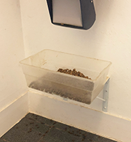

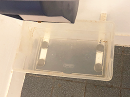
Greyhounds need their food and water bowls raised up several inches to accommodate their height and allow their eating tubes to not be bent or crimped. Beneath the wall-mounted dog food container with dispensing spout, I mounted some standard shelf support brackets to the wall (allowing easier cleaning underneath). I soon learned that filling, cleaning, and emptying the bowl would be easier if the bowl was removable. I glued some magnets to the bottom that adhered to the metal brackets.
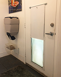


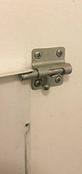
Dog doors are game-changers. No more getting up when she stood by the door or whined. At all hours of the day and night. A dog door lets her come and go as she pleases. A downside to the door is the panel that secures the house. I would often shut it at night to keep her from foraging in the yard, occasionally barking, and getting sprayed by skunks. When not needed, I set it on the floor nearby. Issues: I had to carefully thread it into the sliding slots on the side of the frame, store it, and keep it in good condition. Solution: two latches that slide in and prevent the panel from sliding down the slot. The metal door is up out of the way and is stored against the door - much simpler and easier.
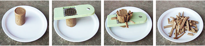
Normally I feed dry dog food because I can leave it out and the dogs free feed - they eat whenever they choose. However, they have been put on a prescription diet requiring me to feed them canned dog food (they love it.) I plopped the food out of the can and chopped it into bite-size pieces with a spoon or the edge of the can. But, that got messy. Later, while cleaning out kitchen cabinets, I noticed the apple slicer.
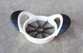
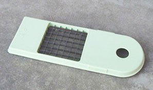
This gadget worked great - I slid it down the cylinder of food and it cut it onto wedges. But I still had to cut those wedges in half. That required using the can again. So, I bought this food chopper and experimented with two different sizes of grid openings. I thought that if the pieces were skinny enough, my dog would eat them without my having to cut the sections in half. March 2010
Advantages
• There is no need to touch the food.
• It is cut into convenient bite-size pieces.
• The dog thinks its eating a plate of delectable french fries.


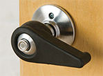
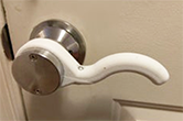
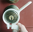
Lever handles are more convenient, more universal, and easier to use than round knobs. Much new construction specifies lever handles. But, what about older houses with round knobs? Instead of replacing each, there could be a lever that stretches and slips over the round knob, making it a lever knob. It would need to be adjustable or able to be tightened to keep it secure on the knob. Concept: 1995. Below are some options, available since 2015:

Strong beat and rhythm to motivate endurance running (I now do this with an iPod). 1980s
You can now clap, hold a drink, and still wave that flag at a parade or rally.
For a birthday gift, I had gotten a 'Dancin' Coke Can' - you know, one of those gift gimmicks that people chuckle over for about a minute and a half and then its just junk. It had a battery-powered mechanism inside that made the vinyl can wiggle. Being inquisitive (and the fact that it was now junk), I took the can apart to see how it worked. The mechanism created a simple back and forth motion. I wondered what other tasks this motion could do. From one direction, it looked like a waving motion. I thought what needed an automatic waving motion. When do we wave? Where do we wave? And why would it need to be automatic.
I had attended the 1989 Edmond Fourth of July parade a few weeks earlier and being dismayed that the Lions Club was passing out flags that were stamped 'Made in China'. For America's most patriotic day - flags from Communist China. How absurd and embarrassing. Anyway, I was trying to wave the flag and, at the same time, clap when the band went by. I couldn't do it. My hands were full. Eureka! An automatic flag waving hat. Stick the mechanism in a hat to wave a flag over someone's head and allow the hands to clap unencumbered.
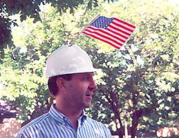
Now, to get to work. I considered several types of hats but the mechanism needed to be secured inside and it was sorta bulky. I saw a plastic hard hat - great, that would work. I bolted the mechanism inside and cut a hole for the flag to stick out. I even used one of the original 'Made in China' flags. Oh, did I mention that the 'Dancin' Coke Can' was sound activated - it would sway in response to music. Perfect. The flag would wave only when the band went by or when the wearer was clapping (or screaming).
I never pursued manufacturing and marketing. Not sure why not. There are other possibilities - flag banners of university mascots to wear at football games or homecoming parades; there are mascot hats (Arkansas Razorback, Green Bay Cheesehead) and hats that hold beer cans, fans, and lights. Flags with images of donkeys and elephants for use at a political convention. The flag waving hat could have been a big hit, but it was just a fun project.
Wondered why we had to bend over to reach the flush handle - why not extend the handle? So much easier and convenient.
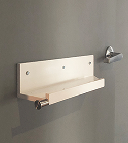
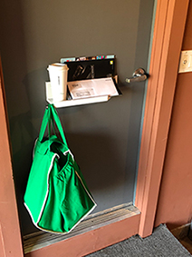
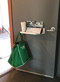
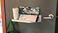
I had enjoyed the convenience of a cupholder on the side of my car - if my hands were full, I could set my coffee there while I got out my keys and opened the door. That same logic applies at home. When entering the house, this shelf provides a place to empty my hands so I can open the door. The door swings into the house delivering the items.
• Clock face of kitsch items; sink with no visible pipes underneath to minimize pipe chaos
• Wheeled closet unit
• Lights on the closet and bathroom wall (rather than on the ceiling) to light the contents and the face rather than lighting the top of the shelves or the top of the head.
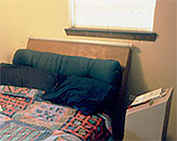
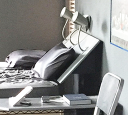
Most bedside lamps are on nightstands and shine on the sides of books - not the open pages (like closet lights on the ceiling that shine down and miss lighting the lower shelves, or a bathroom with ceiling lights that shine only the top of the head). Some lamps even have lampshades that block even more light. They might look good from the doorway or in a photo, but they don't do a good job of illuminating the intended object. The lights above are behind the reader and shining on the page. One is a fluorescent tube and the other uses 3 fixtures mounted at the top of the sloped headboard.
A cart that is narrow to fit into rooms, unobtrusive while in hallway, decorated to match hotel decor, and tall to hold more. 1995
Improvements including double deck drives - one for arrivals, one for taxi & valet pickup (as Mandalay Bay did later) and sidewalks over the entrance drives (Aladdin) to separate pedestrians and vehicles. 1996
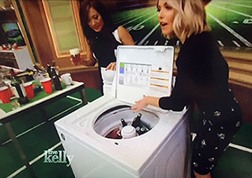
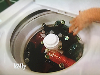
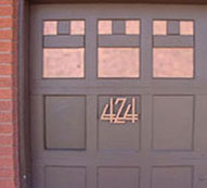
It may be weird, but it holds lots of ice and drinks, and cleanup is easy - the ice melts when you run a wash cycle. It is fun to tell guests to go get their drinks out of the washing machine. Open House at 424 in 2000.
Febuary 3 2017: Live with Kelly did a segment on snacks for the Super Bowl. Kelly Ripa: "If you don't have a big enough cooler, you can use your washer - fill it with ice - you can put all your favorite beverages in here. That's a great idea. I'm pretty sure we are geniuses." Maybe, but 16 years after Jim.
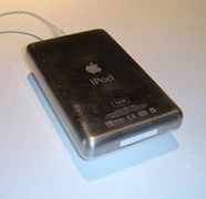
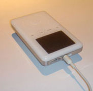
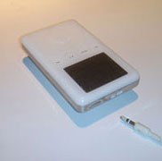
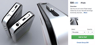
What do we do with old iPods and how can we sneak alcohol into stadiums and arenas that don't sell beer or allow it to be brought in? Put the two together. I removed all the inner hardware from an old iPod, sealed the holes (except for the earbud input which I use as the opening to the flask) and ended up with a hard-to-detect flask that holds about a jigger (oops, sorry, I mean the j-word).
iFlask idea: March 2009. Several years later, I noticed products on Kickstarter (below left) and Fancy (right) for flasks made from iPhones:


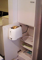

A toaster is attached to a cabinet door and swings out for access. The blender and coffeemaker are inside another cabinet. Electrical outlets were installed in each of those cabinets. When these appliances are not in use (most of the time), they are out of sight and the kitchen looks cleaner and less cluttered.
Just to inspire contagious laughter and better health. 1980s
The condo in New York has a laundry room to service all the residents. It can sometimes get a bit busy, even thought there are quite a few machines. Some rude people leave their clothes in the machine long after the cycle has completed. Maybe they got caught up in another task, maybe they just forgot they were doing laundry, or maybe they're just inconsiderate. Who knows. But it can be frustrating. Once, upon entering the laundry room, I noticed a sign - great. Maybe it will encourage people to not leave their clothes in the machine. Nope. It said not to remove clothes from a machine.

The sign is a piece of graphic design - intended to communicate a specific message to a specific group of people to achieve a specific purpose. Therefore, like any piece of graphic design, it can be made better. Here's how:
• The concept of the message - people apparently were touching other's clothes when they had been left in the machine too long. This is a busy laundry room. Even though there are 10 washing machines and 8 dryers, there are times when people are waiting. It is just rude and inconsiderate to not promptly remove clothes. This sign, however doesn't address that, it says the opposite - leave those clothes alone.
• The tone of the message is too harsh and demanding. There is no explanation or respect shown to the reader.
• The signs are posted above each machine and the text is red. There is no need for the word 'Attention'. In all caps.
• The building has tight security - visitors have to check in with the concierge in the front lobby. There is no need for the sign to state, 'Residents of Cove Club Condo' (again, in all caps). Who else would be doing laundry but a resident or a resident's employee?
• 'from machines that do not belong to you' - I didn't realize these machines belonged to me. Heck, I'll just move one of my washers and one of my dryers up to my apartment and avoid this whole sign issue.
• Cheesy and unnecessary clip art.
• Poor line breaks. 'articles of clothing' is a phrase that should not be disrupted.
Graphic design should respect the intelligence and dignity of the user/reader/viewer - the audience. I rewrote and redesigned the sign to better communicate both messages and to do so in a more considerate manner. As a sign-off to increase credibility and familiarity, I included a logo for the Cove Club condominium that I designed for an earlier project. The building manager liked the new sign but asked for a version with a Spanish translation. Huh? In Spanish? Then I realized there were nannies and apartment caretakers from many countries. I took the sign copy to a Spanish teacher at OSU in Stillwater and had him translate the sign. I explored different layouts - English & Spanish stacked and side-by-side. I also changed the font to a bold sans serif to be more demonstrative and clear.
The new signs were posted in the laundry room in early March, 2010.
To my surprise and delight - the signs were larger than what I submitted, 20" x 16", and mounted on a stiff backing.
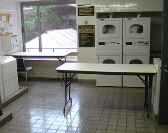
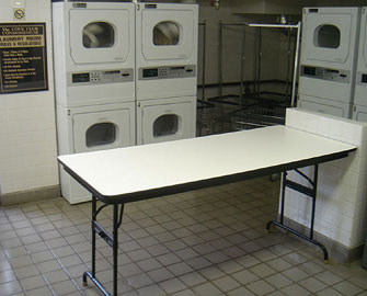
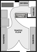
Before: For over a year, I tolerated the arrangement of the folding table in the condo laundry room that formed a barrier between the washers (out of view in the foreground of the pictures above) and the dryers. I, like everyone else, just stepped around the awkward placement of the table.
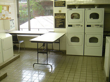
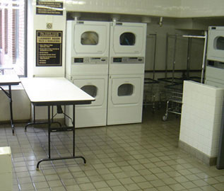
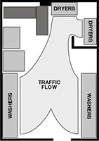
After: In August, 2005, I moved the table to open up access to the dryers. Sometimes, when I rearrange furniture in someone else's place (like in the elevator lobby of this same building), it is put back when I see the room the next time. But this time, when I went back to do laundry a week later, not only was the table still where I moved it, but there was a man in a wheelchair who commented how much easier it was for him to now get to the dryers.
Of course, the table was moved back. Somebody, maybe one of the porters, didn't realize that it was a more efficient and convenient arrangement and just put it back the way he was conditioned to seeing it. But, after the management accepted the new signs (above) I tried again and presented the suggestion to the condo board. They agreed and the tables were rearranged as recommended above. They have remained in the new configuration ever since.
Television networks have long put their logo in the lower right of the screen. A logo bug. For the same reasons - recognition, confirmation, and memorability, advertisers should put theoir logo onh screen to stay visible durig the whole spot. A logo bug. Today, there is an increasing number of spots that have adopted the on-screen logo bug. (2016)

I didn't want a mailbox to mar the simple A&C look of the front of the house. I first installed a store-bought mail slot, but even that was too dominant. I wanted even more subtlety. I cut out one of the panels in the groj door, mounted a hinged wood flap behind, and painted it the color of the door. Inside the garage, beneath the opening, is a basket to catch the mail when dropped in from the front. Letter carriers don't even slow their step - they push open the flap and drop the mail.
A variety of notes, sketches, and proposals of additional design projects.
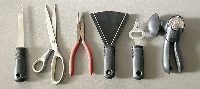
_ Knife to cut box tape
_ Scissors to open bags and cut hard plastic
_ Needle-nose pliers to roll open foil cap
_ Jar opener
_ Bottle opener, puncture foil and plastic covers, reach and remove cotton, and pry bar for opening box flaps
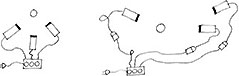
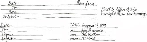
In the late 1970s I was conducting business concerning the production and marketing of the round backgammon board. Much of the work was done by phone - calls to vendors, manufacturers, designers, and toy companies. Conceived: winter 1978. Sketched/designed, Cleveland: April 1978; Dallas: August 1978. (I doubt the need is the same today with the proliferation of email and texting.)
Advantages phone call over letters: Can communicate better with intonation, voice inflections, pauses, etc; can get immediate replies and reactions; and more personal.
Disadvantages of phone calls: No written record for filing and no organization of thoughts and content of call.
Solution: A telephone form that is a guide for organizing what to say and a permanent record for filing and reference. Available in 8.5x11 & 8.5x14.
Form needs: Like a memo form but with lines for handwriting and guides for questions & answers. Cover sheet explains why we've needed a Phone Phorm.
• Date
• Who called
• Subject
• Questions to ask - answers
• Points to make
• Follow-up actions


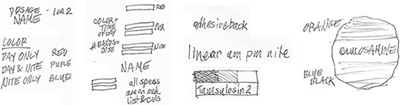
A system that organizes and simplifies which pills to take at which time of the day - better than just conveying what day to take. I rearranged the daily boxes in the holder tray so that their position communicated visual clues for the status of the pills - taken already or not yet taken. When the tray is positioned on the shelf, the sightline shows the full box with the label facing dead-on to the viewer, the half full position moves the label away at an angle, and the empty position places the label in a tough to see horizontal position.
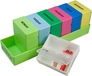

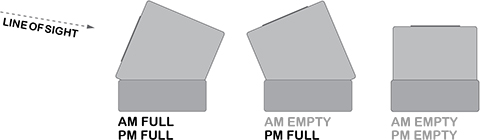
Concept: Visual reminders of pills taken that day conveyed by the boxes sitting within the base to convey a different status of the contents. Examples below:
1. Monday morning: All boxes full, labels facing user.
2. Friday morning: Mon-Thurs boxes empty, Friday-Sunday boxes full.
3. Friday afternoon: Mon-Thurs boxes empty, Friday morning pills taken - box rotated halfway up to show half empty.
4. Saturday morning: Friday box empty, box rotated up all the way, label away from user.
5. Sunday night: All boxes empty.
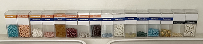
Problems
• Disgust at fitting round bottles in square cabinet.
• Depth of cabinet prevents seeing all bottles at once.
• Clutter of variety of sizes, typography, distracting info.
Influences
• Clear RX by Adler & Glaser.
• Prescription packs.
• Amassing more prescriptions.
Objectives
• Visual distinctions, color-coding, placement on bottle
• Minimal footprint on shelf space.
• Minimal info - time of day, dosage, med name.
• Consistent orderly visual system.
• See appropriate info at a glance.
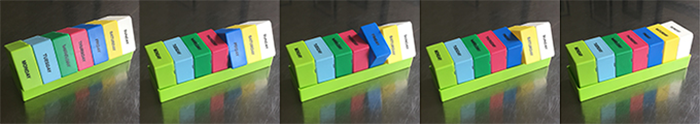
Components
• Square boxes/bottles - solves frustration with inefficient round bottles in cabinet.
• Art exhibit - no need to hide them, see them all at once, see at a glance which are low.
• Plastic box label design, color-coded bands, text: centered, FLRR, U&lc. Spice jars: centered, all caps, bold.
• Color-coded bands - primary focus for refill info.
Concept
• A consistent and efficient system of containers, labels, colors, and text that help make refilling weekly pill planners easier and quicker.
Evolution
• Linear left to right row, instead of top to bottom, with pill capsule shape.
• Color-coding by dosage time on thick bands at bottom of square plastic boxes.
• Thick bands at top to better see when running out of pills.
• Thin bands at top.
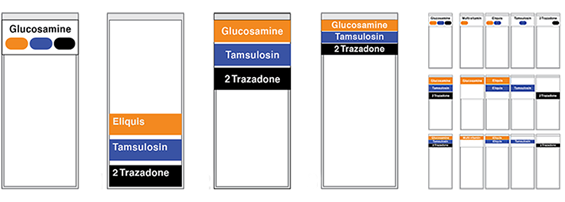
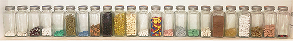
Glass spice jars with color-coded bands and name printed on cap.

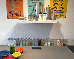
Left - Lid codes: Morning only. Misc stuff. Morning & Evening. Bedtime. Right: Lined up on the kitchen counter.
The jars of items looked so good, I set them up, all visible, in a row on the kitchen counter, as an art installation. Worried that the window light might affect the medicine, I moved them to a ledge in the darker Laundry Room (I might explore using amber or tinted glass - I just need to see how many pills are left, not the color of the pills.) I filled the extra jars with stuff for exhibit - Lego pieces, Okie red dirt, small white nails, gold chain, and screws.
Concept: a sphere aquarium that holds a plant in the top opening and an aquarium in the globe. The plant roots grow down into the aquarium where the fish nibble on them for food and trim them from filling the aquarium.
Date: While in college, room 4 of the Sigma Chi house, 1972.
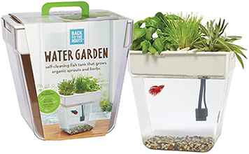


In 2017, 45 years later, I saw this product with the exact same concept - the Water Garden - a self-cleaning fish tank that grows sprouts and herbs. In this aquaponics ecosystem, the fish feed the plants and plants clean the water - no water changes required. This closed-loop ecosystem is powered by aquaponics - the combination of aquaculture (or fish farming), with hydroponics (or growing plants in nutrient-rich water). The self-cleaning cycle:
• The fish produce nutrient-rich waste.
• In regular aquariums the waste becomes harmful to fish. In this Water Garden, the plants continually take up these nutrients as food.
• The clean filtered water drops back down to your fish, and the cycle continues.
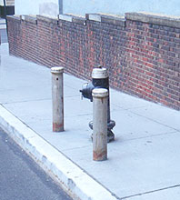
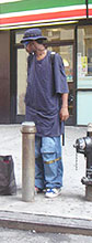
Walking around New York City, I noticed that there are these posts all over the city - usually in pairs. I was baffled as to their purpose until I saw this guy set his round CD player on top of one, and, Eureka, I realized what they were for - they are CD holders. For those urban audiophiles who need to rest and want to set their player down, the city has graciously provided these CD Columns. I assume that people were setting their CD players on the top of fire hydrants, so they mounted the CD Columns near the hydrants and in pairs to encourage socializing and sharing.
CD Columns are a nice gesture from the city, but now that the CD player is becoming obsolete, there is less need for so many CD Columns around the city. To keep up with consumer and cultural changes, the city should offer columns for the iPod listener. The considerate gesture will then have a new life catering to the new generation of audio technology.
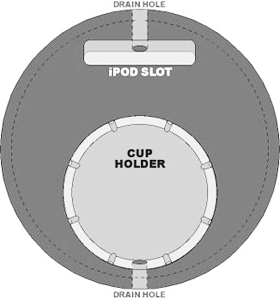
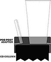
It would be expensive to replace the hundreds of CD Columns in the city, so I designed an adapter that just fits over the existing CD Columns and - presto - they are now Pod Posts. All sizes of iPods can fit in the slot. Because the iPod has a smaller footprint than a CD player, there is even room on the new Pod Post for a cup holder. There are also drain holes so rain water will not collect in the recessed slots. I am eager to see how the city responds to the PodPost when I present it to them later this fall. I think they will be stunned.
Inspiration: June 2006. Design and development: July 2006.

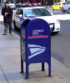
The Postal Service has one of the largest fleets of vehicles in the world, numerous buildings, and thousands of mailboxes around the country. That is a huge saturation of potential billboards. If they would market their trucks, buildings, and mailboxes as promotion media, they could get out of debt, turn a profit, and lower the price of postage to better compete with email.
Just as there are ads on the sides of buses, there can be ads on the trucks, either complete wraps or framed placards (there could be smaller USPS branding on the trucks). There could be individual ads or a company could sponsor all the trucks in a zip code area. The ads can be easily tailored for specific markets, based on zip code demographic data. Campaigns could also be for movies, television shows, or special events and concerts. Such campaigns could include the street corner boxes or those could be purchased separately. Example: the entire box could be painted red with the Coke logo and bottle shape on the sides. Below is an example of a vinyl wrapped box with a Princess posting a letter.


Sidebar: That reminds me of the time I was playing Bingo in the basement of the old First Baptist Church and I only needed B1 to win the evening's big jackpot - a dinner for two with unlimited cheese rolls at Cracker Barrel. So, I yelled out to the ball caller at the front of the room, under the picture of Jesus with the lambs, "Oh, B1, you're my only hope."
The huge obstacle
The US Postal Service is overseen by the US Congress, yep, that do-nothing group of immature bickering egos. The above idea may be too logical and productive for the Congress to understand and implement. Oh well, it's still a good idea.
The United States Postal Service is one of the few government agencies explicitly authorized by the United States Constitution. The USPS traces its roots to 1775 during the Second Continental Congress; Benjamin Franklin was the first postmaster general. The USPS is legally obligated to serve all Americans, regardless of geography, at uniform price and quality. The USPS has not directly received taxpayer-dollars since the early 1980s with the minor exception of subsidies for costs associated with the disabled and overseas voters.
Sidenote: If the Post Office is ever to make a profit, it absolutely must be removed from under the control of the US Congress.
A few USPS figures
160 billion pieces of mail processed
40 percent of the world's mail volume handled by the US Postal Service
574,000 workers
31,272 - number of Postal Service-managed retail offices
260,000 - number of vehicles - one of the largest civilian fleets in the world
1.3 billion - number of miles driven each year by letter carriers and truck drivers
0 - tax dollars received for operating the Postal Service
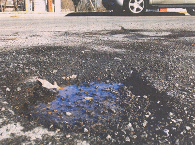
1. Have you ever noticed all the dark round spots on the pavement? Those are the hardened remnants of chewing gum that have been spat upon the ground. Littering sidewalks and, occasionally gumming up the bottom of someone's shoes.
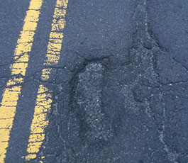
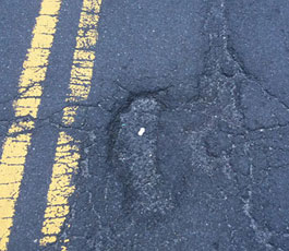
2. On many roads in the USA, there are numerous potholes waiting to be filled. They are annoying, jarring, and destructive to cars. City and state transportation budgets are stretched thin - there just is not enough money and time to fill in all the potholes.
Simple solution: Every gum chewer should not toss their used wad (of gum) into the trash, but spit, drop, or carefully place the gum into a pothole. There is certainly one close to where the chewer is when finished with the gum. Soon after spitting it into the pothole, the gum hardens and, soon, with public participation, the pothole will be filled with the durable dried gum. The photos above are an example of how Jim has made efforts to improve the driving experience in New York City. Inspiration date: 2008
The sidewalks will be cleaner, potholes will be filled, and not a penny of tax dollars will be spent. Drivers will be happy, taxpayers will be happy, and gum chewers will have a new target game to play. So, please help spread the word: Gum in the hole.
Formula: Gum forming hard dark blots + potholes needing to be filled = a perfect match.
1. Any individual who chews gum can participate.
2. Schools can hold contests - Chew-Offs, Gumholes. Each class could adopt a hole to fill during the semester.
3. Organizations, fraternities, social groups can adopt a section of roadway and aim for a complete filling.
To reinforce recognition of the product package, print, eb, an=d tv commercials should use dominant colors from the package design. This helps with memorability and product recall. Today, this has become quite common in both broadcast and print. (2012)

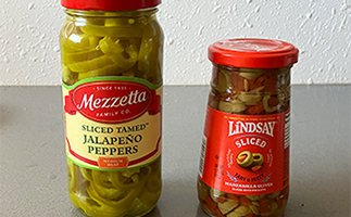
While visiting with friends, one of them, dropped an olive and a tamed (mild) Jalapeño into his beer. I was intrigued; those were two of my favorite flavors. He brought a jar of each; I sliced the peppers and the olives and used them as a salsa condiment. Later, I bought a jar of sliced olives to save the hassle of cutting them. I tried adding store-bought Pico de Gallo (very tasty) and salsa. But the best combination remained the tamed jalapeño and sliced olives. I add it to salad and some entrées. 2018

In 1985, a few years after it was introduced, I mixed Ranch Dressing with an equal part of Tex-Mex pico de gallo. It was delicious. In restaurants, I asked for a ramekin side of salsa and mixed the flavors into my salad or as a dip for chips. In 1994, Kraft introduced Southwest Ranch dressing. Today, there are numerous Salsa Ranch or Spicy Ranch dressings.
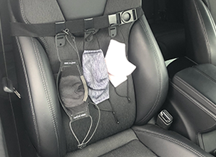
The buckle on the pillar strap is low on the belt that on the pillar. That location requires the driver to reach low for the buckle.
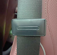
Better: I placed a belt clip (below right) higher up easing the and tall people have to reach. Winter coats. One no longer has to squirm around to reach the buckle.
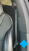


The console receptor is down in some mysterious valley with dropped food and coins. I had to reach in and poke until I found the receiving slot.
Better: A seat belt extender brings the buckle up high enough to easily find.
Send in photo with what changes you want (less fat, darker hair, more muscles) & photo is manipulated to reflect that and returned in variety of sizes (frameable, wallet) for motivation and goalspirations. 1994
Creative people rely on perceptions in their brain as resources for creative problem solving. These perceptions come from one's imagination creating new stored images from actual images previously experienced. Actual images are recorded from numerous sources, including travel, television, magazines, and movies. If the variety of experiences increases - the creative source file is increased. This can be an expensive and time consuming process and limited by one's environment and ability to travel and purchase media.
Can this period of experiencing images be condensed in time and broadened in scope? Could images of artwork, architecture, graphics, interiors, products, and environments be compiled and shown to one at a high rate of speed - long enough for the image to register within the subconscious? Like programming a computer, can a machine help program a viewer? Can the brain perceive 2-D images from a machine as if actually experienced? Will the images register as experiential memory? How fast can the brain process an image? Can the viewer control the speed of projections? Can the images be organized by keywords? 1980s
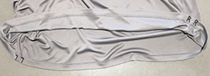
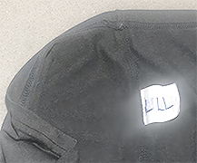
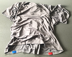
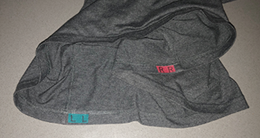
To put on a plain teeshirt, I had to guess which arm to put in which hole or I had to find the label on the collar.
Simple solution: I marked an L or R with a permanent marker on the side seam at the base of the shirt. The fabric is thick enough at that seam that there is no bleed-through of the ink. Now, as I open up the bottom I notice the R or L - it's easier to put the correct arm in the correct arm hole.
Another option: mark the L or R on the label along the side seam. 2018/19
Update: On dark shirts, the black marks didn't show up well and the marks needed to be more obviously visible. Solution: I applied iron-on tabs of color. After test-wearing, I put the R L letters on the label - now there is a color code and a text code.
• Round-Up facade
• Round Up parade float
• Room 5 renovation
• Graphic projects
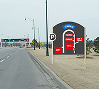
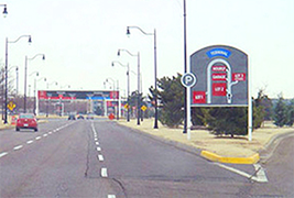
In 2005, the airport in Oklahoma City, Will Rogers World Airport (one of the few airports named after someone who died in a plane crash) needed a way to communicate to drivers how to get to the newest parking lot. Funnel Design Group was the airport design firm. I consulted as a team member to work on this project to improve the environmental graphics and wayfinding at the airport.
We explored the entire system of environmental graphics - signage, labels, wayfinding, placement, size, colors - from the exit off of the freeway, the roadways towards the terminal and parking, and the entrances to the lots and the terminal. We explored user needs - the primary target market would be rushed, ignorant of the airport layout, and possibly a bit stressed. The new signs would need to provide assurance, guidance, and comfort. Details of exits, specific sizes and relative scale were not important. Just show the user how to get to the parking options - that's all the motorist is concerned about.
The map sign, lot signs, and other wayfinding signs were submitted to the director of the airport. Some were accepted and implemented, other proposals may wait for implementation until the new garage is finished. The map wayfinding sign was built and installed.
Concept: Jim Watson; Design: Jim Watson and Sean Cobb; Production: Sean Cobb; Fabrication: Airport staff
Designed: September 18, 2005; Sign installed: late fall, 2005

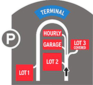
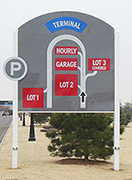
Concept
A map-like plan of the parking options at the airport; color-coded and clearly marked with type and labels.
Objectives
1. Get attention of motorist - large sign, bright colors, recognizable type and symbols
2. Communicate quickly - use standard parking symbol to convey that this is about parking and black arrow to show 'You are here' and direction of travel
3. Show that there are several options for parking - lots, garage, and hourly
4. Guide the user accurately - show roadways, direction of travel, and lot entrances
5. Easy to read and understand - high contrast, sans serif type, bright colors, minimum of detail and clutter
6. Relate to existing system of color-coded signs in use at the airport - red for parking, blue for terminal
7. Easy to build and maintain - use existing standards and signboards and airport construction staff
Below left: Comp rendering of sign superimposed on site. Below right: Photos of finished installed sign.

In college in Texas in the early 1970s, I proposed an ad agency that could serve small and-size markets. Towns like Temple, Waco, Harlingen, Tyler, Amarillo; markets too small to support a full-service agency but big enough to need creative services. The full-service agency would be centrally located (I was in Austin at the time). There would be an Account Services rep that would serve an entire region of the state. They would solicit clients, present campaigns, and buy local media. All the creative work, statewide media buys, and billing would be handled by the central office. The communication and campaigns would be sent overnight or 2-day delivery. The objective was to provide quality marketing and communication services at a small-market affordable price3. The plan would require technology to send client needs, objectives, desired re4sukts; and creative work and camera-ready ads. That technology didn't exist in 1973. It might still work today.
Go on red after stop - we waste much time and gas idling/sitting at a red light while no one else is at the intersection. Maybe we should just go - like at a stop sign. Yield to traffic with the green light, then, if clear, go ahead and cross the intersection (I came up with this notion long before people had cell phones in their cars and became less attentive drivers); Change all stop signs to Yield: a complete stop is often unnecessary, wasting gas, car maintenance, and time. 1978

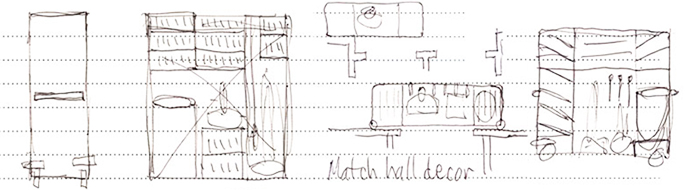
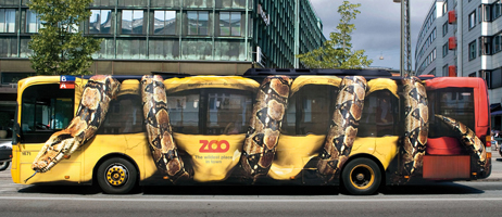
To make a positive impact on the riders' experience; fun car interiors might provide a conversation starter, help remind riders that life is not to be taken too seriously, and help to brighten the outlook for urban commuters. There could even be product tie-ins to pay for the remodelation and provide extra income. 2005. Some options:
• Sports: Yankees, Mets, Giants, US Open, etc.
• Art Deco: rich details, pastel colors
• Manhattan kitsch souvenir touristy stuff
• Disco: music, mirror ball, 80s colors
• Jungle: foliage print walls; leopard, tiger prints, jungle sounds
• English library: Hunter green walls, walnut veneer, faux leather seats
• French Rococo drawing room - might be fun to see urban hip-hop fashions in such a room
• Space: Alien and Star Wars/Star Trek style materials and appliances
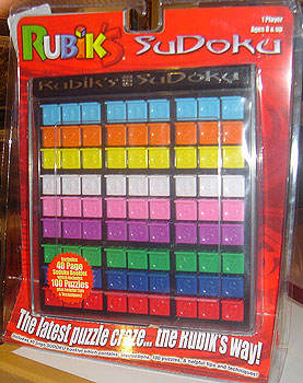
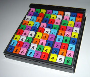

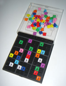
I have been addicted to Sudoku since the winter of 2005. In July of 2006, I was at FAO Schwarz with friends in New York City and saw this plastic version. I bought it to try it out. It worked okay - one could set it up with the puzzles from the daily newspaper or Sudoku books. There were some problems, however:
• The numbers on the pieces were hard to see. On one side of each piece, the numbers were raised, making it quite easy to darken them with a felt tip pen; making them easier to read.
• The back of each piece had a slight ridge to help it stay firmly in place in a slot in the gameboard, but that ridge made it tough to remove the pieces. I filed off the ridges on the backs of all the pieces. That allowed me to turn the game over when I was done and all the pieces fell easily into the clear plastic top of the game.
• The notation of the 3x3 grids was created by a slightly larger width in the black plastic grid - I sanded those to lighten their color and create a greater contrast.
• The title, Rubik's SuDoku, was highlighted in silver and was a bit too corporate and distracting. I blackened it with a pen.
In most noisy bars and restraunts, there are lots of hard surfaces. Concrete, tile, or hardwood floors. Walls with little variation in surface texture. Sometimes, its tough to have a conversation.
Solution: Add some sound dampening material underneath the chairs and tables. Date: September 12, 2019

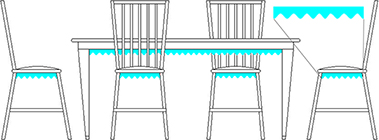
Objectives
• Easy to clean.
• Rough irregular texture to disperse sound waves and echos.
• Shapes: concentric rings and grid to facilitate cutting material to fit.
• Thin to minimize encroaching on knee space.
• Easy to cut, apply/adhere to underside surfaces.
• Inexpensive.
• Subtle dark color to blend in and not be noticed.

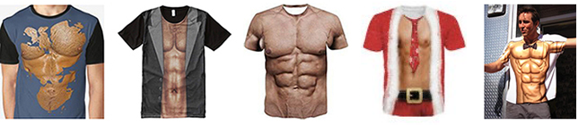
Seeking a way to look fit that was easier than dieting and working out, Tom and I came up with this idea in Austin in the early 1970s. Skip the gym and put on one of these shirts. Since about 2010, there are now numerous options of shirts sporting this concept.
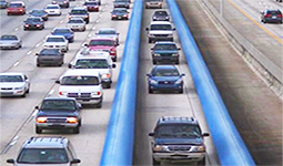
Every so often, on Interstate highways, there could be a long single lane with concrete walls (above) with large rubber rollers or bumpers mounted on each side. A driver could get into this lane, let go of the steering wheel, and have both hands free for texting. This idea doesn't solve the problem of ramming the car in front, however. 2008
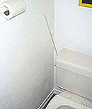
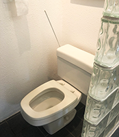
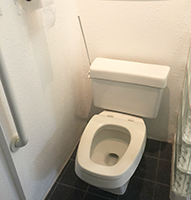
I bought my first house in April, 1995. I was looking forward to designing spaces just for me and to being able to solve design problems. One issue I addressed was the (quite simple and easy) task of bending over to flush the toilet, especially when standing.
I sought a way to extend the flush handle so it was easier to get to. I had a leftover piece from a window blind - the rod used to turn the blinds open and shut. I bolted this to the flush handle and put a cap on the exposed end. Fortunately, the handle was mounted on the side of the tank where the motion would be appropriate for an extension. If the handle was mounted on the front, I don't think one could extend it quite this easily. Simple but effective. Much better. Design and production: 1995

New kitchen cabinets had fold out doors in front of the sink. I used them the way they were intended, until realizing that one was right over the trash can in the cabinet below. As a chute guide, I bought a plastic bin of appropriate dimensions, cut it to fit, and taped it to the inside of the door. It works great - trash drops right into the can - its easy and quick to use and the door is unobtrusive.
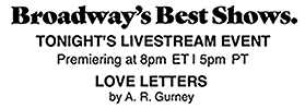
During promo announcements, there is a slightly awkward notice of the air time of the program: "Eight o'clock, seven central." There must be additional programming for the western US: "Nine o'clock, ten mountain." Not only is there the cumbersome verbage, but networks must record and air different spots based on the time zones.
A simpler and clearer way to communicate show air times - a graphic that shows a stylized map of the US with the 4 time zones delineated and the air time in each zone. Each zone shape is a distinct and representative shape. The viewer, who cares only about one time, will soon learn which shape on the map to focus on to get the time. The voiceover announcer could even say "Nine, Ten, Eleven, and Twelve". We would soon learn which number in the four applied to our time zone area.
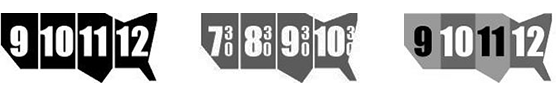
The options shown convey a basic shape of the continental US - enough to recognize and remember a specific time zone. There are several ways to render the info. One could have varying grey to mimic typical time zone maps. Others could rely on divisions between the zones. Shows airing at 30 minutes past the hour could be communicated with the familiar 30 stacked next to the hour. Below is a sample showing a location on a screen.


For print copy where the map version doesn't fit, the info can be set as part of the copy. The 4 times and, if necessary, the legend of PMCE - Pacific • Mountain • Central • Eastern.
Concept: spring 2005, Sketches: October/November, 2005
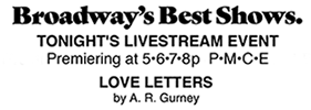
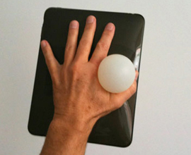
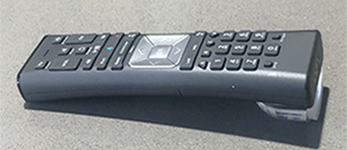
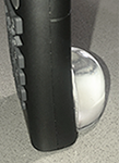
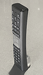
I have an Apple TV remote and a Cox cable remote. I'm fine with the functionality, except that it's completely symmetrical. I've grabbed it backward in the dark and pressed the MENU button rather than pause. Each has a symmetrical shape and layout making it easy to pick up the wrong way. This required looking at the buttons to determine orientation. To make the remote better, I explored bridht red and green decals at each end (not large enough and didn't help much in a dimly lit room), arrows along the side, and a triangle affixed to the base (too cumbersome).
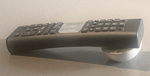

Mitch, during a brainstorm session over coffee, suggested a raised 'button' on the back/bottom. I had some at home, but all were too small or shallow to be of much help, except for a bumper used where a door knob hits a wall. Tested that one and it was a success: it was easy to hold, visually clear which end was up, and the orientation could be felt in the dark. It was a bit too big, so I ordered a different door stop and affixed one of those. Works great.

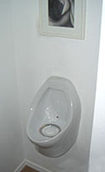
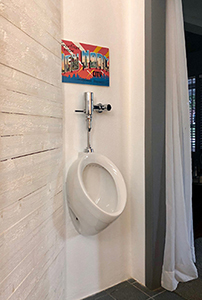
Years ago, I was disgusted by the splash residue around the toilet. No man can be completely drip-free or avoid splashing. In public restrooms, the answer is urinals. Why not apply the same logic for home use. Important: a home urinal solves forever the seat-up or seat-down issue. I experimented with different styles of urinal bowls and even a waterless version.
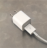
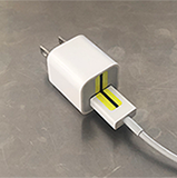

When these were first introduced - most of us were using trial & error to plug them in correctly. The physical objects gave no clue to 'This side up" and the small printed or embossed USB symbol was tough to see. A mid-size bump on each end, male & female, might have been easier to see. One could even feel the bump. After years of just putting up with the poor design, I drew a short highlighted black line onto adhesive-backed small blank labels. Not as elegant as a solution built into the plug, but simple, effective, and clear. Noticed upon introduction in 1995, finally fixed in 2021.
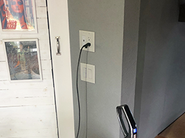
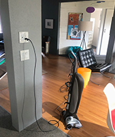
This hand-level outlet means no more bending or stooping to plug in the vacuum at a normal lower outlet.

There are machines that can digitize photos and documents. Now we need a machine, about the size of a toaster oven with a USB or FireWire connection, that can digitize a pizza. The digitized info can then be transmitted wirelessly to another machine where the pizza is translated back to analog from digital. These machines could even be installed in cars. I am now looking for investors to fund this new Wi-Fi-Pi venture. Please contact me ASAP so we can get started. Thanks.


What Would Jesus Do Condoms might give pause to teenagers who are about to have sex. Hopefully, this might reduce the number of unwanted pregnancies, immature mothers, and kids getting married too young (Corey suggests that WWJD could also stand for 'Who Would Jesus Do?') Give them away to undercut the price and success of all others, thereby making them very popular and common.
A variety of notes, sketches, and proposals of additional design projects.
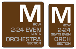
Delete the useless M and save the world.
That's the way most of us plan our weeks and weekends.
Friday, August 12 is clearer than August 12. "What day is that?"
See these examples to see how it makes so much sense.
Of course, we should pay for that drink.
Genders aren't equal in there.