
Copy set Flush Center is easier to comprehend
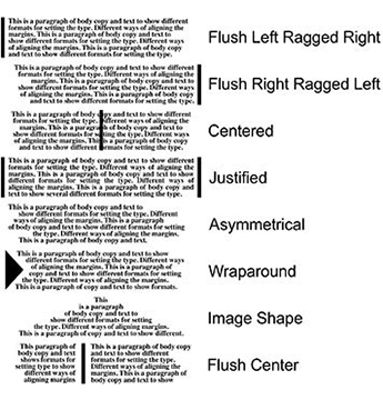
There are 8 ways to set blocks of text copy:

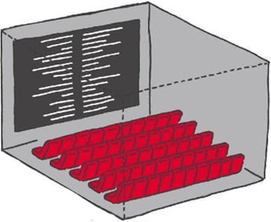
Setting body copy with the left block of text set flush right and the right block set flush left. A center margin is created allowing info to be in better proximity. Credits at the ends of movies adopted the flush center format years ago.
Lesson: The use of Flush Center alignment encourages like-minded bits of info to be near each other and is the most efficient for columns of info.
Better arrangements of columns of info in the flush center format
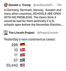
We read by taking a picture of a group of words - not letter by letter. When scanning a phone book or any directory, we find the name and then have to scan to the right a ways to get to the phone number. There is no advantage to setting the info with justified margins. We are not reading a block of copy like prose, we are reading only one line of info. To aid this horizontal eye movement, a line of dots has been added to help us stay on the proper line of info.

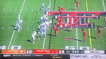
Existing layout for scores: We read by taking a picture of a group of words - not letter by letter. When reading scores on television, most stations do the usual transfer-from-print layout of putting scores after the team name. Since the length of team names varies widely, these scores may end up being a ways from their team. There is no advantage to setting sports scores with justified margins. We are not reading a block of copy like prose, we are reading only one line of info.

Better layout for scores: In the example above, the scores are aligned to the immediate left of the team names. One sees the number right next to the team name - no having to move along a horizontal line. This method allows more clarity and easier reading and allows a slightly narrower column width.
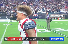

When the viewer glances at the screen, they want to know the score. The one above right is easier and quicker to comprehend than the one above left.
Notice how much easier it is to find the score of 29 23. The LV mark is closer to the Arizona score than it is to its own.
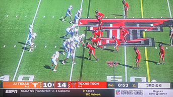
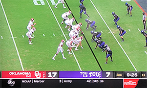
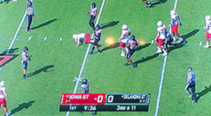
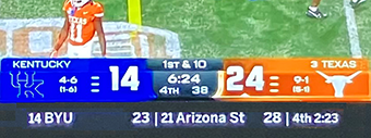
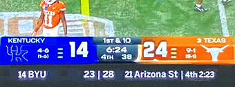
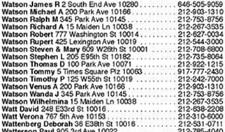


In the example above right, the numbers are aligned to the immediate left of the names. One scans down the column to the desired name and then sees the number right next to it - no having to move along the line. As shown below, this method saves enough space to allow more letterspacing for clarity and easier reading, to allow setting the phone numbers in bold, and to allow a slightly narrower column width (as shown by the grey bar at the bottom of the column).
Flush Center Conceived: mid-1990s. Designed/copyrighted: May, 2003.
Below left: 4 columns of existing directory page. Below right: 4 columns of a Flush Center directory page.


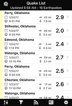
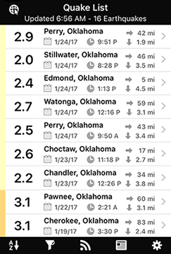
Above right QuakeFeed app: the earthquake intensity is listed first and right next to the city location. The date and time info are on one line to allow compression of info to fit more incidents on one screen (less scrolling). People access the app to learn, "Dang, how big was that one? And how close was it?" The arrangement better respects the desires of the user.
Lessons:
Design from the user's point of view, not the client nor the designer.
Minimal scrolling and swiping speeds access and eases use.

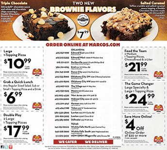
This was a newspaper insert for a pizza chain. The list of locations in the center wasted lots of space and was a bit tough to use effectively. Improvements:
Phone numbers closer to location
Larger point size for better readability
Fewer unnecessary marks: ( " .
Less info in locations - deleted W, St, Ave.
More consistent setting of Oklahoma City SW & NW
Better spacing within coupons
Larger logos inside coupons


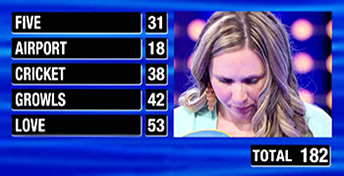

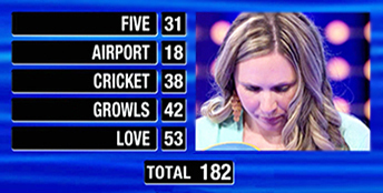
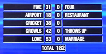
Above: Copy set in the traditional flush left layout. And, yes, her husband got 182 points out of 200. She only needed to get 18 points to win the jackpot, but her answers were so off that she didn't earn any additional points. So sad for her. Below: setting the copy so the answers respect their points earned by aligning to a central margin:
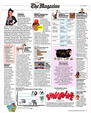
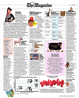
The graph in the middle of the page (enlargement below left) is a comparison of games per month. To visually clarify a comparison, it helps to align the icons so that the width of each row starts from the same zero point. As printed in The Magazine, there is inconsistent spacing and an awkward alignment. There is no advantage to having the months aligned left - we can easily scan the list.
Tip: Align the elements that convey the message content, not the message labels.




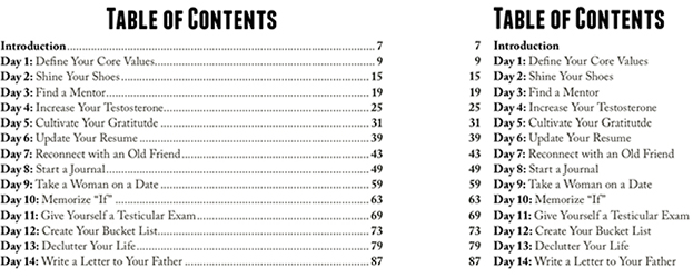
Align monetary lists by the decimal points for easier comparisons


It is much easier to understand the point being made - that more money goes to Corporate Subsidies
than to any of the other expenses shown. Improvements:
• Aligned the decimal points so that the dollar amounts line up and can be more easily compared.
Arranged the items in increasing dollar amounts.
• Decreased the leading - allows a larger point size without taking up any more height.
• No need for bullets.
• No need for the repeated dollar sign.

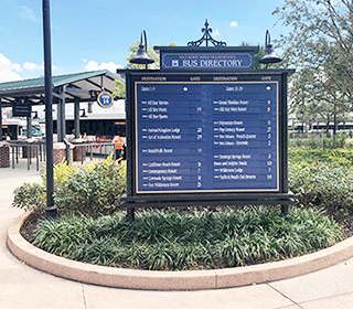

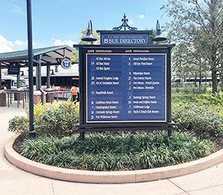
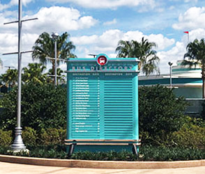
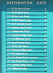
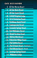
Signs at Disney World. The viewer/parkgoer is often tired, dealing with kids, and looking for the easiest and fastest way to get back to their hotel, another park, or the car. The proposed signs below have less copy and are easier and quicker to understand.
1. These sign readers do not need to be reminded that their resort is a Disney resort - all the references to Disney just bog down these signs.
2. On the above sign, removing the arrows to gates lessens the confusion with the numbered destinations.
3. Setting the copy Flush Center allows for better proximity of related information.



This is a classic saying, tough to achieve, but a great goal to work on. The person that posted it was probly not a great designer - a great designer groups together the words that form the thought. When we read and get to the end of a line, there is a pause as the brain and eye move down and back to the left to start the next line. That pause is just like the pause from a comma or period.
Look at the second line - minds discuss events; small
How it could be better
The line breaks allow each thought to be contained on one line (and the semi-colons are replaced by less-obnoxious commas):


Above right: the lines are arranged in a Flush Center format so that the 'minds discuss' stack up, allowing the reader to see 'Great, average, and small' and connect those to 'ideas, events, people.' thereby further emphasizing the differences.
Compare these 2 to see which enhances clarity, communication, and comprehension.
Alignment of information on highway signs
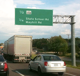
Rapid and easy comprehension is probly the most important objective of effective sign design. The viewer is often in a car, in a situation where he/she must be able to focus on the act of driving - checking the road, other cars, weather, etc. To gain information from a sign, that sign must be absolutely clear. With info that is easily noticed (highly visible, legible, and easily recognized) and clearly communicated (easy and quick to comprehend).
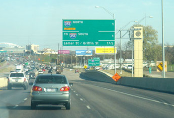
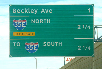
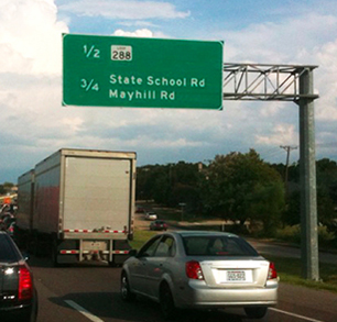
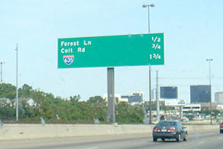
Notice the large gap between the bits of information that relate to each other. The exit name and the distance should form a single bit of info for the driver. But the gap prevents the brain from immediately associating the two.


There is no advantage to setting text on the signs with justified margins (with the exit names aligned on the left and the mileage aligned on the right). We are not reading a block of copy like prose, we are reading only one line of info. We have become accustomed to scanning a sign to focus on just the info we need. The typography, layout, and composition on the existing signs discourage efficient comprehension. The letter spacing, word spacing, and alignment require more time to scan, read, and comprehend the info. And - very important - this is while one is driving, when one's attention should be on the road and other cars.
Better sign layout: flush center margins
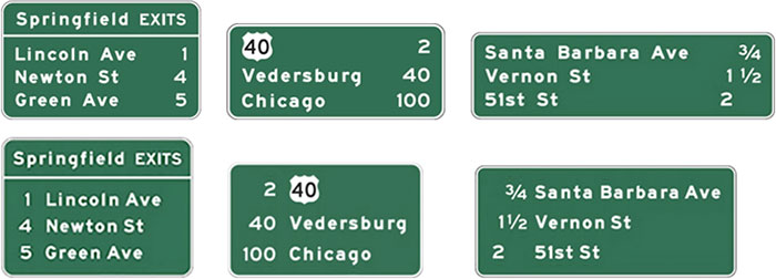
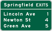
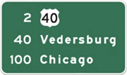
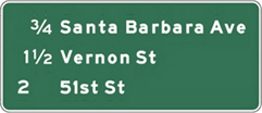
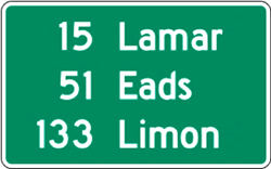
In the example below on the right, the exit ramp distances are aligned to the immediate left of the exit names. One sees the number right next to the name - no having to move along a horizontal line.
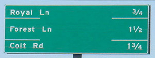

In some of the examples, the sign designer added a horizontal line between bands of info, presumably to improve comprehension.
Lesson: When you have to add an element to improve communication, there is something weak about the original design. Solve what caused the problem, don't add crap to compensate.
The value of the flush center arrangement
We don't read letter by letter or even word by word, we read groups of words as a single unit. The retina receptors take a photo, send that info to the brain for processing, then jump to the next group of words.

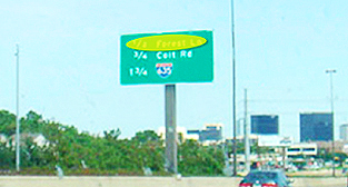
The existing signs require at least 2 photos per line since the gap between words is so large. (Some of the layouts look like cruel jokes played on innocent drivers.)
With the mileage to the left and next to the exit name, the viewer's brain can snap one picture of all the needed info. The flush center format allows more clarity, easier reading, and, often, a smaller sign. Most importantly, this format allows the driver to spend less time comprehending the info and more time on the cars and highway. This will create a safer driving environment.
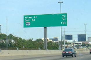
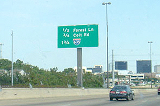
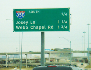
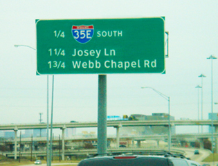
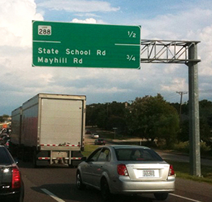
Highway sign layout that can improve safety while driving
Signs serve to inform, guide, and direct the driver. The primary target market of a highway sign is a navigator (most often the driver) who is seeking guidance and information. The driver is often in a situation where he/she must be able to focus on the act of driving - checking the conditions, cars in the immediate proximity, passengers talking, and music volume. The highway sign must efficiently convey clear and rapid communication.
No one ever complained because something was too easy to understand.


Flush Center alignment of information
The large gap between the bits of information that relate to each other prevents the brain from immediately associating the two.
There is no advantage to setting text on the signs with justified margins (with the exit names aligned on the left and the mileage aligned on the right). We have become accustomed to scanning a sign to focus on just the info we need. The letter spacing, word spacing, and alignment require more time to scan, read, and comprehend the info. And - very important - this is while one is driving, when one's attention should be on the road and other cars.
The advantage of using the Flush Center arrangement
We don't read letter by letter or even word by word; we read groups of words as a single unit. The retina receptors take a photo, send that info to the brain for processing, then jump to the next group of words.
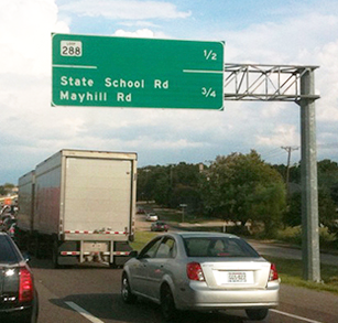
The exit name and the distance should form a single bit of info. With the mileage to the left and next to the exit name, the viewer's brain can snap one picture of all the needed info. The Flush Center format allows more clarity, easier reading, and, often, a smaller sign. Most importantly, this format allows the driver to spend less time comprehending the info and more time on the cars and highway. This creates a safer driving environment.
In the example below on the right, the exit ramp distances are aligned to the immediate left of the exit names. One sees the number right next to the name - no having to move along a horizontal line.


Sometimes, the sign designer adds a horizontal line between bands of info, presumably to improve comprehension:


Red flag: When one has to add an element (lines) to improve communication, there is something weak about the original design. Solve what caused the problem; don't add crap to compensate.
More examples of existing and proposed Flush Center






Better Rest Area directional signs
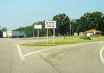
As the exit ramp approaches the rest area, there is often a split - trucks one way - for longer parking slots - and cars another way. At this Y split, there is a sign guiding the driver who must make a decision in a second or two. Competing for the driver's attention: navigating the exit ramp, wondering which way to go, music playing, and anxious passengers. The sign must be so clear that a driver can comprehend it and make a decision almost immediately.
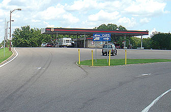
Examples of existing signs

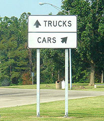
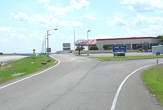


Problems/weaknesses
• Proximity of the arrows to their accompanying icons. In the sign above on the right, the truck icon is closer to the left arrow than to the right arrow (and the truck is even facing left)
• Horizontal layouts that provide little visual clue on which side of the sign to drive. The driver wants to know left or right and the sign is divided top and bottom or above and below.
• Arrows that convey turn left or turn right rather than just angle to one side of the sign or the other.
• Poor contrast of text and background and sign background to environment.
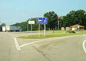
Improved sign
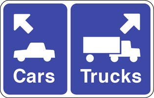
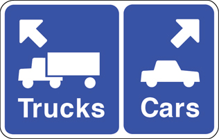
Improvements
• Image icons, arrows, and text are aligned in proximity to reinforce the message.
• The vehicles are facing the direction of their arrow.
• The info is side by side - left/right - to better suggest going left or right.
• Different size background shapes s provide a visual clue, larger vehicles (trucks) get larger background shape.
• Arrows point in a truer direction, rather than turn left or right, softer turn to parking area.
• Icons, arrows, and text are set flush to the directional margin, the left sign info is aligned to the left.
• The background color is the standard highway information color.
Comparisons



Full essay on sign design
Flush center highway signs: Conceived: late-1990s, sketched: May 1997
www.jamesrobertwatson.com/flushcenter.html