
Guidelines for recycling symbols on collection bins

Someday recycling materials will be a normal part of our everyday routine and attitude. A program of standardized graphic symbols (both shapes and colors) for use on public recycling bins will help us move towards that point more efficiently.
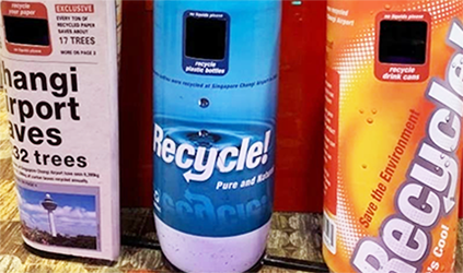
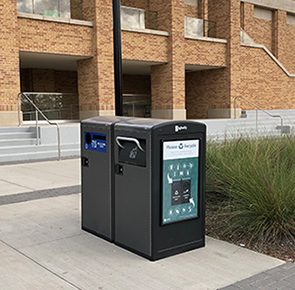
A few assumptions, based on observations (see photos below) and internet research:
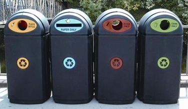
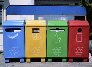
• Currently, there is no existing system of color coding.
• Blue seems to be the most commonly used color, followed by green.
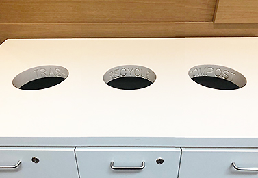
• If a bin has holes with unique shapes, they are most often a slit rectangle for paper and a round hole for cans and bottles.
• There is much discrepancy concerning recycle symbol graphics.
• There is value and a need for a program of standardized graphic symbols.
Purpose of standardized graphics
• Enhance and simplify the process of public recycling.
• Encourage children and adults to participate in recycling.
• Increase the amount of waste materials that are recycled.
Objectives for the graphic symbols
• Communicate meanings clearly.
• Easy to understand.
• Quick to see, read, and comprehend.
• Take up minimal space (maximum amount of info with minimal amount of line).
• Overcome language barriers and different levels of literacy.
• Adapt to a variety of materials, uses, and surroundings.
A graphics style manual
There are many variables in producing these symbols for different locations: style of architecture, colors of the interior, location of bins, size of can inserts, and more. Therefore, this proposal is primarily a guideline to standardize the symbols enough to enhance the consistency and therefore, the education of the user. The manual could include detailed specifications for the symbol shapes, sizes, colors, and locations. Other items that could be encouraged include positioning the bin openings in the front for easier recognition, understanding, and protection, using a sans serif font in all caps, and using photos or icons of the items. These other variables could be determined by the manufacturer, space architect, or owner of the space.
Recycle bin graphic symbol components
Designations: Objects - Color - Shapes
Relying on familiar meanings reduces the time required to educate the viewer about the symbols.
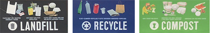
• Paper: Blue thin rectangle: rectangular paper is inserted on its thin linear end.
• Bottles and/or cans: Round green to respect the color most often associated with the environment and recycling. Bottles and cans, generally cylinders, are inserted on the round end - a circle.
• Electronics (toner cartridges, phones): Purple vertical rectangle to fit the familiar shape of gadget components. Purple seems more mechanical and industrial.
• Other (aluminum, paperboard): Orange triangle (circle, rectangle, and square are so logical for bottles, paper, and trash - the triangle is the only remaining 2-D shape), orange for visibility and contrast from the other colors.
• Trash: Red square: provides maximum opening area to accommodate awkward shaped pieces of trash. Red, which likely conjures up the meaning Stop, works well as it asks the user to stop and think before putting things in the trash.
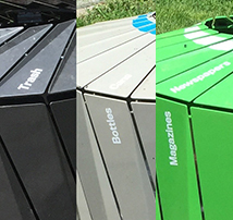
Symbol shapes and colors
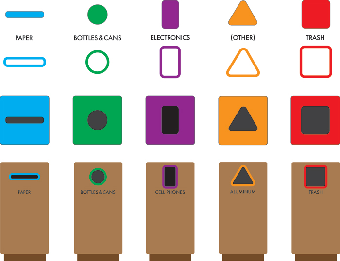
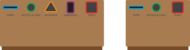
Suggested use in bin combinations
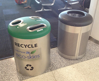
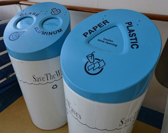
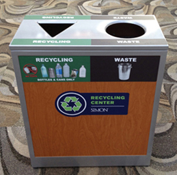
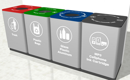
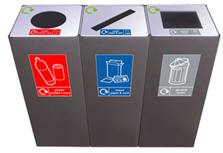
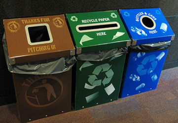
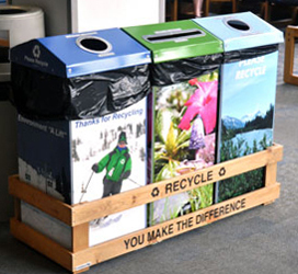
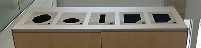
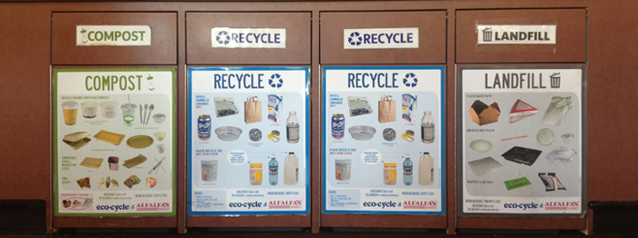
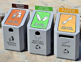
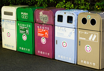
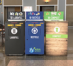
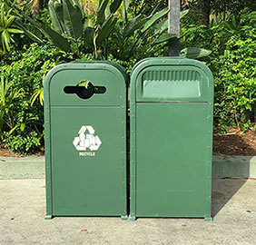
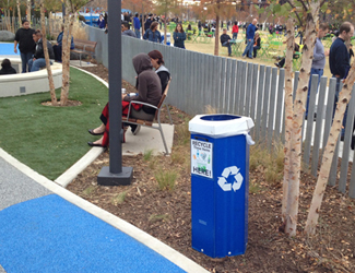
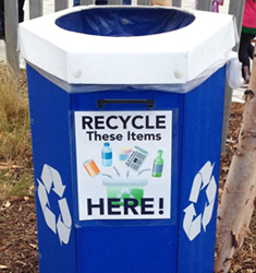
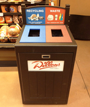
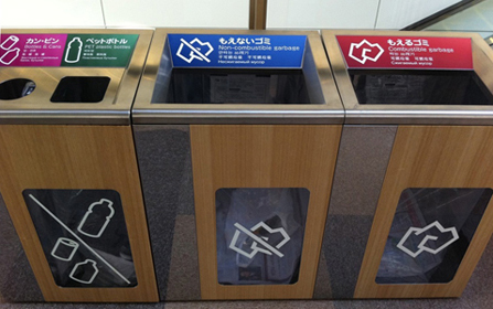
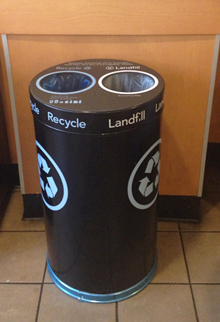
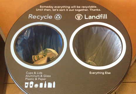
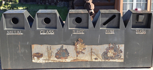
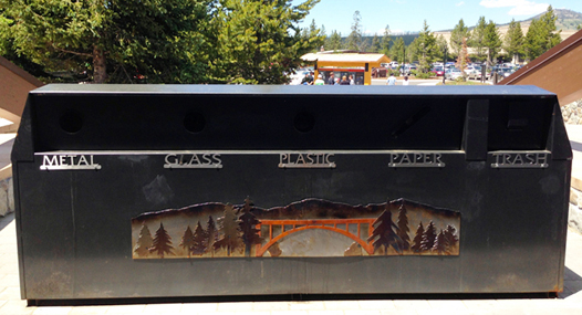
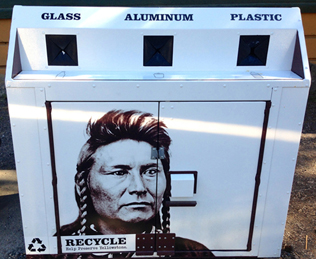
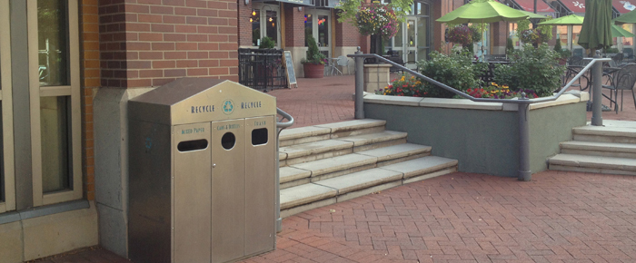
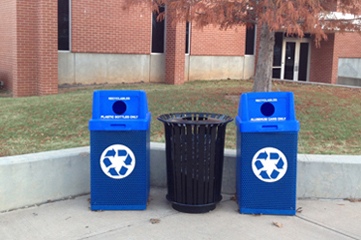
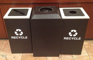
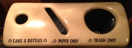
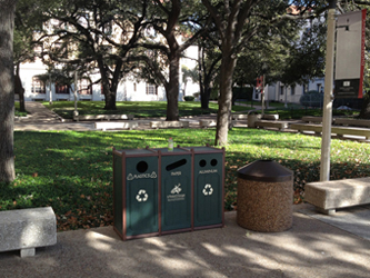
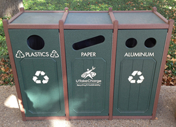
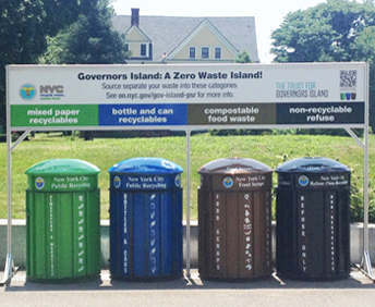
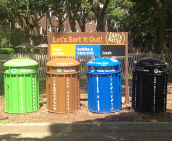
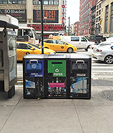
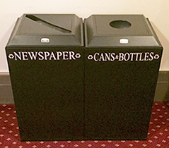
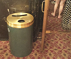
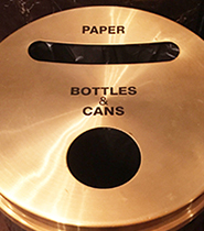
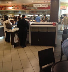
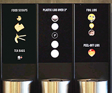
Samples of current shapes, colors, and placement
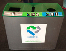
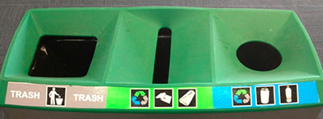
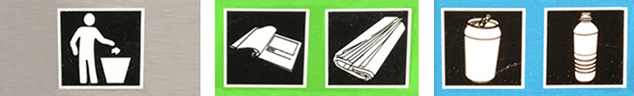
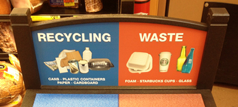
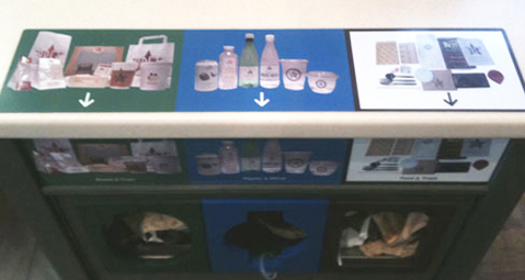
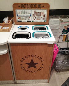
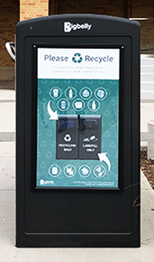
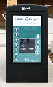
Note the locations of the holes, readability, label text or image icons, color coding, and shapes of holes. Some of these examples show the benefit of visually illustrating what goes in each bin:

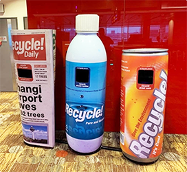
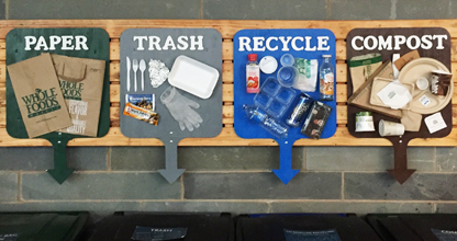
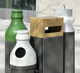
Below: fun idea of receptacles in the shape and color of what goes inside. Probly expensive, but it is clear and easy to understand. Might even make depositing fun.
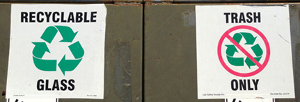
Below: Recycling prohibited = Trash. Not sure the negative works well, but, interesting concept.
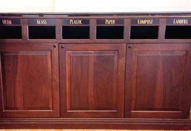
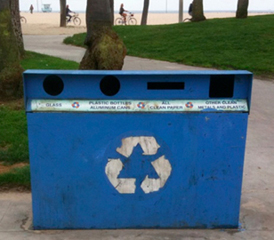

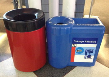
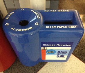
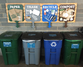
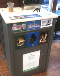
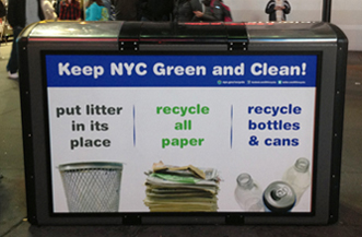
These labels (no illustrations nor symbols) are a bit tough to read. The colors and the smaller bottle opening help a little:

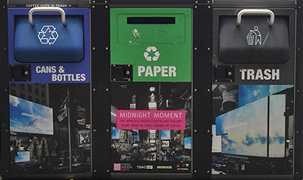
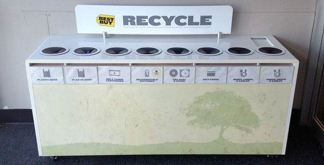
Above right: I am quite sure that trash will be put into this recycling bin. There is no trash can nearby and this is the last stop before entering the auditorium of a Broadway theater. Some other mistakes in labeling:

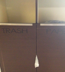
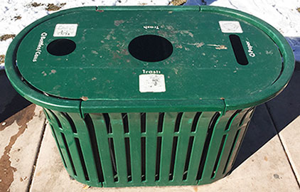
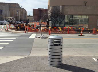
The labels are embossed black on dark brown. The legibility is so poor that these bins are useless for separation. I noticed customers just putting all their trash into any of the three slots. Below: this bin in OKC does not have enough information to be useful. The recycling symbol is on top and not very visible when approaching the bin. And just what goes in the bin? Anything that can be recycled? This location is in a tourist spot - people who do not know which items are accepted by this local recycler. There was not a trash can nearby - I suspect there will be lots of trash thrown in this bin.
Below: The arrangement of the symbols could be clearer. The bins are side by side but the symbols are left/right. Better: place the symbols in a column adjacent to their bin. No need for arrows to compensate for the poor layout.
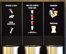
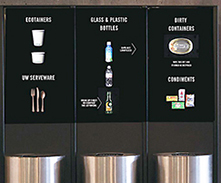
Smart Bins at the University of Washington
The UW Smart Bins installation features separate receptacles, each fitted with a scale, a microcomputer, and a digital screen. When in use, the screens show how much money is saved by proper composting and recycling; when not in use, the screens show correctly sorted trash items cascading into each bin.
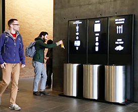
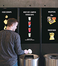
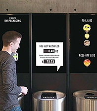
The bins give users positive feedback for throwing away their waste. This was very surprising to users, because the normal trash experience is mindless - people generally don't think at all when throwing something away. Users were very engaged by the video loop that plays when the bins aren't in use. The loop shows a stream of correctly sorted items falling into each bin. It was difficult finding an attractive way to show trash - garbage is inherently ugly. Arranging the items precisely - upright, in neat rows - gave the animations a kind of deliberate beauty and dignity. Savings are calculated by weight - UW pays $145 per ton for landfill and $60 per ton for compost, and recycling is free.
After installation, correct composting increased by 20 percent, and incorrect recycling decreased by 15 percent. The overall amount of waste correctly diverted from landfill increased by 8 percent - a substantial environmental impact. Developed by UW graduate students, the project took seven months to complete.
History of the recycle symbol
In early 1970, worldwide attention to environmental issues culminated in the first Earth Day. In response, the Container Corporation of America, a large producer of recycled paperboard, sponsored a contest for design students at high schools and colleges across the USA to raise awareness of environmental issues. The 500 entries to the competition were judged by some leading designers in graphic and industrial design, (including Saul Bass and Herbert Bayer). The award was announced at the International Design Conference at Aspen.
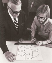


The winning entry was by Gary Anderson, a 23-year-old college student at the University of Southern California, whose entry was the image now known as the universal recycling symbol.
Anderson has said that violence stemming from the drug-infused political youth movement led him to strive for a graphic approach that reflected restraint and balance. The symbol is composed of three mutually chasing arrows that form a Möbius strip (an unending single-sided looped surface). The arrows represent three different facets of recycling, forward motion, and a never-ending cycle.
www.jamesrobertwatson.com/recyclesymbols.html