A better way to display museum hours
Like many people, I check a museum's website to confirm their operating hours. The web makes it easy to get such info. But, often, the info listed is not a clear, easy-to-comprehend format. The hours listed on different websites are inconsistent formats and the museums are closed on different days. Here are three examples:
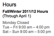
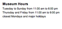

There's gotta be a better way. Considering the increase of information clutter and the desire to find answers quickly and easily, the principles of information graphics might work well here - providing the information in a visual, easy-to-understand format.
Sketches
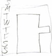
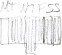
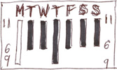

I explored a vertical format, but realized that familiar calendars have the days of the week in a horizontal line with the sequence moving from left to right. But, many people are seeking the hours for just one day - "When do they close on Friday?" The hours ought to be within each day's column. Yes, that makes more sense and is easier to understand.
Introducing the hours chart

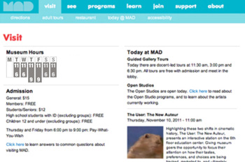
The concept is simply a visual graph that clearly denotes days and hours. A format with the days in a vertical column is shown below as a good example.
Objectives
Easy to understand.
Adaptable to a variety of formats.
Easy to recognize on both webpages and print brochures.
Use minimal amount of space.
Visually convey those days that have later hours.
Legible and easy to read typography.
Ability to customize the graphics identity of the institution and the medium.
Meet the needs, desires, and lifestyle of the customer user.
Features
Don't need am and pm - its quite clear that a museum opens in the morning and closes in the afternoon.
The days are grouped into logical sets - weekdays are grouped together and the weekend days are grouped together - respecting the way we live our lives.
Easy to pick out of a busy webpage or brochure.
Easy to understand - familiar content, order, and layout.
Easy to remember - there is both visual info and text info.
Takes up little room.
Adaptable to variety of media, uses, formats.
Lesson: Visual images are more appealing, intriguing, and memorable than text.
Tip: When feasible, consider using charts, graphs, and other visual images in lieu of text prose.
A good example
The excellent and worth-a-trip Crystal Bridges Museum of America Art in Bentonville AR charts the museum hours on the Visit page of the web site:


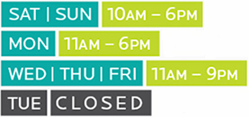
The TUE CLOSED is the most dominant element - the info that is least important and most negative is the focal point.
The days of the week aren't in order, making the info even harder to decipher.
There is no visual clue (other than the text) to convey which days the gallery opens early and closes late.
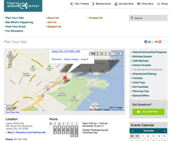
The chart below conveys the same text info but enhances it by using the visual image to clearly communicate the gallery hours - the days of the week are in a more familiar order and the days that the museum opens earlier ands closes later are conveyed with the length of the color bars. The webpage below left also is tightened up to require less scrolling. When the user clicks on Visit, the hours are visible on the page. On the existing webpage above, the user has to scroll down to access the hours.


Samples from the museum map and an earlier web design:


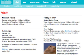
More samples, Existing and proposed



Dates
Idea and sketches: October 2011
Comps: November 24, 2011 and March 2017
Epilog
In 2013, the Guggenheim museum in New York City posted the museum hours on their website in this more orderly chart format. It is better than most, but there is still no visual clue that the museum is open later on Saturday.


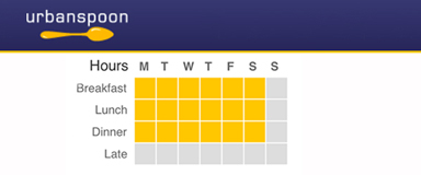
A sample chart from Urbanspoon, summer 2014:
