
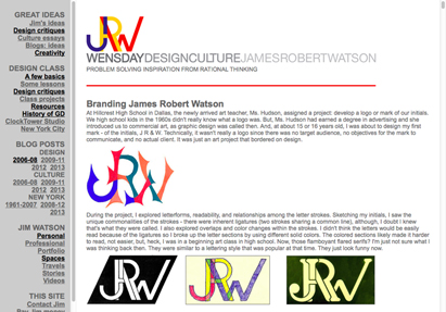
Branding James Robert Watson
At Hillcrest High School in Dallas, the newly arrived art teacher, Ms. Hudson, assigned a project: develop a logo or mark of our initials. High school kids in the 1960s didn't really know what a logo was. But, Ms. Hudson had earned a degree in advertising and she introduced us to commercial art, as graphic design was called then. And, at about 15 or 16 years old, I was about to design my first mark - of the initials, J R & W. Technically, it wasn't really a logo since there was no target audience, no objectives for the mark to communicate, and no actual client. It was just an art project that bordered on design.
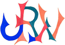
During the project, I explored letterforms, readability, and relationships among the letter strokes. Sketching my initials, I saw the unique commonalities of the strokes - there were inherent ligatures (two strokes sharing a common line), although, I doubt I knew that's what they were called. I also explored overlaps and color changes within the strokes. I didn't think the letters would be easily read because of the ligatures so I broke up the letter sections by using different solid colors. The colored sections likely made it harder to read, not easier, but, heck, I was in a beginning art class in high school. Now, those flamboyant flared serifs? I'm just not sure what I was thinking back then. They were similar to a lettering style that was popular at that time. They just look funny now.
A few years later, at the University of Texas in Austin, I was at a fascinating advertising presentation by Mary Wells, one of the first successful female ad creatives. She was the first woman CEO of a company listed on the NY Stock Exchange. She and her firm, Wells, Rich, Greene, created the graphics and airplane environments for Braniff Airways, and some of our culture's most endearing slogans: Plop plop, fizz fizz; I can't believe I ate the whole thing; Try it, you'll like it; I ♥ New York; At Ford, Quality is Job 1; Raise your hand if you're Sure; Friends don't let friends drive drunk.
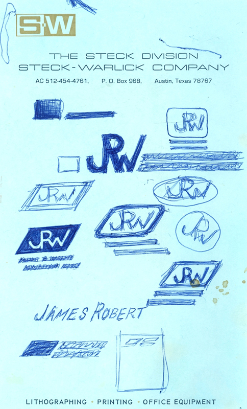


Anyway, maybe I was inspired during her talk, but I had begun thinking about a professional career. I doodled the JRW versions above. I dropped the serifs and rendered it in one color (likely due to only having a pen with me), but kept the ligatures.
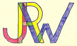
That simple combining of letterforms seemed a bit too simplistic and elementary. I wanted the mark to have more sophistication and intrigue. I exploited the overlapping letters so that the shared strokes were side by side rather than on top of each other - adjacent, intertwined letterstrokes instead of the formal ligatures. I then wove the letterstrokes in and out of each other to provide cohesiveness and connection with a bit of tension. I rendered it in colors and with serifs.
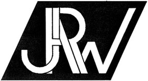

During a 30-year teaching career, I didn't do much else with the logo. After retiring in 2008, I needed my own professional identity, I again refined the mark and applied it to stationery. In the meantime, design and culture got more complex - so, I pushed the mark back to basics. The logo needed to represent Jim Watson. Some of the qualities expressed in my work, philosophy, and, therefore, in the mark, are for design and life to be simple and minimal.

There are no serifs, no decoration, no embellishment; no bullets, lines, bars. Just a mark of three intertwined initials.


In the 1920s, the designers of the Dutch De Stijl movement were appalled at the horrors of World War I and thought that design could influence society if it emphasized more order, purity, and harmony. This is conveyed by the basic primary colors, from which all other colors can be created (at least in pigment mixing). RGB may be more common in graphic design since they are the colors used for computer displays, but our culture still perceives red, blue, and yellow as the familiar primary colors.
I explored transparency - showing the mixed color where two primaries overlapped - red + yellow = orange. Sorta nice, but it added another layer that diluted the purity of the primaries and the mark lost the clever overlapping of the intertwined letters. This way they are just on top of each other with color showing through. So, back to the simple, primary mark.

Stationery

For the first time in my life, I did not include the postal address on the business card. I just do not receive enough letters to warrant having that information on the card. Sometimes, people text me and ask for my address so they can send me a wedding invitation or something similar. I suspect the need for a postal address will continue to diminish.
• The copy is set flush left ragged right to allow even letter and word spacing (since the line lengths are uneven), it is more familiar, and it allows the name to be aligned directly beneath JRW.
• Sans serif letters are the purest letterforms: no embellishments, no thick and thin strokes - nothing to mar the clarity of the letters.
• Setting the text in all caps forms bands with no pesky ascenders and descenders that throw off the order and consistency of the rows of letters:
JAMESROBERTWATSON.COM versus jamesrobertwatson.com
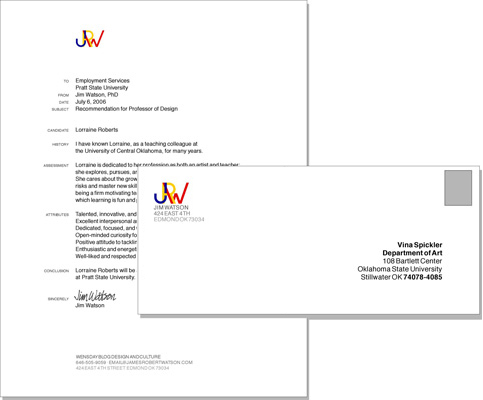
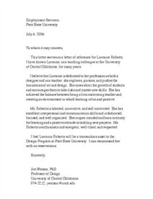
The example on the left below is a standard format for writing letters - in prose paragraph form. We now like to scan to the parts we are looking for or to the parts we feel are important. The example in the middle groups the information into categories and labels them with headings that are set to the left in a flush-right column for scanning. I once sent a letter of recommendation for a graduate to get into graduate school. A committee member from Buffalo, New York, called me just to tell me that he enjoyed reading my letter. He said he gets many letters each day and that my layout made it a joy to read - so much so that it was worth a phone call.
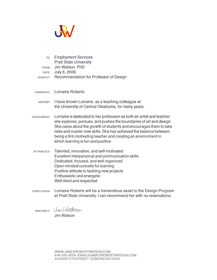
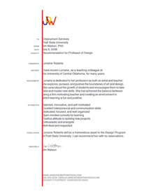
The JRW mark is aligned with the copy but the contact info runs in three lines along the bottom. That information does not need to be obvious. The only readers who need it will seek it out.
Website

A base for the mark is established by text aligned beneath - the word Wensday or Jim Watson, to provide stability and relate to the flyaway strokes of the J and W. The sans serif letterforms are also the purest: no embellishments, no thick and thin strokes - nothing to mar the clarity of the letters. Setting the text in all caps creates graphic bands with no pesky ascenders and descenders to throw off the order and consistency of the rows of letters.
The uncluttered layout of the site has very little embellishment; just the identifier header, a menu band, a menu column on the left, and the content of words and photographs. It responds to the chaos of the Internet and other websites just as De Stijl designers responded to the complexities and chaos of war and discord. Full story of this website design.
Wallpapers
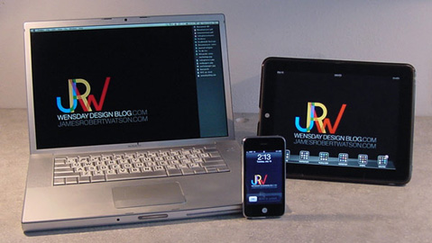

Social screens
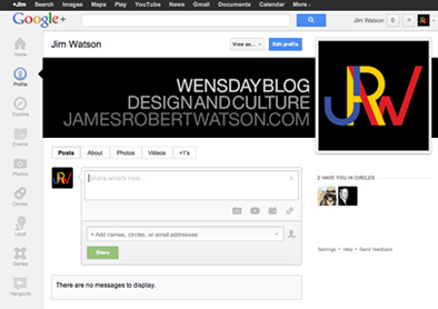
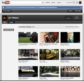

The office

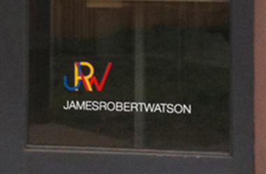
The JRW Lego logo


The grid JRW


Dates
Concept: somewhere in childhood
First formal sketch: 1966
Refinement: Austin, 1968-69
Design & production: Begun in the early 1990s
Mac rendered: 2005
Applied to stationery: November 2008-2011
Constructed in Legos: Febuary 9-11 & 25, 2014
The JRW initial cube

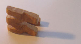
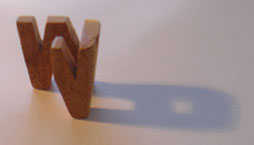
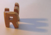
In the early 1980s, Godel, Escher, Bach: An Eternal Golden Braid by Douglas Hofstadter was a best-seller. The cover stated that it was "A metaphorical fugue on minds and machines in the spirit of Lewis Carroll." The cubes shown to the left were pictured on the cover of the book. Hofstadter constructed them himself and called them trip-lets - a block of wood shaped in such a way that its shadows in three different orthogonal directions cast shadows of three different letters. The trip-let idea came to Hofstadter in a flash as he was trying to think how best to symbolize the unity of Godel, Escher, and Bach by somehow fusing their names in a striking design. Hmm, I wondered if I could put my three initials, JRW, into such a cube format and make it work. I sketched the three faces and cut a block of wood with a jig saw. Dates: Designed and model built: early 1980s
ed.
Perspective view
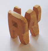
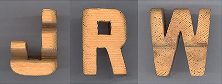
Shadows casting each initial
Mechanical drawings

Branding archives
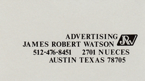
During and after college, I used grey paper stock with my logo and contact info printed in black. For quite a while, I used pieces of acetate cut to standard business card size that I had printed with contact information. I signed my name in black ink at an angle over the card.




The concept below provided more than just contact info - it conveyed a sense of what Jim was about. The fotos conveyed the interior spaces, inventions, and environments that impact Jim's life (the fotos shown are just for comp placement). The bottom portion, with the text, is typical business card dimensions and could be perforated if one wanted that size for convenient filing. I was going to have these printed as postcards. I finally rejected the concept. The photos would not accurately convey the depth of what I am about; the website is more effective at communicating that.

I then questioned why we even have business cards, how they're used, what people do with them, etc. Do I really need a card? I haven't handed out a card in the last few years. But, I concluded that I would rather have a card for occasional uses than to not have one. I didn't want to spend much money and I wanted to defy the current trendy 'designy' standards of small point size, expensive papers, die-cuts, and overdone marks and gimmicks. The designer tries to make an artistic statement of being hip and cool, but often overlooking the primary purpose of the card. The card should simply tell the recipient how to contact someone. Hence, the heading below.

I doodled around with these versions - the first with the categories aligned along the left and the second with the block of copy more-or-less centered. Partly to save paper and partly to be a bit more memorable, unique, and appropriate for me (violating the norm), I condensed the type and narrowed the card.
I also experimented with printing on the back of used paper - to recycle/reuse paper and make a statement about flashy design. I am intrigued by the idea of printing onto reused card stock - postcards, reply cards from magazines, etc. I like the statement that designers waste too much paper and to encourage ways to reuse and recycle wasted paper. Using my own desktop printer means the cost of business cards is practically nothing.



Above left: Version from fall 2006. It was standard width, 3.5", but only 1.5" tall. Very simple - just the title heading and 4 lines of pertinent info. I put both the cell phone and the home phone - some people don't like calling the long distance 646 area code so they can call the local Oklahoma number. The slimmer size felt more human scale in the hand. Above right: a slim version with the JRW logo and a QR code on the back for the website.
Letterhead formats
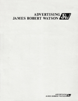
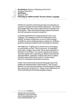


Envelope and stamp
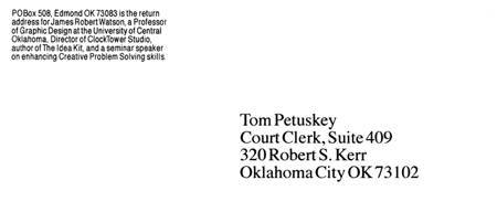

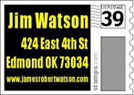
If I hand address an envelope, I write in large type to be considerate of postal workers who have to sort and file letters rapidly. For several years, I designed and ordered stamps from photostamps.com that included my return address so I didn't need to add anything else to the envelope. The type was large and high contrast black/yellow so it could be easily read even with a postmark stamped over it. Simple - address it, stamp it, mail it.

www.jamesrobertwatson.com/brandingjrw.html