

Construction photos
Descriptions of furniture, accessories, and artwork
Innovations
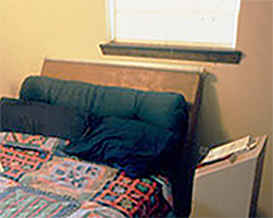
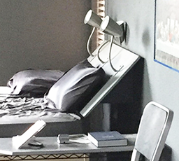
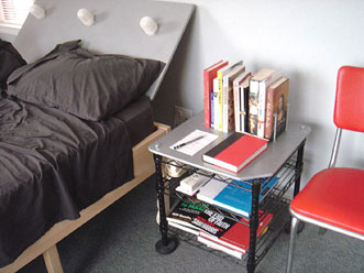
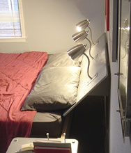
Sloped and attached to the wall, this early headboard floats over the bed, and has 3 lites integrated into the surface. Most bedside lamps are on nightstands and shine on the sides of books - not the open pages. Some lamps even have lampshades that block even more light. They might look good from the doorway or in a photo, but they don't do a good job of illuminating the intended object. These lights in 424 are behind the reader and shining on the page.
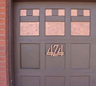
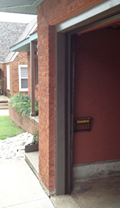
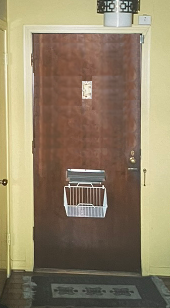
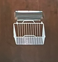
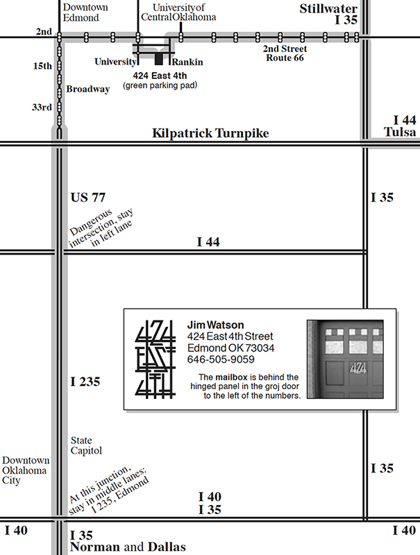
I didn't want a mailbox to mar the simple A&C look of the front of the house. I first installed a store-bought mail slot, but even that was too dominant. I wanted even more subtlety. I cut out one of the panels in the groj door, mounted a new hinged wood flap behind, and painted it the color of the door. Beneath the opening, I mounted a basket to catch the mail when dropped in from the front. Letter carriers don't even slow their step - they push open the flap and drop the mail. Occasionally, when a sub is running the route, they get baffled, give up, and put the mail on the porch.
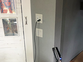
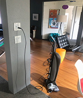
No more bending or stooping to plug in the vacuum at a normal lower outlet.
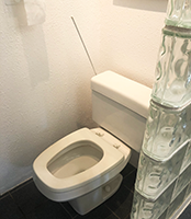
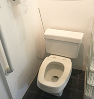
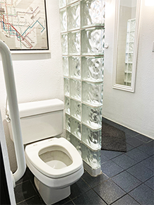
Wondered why we had to bend over to reach the flush handle - why not extend the handle? So much easier and convenient.
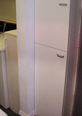
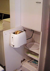
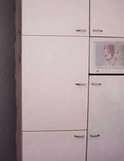

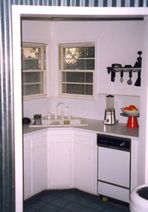
A toaster is attached to a cabinet door and swings out for access. The blender and coffeemaker are inside another cabinet. Electrical outlets were installed in each of those cabinets. When these appliances are not in use (most of the time), they are out of sight and the kitchen looks cleaner and less cluttered.

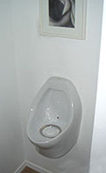
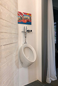
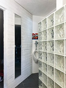
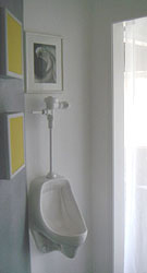
Years ago, I was disgusted by the splash residue around the toilet. No man can be completely drip-free or avoid splashing. In public restrooms, the answer is urinals. Why not apply the same logic for home use. Important: a home urinal solves forever the seat up or down issue. I experimented with different styles of urinal bowls and even a waterless version.
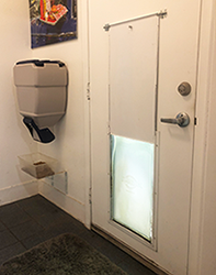


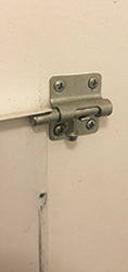
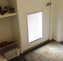
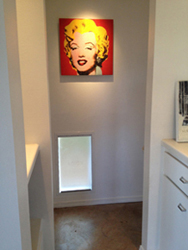
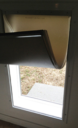
Dog doors are game-changers. No more getting up when she stood by the door or whined. At all hours of the day and night. The dog door lets her come and go as she pleases. A downside to the door is the panel that secures the house. I would often shut it at night to keep her from foraging in the yard, occasionally barking, and getting sprayed by skunks. Where to store the panel - at first I set it on the floor nearby. Issues: I had to carefully thread it into the sliding slots on the side of the frame, store it, and keep it in good condition. Solution: two latches that slide in and prevent the panel from sliding down the slot. Much simpler and easier.
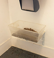

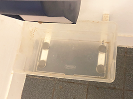
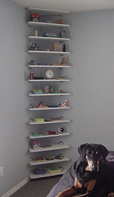
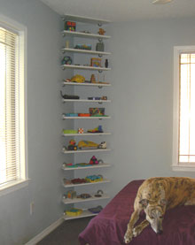
Greyhounds need their food and water bowls raised up several inches to accommodate their height and allow their eating tubes to not be bent or crimped. I mounted some standard shelf support brackets to the wall (allowing easier cleaning underneath); I soon learned that filling, cleaning, and emptying the bowl would be easier if the bowl was removable. I glued some magnets to the bottom - these adhered to the metal brackets. Below, I installed a wall-mount dog food container with easy dispensing spout.
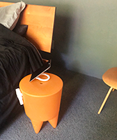
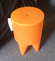
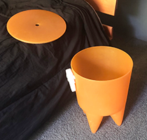
For nightly nose cleaning, I needed discreet and convenient storage. Fortunately, the top of the Bubu stool (Philippe Starck, France, 1991) had a finger-sized deposit hole. Perfect for my needs.
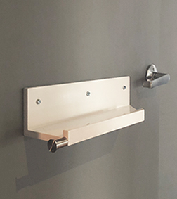
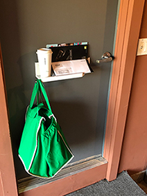
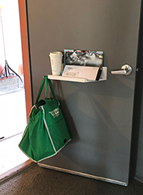
I had enjoyed the convenience of a cupholder on the side of my car - if my hands were full, I could set my coffee there while I got my keys out of my pocket and opened the door. That same logic applies at home. When entering the house, this shelf provides a place to empty my hands so I can open the door.
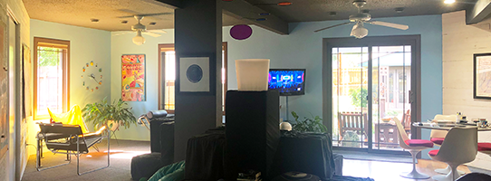
After redesigning a potential house in Denton to include an entire wall of glass, I realized I liked the idea of the light and color flooding the house. I considered doing that to the 424 house, but, vetoed it due to utilities and costs. But, maybe wallpaper of lush plants? Settled on painting the wall sky blue. It works - it opens up and lightens that end of the great room.
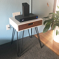
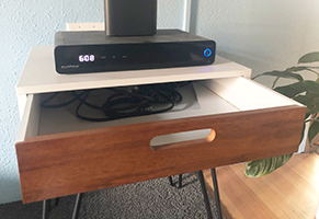
I have tried several ways of hiding the cords and cable of electronics. I have used a hollowed-out book and a basket under the tabletop. In 424, I wanted something simpler and maybe with a mid-century look. Ordered this end table online, drilled some plug holes in the top, and cut the back of the shelf off so it can slide in and hide the cords inside.
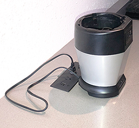


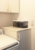
A simple way to hide countertop cords - next to the outlet panel is a slot cut into the countertop. The excess cord can be stuffed into the slot.

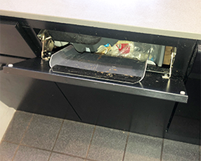
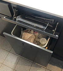
In an earlier kitchen layout, the trash and recycle cans were right behind the pedestal cabinets, making it very easy to dump trash. With the kitchen remodel and cabinets up against the wall, that convenience was lost. The new cabinets had fold out doors in front of the sink. I used them the way they were intended, until realizing that one was right over the trash can in the cabinet below. As a chute guide, I bought a plastic bin of appropriate dimensions, cut it to fit, and taped it to the inside of the door. It works great - trash drops right into the can and the door is unobtrusive.
Living, Dining Room, Media Den










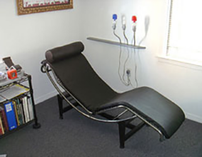

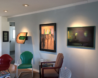


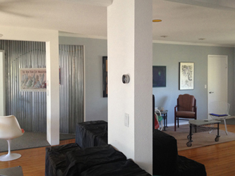
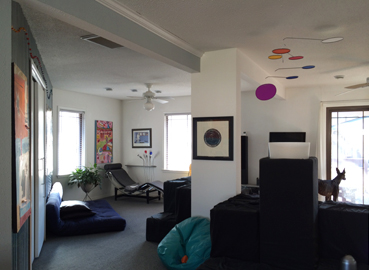

Curtains
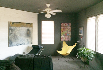
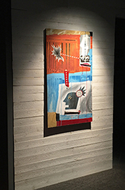
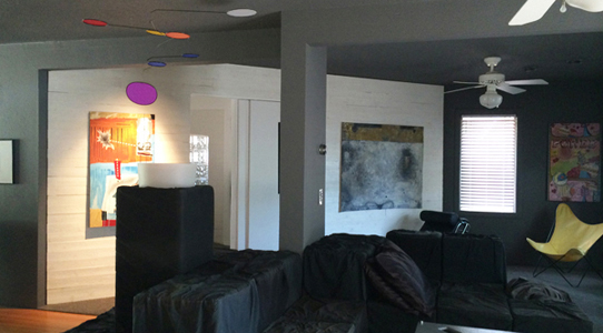
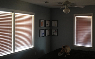
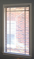
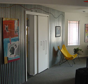
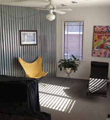
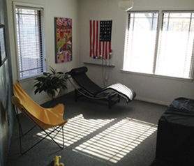
Explored Mid-Centry. Too demanding, would take focus away from legitimate 50s pieces in the house. Eureka: Arts & Crafts William Morris floral pattern. Green to replace green view. Hang within door trim - a frame of A&C design. Hung Mid-Centry blue pattern on front windows. Privacy, lighten corner, and 50s.
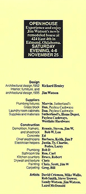
Open house
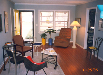


Original 1995 house

Kitchen, Laundry Room



Bedroom

Bathroom




Storeroom
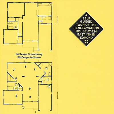
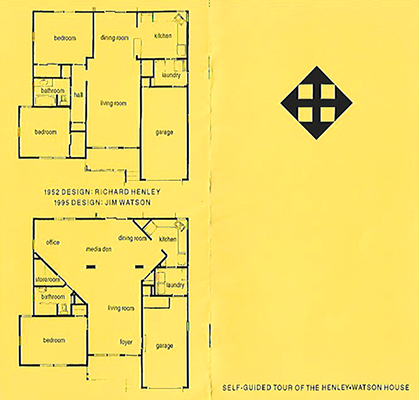
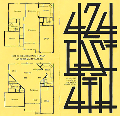
Tour Guide booklets
Office
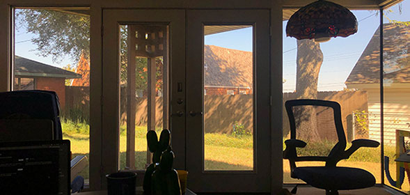
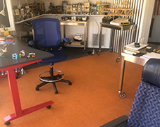
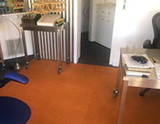
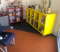






Office carpet tiles
Exterior rear, Deck




Hotub




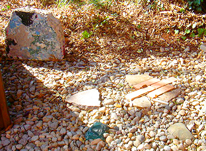
Graffitti Bridge, Murrah Building, Shinenkan Cobalt glass, Orchid Lane sidewalk, bricks, driveway, and pool deck.
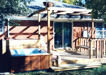
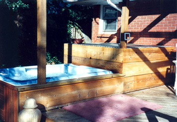
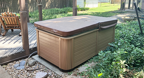
Hotub #3 sold (poor service): August 4-14, 2023
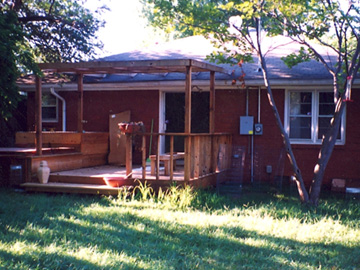
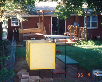
Exterior front, before and after
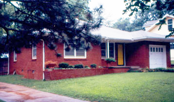
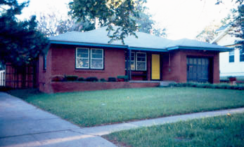
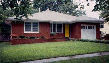
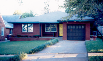
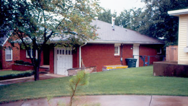
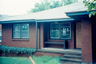
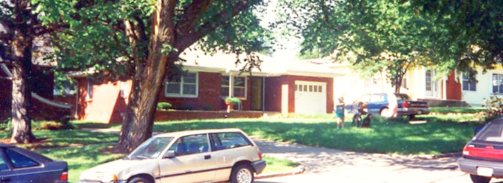
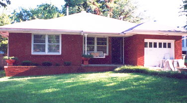

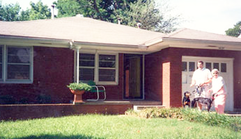
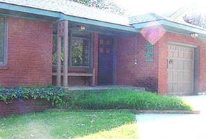
Driveway with off-street parking

Landscaping
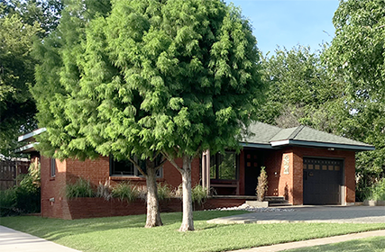



Address signs
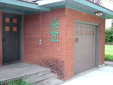

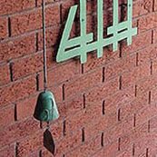
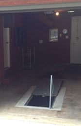
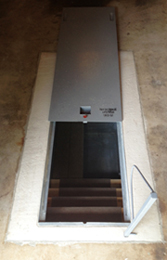
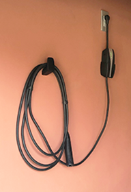
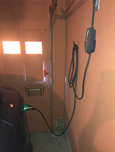
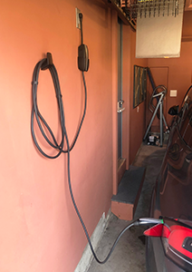
Groj with mail basket, tornado shelter, and EV charging

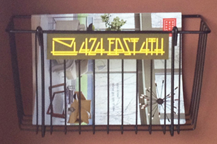

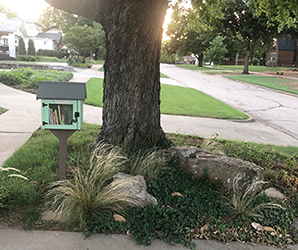
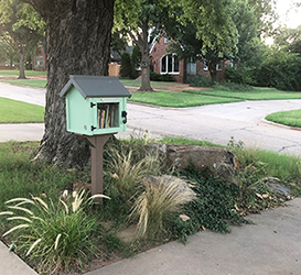
Little Free Library





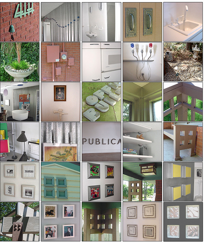
The logo identities



The logotype for the house is a type treatment that respects the lettering and typography of Arts & Crafts: double horizontal bars and arms in the letterforms, angles that align with other elements, straight horizontal baselines, and individual elements forming a single cohesive unit. The letterforms respect each other and their position within the rectangle shape.
Stacked words allow the 424 at the top to be prominent. The vertical lines align and run through each line of type conveying the unity and strength within the house. 2002
This logomark (above right) is a juxtaposition of a diamond and four squares. The four squares are a pattern popularized by the Scottish Art & Crafts designer, Charles Rennie Mackintosh. This pattern is found throughout the house. The diamond represents the walls within the house that are at a 45 degree angle to the overlapping house grid. The black shapes form 4 arrows spreading out in all directions, representing the open spaces within the house and the fact that one can stand inside the house and look out a window in all four directions. 1995


Imagined evolution of the property since the Land Run
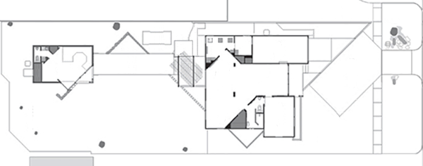
Left: Original farmstead with a house, small barn, and a dirt drive from the surveyed property edge. Middle: Once the area was divided into lots, the farmhouse sat on the 2nd lot up from the boundary. The unneeded barn was replaced by a garage with storage area. Right: The ranch house replaces most of the abandoned farmhouse and the garage became an office.
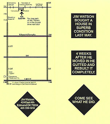
Below: Map to the house for students and open houses:




Construction photos
Descriptions of furniture, accessories, and artwork
424 East 4th
Within minutes of touring the sale house, I saw the possibility for removing rooms and closets and creating the diagonal swath - and sketched a renovation (knew I would remodel whatever house I moved in to). After I finished the semester and arranged stuff in the house - a row of chairs in the dining room and a row of original artwork above.
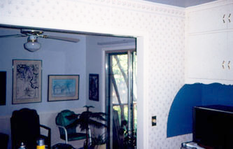
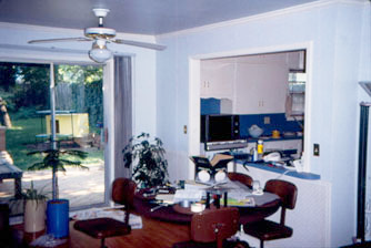
The house was built in 1952. A previous resident put in sliding glass doors from the dining room to the backyard and poured some concrete steps and a small patio, put in a pass-thru counter between the dining room and kitchen, and built a wall in the garage to create a separate laundry room.
I was seeking the openness of a loft type space with a bit of industrial feel in a residential naborhood. I began by cutting the living room wall to install a door to the carroom. Whoa, lots of sheetrock dust. Sat down and questioned if I should be doing this. Yes, I should. The interior of the house was completely remodeled during the summer of 1995. An office addition was designed and built during the summer of 2000. The kitchen, bathroom, and driveway have been remodeled several times since.
FLW & Disney, never finished, laboratory, workshop for new ideas.
Arts & Crafts Movement: attention to detail, natural earth colors and materials.
Ranch style houses of the fifties.
Industrial loft spaces
Scandinavian and Japanese interior minimalism
Frank Lloyd Wright's early work, horizontal lines, minimal furnishings, and philosophies of:
• Remove all that is unnecessary
• Alignment of elements
• Use of natural materials
• Narrow hallways
• Low ceiling entries
Rooms revolving around a central core
The open floor plan with room areas that flow into one another
Furniture built appropriate for the space
• Minimalism - Watson prefers simple and uncluttered spaces.
1950s icons representing memories from Watson's childhood
Arrangements of picture in Arts & Crafts quad compositions
Horizontal sets of 3 items
'Tornado' angled walls of corrugated tin
• 45* angle walls and furniture placement
Many shelves, end tables, and storage units are industrial shelving, black in the house and aluminum in the office
Shelves and table tops have faux stone tops, some of which are sliced at 45 degree angles
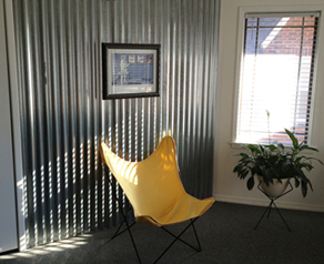
The rooms have white/grey painted walls and angled walls are corrugated tin/rough cedar. The tin/cedar walls are at a 45 degree angle to the layout of the house - rural Oklahoma twisted by a tornado and plopped down into the '50s ranch house.
Windows in the house are picture windows with Craftsman/Mission detailing grids.
Window coverings: mini-blinds 1995 - simple, clean lines, and unobtrusive. 2" blinds 2012 - wider slats are reminiscent of Jim's childhood home and create a dramatic shutter pattern of sunlight. 2018: blackout solid pull-down screens.
Door handles in the house and office are lever style for easier operation, especially when hands are full or wet.
Electrical outlets and switches in the house and office are flat Decora style, some are dimmers and some switches are illuminated for easy locating at night.
All water control valves in the house and office are single lever.
The series of three round heat/ac vents are aligned with the front windows and angled in the corner rooms.
Seating units align with the height of the dining/end tables and the coffee tables.
Fixtures in the bathroom: faucet, coat hook, soap dish, etc, align.
Angled cut corners of table tops align with other features in that room.
Kitchen sink aligns with windows.
Shower head uses minimal water
No sink disposal, organic material is thrown outside,
Appropriate items recycled
Energy-efficient Washer/Dryer
Don't wash car at home (commercial carwashes use less water)
No fireplace
Smaller refrigerator
Compact fluorescent lite bulbs used throughout the house where feasible
Solatube to light the garage, captures sunlight from bubble on the roof and channels it into the groj
High efficiency window panes
Electric lawn mower
Minimal mowing, edging, and blowing
The entry is a welcoming introduction to the interior spaces, the cornice molding visually lowers the ceiling to a more personal human scale. New doors lead to the groj and to the bedroom. From this area of comfortable tradition, one can then step into the areas of contemporary open spaces.
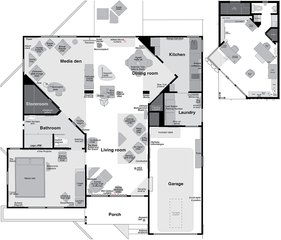
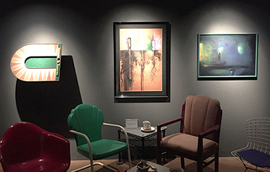
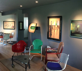
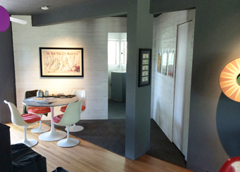
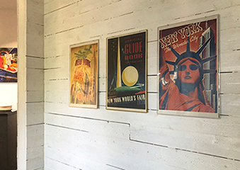
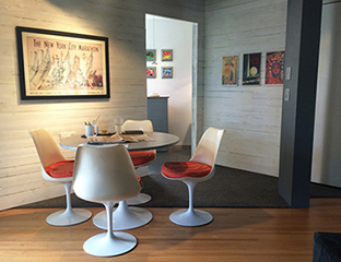
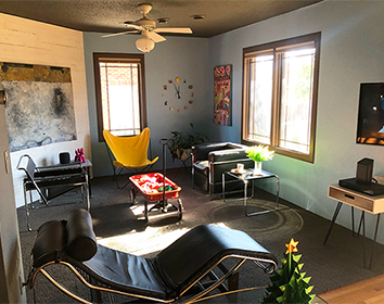
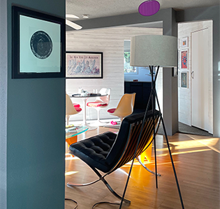
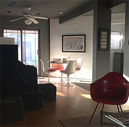
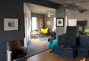
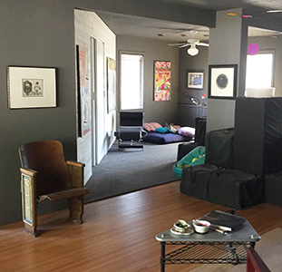
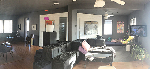
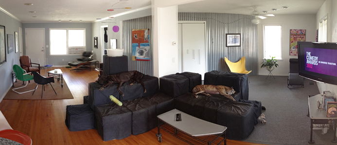
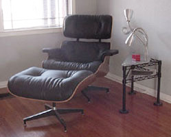
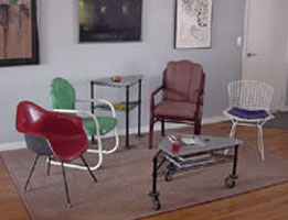
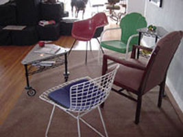
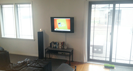
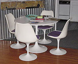
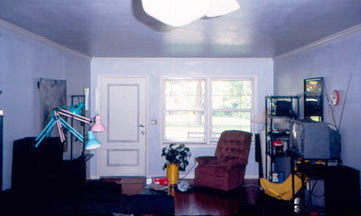
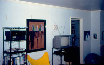
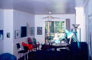
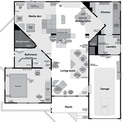
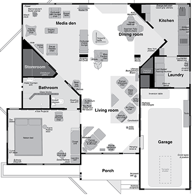
The living room is defined by the area rug and the collection of chairs. The best arrangement for visiting and conversing is to align seats at a 90 degree angle so that its easy to look at another person (unlike sitting side-by-side on a sofa) and easy to look away (unlike in chairs that face each other). Sofas make inefficient units for humans to comfortably converse. The individual chairs allow arrangement flexibility and are fun as guests select their favorite style of chair. The angle of the chairs respects the angle of the tin walls while the rug respects the alignment of the foyer walls. Primary purpose of the room is visiting and conversing with guests, secondary: reading. The floor is the original thin-plank hardwood. Built-in lites in the end table by the Eames lounge provide ambient light. Defined by the modular Sofa Units (1977-2021), is a seating/reading area and a media den. The TV and stereo are positioned to be seen or heard from anywhere in the great room. Use: Watching television, lounging, listening to music, and conversing with guests. A table is positioned so diners can watch TV (which is on a swivel bracket) or look outside and enjoy the yard. A minimal and unobtrusive spotlite shines on the table while another highlites a painting. Nearby is a closet for cleaning supplies. Its door was disguised to minimize intrusion into the purity of the tin siding.
After I retired in spring of 2009 and decided to no longer teach studio courses (I continued to teach the history lecture course), I conducted a major purge of stuff in both Oklahoma and New York. I did a major purge of every closet, cabinet, and room in the house and apartment.
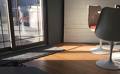
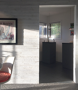
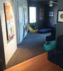
Rehab: April-June 2014: After 19 years; it was time to refresh and simplify - within the concepts of sleek contemporary mixed with rural Oklahoma. Removed all baseboards (walls now go right down to the floor); doors and windows were framed with slats with less detail; walls and ceiling painted Pantone Charcoal Grey; corrugated tin on the angled walls replaced with rough cedar planks painted white; wood floors were refinished to lighten the color; and the industrial carpeting replaced with Flor carpet tiles.
Goal: minimal, sleek, little detail. Influences: Denver art museum, MoMA, Dallas Museum of Art. $6,840 Total
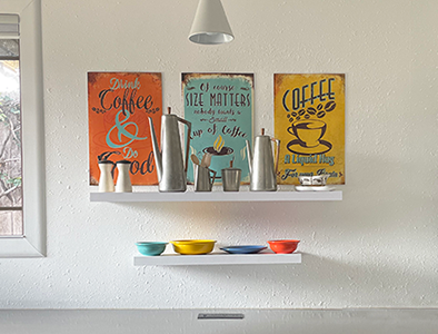
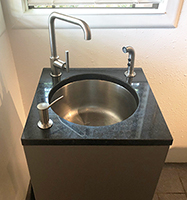
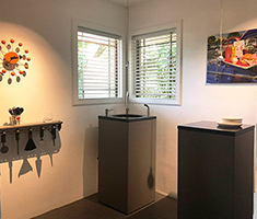
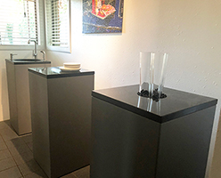
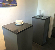
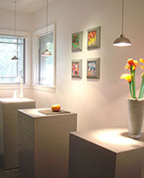
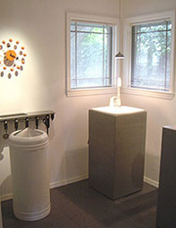
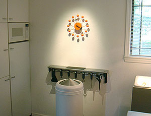
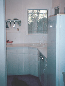
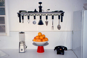
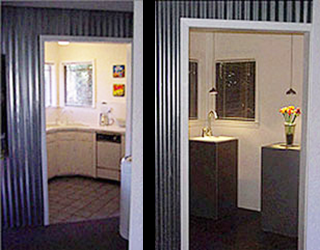
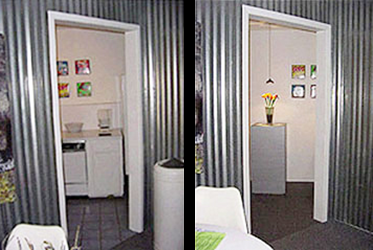
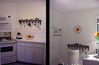
An all-white kitchen helped this space blend into the background when viewed from the great room. The entire kitchen was remodeled in the summer of 2002. Inspiration: home furnishing stores in SoHo in March of 2002. The concept is to not have cabinets and counters up against all the walls. The main counter tops are pedestals that are floating in the room, away from the wall. The faucet set allows easy access with the high faucet, one-touch control, and built-in soap dispenser. Storage is accommodated by new floor-to-ceiling cabinets with flush front microwave and refrigerator and new cabinets in the adjacent laundry room. Smaller appliances are hidden inside the wall cabinets. There is no dishwasher nor stove - those are unnecessary for a single tenant who is satisfied with a microwave oven. Ceiling spotlites aimed on the wall highlite the art. The hanging minimal fixtures over each pedestal are similar to fixtures designed at the Bauhaus in 1926. Orange Ball Clock by George Nelson. 8" dark grey ceramic tile to match the grey carpet. The kitchen was again remodeled in 2018 to include more counter space, a cooktop, oven, and dishwasher.
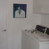
Laundry rooms were not common in 1952 - there was a space in the groj for laundry machines. Sometime between 1952 and 1995, a room was created by a new wall and moving the kitchen door a few feet into the groj. 1995: the dryer was moved to sit side-by-side with the washer. A built-in shallow storage cabinet was walled over and new overhead cabinets installed.
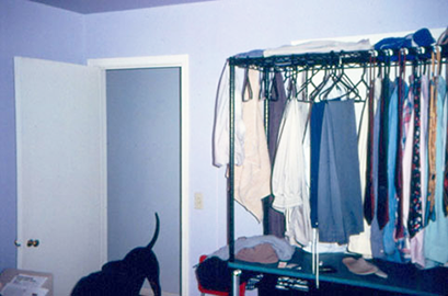
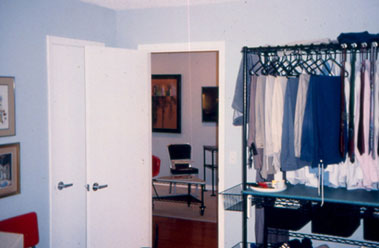
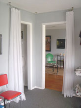
The 1952 closets were removed to enlarge the space. The new closet is a rolling unit with all the necessary compartments. I don't like the awkward inconvenience of opening and closing closet doors (what is there to hide?) The closet and rolling laundry cart are created from industrial shelving components. The bed has a slanted headboard and cushion for comfortable positioning. Reading lites mounted into the headboard shine directly into reading matter while lying in bed - lites next to a bed with a shade do not lite reading material adequately. Switches for these lites are in the three recessed holes in the nitestand for convenience of finding the switches at night. The lite switch is conveniently located on the front of the nitestand. On the bed, Watson uses only a bottom sheet and a comforter or bedspread (depending on the season). Making the bed consists solely of smoothing the bedspread over the bed; no multiple layers, and no sheets to tuck in. The carpet in the house is industrial grey to enhance the loft-tech look. The bed faces the window view of the naborhood. There is no TV in the bedroom, nor desk nor easy chair. This room is solely for sleeping, reading in bed, storing clothes, and dressing. Curtains hanging on taut cable suspended from the ceiling - the original wooden doors got in the way.
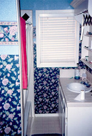
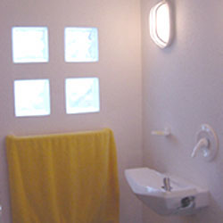
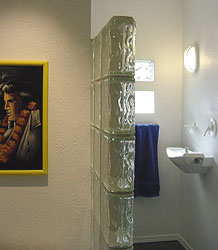
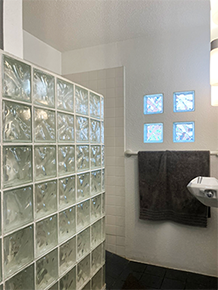
Demolished and renovated: 1995. Remodeled: 2004. Urinals: 2004. Remodeled shower: 2024. The framed mirror is full length and accessible - why lean over a counter to get close to the mirror?. The light fixtures, on the wall to better lite one looking into the mirror and into the shower stall, align. The only electrical outlet is inside one of the medicine cabinets. Countertops and undersink cabinets in bathrooms just collect junk. Floor: 8" charcoal grey ceramic tile. White walls, glass block shower enclosure, 4" ceramic tile. Window reminiscent of Charles Rennie Mackintosh Arts & Crafts pattern. Shower stall: defined by a wall of glass block, popular in homes and offices of the 1930-50s. Watson dislikes stepping over a tub and ducking under a shower curtain rod. The fixtures and faucets are unobtrusive white.
2024: The opening in the glass block wall had gotten too narrow (the opening stayed the same, I got wider). I was reluctant to give up the glass block wall. Explored leaving half of it up to widen the entry with a new door behind the wall. It took a while to process the loss. I got to the point I accepted that it was time for it to go. It had served its purpose and done a good job I also thought if I could build a better shower, then the loss of the glass block wall would sting less. The glass block was cool for 29 years. But, twas time for an upgrade and refresh.
Objectives
• Accessibility: wider opening, low threshold, and grab bars.
• Low maintenance.
• Less cleaning, mildew.
• Pure white
• Glass pivot door
• Wand shower
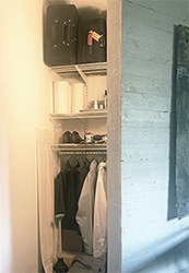
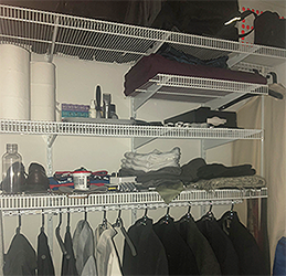
Concept from the minimalist Japanese - a 'home is neat and orderly with things not immediately in use being stored out of sight.' They use a large storeroom rather than multiple smaller closets - here, a large closet replaces several smaller closets and cabinets in the 1952 house. Shares a sliding door (representing barn doors) with the bathroom. The custom shelves allow for long hanging garments. A light fixture is on the wall to better shine into the shelves rather than down onto the top shelf from the ceiling.
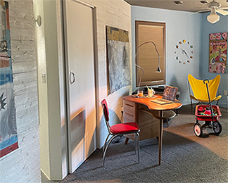
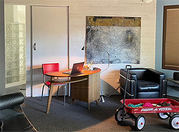
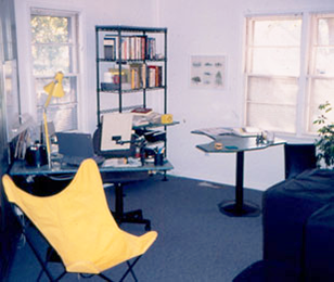
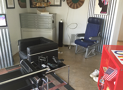
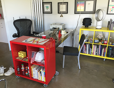
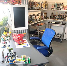
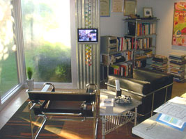
Purpose: work area with open, minimal, flexible project areas; teaching prep: course lectures and projects, grading, and archiving projects and student files; weblishing: writing essays and the Design blog; creating and producing design products; and writing short stories.
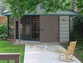
An imagined history of the office: in the 1930s, this lot had a simple bungalow house with a garage in the rear. Remnants of the driveway, the original garage structure, and the garage doors have survived and can be seen as part of the current office structure. In the early 1950s, the garage was remodeled into a living space for the owners while the frame house was torn down and replaced by the current brick house. Once that house was complete, they moved into the house and remodeled the garage into an office.
The actual design of the office was developed during the winter and spring of 2000. Construction took place during that summer. The office uses similar materials as the house to connect the two structures with unified visual themes. A diversity of spaces is more productive. The new concept is called activity-based workplace design, tailoring spaces for the kind of work to be done.
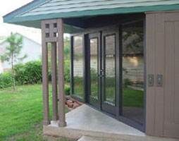
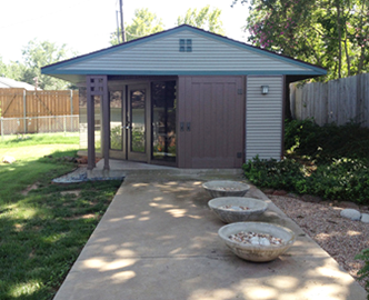
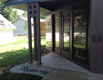
The porch column mimics the Arts & Crafts column on the house porch. The porch is created by slicing a corner off the garage mass - the angle unifies the office with the deck canopy and interior walls of both the house and office; exterior walls: Vinyl siding to convey the backyard garage motif and for ease of maintenance; front has a faux garage door and Mission style lighting; Floor: Sealed concrete floor to continue the old garage theme and an area rug with geometric patterns. 2017-18: painted the same grey that is on the walls of the house; interior walls: White walls and corrugated tin that once matched those in the house.
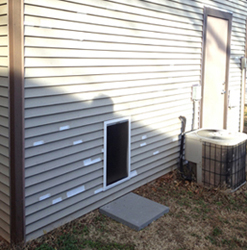
When the office was built in 2000, I didn't think a dog door would be necessary. After more than a decade of getting up to open the door for the dogs, I bought 2 doors that matched the one in the house and installed them back-to-back between the studs in the bathroom. I filled the wall surround with some white tin flashing. The double flaps helped insulate and weatherproof the door and the opening. The dogs adapted to the new door easily.
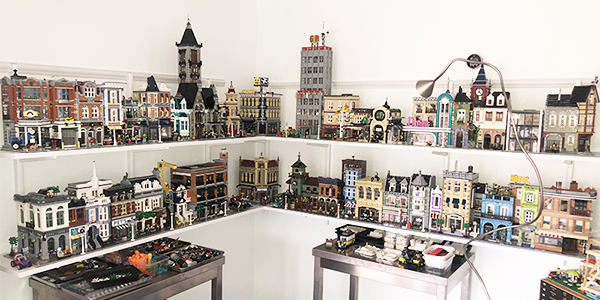
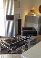
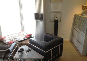
Summer of 2007: to accommodate the items that I brought home from the school office after retirement. Additional refinements were implemented in 2010 after purging the slides, files, and books amassed during 30 years of teaching. Removed the octagon table (I didn't use it very much) and one Ronde chair; moved the lounge chairs by the windows to create a sitting area which works better by the full-length windows; installed a flat-screen television for the sitting area; put in a large lateral file; moved in the flat file from the school office; removed the refrigerator and microwave and installed shelves for product inventory; installed a JRW jamesrobertwatson sign on the front window.
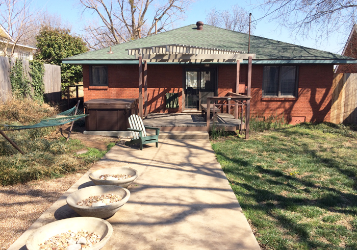
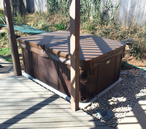
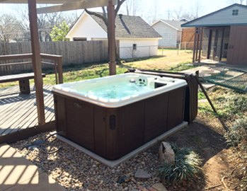
Hotub: 215 Gallons, D filter, ThermoSpa Gemini
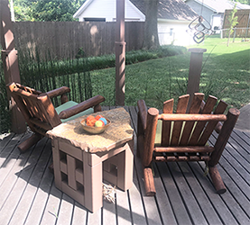
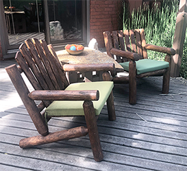
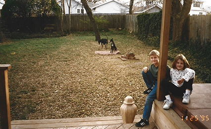
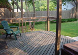
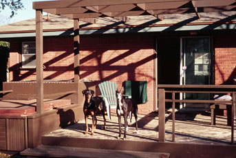
A hot tub was one of the first additions to the house. There have been 3 spas in that space. The deck and the canopy/pergola are at the same angle as the interior walls.
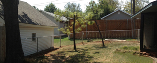
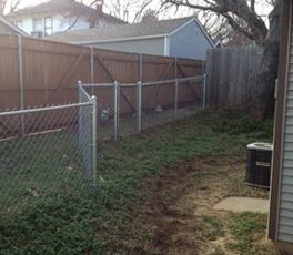
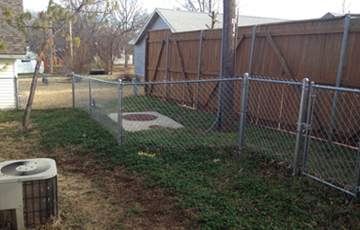
In 2012, the temporary (for 15 years) wire mesh fence was torn out and replaced with a classic chain link fence. The old fence had been staked, meshed, and supported with junk to improve its barrier. Both Vegas and Brooklyn had found weaknesses in that fence. The chain link is reminiscent of the fences from Jim's childhood, that surrounded the schoolyards and playgrounds at Preston Hollow and George B. Dealey. The fence angles in 2 places to better follow the terrain and to respect the angle in the house, office, and parking pad.
The southeast corner of the yard was home to 3 pine trees - the sound of the Oklahoma wind whistling through pine needles was a reminder of trips through Colorado and New Mexico.
Dimensions: H = 82" (mail door hang 71.5"), W = 90", L = 238" (to wall)
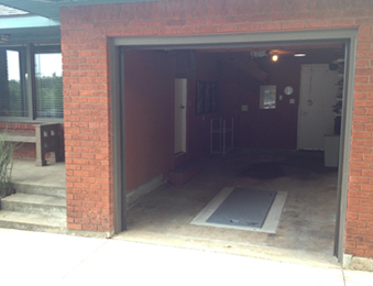
The clean orderly environment provides a smooth transition from the car to the house. Walls were grey until 2013. Wall-mounted white shelves for tools, hardware, and storage. A Solatube admits natural sunlite and an overhead fixture with energy efficient spiral bulb. During weeks of 100 degree temps in 2011 and 2012, I would leave the groj door up to let the car cool off. I had an exhaust fan installed. Since the groj might resemble a carport, I painted the inside of the garage to match the brick color. I moved the artwork towards the back so it would be less visible from the street. The goal was to minimize the prominence of an open garage when viewed from the street.
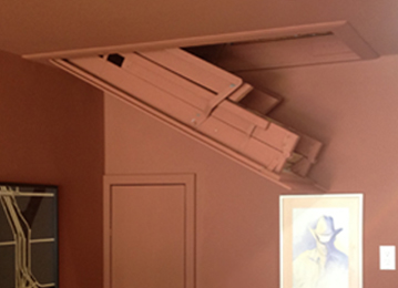
September 2013: a spring tornado came within 3 miles. Laying on the closet floor, checking weather apps, and getting texts from friends about where the tornado was - that was a scary moment. If a tornado hit my house, 2x4 wood and sheetrock wouldn't quite save me. I had thought about it before, during spring tornado season, but never committed. "Oh, I'll be alright." That spring was different. There were offers of basements down the block, but it was time to get a shelter in the garage.
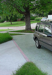
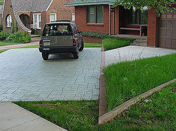
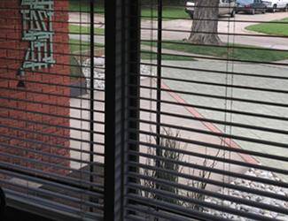
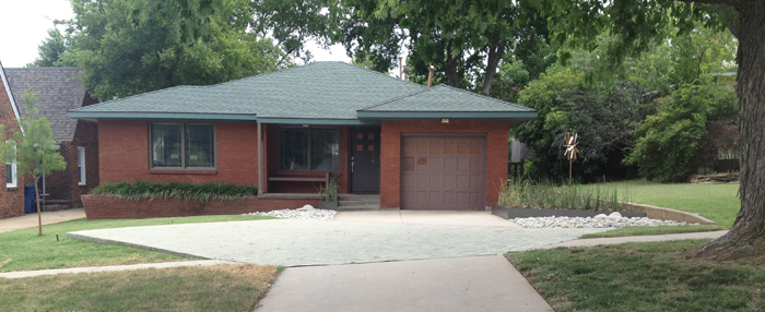
In 2004, the 1952 driveway was removed and replaced with a larger one that provides space for parking in front of the house. The parking pad is angled to relate to the angled great room inside and provides a subtle intro to the angles the visitor is about to encounter in the house and office. The pad is stamped and stained concrete to soften the harshness of so much concrete in the yard.
When I moved in, the front porch was hemmed in by wrought iron railing and the trim and groj door were painted white. The railing was removed within hours of moving in and the white groj door against the dark brick made it the focal point of the house curb appeal. Renovated in 1995 in a style reminiscent of National Park Arts & Crafts. All white trim was painted brown. The brick planter uses roman style bricks, noted for their long thin shape and used extensively by Frank Lloyd Wright to convey a low horizontal prairie style. The unique angle at the end of the planter was disguised by a bush, cut down soon after moving in. To enhance the horizontalness of the planter, vertical shutters and railings were removed and broad-bowl planters were placed at the extreme corners to draw one's eye to the side extremes.
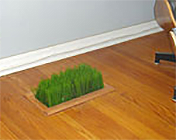
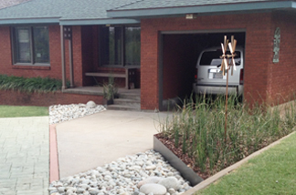
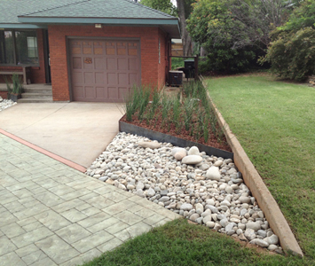
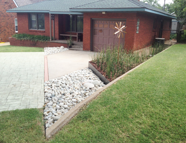
I had wanted to do something special to the planting beds on either side of the driveway. First, I just let the grass grow tall. But, that wasn't special enough - there needed to be a more intriguing look to the front yard. During the purge in spring of 2013, I hired a landscaper to implement a new look. Criteria: low maintenance, few droppings from new trees (no acorns, seeds, etc.) and low water usage. At a friend's house, liked the way horsetail reed grew tall, straight, and dense - filled the steel-edged beds; small triangular bed by the steps forms a visual 'handrail' and helps frame the steps and accent the porch; smooth river rocks; wind sculpture in the large bed of horsetail- kinetic focal point that references a windmill from the Oklahoma prairie; three cypress trees - two in front and one in back - in alignment with the parking pad and the side of the house.
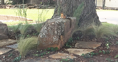
The notion of a bench under the big tree had floated around for several years, but not strongly enough to do anything about it. Then 2 factors changed - I gave up trying to grow grass under the shaded tree and I was waiting for an Uber ride and wished I had a place to sit down. I looked at some bench options online and was exploring a NYC park bench like those I sat on every evening along the Hudson River. But, the downside to such a bench is that it looks lonely when empty and this bench would sit empty about 99.9% of daylight hours. Not sure from where the inspiration came - but a boulder could serve as a bench and look sculptural and natural when empty. I went to a rock store in Midwest City and picked 3 rocks and they were delivered and positioned 2 days later.
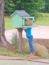
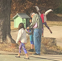
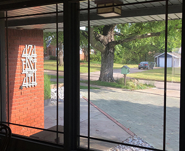
After the Uber bench was in, the island beneath the tree seemed hungry for a Little Free Library. I ordered a library and mounting post and my neighbor John and his dad dug the hole and set it up. It was an immediate success. Many more books have been donated than have been taken.
Chronology
Architectural design: Richard Henley
Inside area: 1,080 square feet
Purchase house, May
Architectural, interior, & furniture design: Jim
Remodeling: July 9 - Sept 26
Spa concrete footings; Hot tub: Morgan
Demolition, framing, and drywall: Jim Watson, Lon; Ronnie, Steven, Bob
Bathroom tile: Ron, Carl
Drywall and texture: Chris
Painting: Chris, Scott
Electrical, Plumbing, Kitchen counter, Carpeting, Corrugated tin
Eaves, remove gutters: Ron, Bill, Rick
Porch column, bench: Jim Watson
Removed back fence, vines, trees
Office: Architectural, interior, and desk design: June 6 - August 23
Inside area: 330 square feet
Tree removal: Tom
General contractor: Lance
Siding and eaves: Paul
Bench and column design: Jim Watson
Deck bench: Lance
New windows, patio door
Front door: Jim Watson
Landscaping: Martin, Jim Watson
Trex Deck, deck railing.
Front yard curbs (later removed)
Fences: Jeff
Grass: Steve
Roof: Randy
Kitchen design: March 30 - June 14
Demolition: Jim Watson
Framing, Electrical, Floor tile, Drywall and texture, Painting: Mark
Plumbing: Harold
Pedestals: Jon
New HVAC system, mounted in groj attic
Angled, stamped concrete driveway
Bathroom design: March 25 - May 24
Demolition, Drywall and texture, Painting: Jim Watson
Framing, Electrical: Danny, Scott
Urinal plumbing: Scott, Harold, Rob
Floor tile: Bryan, Chad
Grout: Randy
Door curtains: Jim Watson
Address signs, July: David
Side door, July
Purge and rearrange office
Installed new laundry room dog door: December
Wood fences
The great purge
Rearrange office
Wood fences
Nest thermostats
2" blinds
Chain link fence: Jackson
Installed office dog door
Move Wright planters to back 'driveway,' fill with rocks
Landscape design: June/July: Jim Watson
Installation: steel beds, plants, rocks, trees: Randy, Klint
Sod installation, July
Wind sculpture, July
Renovation: July: Replace column bases; reswing gate; repair/repaint office groj door, front door, groj door, address numbers, hot tub
Paint inside of groj to look like carport
Restored and reduced Airline seat
Remove and replace office windows with no vertical mullion, trim and paint: July
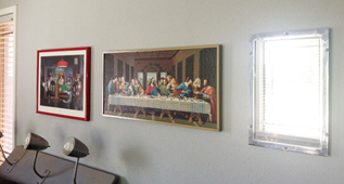
Frame Sorel, buy and frame Last Supper, rearrange house art
Backyard gravel beds
Buy futon for dogs
Tornado shelter September
Spa removal, Concrete pad, New hotub, March
Driveway resealing
House Rehab April-June
Install grey outlet/switch plates, blinds, front door hardware, cleaning closet door, closet sliding doors, closet teeshirt bolt rods, recessed bath cabinet, kitchen cedar slats
Smooth subfloor, fill vent hole; install carpet tiles
Clean, regrout existing tile; paint white walls, ceiling, slats
Refinish kitchen pedestals, install granite countertops, new sink, clean, regrout existing grey tile
Install grey outlet/switch plates, blinds, front door hardware, cleaning closet door, closet sliding doors, closet teeshirt bolt rods, recessed bath cabinet, kitchen cedar slats
Blow-in attic Insulation
Deck railing removal, January
New electrical circuits: March
Started bathroom, kitchen, deck refresh, March-July
Deck columns, painting, June
New washer/dryer installed
New hotub ThermoSpa Gemini: June
NYC furniture arrived: Sunday am, July 3
Remove office desk, trim; refinish walls: August 1-2
Fence stained & sealed: December
Office remodel: refinish walls: July August
Uber bench: Boulders, landscaping grasses: John, August
Purged, rearranged office: September-October
Paint walls white, digital frame art: October
Trim tree: Taylor, October
Fill floor cracks; painted office floor: October, November/December
Designed, built, mounted Groj key/cup shelf/ledge: December
Returned to office (painted floor): December, arranged furniture
Little Free Library: January, Jim, John, and John dad
Paint office floor: April
Returned to office: May 5, arranged furniture
Remove office television, remove all artwork, paint walls: June
Privacy film on front windows: June
Painted living room Skywall, opaque grey blind screens: August
Assembled CableTable: September
Installed new urinals, painted walls; buried cable: September
Kitchen Renovation
Design: May
Demo/plumbing, electrical/cabinets, counter: August
New counter, sink: September 24
Appliances, finished cabinets: September
Added circuit to groj for EV charging: September
Covid: Install home gym pulleys, remove closet pictures, trash chute: April
Trim trees, electrical, appliances: October ice storm
Deep freeze: Febuary
Rearrange house, remove Sofa Units: September
Corbusier Lounge to TV, demo half of Sofa Units, September 4-5
Bed nitestand, Tripod lamp, demo floor lamp unit, September 16
Noguchi table, September 23
Pavilion & Petit Cube chairs (from Austin), demo remaining Sofa Units, October 1
Carpet office, orange & grey tiles: Febuary 7-10
Carpet office bathroom, grey tiles: Febuary 22-25
Remove planter reeds: May - December
Shower redesign, Interview/hire contractor: June17-24
Shower installation: October 22-26
Cool Homes
By Angie Mock, FOX25 Morning News, Oklahoma City, June 25, 2007


Angie and John, the cameraman, filmed the house on Friday, June 22 from 10am to almost 1pm. The two-minute segment on the morning news show covered the location and some of the background to my buying the house. Images were of the kitchen pedestals, the seating units, living room chairs, bedroom nitestand lite switch, and the office.

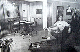
Was Frank Lloyd Wright or wrong? The noted architect was absolutely right as far as an Edmond Design professor is concerned.
By Dennie Hall, The Oklahoman, July 3, 1996
Jim Watson, professor of design at the University of Central Oklahoma, has redesigned his home to reflect modern European and Japanese minimalism and Wright's philosophies. "These philosophies are," Watson said, "open spaces revolving around a central core, furniture built appropriate for the space and the open floor plan with room areas that flow into one another."
Watson bought the house, 424 East 4th Street in Edmond, in 1995 and then spent "six weeks of pure hell" in remodeling projects. The result is a house interior that perhaps is the most modern and functional in Edmond.
His views are incorporated in every feature. For instance:
A pet peeve is making beds; he built one that requires merely a quick spread of a cover.
He doesn't like to search through closets of open and shut doors, so his bedroom has a closet on wheels with everything exposed to view.
Hallways are a waste of space, he believes, so he eliminated them.
Horizontal surfaces collect 'stuff'. He did away with most of those.
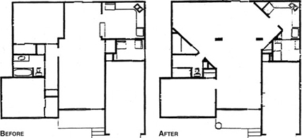
In gutting the house, Watson and the workmen he hired created a great room that contains a living area defined by the carpet and collection of chairs, an office area, a den/media area, and a dining room. To gain the needed space, he eliminated one of the two bedrooms in the 1,080 square-foot house and reduced the kitchen size.
Don't look for a sofa. Watson thinks they make inefficient units for humans to converse comfortably, so he has chairs in several different styles. Some walls in the great room are of corrugated tin at a 45-degree angle to the layout of the house. "This represents rural Oklahoma twisted by a prairie tornado plopped down into the 50s ranch house," Watson said. Other rooms in the house are grey or white.
The office corner of the great room contains industrial shelving with table and desktops of faux stone. A workstation contains an iBook laptop, file cabinet, and digital answering machine.
Watson, who wrote a graduate school thesis on Wright, designed and built 22 modular seating units for the den/media area. Watson designed and built the foam-covered table for the dining area. The base of the table - and those in the office - is a pedestal, thus cutting down on stubbed toes and banged knees. Watson's bathroom and even his laundry room are out of the ordinary. For instance, he dislikes stepping over a tub and under a shower curtain rod. Therefore, the shower stall is defined by a wall of glass block. He dislikes cabinets under bathroom sinks. Furthermore, he didn't want a sink with a large protrusion from the wall or with visible pipes underneath. Persistence paid off; he finally was able to order one he liked from the manufacturer.
Simplicity is a primary goal of Watson's. "We Americans are guilty of amassing stuff we don't need," he declares. Some of the house's other features are a wall clock made of knickknacks, a slot in the laundry room wall so the dogs can come and go, a mail slot in the garage door, dimmer lights, a hot tub beside the deck, and doors that open with levers instead of knobs.
Watson paid $58,000 for the house and spent another $13,000 on the remodeling. "I can't estimate the quantity of work that it took," he said. Resale was no consideration in the remodeling project. Watson is pleased with the naborhood and the nearness to the UCO campus. Living with him are his two dogs, Dallas and Austin. Watson grew up in Dallas and went to the University of Texas in Austin for his undergraduate work. He has a master's and doctorate from the University of North Texas.
A glance at Watson's watch reveals it has only one hand. A peek at his eyeglasses will show they have no frames over the lenses. What else would one expect from a minimalist?
'The simpler it is, the more beautiful it is'
Dr. Jim Watson, professor of design at UCO, describes his life as a minimalist and why 'less is more'.
By Mary Reinauer, The Vista, September 17, 1996

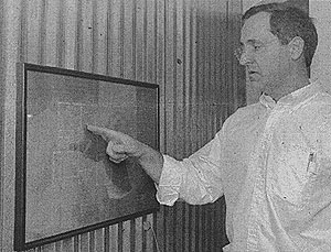
In a world increasingly filled with the clutter of comfort, UCO's Dr. Jim Watson has less, by design. The design professor, a devotee of architect Frank Lloyd Wright, said he is a minimalist. That means no knickknacks, no undersink cabinets, and few walls. Instead, Watson filled his house with functional items that also happen to be decorative. The overall effect might be described as a loft-tech-meets-Oklahoma-prairie look.
"This house allows me to address all my pet peeves," said Watson. Wasted space and time, obtrusive decorations, and hard to use or uncomfortable items have no place here, he said.
On the front porch of the typical 1950s ranch style Edmond home, Watson explained why less is more and how the ordinary house lent itself to the simple life. "Its all suburban kind of architecture. One story, simple floor plan, etc." The front planter is of Roman style bricks, noted for their long thin shape and used extensively by Wright to convey a low horizontal design that is in tune with the lines of the prairie. There was a lot of interest in Wright's work in this area at the time his house was built. Wright even called his style of wide houses with open floor plans the prairie Style, said Watson. Roman brick is one example of Wright's design that is meant to draw the eyes to the side, he said. Shutters and wrought iron railings were removed, bushes trimmed, and planters added to enhance the strong horizontal line. "The simpler it is, the more beautiful it is," he said.
The house at 424 East 4th Street is in the old Edmond naborhood of Capitol View where residents plan to form a historic preservation association soon. "Right across the street is the old Clegern house," said Watson. The Clegerns were Edmond pioneers. The old farmhouse was probably built in the teens. "Its still there. Now we have a Clegern school and Clegern Drive. When Watson bought the house last year, it required extensive work to achieve the simplicity Watson desired. "We had six weeks of real serious work: I had electricity only in the bedroom so if I took a shower at night I had to take a lantern in there. "I had about two weeks without a shower, but fortunately I could shower outside since it was August. And I had a week without a toilet. I won't talk about that," he said.
When the walls were demolished, workers found an original set of blueprints for the house, designed in 1952 by Oklahoman Richard Henley. Because this find simplified the task at hand, Watson reacted as if he "had found a treasure map." When the remodeling was finished, he had something even better, he said. Mailcarriers especially appreciate what Watson has done to the old house, even Watson has to train them to find it. A hinged panel on the garage door swings inward to reveal a drop box for Watson's mail. "The postman loves it because he doesn't even have to slow down," said Watson.
In the bathroom, the shower has no shower curtain. 1930s style glass blocks serve as the walls of the stall and as windows that provide light while maintaining privacy. A pristine white sink juts directly from the wall with no visible plumbing or supports. The 'sink' is actually a commercial modern drinking fountain. The pipes are hidden within the unit and run behind the sheetrock. Appropriately hung over the toilet is a colorful oil painting of Elvis on black velvet. "It's fitting that it should hang in the bathroom - that's where he died, you know," said Watson. Watson has two roommates. Austin, a space-saving greyhound Watson found on the Bailey Turnpike, and Dallas, an exuberant Doberman-type mutt who adopted him from the pound. "I spend a lot of time on the highway," said Watson of his dog's names.
(Written before the kitchen and office remodel in 2002.) The kitchen is a white recessed space that steps down into the laundry room, where faucets project directly over the dogs' bowls. Unobtrusive recycling bins fit under and to the side of a narrow refrigerator. In the silverware drawer, black handled utensils are lined up in a wire basket like a display at Pier One. A stainless apple corer has found its way into the drawer. "That doesn't belong there," said Watson, apparently restraining himself from relocating it. Don't even ask to see Watson's 'junk drawer.' Minimalists don't have junk drawers," he said. Nor do they have sofas, closets, or elaborate wardrobes. Collections, however, are acceptable if they have function. Watson offers a collection of chairs representing 'classic '50s, Art Deco, and vintage UCO dorm styles for visiting and conversing. "People come in and get to pick where they want to sit," he said. A decorative time piece is really a collection of pop icons displayed on the wall in a circular pattern centered with a generic clock movement. "This way "it becomes more than just a clock. Its functional art."
The floor plan is dominated by the multipurpose great room featuring galvanized corrugated tin on three walls. The low-key silver color lends drama to the area and also represents the Oklahoma rural heritage. The great room includes areas for eating, living, and working. The office area features industrial style shelving and tables that can be arranged in a variety of ways to fit the modular setting. The effect is much like a functional puzzle. "Its messy right now because I am writing a book (The Idea Kit)," said Watson, although a look around might prove Watson has different standards for clutter. The topic of the book is appropriately 'creative problem solving.'
Form follows function...
An open home leads to an open house for UCO professor
By Mary Reinauer, The Vista, October 8, 1996

An open house plan has spurred plans for an open house of a different kind for UCO design professor Dr. Jim Watson. People who got a glimpse of Watson's unusual home in The Vista's September 17 issue can see the whole thing for themselves at his open house at 424 East 4th Street on Sunday, October 13, from 1-5pm. The house, within walking distance of campus, incorporates the industrial loft look Watson admires. But friends and visitors will be mistaken if they expect loft art to adorn Watson's house. Watson is a minimalist.
The Vista's September 17th article described how the principles of Frank Lloyd Wright and Japanese and European minimalism transformed his ordinary house into a showcase of functionality and enduring design. Since then, Watson has been a busy man. "For the first week or so (after the article) I could barely walk from my office over to the Student Union without people wanting to talk to me about my house," he said. Several phone calls a day and even some curious visitors have prompted Watson to host the open house. Everyone, especially members of the UCO community, is welcome, he said.
Although Watson enjoys expounding on the minimalist concept, true to form, he has prepared a brochure to expedite the process (info now on this website). The graphic yellow and black self-guided tour booklet ushers guests through the bright yellow door, through the five room house, and even into the bathroom where the 'King' is enshrined on black velvet. Modifications to the 1952 design transformed the architecture of the house, so typical of the era, to meet a minimalist theory of structural simplicity that suits Watson's busy lifestyle. Visitors to the Open House can check out the newest addition to Watson's minimally mowed back yard - pink flamingos.
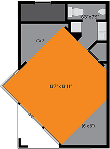
Above right: The floor plan of Dr. Watson's house before and after renovations were made.
www.jamesrobertwatson.com/house424.html