
Symbols and stickers for Push & Pull
Okay, admit it. You've pulled a push door and pushed a pull door. It was a bit awkward, wasn't it?
Some doors swing only one way but often, the clues - hinges, handles, and knobs - don't clearly communicate in enough time for the viewer to respond with a hand out to push or to grab.
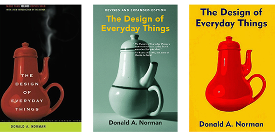
I first read about this phenomenon several decades ago. In his iconic book, The Design of Everyday Things, Don Norman argues that if anything in life should be easy, it should be doors. A door poses only two essential questions - In which direction does it move? On which side should one work it? The answers should be given by design, without any need for words or symbols, certainly without any need for trial and error. Norman has said his ideal door is one that as I walk up to it and walk through it, Im not even aware that I had opened the door and shut it.
For 20 years, I assigned a symbol design project in Graphic Design I. The project addressed the need for a clear symbol to clearly communicate Push or Pull.
Minimize humiliation, embarrassment
Convey compassion from building/store owner
Raise awareness/consciousness
Educate the target market
Age 26-55
Physically able to open doors
Interested in making things better
Community-minded
Age 26-50
Building, store lessee/owner
Architects, Interior Designers
Interested in making things better
Solutions usually fell into one of these categories
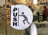


These show exaggerated figures in action of pushing and pulling. They are side views, however, and that might hinder the viewer's empathy with the figure.

These emphasize the pertinent action - the hand reaching out in front of the viewer performing the appropriate action.
These show the object in question in perspective, sometimes exaggerated. To help clarify, one would often add a handle for pull and a plate for push.
Of these three main categories, the doorway seems to provide the clearest and quickest communication of the action.
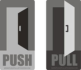


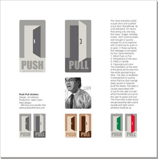
The message is communicated through four components:
1. The trapezoid shape of the door in perspective
2. The plate or handle on the door
3. The color or figure/ground reversal
4. The words Push and Pull
The door is rendered in perspective to quickly show that the door swings away (push) or towards (pull) the viewer. The plate is associated with a cue for the user to push there while the handle is the cue for the user to grasp and pull. The Push door is black since we perceive that dark colors recede and light colors advance towards us. The orientation of the door is the view one has while approaching a door. The version on the right, with the additional elements of the door frame, was rejected as the frame didn't add enough clarity to enhance the message.
Applications on different doors
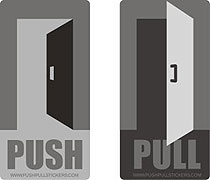

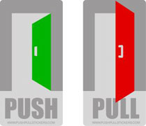
For black, white, or glass doors. For bronze or wood doors. Highlighted in symbolic colors.
Promotion and marketing

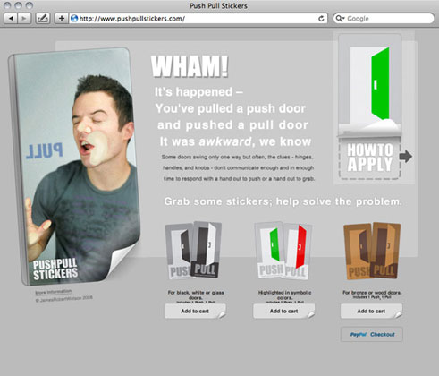
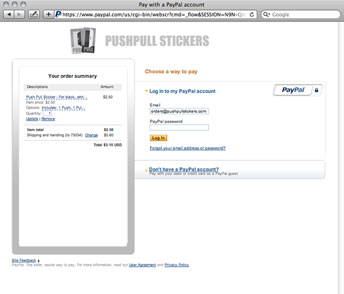
In the summer of 2008 I marketed the Push Pull stickers. I ordered sets of all 3 colors of stickers and in August, hired Bill Davis and Jennifer Zink to develop a website - www.pushpullstickers.com
Website Design
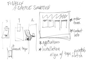
Notes from the website exploration phase.



Photos
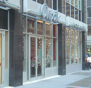
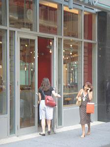

At a Chipotle restaurant in LoMa (Lower Manhattan), the door handles - conveying pull - are identical on each side.
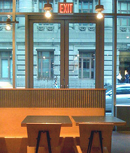
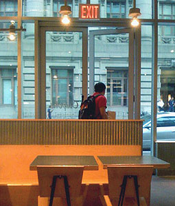
To exit, one must push the 'pull' handle, however.
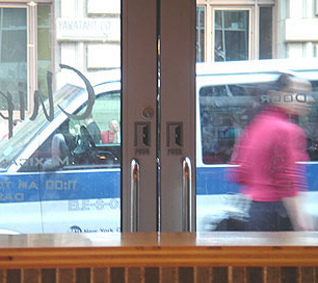
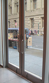
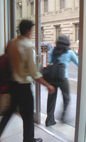
After I applied the new Push/Pull stickers.
Dates
Noticed the phenomenon: sometime in the 1970s?
First assigned it in class: September, 1988
Witnessed man at Chipotle: October 21, 2006, 7:44p
Decided to do something about it: October 21, 2006, 7:45p
Sketches: October
Stickers ordered: November, 2006
Website uploaded: August 18, 2006
Website removed: May 7, 2011
A well thought-out solution
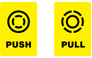
Robert proposes an abstract design that could work in a variety of cultures and applications. To make them easier to learn and understand, the symbols rely on two existing concepts:
The closer an object is to the viewer, the larger it appears.
A solid line indicates an object's present state; a dotted line indicates a possible, future state.
More rationale, examples, and info
Door design that also addresses the confusion

In & Out Door is an elegant (albeit expensive) solution that indicates whether to push or to pull by directing the user to flatten a plate or pull a handle, the action of which unlatches the door.
www.jamesrobertwatson.com/pushpull.html