
Better screen design and layout for websites, apps, and emails
Screen design for devices will go through a transition shake-down as designers learn and embrace the needs, advantages, and limitations of the medium and how best to satisfy the users.
Screen design objectives & considerations
Short download time: minimal graphics, no gimmicks
Easy to navigate and access
Minimum number of pages to get to destination
Provide convenient links
Easy to read: legible point sizes, common simple fonts
Maximize live area
Minimal scrolling
Consistent layout on pages
Visual appeal
Responsive to adapt to a variety of platforms
One finger/thumb operation (where applicable)
Target audiences
Seekers: someone accessing specific information
Users: someone specifically exploring this site
Browsers: surfers accidentally hitting site
Some objectives (From the Plain Language.gov website)
Users require three things when using a device screen:
1. A logical structure so they know where to look for information (information architecture).
2. An easy-to-use interface to get them to that information (usability).
3. Information (content) that is easy to understand (plain language).
Minimize scrolling
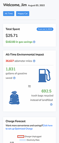
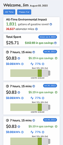


This is an app that gives info about charging an electric car.
Tighten up all lines and data. Remove excess space and leading.
Put seldom used notices at the bottom (Change Forecast).
Delete useless data and accompanying unnecessary logostrations. Nobody knows how much 692 trash bags is.
Increase contrast to help the boxes stand apart from each other.
The main reason a user opens the app is to see the status of their charging, length of time, cost, and gallons saved. Above right: Notice how much more info could be presented with less scrolling.
A new Bank of America mobile app that is more user-friendly
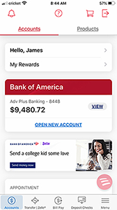
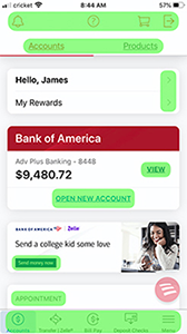
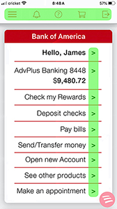
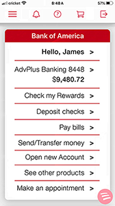
All the info from the left screen is on the next screen - in a format that is easier to navigate, easier to understand, more orderly, and more consistent.
Navigation is currently in 8 menus spread all over the screen - the improved version has one icon menu across the top and a list of items running down the screen in a consistent and aligned format.
The red Bank of America band - as a unifying brand marker - is at the top of the screen, not partway down.
The photo - useless, potentially alienating, and taking up precious space - has been removed.
The multiple text specs - font, point size, placement, and case - have been replaced by a simpler type format.
The contrast with the gray background has been enhanced.
Compare the visual chaos on the left to the logical alignment order on the right.
AppleCard app improvements
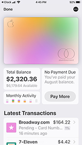
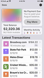
The Transactions are only on 2 lines, instead of 3. The location is not necessary since tapping the item takes the user to a map of the location.
The multi-color image of the AppleCard serves only as a toggle switch - tapping it toggles back to ApplePay. The smaller image allows plenty of finger room to do that, and it frees up more space to list more transactions - requiring less scrolling.
More info is available on the app screen without swiping or scrolling. Simple and clear.
The contrast was upped a bit to better delineate the bubbles of info.
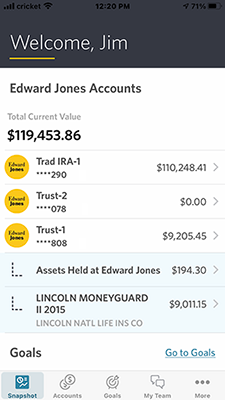
Edward Jones - no need anymore for a Welcome statement - we want info

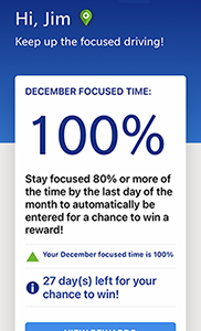
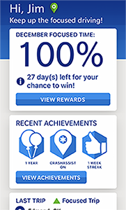
Farmers insurance - less scrolling
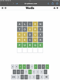
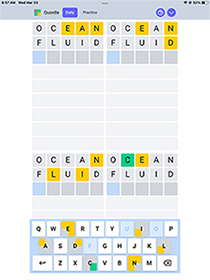
Point size of letters on keyboard too small
Far left is the game Wordle. The others are copycats that saw the small type on the Wordle keyboard and fixed them.

Tesla app without redundant or useless options

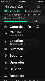

Unnecessary text copy and excessive scrolling

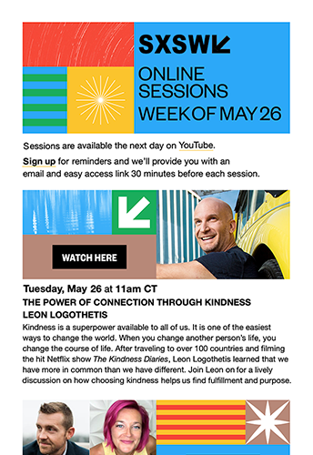
Improvements
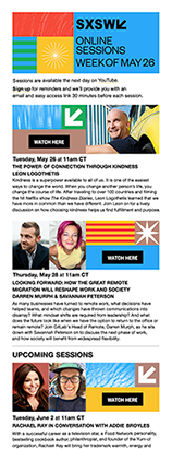
Deleted the SXSW at the top since it is also on the very next line of copy. SXSW is set larger to become a headline.
Set Online Sessions on 1 line and Week of May 26 on 1 line - these are self-contained phrases that, if feasible, should be kept as a unit on 1 line.
Edited superfluous copy in the opening - the reader wants to know what sessions are newly available online. They are somewhat savvy with SXSW Online. All they need is a couple of reminders, not a bunch of crap to skip over. "Hi, everyone"? "We hope to see you ..."?
Important info like day, date, and time is moved to the top of the session text, enlarged, and set differently to easify recognition, memorability, and comprehension.
The title of the session is set on 1 or 2 lines. The presenter's names are set on one line beneath the title, rather than part of the title sentence.
All session text copy is edited and set with less leading.

Please don't make the user scroll too much


I was seeking info on the annual Christmas dinner in downtown OKC, so I went to their website. The left image is what a surfer sees on the home screen. Of all the screen space allotted, this site uses only the blocks in yellow - the rest is wasted and of no value. The user must scroll down to get more info. The image below on the left shows the entire site, that took about 4 screen scrolls to access. The photos appear in a random slideshow sequence.
Reminder: People now go to the web primarily to watch cat videos and to seek information. Ignore the cats, but, please, provide info for users in an easy to navigate format. The less scrolling, the better.
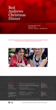

Above right is a redesigned home page - in fact, it's now the only page. All the information and menu links can be seen on the page with no scrolling. All the type point sizes remain the same. The pertinent info is in the top red banner, the photos have been cropped and can now be seen all at once, and the explanatory info and links are towards the bottom. Now, the eye can scroll around the page to find the desired info, rather than the finger or mouse having to scroll down.
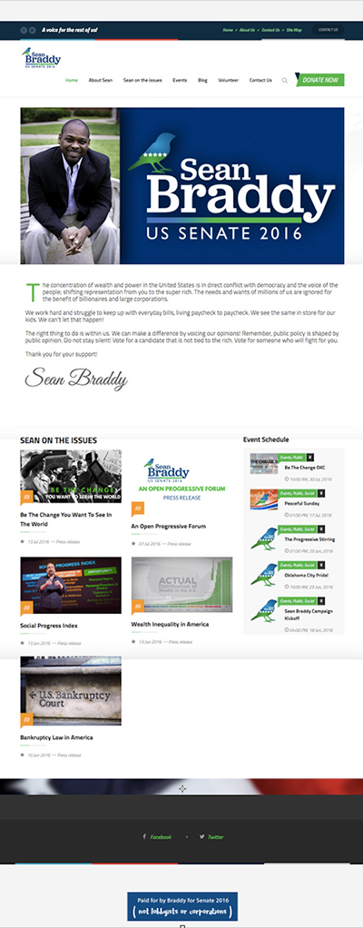
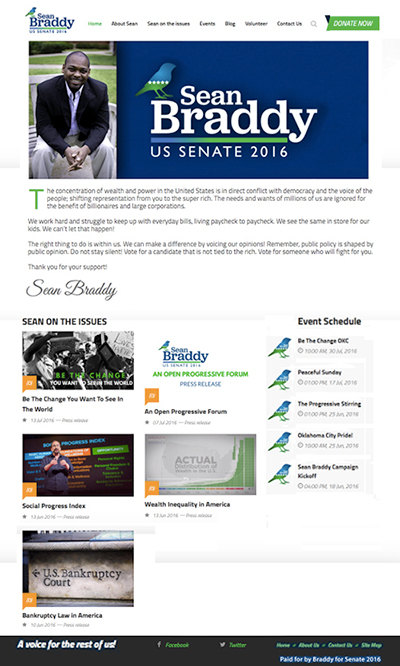

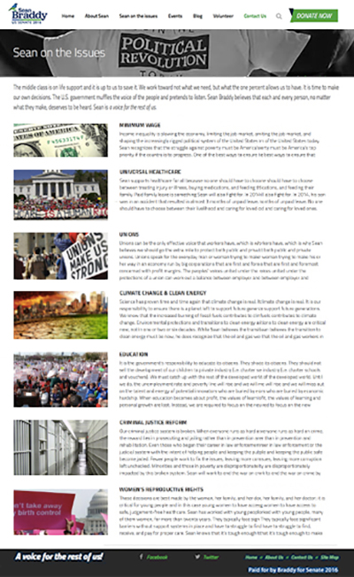
Example below: Nobody cares much for just pretty pictures - the visitor wants information and easily accessible. Better: minimize the size of the picture (even more than I show here) and decrease the excessive white space.


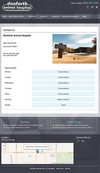
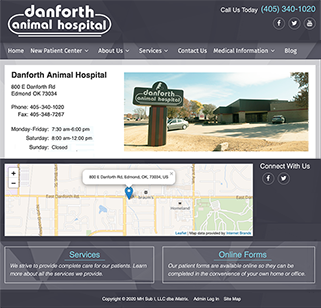
Below: too much space devoted to days and hours. Cropped and lightened photo. Moved the map higher up.
Apple iPhone:
Lots of wasted space - if it is tightened up (far right), more info can be read without scrolling.


Walmart:
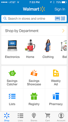
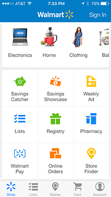
On the Walmart app home screen, the user has to scroll to access all the options. I use Walmart Pay and can't even find the icon on the home screen - I have to scroll down.
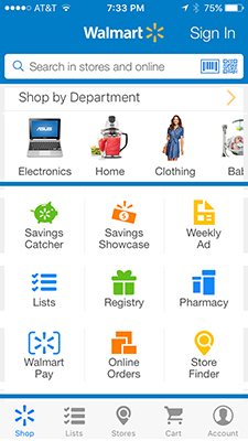
The screen has a lot of wasted space, the layout is too open, and there is not enough visual hierarchy to guide the user. Improvements (image above right):
1. Enlarged Sign In text/button.
2. Tightened rows of text/Icons so all info fits on one screen - no need to scroll.
3. Moved labels closer to their image icons.
4. Enlarged the Walmart Pay icon.
5. Separated the main categories with Walmart blue lines.
Red Roof Inn:
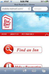
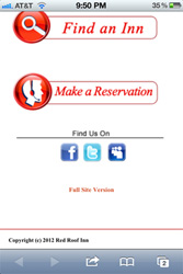

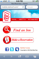
There is much wasted space: about 40% allotted to a useless photo of clouds and too much white space among all the elements. This one long page (requiring scrolling) could easily be tightened up to allow all the info to be contained on one home screen, as shown on the right.
Lesson: See the design through the eyes of the end user. Consider their needs, desires, and habits.
Tip: Determine the hierarchy of information. Make sure that unimportant elements don't hog too much space.
Bank of America and Chili's:
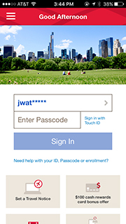


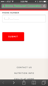
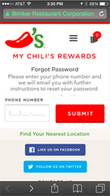
TVGuide:

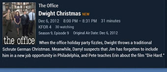
When the user taps a program, its details and description open in a window too small to contain all the text: there is not enough dedicated space to display the entire program description - the user must scroll. But, notice how much blank space is to the right of the photo.
Simple solution: group more of the program details on less lines, as shown above right. This frees up enough space for the entire program description to fit within the allotted space. No scrolling necessary.
Avoid unnecessary extra screens
On the iPhone, I am not a fan of swiping to multiple pages in search of an app or a folder. I created folders so that all the apps would fit on the home page. The look is more industrial - this is, after all, a machine. A hand-held phenomenal machine. It seems more honest to let it look industrial and serious. And more useful and efficient.

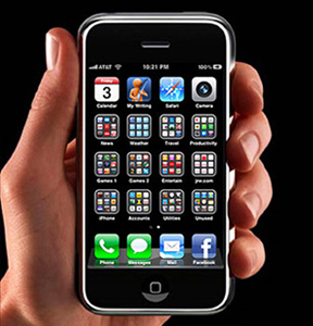
I can access every app from one page - no more swiping along multiple pages to access an app.
Along the bottom row, I placed the 4 apps that provide connections to others: phone calls, text messages, email letters, and Facebook updates and messages. Update: I rarely access Facebook any more so I moved the icon to the Fun Stuff folder and moved the Safari icon to that spot on the bottom row.
The top row - I placed the camera app in the upper right - to minimize taps to access it and to remind me that the camera lens is positioned in that corner on the back. The rest of the row contains apps I use frequently.
The middle 3 rows contain the app folders. If a folder had less than 9 apps in it, there would be blank voids in the folder window. To fill those voids, I added photos of my dogs.
With the additional busyness, its important to create a solid background to minimize the visual noise.
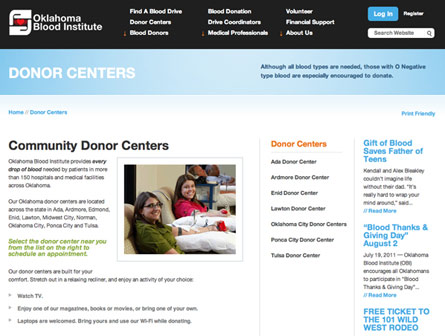
Above: the webpage of Donor Centers on the OK Blood Center website. To find a Donor Center, a list appears, but the locations in the OKC metro area are grouped within an additional menu (middle photo below).
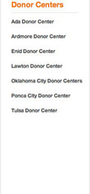
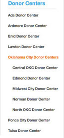
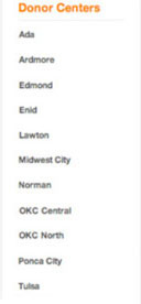
There is no need for the additional menu - all of the locations can be listed in one menu (as in the example on the far right). The list is alphabetized. Putting OKC first in their names allows the two locations to be next to each other in the list. People living in Norman or Midwest City would more likely check a list for Norman or Midwest City, rather than as a subset of Oklahoma City.
Tip: Many people today seek information immediately and easily. Adding unnecessary links or pages bogs down the process of using the web to access info.
Lesson: websites are more efficient when there are fewer links to open or pages to access.
Starbucks: 4 screens into 1
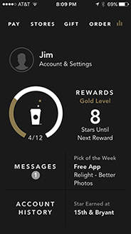
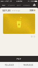

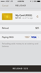

The user taps PAY on the black home screen - a new page opens and the user must tap PAY again to get to the code for scanning at the register. The 4 pages above can easily fit onto one page (below). Now, all the pay tasks are seen on one screen. Easier to understand, easier to use, and quicker to access.


The New York Times crosswords app
The Times has established itself as a leader and authority in crossword puzzles. Its app for the iPad provides archives of puzzles and a user-friendly navigation on the puzzle page. However, the menu pages are not as well thought out. There are at least 6 pages of menus on the existing site:
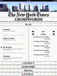
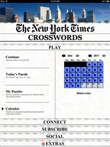
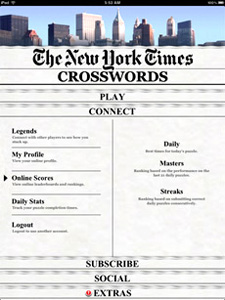
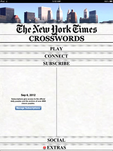

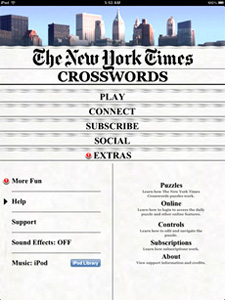
Notice how much space is wasted on several of those pages. The photo of the skyline is unnecessary as the Times is basically a national paper and the puzzle app is sold world-wide. The banner The New York Times doesn't need to be quite so large - the user already tapped the app and saw the loading screen. The user must also tap to other pages to get info. Those 6 pages above could be combined into just one (Below right):
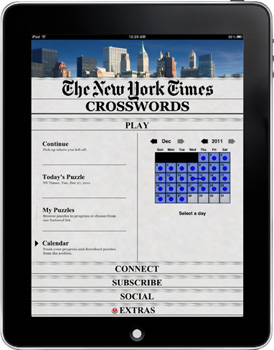
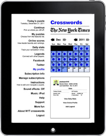
App users scan the menu to find what they are seeking. The single menu column makes that quite easy and comfortable. On the right side of the page are the puzzle calendar and a window for info from the various links. Putting all the links on one page minimizes links to other pages. Some of the menus can be combined to also reduce the number of links.
Lessons: Embrace the medium and design apps that reflect the technology.
Avoid simply transferring the design principles from other media to the app medium.
Numbrix
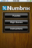
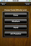
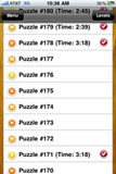
A fill-in-the-blank number game created by Marilyn vos Savant and published in PARADE magazine, Numbrix is a great game. However, there are just too many screens the user must get through to play a game, all shown below.





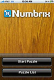
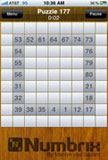
Improved screen sequence: The number of screens shown above can be reduced from the above 11 to these 5:



The first 5 screens could be combined onto one screen, like a title page, that lists the 3 contributors to the Numbrix game. Ideally, there should also be a rotating symbol or bar that shows that the game is of loading. That could be built into the blue Numbrix icon, similar to the movement shown when a puzzle is completed. The user is often more comfortable seeing verification that the game is loading and not having to read 5 separate screens.
An easy and effective improvement is to combine the two menu pages into one. Currently, the user taps on Puzzles on the first screen but then gets a second screen that also asks the user to select a puzzle. There is enough room to combine the menus from both screens and not have to repeat the heading of Puzzles. The line, Choose puzzle difficulty level, is unnecessary. The levels are obvious by the listings Easy Medium Hard and the box containing those options with the words All Puzzles.
Tapping the selected puzzle from the list should be enough to state 'Start puzzle'. There is no need for the intermediate screen step to repeat the request of starting the puzzle. The Puzzle page has a button at the top to Pause or return to the Menu.
Lesson: One of the goals of good web design - and now app design is allowing users to get to their destination in a minimum number of screens.
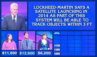

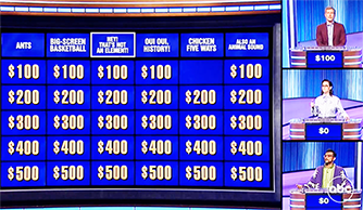
A better game show tv screen layout. We have become so accustomed to seeing web sites and app pages with multiple blocks of info that the linear images on game shows seem primitive. TV screens are wider now (more real estate to use for images) and our home screens are larger and in higher definition. Often, when watching, I wonder what the score is or the amounts of money a contestant has. My desire may not match what the director has chosen to put on the screen. Solution: arrange the Jeopardy (or Family Feud, Millionaire, Wheel of Fortune) blocks of info like a web site to allow the viewer to access info as needed or desired.

A better map and screen for NorthPark To-Go
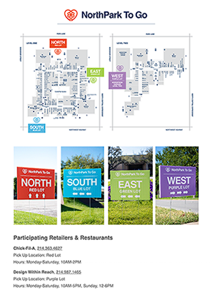
Some stores in NorthPark Center, opened in Dallas in 1965, participate in Texas' retail to go, begun in April 2020. The consumer contacts an individual store to order and pay. The merchant relays the designated pick-up location in one of four color-coded parking lots. Color-coded signs on-site guide drivers into the lot. An employee delivers the purchase to the backseat or trunk of the vehicle. Customers remain in their vehicles and are not allowed inside NorthPark or individual stores.
Target audience
The viewer of the pick-up location map has ordered online or by phone. That person wonders: "Where do I go to pick up my purchase?" They have no need to know where stores are in NorthPark, where the entrances to the center are, what is on each level, where elevators or stairs are, etc. All of that info just clutters the map and makes it more difficult to decipher where to park for pick-up.
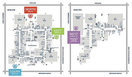

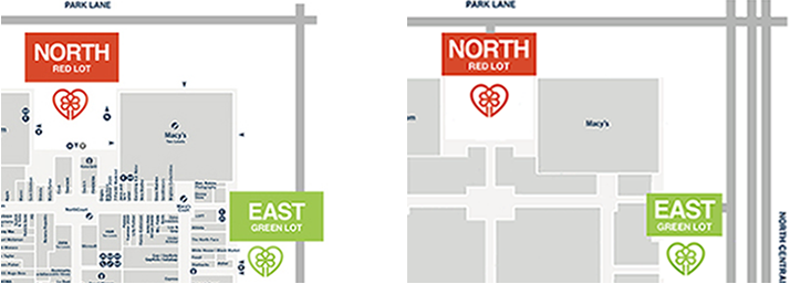
Improvements (Left = Existing, Right = Improved)
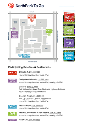
• The more uncluttered, simple, and clear map is easier to recognize and understand.
• All 4 Parking Areas are located on one map.
• The anchor stores, masses of stores, and allow easy recognition and confirmation of NorthPark Center.
• The image better communicates how to arrive and maneuver to 1 of 4 parking areas, with parking entrances connected to streets and the divided road and Expressway.
App/Web page
The component of proximity
Proximity refers to grouping bits of information or elements close enough to form an association. This grouping provides some comfort through familiarity. We humans like change but only if we can experience it from a foundation of something comfortable. Grouping like elements also aids clarity of understanding of information by creating a hierarchy of information.
From the essay, Design Components
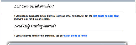
The graphic elements of a bar, rule, or line can serve as an organizer to separate disparate images and text. We are conditioned to seeing lines as separators. But, in the above example, the lines are in the wrong places. Lost Your Serial Number? is separated from its accompanying text. The text copy, "If you already purchased . . ." is closer to the heading Need Help Getting Started than to Lost Your Serial Number?
Below is the improved version - the line separates the two sections of different thoughts. Each heading and its accompanying copy are in closer proximity. making it easier for the reader to comprehend.

Lesson: Group together associated elements (text, images) to create a single visual unit.


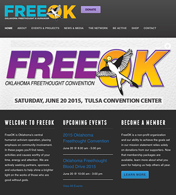
Of course, the ad needs the day of the week. Why do "designers" continue to disrespect their audience by not including the day? Can't figure it out. Is it ignorance? Apathy?
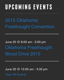
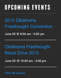
Also, notice below left, where the horizontal white lines are - they separate the event title from the date and time of that event. They push the date and time closer in proximity to the event title below. On the right is how it could have been to read more clearly (I also brightened the blue a bit). The lines should separate events, not separate events from their accompanying info.

Usable space within a screen

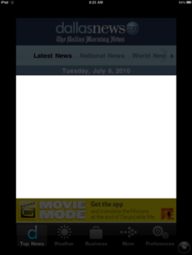
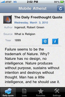
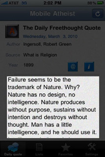

Left: This app, for The Dallas Morning News, only uses about 50% of the allotted space within the screen of the app. There are 3 bands of info at the top and 2 bands at the bottom - an ad and navigation tools. That doesn't leave much room for the content info - the very thing that consumers want from their devices. Some of the info in the bands could be minimized and combined in order to decrease the space needed for these bands. Right: The highlighted area can be increased:
Decrease leading (the space between the lines of copy)
Group all symbols together in top bar
Apps should cluster at the bottom, not the top

Left: the way apps cluster on the iPhone screen. Right: the better way - cluster down towards the bottom.
It can be tough to reach apps at the top of the screen when using the phone with one hand. Apple recognized this and built a feature called Reachability that lowers the apps to the bottom of the screen. But if the screen is not full of apps, they cluster up towards the top. They should cluster at the bottom, putting them within reach for more people using one hand. They are also in better proximity to the fixed bar of apps at the bottom.
App buttons that exploit their perimeter shape

There are several app icons that convey books or reading. But, the samples below have an added dimensionality while staying within the given confines of the rounded rectangle. These are symptomatic of a designer who sees possibilities, has a good eye for design detail, and stays true to design objectives while exploring appropriate options.
App button that is clearer

App buttons do not need much detail. The available real estate is just not big enough to include minor info. Simplify for the button. Observe the clarity of those that are simple and only 2-color. Of the 2 Fuzzy's Tacos buttons, the one on the far right is clearer.
The Voice Memos app
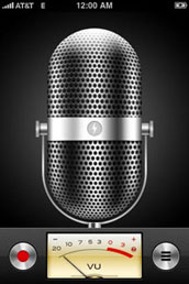
With the introduction of the 3GS phone in June, 2009, came the new included app of Voice Memos. This app allows the user to record messages, edit them, save them, and play them back later. What a great idea. Especially in situations when one doesn't have pen and paper handy. I found this function to be a very useful app while in the car - just grab the phone and record.
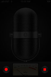


Problems with the app screen
The two red areas, emphasized in the second image, are the only functional interfaces on the entire screen. The rest of the space sits idle - just useless decoration. About .12% of the available screen space is used to perform the functions, 99.88% of the screen is wasted and nonfunctioning. The retro microphone and the VU meter serve no practical purpose. These function buttons are so small that one has to search and focus on the screen to operate the app (dangerous while driving, walking, or doing just about any activity other than staring at the screen of the iPhone).
The functions of the button, once tapped, change to a different function. The red dot is record, but, while recording, it becomes a pause function. The 3 line button accesses the list or recorded memos but, while recording, it becomes the stop button. But these functions are not apparent when looking at the screen. The user has to figure them out.
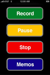
Improved version
Above right is an option for an improved version that addresses the issues raised above and has an interface that is much easier to use. This version has no unnecessary graphics that take up valuable space within the limited available area for function controls.
On the right is a home screen showing the appropriate small icons in the lower right.
Note: these are rough renderings - the elements should adhere to iPhone visual and textual iconography and the colors need to be of more appropriate value and intensity.
A few features
1. Large buttons that are easy to see and easy to reach with one finger or thumb for one-handed operation.
2. Color-coded buttons for immediate recognition. Red means stop, green means go, and yellow means caution, wait, pause. Blue is used on national highway signs to represent information.
3. The user can see all 4 functions on one screen - none of the basic functions is hidden.
4. Buttons are labeled in familiar and comfortable iPhone style and lettering.
These features allow a more intuitive understanding of the app and a very short learning curve due to the primary colors, familiar capsule button shapes and labels, button functions, and orderly alignment.
Lesson: Successful utility apps should be easy for the user to understand and operate and they should help make the users life easier, more productive, and more efficient.
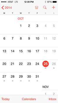
Redesign iCal column spacing to gain more usable area
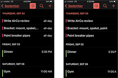
The screen layout for iCal, the calendar function on the iPhone, wastes valuable space. The user wants and needs the maximum amount of space for the display of information. In the middle image below are grey columns showing the wasted space - about 25% of the allotted screen space. Redesigning the screen can gain enough space to display 9 additional characters. This is beneficial because it minimizes the need for the user to tap and select the item to read the rest of the info. Users want and need the allotted space to display the maximum amount of information.

The existing format allows 17 numerical characters in one line. The proposed format allows 26 characters.
1. Decrease the spacing between the time numbers and the AM or PM.
2. Delete the M after the A & P. The M is useless info - it serves no function since both the AM & PM have an M. It doesn't help distinguish morning or afternoon - the A & P do that. The M wastes valuable space.
3. Decrease the spacing between the A/P and the list of tasks and events. The purpose of spacing here is to provide a visual pause and a separation between elements to enhance comprehension. However, those objectives are accomplished by setting the A & P in a smaller point size, in grey, and in ALL CAPS. That's enough to create a clear separation. Additional spacing is not necessary.
4. Allow the task/event info to be set all the way to the right of the screen. There is no need for a margin along the right side.
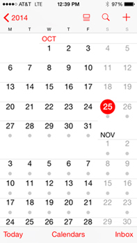
Why is the Calendar on the iPhone so spaced out?
Why not tighten it up and allow more weeks to show. There seems to still be ample room for a finger tap on a specific date.


Above right: Fantastical Calendar - there is not enough room devoted to characters in the event titles. Better:
Remove the M in AM & PM - useless, the M doesn't help clarify morning or evening.
Delete 'all day'. If an event is 'all day', there is no specific time (examples above & below).
Move the time down to line with smaller text, freeing up more room on top line.
Allow the user to delete the colored bars of tasks in the top band. Not a worthwhile use of the space taken up.
Allow the user to select 'None' for dot color. Deleting the dots increases available space for task description.
Note how much more info is on the line Flight UA738 EWR to CLE
Larger buttons in an app


The two buttons, in the bottom band, toggle back and forth between solid-fill and the vacant X but they're a bit too close and too small. While playing fast, it is too easy to hit the wrong button. An improved version is on the right:
1. There is enough room in the lower bar to enlarge both buttons.
2. They can be spread apart to minimize hitting the wrong button.
3. The buttons are all centered under the live game area.
A better Weather Channel app
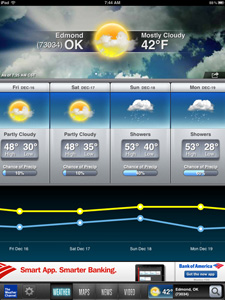
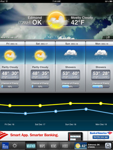

Make the low temperature timeline more visually accurate. The format to display temps in the app is a left-to-right sequence of time. However, the low temperatures don't adhere to this theme. The low temps are directly below the high temps (which is impossible - to have 2 different temperatures at the same time). Often, the low temp is in the early morning hours of the next day. The example above right from another weather site conveys the high/low temps more clearly and more accurately.
Thoughtful: The Weather Channel color codes the temps - yellow for day/high/warmer and blue for night/low/cooler. But, to better convey the passing sequence, the low temps should be between the highs, as in the altered example on the right.
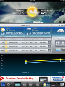
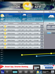
Waste less space on the screen. When then user taps a date, it expands to show the hourly temps and precip. But it only shows 3 hours worth. Notice how much space is wasted and used for useless information, primarily the unnecessary photo in the background at the top. Reducing that space and some at the bottom allows 7 hours to be displayed at once - over twice the number. This allows less scrolling by the user.
Tip: Layout web/mobile sites to require minimal scrolling.
Lesson: Assess the use of live area to see if its being used efficiently.
Wallpaper screens that are less chaotic and more appropriate
The wallpaper background screen has no useful function, no practical purpose. It is simply a backdrop for other icon functions.
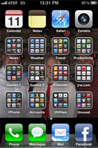
Designers who follow trends without intelligent assessment and consideration of the user place images behind text. Often, poor design results when the decision maker doesn't adequately consider the needs and wants of the end user - the reader, viewer, consumer. Too often, designers make decisions based on their own biases and preferences and not based on research of the psychological characteristics of the user. Text over an image is one example. If you want the reader to understand the text, don't dilute it with an image and if you want the viewer to see the image, don't hide it behind type.
This logic applies to print ads and to the wallpaper on a smartphone. The wallpaper is visible behind the home page of icons and the page of functions used for making phone calls.
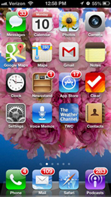
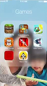
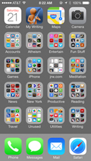
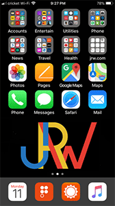

Notice how much easier it is to see and use the phone functions when the screen is gray or black. Especially when making phone calls or during boring meetings or other situations where time and concentration on performing the task is limited. The smartphone is a marvel of function and productivity. The solid-color wallpaper enhances the efficiency of function.
For those people who insist on putting crap on their home screen behind the app icons, some phones blur the image when the focus should be on the icons. Note: the focus should always be on the icons - that's the purpose of the screen. If you want to see or show a photo, open up photos and show the image without crap obscuring it or blurring it.
Consistency in layout design
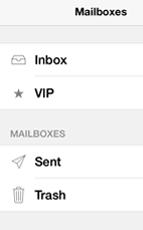

The Apple mail program includes almost all outline symbols - except for the solid VIP star. Notice how awkward it is in the column of symbols. It would have been so easy to use an outline star so it would match the others in the set.
Lesson: Consistency within a set or series often aids association inclusion, communication, and comprehension.
The component of proximity
Proximity refers to grouping bits of information or elements close enough to form an association. This grouping provides some comfort through familiarity. We humans like change but only if we can experience it from a foundation of something comfortable. Grouping like elements also aids clarity of understanding of information by creating a hierarchy of information.
On the website for Fetch, a file uploading service, the home page (on the left below) requires the user to scroll down to access more information.

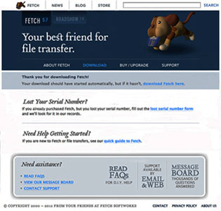
There is generous leading and much wasted space. I tightened it up as shown on the right. The text point sizes are all the same, no information is lost, and there is no need to scroll down.
One objective for effective web/app design: minimal scrolling and swiping.
Lesson: The experience of visiting a page and seeking info is enhanced if there is less need to move to other pages.
People have evolved past being intrigued by artistic web design - we want information and we want it efficiently.
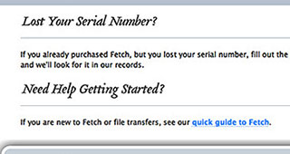

The graphic elements of a bar, rule, or line can serve as an organizer to separate disparate images and text. We are conditioned to seeing lines as separators. But, in the above left example, the lines are in the wrong places. Lost Your Serial Number? is separated from its accompanying text. The text copy, "If you already purchased . . ." is closer to the heading Need Help Getting Started than to Lost Your Serial Number?
Above right is the improved version - the line separates the two sections of different thoughts. Each heading and its accompanying copy are in closer proximity. making it easier for the reader to comprehend.
Lesson: Group together associated elements (text, images) to create a single visual unit.
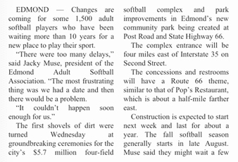
Setting text blocks FLRR for better readability
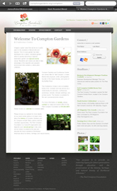
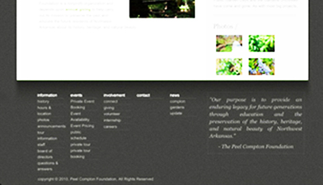
Notice the block of text copy in the lower right of the above page, enlarged below left:



On the left: The body copy as originally set. Copy that is set justified (both margins aligned) creates inconsistent letterspacing and word spacing - notice the line: through education and the Those differing gaps annoy the brain and slow down readability. Above, in the middle: How it would look if it was set flush left, ragged right. Now, there are no inconsistent gaps - all letter and word spacing is the same, providing a more comfortable flow for the brain to read efficiently.
Even better, above right: Copy block set FLRR but with the margins manipulated so the lines are of a more consistent width. The punctuation also hangs outside the margin - notice how much better the left margin looks when the quote marks are not inside the margin. Another example:

Organizing text copy for easier comprehension:

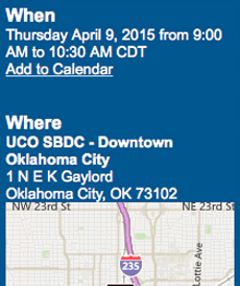
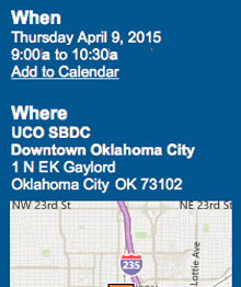
Put all time info on one line: 9:00a to 10:30a.
Abbreviated 'AM' as 'a' (and PM as p, if included).
Deleted the unnecessary CDT.
Placed 'Downtown Oklahoma City' on one line.
Tightened up the initials EK.
Decreased leading between the two blocks of text copy.
Increased leading between the map and the copy.
Increased the blue space in the left margin.


Includes the day of the week.
Each appt time info on a separate line.
Places action info in text block at the bottom.
No one needs to arrive an hour early.
Better email content and screen layouts


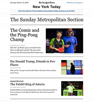
I get this email newsletter, Times Insider, each week. All I see on the screen is a standard format old-school letter. Not appealing nor does it pique my interest. Click, Delete. Done. (look how far down the reader must scroll to get to the first headline)
Instead of a letter that I don't want to read (who does?), they could easily jump right to the lead story - the headline and the visual are much more interesting.
The letter is ego-driven - the editor tells us what she likes and is putting in this issue. Does the reader care who the editor is and how she introduces stories? Old-School Journalism - copy to read linearly. Today's readers scan, they jump to what is appealing.
Repeat: letters of text only are no longer appealing.
This intro letter just lists the stories below. Useless information. It seems both of these editors have some ego issues (they like to see their name in print) and both are from old-school Journalism - today's reader scans to topics of interest. We do not want to read letters with no useful info in them.

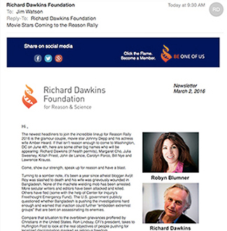
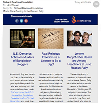
The Richard Dawkins Foundation regular email (left below) looks like a letter (and an appeal for donations). I didn't realize until after the first few emails that there were interesting stories below the letter. The editor, Robyn, puts her picture and an intro to the stories first in the email newsletter. That is just a bit too much ego (like, who cares?) I also question the value of the letter - it just repeats what is in the stories that follow. The newsletter should be about stories, not the editor. Why not just get right to the info? We each get so much stuff in our Inbox - I appreciate those items that provide clear info with easy access. Which example below looks more enticing to read?
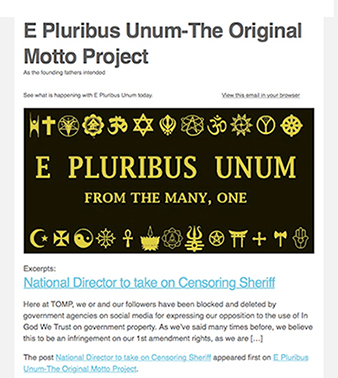
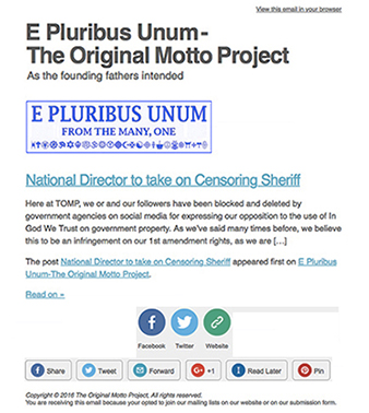
From an organization that wants to restore the USA National Motto to E Pluribus Unum. The email posts are visually overwhelmed by the big black box with redundant information. It becomes so dominant, its tough to see the lead story headline. I softened up the box (blue on white) and reduced it. And made some other tweaks. I emailed them and included the two images above and told them to use the suggestions as they wished.
Their reply: Thanks for the suggestion. We think we will make a change.
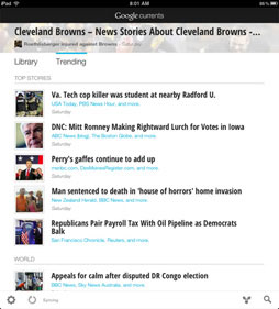
Google introduced a new news reader app. There are lists of stories in a variety of categories. On an iPad page, there is a given amount of 'live area' - the screen space that can be used to display information, as shown on the left. On Google's site, a large amount of space at the top is devoted to a collage of often-meaningless photos. Some photos repeat, some are just filler, and almost none have value to any of the stories. Taking up that much live area requires the user to scroll more to run down the list of articles. On the right I built a layout without the photos to allow the page to list 8 stories instead of 4. I hope in a future update, they provide a setting to allow the user to turn off the photo band at the top.

Confusing wording:
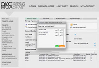
I had to change my password. On the Oklahoma City Museum of Art website, this dialog box (middle) came up, asking how I could be reached.
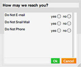
How may we reach you? Yes, do not e-mail or No, Do Not E-mail. (Got it?) Better solution below right.
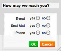
Design criteria to consider:
Convey a positive attitude, not a negative one.
Align the baselines of the media and the options.
Align the media to a flush right margin, closer to the options.
Remove white space from within the box - tighten up the info.
Lessons
Strive to convey positive requests and information, rather than emphasizing the negative.
Design should be user-friendly. Consider the user when making design decisions.
Below: Another poorly worded dialog box - answers should agree with the question - Are you sure? Yes, I am sure. No, I'm not sure.

Don't cling to old-school journalism
The story below was on some news feed. The headline was intriguing - funny PortAPotty stories. When I click on the link, I want to begin reading the stories. Instead, the author felt a need to bore us with an intro story about how shit stinks. And this crap: "What follows are six of the funniest, most disgusting, and horrifying real stories we could find." Yes, we got all of that just by reading the headline. No need to repeat it.

Look how much junk there is to scroll through (3.5 screens) before getting to the disgusting stories. Without the junk, the reader would see the first story on the first screen (above right).
Lesson: This is a different era in info consumption. Give us the info, skip the flowery J-class crap.
An idea for a walking app
I try to take a 30 minute walk each morning. I'd love to have an iPhone app that gives me random directions (straight, left, right) to vary the route of my walk. A random generator like the old Magic 8-Ball.
Purpose: break a routine, provide options for discovery.
Objectives: Easy to use, Convenient, Intuitive, Fast.
Target audiences: Those seeking a new route and willing to accept random directions: 1. Fitness walkers (timed, goal, pace), 2. Recreational walkers (fun, enjoy).
Features: Shake to get new direction, Hit button to get new direction, Other functions: timer, randomizer, pedometer, calories burned

www.jamesrobertwatson.com/design-screen.html