
![]()
Blogs about design
![]() Advertising: objectives, layout, copy, examples
Advertising: objectives, layout, copy, examples
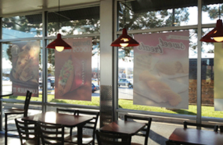
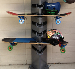
![]() Covid: timeline, graphics, masks, car mask rack, carry case
Covid: timeline, graphics, masks, car mask rack, carry case
![]() Fashion: Jim's innovative proposals and products
Fashion: Jim's innovative proposals and products
![]() Flush center: ways to set copy, better way to set lists, examples
Flush center: ways to set copy, better way to set lists, examples
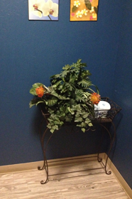
![]() Furniture: Jim's innovative furniture products
Furniture: Jim's innovative furniture products
![]() Infographics: charts, graphs, copy, layout
Infographics: charts, graphs, copy, layout
![]() Logos/Branding: great examples, improvements
Logos/Branding: great examples, improvements
![]() Maps: layouts, clarity, legends, wayfinding
Maps: layouts, clarity, legends, wayfinding
![]() New York City: Chrysler spire, MoMA cafe, Liberty visitor center
New York City: Chrysler spire, MoMA cafe, Liberty visitor center
![]() Package: labels, pill boxes, examples
Package: labels, pill boxes, examples
![]() Parks: objectives, art & sculpture, dog park, pathways
Parks: objectives, art & sculpture, dog park, pathways
![]() Product: examples, Jim's product proposals
Product: examples, Jim's product proposals
![]() Screen: laptop, app, email, objectives, scrolling, copy, layout
Screen: laptop, app, email, objectives, scrolling, copy, layout
![]() Signs: highway, layout, text, wayfinding, arrows, flush center
Signs: highway, layout, text, wayfinding, arrows, flush center
![]() Stage sets: innovations, light machine, models
Stage sets: innovations, light machine, models
![]() Symbol: clarity, layout, color coding, examples
Symbol: clarity, layout, color coding, examples
![]() Ticket: etickets, layout, user-friendly
Ticket: etickets, layout, user-friendly
![]() Typographic: formats to set text, clarity, kerning, case
Typographic: formats to set text, clarity, kerning, case
![]() Urban: boulevard, intersections, parking lots
Urban: boulevard, intersections, parking lots
![]()
Observations about design work and how to make them better

Chaotic menu design, existing left, better on right:
• Two columns, read down; one text block spans across two columns.
• Headings are set centered, copy is set FLRR.
• Order of courses - sides should be in promixity to 'Mains'
• Change Mains to Entrees
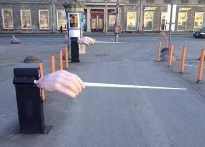
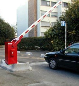
![]()
OMS
Old Man Syndrome
Descriptor for the myriad changes happening as one ages.
A condition characterized by a set of associated symptoms and physical mannerisms.
OMS provides excuse for behavior that is not quite socially acceptable.
Symptoms of OMS
• Mismatched socks.
• Shirts with samples of meals stuck to the front.
• Bodily noise expulsions from mouth and butt.
• Creaks and aches in body parts.
• Standing up in phases.
• Losing one’s thoughts, even in the middle of a sentence.
Treatment
For the syndrome, there is no treatment. To minimize symptoms requires focus and caring. Most of those living with OMS rarely care about spending the time and energy needed to disguise the symptoms. Support groups are available as groups of men meeting for morning coffee and reviewing updated ailments and conditions.
(Feb 6 2024)
![]()

Why does the cartoonist shade dark skin (making it darker), but not light skin? Above right: shading cross hatching removed. (Frazz by Jef Mallett)
![]()
Left: Existing • Right: Improved


![]()

![]()
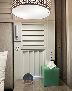
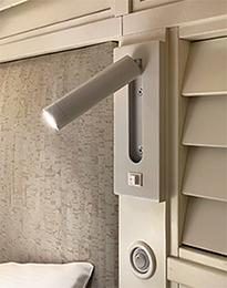
Finally, hotel reading lamps done right

Typical interior design of hotel rooms specifies nitestand lights that may look good in the showroom or in a rendering, but they are useless for reading in bed - a likely use of bedside lamps. The lamp slightly illuminates the back of the book.
Before drifting off to sleep, the user has to contort to reach the switch on the lamp stem or at the top of the lamp.
Below is from the Margaritaville hotel in Manhattan. The reading lamps are mounted in a better position, can be aimed at the reading material, and have easy-to-reach switches - located close to the bed and at eye height.
For convenient access, each side of the bed has 2 electric outlets, 1 USB outlet, a nitestand lamp, and a reading lamp.

![]()
Better place to mount row numbers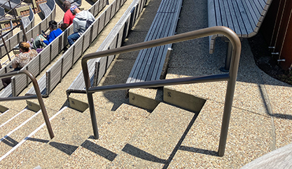
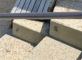
This is the new on the excellent Little Island park on the Hudson River. Above left: I challenge you to find where the row numbers are. Above right: the zoomed in and contrast-enhanced to show where the numbers are = low, on the concrete, and facing perpendicular to the viewer. Nobody else would’ve seen them. Then I noticed that the vertical post of each section of railing aligns with a row.
Better, below: Mount row numbers on the railing posts, facing the viewer, at seat back height. They’re easily visible while walking down the aisle and mounted so that one's hand can still slide along the handrail.

![]()
Colors can help clarify a message

The ramp signs in this parking garage use arrows and text to guide the driver/parker. The driver is accustomed to driving on the right, but the right ramp is Exit Only. The left ramp is the Entrance.
Better: make all the entry sign backgrounds green (allowed, preferred); exit signs red backgrounds (prohibited).
![]()
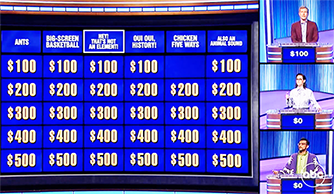

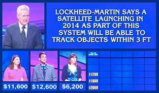
A better game show tv screen layout. We have become so accustomed to seeing web sites and app pages with multiple blocks of info that the linear images on game shows seem primitive. TV screens are wider now (more real estate to use for images) and our home screens are larger and in higher definition. Often, when watching, I wonder what the score is or the amounts of money a contestant has. My desire may not match what the director has chosen to put on the screen. Solution: arrange the Jeopardy (or Family Feud, Millionaire, Wheel of Fortune) blocks of info like a web site to allow the viewer to access info as needed or desired.

![]()
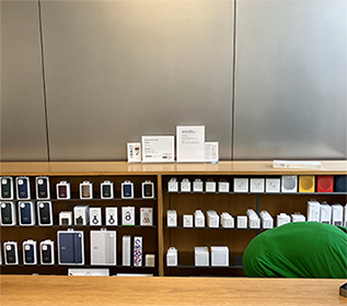
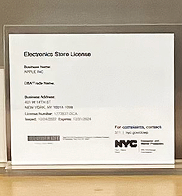
Electronic Stores in NYC are required to post the license issued by the city. Most are ugly standard license templates or the official notice. The Apple Store redesigned the license to reflect the Apple vibe - minimal purity and simplicity that better fits the interior of the Apple Store.
![]()

Standard ceramic toilets often waste space in areas where space is at a premium. The seat and bowl probably can’t be reduced very much in size, but the water tank in the back can be both taller and wider, making it more shallow and allowing the toilet to be mounted closer to the back wall.
![]()
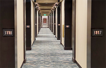
Below: A great idea for hotel hallways - mount the room numbers to face the user walking down the hall. The traditional placement, room number on the door, requires the guest to turn towards the inset door.
![]()

Text clarity reduced by background. Reads as '"'Coming in Not' - it is likely supposed to read 'Coming in Hot'.
![]()
Signs that are more welcoming and more positive
When someone posts a sign expressing some 'rule' to obey, they are seeing the problem from the inside out, from their point of view. More effective and respectful would be to empathize and see the issue from the user's point of view.
At the main entrance to the Liberal Arts Building on campus were these signs: No Smoking, and Don't Sit on the Steps. Several of each. There was no mention or effort to welcome the visitor. Just negatives, No and Don't.
Smoking (tobacco or vapes) was not allowed anywhere on campus, inside or outside of buildings. The No Smoking signs were not even necessary.
The Don't Sit on the Steps signs, again, were from the staff's point of view. They might have had to wend their way through the steps to get to the door. The signs would help with that. But, there was a better solution. Apparently, there was a problem with students seeking a place to rest before class. There no other seating spots nearby. So, the steps will do. That was a clear statement that students want to sit. They solved their problem and found a place. But the campus hasn't addressed the problem. There's clearly a need for seating near the doors to the building. These could have been benches flanking the door or landscaped seating areas. Adding benches would better solve the problem. Students would have a place to sit and they wouldn't have to block the stairs.
There could then be more positive, Welcome signs at the entry, No and Don't.

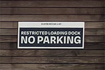
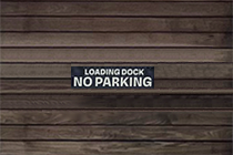
The signs above are on a wood fence at an art museum. They face the entrance from the parking garage. There is a circular drive for rideshare and those who wish to get their passenger closer to the door. The sign on the left works well: Clear message, good contrast, warm color, and easy-to-read font. The sign on the right, however, is too obnoxious. The audience for this sign is those trying to park in this driveway (the fence gates lead to the loading dock). The driver will be close to the sign on the fence - the sign needs to inform those drivers that this drive needs to remain clear for the loading dock. It doesn't need to stand out or yell at the driver. Better: smaller point size, no white outline, and smaller point size.
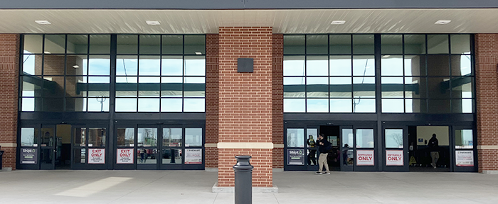
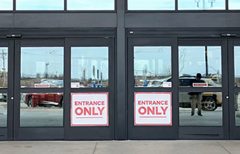
This is the entry to a large grocery store. The doors on the left are screaming Exit Only. The audience for these signs is those approaching the building who do not know where the entrance is. They're not looking for an exit. A better sign would be positive and welcoming, Welcome, Entrance (with an arrow pointing to the entry doors.)
The doors on the right are also yelling at us: all caps and bright red. The signs say Entrance Only. The word Only is useless, The user is deciding which door is the entry. The word Only adds nothing to that. Better: Entrance in green (nature, go). Just the word Entrance would be better, but adding copy beneath would be even better: Welcome to (Store). We're glad you're here.

![]()
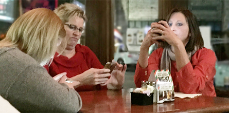
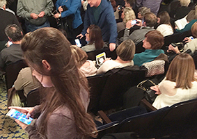
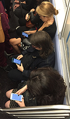
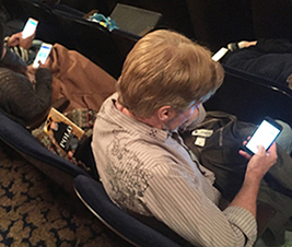
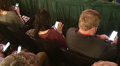
Today's family at dinner, with devices


A night out with the girls. And by girls, I mean devices. Intermission at the theater.
![]()
A chair option to fit Americans

![]()
Restoration of bungalow house


• Remove porch enclosure. Windows don't match, there is no stoop st the front door; front door looks inappropriate for the style and the neighborhood.
• Paint exposed wall blue to match the existing walls.
• Paint louvered vent blue. The existing vent is too large for the front elevation. Either replace it with a smaller one or just paint it the wall color so it is not so dominant.
• Paint porch ceiling sky blue, pioneer style and common among bungalow houses of the era.
• Replace door with an appropriate bungalow style.
• Install house numbers that are truer to 1920s style. Mount numbers from porch rail to overhead beam.
• Plant hedges to reduce porch wall mass and enhance the horizontal.
• Remove exposed light fixture or replace it with a period style fixture.
• Remove flagpole.

![]()
A better listing of events
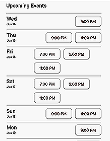
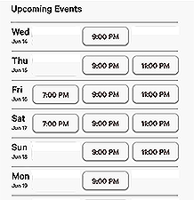
These events are at 3 different times - 7:00 9:00 and 11:00. The event offerings are different depending on the day. By aligning the event times, 3 shows can fit on one line, and the viewer can see at a glance winch days have an early show or a late show.
![]()
Residential off-street parking
I live in an older neighborhood with slightly narrow streets. To provide parking for guests, I built a parking pad that can hold two cars (plus a third in the driveway) to provide off-street parking. The pad is oriented to reflect the angles within the house. The concrete was dyed a slate green and pressed with a rock pattern to allow the larger paved area to better fit the environment. Some advantages:
• Easier to enter the street - driveway has more room for cars to change directions and drive out forwards.
• Safer to have cars off the street - less chance for side scratches, fender benders, and vandalism.
• More considerate: guests don't need to walk in street to access driver's seat.
• More paved room for basketball, other games, and yard sales.
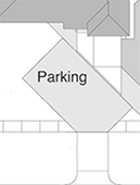
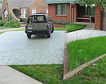

There was a time when off-street parking wasn't needed; there were fewer drivers within a household. Today there are often kids with cars plus a car for each parent. To avoid the used-car lot appearance of street parking, more architects and urban planners should design, include, and code off-street parking. Many homes on larger lots already provide off-street parking. The same principles and design elements should be applied to more modest lots.

![]()
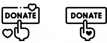
Simpler and more clear Donate button
![]()
More efficient Newsletter
A weekly email pdf newsletter sent to residents In a condominium.
Target audience
Professional busy people living in a luxury condo building.
Objectives
• Less scrolling.
• More professional, age appropriate, respectful, and considerate of reader.
• Easier to scan: bold headings, date/time callout.
• Clearer separation of current news from past news.
Scrolling distance comparison (shown sideways)

Above: Existing. Below: Proposed
Infographic changes in text copy
![]()
More consistent DART Map improvements
Henry Beck pioneered the stylized transit map for the London Underground. Most global transit systems have adopted the Beck or Modern Map style. The advantages are that the lines are easier to understand. One can route their journey quickly and easily. In the Beck version:
• Lines are color-coded.
• Lines are straightened.
• Map is void of surface detail. The rider doesn't need details - just boarding and destination stations.
The Dallas Area Rapid Transit, DART, introduced their route map in 1996, and adopted the Beck map style. (above left) When the map was updated, the new lines followed the city streets. (Above right)
The original map and the later map look like they were designed by two different teams. There is little consistency and continuity. The map shows two different systems of route representation; roadmap versus straight line diagram. Mixing the two will likely confuse the reader who is seeing the city map version may assume that they’re all accurate routes.
Above left lines seem to be designed by Team 1. Above right lines seem to be designed by Team 2, unaware of the work by Team 1.
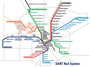

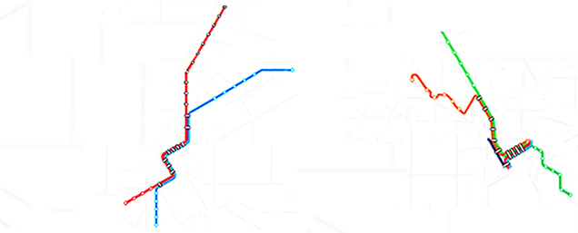
Improvements to the diagram above right
Straighter line diagrams:
Orange line towards Northwest
Green line towards Southeast
Blue line towards Northeast
A Train connector to North
• Improved spacing and clarity.
Shorter and more consistent station names;
North Carrollton/Frankford -> Carrollton
Downtown Rowlett -> Rowlett
DFW Airport Station -> DFW Airport
Baylor University Medical Center -> Baylor Medical
DART graphics use the straight line style:
Below left: DFW rail routes in 2024. Below right: Chicago Transit.

![]()
Some better brands More logos with rationale and sketches

![]()


![]()


![]()


![]()


Rationale, sketches, and more samples
![]()
Ads on Amazon boxes: Stroke of Genius
Amazon delivers approximately 1.6 million packages a day, or more than 66 thousand per hour, In 2020, Amazon delivered over 4 billion packages in the US. Many of these boxes are visible on porches, and millions of them are taken into homes. Packages are expected and are awaited with anticipation. Getting a package is a positive experience. By association, the advertiser presents their brand and message in a positive environment.
![]()
![]()
Find 2 major errors in the design/production of this poster
![]()


There are some minor ones, even some I agree they did the right thing by leaving it in. But the two big ones are clearly mistakes. (Corrected revisions shown on right.)
![]()
Misleading, completely inaccurate, article headline
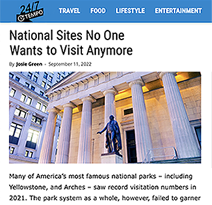
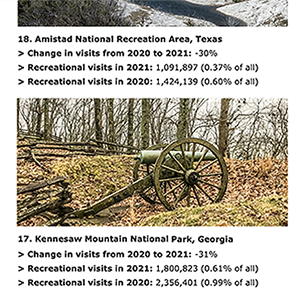
247 Tempo recently published this, National Sites No One Wants to Visit Anymore. The article lists National Sites with both their 2020 and 2021 attendance figures. Of course, due to Covid lockdowns and less travel, attendance figures dropped from '20 to '21. Despite that, 8 of the sites listed had over 1 million visits each in 2021, proving No one wants to visit to be wrong. The incorrect headline does disservice to those park sites, the tourism industry in multiple states, and the integrity of journalism. A more accurate article heading would be something like The Impact of Covid on Visits to National Sites.
I sent an email to 247 Tempo stating the above. I have yet to hear back nor do I expect to. They know what they're doing. This article was just click-bait to lure readers in to an advertising platform.
![]()
Better arrangements of columns of info in the flush center format
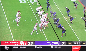

When the viewer glances at the screen, they want to know the score. The one above right is easier and quicker to comprehend that the one above left. Below: notice how much easier it is to find the score of 29 23.
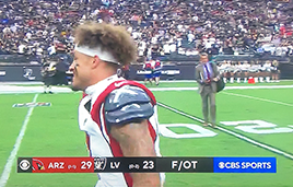

Above: The LV mark is closer to the Arizona score than it is to its own.
There's no need to repeat the CBS logo on the left since it also on the right.
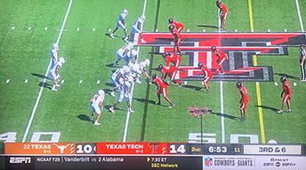
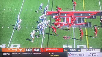


Below: By putting the Down Yardage beneath the team with the ball, it is quickly clear who has the ball and the football marker next to the score is unnecessary.

![]()

![]()
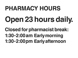
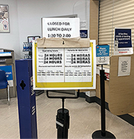
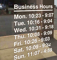
Hey, Walgreen's, pick one - they both can't be true:
Open 24 Hours
Closed 1:30a-2:00a and 1:30p-2:00p
Open 23 hours daily is accurate and would be even easier to remember.
Lesson: Design should be honest and trustworthy.
Design tip: If the hours are exactly the same every day of the week, you don't need to break it down to M-F, Sa, Su.
![]()
How to make the Olympic Games better.
Objectives
• Provide outlets for amateur athletes to achieve recognition and championships.
• Stage games that are more efficient, leaner, less expensive to produce, more exciting.
• Schedule fewer days, streamline Opening & Closing Ceremonies. to be shorter and less expensive.
• Build/use fewer venues; group sports to same venues or outdoor areas.
• Remove sports that have an existing system of championships or allow professionals.
Remove these sports:
• Baseball (World Series)
• Basketball (NBA Championship)
• Boxing (Championship bouts)
• Football/soccer (World Cup)
• Golf (Masters, USOpen, British Open)
• Tennis (US/French Opens, Wimbledon)
Add these:
• Darts
• Billiards: game
• Billiards: trick shots
![]()

The upholstery pattern conveys these seats are reserved for Special Needs.
![]()
An intelligent respectful way to deal with sensitive statues and plaques
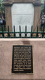
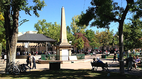
Instead of removing statues and plaques of Confederate soldiers or other somewhat-inaccurate dominant people, the city of Santa Fe has added this plaque to the obelisk in the center of the Plaza. It does a good job of educating the reader with some context of the period in question. The new plaque reads, "Monument texts reflect the character of the times in which they are written and the temper of those who wrote them. This monument was dedicated in 1868 near the close of a period of intense strife which pitted northerner against southerner, Indian against white, Indian against Indian. Thus, we see on this monument, as in other records, the use of such terms as 'savage' and 'rebel'. Attitudes change and prejudices hopefully dissolve."
![]()
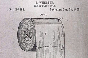
The original patent from 1891 shows the correct rolling direction, in case you ever doubted.
![]()

![]()
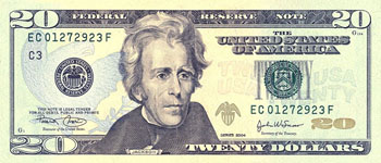
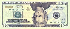
A better design for the US Twenty dollar bill
By some person whose name I don't remember, sorry.
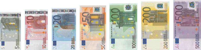
The US mint has recently redesigned denominations of currency to make it harder to counterfeit. But, the USA is now the only developed nation that does not color code the different denominations. Examples: bills from Bolivia (shown to the left) and Euros (above) that are color-coded and different sizes. The new Euro bills not only use color-coding, but the bills are even different sizes. Cashiers can see at a glance which bill was handed to them by the customer. There will be less confusion by customers and less mistakes of handing someone the wrong bill. Now, about 'facing money' - this is the task that cashiers in retail and fast food do at the end of their shifts - they must turn each bill so it is right side up and so all bills are facing the same direction.
![]()
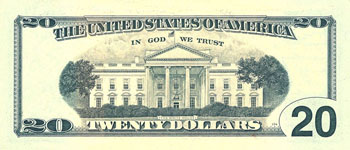
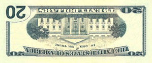
Current US Twenty dollar bill, front and back
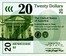
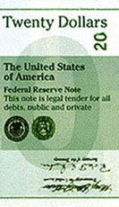
The proposed bill
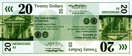
The new bill is identical on the front and back - in fact, there is no longer a front and back - just two sides to the bill. It is also the same layout if the bill is rotated - so there is no longer a top or a bottom. The combination of a serif typeface and a sans serif typeface enhances legibility. A engraving of a government building (the White House in this case) maintains tradition and all the required numbers are signature are included.
Advantages
The typography and layout enhances readability and clarity.
No more 'facing money'.
Folded in half one can still read 'Twenty' either in numbers or in text.
Folded in quarters one can still read 'Twenty' no matter which section is exposed.
Each denomination is a different color.
![]()

![]()
Proposed bill folded in half showing 'Twenty' and folded in quarters showing 'Twenty'


Variations for 'facing money' with the current Twenty
Variations for 'facing money' with the proposed Twenty (Each face is the same. It doesn't
matter how one orients the bill - it will always face the same way as the ones next to it in a stack.)
Whoever redesigned the US currency to thwart counterfeiters probably did just what the government asked them to do; just what the client wanted them to do. The above proposed bill can accomplish that but this designer went beyond the given problem. The new bill is much better - it addresses and solves several problems. No top or bottom, no front or back, no more facing money, easy to see the 20 no matter how the bill is folded - in half or in any quarter, easy to read, and color-coded to minimize transaction errors.
There's always a better way.
![]()
Value and cost
Value as a noun
1. the real-worth.
Ex. They bought the house for less than its value.
2. high worth; excellence, usefulness, or importance.
Ex. the value of education, the value of milk as a food.
3. an estimated worth.
Ex. He placed a value on his furniture.
Value as a verb
1. to rate at a certain value or price; estimate the worth of; appraise.
Ex. The land is valued at $5,000.
2. to consider with respect to worth, excellence, usefulness, or importance.
Value is what one gets minus what one gives
We often make decisions based on cost, the sticker tag price, how much money we will have to part with. But these decisions shouldn't be based on money, but rather on what we will receive in exchange for spending money. That is, the value of the transaction. Examples:
• A gym membership may have a high cost, but its not expensive - it has a high value. The return on money invested is much greater than the loss of that income - better health, longer life, more productive days, more energy, more self-confidence, etc.
• Restraunt: I order the special, friend orders the usual. Friend tells me, "The Special is often more expensive." I choose something different, to try new items and tastes. The extra cost is worth it for the exchange of trying something new.
• At a Broadway show, some people buy the soundtrack on CD. Those CDs usually sell for $20, even though one can buy the CD at a store or download it on iTunes for about $12. But buying it at the theater has these extra benefits - one gets to listen to the music once at home and there is the emotional connection of having bought it at the theater where the memories were made.
![]()
A very simple way to make this procedure easier
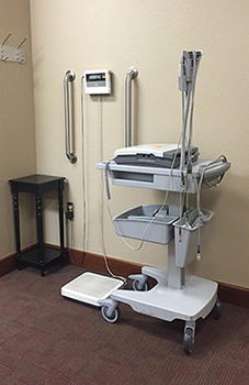

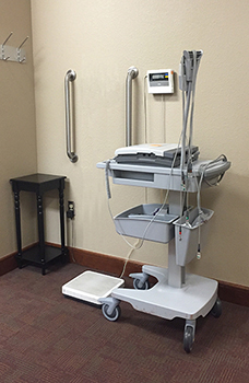
This is the scale at the Heart Hospital check-in area. Notice that the digital readout is mounted directly above the scale. That means when the patient steps on the scale his/her body is right in front of the readout. Each time I am there, the nurse makes awkward contortions around me to read my weight. Some even set their clipboard on top of that machine on the right. Also, each time, I mention to the nurse how much easier it would be for everyone if the readout was moved over so that both the patient and nurse could easily see it (proposal above right). And, each time, I get lame excuses, "That's the way they built it." "That's not my job." (just nervous chuckles). Two problems here:
1. The mounting of the readout with no consideration for the users (lack of empathy).
2. The I-don't-give-a-fuck attitude of the nurses.
![]()
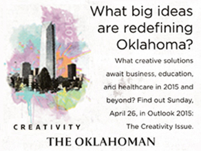
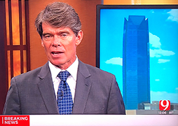
Oklahoma City looks like a single skyscraper town
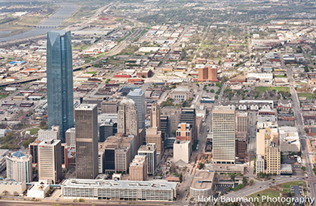
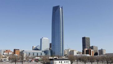
October of 2012, Devon Energy opened their new headquarters building overlooking the superbly designed and executed Myriad Gardens. While the Devon Tower seems to claim artificial superiority - it does not respect it's neighbors. There are some nice views from the top of the tower and nice views of the tower from the Gardens, but superficial pride and nice views are not quite enough to justify the ego-driven massiveness of the new tower. Many people hoped that new buildings would help the new tower stand out less. But, new buildings announced and proposed for downtown OKC will all be low/mid-rise buildings. As those fill in some of the gaps in the skyline, the Devon Tower will look even more out of place.
Lesson: Part of successful and thoughtful design includes respecting the environment - whether it is an ad, a poster, or a building. No design solution lives on it's own - each is a part of a larger community.
From Boom Town: The Fantastical Saga of Oklahoma City by Sam Anderson:
"You can navigate by the skyscraper - skyscraper, singular, because there is, by modern standards, only the one, and it is so completely out of scale to the rest of the city that you can see it from everywhere else. It is nearly twice as tall as any other structure for one hundred miles in every direction. It dominates downtown, glittering like an open blade. This is the Devon Tower, headquarters of one of OKC's biggest energy companies. The skyscraper was meant to make the city seem big, but mostly it makes everything around it look small: thick, stocky, ancient, heavy, extremely midwestern."
"Everywhere we drove, Orton and I could see the Devon Tower - the disproportionately huge skyscraper that dominated the horizon. “It's really awkward," he said. "It looks too tall, standing there by itself. They'd have to build at least one more that big before it would start to look normal."
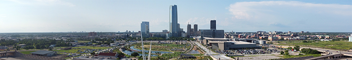
Better options
Below left: a rendering of a lower tower, as if the building had respected its environment. Below right: a rendering of two towers on the site - to provide similar (or more) square footage as the built tower, but in a way that is more appropriate and respectful of downtown OKC.

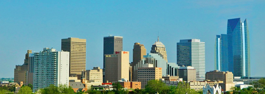
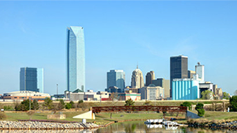
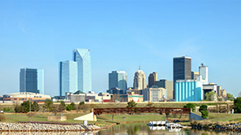
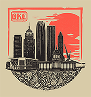
Below: How some have addressed the awkwardness. The Memorial Marathon placed a seal to balance the tower. The Oklahoman ad used splashes of color. The bottom 2 simply shrunk the building and tweaked to show a more accurate scale of the buildings.


![]()
More, maybe all, drinking fountains should have bottle fillers
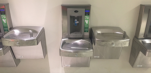
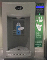


Above is the bottle filler fountain at O'Hare Airport. More people are carrying empty bottles through TSA and then filling them before boarding. Nice thoughtful move by the airport for the traveler's convenience. With the proliferations of water bottles, disposable and refillable, at the gym, at work and school, in cars, and while hiking; there should be a better way to refill them rather than having to hold them under the low spigot used for sipping. Better: two separate spigots so that 2 people can use the fountain at the same time, one drinking and one filling.
Above right: an outdoor fountain seen in Colorado with 3 spigots - filling, sipping, and dog lapping:
![]()
Of course, restraunts should charge for water


We pay nothing for a cup of water but about 2 bucks for soda and the only difference is a small bit of flavoring.
Why should we expect others to subsidize our choice of drink? Of course, we should be charged for water. More info
(And that is how I spell restraunt.)
![]()
How to make a video look worse, and better
Often, I see videos that don't fill the allotted space so some poster adds some side bands, often just repeated, blurred, enlarged, or distorted versions of the central image. But, those options just make the total image more complex and cluttered and compete with the video content for attention. Maybe it would be better to add solid grey bands, or a color that respects the video background, to fill the space.
![]()
![]()

![]()
![]()
![]()
Valuable lesson from the late 1970s

For fun, when I was in my 20s, I enrolled in Intro to Interior Design at EastField College in Dallas. The matronly instructor who spoke with an air of authority and respect discussed priorities. A sofa or chair with a bright busy print might look great in the showroom, in a catalog, or even in the living room - but imagine what will happen when a guest with a busy print, striped, or colorful dress sits on that sofa. Not so great anymore.
Take a look at Andrew Lloyd Webber at some Red Carpet opening event. Poor choice for a backdrop (or a shirt):
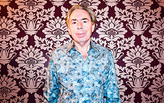
Her lesson: the people in the room are the most important design elements in a space. Design around them, not despite of them.
That has stuck with me for decades - the users are the most important design element, not color, shape, placement, typography; but, the people that will benefit from the piece.
![]()
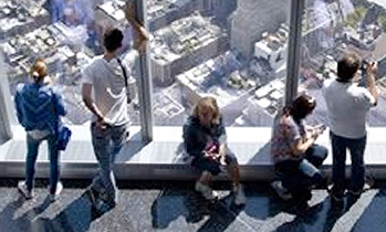
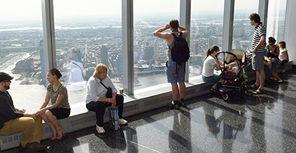
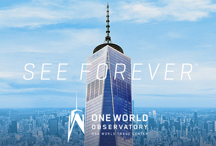
How to make the One World Observatory a bit better
There is a new tourist attraction in New York City - the observation deck at the top of One World Trade Center, the 2nd tallest building in America (Willis/Sears Tower in Chicago is #1, unless you count the antenna at WTC, then WTC is #1). Overall, the experience was quite well done, but here are some ways to make the One World Observatory even better:
Provide seating
Many people have been standing for at least an hour before they get up to the Observatory, then they find that there are no seats. Total time at OWO is well over 2 hours - standing the entire time. It seems somewhat inconsiderate and disrespectful (especially of senior citizens) to require them to stand for hours.
There are plenty of places to place some seats (like along the curve of the SkyPortal platform) that won't congest the viewing areas. As it is now, people sit on the steps to the SkyPortal (maybe a fire hazard?) or on the ventilation ducts along the windows which block prime viewing areas.


Create a bypass line at the Photo Booth
At the photo taking area, I and several others asked for no picture to be taken. The very nice young woman told us to just go straight through the crowd. I thought how awkward - I have to wait or walk in front of the photographer to get by. Once through, I noticed the aisle towards the windows that could easily have been the bypass route. I realize they want to sell photos and encourage guests to have their photo taken, but it would have been so easy for her to tell us to step to the left of the white column and move beyond the photo area. Less congestion, less confusion, less discomfort, and less awkward. Such a simple effective solution. Somebody just wasn't thinking.
Reorganize the dining area
So much amiss here: too few chairs, an awkward pay station (I saw two people just go to the seating area with their 'free' coffees and cookies), no trash bin by the coffee fixings, and no trash can in the seating area - there were several dirty tables and some people wandered around with their trash looking for a place to put it. They gave up and set it on a table.
Minimize the line confusion on the street level plaza
My goodness, where do we go? We had tickets, but the line in front seemed like the right one. Nope, that's to buy tickets. So, we got out of that line and had to ask an attendant where to go. There should be better signage or announcements to guide the visitor to the correct line.
Remove the scene in the film where we fly into the tower
During the elevator trip back down, the animation takes us outside the building and then straight into it (just like you're on a plane flying into the building). In our elevator, there was an audible gasp. Others knew why but nobody said anything. Very uncomfortable.
Commission a new design for the branding
The awkward W that doesn't quite fit the supposed inspiration of the top of the building. And why emphasize the W? In the type treatment, the word One gets as much prominence as the World. And, absolutely no one will refer to the observatory as W or The W, or even the OW, or OWO. More likely, The Observatory, The Observatory at the WTC, the WTC Observatory, The WTC, or The World Trade Center.
I wrote the OWO with these suggestions and got back an automated reply that someone would contact me within 24 hours. That was on July 6, 2015 (and re-sent on July 14). I am still waiting for a reply - even just a courtesy reply ("Thanks for visiting and writing"). Still, nothing. That lack of response might help explain why the customer experience is not so great. The views, however, are outstanding.
![]()
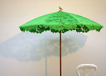
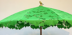
Left: Clever design for New Years. Its a mirror ambigram - the 2 flops down to become the 5. It was designed by Frank Nichols, a New York designer, as his New Year's card for 2005.
Right: This is so cool - an umbrella that lets in some light and forms a dappled shadow - like the canopy of light that filters down to the forest floor. It even comes with the bird on top. It is from a design collaborative in Holland called Droog (rhymes with rogue). There is an exhibit at the Museum of Arts & Design in New York city of many of their products. Fantastic stuff - functional and imaginative.
![]()
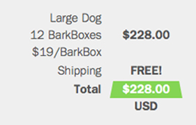
It is about integrity and trust
This was a new subscription service for dog treats and toys. It seemed like a good idea, so I thought I'd sign up for $18/month. But, notice the smaller print in the Summary: $18.25/month. They snuck in another quarter:

![]()
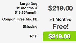
A quarter per month? That's not much. What's the big deal?
Here's the explanation in our edited September 2014 email exchange:
Jim Watson wrote: "I like the BarkBox idea, but is it $18 or $18.25 a month?"
Samantha replied: "It's $18.25! We round each month on the site!"
Jim: "Friendly suggestion: don't round off figures when you advertise a price on a website. That's deceitful advertising - promoting a lower price to entice someone to join and then giving the higher price. And, it's not about the 25 cents, it is about integrity and trust and not respecting your customer enough to give the correct price. Now I wonder what else about BarkBox is inaccurate."
Samantha: "Please know it is not our intent to be deceitful. The 12 month dollar amount was rounded as a design choice."
Jim: "Design choice? They changed the price of your product for aesthetics? Imagine if a restaurant stated a different price in the menu because it fit the space better or was fewer numbers or just looked better. Or if Walmart advertised a lower price to get you in the store and then explained the higher price with, "It was a design choice."
Your designers should know that the first objective of good design is to be accurate and honest."
As of early November 2014, the come-on price now matches the actual price. No more 'Design choice' excuse.

![]()
![]()
At Nathan's Original hot dog stand at Coney Island, I saw these two different ways to get ketchup and mustard. The one with the color-coded support arms communicates more clearly. Neat idea. And the hot dog was excellent.
![]()
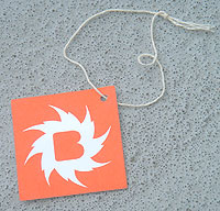
When you pay the suggested admission of $8 at the Brooklyn Museum, you get this tag on a string to wear to show the guards that you paid. This is common practice in museums - to provide something to wear on your person. Most museums use metal buttons with fold-over tabs or an adhesive-backed sticker to put on your clothes. This was the first time I got one with a tie string, presumably to wrap around a button. I and my friend were each wearing tee-shirts. Where do you put it on a tee-shirt? I asked the ticket seller behind the counter. She said some kids wear it around their wrist. Not going to work for me - the loop was not big enough. She also mentioned she had heard others question this, also. This is just bad design - to produce a wearable tag that has to be tied or wrapped around something. Is this museum not aware of how many people wear tee-shirts. now, especially in the summer?
Note on museum admissions - I have long felt that teachers should get into any museum for free. Reasons: 1. Teachers don't get paid enough and this is one way for corporations to supplement pay and benefits. 2. Teachers are great salespeople for museums. They schedule field trips, encourage students to visit museums, share info from the exhibits in class. Some museum visits are necessary study and research for many teachers.
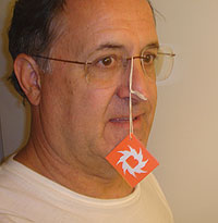
Above right: here's how I wore the tag from the Brooklyn Museum - I slid my glasses frame through the string loop. The ticket seller laughed and the guards got a kick out of it. A few minutes later in a crowded elevator, a whole bunch of school-age kids were giggling and laughing at the silly old man with the tag on his face. I continued with a serious conversation, swinging the tag all over my mouth and face. That just made them laugh harder. Stupid, unresponsive design that turned into something fun (and silly). After I got tired of the annoying string in front of my face, I removed the tag and put it in my pocket. If I had been stopped by a guard I would have shown him/her the tag and commented that I couldn't find a place to tie it to my tee-shirt. Of course, the guard wouldn't really care, but maybe someday, someone will address this design problem and make it better - for the museumgoer and the museum.
![]()
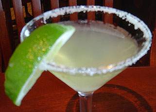
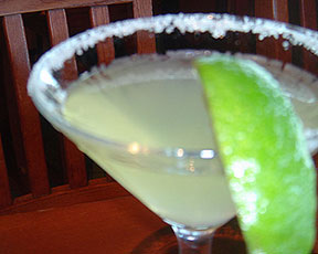
You know how, when you get a margarita, sometimes there is too much salt to sip? Sean has a great solution - he just slides the lime around a bit and it cleans the glass. When you're out drinking margaritas (or in drinking margaritas) you don't want any more hassles than necessary; you want life to be easy, hence, the lime salt remover.
![]()
Every now and then, I'll hear a design student or novice designer express disdain or opposition to a typeface (like Comic Sans, Papyrus, Fajita, etc.) I've even known teachers to hate a certain color. A shame. A designer should not hate any color (or typeface, or shape). There are appropriate uses for any element. There is a design problem that needs the typeface Comic Sans because it works well in that situation. Designers decide when any specific element is appropriate - that's their job. Hatred and extreme bias cloud one's objectivity to make valid, appropriate, and rational design decisions.
![]()
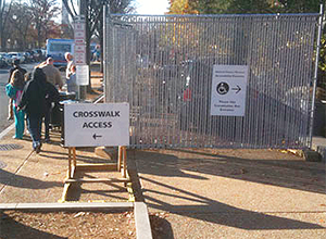

I'm walking along the mall in Washington DC and I see this construction fence and the temporary sign. Coincidentally, right when I noticed how the temporary sign blocked the sidewalk, a family approached with a child in a wheelchair. The chair couldn't get between the fence and the base of the sign. I dragged the sign over to the right, where it should have been. Now there are visual cues apparent in the sidewalk that guide the pedestrian.
![]()
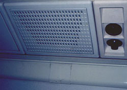
Vandalism on an airplane: I'm sitting on the plane with Sean and his wife when I look up and notice that the panel overhead has vent holes in it - but, the vent holes are not arranged symmetrically. See how the number of holes in each row changes by two. Except for the top two rows. Weird. To fix this, I took out a pen and filled in the two depressions that should be holes (foto on the right). There. Better.
![]()

![]()
Another renewal notice just came in the mail. Some magazines send these out every few months. It's not that the subscription is about to expire, its just a thinly veiled attempt to get me to send money. Sometimes its frustrating to figure out just when the subscription expires. Some labels give the expiration date, most do not. The one below is from Adbusters magazine, a very progressive periodical (Adbusters is responsible for initiating and encouraging the Occupy movements). Note that the label is very clear: it states the number of issues remaining and info on how to renew or subscribe.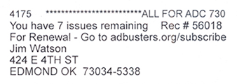
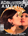
Above right: At the newsstand, it can be a struggle to find the cover price of the magazine. Not so with Adbusters. Larger and positioned above the UPC code.
![]()

The OCCC Arts Festival is held each Labor Day. One of the entertainment acts was a Mexican Folkloric Dance group. In high school, I was a dancer in such a group that my mother had created to perform around the Dallas area. So, I thought it would be fun to see those dances again. And it was. But, it was very hot and the view from the shady seating areas were blocked by this banner listing the festival's sponsors. Someone decided to mount the sign there without much thought as to the sightlines from the audience.
To make it slightly more frustrating was the observation that the blank area between the columns for the two stages would have been a perfect spot to mount the sign (as rendered above). Then, the sponsor names would be at eye level and right in front of the audience. And, most importantly, it wouldn't be blocking views for most of the festival-goers.
![]()
Walked by this window display at the mall. I couldn't decipher the mark. I stopped and pondered. People stared at me - What's that guy doing? I should have asked some of them if they could read the letters, but I was too enrapt by the enigma to be aware of what was going on around me.

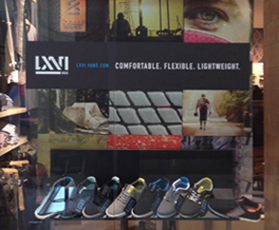
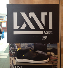
I had to googalit to discover that the mark is the Roman numerals for 66: LXVI.
Lesson: Requiring the reader to decipher a mark can be good - it requires memorable participation - but be careful: if the correct solution is too obscure, many people will give up and move on or turn the page.
Tip: Seek clever interplay of letters but view the piece as the reader would, to maintain readability.
![]()


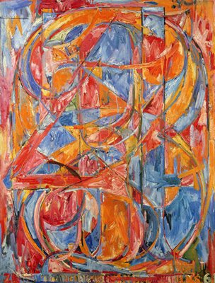
"The eye fools the mind by picking out the silhouette of one number then instantly recognizing another, sometimes in quick succession"
In 1967, Jasper Johns produced this lithograph entitled 0 Through 9, which was originally an oil painting created in 1961. It consists of the 10 numbers meticulously overlaid one upon the other within a rectangular area, creating a kaleidoscope of figures that battle each other for the viewer's attention. All color in the original painting was removed except for the blacks and whites, rendering the details of the superimposed numbers much more visible and intense. Johns re-created this lithograph numerous times in response to the ever changing digital age. The symbolism, however, never changed. The artist meant for this iconic picture to represent his personal view of a world whose system has been built on the interpretation of different signs. There are versions of John's piece at the Museum of Modern Art in Manhattan, Tate Gallery in London, and at ULAE on Long Island, NY
![]()
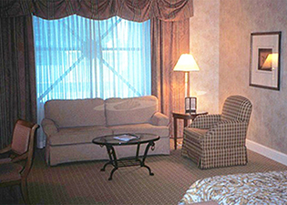
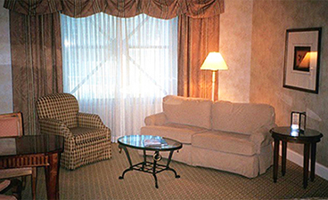

Left pix: the room arrangement as I found it upon entering. Right pix: the room after I rearranged it.
Two issues that were improved upon: The sofa blocks access to the window view of the Vegas Strip. Better: Rotate the sofa and chair 45 degrees which opens up access to the window. While working at the table - one looks at the wall. Better: Rotate it 90 degrees so that one can look towards the window and the view.
![]()
I was in the mall and texting as I walked. I had tried that app that takes a picture of what is beyond the phone and shows it in the background of the text window, but found that it was too distracting. As I approached the area shown above, I almost ran into that column. Please note that I no longer text while driving. When driving, 'columns' are often heavy machines that are coming at me at a fast rate of speed. Anyway, I noticed the ramp and realized that it provided a safer and more convenient texting option than the stairs - I could continue texting and walk up the ramp without stopping; the stairs require me to slow down and navigate the steps, thereby interrupting the texting task. This was no longer a handicap ramp, it was a texting ramp.
![]()
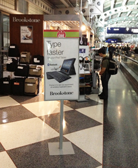
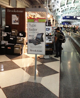
I realized a while back that I was a 'noticer'. I notice things. Example: At O'Hare airport in Chicago, I couldn't help but spot how the base of the sign outside the Brookstone kiosk did not respect the patterns in the terrazzo floor. So, of course, I moved the sign. Didn't bother to check with anybody, even though there were several people nearby watching. In its new position, it creates an arrangement that is more orderly, more connected to its environment, and more respectful of the viewer and our innate desire for order.
Lessons
1. An orderly environment is often preferable to one of chaos.
2. Seemingly disparate elements can respect each other, often in subtle ways.
3. If you act like you know what you're doing, you can get by with almost anything.
4. It's often easier to ask forgiveness than to seek permission.
Although I didn't need to do either in this case. The Brookstone employee did not care about me or what unusual stuff I was doing to their sign.
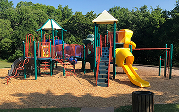

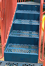
I noticed this upper section of the staircase had been installed upside down. The top and bottom risers were the wrong dimensions - causing a tripping hazard. The fix was simple - drop that section, flip it over, raise it into place and reattach the 4 bolts. I wrote the Parks Department with pix and rationale. The staircase was corrected the next day.
![]()
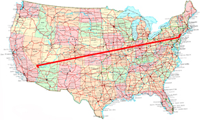
Let me see if I have this right
I can write a 3-page letter, and put it on my front door.
That same day, someone authorized by the government will stop at my house and pick up that letter.
The letter will then be transported anywhere in the country.
It will then be hand-delivered to the front door of the person I wrote the letter to.
This cross-country trip will take 2-3 days.
It will cost me about 50 cents - 2 quarters!
And some people bitch about the price of stamps.
![]()
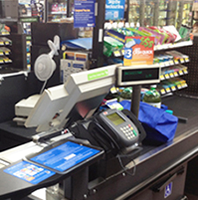
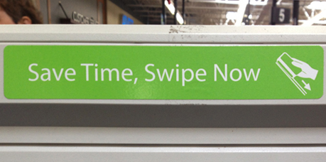
Walmart, which often puts much thought into improving the shopping experience, has these stickers posted on the machines to educate the customer. Nice job.
You have likely stood in line behind someone who was checking out and they stood there until all the groceries were rung up and bagged and the cashier gave the total due. That customer then began rummaging through their purse for a checkbook, cash, or credit card. Hopefully, you have also stood behind someone who, while the cashier was scanning the items, got their credit card out and swiped it. When the total showed up, they just signed the pad and got their receipt.
![]()

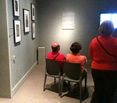

For an exhibit at the Metropolitan Museum of Art, this gallery/room had one entrance (on the left in the fotos) and videos playing on the other three walls. There were also some mounted displays on the wall to the left. So, the guy in the red shirt grabs a chair and moves it to where he and his wife (just guessing here, it could be his mistress) can sit together with plenty of room. But this selfish bastard doesn't consider how inconvenient his chair location makes it for other museumgoers to see the mounted work.
Lesson: Please resolve to be more aware of your environment and more considerate than this guy. We all thank you.
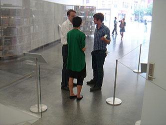
I had just finished a tour of the Tenement Museum and walked a few blocks to the New Museum in the Lower East Side for coffee and snax (and to sit down and rest). I noticed these three people standing and talking. But they were right where the passage of traffic narrowed between the glass railing of a staircase, a sign stanchion, and a set of ropes. The ropes signified the secure entry to the museum elevators and staircase. In the lower left, you can just barely see the stairs that lead down to the restrooms and more galleries. The museum shop and bookstore is in the left background. I shot the fotos from the museum cafe. So, this passageway sees quite a bit of traffic connecting those elements of the museum. The three people may have even been employees of the museum, although they were apparently oblivious to their surroundings. The other visitors have to squeeze by them. I've also seen people stop and talk or wait at the top of stairs and escalators, or at the entrance to a subway station. Sometimes, I want to tell them "There just has to be a better place to stand." But I don't - I guess I get too disgusted at the inconsiderate, self-centered members of our species.
Granted, a major contributor to the problem in this case is the poor architectural and interior design of the traffic flow within this public space. This is a major artery in the New Museum and, clearly, not enough room was allocated for the simultaneous passage of several people.
Lessons
1. Design spaces to handle traffic flow more smoothly and conveniently.
2. Please think about your surroundings when you make decisions on where to stand and chat. We are often so focused on our own needs that we forget that we are just one part of an environment of objects and other people.
![]()

Please don't cram things into the corner. Recently, I was in a yogurt place to satisfy my weekly fix. Before filling my cup with salted caramel frozen yogurt, granola, and dark cocoa-coated almonds, I went to use the restroom. Inside, I noticed this stand with a vase of flowers shoved into the corner. I call this type of furniture arrangement the Centrifugal Force Method: Put everything in a room and spin (figuratively) the room so fast that all the stuff is flung tight against the perimeter walls. There, all arranged.
So, I pulled the stand away from the walls. Notice how much better it looks. The arrangement is freer - with room to 'grow', it fills the space of the room a bit better, and the lighting highlights it more dramatically and minimizes the shadows in the corner.
If you're wondering about the flowers and the color of the walls in the men's room - I can explain: I was in the Ladies Room. Purely by accident. On my next visit, I checked the men's room (above right) to see if it had a similar corner arrangement.
Lesson: Avoid the Centrifugal Force Method of arranging furniture. Float some pieces away from the wall.
![]()
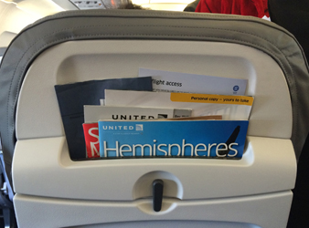

So much crap in seatback pockets: 6 pieces of literature. I had to rearrange and neaten them up. I put 3 of the technical pieces inside the 4th, a single fold piece that served as a folder; magazine and catalog in front.
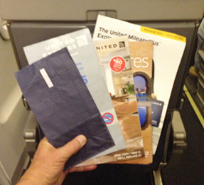
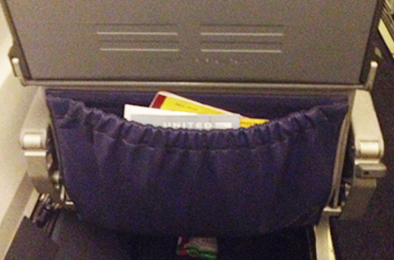
In that library of literature, one of the items is a bag "to collect and contain vomit in the event of motion sickness." If you have flown more than twice, this has probly happened to you: you pull out the inflight magazine or the SkyMall catalog - when you shove it back into the seatback pocket, it snags on something, it doesn't just smoothly go back to it's home. Often, that is the barf bag - a typical paper bag with a flat bottom and lined with a thin veneer of plastic to retain liquids. That flap at the bottom of the barf bag is what catches other items slid into the pocket.

There has to be a better way. And there is. The airline could simply specify a flapless bag with a bottom like those below. These bags are plastic (waterproof), have a secure seal, and have a flat bottom when opened. And the bottom crease folds inside the bag, with no extending flaps that can cause snags.
![]()
Error in exhibit installation
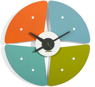
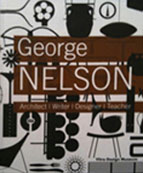
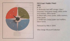
This is Leaf/Paddle/Petal, one of George Nelson's innovative 1950s-era clocks. He designed clocks so that the hour markings would be oriented in a familiar orientation: the 12 and 6 formed a vertical line and the 3 and 9 formed a horizontal line, as shown in the catalog entry above.
When I visited the Nelson exhibit at the OKC Museum of Art, I noticed immediately that some of the clocks were mounted incorrectly (photo below). Leaf/Paddle/Petal was the most obvious error.

To address the error, I asked a curator at the museum and was abruptly told that I had to contact the exhibit owner, the Vitra Design Museum in Germany; the OKC Museum of Art could do nothing about the mistake. So, I contacted Vitra in Germany and received a response (copied to the museum) that the clocks should have been mounted as shown in the catalog. Great museums pay better attention to detail when mounting shows.
Lesson: The museum, as the repository and archive of art and design for central Oklahoma, has an obligation to accurately portray designers' intents. The general public, scholars, researchers, and art historians need to be able to trust that the institution will exhibit artifacts correctly.
![]()
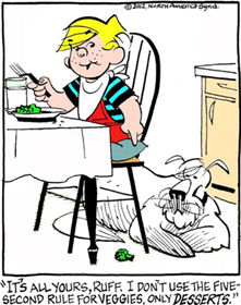
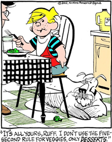
Three versions of a single-panel cartoon of Dennis the Menace.
Middle: Added elements: floor tiles, bottle on the counter, and Dennis' dad's head and foot peeking in.
Right: Added: a patterned tablecloth.
Notice: The busy tablecloth, floor tiles, bottle, and Dennis' dad distract from the piece of broccoli on the floor and the action of Dennis pointing to it. Dennis is talking to the dog.
Compare the 3 panels - the far left one more clearly communicates the gag.
Unfortunately, the panel on the far right is the way the cartoon was originally published.
Lesson: All elements in a piece (any piece, not just cartoons) should emphasize, or, at least, not distract from, the element that provides the primary focus.
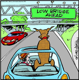

Caption: "Better duck!"
Do the sign support truss and the overhead lights get in the way of the message that the bridge ahead is low and may hurt Marmaduke's head?
Is this cartoon funny?
![]()
How something is viewed is always a matter of perspective.

![]()

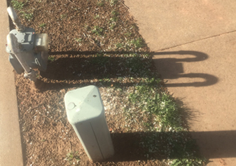
Took a walk to Starbucks for their new drink - Flat White. Saw this painted sign on the parking lot concrete. Why the unusual B? A few feet away, was this shadow of gas meter pipes.
![]()
Dining inside a billboard
Humans have always enjoyed looking outside while dining, probly stemming from our tribal ancestors who had to keep a sharp eye lookout for marauding tribes who wanted to steal their food. That threat is long gone, but the desire to have a view from the table remains.
So many restraunts post promotions in their windows that I feel like I'm eating inside of a billboard.
They see the blank glass space as a medium to advertise their restaurant and products. I see the glass as a portal to look out onto the passing world - traffic, sunlight, and trees. They, however, are winning. Dining areas are often compromised by the lack of open views.

Some solutions
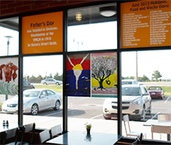
1. Remove all window billboard displays.
2. Limit window posters to just one or two window panes.
3. Mount the ads only at the very top of the windows. This would open up the vista for the diner and still allow the ads to be visible from the street and parking lot. Of course, no billboards at all would be better, but this could be a fair compromise.
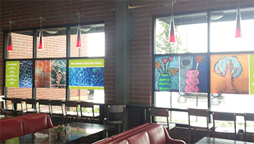
This grocery store has an extensive deli and hot and cold cafeteria. The seating area is bound on two sides by large windows. But, the marketing manager posted children's artwork directly in the line of sight, preventing most people from looking outside while they dine. An Assistant Manager said the images used to be mounted in the top row of windows (much better) but that it was harder to maneuver the ladder so they moved them down. This is one great example of putting the needs of the employee ahead of the needs of the customer.
Above right: A few weeks later, however, the posters were in a different arrangement, allowing better views out the windows. Maybe he really was listening. Months later, I went back, and, wow - all the posters were up at the very top - where they should be - allowing full views out the windows.
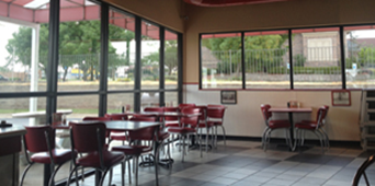

The Freddy's restaurant has full walls of windows and no billboard ads on any of them - just unobstructed views outside.
![]()
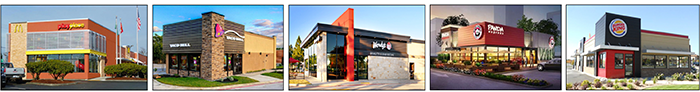
New look for QSR (fast food) restraunts
A more homogenous style of building design, characterized by:
Horizontal rows of slats, often wood.
Intersecting slabs of masses.
Eave overhangs.
Flat roofs, no mansards, gables, or domes.
Strong horizontals and verticals, fewer curves.
Spelling of the word restraunt.
![]()
At the entrance to the parking lot at the Estonian State Opera. Can you imagine the music in the driver's head as the gates open and close? An innovative mind saw a possibility to transform a standard gate into something festive, appropriate, and animated. Very cool.
![]()

Nice detail of merging the old with the new. Built in 1818, the 3-story Federal-style building at the corner of Spring and Wooster streets, is likely the oldest building in Soho. Crocs (yes, those shoes) renovated the building and replaced a garage in the adjoining Wooster Street plot with a contemporary glass-faced structure.
![]()
Wisdom from Milton Glaser
![]()
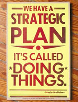
When i was Chair of the Department of Design, one of the tasks i enjoyed the least was having to write Strategic Plans (redundant words - a strategy and a plan are the same thing). We spent a disproportionate amount of time preparing reports for an administration that didn't know nor care what we really did. The university bureaucracy would often have us write reports and fill out forms that had little-to-no value. Once, i had to call a meeting with the Design faculty and the admin to present the SSCI report - a huge paper that discusses our procedures for planning. The VP asked me to detail the ways in which i involved the faculty in the preparation of the report. I told him that i didn't involve the faculty at all - i saw nothing in the SSCI that would help faculty do a better job in the classroom and i wouldn't be so inconsiderate as to ask them to help with a useless report (no one in Admin read the entire thing or used it to improve teaching at the university). The poster above is from the Baltimore Print Studios of a quote from Herb Kelleher, the guiding force behind Southwest Airlines, a lean company that makes profits while other airlines lose money. Herb is a doer.
![]()
We often say, I have to go to work or I gotta go to work. This attitude of 'have to' can be a bit demoralizing. Like its an awful ordeal. One's entire outlook can change with a simple change of attitude about work. Given the option of not working, going to work is usually preferable. We like the benefits that work provides - a sense of satisfaction, service, and productivity and, often, a sense of self-worth. We also love the benefit of a paycheck. We love the money to pay bills and buy stuff that we want. So, maybe the a healthier attitude would be I want to go to work.
American English intrigues me - it is still evolving and adapting to cultural needs. I read the phrase I got to go to work on Facebook and wondered if it could still be read if it was translated into phonetic and slang: gada goda wirk. The unscientific survey confirmed that it could.
![]()

The formula for Hate. Fear is the catalyst and the flame stirs up the ignorance that is contained until it boils over.
![]()
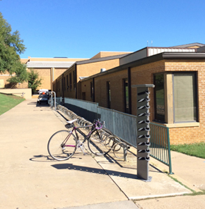
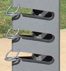
Was wandering around the University of North Texas and came upon this sculptural column. I assumed that it was for skateboards - that made the most sense on a college campus next to a bike rack. Farther down the bike rack was this bike repair station. A cool idea - to provide tools and a support bar for making repairs.


![]()

On the flight to Oklahoma from NYC, I was looking out the window. I wondered what town we were looking at - so, I tapped the glass to bring up the map settings window so I could turn on 'Labels' which would add the layer of text over the map. Oops, it's a fucking window, not an iPad. Why are these planes not equipped with iPad windows? There could be a camera lens behind each iPad to capture the image beyond and display it on the screen. Then I could access it and have all the functions to manipulate and access info.
Or, I could do a better job of separating reality from my digital universe.
But, wait, maybe it could work. The screen could be much larger than an iPad. Instead of windows cut into the fuselage exterior, there would just be a row of digital screens along each side of the plane. The safety video could be shown on the pads before takeoff. In case of an accident, evacuation instructions could be displayed.
![]()
I was at the gym, Gold's on the north side. I was a new member and was doing some chest presses when I looked across the bicycles and rowers and saw the sign over a set of double doors: Cardio Enema. Huh? Did I read that right? It was a serious sign - individual thick letters mounted on the wall above the door. Was it a cruel joke or a mistake by the sign company that no one had yet noticed? I couldn't tell, but I figured that there may have been some exercises in that room I didn't want to do.

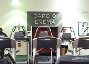
I finished the presses and then went to two other machines. I took another look. Nope, still there. Still says Cardio Enema. I got my stuff from the locker room, no shower, not after what happened last week, my first week at this gym. On my way out, I told the fit young woman at the front desk about the sign. She looked at me like I was a fool, turned to read the sign, read it again, gasped audibly, and ran to the manager's office. I waited, no one came out. I was satisfied: I had alerted them, not much else I could do. So, I went on out the front door just as two police cars pulled up, lights flashing. They ran right by me. As I turned back to look, they were pulling their guns out. I drove on home and made a protein shake. Chocolate - well, I had just worked out.
![]()
Redesign of The Week magazine cover
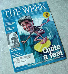
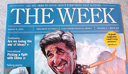
The Week is a newsmagazine that digests articles from other media in a variety of subjects. A few opportunities to make better:
• The thick & thin serif font used for the subheads doesn't hold up well when set in reverse.
• The double lines of varying thickness are busy, clutter the top and distract from the picture and the headlines.
• The font and layout are a bit too boring, normal, standard, and run-of-the-mill - all inappropriate for a new concept in weekly newsmagazines.
![]()

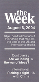
Another way:
The text type
• Helvetica (without serifs and thin strokes) for the article teasers holds up well in reverse.
• the Week is set in familiar Times. The more personal lowercase t in the softens the lead-in to the word Week, as if from a sentence.
• Combining both of the subheads All you need and The best of into one statement is clearer and easier to read.
• The issue date is prominent for later referencing or verifying date of the issue.
• An appropriate order of information: logo flag, issue date, mission statement, article teasers, and at the bottom, volume and issue info (not very important to the reader) and finished off with the web address.
The layout composition
• One strong vertical band - a fresh approach to magazine flags - fitting for the Week.
• The strong sense of order is established by the flush right alignment of the text type, all text set in one font (except for the logo flag set in a second font).
• Both fonts, Times and Helvetica, are popular, legible, recognizable, and comfortable fonts for viewers.
• The band is on the left of the cover but the type is set flush to the right - symbolic leaning to both the left and the right (balanced journalism?)
• In newsstand racks the top is exposed and sometimes, if arrayed overlapping, only the left side is exposed - the new layout keeps the Week always in view.
• The smaller logo flag is appropriate for the content - the Week is about stuff that matters - not an arrogant flag title that yells at the reader.
• Emphasis is the cover picture and headlines first, then the flag of the magazine - a more appropriate order.
• The layout can be easily adapted for the Week website.
Dates: August 1-3, 2004. The letter I sent to the editors:
![]()

Carl's Jr. and Hardee's were serving up a delicious symbol of freedom with the arrival of the Most American Thickburger - it unites three popular American picnic foods together on one bun: a split hot dog, potato chips, and a hamburger patty, along with a slice of American cheese, lettuce, tomato, pickles, ketchup and mustard, served on a bun. “A hot dog, potato chips, and a beef patty is, unquestionably, our most American creation yet."
"A burger this epic required an equally epic ad campaign that salutes all things American." American as the military, sex, red white blue, blond, liberty, boobs, cleavage. Statue of Liberty, aircraft carrier, skimpy bikini on a blog.
![]()
Great business for when some people regret what they have done.
![]()
Starbucks love/hate: love the community ambiance, hate the waste
I don't even remember when I firast walked into a Starbucks. It was years ago. Probably in Dallas, Manhattan (above: SoHo), or Seattle's Pike Place Market, the location of the very first Starbucks. What I like is variety of drinks, clean coffee drinking environment, current with music and technology, and pastries and food that are usually very good, and the ambiance and interiors of the stores.
I often take my laptop and get work done (I'm typing this now while sitting inside a Starbucks). I enjoy the community, the conversation, the music, watching the people, and the notion of writing and hanging out in a coffee shop - like the Cafe Society in Paris in the early 1900s.
What Starbucks does poorly
![]() Lots of stuff is wasted at a Starbucks. I have witnessed numerous people walk from the pickup counter to the trash and throw away the lid. They put a lid on every drink. Even when I order an iced coffee. Once in Oklahoma, as the barista was about to put a lid on my coffee, I said "I don't need a lid". She stated that she had to put a lid on it. I mentioned it was an iced drink. She tried to convince me that the coffee was very hot when she put it in the cup, therefore a lid. I pointed out that there was now ice floating in the cup - that coffee had apparently cooled off quite a bit and I was only transporting that cup of coffee about 4 feet to a table. She was insistent - that cup had to have a lid on it. This also happened in Manhattan when I ordered an Iced Coffee. This barista argued that he couldn't let a drink leave the counter without a lid. I asked him if he really thought I might hurt myself on an ice cube. He indignantly took off the lid and threw it in the trash. That lid provided no value to the company, the consumer, or society;
and it defied any thought of "Environmental Stewardship".
Lots of stuff is wasted at a Starbucks. I have witnessed numerous people walk from the pickup counter to the trash and throw away the lid. They put a lid on every drink. Even when I order an iced coffee. Once in Oklahoma, as the barista was about to put a lid on my coffee, I said "I don't need a lid". She stated that she had to put a lid on it. I mentioned it was an iced drink. She tried to convince me that the coffee was very hot when she put it in the cup, therefore a lid. I pointed out that there was now ice floating in the cup - that coffee had apparently cooled off quite a bit and I was only transporting that cup of coffee about 4 feet to a table. She was insistent - that cup had to have a lid on it. This also happened in Manhattan when I ordered an Iced Coffee. This barista argued that he couldn't let a drink leave the counter without a lid. I asked him if he really thought I might hurt myself on an ice cube. He indignantly took off the lid and threw it in the trash. That lid provided no value to the company, the consumer, or society;
and it defied any thought of "Environmental Stewardship".
Now a lid on a coffee that is to go makes sense. Let me explain why a lid on every drink is ridiculous. For coffee consumed in the store, the lifespan of the lid is about 4 seconds. It lives its entire useful life from being put on the coffee until I take it off at the fixins counter. But look what that lid has gone through: raw materials shipped to a manufacturing plant, the manufacturing process, transportation to a storage facility, storage in a warehouse, shipped to individual Starbucks locations, checked in and stored in the retail store, set out in columns at the coffee prep area. Then it lives its entire 4 second life. Then removed and put in the trash, bagged up and set out for pickup, pickup by the local community garbage collectors, and, finally, shipped to a landfill where it languishes for decades. It doesn't seem worth the effort, expense, materials, personnel, and hassle for such a short useful life. In a sense, it never had a useful life - there was never any need for me to have my coffee covered while I walk 4-8 feet. I am amazed at how many perfectly good lids I see inside every trash can in every Starbucks I've been in.
To address this waste, I called the Starbucks home office to verify that the barista is required to put a lid on each cup. I realize that the policy probably stems from that lady whose hot coffee from McDonald's burned her while in her car. Starbucks, like most of corporate America, is litigation fearful. The person I talked to said it was not a corporate policy - that it is up to the discretion of each barista. I have begun to request no lid, but I still get the excuse that it's a "corporate policy, sorry, there's nothing I can do." What makes this more ridiculous is that Starbucks prides itself on being environmentally conscious. Starbucks interior decor includes these statements: "To minimizing our environmental footprint" and "Environmental Stewardship".
The solution is simple - have the baristas ask: "Would you like a lid on that?" This could happen at the register and a code marked on the cup or it could happen at the pickup counter as the barista reaches for a lid. While it is an additional task for the barista (although offset by deleting the lidding task on many drinks), it leaves the decision and responsibility up to the customer, where it ought to be. And it will save materials, minimize the amount of trash, and keep more plastic out of landfills.
Note: To minimize the waste from unnecessary lids, double cups, and sleeves, I now simply take my own mug with me. Problem solved. After finishing my coffee, I rinse out the cup in the restroom and place it back in my car or backpack - ready for the next visit. Also, when I get coffee at a place where the urns are out for the customer (like at coffee bars, Borders & Noble, convenience stores, and Panera) I put the sweetener and cream in an empty cup and then add the coffee. The coffee swirling into the cup mixes the sweetener and cream so there is no need to use (and waste) a stir stick.
Lid
Cold cup leaks
Set on counter
Ways to make Starbucks better, more user-centered
![]() Offer, but don't require, a lid on every cup (see above).
Offer, but don't require, a lid on every cup (see above).
![]() Recycle more. Lots of trash in the cans is recyclable - napkins, paper bags, and newspapers. Starbucks could put into practice what they preach on their website about 'Social Responsibility' by providing recycle bins. Design receptacles with compartments: paper, bottles, trash.
Recycle more. Lots of trash in the cans is recyclable - napkins, paper bags, and newspapers. Starbucks could put into practice what they preach on their website about 'Social Responsibility' by providing recycle bins. Design receptacles with compartments: paper, bottles, trash.
![]() Encourage reusable ceramic cups. Sell cups more cheaply than in stores. See them as a community service, not a profit center.
Encourage reusable ceramic cups. Sell cups more cheaply than in stores. See them as a community service, not a profit center.


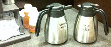
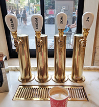
![]() Label the creamers in a more user-friendly way.
Label the creamers in a more user-friendly way.
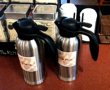
On the left is an intuitive stopper on the cream canister - the handle jutting out says 'press me'. On the right, the screw cap might say 'turn me' but how far? Is it already open? If I turn it will the cap come off and spill the contents? Which way do I turn it?
Okay, that is just too many questions. And I probly shouldn't ask them out loud while standing at the fixins stand. One can operate the one on the left with one hand while the one on the right requires two - one to hold the canister and the other to turn the cap. Also notice the labels on the canisters. One is designed to enhance the graphics and decor of the restaurant, the other looks like tape from a labelmaker. Photos were shot at Panera and Starbucks in 2011.

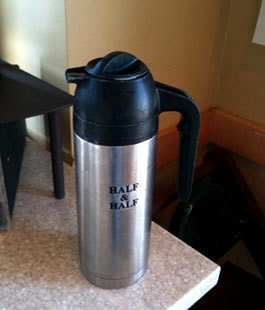
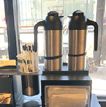
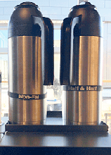
Some Barnes & Noble Starbucks in New York City are using these creamers with the handle and lever - much better. Now, Starbucks needs to invest in some custom-made vinyl stickers that convey the contents and fit the new design motif of their stores. Above right: another way to solve the problem.
This rubber band around the pitchers is nice, but incomplete - the labels show up only when the creamer is facing a certain way. Solution? So simple, its a bit frustrating - print the label on the band 2 or 3 times, all the way around the band. Then, no matter how the creamer is set back on the
counter, the label will be visible. As with most poor design decisions, the designer or producer didn't imagine the product in use. If there had been more observation or testing, they would likely have noticed that the creamer was set down in a variety of positions.
Some other ideas for coffee shops (from anonymous internet postings)

• Frozen coffee cubes in iced coffee so it doesn't get watered down.
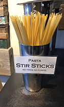
• Fettuccine stirrers, reducing environmental impact (it doesn't make coffee taste like pasta).
• Creamer on tap, keeping it cold and fresh for customers.
• Special lid indents for holding a cookie, keeping it warm.
www.jamesrobertwatson.com/designblog.html
![]()
![]()
![]()
![]()