
![]()
Better Rest Area directional signs
As I drive across country (or just on the local turnpike), I sometimes stop at a rest area. As the exit ramp approaches the rest area, there is a split - trucks one way - for longer parking slots - and cars another way. At this Y split, there is a sign guiding the driver who must make a decision in a second or two. There are several factors influencing the driver's attention: he/she is navigating the exit ramp, wondering which way to go, there is often music playing, and there are sometimes anxious passengers in the mix. The sign must be so clear that a driver can comprehend it and make a decision almost immediately. Most existing rest area signs are poorly designed. Development: Road trip photos: June 17 2007; Sketches: July 1 2007
Rapid and easy comprehension
The most important objective of effective sign design - the viewer is often in a situation where he/she must be able to focus on the act of driving - checking the road, other cars, weather, etc. To gain information from a sign, that sign must be absolutely clear - with info that is easily noticed (highly visible, legible, and easily recognized) and clearly communicated (easy and quick to comprehend).
Target markets/users
During numerous road trips, I notice symptoms that highway sign designers don't follow some basic design components: clear communication, rapid comprehension, proximity, and orientation.
Signs serve to inform, guide, and direct the reader. Primary sign readers are navigators (often drivers) who are lost, confused, or new to an area and are seeking guidance and information.
1. Car drivers unfamiliar with rest area.
2. Car drivers familiar with rest area.
3. Truck drivers unfamiliar with area.
4. Truck drivers familiar with rest area.
Examples of existing signs

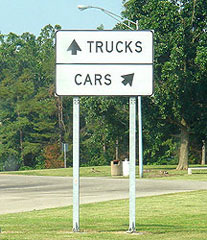
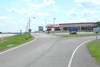


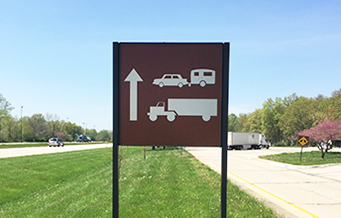
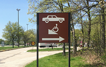
Problems/weaknesses
Proximity of the arrows to their accompanying icons. In the sign above on the right, the truck icon is closer to the left arrow than to the right arrow (and the truck is even facing left)
Horizontal layouts that provide little visual clue on which side of the sign to drive. The driver wants to know left or right and the sign is divided top and bottom or above and below.
Arrows that convey turn left or turn right rather than just angle to one side of the sign or the other.
Poor contrast of text and background and sign background to environment.
Improved sign
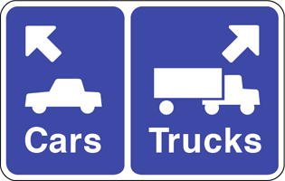

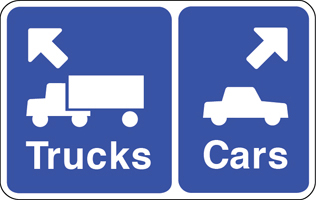
Improvements
Image icons, arrows, and text are aligned in proximity to reinforce the message.
The vehicles are facing the direction of their arrow.
Layout places the info side by side - left/right - to suggest going left or right.
Different size backgrounds provide a visual clue, larger vehicles (trucks) get larger background.
Arrows point in a truer direction, rather than turn left or right, softer turn to parking area.
Icons, arrows, and text are set flush to the directional margin, the left sign info is set flush left.
• The background color is the standard highway information color.
Comparisons

![]()

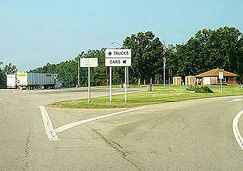
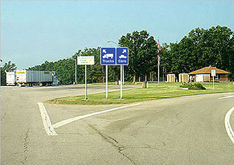
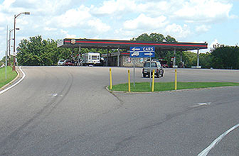

A rest area in Missouri that got close


![]()
Another brilliant idea
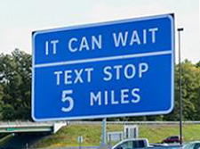
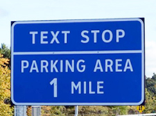
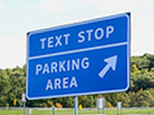
New York State has introduced 'Texting Zones' along its major highways and thruways - pullout stops where drivers can read, write, and send texts, phone calls, and emails. Governor Andrew Cuomo said 298 signs will be positioned along the state's busiest roads, pointing drivers to 91 Texting Zone locations. The zones will cost nothing to build as they already exist in the form of rest stops and parking areas. It's really all about the signage, branding the locations, and educating drivers.
www.jamesrobertwatson.com/restareasigns.html
![]()
![]()
![]()
![]()