 Highway sign layout that can improve safety while driving Road signs first appeared in ancient Rome as stone markers with chiseled numbers that showed the distances to various cities in the empire. A few years after Henry Ford sold the first Model T, signs were nailed up on fences, posts, and walls to denote a location or show direction. There was no effort towards uniformity, consistency, efficient readability, or user-convenience. In the 1920s, signs became a bit more uniform, with cities and states dictating basic standards of layout and typography. As the popularity and accessibility of long-distance travel increased, so did the need for coherent nationwide standards. Signs serve to inform, guide, and direct the driver. The primary target market of a highway sign is a navigator (most often the driver) who is seeking guidance and information. The driver is often in a situation where he/she must be able to focus on the act of driving - checking the conditions, cars in the immediate proximity, passengers talking, and music volume. The highway sign must efficiently convey clear and rapid communication. To gain information from a sign, that sign must be absolutely clear - with info that is easily noticed (highly visible, legible, and easily recognized) and clearly communicated (easy and quick to comprehend). No one ever complained because something was too easy to understand.  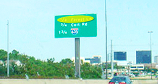 Flush Center alignment of information The large gap between the bits of information that relate to each other prevents the brain from immediately associating the two. There is no advantage to setting text on the signs with justified margins (with the exit names aligned on the left and the mileage aligned on the right). We have become accustomed to scanning a sign to focus on just the info we need. The letter spacing, word spacing, and alignment require more time to scan, read, and comprehend the info. And - very important - this is while one is driving, when one's attention should be on the road and other cars. The advantage of using the Flush Center arrangement We don't read letter by letter or even word by word; we read groups of words as a single unit. The retina receptors take a photo, send that info to the brain for processing, then jump to the next group of words. The exit name and the distance should form a single bit of info. With the mileage to the left and next to the exit name, the viewer's brain can snap one picture of all the needed info. The Flush Center format allows more clarity, easier reading, and, often, a smaller sign. Most importantly, this format allows the driver to spend less time comprehending the info and more time on the cars and highway. This creates a safer driving environment. In the example below on the right, the exit ramp distances are aligned to the immediate left of the exit names. One sees the number right next to the name - no having to move along a horizontal line. 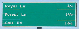  Sometimes, the sign designer adds a horizontal line between bands of info, presumably to improve comprehension: 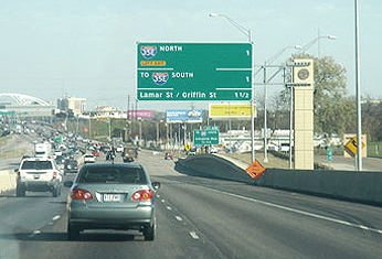 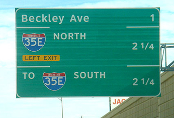     Red flag: When one has to add an element (lines) to improve communication, there is something weak about the original design. Solve what caused the problem; don't add crap to compensate. More examples of existing and proposed Flush Center 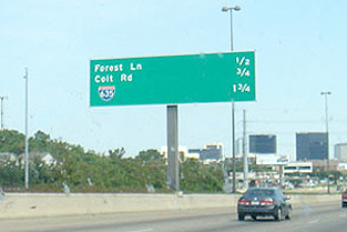 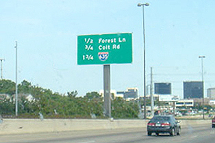 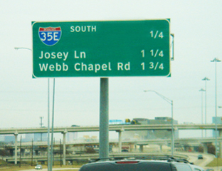 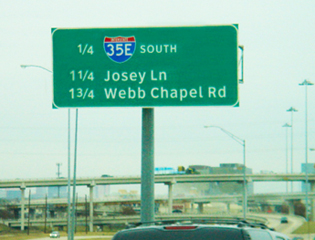  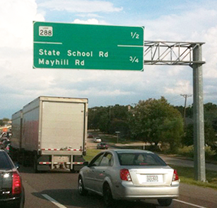 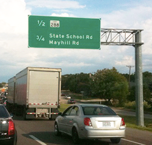 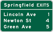   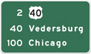  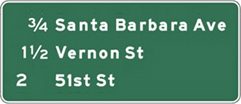  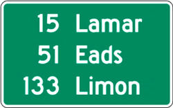 Formats to set blocks of text copy 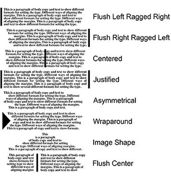  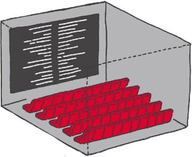 Setting body copy with the text set Flush Center allows blocks of info to be in closer proximity. Credits at the ends of movies adopted the Flush Center format years ago. 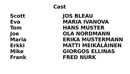 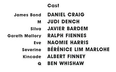   Above and below left: When reading scores on television, most stations do the usual layout of putting scores after the team name. Since the length of team names varies widely, these scores may end up being a ways from their team. Above and below right: the scores are aligned Flush Center. One sees the score next to the team name. This method allows more clarity and easier reading. 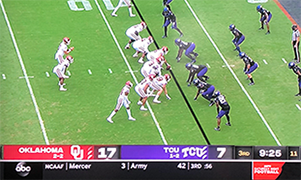 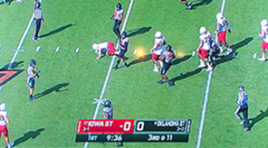 Better Rest Area directional signs As I drive across country (or just on the local turnpike), I sometimes stop at a rest area. As the exit ramp approaches the rest area, there is a split - trucks one way - for longer parking slots - and cars another way. At this Y split, there is a sign guiding the driver who must make a decision in a second or two. There are several factors influencing the driver's attention: he/she is navigating the exit ramp, wondering which way to go, there is often music playing, and there are sometimes anxious passengers in the mix. The sign must be so clear that a driver can comprehend it and make a decision almost immediately. Most existing rest area signs are poorly designed. Development: Road trip photos: June 17 2007; Sketches: July 1 2007 Target markets/users 1. Car drivers unfamiliar with rest area. 2. Car drivers familiar with rest area. 3. Truck drivers unfamiliar with area. 4. Truck drivers familiar with rest area. Examples of existing signs  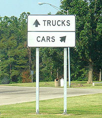 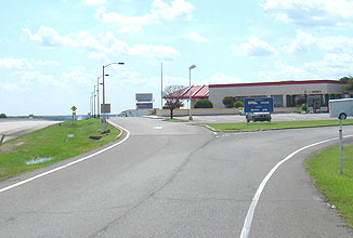    Problems/weaknesses • Proximity of the arrows to their accompanying icons. In the sign above on the right, the truck icon is closer to the left arrow than to the right arrow (and the truck is even facing left) • Horizontal layouts that provide little visual clue on which side of the sign to drive. The driver wants to know left or right and the sign is divided top and bottom or above and below. • Arrows that convey turn left or turn right rather than just angle to one side of the sign or the other. • Poor contrast of text and background and sign background to environment. Improved sign 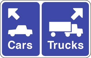  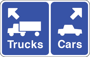 Improvements • Image icons, arrows, and text are aligned in proximity to reinforce the message. • The vehicles are facing the direction of their arrow. • Layout places the info side by side - left/right - to suggest going left or right. • Different size backgrounds provide a visual clue, larger vehicles (trucks) get larger background. • Arrows point in a truer direction, rather than turn left or right, softer turn to parking area. • Icons, arrows, and text are set flush to the directional margin, the left sign info is set flush left. • The background color is the standard highway information color. Comparisons   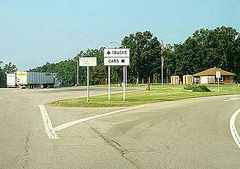 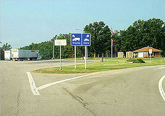 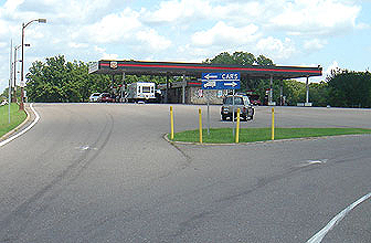  A rest area in Missouri that got close  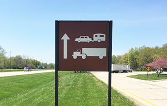 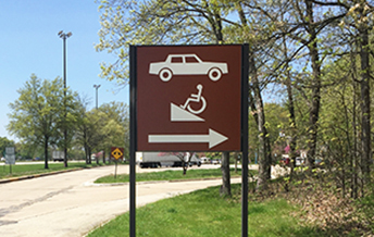 Another brilliant idea 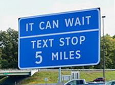 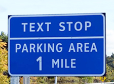 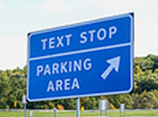 New York State has introduced 'Texting Zones' along its major highways and thruways - pullout stops where drivers can read, write, and send texts, phone calls, and emails. Governor Andrew Cuomo said 298 signs will be positioned along the state's busiest roads, pointing drivers to 91 Texting Zone locations. The zones will cost nothing to build as they already exist in the form of rest stops and parking areas. It's really all about the signage, branding the locations, and educating drivers. Full essay on sign design Flush center signs: Conceived: late-1990s, sketched: May 1997 Rest area signs: July 2007 www.jamesrobertwatson.com/DOTsignage.html |