
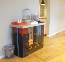

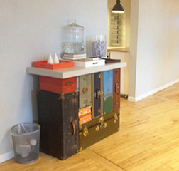
I went by the Warby Parker headquarters and showroom in SoHo to check out some new frames. I noticed this counter in the Customer Experience area. I was told that it was custom made for the space. The stack of old luggage is cool and well done. But the blue strap distracts from the concept. The focus here should be on the clever idea for a countertop support and the items on top that are being supported. The luggage pieces serve as the legs of the counter. The blue strap does nothing, but demand attention - away from where it should be. Without the strap, the piece is a more pure and honest design; a good concept (stacked luggage serving as legs for a counter) that is well executed.
Lesson: Figure out what's working in a piece; exploit that and minimize the rest.
Some of Jim's experiments in Furniture Design
Some notes and sketches for building a bed. December 3-4, 1977
Conventional mattress and bed linens
Padded perimeter for sitting
Padded headboard for reclining
Angled headboard for reading
Platform base with inset legs for fewer stubbed toes
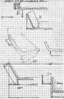

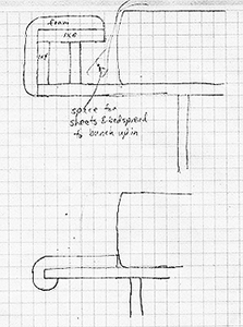
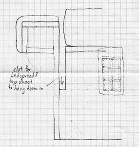
Bed with center for lite, clock, music, etc.
Possibly closet behind headboard. One unit to fill all needs of bedroom. To sit in the middle of the room - floating.
Concept: a mattress that supports the human body in the most comfortable, relaxing way to allow a restful sleep.
Sleeping positions: the side is supposed to be the best, then back, and lying on the stomach is the worst.
Lying on the back is not as good as lying on the side because of bad support. If a mattress had good support in the right areas - then I believe lying on the back would be the most restful and healthy for the body.
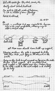
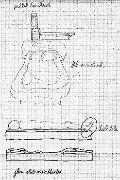
Men used to (Boy Scouts are taught this) lie on the ground and scoop out depressions for hips & shoulders.
Most mattresses do not support well because they are constructed of the same materials and act consistently throughout the entire mattress, even though the human body is placing stresses of different weights in different places. A consistent surface cannot correctly support an inconsistent surface. 40 years later, I saw this product for sale:

At the ICFF - International Contemporary Furniture Fair - in May 2006 at the NY Convention Center, I saw in the Umbra display, a stack of books sitting on a new product, called the Conceal Shelf. It works with a lip to hold the bottom book cover and a horizontal shelf part hidden inside book. Nice, but I wanted a shelf just for a book or two. The fairly large vertical wall mount area of the Conceal Shelf would show (its a true concealed shelf only if you stack enough books or items on top to conceal the metal support plate). I looked in several stores and saw the brackets that are simply metal rods or dowels sticking out to hold glass shelves. I made the connection: cut a hole inside of book pages and slide the book over the rod. The support rod is completely hidden and the book becomes the shelf - hence the name - Book Shelf. In Home Depot, I was about to buy the brackets when realized this could also replace the nitestand by the bed. A series of Book Shelves mounted on the wall next to the bed. Eureka. I wanted to go home and work this out before buying the brackets.

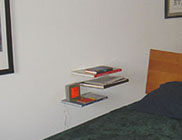
Shelves for books made of books with no visible means of support.
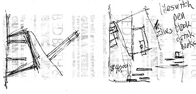
Riding the subway home I got pretty excited about the idea - so, I pulled out the only paper I had - a receipt from Bed Bath & Beyond, and started sketching to get my thoughts down on paper. I started to work out the details - how many books/shelves, the layout arrangement, list of items that will go on the shelves, etc. Maybe a magazine to hold magazines? Maybe cut the books at the angle of the carpet tiles? I had previously experimented with angle cuts on a table top mat and the dog bowl floor mat. I liked the idea of mixing the angles - the book shelves would align with the grid of the carpet yet be cut to be positioned up against the wall. I have a bedside clock that projects the time on the ceiling. I realized this would not allow the shelves to be stacked and aligned vertically because I didn't want the clock to be on the top shelf (too predominant). Placing the clock on a lower shelf necessitated the random asymmetrical layout of the three shelves.
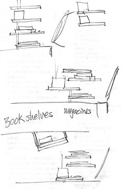
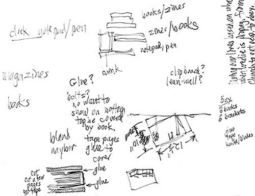
Now to find the right three books. Strand Books is a New York institution - near Union Square, its an old musty book store, crammed with new and old books, people browsing and jostling through the aisles. I was reminded of Strand when I saw their kiosk at Central Park. I remembered the Strand Annex downtown, not too far from the apartment. Once there, I looked thru the dollar books (investing 3 dollars for the shelves would be a great bargain). Alas, I found no books large enough. I had determined three preliminary goals for the book selection: big, cheap, and some relevance. Then in the religion section, I found a large book on The Story of Jesus and it was only $10. I could handle $10. I had accepted that the dollar per book deal was out and I would have to pay to get the effect I wanted. At $10, the total would still be only $30 - cheaper than any shelf at a store. Then nearby I found The History of Islam. What a kick, now if I could find a large book having to do with Hebrews or Judaism, then that could be the theme - the world's major religions, especially as a nitestand for Jim Watson. But I couldn't find a large book with a Jewish theme for less than $20. I wasn't willing to spend quite that much. I also realized that this theme would be fun for a while - quite ironic to have religious books as reading matter, but I would likely tire of looking at those spines day after day. No, I needed something better. So, I kept looking. Maybe a theme of Design. So over to that section. Whoa, too expensive. I did find a large inexpensive book on Frank Lloyd Wright. Cool. After browsing lots of shelves and tabletops, I saw a large book called Stuff and Nonsense. What a great title and a fitting for my apartment. Then the thought - what about a New York theme. Over to that section. There were several coffee table size books, some of them cheap. One was too thin to hold the brackets, however. I also saw a collection of books all in grey covers. Maybe? A consistent color in the shelves. No, that would stray too far from the concept of having it look like three random books protruding from the wall supporting other books and magazines. I went back to what I had already - the book on Frank Lloyd Wright, Stuff and Nonsense, and for the third, a book on New York City. Good assortment. Done.
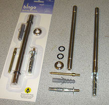


The brackets - or rods as they are used here; the 3 books marked up for cutting; and a book with the pages cut out (to hide the rods), rods shown for placement.
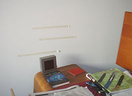
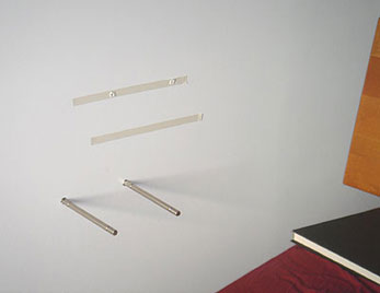
So far, I had the idea pretty solid in my head, a few rough sketches, the brackets, and three books. I bought the bracket/rods at Home Depot. The first step was to cut the books - the angle to respect the carpet grid and the cavity inside to hold the and conceal the support rods. I used stacks of foam mounting tape to hold the bottom of the book up against the book cover and to provide some snugness to embrace the rods. It was a bit weird to cut up books, but I reminded myself that they were bargain books - there were several more if I really wanted to go back and buy a virgin book and they were in the bin of leftovers of books that had been picked over and rejected by many people. I read each of the books (the Stuff and Nonsense book was just, well, nonsense stuff). I had put up three strips of tape in the bedroom to begin to determine placement of the shelves. I knew by this time that the bottom shelf would hold the alarm clock - I wanted to hide its electrical cord as much as possible and this would be the least visible. This bottom shelf would also hold a notepad, pen, and coaster for a glass. Therefore there needed to be space above the left side for the clock and glass.
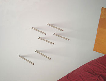
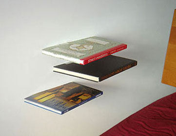
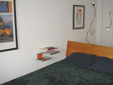
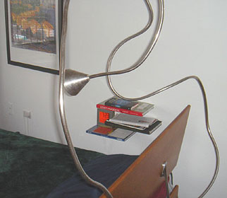
Inspiration: May, 2006
Store search: June 14-15, 2006
Design: June 16-17
Production: June 18-19
I used to wear a 'uniform' to work. I didn't have a lot of clothes, just classics - khaki slacks, white oxford shirts.
In 1987, I was living in an apartment with two sliding closet doors to a not-so-large closet. I often had to slide doors one way or the other to get to what I needed. I even would leave one side always open. I wanted to have my clothes more accessible, easier to get to. At this time, I was also becoming enamored with the metro shelving line. I had received a gift certificate to the Container Store in Dallas which carried Metro shelving.

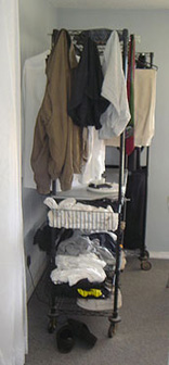
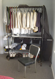
I went to the store and made measurements of the pieces and became familiar with the component options. At home, I sketched options for assembling the components into a large rolling unit that could hold hanging clothes, shelves for shoes and T-shirts, and drawers for socks and underpants. I went and bought all the pieces and packed them for my trip back to Oklahoma. In the apartment, I assembled them with a hanging laundry basket. With the whole unit on wheels, it was easy to maneuver it to easily get to both sides. When I moved into the 424 house, I removed the original bedroom closet to make the room bigger and set up the Metro closet unit against one wall. I added a rolling laundry cart that fit next to the closet unit. It works great. I had often wondered why we had to hide our clothes in separate rooms, anyway.
After I retired from full-time teaching, I switched uniforms, no longer was there a need for the dress shirts and slacks - now it was teeshirts and jeans. So, those hanging clothes can go in the storeroom by the bath, still easily accessible (I wear a collar shirt maybe once every month or two). To accommodate the teeshirts, I bought a plastic folding template like those used in retail stores.

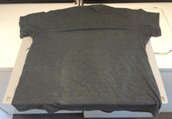
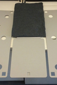
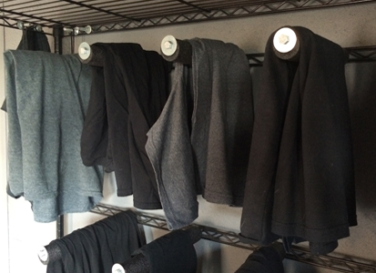
But, that was more trouble than it was worth. These were teeshirts and I didn't like doing laundry. And it was too small for my shirts. So, I just folded the shirts in half and lay them on the top of the shelf in the closet. That was okay, but they got stacked up. I needed a better system. I often would throw a shirt over the back of the chair and noticed that it didn't wrinkle the shirt. That might work. I set out to discover a way that I could lay the shirts over rods. I had used bolts in the closet unit to hold belts, umbrellas, and ties (I haven't worn a tie in years). That same concept - a long bolt extending out from one of the shelf supports - could work for the teeshirts I had to online order the long bolts and the pads to go over the rods are pipe insulators from Lowe's Depot.
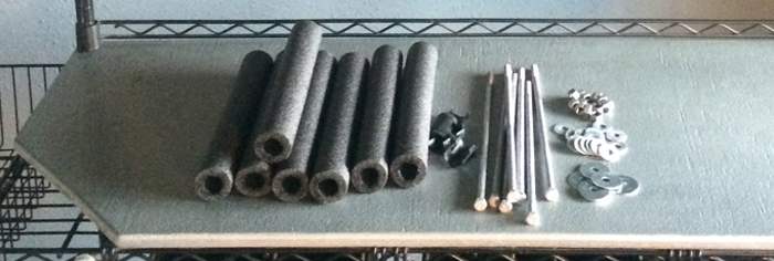
Parts: cushion tubes, 12" long bolts, nuts, and washers.

The assembly of the end that pokes through a hole in the Metro horizontal spacer.

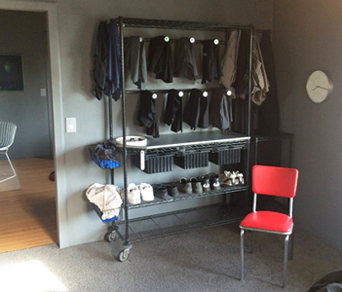
I rearranged the closet shelves to put the spans across the back. Into these, I bolted the rods. It works great. The rods keep the shirts neat and accessible and the closet unit is very organized and appropriate for the minimal house.
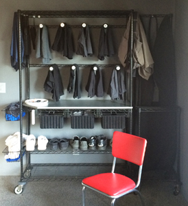
Closet, design and assembly: spring 1988
Uniform transition, dress shirts to teeshirts: summer 2009
Teeshirt rods, design and assembly: July 2014


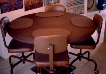
I was exploring the development of a table that could seat 1-6 people comfortably. A round table can be used for 2, 3, or 6 people and still look good, not so with a square or rectangle top - a square can typically only seat 4 comfortably. There was a layer of foam rubber on top and folded around the rounded side edge. It was very comfortable and pleasant for dining - soft, mellow, quiet, subtle; and firm enough to support full glasses and plates.
The pedestal base avoided awkward legs at the outer edge and the flat base wasn't a barrier to chair legs. The pedestal could be painted to match the room.
An elastic edge on the tablecloth helped it fit snugly and smoothly around the table.
The chairs (ordinary office work chairs) on wheels allowed easy in and out for graceful seating, there's no need to skootch the chair in.
January 1977
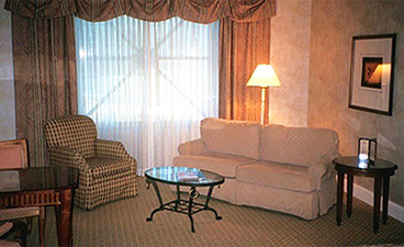


After I moved into a rent house to have a yard for my new puppy, Dallas. She was too obstinate to leave in the house for long periods of time. I needed to get a doghouse for her. I was used to using the Metrowire shelving throughout the house and wondered if I could adapt its components for a doghouse. I knew I would need
After I moved into a rent house to have a yard for my new puppy, Dallas. She was too obstinate to leave in the house for long periods of time. I needed to get a doghouse for her. I was used to using the Metrowire shelving throughout the house and wondered if I could adapt its components for a doghouse. I knew I would need to build a box and platforms for her to walk on since the wire shelving would not be comfortable for her paws.
While sketching the elements with the box, platforms and roof, it evolved into a De Stijl composition. De Stijl was a Dutch style of art & design popularized by the architect and furniture designer Gerritt Reitveld and the painter Piet Mondrian. I exploited that by painting each wood element a different primary color. The roof part helped protect the opening to the house so the dog could be inside and stay somewhat protected from rain and sun.
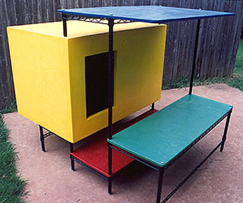
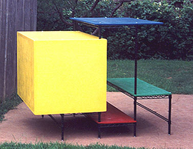
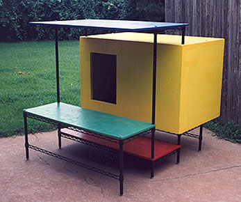

Dallas, the dog, didn't use her fancy De Stijl house too much - she preferred to be inside with me. It was hard to keep her outside (I wanted her with me also). The house did serve its purpose for a few years until I moved into a different house and she had grown out of her obnoxious puppy ways into a better-behaved adult.
Designed and built: 1991. Dismantled: 1995 while moving.
Sofas are inefficient for seating in which to converse. If two people sit next to each other on a sofa - they have to turn 90 degrees to the side to see the other person. If two people sit across from each other - it is awkward to continually face the other person. That's why you'll almost always see a chair next to a sofa at a 90 degree angle. This creates the most comfortable seating position for conversation. We use sofas for reclining, napping, and seating. We also have a need to adapt furniture to our spaces and to our lifestyles. I began searching for a large seating unit in the late 1970s. I found nothing that was satisfactory, so I decided to build my own. I began making notes on usage needs and researching human seating/reclining positions. I looked at foam densities, shapes, and foundation materials.
Assessment: need a seating unit that can
1. Support the human body in more positions than just sitting and lying.
2. Be comfortable.
3. Be easy to get in and out of.
4. Look acceptable in a living room.
5. Be inexpensive.
Objectives
High off the floor - easy to get in and out
Soft foam for molding to body.
Interchangeable units of varying heights and angles.
All on a uniform standard base.
Back support, leg support, arm support, head support.
Variety of arrangements to suit various people, occasions, and positions.
Frame grid base to support foam units.
Needs
Sofa for 2
Recliner for 2
Conversation for 3-4
Matching individual chair?
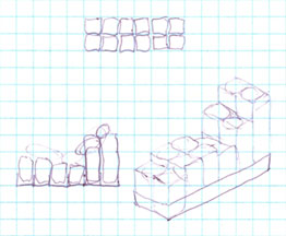
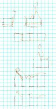
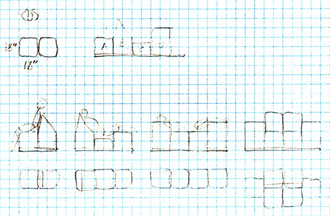
Concept: A unit of grids for a person with 4 different-sized blocks, that can be arranged in that grid for the variety of positions desired. Grid units can be interlocked for serving more people. A hinge bracket could allow the units to pivot.
Concept of individuality as in a chair. Chairs grouped together to make a sofa.
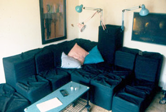
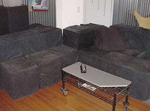
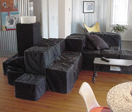
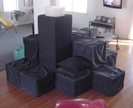
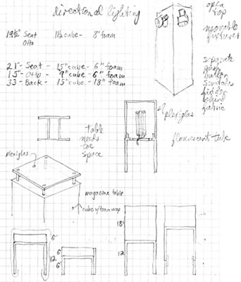
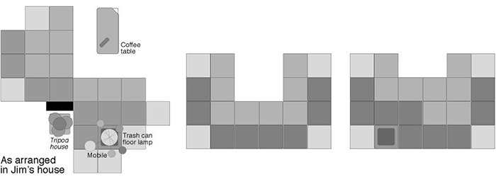
The units consist of 3 sizes: the seat, the back, and the ottoman. The set in the Watson house has 8 seats, 8 backs, 4 ottomans, and 2 end tables. A metal u-shaped connector grasps 2 units from the bottom up. There is a matching light fixture. All units are 17" square. The seat is 18" high, the back 36", and the ottoman and end tables are 12" high.
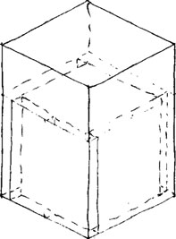


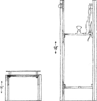
Fabric color: The primary function of a sofa or seating units is to support humans while they socialize or rest, in groups or alone. These people will be wearing a variety of patterns, colors, and textures. The sofa should not compete, overwhelm, dominate, nor clash with the humans it serves to support. The color should be neutral. Originally, these sofa units were natural unbleached muslin (shown to the left in an exhibit at the UCO Museum of Art). That fabric proved to not be durable enough and it showed dirt easily.
The units were recovered in black canvas in about 1995. The black pays homage to le Corbusier, Mies van der Rohe, Ray and Charles Eames, and Marcel Breuer who often used black to upholster their furniture. Black fits into the Watson house, will never go out of style, shows dirt less, and complements the human users.
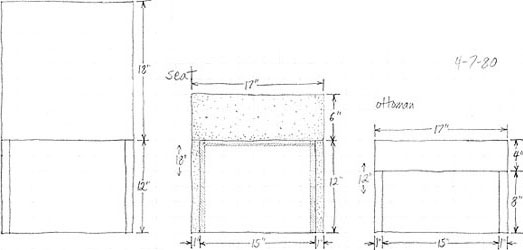
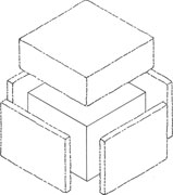
Construction: The foundation is a particle board cube that is covered with 1" thick foam. The top is 6" thick foam for the seat and the ottoman. The back has 18" of foam on top of the cube. The coverings fit loosely around the foam for a casual look. The fabric is held in place with squares of Velcro. This allows them to be easily removed for washing. There are 8 rubber feet around the base of each foundation cube to prevent movement on the floor and to help grab onto carpet piles.
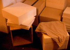
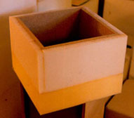
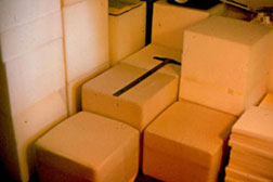
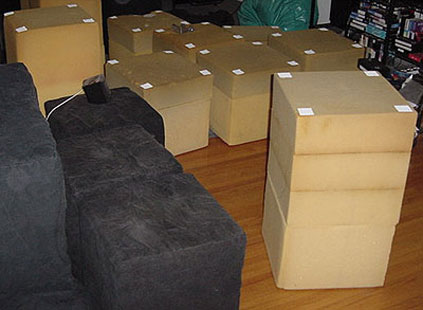
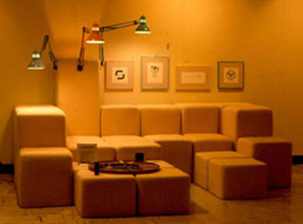
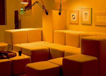
Arrangement options: The 22 total units allow tremendous flexibility in arrangements and seating options. A seat and a back form a chair. Rows of each form traditional sofa sizes. Lounge chairs are formed with 2 seats, an ottoman, and a back unit.
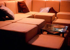
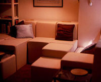


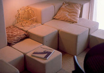
The name: Sofa? seating units? modular seating units? Sofa means a long, upholstered seat or couch having a back and arms. These don't really have arms but the term has probably been vagueified to include most types of 2-or-more seating units.
Design and construction: 1977
Removal & Demolition: Phased 1: September 2021, Phase 2:
Other manufacturers: Since building these units in the 1970s, I have noticed numerous recent products of similar concepts, first noticed in the 1990s.
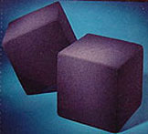
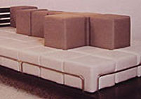
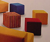
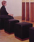
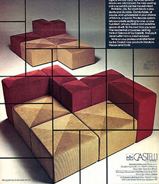
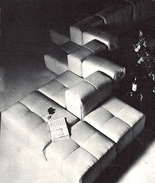
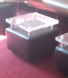

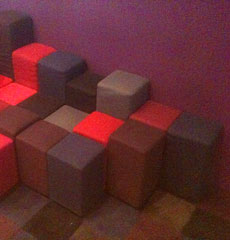
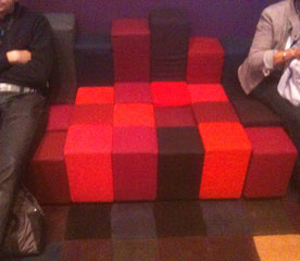

Lovesac is a patented modular furniture system called Sactionals, consisting of two combinable pieces, Seats and Sides, and covers and accessories. Founder Shawn David Nelson hand-made chairs and delivered them to students at the University of Utah. The company relocated from Salt Lake City to Stamford, Connecticut in 2006, filed for bankruptcy protection, and left Chapter 11 protection in August 2006, 30 years after the Sofa Units. The Lovesac pieces, philosophies, and attributes are almost identical to what I was trying to achieve. They pulled it off and in a sophisticated way. Check 'em out.'
In 1987, there were 2 wooden tables in the smaller part of the UCO design classroom to serve as a seminar table for small group discussions, presentations, faculty meetings, and overflow for extra students. That worked fine, but I wished that the tables could be reconfigured into a variety of arrangements for different uses. Later, when updating the room, I designed four triangular tables that could be arranged into a large square for seminars, individual desks, or for presentations. The university's carpentry shop built the table tops and covered them with formica and we used plumbing pipe for the legs.

Years later, when redesigning ClockTower Studio with all movable furniture, the same concept was applied and I ordered four tables that nested into each other for a large seminar or individual workstations.


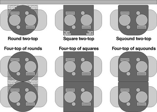
Sometimes, when seated at a round table for two (a two-top), there is not enough room on the table for dishes, glasses, all the stuff. It is uncomfortable. Round tables may work okay in a bar or cocktail lounge where it just needs to hold a few drinks. But not in a restaurant.
Table shapes
Round - an inefficient use of available space. An advantage to a round table is it does not have to be oriented by the restaurant staff. Wherever it is moved or placed, it is in the correct orientation - there is no front, back, or side.
Square - fits within the implied footprint of a round table but uses the corner space better. There can be a problem, however, when trying to get in and out of the seat if in a crowded or cramped restaurant (as many are in New York). The aisle corner makes it tough to squeeze in & out of a seat at the table.
Solutions
1. Restaurants should order only square-cornered tables. If the space is tight and they need a round-cornered table to facilitate access, then the next solution makes more sense.
2. A D-shape table - one that has two rounded corners for easy access on one side and two squared corners to maximize space and increase the tabletop surface.
Name
Squound, adj, USA, 2005: square + round = squound (skwownd), in the shape of the capital letter D. Ex: A squound table is an efficiently shaped restaurant table.
The squound name was coined by the inventor/designer Frank Nichols of New York City on July 3, 2005.
Idea: probably in the early 1990s
Details and design: July, 2005
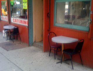
I saw these tables in 2009 on Park Place in downtown Manhattan. Not bad - almost there, but the diameter of the round side does not need to be quite that generous.
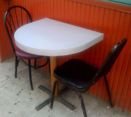
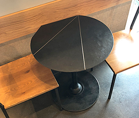
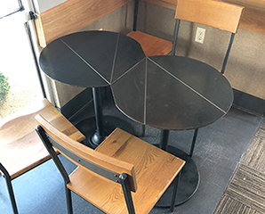
These table at Starbucks, seen in about 2017, get close - they share the idea of a somewhat flat side to butt to another table's flat side.
Sometimes its a pain shoving a chair back under a table - a bit awkward, cumbersome. The legs hit the table base or the other chair legs. Sometimes the chairs don't even fit well underneath a table.
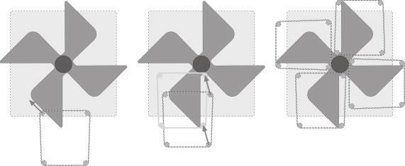
What we need is a way to easily guide the chair in as it slides under the table. Maybe electric chair movers with sensors that measure available clearances and distances and motors that smoothly glide the chair into its storage position under the table. Wait, that sounds awfully complicated and expensive. What else can be done - maybe design table bases with grooves that guide the chair legs - a Pinwheel base. This new base is shaped to provide guides for the chair legs. The extensions of the base provide stability for the table top while the angles help the diner position the chair while pushing it in - the action automatically positions the chair underneath the table as the chair is pushed in.
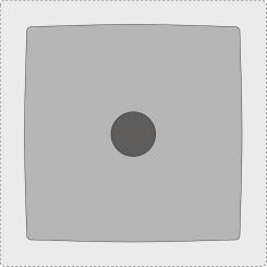



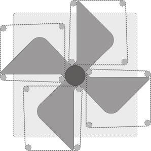
Above left: A standard square base - the dark grey circle is the cylinder stem support, the medium grey is the base, and the light grey represents the table top.
Above middle and right: Pinwheel base with the tabletop. Pinwheel base with the chairs pushed in.
Advantages
Easier on the customer
Wider aisles with chairs pushed in
Neater, more orderly interiors
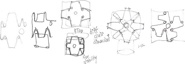
Dates: Idea: sometime in 2006 or 2007. Sketches: winter 2007-08
Below: The sequence showing the base guiding the chair into position.
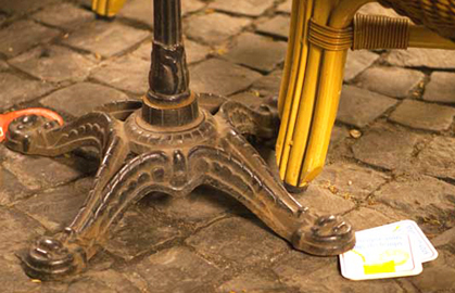

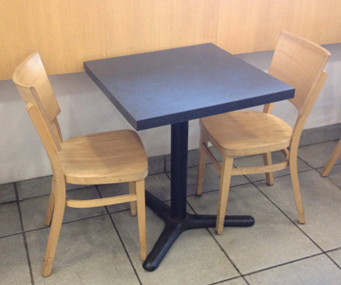
Why don't all tables have just 3 legs? Four legs allows the table to wobble when on an uneven floor. During lunch in FiDi in Lower Manhattan recently, I noticed that the tables had 3 legs. Brilliant - no wobble. What a simple solution. The tripod concept means the table will always be stable on any surface. No sticking matchbooks or folded up napkins under the short legs. An advantage of 4 legs may be greater stability. But, by extending the span of the 3 legs stability is improved.

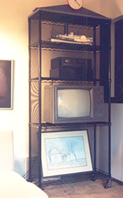
I needed a piece of furniture that would hide outdated stereo gadgetry and cables and was also movable so I could aim the speakers to different parts of a large room and and move the whole unit to other rooms.
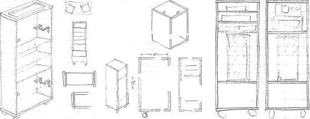
The solution was to build two large cabinets with fabric fronts. Each unit contained a large speaker. One side held the tuner and cassette player, the other had trays to hold the cassette tapes. Below: the cabinets are in the background of this apartment in Dallas. May 1980
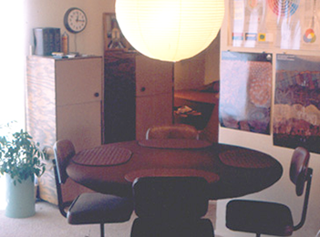
Media cabinet and floor lamp

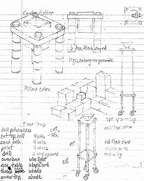
The sketches, of a candle holder and the floor lamp, below were made while watching the sunset at the North Cove at World Financial Plaza in Battery Park City.

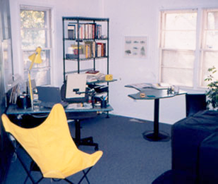
Freeform desk tops with pedestal column support.
www.jamesrobertwatson.com/design-furniture.html