
Please include the day of the week along with the date


Great - free pastry! When? The 23rd? What day is that?
I had to look it up. But, there was no need for me to have to do that. I tweaked the above announcement on the right to show the day. The day and the date are also grouped together as a unit on one line.
Designers, writers, and editors should always include the day of the week with the date.
Even if the copy given to you does not have the day, please add it. If there is not enough room in the given space, explore options - abbreviate the day or the month (we are so familiar with day and month abbreviations that comprehension should not be affected).
Instead of:
January 29, 7:30pm, Music Hall
Include the day:
Thursday, January 29, 7:30pm, Music Hall
Or if space is a problem:
Thurs, Jan 29, 7:30p, Music Hall
Here's why
We often plan our schedules based on the day. Bridge on Tuesday nights, classes on MWF or TT, weekly meetings on Monday mornings, etc. When planning upcoming events and activities, we all think most often in days, not dates. Using just the date requires the reader to figure out what day that is so they can schedule it. Be more considerate and more clear - save the reader some trouble and just give them the day.
It is more familiar - it's how we speak with our friends:
"Lets go to the concert this Thursday."
"Okay."
That is easier to comprehend than:
"Lets go to the concert on the 29th."
"What day is that?"
"Thursday."
"Okay."
There is no advantage to omitting the day of the week.
There are advantages to including the day of the week: more respect for the reader and clearer communication.
More examples


This Visitor Pass denotes the date and time I could visit the new 9/11 Memorial at the World Trade Center. It should also have included the day so people could more easily plan their trips. I looked at a calendar, checked what day November 10th was, and wrote that day on my ticket.


This newsletter included a calendar of events, but just the date, not the day.


I got this letter from Mercy Clinic about some info sessions for Medicare. But, only the date was given, not the day of the week. Stating only a date is inconsiderate to the reader - especially in this case, many recipients are retired and not on a routine schedule. In any case, the reader must then question, "What day is that?"
Great designers respect the reader enough to not make them work - just give them the day. Improvements to the info in the Mercy letter (shown below):
• Can see at a glance that there are 6 sessions, not 3.
• Can see easily that sessions are on Monday and Thursday.
• Aligned the times for easier scanning down the column.
• Don't need all those pesky periods after a, p, and m.
• Separated the days and dates from the location.
• Provided a better description of the location.


I got this invitation in the mail - what fun - 50s music at the Art Museum, with cocktails. It sounds like a great time. I want to go. When is it? August 15? When is that - a Thursday, a Saturday? Why didn't they tell me so I could mentally plan my schedule? I plan my schedule in days of the week rather than dates.
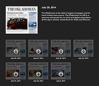
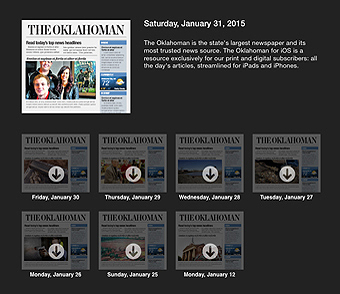
Above: The Oklahoman mobile newspaper: existing and proposed. I wrote them about adding the day of the week to the listings on their iPad version (a daily paper ought to include the day) I included the two images above as an example of the improvement. No response. I wrote again. Nothing. Many weeks later, a former student saw this essay and wrote his boss, the Creative Director. That finally nudged them to act:


This mailer tells us there's a big event on the 25th. Its so easy for designers to respect their readers by giving us the day - in this case, it is a Sunday.


I donate blood regularly (its just the right thing to do). I went online to make an appointment and nowhere in the process did the blood center tell me on what day the blood drive would be held. I had to perform a separate function of opening and checking a calendar to determine what day the 23rd would be. There is no reason I or any user of their website should have to do that - just include the day with the date.
Reminder: we schedule our lives in days, not dates.

The OSU Museum of Art opened an exhibit of a Frank Lloyd Wright house and sponsored four programs:


The text of the program details were in prose form - one paragraph per, and it wasn't easy to find the important info.
Improvements:
• Add the day of the week.
• Add a line break after the title and after the time & place.
• Bold the important info.
Below: I not only added the day of the week, but also changed the text to read in a more logical, clearer order. 'Leaving for OKC' is redundant since the headline says 'to OKC'. Changed that to read 'Leaving OSU', which is more appropriate for the student to understand.


Places that got it right


Another correct example. This was from Target, 2011:


In the example below, the two columns on the left include both the day and the date, the columns on the right have just the date. Again, see how much clearer it is. It respects the reader and his/her time.
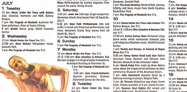


The two ads on the left include the day, the two on the right do not. Notice that there is plenty of room to include the day of the week.
Please include the day of the week whenever you print a date of upcoming events.
Thank you. And please spread the word.
Three ways to denote a date
To denote an exact date, one must provide 3 bits of information - the year, which month, and the specific date. Those 3 bits can be arranged in different ways - there seems to be some disagreement which is more correct - it differs by country, company, system, and culture.



We state time in decreasing increments - from larger to smaller - hours, then minutes, and down to seconds. Maintaining continuity with that logic, the idea that drives this option is this - start with chaos and refine to specific. When referring to a date, it makes sense to state the year first - that narrows the chaos down to 1 of 365 days, then the month - now, we're down to one of 28-31 days, then the specific date. The reader or listener is taken from the broad to the specific in a logical easy-to-follow format. If the listener, reader, or audience knows the year referenced, one can omit the year and just give month and date (above right).
Sometimes, the year is not necessary as those involved in the exchange assume the year is the current one and the year could then be omitted from stating the date. Then, the logical system is adhered to but also respects the prevailing custom of month and date. If all numbers are used (1950-27-07), there can be some confusion when the date is 12 or less. Does 10-8-12 mean December 8, 2010, August 10, 2012, or October 8, 2012? This confusion can be minimized if the culture has agreed upon this particular system.
Another solution is to use letters for the month, full or abbreviated: YYYY MMM DD or YYYY Mmm DD, like 2012 APR 04 or 2012 April 4. This method is used in China, Japan, and Korea; by the US military and The New York Times:


This format is the one preferred and promoted by the the ISO (The International Organization for Standardization).
In 1946 October, delegates from 25 countries met in London to create the International Organization for Standardization; it began operations in 1947 February 23. The organization promotes worldwide proprietary, industrial and commercial standards. It is headquartered in Geneva Switzerland, and works in 164 countries to facilitate world trade by providing common standards among nations. Nearly 20,000 standards have been set covering manufactured products, technology, food safety, agriculture, and healthcare.
ISO 8601 Data elements and interchange formats - Representation of dates and times was issued by the ISO in 1988. This standard provides an unambiguous and well-defined method of representing dates and times, so as to avoid misinterpretation of numeric representations, particularly when data is transferred between countries with different conventions for writing numeric dates and times. When dates are represented with numbers they can be interpreted in different ways. This uncertainty can be very frustrating, in a business context it can be very expensive. Organizing meetings and deliveries, writing contracts and buying airplane tickets can be very difficult when the date is unclear.
• Date and time values are ordered from the largest to smallest unit of time: year, month (or week), day, hour, minute, second, and fraction of second: YYYY-MM-DD
• YYYY-MM-DD sorts both alphabetically and numerically.
• Representations and formats of dates use the Gregorian calendar and times are based on the 24-hour timekeeping system.
• Each date and time value has a fixed number of digits that must be padded with leading zeros. The first of the month is 01.
• Representations can be done in one of two formats - basic, with no separators (19661230) or extended, with separators to enhance human readability. The basic format should be avoided in plain text. The separator used between date values is the hyphen, while the colon is used as the separator between time values. Example, 2009-01-06, 08:15.
• ISO 8601 prescribes a four-digit year (YYYY) to avoid the year 2000 problem. It represents years from 0000 to 9999, year 0000 being equal to 1 BCE.


This option is driven by the concept of stating the most important info first - the date of the event/activity, then progressing sequentially to the month, then the year. As with YearMonthDate, if all numbers are used (10-8-12) there can be some confusion. This method is popular in Europe and in the flight info from United Airlines (above right).
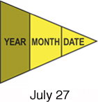


This system - commonly used in the USA - is based on the notion that the year is usually understood; the only info needed is the month, then the date. If the year is needed, then it is tacked onto the end of the date, as supporting clarification. But, adding it to this end makes it less sequential and less logical.