
How to make elevators (and escalators) more user-friendly


The button panel on the left is in the garage elevator at an airport. Users at the airport may be in a hurry and have a lot on their mind. That person, trying to catch a departing flight, does not want to have to think about button labels. Just make it clear. Most of the users in this elevator cab (if not all of them) will be heading down to the tunnel that connects to the terminal building. That's the T on the panel, although many people would not know that the T was for tunnel; some might not even know that they would be taking a tunnel. The T button should be ridiculously well marked so that the user enters the cab and, in a quick glance, sees to punch that button to get to the terminal. No thought, no deciphering, no explanatory plaques or signs - just an obvious label - large, clear, and demanding - that quickly communicates exactly what the user wants to know.
Placement of controls on a stove, car dashboard, and in elevators should allow some sense of intuition and common sense to determine the function and connection between the task and its control device.
The star next to a floor button conveys the level to exit the building, usually ground level. The other buttons should be arranged in a way that makes some rational sense to the rider and can be understood rapidly.
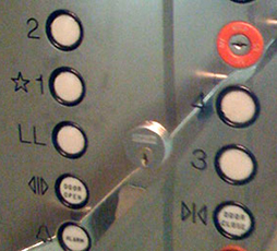
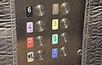
In the photos above right, the button for floor 3 is lower than the one for floor 1 - intuitively, floor 3 should be above floor 1. This picture was shot in an academic research building at a university. Since these control panels are custom made for each installation, this panel could have easily have one column of the 5 floor buttons on the left side (closest to the elevator doors so entering patrons can access them easily with less disruption to the other riders). The other column could have the less-frequently-used buttons, alarms, and locks.
Criteria for better elevator button panels
A better system for placement
Buttons on an elevator panel should be placed in a composition that is orderly, logical, and intuitive. Lower floors should be towards the bottom and the numbers should increase as their location rises on the panel. Rather than in horizontal rows like pancakes with maple syrup stacked on a plate, buttons in vertical columns are more like the floors in a building. The user wants to travel up or down, not left or right.
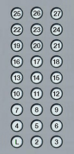
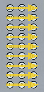


Typically, button placement seems random and not very well thought out from the user's PoV (all design should be built from the user's PoV, always.) From the reference point (usually the Lobby), the user looks up to find their floor, or down if leaving the building. Intuitive, "I want to go up." On existing layouts, the user reads left to right rather than up.
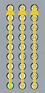
The columns of buttons could even be staggered up to better convey the direction towards the top of the building:
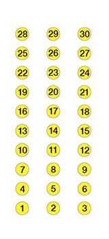
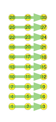

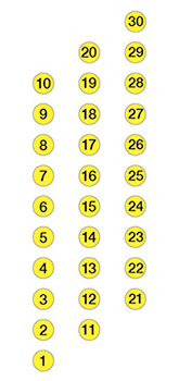
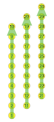
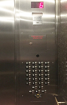


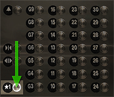
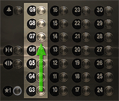
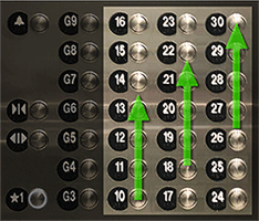
A common example. Above left and middle: Existing. Right: Better layout.


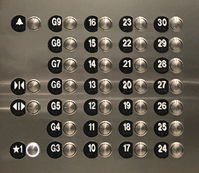
Above left and middle: A fairly standard button layout - a grid of sequential buttons, left to right and bottom to top. Better: above right. This particular elevator has several groups of stops - Lobby on 1, Garage levels 3-9, Amenities on 10, and Residences on 10-30, as shown below:
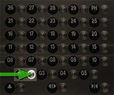

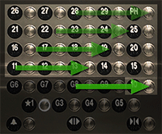
Below: The improved layout shows the intuitive layout by groups. The most popular button - the lobby is in the lower left - everyone touching this button wants to go down. The next column is the garage levels, from bottom to top (going up). The residences are in the next 3 columns, going up. Another popular button, the amenity floor, 10 is at the bottom of the residence floors and in line with button 1.
Lesson: Since building floors go up or down, elevator buttons should do the same.

Nice example from the Austin Public Library (the number decals need to be replaced).

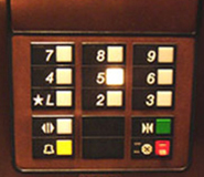
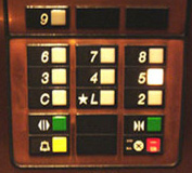

These are two elevator panels in a condo building in NYC. The building has 9 floors and a basement. The elevator on the left services only the 9 residential floors. The one shown in the middle serves the 9 floors plus the basement. The basement is accessible only by building staff (to get to the trash compactor, maintenance room, etc.) However, the two panel arrangements do not jive. One has 9 floor buttons while the other has 10. Having each button panel with a different layout means that the user can't learn the arrangement and punch buttons consistently. It would have been easy to have both panels laid out the same (far right above). The C or cellar button could be in one of the blank slots below the numbers. It does not need to be in a logical position since it is only staff that punch that button. There are already two blank slots; there's no need to add three slots above the panel to accommodate that 10th button. The proposed solution would have been cheaper (no additional button slots), more consistent and uniform, and more efficient and appropriate for the primary users - the building residents and visitors.

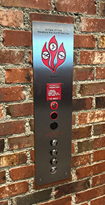

This elevator is in the Coca-Cola store at Disney Springs in Orlando. Of the 7 round objects on the panel, only one is for the customer. And it is a bit hard to find. On the wall directory, 1 is at the top and 3 is at the bottom.
Improvements
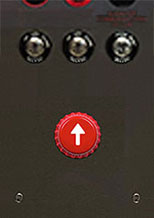
More obvious user button. Bonus: the bottle cap shape relates to the Coca-Cola store.
Better confirmation of pressed button. The existing button had a ring of light so faint that it doesn't even show up in the photos.
Group non-essential items together and away from the user button.
Directory on the wall is in logical order. Higher floors are higher up on the Directory.


Below: There are 4 'buttons' to choose from to call the elevator. The white button seems obvious. The correct button is the top one. Even after pressed, the confirmation is small and easy to overlook.

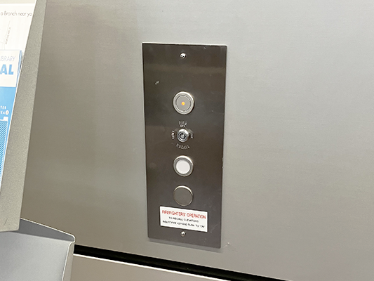
Below: 3 buttons, 2 of them in eye-catching red. They added a clearer way to denote the correct button to push.
Design tip: if you have to add an explanation - don't. Improve the design so there is less confusion.
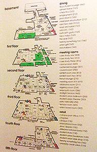

1. Left: The building directory and map in an elevator in a Student Union shows the basement at the top and the top floor at the bottom (no visitor would think to look inside the elevator for the building directory). Update: the Union has been completely renovated and this directory map no longer exists.
2. Not a bad idea - to be consistent in ordinal numbering. Ignore the correct spelling of 1st and 2nd.
3. This panel is in a Manhattan parking garage - the buttons are color coded to match the color coded floors of the garage. Great idea. If one parks on the yellow floor, they don't even need to remember the floor number, just the color. Unfortunately, the layout is poor - zig-zagging up.
Better Emergency & Information button placement
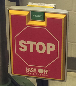

1. Left: Large buttons for common stops (Lobby, Street level) would enhance efficiency. The button is for machinery that needs to be shut off in a hurry - but, the idea would be valid in other uses.
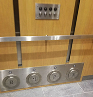
2. Right: Large toe-tapping buttons at the floor for residential buildings in which elevator riders may have arms full with packages or groceries. Also a good idea during times of pandemics to avoid touching anything in the elevator cab. Of course, there is a limit on the number of buttons that could fit around the perimeter base. Still, a good idea to explore easier button pushing - maybe elevator controls will be voice activated soon?
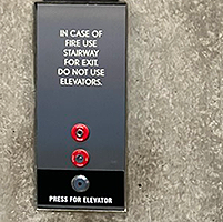
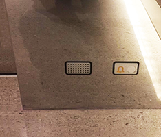
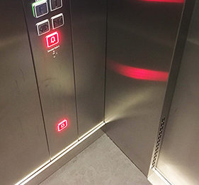
Below: In these elevator cabs, there are additional intercom and alarm (left) and emergency (right) buttons down low to facilitate use and encourage passengers to get down to the floor if the cab fills with smoke (though its a good idea to not get in an elevator during a fire.)
Better proximity of elements
Below left: Existing and middle: Improved. The importance of proximity and up should be above down, just as in most physical realms. Maybe a larger arrow could be the button?
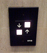
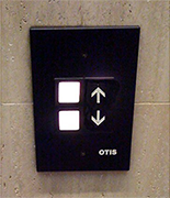

Below: This elevator cab was quite dark (in a trendy hipster hotel - trying to be cool?) Note that the floor labels are almost equidistant between the columns of buttons. I only needed to punch 1 (the star) and 7 - both in the center column. It took a second to process which column of buttons was appropriate.


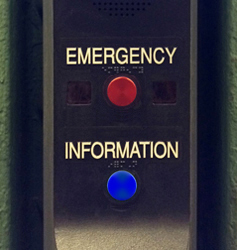
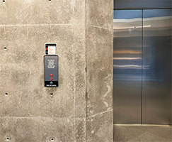
Walking through an NYC subway station, I noticed this call box mounted on a column. The lettering was easy enough to read, but the buttons weren't quite right. It seemed there might be two options, but it wasn't very clear. Was it one button for Emergency Information or two buttons - one for Emergency and another for Information. As I studied it more closely, I saw the second button below the word Information. There are 3 problems:
The Info button does not stand out and can be easily overlooked, especially from a distance or if in panic mode (it looks brighter in the photo than it did in actuality).
The info button is green. Blue is the standard color for Information on signage.
The text word labels are not in proximity to their buttons (the red button is closer to Information than it is to Emergency).
On the right, above, is a revised version with a green info button and the labels moved closer to their respective buttons.
Lesson: Proximity is an important design guideline - position related elements in close proximity to each other. Buttons and labels should be closely adjacent to be read as a single unit.
Better escalator markings
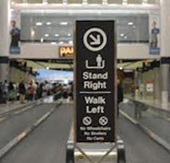
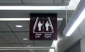
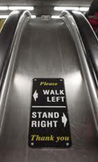
An escalator and moving sidewalk custom in many cultures is for people who want to just stand to keep to the right - those who want to keep climbing or walking use the open left side. Some cultures are still in the Education Mode - training users on the stand/walk etiquette.
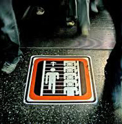
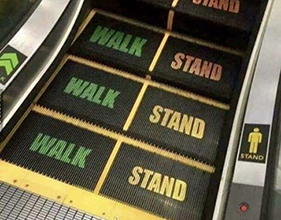
Signs and symbols must first get our attention - they must be noticed. The examples below place the symbols and info in the user's sightline, not off to the side or overhead, but right where one has to look. The designers of these symbols considered the needs and habits of the target audience.
Lesson: Great design solves problems that make the solution more effective, useful, and beautiful.


Better button labels
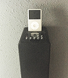
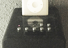
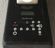
This iPod speaker system (about $60 from Walgreens/CVS) has 7 identical buttons in 2 rows. With tiny text labels.
I often turn the unit on/off and change the playlists - in dim light. Absolutely impossible to decipher the button captions and I don't want to memorize them. The buttons, their labels, and their placement was not very well thought out. Poor attention to detail and poor empathy for the user.
So, I printed some new labels for only the buttons that I use - On/Off, iPod source, and Volume up and down.
www.jamesrobertwatson.com/elevatorbuttons.html