

Some projects and essays on design in NYC
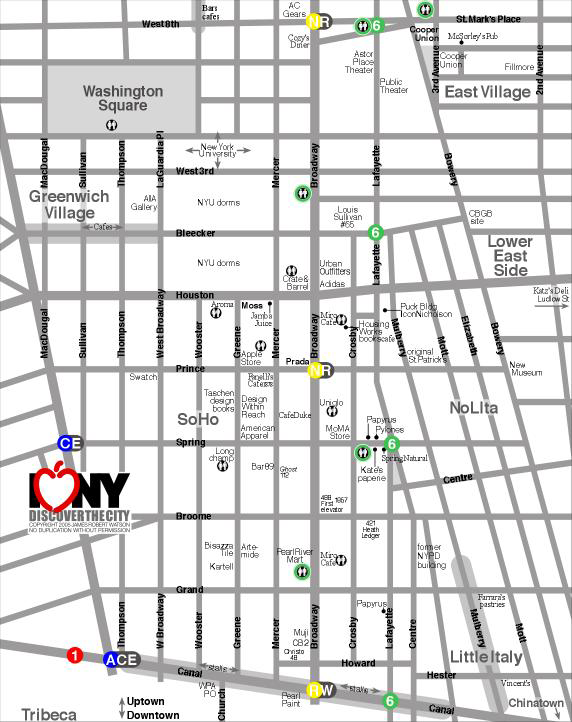
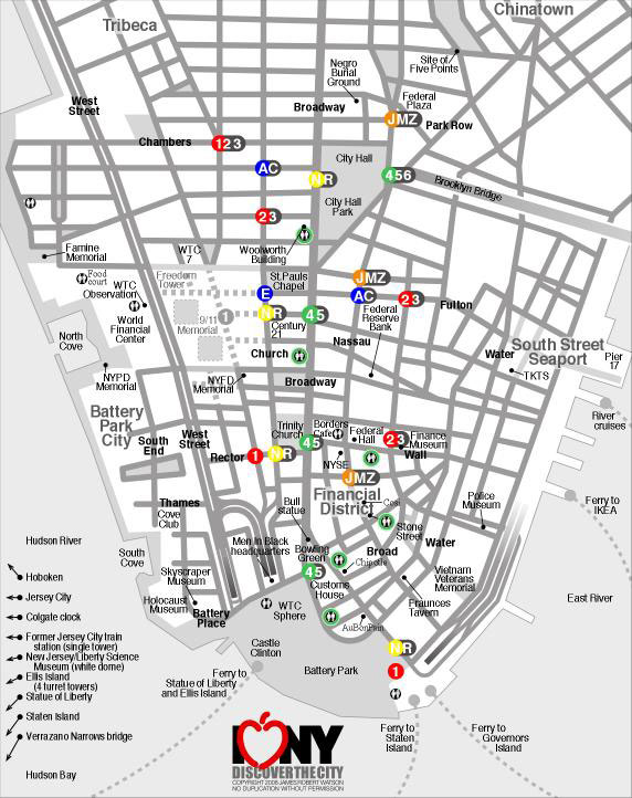
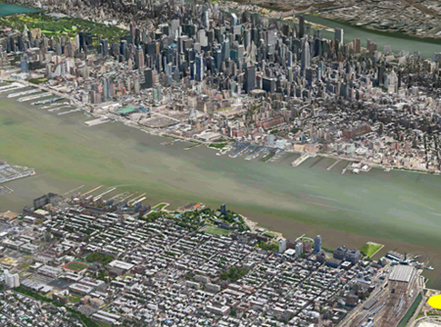
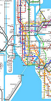
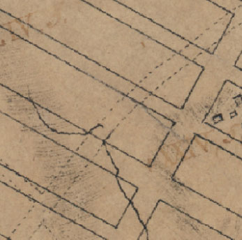
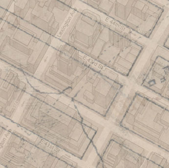
GuideMaps: New York City
Created for student Study Tours, including streets, landmarks, design sights, restrooms, and subway entrances.

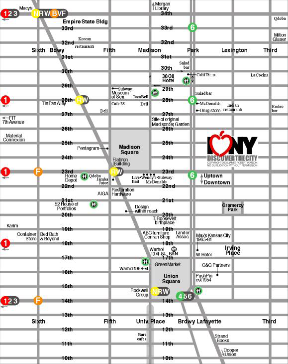
Above left: Midtown and Fifth Avenue. Above right: Design district: Madison & Union Squares.
Below left: SoHo. Above right: Financial District/Lower Manhattan.
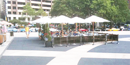
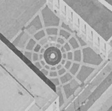
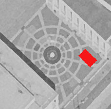
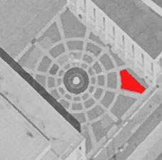
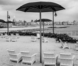
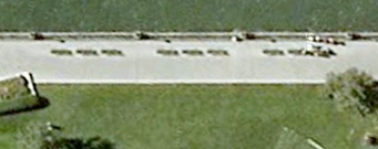
A better seating arrangement on the plaza at Lincoln Center
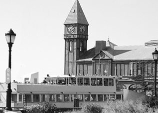
Lincoln Center in New York City is a campus of 12 performing arts and educational organizations. The main entry to the entire campus is the open public space with its central Revson Fountain set into a distinctive patterned pavement designed by Philip Johnson. The Plaza pavement masonry was renovated and the Fountain enhanced with lighting and technical upgrades. On the plaza are often seasonal food carts and a seating area. The arrangement, however, of the seating area and its surrounding fence ignore the patterns and lines of the plaza and the fountain.

Design objectives
Integrate elements to enhance the overall environment.
Respect and emphasize existing architectural elements.
Empathize with the user and with the pedestrian point of view.
A better layout would be to align the fence barrier with the dominant patterns in the plaza. The umbrellas could be aligned on the gird formed by the surrounding buildings, thereby integrating the seating area to both the plaza and the buildings. The proposed arrangement allows the Philip Johnson-designed plaza to maintain its original design integrity. A friend showed this section to the cafe owner who was intrigued and said he'd try it next season.


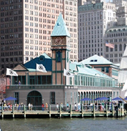
A better Statue of Liberty Visitor Center experience

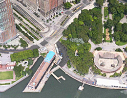
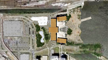
Visiting the Statue of Liberty is one of the most popular visitor experiences in New York City. Since 9/11 and the implementation of heightened security procedures, there hasn't been a great way to manage and educate the crowds of visitors. A tent was set up to contain the security scanners, but the long line of people queues up outside in Battery Park. Tickets are sold at a separate nearby site - the old Castle Clinton historic site. But, a better solution has been sitting in Battery Park for many years.

Pier A, the only remaining Victorian-era pier along the Hudson River, can be repurposed as the home for the Statue of Liberty experience: selling tickets, queue line, security scanners, historic exhibits, boat boarding, and souvenirs and food service.
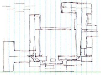
Imagine the complete immersive immigration experience - it starts as the guest approaches Pier A and sees the period architecture. Inside are a foyer of ticket booths, stairs, escalators, and elevators to the second floor. Up on that level are exhibits and the security checkpoint, more exhibits, and a crowd waiting area replicated to imitate the immigrant experience. The boarding area is patterned after European docks of the 1920s. The interior design conveys the crowded sense of waiting to board a ship for the New World. Two or three gangway boarding walkways extend to the second level of the ferries. This allows simultaneous boat exit and entry - guests exit the boats on the lower level and enter the boats on the upper level (where most guests end up, anyway) - this will speed up the transfer of visitors.
The ferries then sail across the harbor to the sight of the statue, just as many immigrants experienced her. The boat vessel has a mutimedia presentation to recreate an immigrant's voyage and arrival. There could be large screens playing videos of recreated immigrant boarding and sailing scenes. Then when in view, the screens could give way to the actual view of the Statue in the harbor - just as immigrants caught a glimpse of it. Then on to Ellis Island. The debarkation docks on Ellis and Liberty Islands continue the period look. Another sight is the Jersey City train station where most immigrants arrived by ferry from Ellis Island and caught a train to a new life in Chicago, Cleveland, St. Louis, and up and down the east coast. Upon the return voyage and debarking the boat, the guests exit down a wide gangplank and through the first floor of Pier A where there are gift and food kiosks, seating, and views of the harbor. The enhanced experience turns the Statue visit into an event, a show worthy of the half-day time requirement.
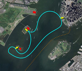
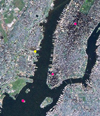
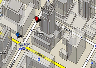
Routes of the ferries from Pier A to Ellis and Liberty Islands. Pier A is at the tip of Manhattan in the upper right. The red dots are, from top to bottom, the Jersey City Train Station, Ellis Island and the Immigration Museum, and the Statue of Liberty. The orange dotted line is the route of the Staten Island Ferry.
Right: Pier A is the light blue dot in the lower right.


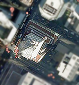
The building: Pier A, the Statue of Liberty Visitor's Center


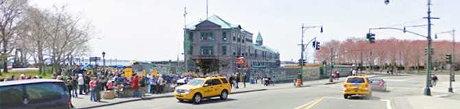
The entry plaza has ample space for crowds without compromising Battery Park.


Advantages to the Pier A Plaza Visitor Center
• Pier A allows the entire mainland experience to be consolidated in one embarkation and exhibit building, providing a landmark identity.
• A larger, more visible, entry plaza on Battery Place allows easier traffic flow of visitors from buses, taxis, and subways.
• Moving the ticket booth out of Castle Clinton frees it up for historical exhibits, a more appropriate and respectful use of that building.
• Battery Park is rid of the temporary white tents and tacky crowd barricades.
• More of the Battery Park river walkway is opened up for better vistas of the harbor.
• Security checks can be conducted in a more secure and less obtrusive environment.
• The queue line is indoors, out of the weather elements. Videos and exhibits can occupy the attention of those in line.
• Space for immigration/Statue exhibits is provided for waiting visitors and for the many people who choose not to visit the statue or arrive too late to get a ferry ticket.
• Two-level loading and unloading speeds up the process and shortens visitor waits.
• Space is provided for vendors of food and souvenirs, protected from the elements.
• A landmark for the experience is visible from along West Street, Battery Place, and Battery Park. A miniature Statue on the top of the flagpole on the Pier A roof provides a strong and familiar visual reference.
• The cohesive continuity of buildings: Liberty Island, Ellis Island, Jersey City Train Station, and the new Pier A Visitor's Center become major components of a comprehensive Immigration Experience.
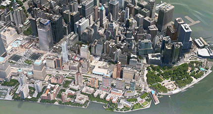
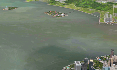
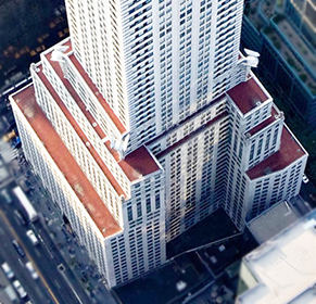
Pier A juts into the bay on the lower right (blue roof), 9/11 Memorial is left center, Staten Island Ferry is right center.


Enhanced visibility at the edge of Battery Park and at the foot of West Street that runs up the Hudson side of Manhattan. The WTC and 9/11 Memorial are a few blocks away.
Idea and sketches: 2009.
Presentation: 2013
Other options for Pier A
LoMa Museum Downtown, or Lower Manhattan, needs a comprehensive history museum. The most historical part of the metro area is within a few blocks of Pier A: early Hudson shipping and piers, Battery Park, early naborhoods, Castle Clinton, Statue of Liberty, Governor's Island, Customs House, Bowling Green, World Trade Center, City Hall, Park Row, Woolworth Building, Wall Street, Fraunces Tavern, Stone Street, Delmonico's, and many more significant sights. Pier A is well located to serve as a starting point to explore downtown.
Visitor's Center: Ticket Booths, Restaurants, and Gift Shops. In the front section could be ferry tickets, harbor cruise tickets, the TKTS booth (move from the Seaport or add a third location). The second floor with its great views of the harbor could accommodate at least two restaurants. The entry level could contain gift shops to take advantage of the mass amounts of tourists.
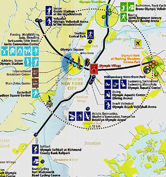
A Disney resort in the New York City area
The Disney Company has a large presence in New York City through their Broadway shows. And, while they have resorts in California, Florida, Hawaii, Paris, Tokyo, and Hong Kong, there is nothing in the densely populated Northeast. They tried a while back with an American-themed park, but it was too close to sacred Civil War battlefields and raised too much opposition.
Cirque du Soleil has permanent shows in Las Vegas and Walt Disney World in Florida but nothing in NYC. They have mounted many shows in New York in a variety of venues. They, too would benefit from a permanent venue in the Big Apple.
Dates: Idea and sketches 2011. Presentation: 2013.
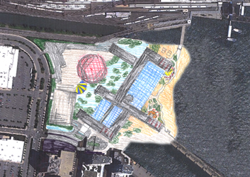
The concept: A vacation destination to appeal to the Disney fan with resort amenities, including an indoor/outdoor pool, waterfront location, and water sports; a permanent Cirque du Soleil showplace; and easy access to the Statue of Liberty, Disney on Broadway, and all that Manhattan has to offer. Much like resorts in Hawaii, Florida, California, and Asia; and on their cruise ships. The resort could even include Disney timeshare units and vacation packages before or after boarding a Disney Cruise ship.
But, a major problem for both Disney and Cirque is finding enough land in the city and then paying high Manhattan prices.
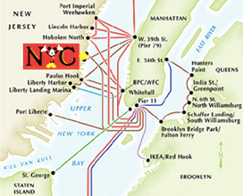
Solution: Build a resort in New Jersey. Yep, instead of being in the city, have a view of the city. Like Disneyland and Walt Disney World, the resort is located in and part of a major amusement park - New York City. Guests would take excursions into the city, but from a resort getaway on the water, a resort that has the safe, familiar, and comfortable Disney attitude and service.
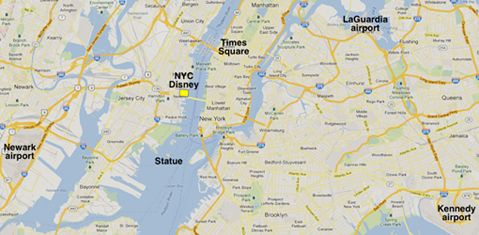
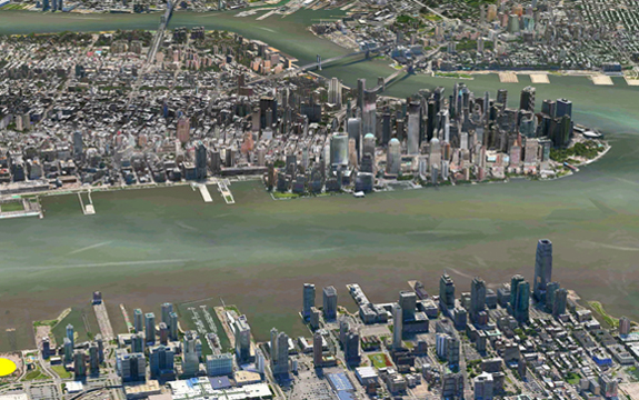
Location: On the Hudson River waterfront between Jersey City and Hoboken, across the Hudson from Greenwich Village, between Downtown and Midtown. Two blocks off of Interstate 78 and US1, and a short way from I-95, allows easy freeway access and convenient highways from all 3 NYC airports. The red dots are, from top to bottom, Times Square, the new World Trade Center and the 9/11 Memorial, and the Statue of Liberty.

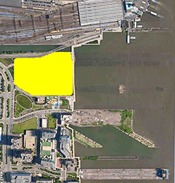
At the very northern boundary of Jersey City. The Erie Lackawanna train and ferry depot is at the top of the photo. Newport Mall and movie theaters are at the lower left.
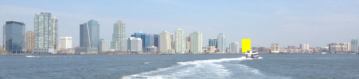
The resort on the Jersey City waterfront. Below: Statue of Liberty on the far left.
Views of Midtown Manhattan and the Hudson River from the resort.

Activities at the resort
• Fireworks several times a week
• River watersports: paddle boats, kayaks, jet skis
• Bike rentals, waterfront bike path
• Indoor/outdoor pool and waterpark
• Cirque du Soleil
• Hotel restaurants, arcade, and theater
• Breakfast and dinner cruises
• River tour boats: Hudson Bay, loop around Manhattan
Activities nearby in New Jersey
• Newport Mall with movie theaters
• Hoboken
• Light Rail: downtown Jersey City, PATH trains to Manhattan and Newark Airport, Liberty Science Museum, and Liberty Park
Ferries across the Hudson
• Times Square: Broadway shows, 3 or 4 are Disney musicals
• Midtown and Rockefeller Center
• Museums: The Met, MoMA, the Guggenheim, Natural History
• Statue of Liberty and Ellis Island Museum of Immigration
• Downtown: WTC, Wall Street
• Brooklyn: the bridge, IKEA, waterfront park, Grimaldi's Pizza, Dumbo shops
• Plus, all of the other sights of New York City
Shuttle vans
• Liberty Science Museum, Airports, train stations, and Meadowlands sports arenas
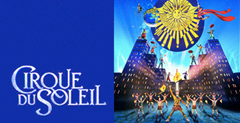
Cirque du Soleil mounts amazing and popular shows that tour all over the world and have a permanent presence in Las Vegas and Walt Disney World. This NYC Disney show could have an urban, city theme and be integrated into the resort complex. The same ferries that transport resort guests would also ferry ticket holders from Manhattan to the resort venue.
Numerous ferries ply the Hudson River. Above right: How the waterfront might look.
Below: The Disney Aulani resort in Hawaii
The resort could pay homage to the days of Art Deco when NYC gained many of its classic skyscrapers: Empire State, Chrysler, GE, Chanin, etc. A rough rendering showing the Hotel towers (brown) and the Cirque arena (red & white) and the expanded riverfront beach and boardwalk. Sketches:
House of Metrocards: Metrocard building cards

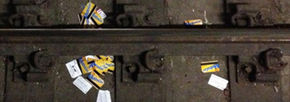
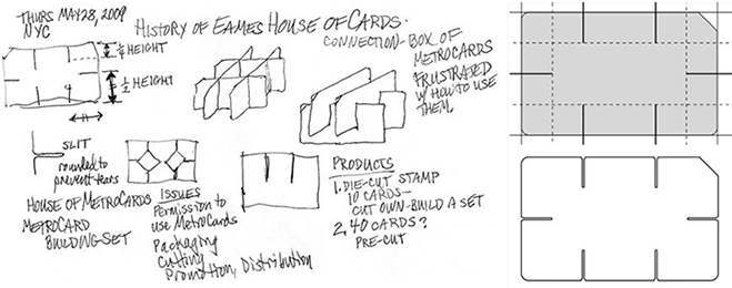
I have collected hundreds of used MetroCards from the NYC subway. With 735 of the cards, I created three vertical sculptural columns. The cards take on a new life - from utilitarian access to aesthetic repetition. But, I still have hundreds more and there are always some hanging around the kiosk booths down in the stations. I was a bit frustrated with the waste of the used cards. Apparently, MTA employees just toss the used cards in the trash or down onto the tracks. I called to verify this and was told that they do not reuse nor recycle them. What a shame.
Years ago, I was fascinated with the work by Ray and Charles Eames. One of their products was the House of Cards.
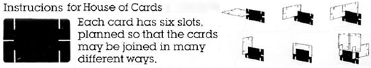
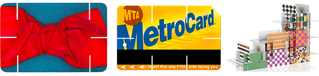
A House of Cards card shown on the left. A device that punches slits into used MetroCards would create building cards. One can then use the MetroCards to create structures as the Eames proposed for their card kit. Advantages:
• Allows used MetroCards to be recycled into a new purpose.
• Is cheaper than the House of Cards - the MetroCards can be picked up in almost any subway station.
• Simple to package and market.
House of MetroCard kit components
1. A slit puncher
2. An instruction sheet
3. A few sample MetroCards: 1 cut, others uncut.
Dates
Collect cards: March, 2004-2016
Inspiration for the building kit: May 27, 2009
Sketches and development: May 28-30, 2009
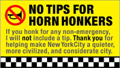
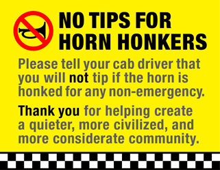
No tips for horn honkers! A solution to obnoxious taxicab horn honking


New York City is full of energy. But, the downside is there's lots of noise and distractions. A major contributor is car horns, most often honked by taxi drivers. The city has posted the warnings shown above left and recently, they have vowed to crack down on honks and issue more fines. But, its not working.
Most honks are completely useless. Just obnoxious and of no value. The honkee is usually stuck - that driver can do nothing about the situation, and the honker is not making things any better. Horns should be reserved for courtesy calls - reminders, caution - or for emergencies. Honking is so prevalent that many people tune them out and when, like the boy who cried wolf, it is really crucial, they would be less effective.
Maybe we install devices in vehicles with three different options for honking a horn:
1. A siren sound used only for emergencies - it would command the most respect in the surrounding area. It could be the sound of a person screaming - as a warning of danger.
2. A brief friendly toot - used to alert pedestrians and other drivers of a situation that needs attention, like caution, watch out, etc. It could even be like the sound of a person doing the Ahem cough or Psst - something more human, courteous, and less intrusive.
3. An electric shock - used when the driver is just being rude or stupid. This would replace many honks in the city.
An effective way to address the problem is to implement a public campaign in which cab riders vow to warn a cab driver that if he honks the horn, it will affect his tip. This can be done with a verbal statement upon entering the cab:
"Good morning, 5th Avenue at 59th Street, please.
If you honk the horn for any non-emergency, you will be tipped less."
Or by handing the driver a card as shown below. The cards are a more effective way for the rider to get the point across without seeming as confrontational. The bright cards might have a longer shelf life and would help push the campaign along. The notices for the drivers should be easy to store and carry, convenient to access, and convey a clear persuasive message.
The plan hits the drivers exactly where it can have the most impact. It shouldn't take long before a cab driver is motivated to change his honkin' habits. Once a critical mass of people use this approach, the drivers couldn't be sure which entering fares will cooperate. The yellow, band of checker pattern, and upper case font convey the connection to taxicabs.
Items for cab riders to hand to cabdrivers. Dollar bill size, Credit card size, Business card size:
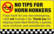
Below: Flier and ad to post. Below right: Sticker to post on doors of taxicabs:


Please program your car key fob so that the horn doesn't honk when you lock your car. Most cars have this option - check the Owners Manual for the instructions. Its quite simple to reprogram the key fob. The sound of the locks clicking still provides an aural confirmation that your car is locked. The extra horn sound is unnecessary, rude, selfish, and obnoxious. Okay, it may not be quite that bad, but it will still be nicer without the honks. Many car key fobs allow you to double click the button to sound the horn in case you need to find your car in the lot.
Better solution: car manufacturers should program the no-honk as the default on the fob. People who feel they need the honk can program the fob to do so. But, for all the people who don't think about it or don't care, the horn option would be turned off.
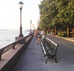
Wider walkways with no additional land

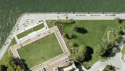
Just move the benches closer to the seawall. Grouping them into sets of 2, rather then 3, allows easy access to both ends of each bench - there is less need for an access aisle along the seawall railing.


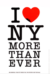
The I Heart NY More Than Ever logomark
In 1977, the New York State Department of Commerce sought to turn the downward spiral of a increasing crime and a weaker economy. They wanted to develop a public relations advertising campaign that would be positive, memorable, and significant to forming a new brand for New York. They hired an advertising firm, Wells Rich Greene to develop the campaign. Research and surveys of visitors to the state confirmed that people really did have a love affair with New York. People loved the museums, shows, parks, historical sites, restaurants, and on and on. The common spoken answer, I love New York became the new tagline for the campaign. To develop the visual mark, the Department of Commerce hired Milton Glaser. Glaser designed a mark of stacked capsules containing the words I LOVE and NEW YORK. He presented it to the committee from Commerce and they liked it and accepted it for use. But, Glaser wasn't completely satisfied - his brain kept working on the problem and exploring solutions.
He knew that design can always be made better.
A few days later, Glaser was riding in a taxicab when another idea struck him - what about replacing the word LOVE with a symbol of a heart. It was not too familiar as a mark for the word but it was familiar for the concept of love as a result of Valentine's cards and Cupid. Then, he realized, if he could abbreviate LOVE with a symbol, he could take that further and abbreviate NEW YORK with the symbols N and Y.
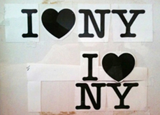
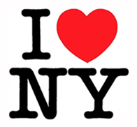
He sketched his idea and contacted the Secretary of the Department of Commerce the next morning. He told the commerce secretary that he came up with a much stronger visual mark for the new tagline. But, the secretary didn't want to reassemble the committee and go through the approval process again. Glaser insisted that he at least come by his office and just take a look. The secretary came by, took a look, grabbed the comp and left the office. The new mark sold itself and has since become one of the most recognizable and most copied icons our global culture.
Immediately after the planes hit on the morning of 9/11, Glaser added the words MORE THAN EVER below the mark and put a small bruise on the bottom of the heart.


He sent his quickly produced emotional expression to a friend at the New York Daily News who rushed the new visual image into the paper. The revised statement struck a nerve among New Yorkers and confirmed how much they loved their city. It became very popular, was posted around the city, and was reproduced as a poster.

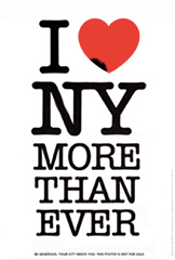
But, design, even classic work, can always be made better. Notice the changes from the original on the left to the one on the right:
1. The MORE THAN EVER lines are set centered, with uneven margins, rather than justified with even margins.
2. The kerning - letter spacing - is improved, more consistent, especially around the A in TH A N and the V in E V ER
3. The visual weight of the MORE THAN EVER text is more substantial - to support the mass of I heart NY above it.
4. The tiny gap between the N and Y is tightened, unifying the characters representing the state.
Side-by-side comparisons


CityGuides NYC
I often see people looking at maps, looking at street signs, or just looking lost. I will go ask them if I can help them find something. I have yet to be stumped. In my naberhood there are many questions about the World Trade Center and how to get there - I guide them there and tell them about the exhibits and models of the memorial and new office towers that are on display. I guide people to subway lines, Brooklyn, Times Square, Little Italy, etc. Someone pointed out (while waiting on me to help some lost folks) that it is the teacher in me, wanting to help and guide people. I also wonder if it is the training I got for 4 summers while working at Six Flags to help guests. Whatever, I enjoy it. I want these tourists/visitors to have a good experience in New York and to not think all New Yorkers are abrupt and rude (I don't let on that I'm not really a New Yorker)
Saturday, July 29, 2006, I walked downtown to get a haircut. I saw some people with a map. I offered to help and guided them to the WTC site. While talking to them, several others gathered and waited patiently in line. They then asked for directions. I guided them also. Others sought a good place for breakfast (we happened to be standing near a place where I had breakfast with my brother just a few days earlier). So, there is apparently a real need for guides around the city to help the lost and confused. Some naberhoods address this with naborhood Alliance volunteers. But its not enough. I propose CityGuides that are trained, equipped, and visible to provide a valuable guide service.
The concept
Volunteers, each with a pack of maps, a marker, and literature of naberhood. They are dressed to stand out - a vest, hat, or pennant. They proactively seek lost people. Each also has a cell phone to a base attendant with adequate literature and maps to can answer almost any question.
Objective
The purpose would be to enhance tourism experience. Help visitors have a more positive experience while visiting NYC.
1. Volunteers
2. Packs of info
3. Cell to answer source
4. Coordinating agency to oversee volunteer schedule, resource. Could partner or use the naberhood alliances.
5. Stand-out uniform (example to the left of a Gray Line Guide) showing colorful vest, pack of info and cell phone.
Locations
Volunteers would be, not just at these locations, but out on the sidewalks, roaming the naberhoods, near subway stops, busy tourist sights, and major street intersections; seeking and helping. Some sample area coordinating locations:
Booth in City Hall Park: downtown west, WTC site, Broadway
South St. Seaport: downtown east
Castle Clinton: downtown south
Fashion Center Kiosk: midtown west
Times Square Info Center: Times Square
Metropolitan Museum of Art: Fifth Avenue, Museum mile
Time Warner/Lincoln Center: West side, Dakota, Central Park
Maps that suggest a Hudson Ocean
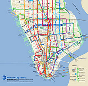
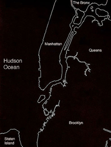
The map above left is from the New York City Metropolitan Transit Authority. It shows downtown Manhattan with the Hudson River (ocean?) on the left and the East River on the right. For some arrogant reason, New York mapmakers, especially those with the MTA, do not like to acknowledge New Jersey. But, many people in New Jersey work, shop, and party in Manhattan.
The purpose of maps is to orient us to our surroundings and guide our journeys. They should. at least, be accurate in their portrayal of the surrounding environment. City limits are no longer accurate divisions of metro areas. Metro areas include numerous towns and cities that are more accurately defined by the the television viewing area, geography, and highways.
This seems to be another example of designers not communicating efficiently to their target audience. Designers must keep in mind the end user and design for those people, not for themselves. The MTA cartographic designer was narrowly thinking of just having to show the routes within Manhattan.
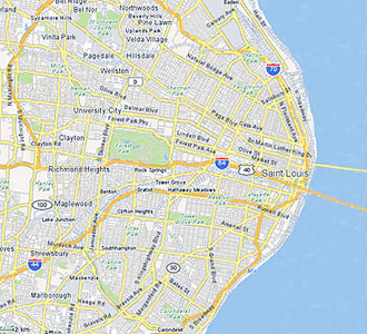
Maps that got it 'right' The maps above are a bit more accurate in that they show the proximity of New Jersey to Manhattan. Above right: If Missouri had the same disregard for Illinois as New York does for New Jersey and if the New York mapmakers were given the task of a St. Louis map, that city would miraculously be on the ocean - the Mississippi Ocean - with the downtown bridges spanning an expansive body of water.
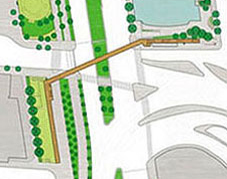
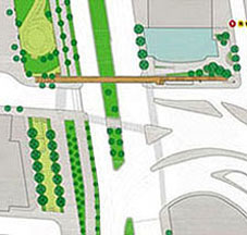
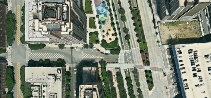
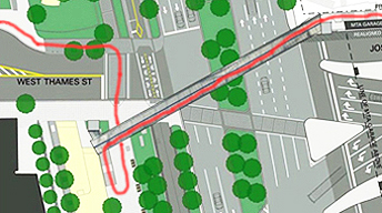
The West Thames Pedestrian Bridge over West Street
The intersection of West Thames and West Street connects the NYC Financial District to Battery Park City. This is also where the Brooklyn Battery tunnel empties into Manhattan. Here are 3 pedestrian crossing options:

In June of 2009, a 21-million-dollar pedestrian bridge at the intersection of West Thames and West Street connecting the Financial District to Battery Park City was announced.
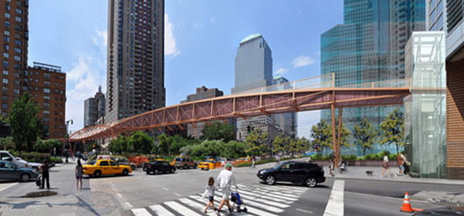
The bridge has 3 angled sections with an elevator and ramp at one end, and stairs & ramp at the other. This plan:
Adds to the literal and visual chaos of the intersection.
Requires the removal of an entire row of trees.
Removes shade from one side of the dog park.
Does not integrate into the order and alignment of the naborhood.
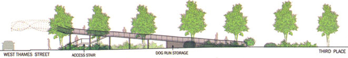
Above: Elevation of the bridge ramp and staircase along the dog park. Below: The row of trees that will be cut down.

In this more obvious and intuitive solution, the bridge goes straight across West Street and terminates with an elevator and a staircase on the west and an elevator and ramp or stair/ramp on the east. A few advantages:
While it may seem hard to integrate the philosophies of organic architecture in an urban setting, the existing sidewalk locations, dimensions, and curves look custom made for the western landing to be on the north side of Thames Street. That side better respects and maintains the fabric of the naborhood by integrating the bridge with the alignment of the existing street and building grid.
The new bridge will serve the residential buildings along Rector Place, South End Avenue, Thames, and Battery Place. Residents farther south will likely use the crosswalk at Battery Place or 2nd Place/Morris Street. As residents from Rector Place and West Thames walk to the financial district or to the subways along Rector Street, many will not have to cross Thames Street.
The distance of the bridge span would be as short as feasible, thus requiring less material.
Option 2 would be the most convenient for the most people, fit the site better by respecting the existing grid and alignment, enhance the naborhood aesthetics and quality of life, maintain the most existing trees, and be more cost efficient.


This option acknowledges that crossing the intersection, with barriers, stoplights, crossing guards and a nearby police presence is quite safe and convenient. The State Department of Transportation has added some traffic-calming features, including colored crosswalks, more than 500 trees in the median, additional time for pedestrians to cross, countdown signals, and reducing the speed limit from 35 miles per hour to 30.
The city cannot guarantee anyone's safety. People should take responsibility for their safety - making smart decisions at busy intersections. They should guide and set an example for their children.
The intersection is already quite safe - traffic signals with Walk and Don't Walk signals, concrete and stone barrier walls, protected median landing, landscaping, recently funded crossing guards, and police officers within a few yards. There is no evidence that the intersection of West Street and Thames is dangerous.
With or without the bridge, school kids have to cross a street before they get home. This particular intersection is quite safe for any person taking responsibility and paying attention to the signals.
This option would save the city millions of dollars.
6 years later: Proposal #2

The 2009 proposal never got adequate funding, went through a lengthy public design review, and hit some bureaucratic and design snags. The snags were finally resolved and a new proposal was presented in 2014. The revised West Thames bridge is a 240-foot-long concrete and steel structure with a glass roof and is expected to cost $27.5 million (not including any certain-to-come overcharges). It will be accessible by stairs and elevators on each end. With no ramp along the dog park, fewer trees will have to be removed.


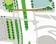
Above left: In 2015, the canopy over the staircase was deleted. Below left: Proposed layout. Right: Option that is cheaper, requires removal of fewer trees, better respects the urban grid, is visually more appealing, and provides a more convenient walking option.


New brand name for Lower Manhattan
Manhattanites have established identities thru their naberhoods - SoHo, Lower East Side, etc. These names help define and locate areas within the diverse and conglomerated city. Some areas are named after a prominent landmark (Times Square, Rockefeller Center), or an area (Upper West Side, Murray Hill), or an industry (Fashion/Garment District, or an ethnic concentration (Little Italy, Chinatown), or acronyms that encompass several identifying marks (SoHo, TriBeCa).
Examples of some acronym brands
NoHo: North of Houston Street
SoHo: South of Houston Street (no relationship to the older Soho in London)
TriBeCa: Triangle below Canal Street
NoLIta: North of Little Italy or North Little Italy
LoDo is the lower downtown area of Denver, Colorado. A historic district known for its shopping and nightlife, it serves as an example of the success of urban renewal.
The downtown area
Lower Manhattan, until recently, was very commercial - lots of offices but not much residential. Since pumping in post-9/11 money, the nature of the area is changing. Office buildings are being converted into condominiums and retail and restaurant growth is booming. New museums and cultural centers are being built or are proposed. The naberhood is establishing a new feeling of excitement and enthusiasm.
So, this part of Manhattan needs a brand - an identifying name. Current reference names include Downtown, Financial District, Battery Park City, and Lower Manhattan. But those names don't quite work. Downtown is too vague - some New Yorkers say anything south of 14th Street is downtown, others say it is south of Canal Street. Financial District referred to the area that was primarily commercial/corporate. That area is changing rapidly to more residential and Financial District now sounds a bit too cold and corporate for a residential naberhood. Battery Park City is often confused with Battery Park and designates a specific sliver of landfill west of the city proper jutting into the Hudson River.
Lower Manhattan is already used and recognized by some - the Lower Manhattan Development Corporation was created to guide the rebuilding of the area after 9/11. There's even a website: http://www.LowerManhattan.info
From an article in the New York Post - in the years since 9/11, aggressive building and selling has doubled the residency. In 2000, the area east of Broadway south of City Hall house 19,000 - that figure is projected to boom to 65,000, a boom so far unmatched in Manhattan. But Lower Manhattan doesn't have a distinct association - so far, its used for corporate and distribution of information. So, while Lower Manhattan has some name recognition, thereby minimizing the education process for a new name, it is not quite sexy nor memorable enough. We need a short catchy name.
Proposed brand: LoMa
Reducing Lower Manhattan to the first syllables (as in SoHo and TriBeCa) gives us the name LoMa. This designation is easy to say, write, and remember.
Here's a fun twist - in Spanish, the word loma means hill and, in the local native American Indian dialect, Manhattan means land of hills. Nice connection.
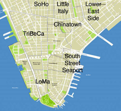
LoMa, the area below the white dotted line on the map, would include the area south of Vesey Street and the WTC site (TriBeCa now comes that far south), City Hall, and the Brooklyn Bridge. It would include Battery Park City and the Financial District, but not the South Street Seaport area which is now trying to establish its own new identity and brand. Specific boundaries would probably remain somewhat vague as developers position and market their buildings in certain identified and branded naberhoods. It seems there is a need for a moniker to clarify the areas downtown. We'll see which one wins out and joins the New York vernacular. Concept: Summer, 2006

1. A logo from the Lower Manhattan Marketing Association (LMMA?) May 2007
2. An Art Festival used the name LoMAN for Lower Manhattan. 2015
3. Banner references the area as the 'south end.' That could work - South End is easy to say, write, and remember. South End Avenue fits and clarifies the naberhood. Fall 2007
4. Many references use the name 'Financial District'. That has a bit of baggage - for years, the financial district was considered to close up at 5pm when the workers left to go home. Because downtown is booming with new residential construction and conversions, the developers may get Financial District to work.
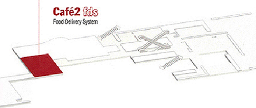
New table cards for MoMA's Cafe2
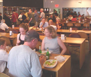
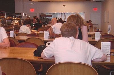
One afternoon in the fall of 2005, I was at the Museum of Modern Art - MoMA. I had ordered lunch in Cafe2 (the cafe on the 2nd floor) and went and sat next to an older woman. As we were waiting for our food to arrive, we got to talking about the food delivery system - FDS.
An explanation of the MoMA FDS
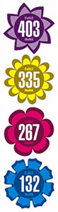
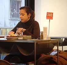
The host hands you a card that explains the procedure at Cafe2. After you order at the counter, the cashier hands you a laminated card with a number on it and she (they were all women) types that number into your order on the machine. Once you find a seat, you are supposed to place your numbered card into the alligator clip mounted at the top of a wire stand. Guys (they were all men) later pick up the order and check the ticket for the number that the cashier typed in. The guys then have to scan the entire room until they find the card with the number that they seek.
Okay, back to the story: This woman wisely suggested that they could color code the numbers. Brilliant idea. I told her so. She flushed a bit and we discussed it a bit further, enjoyed our lunch, then parted ways amicably.
A few months later, Sean and I are sitting in about the same area in the same cafe. I told Sean about the discussion I had with the lady. We further refined the concept - 3 or 4 different colors. And different shapes. Color coding the numbers and using different shapes would reduce the amount of cards the guys would have to scan. If the guy was looking for 'Red round 44' he would only have to peruse the round red cards until he found number 44. Also, Cafe2 at MoMA was very minimally furnished - simple tables and chairs, white walls with white framed white art on them. We felt the splashes of accent colors on the table tops would add a nice aesthetic touch to the space. Especially since it was in a museum. We made a few sketches and notes (our work space shown at left). Sean took some pictures and we refined our notes and the images over the next few weeks.
Design concept
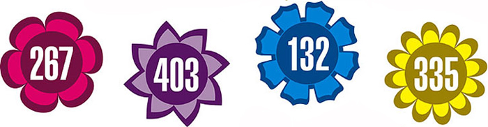
The proposed new FDS consists of colorful unique floral shapes that uniquely denote food order numbers and provide an innovative and fun aesthetic element within Cafe2 at MoMA.
The new cards also serve as 'centerpieces' on the table. Centerpieces remind us of having guests over, decorating the table, and providing a special sense of comfort and care for our guests. The floral shapes offset the rigid geometry of the architectural features in the space and become, themselves, abstract works of art - art that is functional and enhances the Cafe2 dining experience.
Objectives/criteria/advantages
The proposed FDS table cards:
1. Enhance the efficiency of delivery of food. It is easier and quicker to spot a particular number. The basic concept already in place with black & white, is now carried even further.
2. Add a fun layer of aesthetics to the cafe. The spots of colors and shapes become focal points that help unify the room and provide a sense of whimsy and fun for the tired and hungry museumgoer.
3. Continue to show how MoMA pays attention to detail and impresses the visitor with innovative graphics and systems for operation. The proposed solution meets the objectives of improving the FDS and adding a fun element of focal aesthetics to the museum cafe.
Sean designed a leave-behind presentation that included diagrams, sample cards, sketches, and thorough rationale.
In addition to improving the efficiency of the FDS and enhancing the aesthetics of the space, the new shapes offset the rigid geometry of the architectural features in the cafe and become themselves, abstract works of art - art that is functional and enhances the dining experience for the MoMA guest.
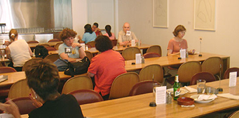
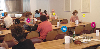
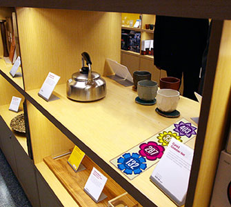
Above left: the existing FDS in Cafe2. Right: the proposed FDS in Cafe2.
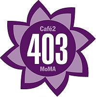
The new shapes and colors used in Cafe2 lend themselves appropriately to a set of coasters that can be sold in the MoMA Design Store. The museum visitor can now take a bit of their experience home with them. Each flower shape has the additional copy of Cafe2 and MoMA to help reinforce the brand image of the museum. The coasters are sold in a flat pack of 4. The simple clear package allows the coasters and MoMA brand to be easily seen while sitting on the shelf in the store. Shoppers can buy multiple sets if they need more than 4 coasters.
Concept refinements, notes, sketches and fotos: July 2006
Preparation of submission packet: September & October 2006
Submission to MoMA: October 20, 2006

Cafe2 was remodeled in November of 2006. A visit after it reopened showed that they are now using three colors - black, white, and red. Each card has instructions printed on it.
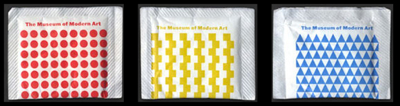
In 2009, I noticed a new pattern on the napkins - these geometric shapes would be perfect on the table cards. These patterns were designed by Ivan Chermayeff in the 1960s for use on sugar packets at the MoMA Cafe. The three basic chspaes - circle, square, triangle - would be perfect for the table cards.
The slightly blurry foto below is of brgr, an excellent hamburger restaurant on 7th Avenue in NYC that uses a similar system of colored flag cards.

The unusual angled plot line of the Chrysler Building


As shown in maps, satellite views, and blueprints, the footprint of the Chrysler Building in Manhattan has an unusual angle on its eastern boundary that doesn't respect the alignment of the street grid. Most people I've asked aren't even aware of the angle and those that are aware do not know why that side of the building is at an angle.

The old map below shows a country road angling right where the Chrysler Building would later be built. I contacted Christopher Gray, the Streetscapes columnist for The New York Times - he confirmed that the country road was the old Boston Post Road, which snaked up the east side, mostly between Third and Second Avenues and led to Boston. Along this road was carried news of the Declaration of Independence. Over time, the city transferred the title of the roadbeds to buyers (the road path up the east side is erratic and does not always appear block to block). When I overlaid the map showing the Chrysler Building with the older map - it was a perfect match that explains the odd angle on the side of the building.

Alignment of ornamentation bands: Across 5th avenue from the Met and downtown in the Financial District.
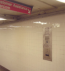
PUSH FOR HELP seems more effective than 'Customer assistance intercom'. Does one care if its an intercom, telephone, walkie-talkie, or whatever - one just wants help. The potential user is likely a bit anxious and in a hurry.

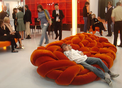
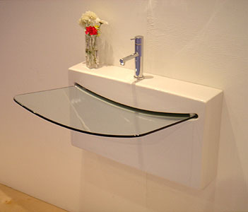
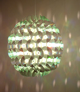
The International Contemporary Furniture Fair
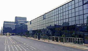

The International Contemporary Furniture Fair. I had sent in a request for an entry badge. Since the fair is open to the trade only - interior designers, furniture designers, retailers, and wholesalers; I didn't expect to get a badge. They wanted proof that I was in the trade. I was about to prepare something when I received notice that I had been approved and my badge was on its way. Great. My theory on how that happened is that they saw I chaired a Department of Design that had an accredited Interior Design program. So, I went. I was blown away. A convention center full of the latest furniture, lighting, materials, and accessories. There are booths from a handful of universities that submitted entries and were deemed worthy. There is also a section where students show off their work and another area where students and young designers can sell their products - with a cap price of $20. Those are some of my favorite areas to explore. The ICFF is very inspirational - lots of great new stuff and good ideas. It is huge and exhausting (over three hours wandering numerous aisles) but such a feel-good upper.


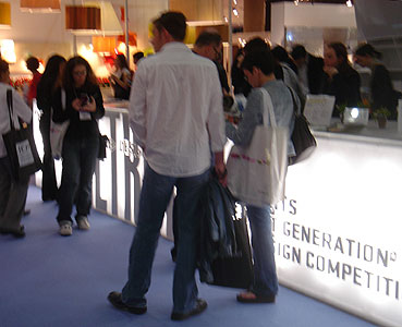
BTW: the foto above is a good example of why one shouldn't put text on the front of a booth - people will stand there and obscure the text.
Taking the stairs
The New York Walk - New Yorkers can't look down and walk or they'll run into somebody; we can't look ahead because we'll trip over something. So, we have developed this very alert way of looking down, looking ahead, and side to side - being very aware of our surroundings so we can smoothly fit into the flow of human inertia.
Clarification: Not all natives and very few tourists have mastered the New York Walk. Sometimes the sidewalk flow can be a bit chaotic.
New York City issued a set of “active design guidelines" aimed at increasing stair use. “If we engineered physicality out of our lives, we can engineer it right back in." Stair-climbing is a more efficient form of exercise than walking:
2 additional minutes of stair-climbing per day (approximately 3 floors) can burn enough calories to eliminate the average adult's annual weight gain.
There is a 33% difference, according to a Harvard study, in mortality rates between men who climbed more than 55 flights of stairs a week and those who didn't.
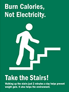
I often see people waiting on an elevator just to go one floor or two. One really shouldn't take an elevator if only going up or down 1 floor (unless physically unable or carrying packages, etc). It doesn't make much sense to use the time and electricity to move a human up 10 feet when that same person can easily (and usually faster) walk the 10 feet up. In September 2008, I saw this green sign in New York City serving to educate people to not use the electricity and provides a personal benefit - burning calories. There was a 67% rise in stair use at a 10-story housing complex in the Bronx after the city posted these signs.
Cooper Union's new academic building features luminous, centrally located stairs - and an elevator that stops on only three of the building's nine stories. It's not the first building to feature a “skip-stop" elevator; elevators at Baruch College's Newman Library and housing in Yonkers are similar. The idea was originally popularized by Le Corbusier in the 1920s to save space by eliminating elevator landings.


Buildings can discourage elevator use just by making elevators smaller and slower, tactics New York City recommends “especially in low-rise buildings." These tactics are called “the naughty strategy."
Elevator trivia
The first elevator shaft was designed in 1853 for the original Cooper Union.
• At the New York World's Fair in 1854, Elisha Otis demonstrated his new safety elevator.
A steam-powered Otis elevator was first installed in 1857 at 488 Broadway in SoHo (a city landmark, it's still there in working condition).
NYC elevator trips per day: 30 million
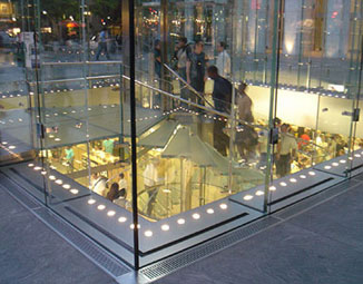
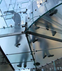
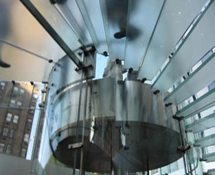
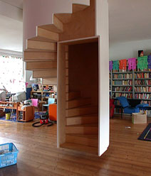
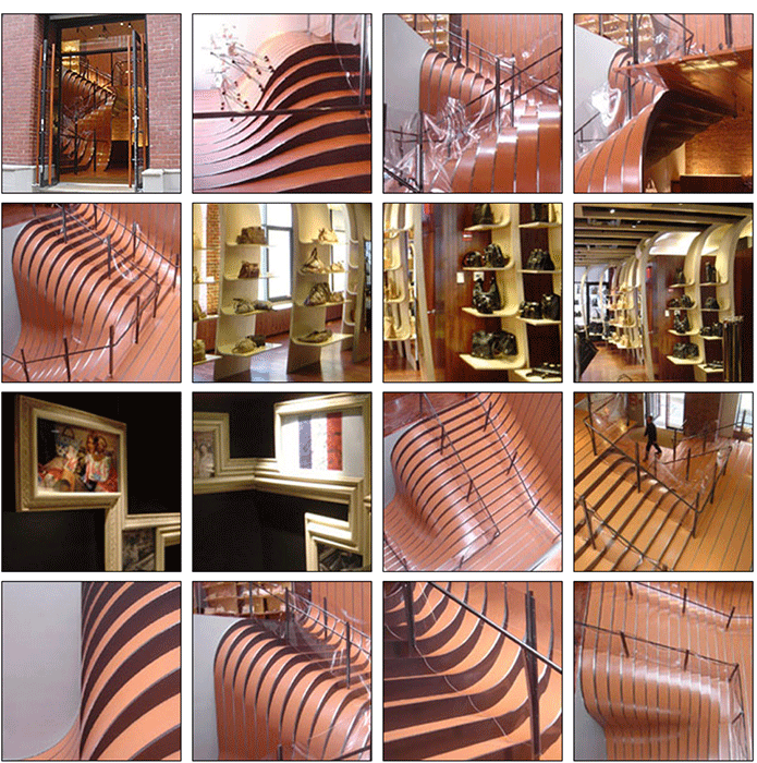
An incredible staircase in SoHo
Longchamp, a women's accessory store established in Paris in 1948, opened a store in New York City's SoHo in a 1936 building in SoHo. Because it was a small street level storefront, they told the architect, Thomas Heatherwick of London (isn't Thomas Heatherwick a great English name?) to make an entry so intriguing that people would want to climb to the second floor. The 55 tons of undulating steel plates and linoleum inserts form a spectacular entrance. The ribbon-like forms cascade down through the skylit core, dividing and converging. The stairway railings are bent plexiglas that undulate and drape as fabric might. The display shelves are strips of plywood that have been peeled down from the ceiling - each veneer layer of ply peels up to form a shelf. The frames in the bathroom are integrated with molding - a morphing of images, frames, and wall.

www.jamesrobertwatson.com/design-nyc.html