
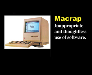
macrap
A neword by James Robert Watson, PhD, Copyright: 1998
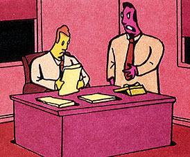
Who cares if its crap? Its digitally enhanced!
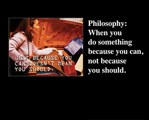
Macrap philosophy
Macrap happens when a Mac user builds graphic elements based on this premise:
when you do something just because you can, not because you should.
Many computer users are seduced by the technology and they lose sight of the task at hand - communicating or enhancing a message. When a computer user loses sight of the message and the solution objectives, the chance for poor design increases. The computer has made the production of design much easier in many ways. But with the ease, speed, and convenience; comes responsibility to use the tool wisely. If not, macrap is produced.
Macrap is not poorly designed ads - that's just crap. Macrap is a misuse of technology or design technology used by non-designers.
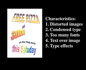
Characteristics of macrap
Multiple fonts
Type effects (zoom, shadow, inline, highlight)
Background patterns
Text over screened images
Over-condensed type
Stretched pictures
Examples of macrap
In the examples below, there are many misspelled words. That may not be surprising since macrap is a symptom of ignorance and shallow thinking. Many of these samples were probably done in Word Art for Microsoft operating systems. So, macrap may be a bit unfair, but it sounds better and is more fun to say than Microsoftcrap (some Apple fans would say that Microsoftcrap is redundant, anyway).
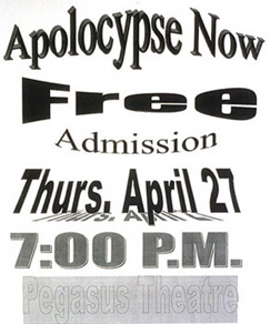
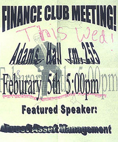

Multiple fonts, image behind type, text effects, misspelled word. Text effect, image behind type.


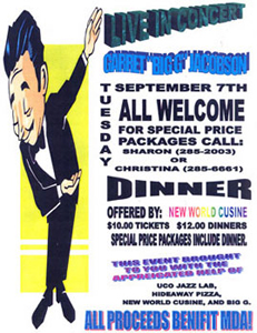
Multiple fonts, text effects, misspelled words.


Overcondensed text & image: Image as printed in ad. Image 'corrected' to normal.

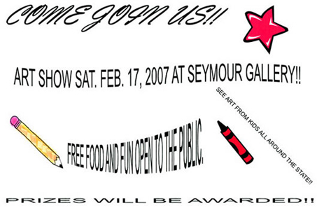
Multiple fonts, text effects, overcondensed type.
Some of the title slides I used in the lecture course, History of Graphic Design:
Some other newords
Oops, someone took credit for my word
Entry in the Urban Dictionary by someone with the avatar muddypebbles, dated 2009, 11 years after I coined the word. Notice how much of their definition is from the above macrap essay.

