
![]()
Miscellaneous projects, proposals, and sketches
A variety of notes, sketches, and proposals of additional design projects.
• Graphic design
• Product design
• Interior design
• Architecture floor plans
• Urban Planning
• Highways
• Miscellaneous
GRAPHIC DESIGN
![]()
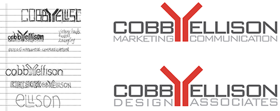
Branding mark for a Design Firm
![]()
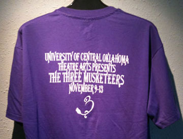
Graphics for The Three Musketeers
Initially assigned as a project for ClockTower Studios, in 1995, I stepped in when they were coming up dry. To overcome the creative block, we went to Mazzio's and ate pizza and drank beer. It didn't prompt too many great ideas, but we did have a good time. Eventually, I guided the concept and art directed the piece. The hand-rendered production was by Mitch Baker.
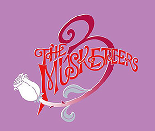

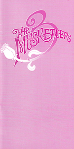
The concept conveys the swashbuckling motion of the Musketeers. The dominant element is the 3 which is enhanced by its stroke evolving into a rose stem with a white rose at the end. The prickly thorn on the stem is offset by the delicate petals of the rose. The purple background conveys the period richness while the reds and oranges provide life and action. The poster (on the left) for the play was a triangular pennant-shape with the identity filling the top two-thirds with the play info beneath. The pennant is reminiscent of the banners that hung from castles and towns of that era.

![]()
Improving a Casino Map
The Choctaw Casino near Durant, Oklahoma, is quite impressive. IT reminded me of a Vegas casino, primarily due to its proximity to 8 million people in North Texas. The architecture and interiors were well designed.
But, not so with the Casino Map: very poor readability, unnecessary color coding, awkward shapes of restaurants and shops, and busy chaotic contents and layout.
Sketched a proposal for a Casino Guide, not a map. Maps should have detail, accuracy, and information for a wide audience.
Objective of the Guide:
Rapid communication of location of places, to help the user get from where they are to where they want to go.
That's it. Simple.
Target audience:
Users in the casino seeking how to get somewhere.
Users that are planning activities for later.
The user is not interested in the building shape of the casino, size of a restaurant, shapes of amenities and restaurants, and parking garages (most will get the guide inside the casino and would have already parked).
They are not seeking details, just a guide of where to go.
Improvements:
Rotated the casino so that the familiar orientation places 'north' is at the top.
A more orderly and simple orthogonal orientation - all lines vertical, horizontal, or angled at 45 degrees.
Conference rooms are not included. The target audience is most likely not going there. There can be notes under the Guide List of amenities: 'All conference rooms are on the Grand Theater level'. Once at that level, signage and wall maps could direct the attendee to the meeting rooms.
• Delete Compass symbol. People often lose their orientation when inside a casino. Concession: with North at the top.
• Simplifying all shapes.
• Arrowheads convey entries (and exits) from hotels and parking.
• Familiar symbols: rest rooms, no smoking
• All text is set larger and with greater contrast to its background. White on light blue does not work in a dimly-lit casino.
* Remove color coding of 3 areas within the casino. Again, very few people care.
Nobody ever complained that something was too easy to read and understand.
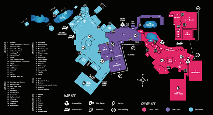

Above draft shows layout concept only. Final Guide might have color, different typefaces, and more symbols (cashier, high limit areas).
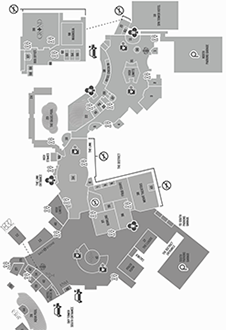
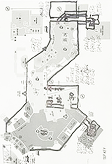
Below: Sketches from Chaos to Order.

![]()
New layout for Board Report



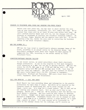
Board Report was a newsletter-style digest of news, tips, and recommendations to improve workplace efficiency, relationships, and effectiveness. It was geared towards graphic designers and other decision makers who needed to survey vast amounts of information and determine which items had value for them. That task can be daunting and waste lots of time. Board Report surveyed numerous sources and reprinted the gist of the items that had value. It was written in a breezy style and was a joy to scan and read. But, the editor acknowledged that the layout was a bit stodgy and didn't use the given 8.5 x 11 page. He asked for suggestions from the readership.

Some weaknesses of the existing layout
1. Logo: some awkward letterforms - the P in report had its stem reaching below the baseline and obscured within the text below. The body of the P became a D - not enough to adversely affect readability, but enough to look ganky in a newsletter for designers.
2. Outline around the logo: dated as being very 70s. A popular graphic treatment that transcended psychedelia and eased into mainstream corporate design. It made the look old and out-of-touch.
3. Column width: too wide - a comfortable line length for easy readability is about an alphabet and a half - 40 characters. Board Report had a column width of about 65-70 characters.
4. Layout: used all caps for its headings, but in a font that didn't work well in all caps. Roman serif fonts with their thick and thin letterforms don't read well when set in all capital letters. The headings need to encourage rapid scanning.
5. Typeface: standard typewriter serif fixed-width font.
![]()
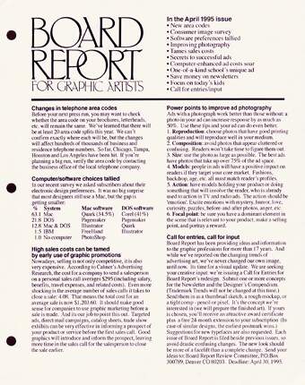
Some advantages to the new format
1. It is simple, clean, and orderly. Highly-designed trendy pieces can look cluttered and are tough to comprehend. People read Board Report for its content: keep it simple, let the reader get to the info easily.
2. The typefaces are the classic Times and Helvetica. Please avoid trendy fonts that will become tired and dated.
3. The logo retains the existing feel but is updated by the removal of the unnecessary '70s style outline.
4. The look is familiar enough to ease transition for the reader.
5. It is easy to read and scan.
a. Column width is narrower for easier eye movement.
b. Contents list allows quick reference when filed.
c. Bold headings provide easy scanning.
6. It is cheaper to produce. All info is on one page of letter size paper. This will allow you to keep subscription costs low, retaining the good value of Board Report.
I sent in the proposed design to the editor/publisher of Board Report. He didn't adopt the recommendations but he did write a nice letter of thanks and admiration. The newsletter ceased publication soon after. Design and production: April 1995
![]()
Better Pixelogic solutions


After I solved the puzzle Old Fashioned TV, I thought it looked more like a microwave oven than a TV. I had to make it better. I did and sent it in - they published it a few weeks later.
![]()
Anniversary invitation

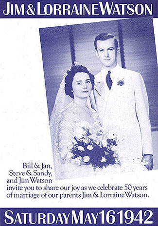
My parents celebrated their 50th wedding anniversary on May 16, 1992. What a joyous occasion - to honor a lifetime partner with a gala celebration. It was held in a country club ballroom with a great meal, speeches from each of the 3 sons, and a dance performance by niece/granddaughter Allison. Earlier, I had volunteered to design the invitation.
Anniversary invitations are fairly standard - Rococo swash lettering in a formal symmetrical composition. I wanted something more than that - something that conveyed the longevity of 50 years. The concept was to show two photographs - one from their wedding in 1942 and a current one, from 50 years later. The type and layout fit a 1940s style to further emphasize the length of time, achieved by the typeface, subdued colors, absence of green (it was being rationed during the war), and the photo elements positioned at an angle. A 40s look would also be somewhat familiar to many of the guests in attendance.
![]()
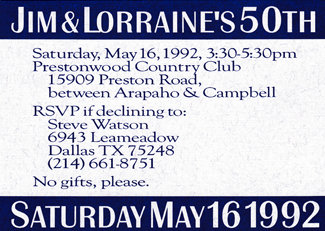
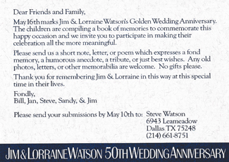
The invitations were printed on a standard card stock at a print shop in Edmond and shipped to Dallas where they were addressed and mailed. One set was framed and presented to the honorees. The unique invitation, that also served as a keepsake memento, received numerous commendations from guests. Design and production: winter, 1992
![]()
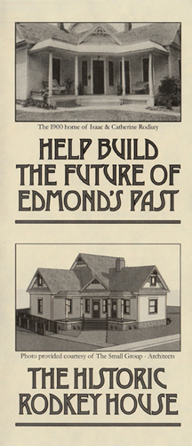
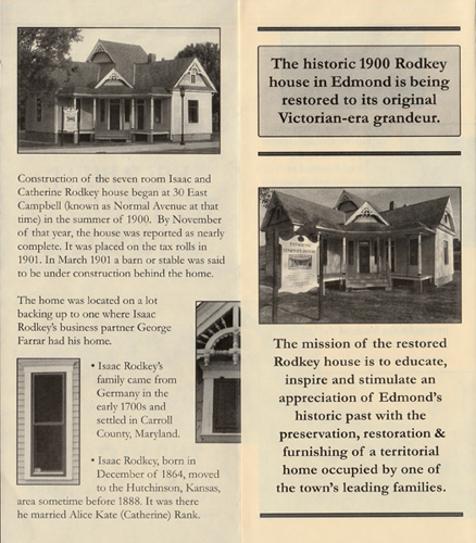
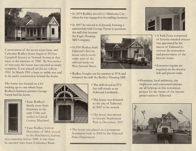
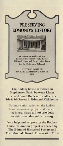
Brochure for historic house in Edmond
![]()
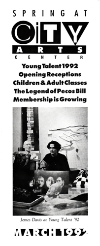
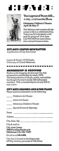
Calendar newsletter for City Arts Center

![]()
Logo for Graphic Design 1 class
Student-requested, the mark represents Jim's in-class teaching style: Student asks a question, Jim responds with another question, student discovers answer.

![]()
Christmas cards/newsletters
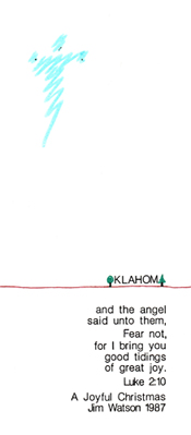
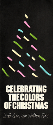
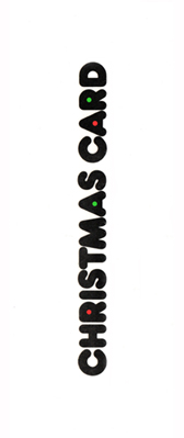

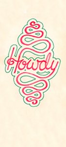
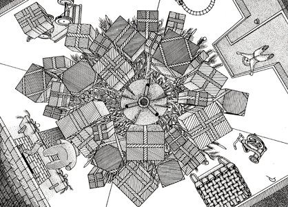
![]() 1987, 1988, 1990? just a blank card-stock, 1991 cover of newsletter. Below: 1985 illustration by Garry Lewis, Brookhaven College, 1987 Change of Address card
1987, 1988, 1990? just a blank card-stock, 1991 cover of newsletter. Below: 1985 illustration by Garry Lewis, Brookhaven College, 1987 Change of Address card
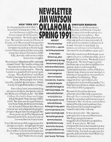
HOWDY
Time for another Newsletter, I hope to send these out three times a year: Christmas, after spring break & during the summer (or just whenever I feel like It).
I see a strong trend in more corporate communication newsletters. It seems a natural step to transfer that logic to individual needs. I'm not much of a letter writer & this is a handy way for me to talk with friends.
Although it may seem more impersonal, it is just a more high-tech format for personal communication.
I predict the newsy letters like the ones you get at Christmas will become common year 'round. We'll see.
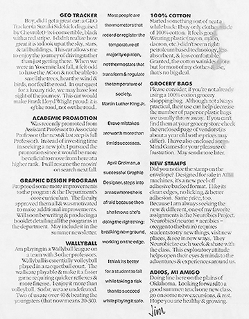
Most people are thermometers that record or register the temperature of majority opinion, not thermostats that transform & regulate the temperature of society. - Martin Luther King Jr.
Brave mistakes are worth more than timid successes.
April Greiman, a successful Graphic Designer, steps into areas where she is afraid because then she knows she's doing the right thing: breaking new ground, working on the edge.
I think its better for a student to fail while taking a risk than to succeed while playing It safe.
NEW YORK CITY
During spring break in March, I escorted 5 women to NYC: a teacher from a neighboring University & 4 UCO Graphic Design majors. We had a great time. We saw the renovated Statue of Liberty, new Museum of Immigration (encountered some Watsons in the computer data base), World Trade Center Observation Deck (unusually smog-free day), Chinatown, Little Italy, & many safe subway rides (even late at night).
We enjoyed Phantom of the Opera & Grand Hotel. We lived in a large Art Deco hotel at Times Square which has been cleaned up some. The city has done a good job of improving its image. We joked about rude New Yorkers because we met very few of them. Most people were very friendly, helpful, & courteous. There is very little graffiti on the subway.
Since they have an outstanding design collection, we spent a day at the Museum of Modern Art. The IBM Gallery also had a show on design: What Modern Was: Design 1935-1965. We also saw design shows at The New York Art Director's Club, the School of Visual Arts Museum (where we met a legendary graphic designer & got him to autograph the show posters), & The Museum of Illustration (with its annual show of the very best in illustration).
It is truly an incredible experience for design students. A highlight for me was weaseling our way to the 71st floor of the Chrysler Building to see the huge gargoyles overlooking New York City at sunset.
CHRYSLER BUIIDING
This is an Art Deco classic: built in 1929 for the Chrysler Corporation with automotive detailing throughout. The lobby floors are marble from Africa & each elevator cab is inlaid with a different pattern of imported wood. Security is very tight: no visitors are allowed in the building (we were kicked out two years ago).
I told the students to follow me to an open elevator, act businesslike, & not to gawk like tourists. We made it past the guards. We tried to get up into the very top spires but could find no access, not even through the Tunisian Consulate on the 65th floor. On our way down we met two ladies who were sympathetic to our efforts to explore the building. They suggested we see Colleen, the receptionist in their office on the 71st floor because there is a balcony there at the level of the gargoyles.
We saw Colleen but she was reluctant since the only access was through the corporation's boardroom & she was preparing for a meeting in 3 minutes. We, of course, cared about none of that & continued our plea. She relented & led us through the boardroom to the balcony.
It was spectacular. The sun was setting on the towers of Manhattan. The huge gargoyles were magnificent in their Deco stainless steel. It was a treat. We had promised Colleen we would not stay out,there long, so we went on down to the lobby, walked smugly past the guards, & back to the New York City the normal person sees.
GEO TRACKER
Boy, did I get a great car: a GEO Tracker (a Suzuki Sidekick disguised by Chevrolet) 4x4 convertible, black with a red stripe. I didn't realize how great it is to look up at the sky, stars, & tail buildings. This car allows me to enjoy the journey of driving rather than just getting there. When we were in Yosemite last fall, it felt odd to have the AC on & not be able to smell the trees, hear the wind & birds, nor feel the road. In our quest for a luxury ride, we may have lost sight of the journey. This car would make Frank Lloyd Wright proud: it is of the road, not on the road.
ACADEMIC PROMOTION
Was recently promoted from Assistant Professor to Associate Professor (the next & last step is full Professor). Instead of investing time in seeking a new job, I pursued the promotion since it would be more beneficial to move from here at a higher rank. I will resume the movin' on search next fall.
GRAPHIC DESIGN PROGRAM
Proposed some more improvements to the program & the Department's core curriculum. The faculty approved them all & was motivated to make additional improvements. Will soon be writing & producing a booklet detailing all the programs in the department. May include it in the summer newsletter.
WALLYBALL
Am playing in a Wallyball league on a team with 3 other professors. Wallyball is essentially volleyball played in a racquetball court. The walls are playable & make it a faster game requiring quicker reflexes & more finesse. I enjoy it more than volleyball. So far, we are undefeated. Two of us are over 40 & beating the youngsters (that now means 20-30).
100% COTTON
Started something sort of neat a while back: I buy only clothes made of 100% cotton. It feels good. Wearing plastic (rayon, nylon, dacron, etc.) didn't seem right: petroleum based technology, less absorbent, & less comfortable. Granted, the cotton wrinkles more but for most of my clothes & use, that's no big deal.
GROCERY BAGS
Please consider, if you're not already, using a 100% cotton grocery shopping bag. Although not always practical, their use can help decrease the number of paper or plastic bags we usually throw away. If you can't find them at your grocery store check the enclosed page of vendors (its about a year old so the prices may differ). I have also enclosed some Mind Games for your pleasure or frustration. May send more later.
NEW STAMPS
Did you notice the stamp on the envelope? Designed for sale in ATM machines, it's a new peel-off adhesive backed format. I like its clean edges, no licking, & better adhesion. Same price, too. Because I am always seeking the new & different, one of my favorite assignments is the Neurobics Project. Neurobics (neuron + aerobics = oxygen to the brain) requires students to try new things, visit new places & see in new ways. They Neurobicize each week & share with the class. This exploratory attitude helps open their eyes & minds to the adventures & experiences around us.
ADIOS, Ml AMIGO
Doing fine here on the plains of Oklahoma. Looking forward to a good summer: teach one new class, go on some new excursions, & rest.
Hope you are healthy & growing.
![]()

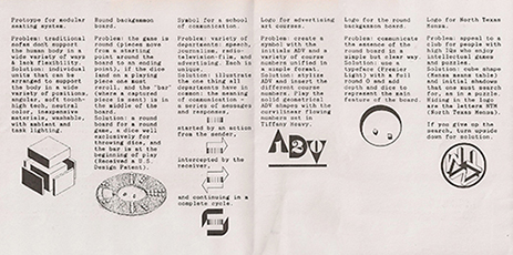
IMFORMAGINATION
Design is the process of digesting information appropriate to a design problem and producing^an imaginative solution to that problem. All designers, graphic, industrial, fashion, theater, interior^or architectural, work from this sane creative problem solving process: information in, imagination out.
Where does one end and the other begin?
The process of informagination.
Students of design should allow into their minds a diverse range of information in order to produce imaginative solutions. A variety of design problems can better strengthen one's understanding of the design process. As a designer, I constantly see a variety of design problems and solutions. If I can't lay comfortably on a sofa, I'll design one in which I can. Playing backgammon on a square board didn't make sense, so I created one that did. Graphics, especially logos, should be simple yet have depth, double meanings, or hidden characters to increase their reader involvement and effectiveness.
• Prototype for modular seating system.
Problem: traditional sofas don't support the human body in a wide variety of ways & lack flexibility. Solution: individual units that can be arranged to support the body in a wide variety of positions, angular, soft touch-high tech, neutral color, inexpensive materials, washable, with ambient and task lighting.
• Round backgammon board.
Problem: the game is round (pieces move from a starting point around the board to an ending point), if the dice land on a playing piece one must reroll, and the "bar" (where a captured piece is sent) is in the middle of the board.
Solution: a round board for a round game, a dice well exclusively for throwing dice, and the bar is at the beginning of play
(Received a US Design Patent).
• Symbol for a school of communication.
Problem: variety of departments: speech, journalism, radio-television-film, and advertising. Each is unique.
Solution: illustrate the one thing all departments have in common: the meaning of communication a series of messages and responses, started by an action from the sender, intercepted by the receiver, and continuing in a complete cycle.
• Logo for advertising art courses.
Problem: create a symbol with the initials ADV and a variety of course numbers unified in a simple format.
Solution: stylize ADV and insert the different course numbers. Play the solid geometrical ADV shapes with the curvilinear flowing numbers set in Tiffany Heavy.
• Logo for the round backgammon board.
Problem: communicate the essence of the round board in a simple but clear way. Solution: use a typeface (Premier Light) with a full round 0 and add depth and dice to represent the main feature of the board.
• Logo for North Texas Mensa.
Problem: appeal to a club for people with high IQs who enjoy intellectual games and puzzles.
Solution: cube shape (Mensa means table) and initial shadows that one must search for, as in a puzzle. Hiding in the logo are the letters NTM (North Texas Mensa). If you give up the search, turn upside down for solution.
Copyright 1987. Jim Watson, PhD. University of Central Oklahoma, Edmond, Oklahoma.
![]()
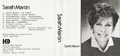
Identity for Sarah Martin
![]()
![]()
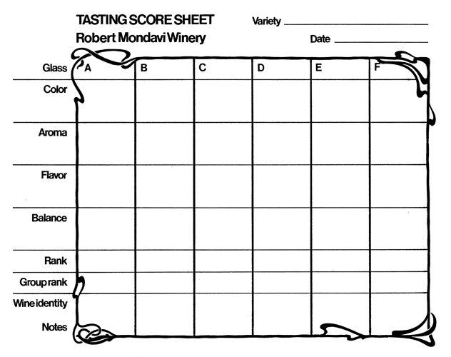
Worksheets for Robert Mondavi wine sales
![]()

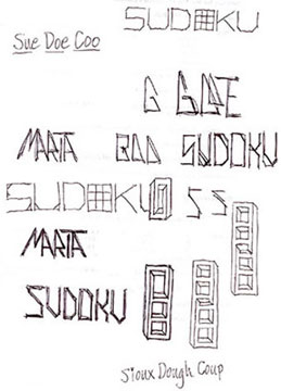
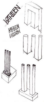
During a phone interview for dept chair, Nov 2005; a faculty meeting, Jan 2006; a committee meeting, Dec 2005
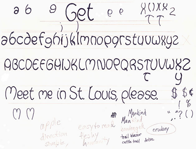

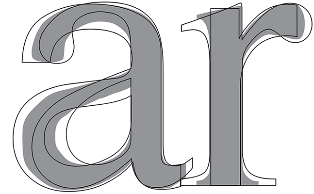
Typefaces: Cowboy bow-legged letters and a merge of Helvetica and Times Roman - the two most specified and time-tested typefaces.
Below: AARP: Arch - rainbow, sunrise/sunset, umbrella, June 2011. Richland College 1984



![]()
PRODUCT DESIGN
A better gym case
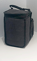

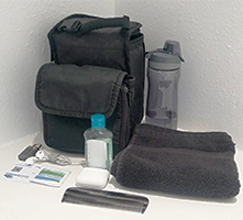
At the gym, I rarely change clothes or even go into the locker room. There are cubicles up front for storage (at the user's risk, but, I keep an eye on them). I needed a case that could carry stuff - water bottle, comb, lock, membership card (as backup only), sanitizer, towel, AirPods, back-up AirBuds, and room for a car fob and a phone.
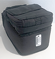
Solution: I had a travel case and an old CD case(?!) I velcroed them together so I only carry one item into the gym. Far right: I glued a memebrship bar code to the bottom so I can just wave the bottom towards the reader - no fumbling, searching, or storing.
![]()
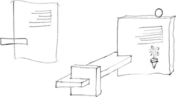
Sketch of personal tombstone 1980s
![]()
INTERIOR DESIGN
![]() Kitchens
Kitchens
Kitchens are geared to standing level - other rooms re geared to sitting level.
A kitchen should be a part of the 'community' room.
Get the cook out of the typical kitchen environment, and into the community environment.
Similar to an Early American Family Kitchen.
Work table with chairs - many kitchen functions can be done while sitting down (preparing foods, chopping, mixing, etc.) a task may take longer, but, if its a community room, there's no hurry to get out of the kitchen.
Use more free-standing furniture - less built-ins.
Hutch for plates, silver, utensils.
Island sink or free-standing sink area.
Pantry in closet, hutch, or cabinet. March 1979
![]() Bathrooms
Bathrooms
Pedestal sink with view - over open space or a window.
Mirror with no obstruction (counter, sink) in front of it so one can stand right up next to mirror surface.
Bathtub so big it doubles as a swimming pool. Problem: expense and time of filling it with water. With shower also.
Single fiberglass unit with toilet and urinal built in.
Objective: make a bathroom look more like a comfortable room for spending time and less like a standard bathroom. September 1977, LA County Fair
![]() Sinks
Sinks

Sink faucets: use color coding for hot and cold (red and blue).
Handles with graspable extensions. Round knobs are harder to turn, especially with wet hands.
March 19, 1979:
Sink high so one doesn't have to lean over as far. Febuary 14, 1979
![]() Door handles January 1979
Door handles January 1979

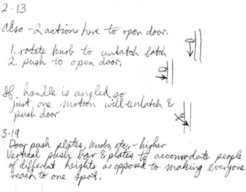
![]() The storeroom
The storeroom
For all items not used on a regular basis. Put all in one place, not spread throughout the house.
Will allow a home to have less kitchen cabinets, linen cabinets, closets.
Will allow a more efficient use of materials - less waste, less throwing away.
Should be inside but may not need direct ventilation.
![]() Vertical wall lights
Vertical wall lights
'Bright Sticks'
In closets, vertical, to light shelf and floor, rather than the top of the top shelf.
![]() Knobs
Knobs
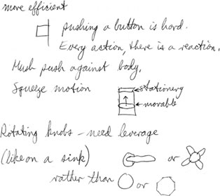
Make an adaptor unit that will fit over standard round knobs.
Material: rubber grip to stretch over existing knob and hold securely.
People will be able to upgrade knobs in current house, easily. Sold in pairs.
![]()
ARCHITECTURE
Carport and fenced yard
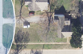

Restore porch on rental property

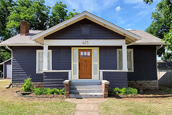
Improvements
• Remove porch enclosure. Windows don't match, there is no stoop at the front door; front door looks inappropriate for the style and the neighborhood.
• Paint exposed wall blue to match the exterior walls.
• Paint louvered vent blue. A vent in the gable is okay, but the existing one is too large for the front elevation. Either replace it with a smaller one or just paint it the wall color so it is not so dominant.
• Paint porch ceiling sky blue, pioneer style and common among bungalow houses of the era.
• Replace door to be an appropriate bungalow style.
• Select house numbers that are truer to 1920s style. Mount numbers from porch rail to overhead beam.
• Plant hedges to reduce some of the porch wall mass and enhance horizontally.
• Remove exposed light fixture. Or replace it with a period style fixture.
• Remove flagpole?
![]()
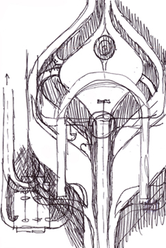
A round recording/television studio
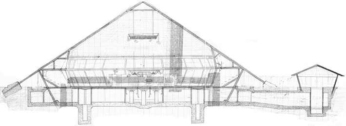
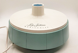
There was a period, during high school, in which I was fascinated by a nail care device my mother had that was about 14" round. The structure looked like a model of a building. Or, that's what my imagination saw it to be. I would often spend spare time (or, more likely, homework time) sketching numerous highways, amusement parks, buildings, and stage sets. This was also the era of rock bands, especially from England, and going to concerts. A local tv station had a studio in Northpark shopping center where they produced and aired an afternoon teen show similar to American bandstand called Sump'n Else. All of these factors came together and formed the concept of a recording and television gallery studio to produce albums and record live performances and television shows. Concept and sketches: 1966-69?
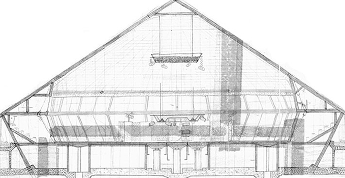
Upper level: Control rooms and private viewing boxes.
Main level: The main recording studio and gallery seating.
Basement level: Three smaller recording studios with control rooms, dressing rooms, offices, storage rooms and two sets of hydraulic elevators - one for moving sets and equipment and another central set for raising performance platforms in the main studio.
Satellite structure: Entrance to an elevator that leads to a tunnel to the main structure, to escort bands and personnel to the dressing rooms safely.

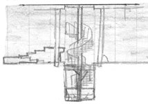


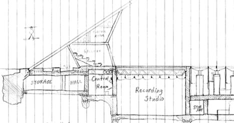
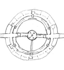
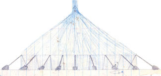
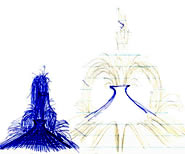
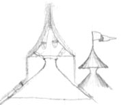
Above: Rooftop fire and fountain detail sketches. Below: The inspiration may have come from this manicure set my mother used in the 1960s. I was fascinated with explorations of the product shape.
![]()
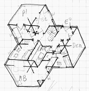
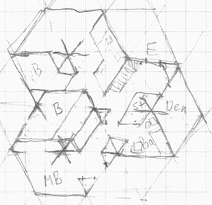
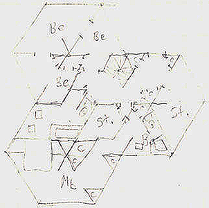
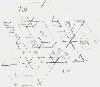
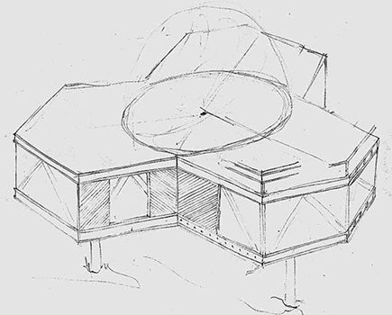
Tripod house
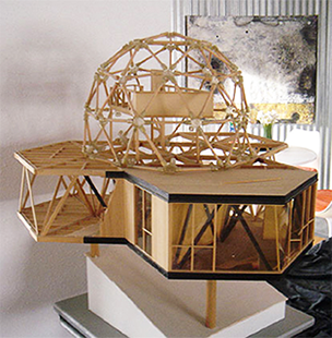
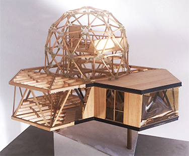
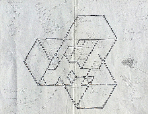
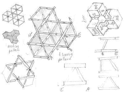
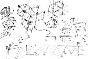
The great visionary, inventor, and designer, Buckminster Fuller developed the geodesic dome of triangular space frames to enclose the greatest amount of space with the least amount of materials. I had become a Fuller fan the last semester of college in Austin and read whatever I could find about him and his inventions. I had been exploring some issues with house design - how to incorporate a dome and how to prevent a house from cracking as it settled. Normally a house sits on a slab, prone to cracking; or piers and beams - each settles into the earth at a different rate - thus cracking. To prevent settling, a house sitting on only three legs would not crack if one leg settled at a rate different from the others. Same logic for camera and surveyor tripods - the base will always be perfectly stable. Below: A Fuller floor plan based on the equilateral triangle:


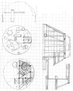
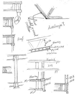
Supporting an entire house on only three points presents an engineering challenge - how to build a structure that will support enough square footage. Again, I went to Fuller and his use of the space frame - a large beam or joist made of triangular forms - the triangle being the most stable shape in design and engineering. The walls of the house are large space frames. Because this house rests only on three legs, it is ideal for inaccessible locations - rocky hillsides, slanted terrain, or where a homeowner wants to make a minimal footprint on the earth. The three concrete columns would probably need to be poured on site but the house framework could be airlifted in - if the location does not allow for easy access. Concept, sketches, and model built: March 31 - April 14, 1979
![]() Dome level
Dome level
The Fuller dome encloses the main living spaces - living, dining, and kitchen. The dome is clad mostly in glass for views and light. Over the kitchen is a loft space for lounging, viewing, and conversing. There is also access to three decks over each of the wings of the support structure.
![]() Main level
Main level
Within the truss framework that provides stability for the house and support for the rooftop dome are the private living spaces - bedrooms and bathrooms. Also at this level are a den or media room and the entry to the house.


![]()
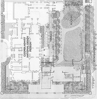
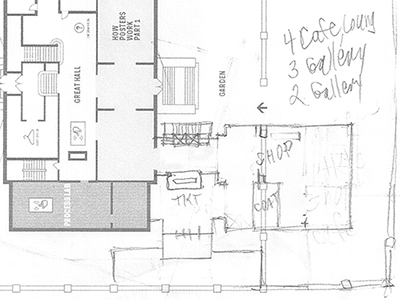
An addition to the Cooper-Hewitt Museum
![]()
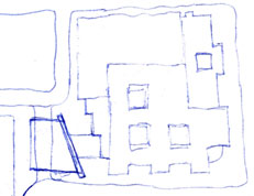
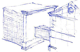

National Gallery London addition
• Small pane reflective glass to reflect surrounding buildings.
• Major focal point angled wall in materials and style to relate to existing museum.
• Angle peculiar to grid and the surrounding buildings.
• Museum cafe and gift shop on first floor with outdoor seating, pedestrian activity, and easy access - enter from the museum or from the street.
![]()
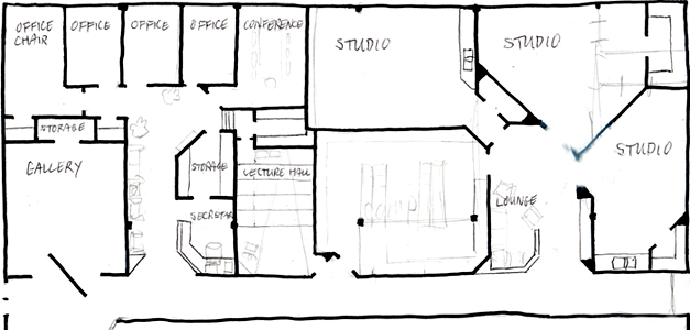
Proposal and final plan for rebuilt OC Art Department

![]()
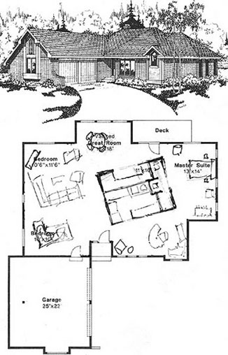
The house pod concept
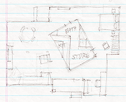
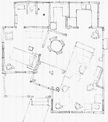
I altered the interior layout of this plan that was in the Sunday paper. Working off the concept of an open plan and spaces that flow into each other, I removed interior walls and placed the support functions (plumbing, closets, kitchen, bath) into a central free-standing 'pod' in the center of the house. Following it are two other plans of interiors based on houses spotted in Dallas and Edmond.

![]() May 1994. ??. Spring 1994.
May 1994. ??. Spring 1994. ![]() January 1992
January 1992
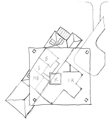
The El Paso house
The existing house (on the city grid, with the staircase) is an unadorned bungalow style, as is the new carport addition. The house addition is a simple mission adobe style. Summer 1987
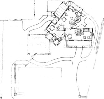

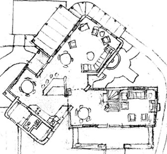
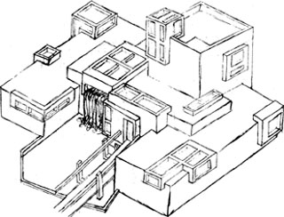
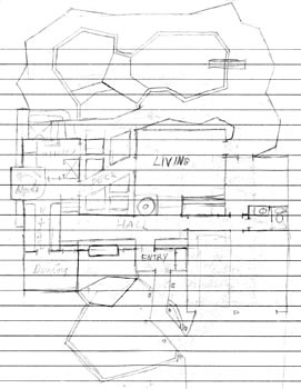
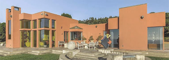
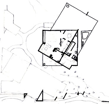
House with 'creek' and waterfall in it
Mid-late 1960s. I don't remember what the inspiration was - maybe Frank Lloyd Wright's Fallingwater house.
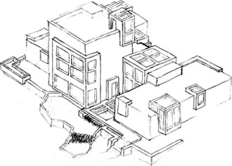


![]()
Below: Seen in 2023, over 50 years later.
Juxtaposed masses
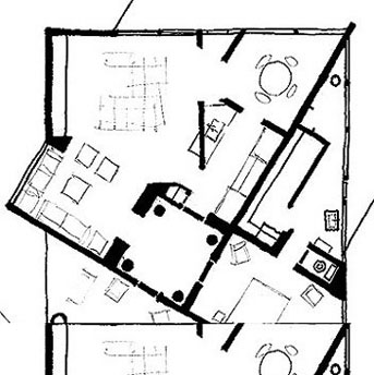
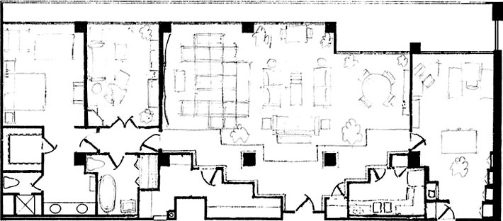
Transformation: 3 bedroom 1 den high rise apartment to 2 bedroom with office
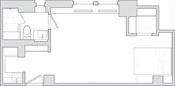
NYC Studio Apartment
NYC apt converted to tour group housing

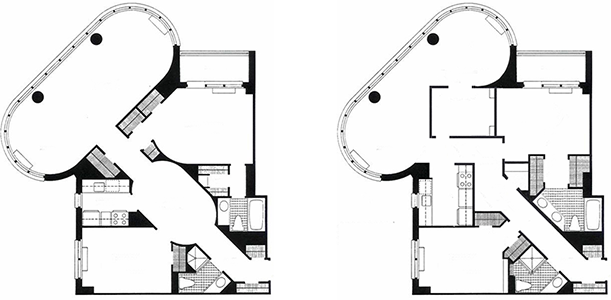
Apt conversion
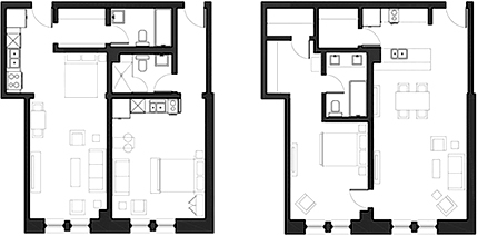
Condo conversion
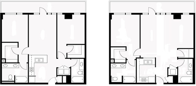
Condo rearrangement
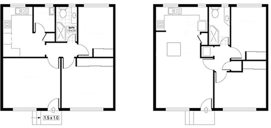
Small house
Hotel/motel room
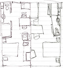


Room on a condo cruise ship
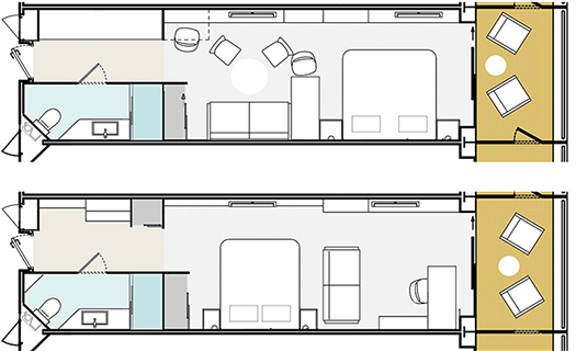
Better space layout

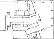
Mid-century open floor plan

The urban country-style house
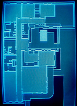
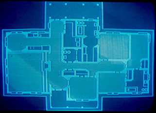
Designed for a small urban lot, in a style reminiscent of a rural farmhouse, it is a zero-lot-line house to minimize the size of the city lot. The lack of a back yard and the large veranda and front lawn encourage socializing with neighbors and a more active street life. The challenge was to fit the large number of rooms into a plan that looked from the street like a classic farmhouse.
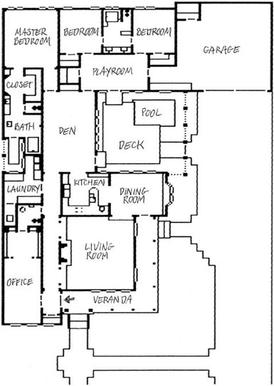
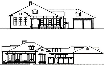
The street is along the bottom. The front walk steps up to the veranda with the front door entry to the left of the wide veranda. The foyer has a coat closet, entry to the office and opening to the gallery that connects the living room to the den. Off the office is a guest powder room. The den/family room overlooks the deck and a small pool or hot tub. Off the master bath is a private courtyard to admit sunlight into the surrounding rooms. The room connecting the two bedrooms could be used as a playroom, computer room, and/or media room. The garage includes space for storage and a workshop.
I rendered this with an early computer graphics drawing program, probably PenDraw. It worked pixel by pixel so there was no escaping the bitmapped look. It didn't allow the addition of text (FreeHand, Illustrator, PageMaker, and InDesign weren't out, yet) so I added that by hand and scanned the image in. I was teaching Computer Graphics at BrookHaven College at the time. The brand new computer lab had IBM PCs, graphics tablets for input, and two software programs - PenDraw and VideoGram. 1980s


![]()
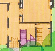
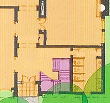
Better staircase location
A new fraternity house. Notice how the planned staircase location (middle) bisects the entry hall and results in wasted space between the staircase and the restroom. Right: Better version opens up the entry and aligns the bottom staircase to the entry to the dining room.

![]()

![]()
A wedge cruise ship
A ship is just a big thing that floats. It needs a flat side so it can dock alongside a straight-edged pier and it needs to be hydrodynamic (aerodynamic but in the water) on the open sea. So, instead of being long and narrow, it could be shaped like a wedge of pizza. If you've ever floated pizza in the bathtub, then you witnessed how well it sliced through the water and still could dock along the side of the tub.
The triangle shape allows more options for a unique resort experience. There can be more broad areas for activities and vistas.
Just an intriguing idea - not sure if the structure is feasible, cost-effective, or practical. But, it is a fun idea. March 2010
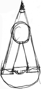

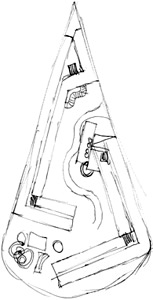

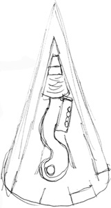
Comparisons - Not quite to scale, but close:

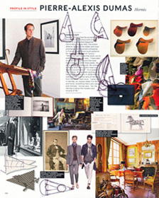

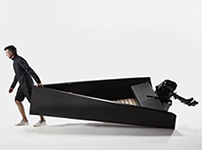
![]() Triangle boat from J.Ruiter, a Product Designer from West Michigan, December 2016
Triangle boat from J.Ruiter, a Product Designer from West Michigan, December 2016
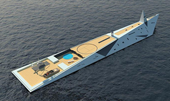
Above right: The Dare to Dream yacht, 2018, has space for 12 guests and 40 crew. Visionary French designer George Lucian, based in Monaco, admits his creation is largely fantasy but believes it could be built one day.
Below: The Freedom Ship, seeking funding as of 2023:
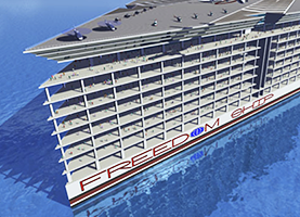

![]()
URBAN PLANNING
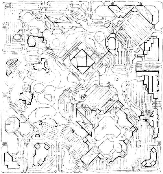
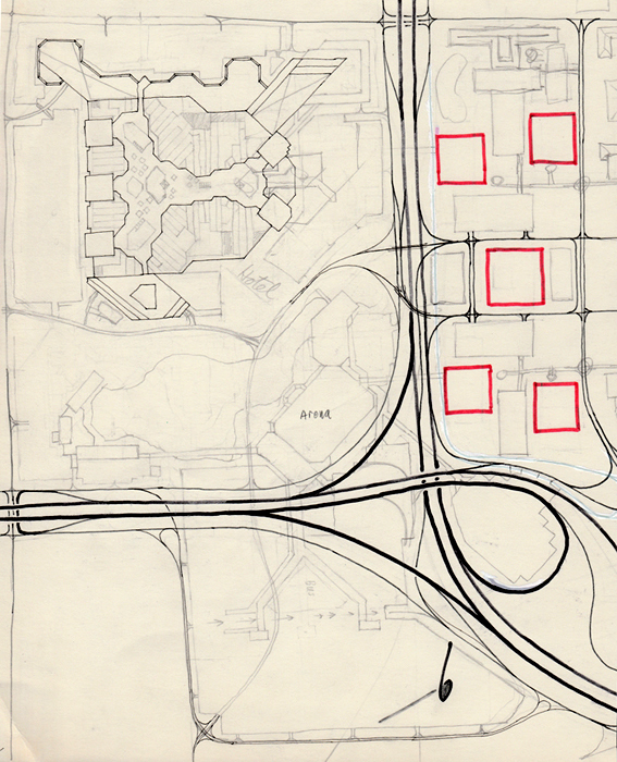
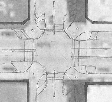
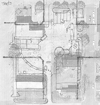
Plan of multi-use development: tall twisting facade tower in center, shopping mall, hotels, restaurants, condo towers, conference center.

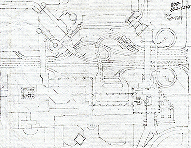
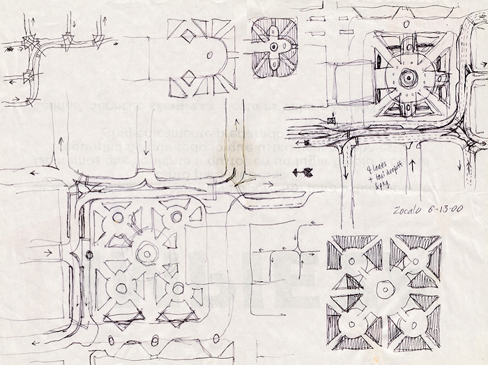
Mexico City Zocolo plaza & traffic patterns.
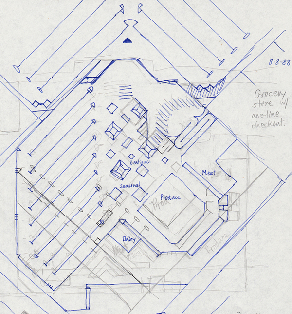
![]() Grocery store with one checkout lane & one Express lane.
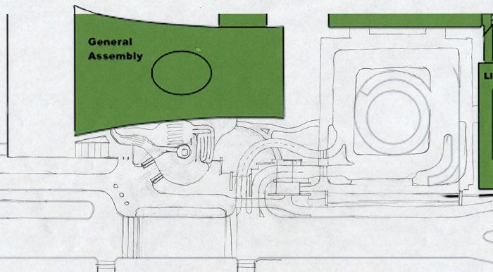
Grocery store with one checkout lane & one Express lane. ![]() United Nations security entrance plaza.
United Nations security entrance plaza.
![]() Customs checkpoint at a border crossing.
Customs checkpoint at a border crossing.
![]()
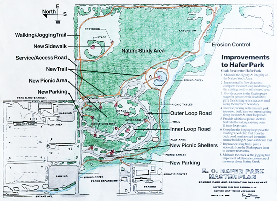
Plan rendering for Hafer Park
![]()
Soccer field in a baseball stadium

![]()
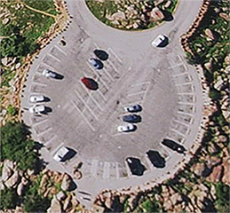
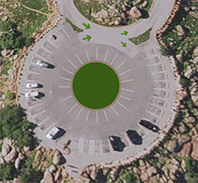
Less chaotic parking
![]()
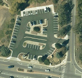
Bus stop for Park & Ride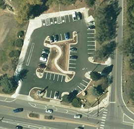
![]()
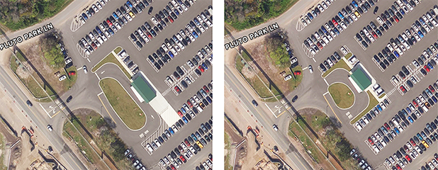
Shuttle stop in a parking lot - more parking spaces
![]()
Plan for equine neighborhood

![]()
Master Plan for an urban hospital

![]()
Love Field in Dallas
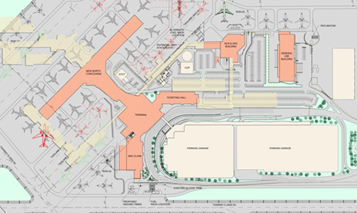
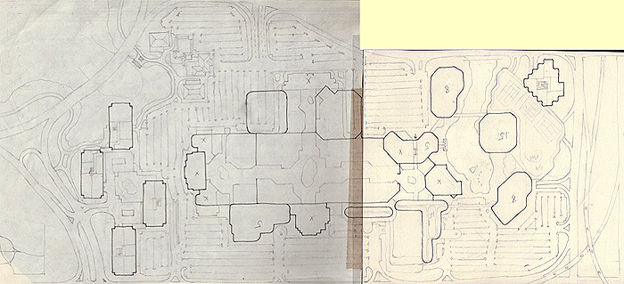
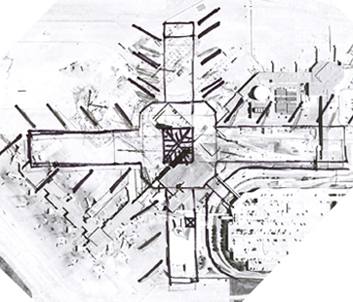
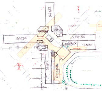
Love Field was once one of the busiest airports in the nation. Then, DFW airport opened and to minimize competition, laws were passed to limit traffic at Love Field. Southwest airlines was founded and used Love Field as it's home base, but much of the terminal was repurposed or just abandoned. While traffic has increased (including other airlines also), many areas were outdated. An extensive reconstruction of the entire terminal is taking place in 2012-13. The map above left shows the new terminal in coral and the old in the tan. The new wings of the terminal seemed awkward and inefficient. Got me to thinking and sketching. What if small airports (not hubs) were redesigned around a more centralized node.
Concepts
1. Instead of spread out thru concourses, one centralized area with all services in the 4 corners:
a. Restaurant, sit-down for those with time.
b. Food court, with several options and shared seating areas.
c. Store: several outlets: snacks, magazines, books, electronics, souvenirs, all together like department store.
d. Entry and exit.
2. Shorter concourses.
3. Minimal ticketing area. Trend is to pre-ticket online and print boarding pass or download it to smartphone. Fewer checked bags.
4. Better area for security lines - more room for queue lines, wider aisles, more scanning stations, larger area for retrieving belongings, and more seats for redressing.
![]()
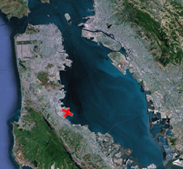
New concourse at San Francisco airport
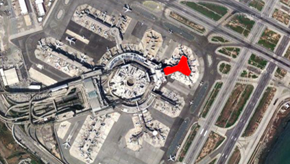
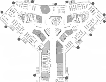

Notice the chaotic hallways and aisles on the left. Imagine
arriving and deplaning at one of the gates (grey dots) and trying to find your way to baggage claim or ground transportation. What a maze of options. And, you'd be battling the passengers trying to find their gate. For the visitor, there will need to be extensive wayfinding signage.
On the right, simple main pathways out of the terminal. Also, the food options are grouped in a court. Have you ever bought food at an airport, then walked a bit farther and found some other, even better options? Here, like in a mall food court, the diner can see all the options before deciding.
Easy navigation is crucial in an airport. Many users in an airport aren't comfortable - they're stressed over time, meeting people, upcoming meetings and presentations, and maybe even a fear of flying. Some people in a hubport may not be familiar with that airport or it's facilities.
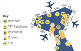
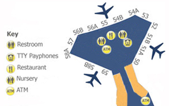
This symbol version emphasizes how chaotic and confusing the new terminal is compared to the revised terminal layout.
![]()
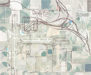
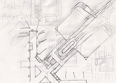
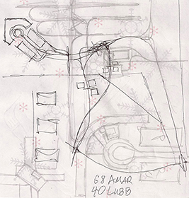
WTX: Lubbock/Amarillo West Texas Regional airport
Combine 2 smaller airports with one larger. Less than an hour from each city, shuttles, and easy freeway access. Apron for emergency landings.
![]()
Addition to Church
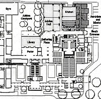
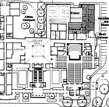
Areas of concern
• Lack of parking
• Poor sense of entry from main Parking lot
• Poor sense of order, maze of hallways
• Inadequate gym/Family Activity Center
• Poor connection to nature, vistas
Target audiences
• Visitors, first time users, guests
• Infrequent churchgoer/member
• Regular, frequent churchgoer/member
Objectives for new plan
• Provide connection to:
1. Fellow members: worshippers, users, social functions
2. Nature: sky, clouds, earth, trees
3. God: heavens, spirituality, uplifting
• Create a sense of entry; welcoming, inviting, clear
• Provide open gathering expanse, vista, light, free space
• Create a sense of order; symmetry, balance, alignment, comfort
![]()
Site plan for Blanton Museum

![]()
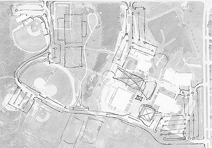
Community College in Pittsburg Kansas
![]()
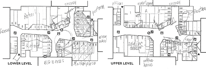
Conversion of shopping mall to Mercado Plaza Community Center
![]()
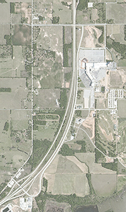
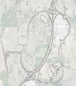
Red River Casino District
Just across the border from 6 million people in North Texas, a loop of 5 or more casino hotel resorts, golf courses, motels, restaurants, theaters, lake and river activities and excursions. Express bus and train service from OKC, Tulsa, Dallas, and Ft. Worth. A cross between Branson and Las Vegas.
![]()
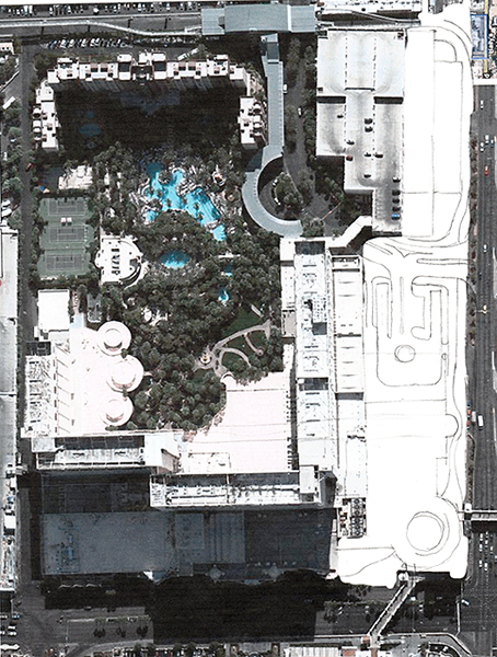
Las Vegas casino resorts
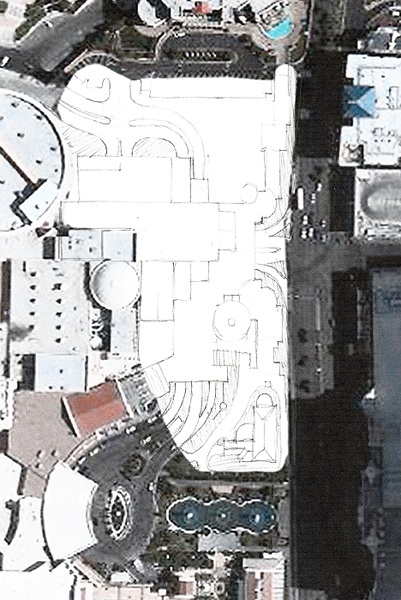
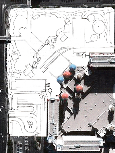
![]() Flamingo, Caesars, Excalibur.
Flamingo, Caesars, Excalibur. ![]() Contemporary connection between TI & Mirage.
Contemporary connection between TI & Mirage. ![]() Paris (former Bally's).
Paris (former Bally's).
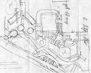


![]() Alpine Resort, indoor ski slope.
Alpine Resort, indoor ski slope.
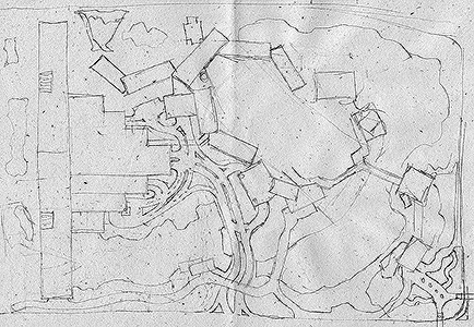
![]()


![]() Addition to the UCO Union. Zoo: traffic flow, restraunts, monorail.
Addition to the UCO Union. Zoo: traffic flow, restraunts, monorail.
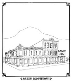
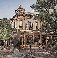
Sketch of building in Aspen. Photo, sketch, different, but similar, building.
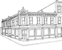
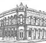
![]()
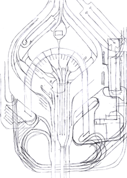
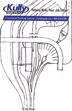
HIGHWAY INTERCHANGES
Ever since I was a kid, enjoying to draw, I doodled highway plans. I found it to be relaxing while satisfying my desire or need to make something better and solve a visual design problem. I was fascinated by the layers of design - safety, efficiency, movement, and aesthetics. I have probly sketched hundreds of interchanges, below are just a few.
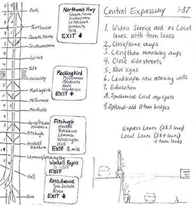

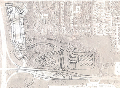
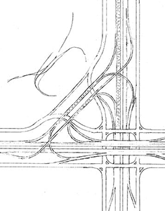
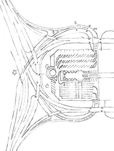
![]()
MISCELLANEOUS
Name for staff members in an adventure park - Guide
Fits the theme of an Adventure Park, like a Safari Guide, Park Guide. The uniform could be khaki or khaki cargo pants/shorts/skirt with roomy pockets or the cargo look, but not the bulk or weight from pockets; a shirt/Polo/pullover; and a vest, scarf, or other accessory with a green accent. Green = growth, forward, go; a positive color; and helps denote Guides for easy Guest recognition.

![]()
Sketches of a wedge cruise ship
A ship is just a big thing that floats. It needs a flat side so it can dock alongside a straight-edged pier and it needs to be hydrodynamic (aerodynamic but in the water) on the open sea. So, instead of being long and narrow, it could be shaped like a wedge of pizza. If you've ever floated pizza in the bathtub, then you witnessed how well it sliced through the water and still could dock along the side of the tub. The triangle shape allows more options for a unique resort experience. There can be more broad areas for activities and vistas.
Just an intriguing idea - not sure if the structure is feasible, cost-effective, or practical. But, it is a fun idea.

![]()

![]()

Comparisons: Not quite to scale, but close.

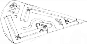


Date: March 2010. Other wedge or triangle options seen since 2016
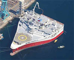
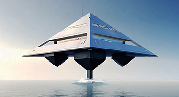


Triangle boat from J.Ruiter, a Product Designer from West Michigan, December 2016
Award winning and globally acclaimed designer, Joey Ruiter pushes through the boundaries of the norm and finds new ways to solve problems which leads to products that are as useful as they are jaw dropping. He has the ability to see around the expected and to notice the unexpected in otherwise ordinary things.
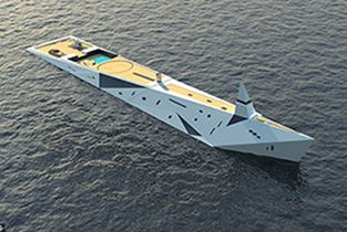

Triangle yacht, 2018
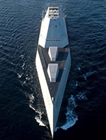
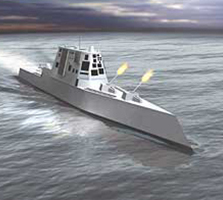
The Dare to Dream yacht has space for 12 guests and 40 crew. Visionary French designer George Lucian, based in Monaco, admits his creation is largely fantasy but believes it could be built one day. Its design is reminiscent of the US navy's recently commissioned $7.6 billion Zumwalt-class US Navy destroyer of October 2016:


![]()
USA regional designations
The 48 contiguous states grew haphazardly thru treaties, claims, and purchases. Founders of the 13 colonies probably had no concept of the Mississippi River, the Rocky Mountains or land along the Pacific Ocean. Some designations are awkward - where is the delineation of Midwest the west, etc. To the early pioneers, west referred to land on the other side of the Allegheny Mountains. The Louisiana Purchase, Santa Fe Trail, and the Oregon Trail redefined the west. The Plains in the 'Midwest' have always had vague boundaries. If we could ignore the deep-rooted names and seek a clearer way to designate areas of the USA, we might propose divisions that break the nation into 9 areas, a 3 x 3 grid. Redefining state boundaries makes more sense.
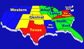
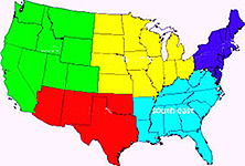
Many people have addressed the issue and proposed solutions. But, New Mexico in Central? On the right: the West and the Middle West are just too large to help simplify and define regions.
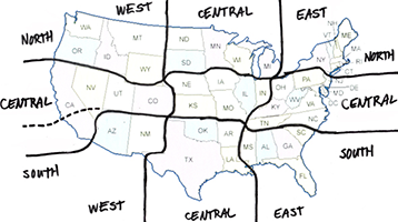
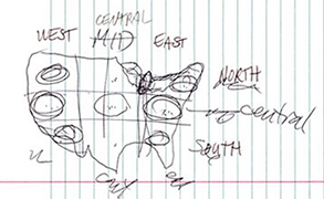
Another proposed solution from talks with Sean and Rusty(2007 sketch above right). Nine regions, each with more equity and logic. The designations east, west, north and south make sense. It gets tougher deciding on the east-west and north-south bands that run thru the central middle of the country. California should probably be cut in two since the southern part is more Southwest in attitude and connection. Using the word Central avoids the confusion from Mid West and Mid East - Mid East is Arabian area and the Midwest is the Plains states.
www.jamesrobertwatson.com/miscprojects.html
![]()
![]()
![]()
![]()