
![]()
Highway signs should be designed to improve safety while driving
During numerous road trips, I notice symptoms that highway sign designers don't follow some basic design components: clear communication, rapid comprehension, proximity, and orientation.
Signs serve to inform, guide, and direct the reader. Primary sign readers are navigators (often drivers) who are lost, confused, or new to an area and are seeking guidance and information. Secondary target audiences are people giving directions to others and educating them for later reference.
Road signs first appeared in ancient Rome as stone markers with chiseled numbers that showed the distances to various cities in the empire. A few years after Henry Ford sold the first Model T, signs were nailed up on fences, posts, and walls to denote a location or show direction. There was no effort towards uniformity, consistency, efficient readability, or user-convenience. In the 1920s, signs became a bit more uniform, with cities and states dictating basic standards of layout and typography. As the popularity and accessibility of long-distance travel increased, so did the need for coherent nationwide standards.
Rapid and easy comprehension
The most important objective of effective sign design - the viewer is often in a situation where he/she must be able to focus on the act of driving - checking the road, other cars, weather, etc. To gain information from a sign, that sign must be absolutely clear - with info that is easily noticed (highly visible, legible, and easily recognized) and clearly communicated (easy and quick to comprehend).
Ways to improve sign design
• Layout improvements
Flush center alignment of information
Rest Area directional signs
Placement of arrows
Text improvements
Case: All caps or U&lc
Kerning: Tighter letterspacing
Amount of sign text copy
• Arrow improvements
Color coding
Proximity placement
• Sign mounting
Orientation: face the viewer
![]()
Alignment of information
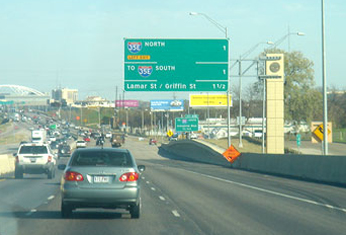
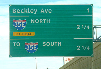
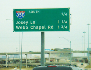
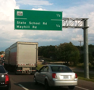
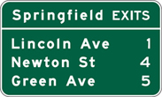
Notice the large gap between the bits of information that relate to each other. The exit name and the distance should form a single bit of info for the driver. But the gap prevents the brain from immediately associating the two.


There is no advantage to setting text on the signs with justified margins (with the exit names aligned on the left and the mileage aligned on the right). We are not reading a block of copy like prose, we are reading only one line of info. We have become accustomed to scanning a sign to focus on just the info we need. The typography, layout, and composition on the existing signs discourage efficient comprehension. The letter spacing, word spacing, and alignment require more time to scan, read, and comprehend the info. And - very important - this is while one is driving, when one's attention should be on the road and other cars. Conceived: late-1990s
Eight ways to set blocks of copy
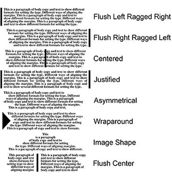

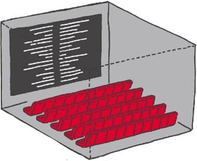
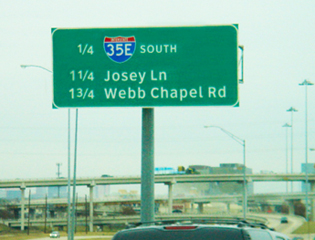
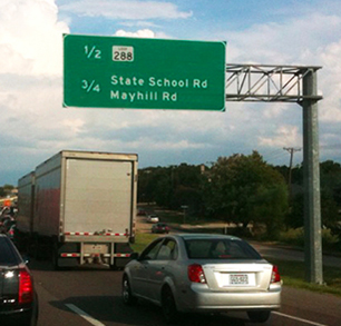
Setting body copy with the left block of text set flush right and the right block set flush left. A center margin is created allowing info to be in better proximity. Credits at the ends of movies adopted the flush center format years ago.
Lesson: The use of Flush Center alignment encourages like-minded bits of info to be near each other, is the most efficient for columns of info on a sign, and is the safest format.
Better sign layout: flush center margins
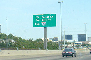
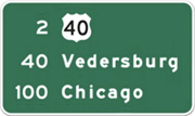
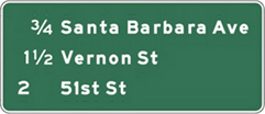
In the example below on the right, the exit ramp distances are aligned to the immediate left of the exit names. One sees the number right next to the name - no having to move along a horizontal line.
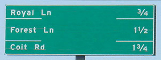

In some of the examples, the sign designer added a horizontal line between bands of info, presumably to improve comprehension.
Lesson: When you have to add an element to improve communication, there is something weak about the original design. Solve what caused the problem, don't add crap to compensate.
The value of the flush center arrangement
We don't read letter by letter or even word by word, we read groups of words as a single unit. The retina receptors take a photo, send that info to the brain for processing, then jump to the next group of words.

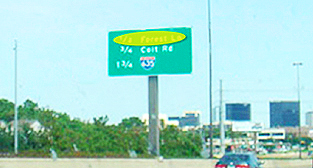
The existing signs require at least 2 photos per line since the gap between words is so large. (Some of the layouts look like cruel jokes played on innocent drivers.)
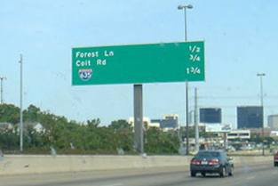
With the mileage to the left and next to the exit name, the viewer's brain can snap one picture of all the needed info. The flush center format allows more clarity, easier reading, and, often, a smaller sign. Most importantly, this format allows the driver to spend less time comprehending the info and more time on the cars and highway. This will create a safer driving environment.



![]()

![]()


![]()
![]()
![]()
Better Rest Area directional signs
As I drive across country (or just on the local turnpike), I sometimes stop at a rest area. As the exit ramp approaches the rest area, there is a split - trucks one way - for longer parking slots - and cars another way. At this Y split, there is a sign guiding the driver who must make a decision in a second or two. There are several factors influencing the driver's attention: he/she is navigating the exit ramp, wondering which way to go, there is often music playing, and there are sometimes anxious passengers in the mix. The sign must be so clear that a driver can comprehend it and make a decision almost immediately. Most existing rest area signs are poorly designed. Development: Road trip photos: June 17 2007; Sketches: July 1 2007
Target markets/users
1. Car drivers unfamiliar with rest area.
2. Car drivers familiar with rest area.
3. Truck drivers unfamiliar with area.
4. Truck drivers familiar with rest area.
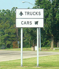
Examples of existing signs

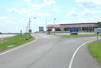


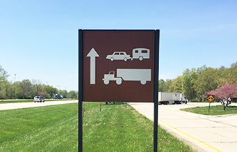
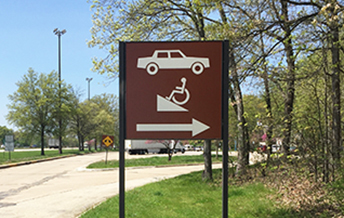
Problems/weaknesses
Proximity of the arrows to their accompanying icons. In the sign above on the right, the truck icon is closer to the left arrow than to the right arrow (and the truck is even facing left)
Horizontal layouts that provide little visual clue on which side of the sign to drive. The driver wants to know left or right and the sign is divided top and bottom or above and below.
Arrows that convey turn left or turn right rather than just angle to one side of the sign or the other.
Poor contrast of text and background and sign background to environment.
Improved sign
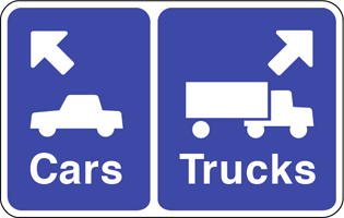

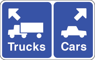
Improvements
Image icons, arrows, and text are aligned in proximity to reinforce the message.
The vehicles are facing the direction of their arrow.
Layout places the info side by side - left/right - to suggest going left or right.
Different size backgrounds provide a visual clue, larger vehicles (trucks) get larger background.
Arrows point in a truer direction, rather than turn left or right, softer turn to parking area.
Icons, arrows, and text are set flush to the directional margin, the left sign info is set flush left.
• The background color is the standard highway information color.
Comparisons

![]()

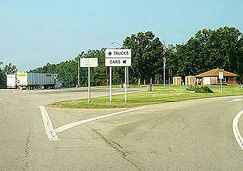
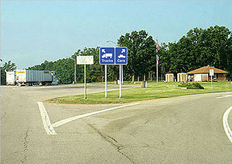
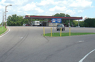

A rest area in Missouri that got close


![]()
Another brilliant idea
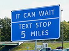
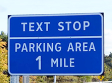
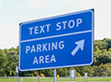
New York State has introduced 'Texting Zones' along its major highways and thruways - pullout stops where drivers can read, write, and send texts, phone calls, and emails. Governor Andrew Cuomo said 298 signs will be positioned along the state's busiest roads, pointing drivers to 91 Texting Zone locations. The zones will cost nothing to build as they already exist in the form of rest stops and parking areas. It's really all about the signage, branding the locations, and educating drivers.
![]()
Placement of arrows on signs

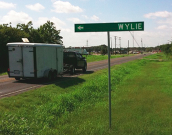
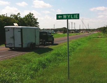
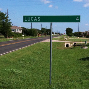
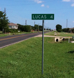
Another area where the design component of proximity is important is on wayfinding signs that contain a name and an arrow showing direction.
The sign above is northeast of Dallas. The TXDoT apparently follows a guideline that destinations and their arrows be placed within a band and are set flush to the outer margins of the signboard. But, when the city names are short, as in Lucas and Wylie, it lays out in a confusing format. Wylie is actually to the right and Lucas is straight ahead. Didn't you assume that Wylie was straight ahead? And wouldn't almost all viewers of the sign think the same? Not only is this sign weak, it is detrimental in that it sends drivers down the wrong road.
The photo below on the left shows that someone had placed strips of duct tape on the sign to connect the arrows to their towns.
Observation: When a citizen alters a sign to make it better, it was a poor design to begin with.
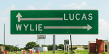
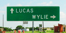
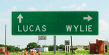
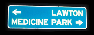
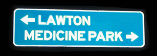
In the middle example above, I moved the town names closer to their arrows, keeping to the guideline of horizontal bands. On the right is a format in which both town names are in one band with their arrows above.
![]()
![]()
Kerning: Tighter letterspacing
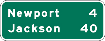
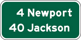
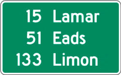
Text set with tighter than normal kerning can help improve readability and shorten the comprehension time.



![]()
Amount of sign text copy
It is crucial that the reader get the message in as short amount of time as possible. If one is looking for Mockingbird Lane and they see 'Mockingbird' on the sign, that is enough to confirm that that is the desired exit. All the viewer needs is confirmation.
Guideline: Time required for comprehension can influence safety while driving.
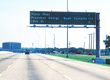
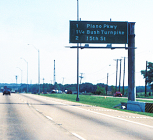
The official name of the highway may be "President George Bush Turnpike", but the driver is just looking for the exit to the turnpike or to the Bush turnpike. The official title is irrelevant (and potentially dangerous) at that time. And, notice how big the above sign has to be - wasting materials, money, and electricity.
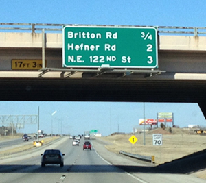

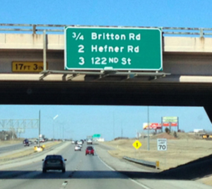
No need for the NE, those looking for NW 122nd won't likely be on this highway. People are just looking for 122nd Street. The less info on the sign to digest, the quicker the comprehension.


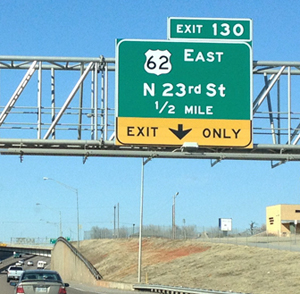
To be consistent, the N should not have a period after it since the St and Rd do not have periods.
![]()
The better point to merge at construction zones
We've all been there, sitting behind the wheel in a single line of traffic that appears to span the entirety of the Midwest. We glance nervously at the gas gauge (only half a tank!) when a car whizzes past in the right lane.
Shut the front door!
We spot a pickup ahead, straddling both lanes of traffic to prevent that jerk from getting to the front of the line, and we silently thank the pickup driver: Way to go, Buddy!
Not so fast.
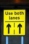
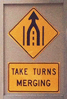
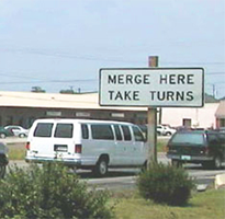
There's a new sign in town, and it may just change everything. It states: "Use both lanes. Take turns at merge."
That's crazy talk, right? Everybody knows the proper way to handle a lane closure is to merge into the good lane as soon as humanly possible.
Evidently not.
We're so inadequate at navigating lane closures, the sign is now spelling it out for us: "Use both lanes."
Jan, a retired business owner: "I remember feeling angry at those people using the empty lane. Even though I would love to sneak over into the other lane, I feel guilty."
Therein lies our problem: We are too polite. We would rather spend an extra half hour in a single line, cursing the passers, than risk the crooked eye from a stranger in another car. The fix for this is fairness: If everybody takes a tooth in the "Zipper" system, everyone wins.
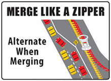
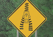
The 'Zipper Merge' eliminates long backups and trucks and other vehicles trying to straddle the lanes. Using two lanes will cut the line in half.
"Once people get used to it, it works well. As long as traffic alternates at the merger, it goes more smoothly."
- From the Quad-Cities newspaper
![]() Cars move into one lane as soon as traffic begins to slow:
Cars move into one lane as soon as traffic begins to slow:

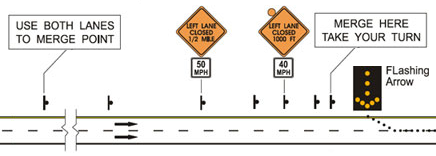
![]() Traffic uses both lanes up to the merge point and then take turns merging into the single lane, like a zipper:
Traffic uses both lanes up to the merge point and then take turns merging into the single lane, like a zipper:

Advantages to the zipper option
• There is less confusion for drivers in either lane - the merge point is fixed and clear.
• The drivers in the continuous lane experience less anger, anxiety, disgust, and discomfort.
• The drivers in the closing lane experience less scorn, uncertainty, and discomfort.
• All drivers spend less time in traffic.
• The trip is safer due to less confusion, less anger, and clearer procedures.
• Less gas is wasted as there is less stop-and-go movement of traffic.
• It is simply more civil. It allows all drivers to behave in a more cordial and more considerate manner.
Why some folks aren't using the Zipper Merge
![]() I don't like waiting to change lanes until the last minute
I don't like waiting to change lanes until the last minute
The feeling of trepidation over merging safely and appropriately are very real in heavy traffic situations. If you're moving at any sort of speed - be it 40 miles per hour or 70 - you don't want to make that merge at the last minute, risking the chance someone in the lane you're moving to is stubbornly unwilling to allow you the chance to get in.
The Zipper is most effective during heavy traffic, so you won't likely use this if you're moving at 70 miles per hour. So don't worry about this issue if you're cruising. Just continue about your business. The hesitation to merge at the end stems from the assumption it's every driver for themselves out there. That's not the way we should be driving! If everyone uses the Zipper, this trepidation shouldn't even exist. In order to get there, we need to collectively use the Zipper.
![]() I don't want to be rude
I don't want to be rude
The only reason this is even a thing is because of all the folks who are doing it wrong. This includes the folks that move over at the first sign of a need to merge - sometimes more than a mile in advance - and get irritated at those who use the lane that's left vacant. Because of folks who merge early and get frustrated, road rage becomes a major factor here. Unfortunately it's misdirected and, in most cases, the individuals getting frustrated are the ones truly at fault. The bottom line: it's not rude to use that open lane, it's actually the way things should work.
![]() Does it really move traffic faster?
Does it really move traffic faster?
A 2008 study by the Minnesota DOT says the reduction in traffic backup is 40-50 percent. They also observed a safer merge and less road rage up there. Those friendly Minnesotans also discovered the Zipper put an end to the frustrations of folks trying to get to exit ramps or turnoffs blocked by that really long backup filled by early mergers.
In 2014 the Washington State DOT promoted the Zipper, and the conversation started rolling. The popular tech publication Ars Technica did a piece on the issue that same year. Some are calling the Zipper, or late merge, a "new" concept, but the reality is it's been employed across the globe for some time. Some countries - like Germany and Austria - require it by law.
Some media coverage
![]() The New York Times Magazine article The Urge to Merge
The New York Times Magazine article The Urge to Merge
How do people handle tunnels, construction, and so on, when driving, where the number of lanes decreases? Some people carefully get into one of the continuing lanes and wait patiently to go through the tunnel. This leads to aggravation and, worse, inefficiency, since the constant stop-and-go allows less traffic to flow through than does a smoothly flowing system. This, however, is the normal procedure - cars move into one lane as soon as traffic slows. This can even be miles before the merge point, such as on busy event or holiday weekends. An interesting phenomenon is the situation in which a driver in the backed up lane pulls into the free lane enough to block those cars - so they don't have an unfair advantage. This creates a dangerous environment for drivers in both lanes.

![]() Results of computer simulations
Results of computer simulations
The late merge produces a statistically significant increase in throughput volume for the 3-to-1-lane closure configuration and was beneficial across all factors for this type of closure. The zipper merge increased throughput when the percentage of heavy vehicles was large. Time in queue was also reduced.
![]() Traffic patterns in Germany are noticeably more organized
Traffic patterns in Germany are noticeably more organized
There, cars all go up to the merge point, at which point the cars alternate in the use of the lane. This 'zipper' effect is done at a reasonably high speed, since there was never any question on whose turn it was. This is a great example of the value of coordination. Almost any solution where a person knows what the other people will do is better than uncertainty.
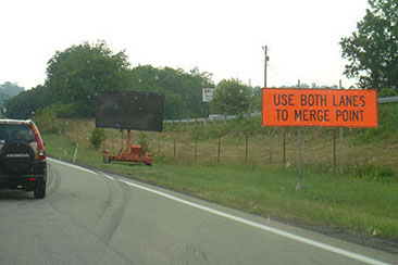
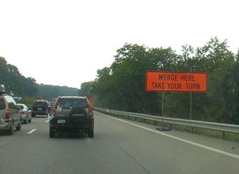
With the late merge (option 2 above), drivers are instructed to use all lanes to the merge point and then take turns proceeding through the work zone, integrating both lanes like the two sides of a zipper.
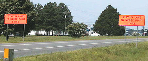
![]() The Texas Department of Transportation
The Texas Department of Transportation
A study concluded that when traffic has to merge down to one lane from two, it is more efficient, faster, and more fair for both lanes to be full up to the very final chance to merge. In some states, people will line up in one lane miles back and others will speed down the more empty lane and then merge in at the last minute. This system doesn't seem to make the people in the long line very happy. Above are some fotos from Missouri, Illinois, or Indiana showing a more efficient system.
![]() Search zipper merge for more references and studies supporting the Zipper Merge
Search zipper merge for more references and studies supporting the Zipper Merge
www.jamesrobertwatson.com/highwaysigns.html
![]()
![]()
![]()
![]()