
![]()
How to design signs to improve clarity, comprehension, and safety
Road signs first appeared in ancient Rome as stone markers with chiseled numbers that showed the distances to various cities in the empire. A few years after Henry Ford sold the first Model T, signs were nailed up on fences, posts, and walls to denote a location or show direction. There was no effort towards uniformity, consistency, efficient readability, or user-convenience. In the 1920s, signs became a bit more uniform, with cities and states dictating basic standards of layout and typography. As the popularity and accessibility of long-distance travel increased, so did the need for coherent nationwide standards.
Signs serve to inform, guide, and direct the driver. The primary target market of a highway sign is a navigator (most often the driver) who is seeking guidance and information. The driver is often in a situation where he/she must be able to focus on the act of driving - checking the conditions, cars in the immediate proximity, passengers talking, and music volume. The highway sign must efficiently convey clear and rapid communication. To gain information from a sign, that sign must be absolutely clear - with info that is easily noticed (highly visible, legible, and easily recognized) and clearly communicated (easy and quick to comprehend).
No one ever complained because a sign was too easy to understand.
![]()
Ways to improve sign design
• Layout improvements
Flush center alignment of information
Rest Area directional signs
Placement of arrows
Text improvements
Case: All caps or U&lc
Kerning: Tighter letterspacing
Amount of sign text copy
• Arrow improvements
Color coding
Proximity placement
• Sign mounting
Orientation: face the viewer
![]()
Formats to set blocks of text copy
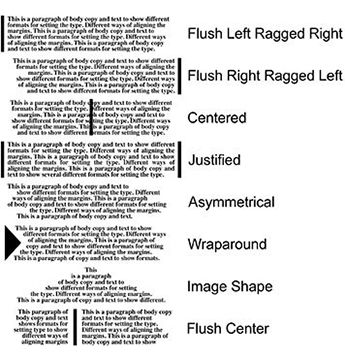

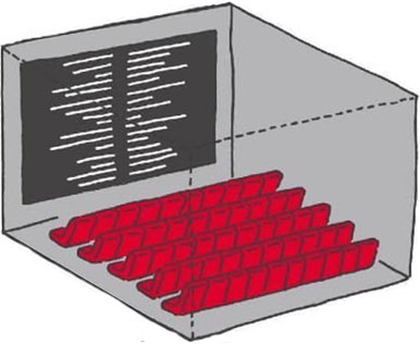
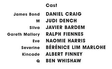
Setting body copy with the text set Flush Center allows blocks of info to be in closer proximity. Credits at the ends of movies adopted the Flush Center format years ago.
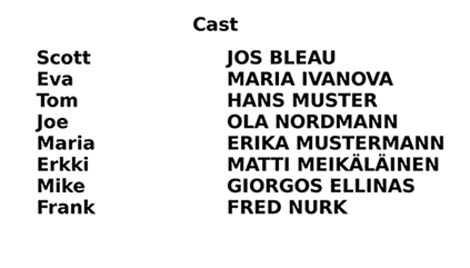


Above and below left: When reading scores on television, most stations do the usual layout of putting scores after the team name. Since the length of team names varies widely, these scores may end up being a ways from their team.
Above and below right: the scores are aligned Flush Center. One sees the score next to the team name. This method allows more clarity and easier reading.
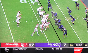
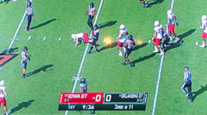
More info and examples about FlushCenter layout and Flush Center in Highway Signs

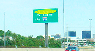
![]()
Placement of arrows on signs

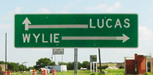
The design component of proximity is important is on wayfinding signs that contain a name and an arrow showing direction.
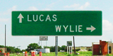
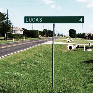
The sign above is northeast of Dallas. The TXDoT apparently follows a guideline that destinations and their arrows be placed within a band and are set flush to the outer margins of the signboard. But, when the city names are short, as in Lucas and Wylie, it lays out in a confusing format. Wylie is actually to the right and Lucas is straight ahead. Didn't you assume that Wylie was straight ahead? And wouldn't almost all viewers of the sign think the same? Not only is this sign weak, it is detrimental in that it sends drivers down the wrong road.
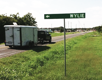
The photo below on the left shows that someone had placed strips of duct tape on the sign to connect the arrows to their towns.
Observation: When a citizen alters a sign to make it better, it was a poor design to begin with.
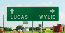
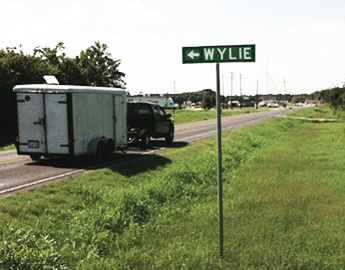
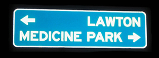
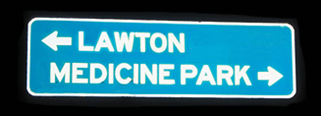
In the middle example above, I moved the town names closer to their arrows, keeping to the guideline of horizontal bands. On the right is a format in which both town names are in one band with their arrows above.

![]()
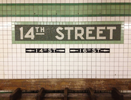

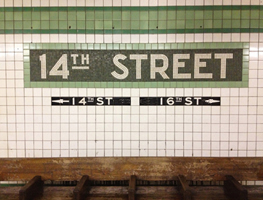
The Union Square 14th Street subway station is a busy one with 7 lines converging and crossing. In the station, I noticed this sign in the tiled wall (above left and enlargement below).

Lesson: As in most arrows, the primary element for communicating direction is the arrowhead, not the stem or the tail. It is the angles of the arrowhead that convey movement.
Below, I deleted the tail. The tail does not aid the comprehension of the meaning of the sign. Therefore, it must go. Seeya.
One sees arrow pulling the eye visually from the street name to the direction of movement. Also shown in the example at the top right - notice which version is easier to understand.

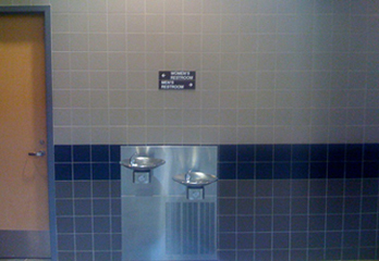

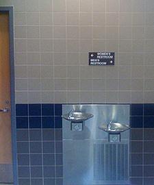
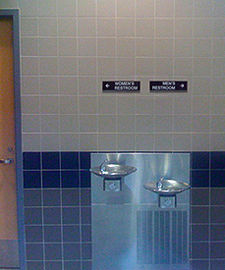
An example in an academic building. The user approaches this recess in the hallway and needs to make a decision on which way to turn. The layout below is easier and quicker to comprehend.

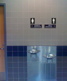
Side-by-side comparisons. Even better: the Men and Women Restroom symbols.
![]()
A better way to list price options on a zoo entry sign
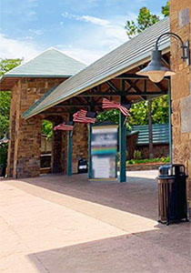
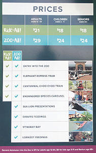
This is an info sign outside the OKC Zoo. It helps the visitor decide which ticket level to purchaser at the booth in a few yards. Great idea to provide this info before approaching the window - it should help speed up the ticket buying process and help the line move faster. However, there are some issues with the layout of this sign - the most egregious is that the General Admission prices are hidden in a different format in the purple band across the very bottom. Easy to overlook and assume that the only pricing options are the ones listed in the chart.
Improvements
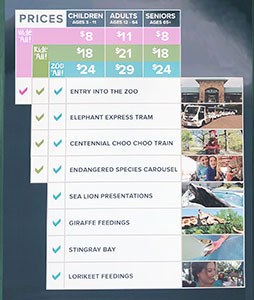
Titled General Admission as Walk it All to better match Ride it All and Zoo it All. When the options are to Walk or Ride, that may be an an easy choice for some.
Added Walk it All prices at the top of the chart to better respect the customer.
Clarified the pricing options and the benefits by attaching the colored bands to their respective benefit column.
Arranged the columns in increasing order: Ages 3-11, 12-64, 65+ - Children, Adults, Seniors.
Enlarged the ages row for easier readability.
Narrowed the columns so that all info could be enlarged.
Below: Another example of a clearer layout:
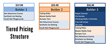
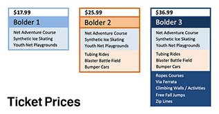
![]()
Signs that are more welcoming and more positive
When someone posts a sign expressing some 'rule' to obey, they are seeing the problem from the inside out, from their point of view. More effective and respectful would be to empathize and see the issue from the user's point of view.
At the main entrance to the Liberal Arts Building on campus were these signs: No Smoking, and Don't Sit on the Steps. Several of each. There was no mention or effort to welcome the visitor. Just negatives, No and Don't.
• Smoking (tobacco or vapes) was not allowed anywhere on campus, inside or outside of buildings. The No Smoking signs were not even necessary.
• The Don't Sit on the Steps signs, again, were from the staff's point of view. They might have had to wend their way through the steps to get to the door. The signs would help with that. But, there was a better solution. Apparently, there was a problem with students seeking a place to rest before class. There no other seating spots nearby. So, the steps will do. That was a clear statement that students want to sit. They solved their problem and found a place. But the campus hasn't addressed the problem. There's clearly a need for seating near the doors to the building. These could have been benches flanking the door or landscaped seating areas. Adding benches would better solve the problem. Students would have a place to sit and they wouldn't have to block the stairs.
There could then be more positive, Welcome signs at the entry, No and Don't.

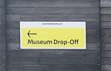
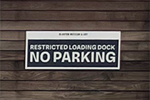
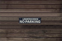
The signs above are on a wood fence at an art museum. They face the entrance from the parking garage. There is a circular drive for rideshare and those who wish to get their passenger closer to the door. The sign on the left works well: Clear message, good contrast, warm color, and easy-to-read font. The sign on the right, however, is too obnoxious. The audience for this sign is those trying to park in this driveway (the fence gates lead to the loading dock). The driver will be close to the sign on the fence - the sign needs to inform those drivers that this drive needs to remain clear for the loading dock. It doesn't need to stand out or yell at the driver. Better: smaller point size, no white outline, and smaller point size.
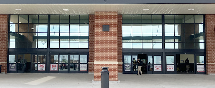
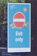
This is the entry to a large grocery store. The doors on the left are screaming Exit Only. The audience for these signs is those approaching the building who do not know where the entrance is. They're not looking for an exit. A better sign would be positive and welcoming, Welcome, Entrance (with an arrow pointing to the entry doors.)
The doors on the right are also yelling at us: all caps and bright red. The signs say Entrance Only. The word Only is useless, The user is deciding which door is the entry. The word Only adds nothing to that. Better: Entrance in green (nature, go). Just the word Entrance would be better, but adding copy beneath would be even better: Welcome to (Store). We're glad you're here.

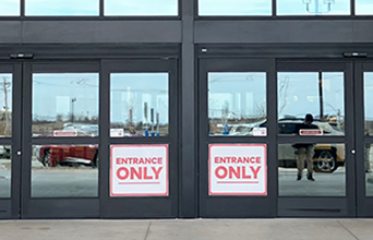
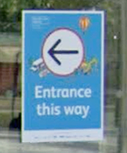
Example of clearer and more welcoming signage.

![]()
A better way to show wayfinding direction
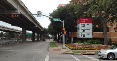

Most signs have multiple bits of info: object name, direction, eligibility, rules, etc. From a distance (as in a car), some signs can be overwhelming and too busy. Different methods are used to help organize information - bands, symbols, consistent fonts and point sizes, and arrows. An arrow denotes direction. Almost all of the directional information comes from the arrowhead, rather than the stem. The stem can help with orientation, but, in many cases, is not even necessary.
Color coding for left, right, and straight on directional signs
Idea: To improve the long-distance recognition of an arrow, the arrow can be color coded to enhance meaning, improve comprehension, and shorten the processing time.
![]()
![]()
![]()
![]()
![]()
![]() Right
Right
![]()
![]()
![]()
![]()
![]()
![]() Left
Left
![]()
![]()
![]()
![]()
![]()
![]() Straight ahead
Straight ahead
These colors make sense. Red states/blue states: conservative red leans to the right and blue to the left. Green means go, closely connected to straight ahead. Their meanings are already familiar. Transferring the symbolism to directional arrows would require little, if any, education and learning period. Repeated and consistent usage would increase the exposure and subliminal education.
Advantages
• The viewer can see direction at a glance.
Colors have some familiar meaning, making them easier to learn and understand.
They are easy to remember.
• Quicker to comprehend.
Primary colors are universal.
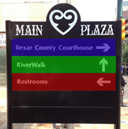

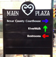

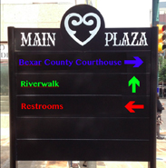
Coloring options
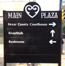
Colored background. Colored arrow. Colored arrow and colored text
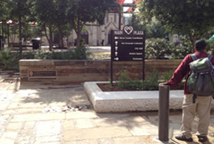
Of course, the layout should be arranged to place the arrows on the left with the place names following, as in the middle example above.
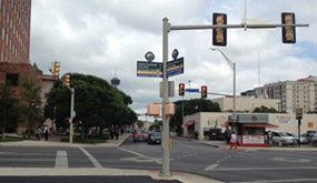
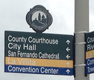

In this example, the color coding of the attractions is not necessary - the user doesn't have enough repeated exposure or time to learn and remember the color coding (and white on yellow is tough to see). The user is more likely to recognize the words and word shapes 'Convention Center' than the color blue. In the revised example on the right, the background color should be changed to enhance the contrast of the arrows.
![]()
Colors can help clarify a message

The ramp signs in this parking garage use arrows and text to guide the driver/parker. The driver is accustomed to driving on the right, but the right ramp is Exit Only. The left ramp is the Entrance.
Better: make all the entry sign backgrounds green (allowed, preferred); exit signs red backgrounds (prohibited).
![]()
Confusing wayfinding sign
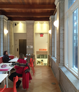
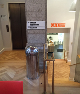

In the 2014-remodeled Cooper Hewitt Design Museum, this is the hallway approach from the museum to the Cafe, Garden, Restrooms, and elevator. Currently, the symbol for Up (an up arrow) is the same as the symbol for Straight Ahead (an up arrow). So, here, while the garden and restrooms are down the stairs to the right, the Up arrow for Straight Ahead suggests that one should go to the left and use the elevator to go up. Unfortunately, this faux pas (among several others in the new museum) is in America's national museum dedicated to design - this museum should be at the forefront of clear wayfinding communication.
The solution is simple: In this case, since going straight ahead requires the user to go down, use a down arrow:
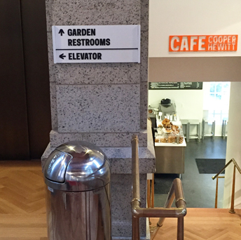
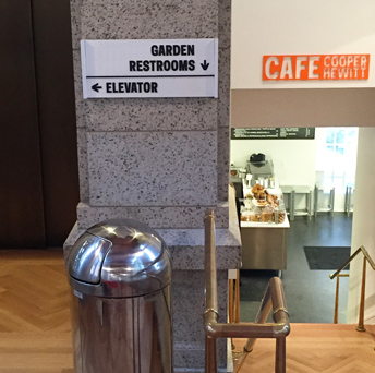
Aligning the text to the side it refers to also provides cues for wayfinding. Henry Dreyfuss, the great Industrial Designer, stated, in this very museum, that good design should be obvious and intuitive.
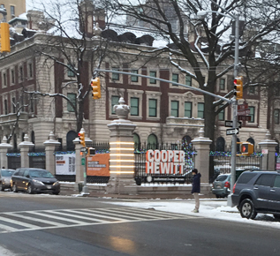
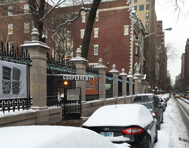
Above & below: Nice exterior sign at the Cooper Hewitt garden entrance.

![]()
Why make this more difficult than necessary?
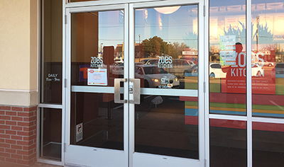

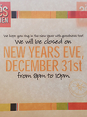
This Zoe's Kitchen restraunt is open from 11a - 9p. On NYE, they will be closed from 8p - 10p (but they close at 9p anyway - will they reopen at 10p?). It would be clearer if it just said We will close at 8p on Saturday, December 31, New Year's Eve.
Better: make it less confusing and just open regular hours, instead of closing just 1 hour early.
Also, they will be open regular hours on Sunday, New Year's Day. That is a plus - that should be promoted on the sign.
![]()
Case: All caps or Upper & lower


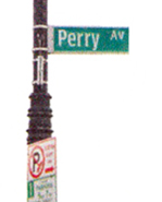
The outline shape of the letters helps the viewer comprehend the word. Time is important when a driver should be attentive to traffic and road conditions. Setting text in upper & lower case provides unique shapes that words set in all upper case do not:


More info about bouma.
Below: ClearView typeface - designed for US Highway signs, 2004.

![]()
Kerning: Tighter letterspacing
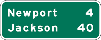
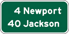
Text set with tighter than normal kerning can help improve readability and shorten the comprehension time.



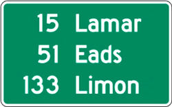
![]()
Amount of sign text copy
It is crucial that the reader get the message in as short amount of time as possible. If one is looking for Mockingbird Lane and they see 'Mockingbird' on the sign, that is enough to confirm that that is the desired exit. All the viewer needs is confirmation.
Guideline: Time required for comprehension can influence safety while driving.


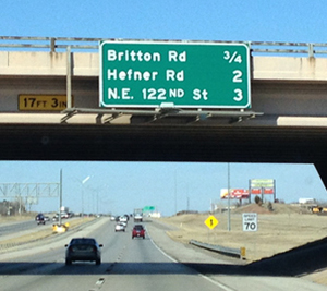

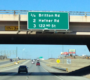
No need for the NE, those looking for NW 122nd won't likely be on this highway. People are just looking for 122nd Street. The less info on the sign to digest, the quicker the comprehension.


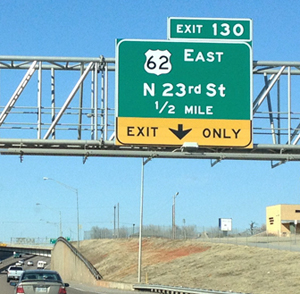
To be consistent, the N should not have a period after it since the St and Rd do not have periods.
![]()
A parking sign simplified so more people can understand it
![]()
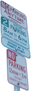

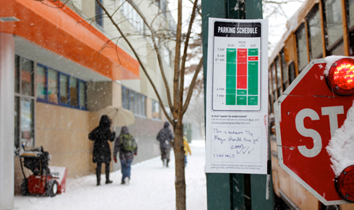
Of all the communication tools our cities use, parking signs are often among the most confusing. There are arrows pointing every which way, ambiguous meter and permit instructions. It's easy to imagine that beyond basic tests for legibility, most of these signs have never been vetted by actual drivers. Nikki Sylianteng was sick of getting tickets when she lived, drove, and parked in LA. The Brooklyn-based designer realized that with just a little more focus on communication design, parking signs could be useful and more easily understood.
The downfall of most parking signs is that they have limited area to communicate multiple conditions and restrictions. Instead of using a text-based design, Sylianteng translated all of the information into a visual explanation that answered two main questions:
1.
Can I park here?
2.
And for how long?
"I just visualized what I construct in my head when I'm reading the sign," she says. Her latest design features a parking schedule that shows a whole 24 hours for every day of the week. The times you can park are marked by blocks of green, the times you can't are blocked in a candy-striped red and white. But Sylianteng says there's really no need for the extraneous detailed information we've become accustomed to. "I've never looked at a sign and felt like there was any value in knowing why I couldn't park. These designs don't say why, but the 'what' is very clear."
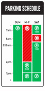
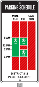
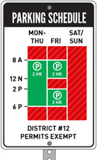
Sylianteng is considering some improvements:
Colorblindness - the red and green are part of the legacy design from current signs, but she might change the colors to a more universal blue.
Incorporate more parking rules without reverting back to the information overload she was trying to avoid in the first place.
Jim Watson added the version on the far right above, removing unused space - less visually obtrusive and requiring less metal and, therefore, cheaper to produce.
Sylianteng has been going around Manhattan and Brooklyn hanging up the revamped parking signs. "A friend of mine called it functional graffiti," she says. She'll stick a laminated version right below the city-approved version and ask drivers to leave comments. So far, she's gotten pretty good feedback. "The is awesome. The mayor should hire you."
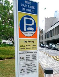
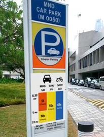
A blogger from Singapore was inspired by Nikki's work and proposed another version:
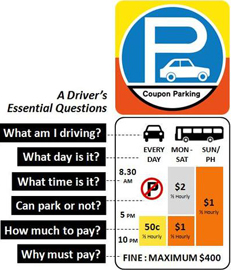
![]()
![]()
Pesky shapes that don't belong

Notice how those triangles of black along the bottoms of the letters are a bit annoying? Or they should be.
Designers can now easily improve the clarity of the typography - there is no longer a reason to ever say, "That's the way it came back from the typesetter." (That was a common excuse in the old days).
Setting type in outline fonts requires a bit of extra finesse - it is up to the designer to check for those pesky captured blobs and take care of them. Fill in the captured spaces or explore different point sizes for the fill and the stroke.
![]()
![]()
![]()
![]()
![]()
An example of a better sign that has an outline font
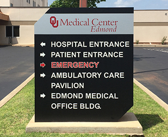
This is at an entrance to a hospital, often where frantic worried people are looking for
help. Notice that the most important word on the sign below is the hardest to read. At least it's in red.

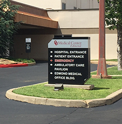
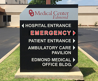
A better sign below right and some of the issues that have been addressed:
Set the copy flush left for items that direct to the left and flush right for directing to the right.
Moved arrows to the flush margin of each side. Now they visually help communicate direction.
Removed the stems on the arrows (info is conveyed by the arrowhead, not the stem).
Enlarged the arrows.
Tightened the leading for locations that take up 2 lines to improve proximity
and clarity.
Enlarged point size and increased the kerning of the outline font.
![]()
A better place to mount a store's hours sign
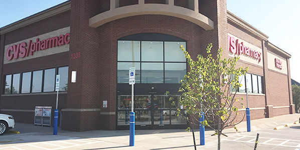
A new CVS drug store opened nearby. But, the sign denoting the hours of operation could be in a better place - one that better respects the needs of their customers.
When do we need to read the Hours sign? Most often, when the store is closed. When it's open, we just walk right in - the doors are even automatic - they open up for us as we approach.
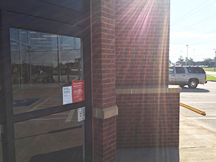


Scenario: One gets to the doors and they don't open. Is the store closed? They look for the posted hours. Since the customer is standing right in front of the doors, he/she looks to the right, then to the left, but no sign is visible.
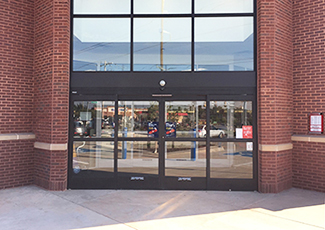
The Hours sign is currently located at A below. If it is moved to location B, it would be visible from the front doors. It would be to the right, where most people are likely to look first.
Lesson: See through the eyes of the user. Not the sign installer.


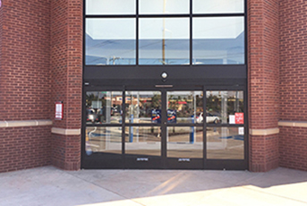
Above: Where the sign is currently located. Below: A better location for the sign:


![]()
Which door is the better location for the sign, Please Use Other Door?
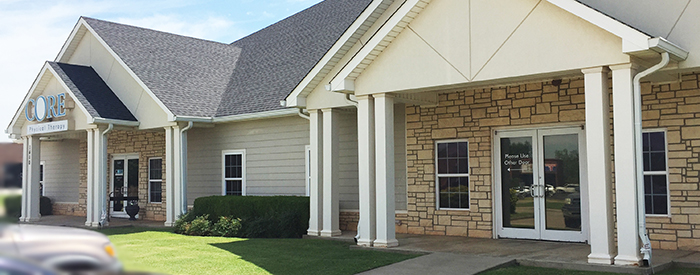
This is the building where I go for Physical Therapy (injured shoulders). The entrance is under the gable on the left, with the sign. Under the right gable is a set of double doors. It was necessary to post a sign telling first-time users to use the doors to the left. But, there are 2 doors on which to mount a sign.
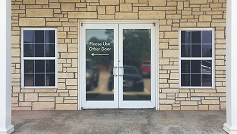
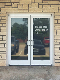
The one above left is a bit better. The one above right could logically and, somewhat clearly, be pointing to the door to the immediate left, not the far left.
![]()
Busy and clumsy signage at the Houston airport
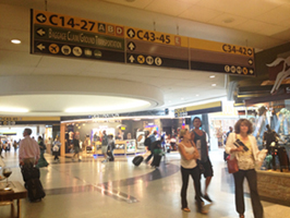

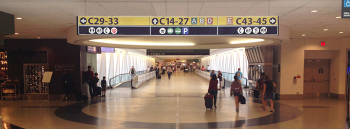
Most airports are improving the design of their signs. Not in Houston - the new signs are worse, a step backward in thoughtful wayfinding. A few observations:
1. Too many useless symbols: escalator? Who wanders an airport wondering where an escalator is? The user is seeking a destination, baggage, taxi, etc. An escalator is a conveyance to get one to a destination. The train symbol? Again, that is a conveyance. The train gets one to another terminal (A-E).
2. Plane symbol (?) and Gates on separate lines.
3. Inconsistent format - either use all text, all symbols, or symbols with text. Here it is all symbols with only one translated in text: Baggage Claim/Ground Transportation, which is also represented by recognizable and familiar symbols.
4. Condensed font. Inconsistently applied.
5. Caps/Small Caps.
6. Too many redundant arrows.
7. Blank panels have no value and add to the clutter.


Above: Existing. Below: Improvements

![]()
Unnecessary and counterproductive signs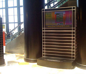
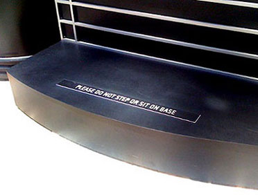
The photo on the left is of a signboard in the WinterGarden atrium in the Brookfield Place (formerly the World Financial Center). It publicizes upcoming events on the monitor at the top of the unit. Okay, so far. But look at the sign added to the base - 'Please do not step or sit on base'. Bad design. Instead of a sign telling people what they cannot do, design the unit so there is no tempting seating area. Then, there is no need for a sign. The solution here is not about designing a better sign, its about designing better units - to be more respectful of their environment and more user-friendly.
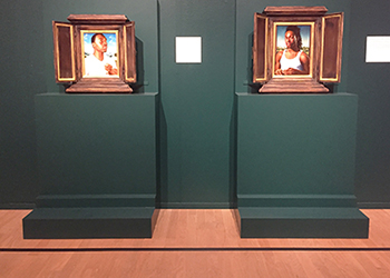
Below: The OKC Museum of Art has instructed the gallery guards to warn visitors not to stand up on the base in this exhibit. Better: Don't build a base (which is unnecessary for the exhibit) that looks tempting to stand on.
![]()



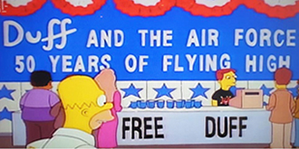
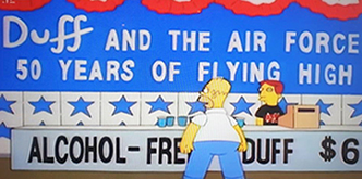
Good examples of why one shouldn't put text on the front of a booth or counter. It may look good on the drawing pad and during set-up, but, once the doors open, people will stand there and obscure the text. NC State was smart enough (and there were a few others) to post their sign name above the table.
![]()

![]()
![]()

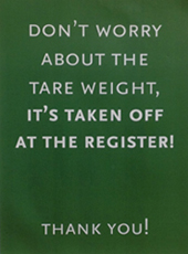
The obscure wording used on a sign at Whole Foods. I stopped several people - customers and employees - and asked them what the word 'tare' meant. Not one of them knew the answer. I questioned the person who was restocking the items. She confirmed that it meant container. I asked why it didn't just say container - why use a word that few understood. Why make the customer have to decode and decipher the unfamiliar word. She had no response and suggested I fill out a comment card. Using obscure words may be Whole Foods' attempt at conveying intellectual elitism.
Tip: Elitism can often get in the way of clear communication.
Lesson: Successful design (clear communication) respects the reader.
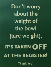
When I later returned to Whole Foods, those signs had been replaced (middle sign above).
Compare the two sentences:
Don't worry about the tare weight.
Don't worry about the weight of the bowl.
Of course, the second one is clearer. Whole Foods did the right thing by wording the sign to be more easily comprehended by more people. Other changes:
• Some of the text that was set in all caps was changed to U&lc. This does appear more friendly and less demanding.
• The rest of the text remained in UC, but in a larger point size and with increased emphasis on the word OFF. I'm not sure why they need to yell that word at us so loudly. I also don't know if its important that they educate the reader about what tare weight is. Is tare weight even necessary? The main point of the message was adequately conveyed in the preceding words.
But, at least, Whole Foods responded and clarified the wording of the sign.
![]()
Confusing location for an informational sign
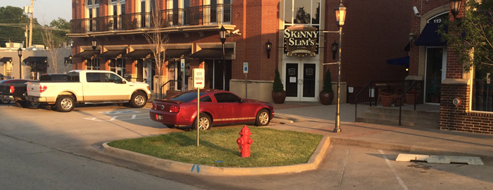
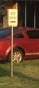
This 'More Parking' sign is located in block-long retail/restaurant strip in an urban naborhood. The purpose of the sign is to inform visitors to the restaurants and bars that there is more parking behind the building and then to guide them to that lot. But the sign is mounted in the middle of the block. It is impossible to get to the parking lot from this location.
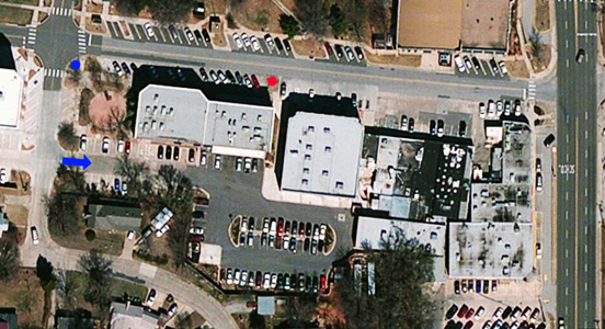
Blue arrow - the only entrance to More Parking.
Red dot - where the sign is located.
Blue dot - where the sign should be located.
Seems so obvious and simple, doesn't it. Makes ya wonder what some people think about. "Tell people there's more parking behind the buildings." If the decision makers had just seen it through the driver's eyes, the slightly frustrated one looking for a parking place,
they would, hopefully, have been more considerate.
Empathy is so crucial for effective design.
![]()
Good example of bad text copy on a sign
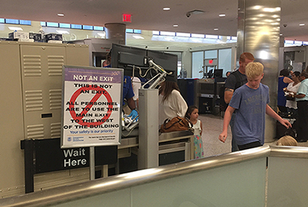
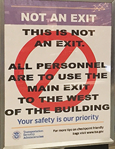
This sign was at the airport security checkpoint where travelers move into the concourse.
ALL PERSONNEL ARE TO USE THE MAIN EXIT TO THE WEST OF THE BUILDING
Issues:
1. Personnel Sounds like government or military jargon. I doubt the general flying public thinks of themselves as personnel.
2. Main exit Why would anyone know which exits are main and which are secondary? We entered one way and we want to exit another way.
3. To the west Have you been in airport? After a ride to the airport or parking your car, walking through hallways, up to counters, and through security lines, do people really know which way is west? Doubt it. Nor do they care.
4. The copy has a Prohibited or No symbol over it, thereby suggesting all the copy is wrong.
This is a great example of design from the inside out - from the viewpoint of the TSA person in charge of putting up a sign. To that person, the copy makes perfect sense - he/she is 'personnel', they know which exit is the 'main' one, and they know where west is.
Most important lesson: See through the eyes of the user, not the designer.
![]()
![]()
Providing a considerate alternative to the request

![]()
Thoughtful placement of a door sign

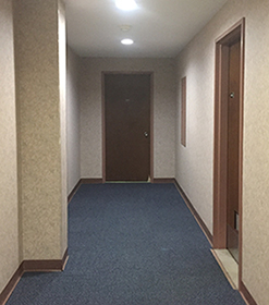
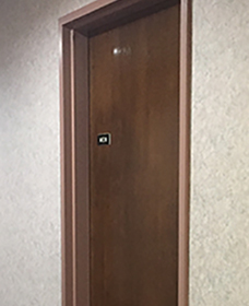
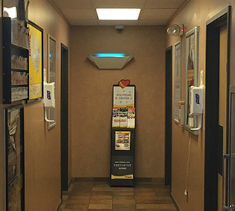
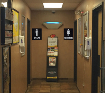
Kudos to whoever mounted these restroom signs. He/she considered the user's line of sight, especially as they walked down this hall seeking the restroom. Instead of placing the 'Men' placard in the middle of the door (as is normally done), here they moved it to the left which allows it to be seen while one approaches the door, rather than waiting until one is upon the door.
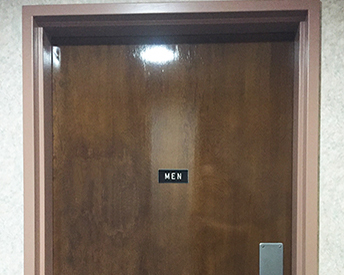

A better way to respect the desperate customer
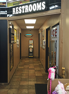


I was on my way to the restroom at some C-store on I-70 between Illinois and West Virginia. There was this great Restrooms sign over the hallway - it was easily visible from the front door. Nice job! I headed down the hall, but didn't know where the Men's room was until almost in front of the doors. So much clearer and easier to navigate if there had been signs posted on that back wall. So simple and so effective. More on Sign Design.
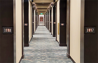
Below: A great idea for hotel hallways - mount the room numbers to face the user walking down the hall. The traditional placement, room number on the door, requires the guest to turn towards the inset door.
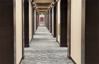
![]()
More thoughtful orientation - signs should face the viewer

A 'blade' sign - one that is perpendicular to its background - is more appropriate as it faces the customer approaching from the side. Those above are in a Target store.
Many signs are placed on storefronts facing out. However, many stores are first seen from a severe angle as the viewer approaches the store along the street, sidewalk, concourse, or mall corridor. Signs are typically rendered and designed on paper (or screen) in an architect's office, not on site. When presented to the client, the storefront and the sign look great. But, that doesn't mean it is good design. To be good, it must work for the reader, viewer, user.
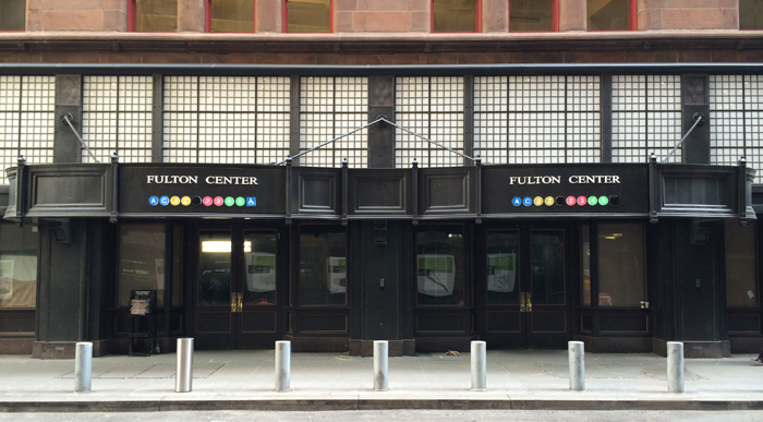
This is a new entry to the Fulton Street subway station. This facade looked great in renderings and in presentations. But, look at it as the viewer will see it - while approaching from either direction. The ends of the marquee that face the viewer are blank. The face with the signage faces a blank wall across the narrow street.


Design principle: Signs should be designed and mounted to face their viewers
Lesson: Appropriate design decisions are made through the eyes of the user, the target audience, not the designer nor the client
Tip: Empathize with the user - pretend you are a customer and view the entity as if you have never been there.
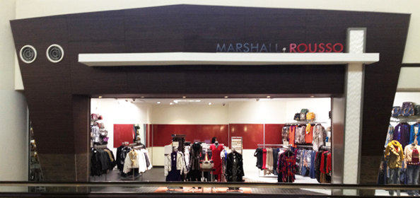
Above is a storefront that may have looked fine in the architectural rendering, but is poorly designed for actual use.
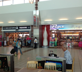
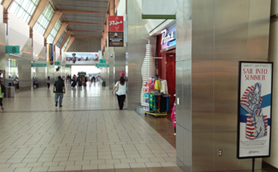
At many airports, the traveler looks down long corridors on their way to their gate. Along the way, there are food and gift shops, but their signs face across the corridor - to the opposite wall, not to the potential customers walking and riding down the corridor who see the storefronts from an extreme angle.
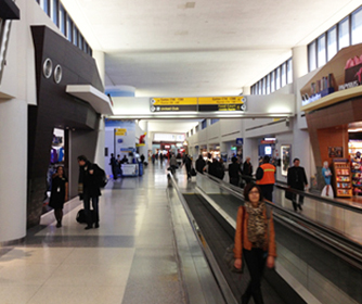
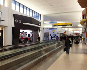
I stopped at this store and asked the clerk, "What is this place?" She told me. I said, where's the sign? She walked me out into the corridor far enough so I could look up and see the letters mounted on top of the projecting white eave (top). I pointed out that no one walking along the concourse could see the sign. She said exasperatedly, "I know - there should be something on the back wall." (which is completely blank.) And she pointed where. I pointed to the projecting wall that faces the oncoming travelers and said, "How about right there where people can see it?" "Great idea! I'll tell my boss."
Lesson: Store clerks will sometimes tell you shit just to get you to go away.
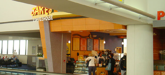
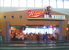
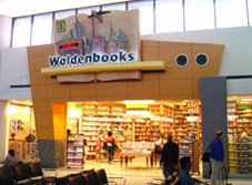
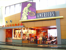
Look how nice these storefronts are and how dramatic their signs are. But, notice below, the view the potential customer has as they approach the store - you can't see the sign at all.
And there are those great crossbeams that could easily support store signage.
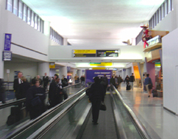
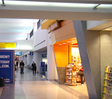
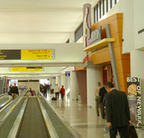
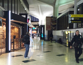
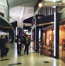

It is impossible to see the Tony Roma's sign from either direction. Not until one is directly across from it and backed up against the far wall.
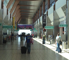
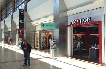
The airport signs and the hanging banners are all faced correctly - towards the reader. But, not the store signs. I suspect the architect and the airport approver saw some nice renderings from straight on, and, of course, they would look impressive. But as in most thoughtless design, they did not put themselves in the point-of-view of the user, the target audience. If they had, they more likely would have realized that the signs were not as effective as they could be.
Update: The remodeled shops at the OKC airport got the signage right - these blade signs are perpendicular to the facades that face the viewer while walking down the concourse.
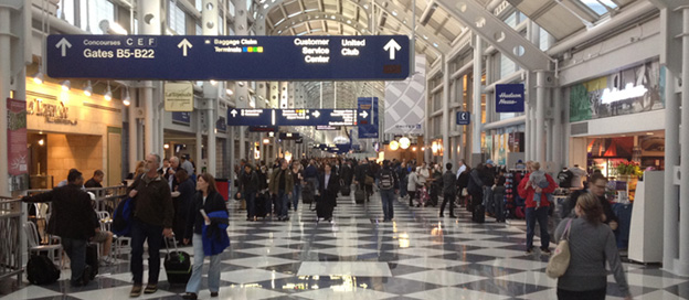

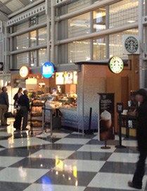
There are signs for 3 food services here. You can recognize Starbucks more easily because all of their signs are facing us we approach. The other two we aren't able to read until we get right in front of them. Often in an airport, we look down a corridor to find or plan our food and gift needs. Some people may just wander with time to kill and these forward facing signs may then be adequate, but for the more hurried traveler, the signs facing down the corridor are more appreciated.
Lesson: Take a moment to see the world through the user's eyes. It can often be quite a different view. Much more important and appropriate.
Trivia: Most airport codes make sense - DFW for Dallas/Ft Worth, JFK: JFK in NYC, OKC for Oklahoma City. But Chicago O'Hare has a code of ORD.
Here's why: The airport was built on a site that local residents were very familiar with - an orchard. It was even known as The Orchard, so the code designators may have been inspired by that and thus, ORD, Orchard.
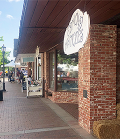

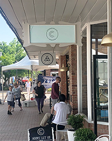
The white signs should be hung so that the shopper walking down the sidewalk can more easily see the store name. In the background is a blade sign that was mounted from the canopy eave. But the eave is old and slants down towards the street. Corrected version on the right.
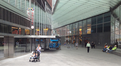
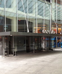
At the Conrad Hotel in Manhattan, the sign is at the front of the canopy, facing a wall and a bench. Everyone who needs to read the sign will approach it from an angle; and clearly see the side of the canopy first, not the front face. On the plan of the building, it may have looked okay to specify a sign on the canopy facing out. But, the designer didn't consider the building in its context - there is another building in the way of viewing the sign. The Regal blade sign ( left fotos above and below) is for the movie theater. That sign faces the oncoming traffic. The Conrad sign faces only the guys sitting on the bench.

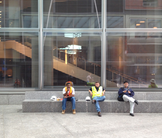
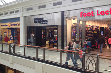
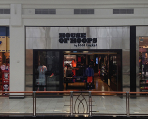
Below are examples in a standard shopping mall.
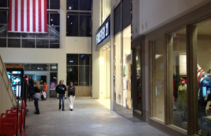
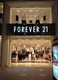
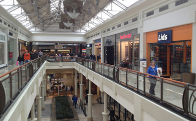
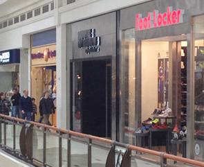
The store past Foot Locker on the right - can you read the sign? Even when straight across from it (below on the right), it's still tough to read.

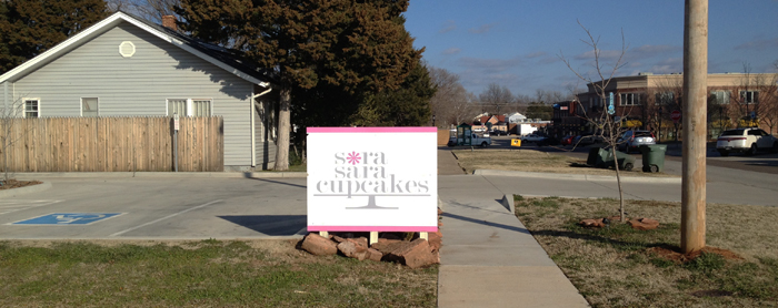
This is the sign at Sara Sara Cupcakes (please ignore the low contrast in the logo and the poor legibility and readability.) The sign looks okay in this foto and probly looked good in an architectural rendering.
Primary target market/audiences: those who have decided to go to SaraSara Cupcakes
1. Regular repeat customers: they know where the store is, they don't need a sign.
2. Infrequent customers: those who know where it is but may need a reminder or confirmation that they are at the right place.
3. New customers: those ignorant of its location - they need guidance.
Secondary target: those who see the sign and/or building and may make an impulse decision to get a cupcake.

This is the sign (just left of center) as viewed by the sign reader. Well, at least, the edge of the sign.
Problem: The sign faces a small parking lot across the street. Most of their customers and potential customers, probly all of them, will see the sign, at a sharp angle, from farther down the street.
Solutions
1. Rotate the sign 90 degrees so that the sign faces the oncoming traffic.
2. Duplicate the sign on the other side to face traffic coming from the other direction.

Above is a photo that I altered in Photoshop to show the sign oriented correctly.
Below are photos, shot a year later, of the sign after they rotated the sign to orient it correctly.

Lesson: Design only from the POV of the user (the target audience, the reader). Not the client, client's spouse, friends, nor the designer.
Tip: For maximum recognition, design and install signs to face the reader, not face sideways to the reader.
Bonus design tips for the SaraSara logo
1.
Increase the weight of the letter strokes (the thin strokes are too thin for easy readability.)
2. Darken the text for improved legibility, readability, and comprehension.

This sign at another location is better. The sign faces oncoming traffic and has darker text.
![]()
A better size and location for a pathway sign


Left: This is the Peter Minuit Plaza in front of the Staten Island Ferry building at the very tip of Manhattan. The bike lane and pedestrian sidewalk split here - bikes to the left, walkers to the right. But, it is so easy to not notice the sign - it is too small and too high up on the sign pole. Often, I see pedestrians walk along the bike lane and the cyclists either go around them or call out that they're about to pass them ("On your left.") Above right is how it could be - easier to notice and understand.
Lessons: Place signs at eye level. Make them large enough to be easily noticed.
![]()
Inconsistent store name and signage
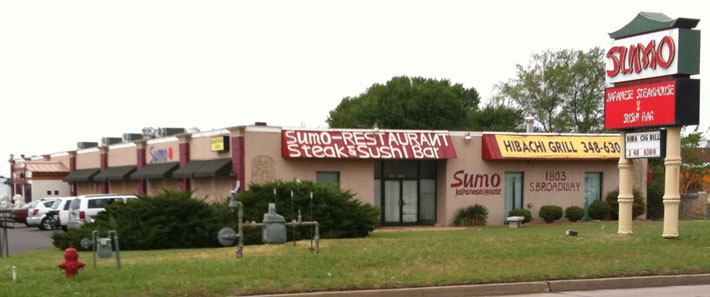
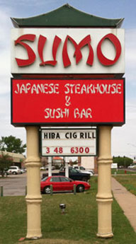
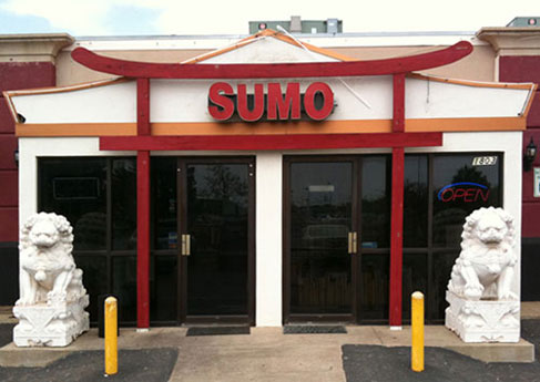
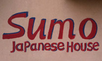
The Sumo Japanese Steakhouse & Sushi Bar or Sumo-Restaurant Steak & Sushi Bar or Sumo Japanese House
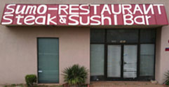
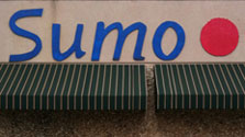
Lessons
A consistent business name helps build strong store recognition.
Consistency of logo images builds brand awareness.
The renewal Spa & Salon or renewal salon & spa or RENEWAL SALON
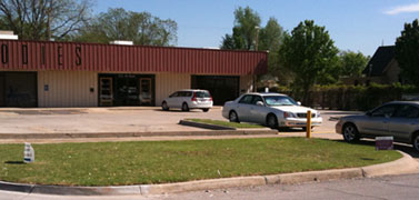
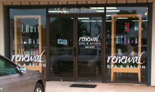
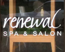

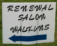

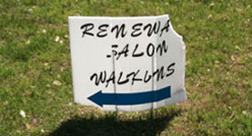
Some tips
Avoid mounting signs where they will be hidden by parked cars.
Replace signs once they no longer present a good image for your business or client.
![]()
Sign layout of poor quality
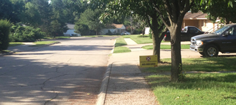
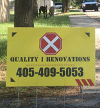
I was out walking the dogs and came up on this sign. I just stood there wondering what I was looking at.
This sign conveys thoughtless decoration, not design. Even though the sign text says 'Quality'.
Elements that don't make much sense
The octagon with an X in it - Does it mean Stop? No good? Railroad crossing?
Stencil typeface, familiar to wooden shipping crates and the military.
Row of red dots above the phone number.
3 black triangles in the corners, drawing our eye and pointing out away from the center.
3 angled red lines in the 4th corner, reminding me of this: ![]()
The purpose of the sign is to solicit new business by impressing someone that this would be a good company to call for home renovation.
Lesson:
Before just arranging elements in a somewhat random format, good designers explore the attitude the client wants the reader to walk away with. Here, the attitude would be improving one's living space, with construction performed by a professional competent crew. The decisions concerning the font, colors, layout, text placement, and images should all work towards the goal of conveying quality and renovation in a way that is well thought out.
![]()
Examples of poor contrast

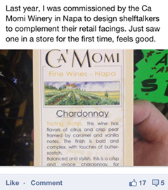
Someone designed this promo piece (in the middle) to hang on a shelf next to the bottle of wine. In the Facebook post on the left, he/she commented that it 'feels good' to see one's work in the store. But, look at the piece he/she feels good about - can you even read the headings at the beginnings of each paragraph? It shouldn't feel good to ignore the design principles of contrast and readability. Also, the text copy is set justified resulting in awkward word spacing and set over some obscure image in the background, decreasing readability even more.
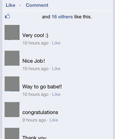
But that's not the example of mediocre design. Notice in the Facebook comments on the right, they are all supportive and complementary. Not one person commented on the poor design decisions or asked why the designer feels good about mediocre work. Could the piece be any more dull? Hopefully, there were many more people who saw the post and wanted to be honest, but were too polite to post any response. When mediocrity is rewarded with "Nice Job!" and "congratulations", it reinforces the notion that there is no need to strive for excellence. Why bother? This level of work is "Very cool :)"

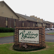
The sign above is mounted on the brick wall just above the Handicap parking sign in the picture below. If you were driving by looking for the sign on that building, I suspect you would miss it completely. What a waste of money. Fortunately, they paid for some other signs that, although in a different font, are much easier to see.
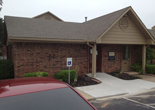
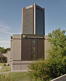

Above: The Hyatt Place hotel has brownish letters on a brown background with a light bar behind the letters.
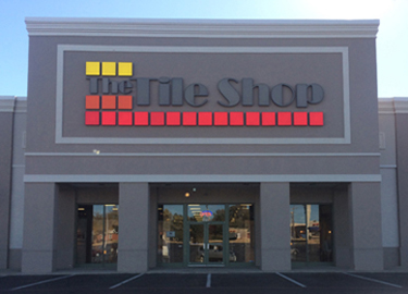
Below: The Tile Shop

Good contrast: Yellow, orange, and red on #7 grey.
Poor contrast: #8 grey on #7 grey.
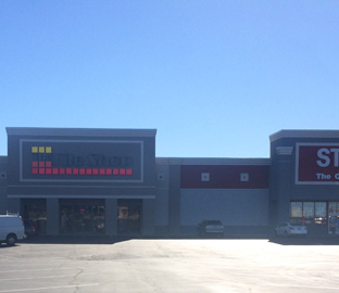
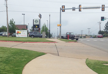
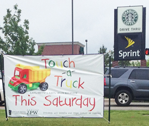
On the Sprint sign (far right) the yellow reads well - the contrast is strong - yellow or white on black is easy to read. But, the yellow on white in the words Touch and Truck are just too close in value to be easily read.


The designer convinced the airline that a light font set in light grey on greybeige would be trendy and cool. No one thought to see it as the passenger would - it is tough to find and even tougher to read. I witnessed 2 people plop down in the wrong seat and numerous people pause to decipher their seat location.
Remember, this is while boarding (usually after delays and airport chaos) and while the airline is desperately telling passengers to hurry up and find their seat. The design firm slowed down the boarding process because they failed to design from the user's point of view.

![]()
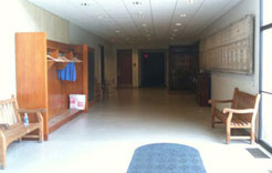
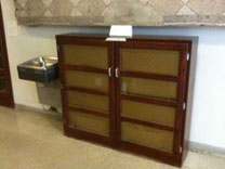
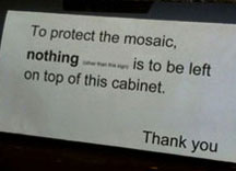
A thoughtless unnecessary sign. The scene: a hallway just off the main entrance to the Museum of Art on the Princeton University campus. On the right side of the hall is a mounted mosaic artwork with a wooden cabinet underneath. Concern: apparently people had been leaving items on top of the cabinet and the staff was worried that the mosaic above might be damaged. Assumptions:
1. People had a need for a horizontal surface on which to set things.
2. The mosaic is fragile (even though there is a water fountain and bench under the mosaic).
Staff solution: ignore the need of the users and post a sign demanding that nothing be left on top of the cabinet.
Better solution: Move the cabinet. See the wall opposite - move the far bench to under the mosaic (that must be okay since there's already one bench on the mosaic wall) and put the cabinet where the bench was. That groups all storage units - coat rack, shelves, and cabinet - together and groups two benches underneath the mosaic.
Another example of thoughtless design: stuff on cabinet, must be outlawed, post a sign.
But that solution is shallow, doesn't take into account the needs of the building user, and places restrictions on behavior. All unnecessary.
Great design should be about content and substance - not gimmicks or pretty pictures. Great work should be honest, true, and full of integrity.
![]()
A store sign above the awning

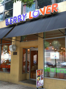
This scene in Queens, New York, shows some new storefronts with their shiny signs mounted above the awning - out of sight of the pedestrians. Did I mention this was NYC, where most people get around by walking? This is yet one more example of the designer looking at a rendering of the store and admiring the sign above the door. But, if more designers would see their work through the eyes of the target audience (in this case, walkers on the sidewalk), they might spot these poor design decisions.
There can still be signs above awnings for drivers or people across the street, but these need to be supplemented by signs that project from the facade, perpendicular to the building - facing the pedestrian as he/she looks down the block. One of the stores in the foto does have a colorless logomark projecting, but its not quite enough to capture the attention of those unfamiliar with this area.
![]()
![]()
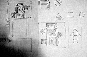
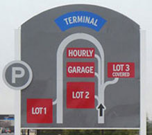
A new parking wayfinding sign at the OKC airport
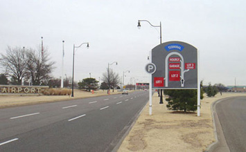
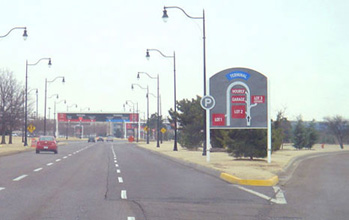
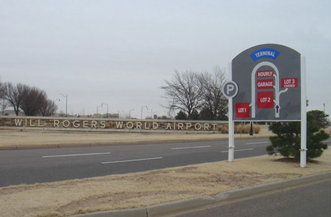
In 2005, the airport in Oklahoma City, Will Rogers World Airport (one of the few airports named after someone who died in a plane crash), closed a large parking lot in order to build a new multi-story garage on the site. A remote lot was opened to compensate for the lost spaces. The airport needed a way to communicate to drivers where all of the parking lots were located. Like many airports, Will Rogers faced increasing competition from off-site lots and increased vehicular traffic as the number of flying passengers increased.
Funnel Design Group was the airport design firm. The banners inside the terminal, some of the signage, and the airport graphic pieces were designed by Funnel. I was hired as a design consultant to work on this project to improve the environmental graphics and wayfinding at the airport.
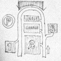
We explored the entire system of environmental graphics - signage, labels, wayfinding, placement, size, colors - from the exit off of the freeway to Meridian Road, the roadways towards the terminal and parking, and the entrances to the lots and the terminal. We explored user needs - the primary target market would be rushed, ignorant of the airport layout, and possibly a bit stressed. The new signs would need to provide assurance, guidance, and comfort. Details of exits, specific sizes and relative scale were not important. Just show the user how to get to the parking options - that's all the motorist is concerned about. The exit information is communicated by wayfinding signs inside the lots.
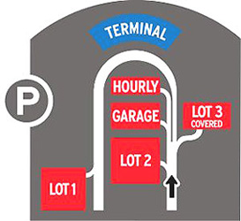
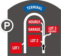
The map sign, lot signs, and other wayfinding signs were submitted to the director of the airport. Some were accepted and implemented, other proposals may wait for implementation until the new garage is finished. The parking lot wayfinding sign was built and installed.
Sign objectives and concepts
1. Get attention of motorist - large sign, bright colors, recognizable type and symbols
2. Communicate quickly - use standard parking symbol to convey that this is about parking and black arrow to show 'You are here' and direction of travel
3. Show that there are several options for parking - lots, garage, and hourly
4. Guide the user accurately - show roadways, direction of travel, and lot entrances
5. Easy to read and understand - high contrast, sans serif type, bright colors, minimum of detail and clutter
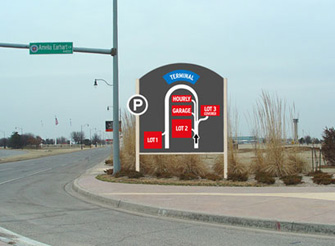

Above: Renderings of comp superimposed on site. Below: Photos of the installed sign

Below: Original sketch. Computer-built comp. Finished installed sign.

![]()
![]()
Credits
Concept/Art Direction: Jim Watson
Design: Jim Watson and Sean Cobb
Production: Sean Cobb
Fabrication: Airport staff
Dates 2005
September 18: Sketched and designed
September 20-25: Plan drafted
Late fall: Sign installed
More info and examples about FlushCenter layout and Flush Center in Highway Signs
www.jamesrobertwatson.com/design-sign.html
![]()
![]()
![]()
![]()