
How to make advertising work smarter and better
Advertising is the science & art of arresting human intelligence long enough to change its mind.
Advertising is both a science - following formulas and research and an art - aesthetics. It should arrest - grab a hold of, human intelligence - one mind 'speaking' to another, long enough - no longer and no shorter, to persuade one to think differently, to change an attitude.
That is one definition of many. The typical textbook definition from when I was in school (1970s) was that advertising is selling a product, idea, or service. But, it's so much more - selling has to do with a behavior - transaction of money, reaching for a certain product, or pulling a voting lever. To change one's behavior (select Tide instead of Cheer) one must first change one's attitude. That attitude change is the job of advertising.
Assessing the effectiveness of an ad
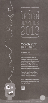
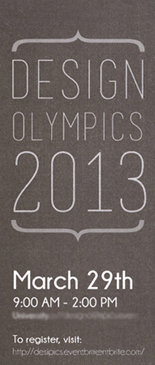
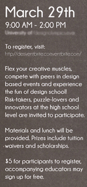
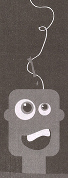
An in-depth look at this ad above on the left.
Every ad and piece of graphic design should meet the following 3 main objectives, in this order:
This ad, that ran in a newspaper, has very low contrast - light grey and medium grey (I heightened the contrast in the 3 close-up images on the right for easier reading in this post). In the medium of newspaper, it is difficult to get a solid black - the ink is not very opaque and the newsprint absorbs and spreads the ink. A black or dark background may look fine on the screen, but will be lighter when reproduced on newsprint.
There is not much intrigue or visual interest here to grab the reader. The text copy is laid out flush left in a single column with straight baselines. The layout has little dynamism or excitement. The face illustration is small and towards the bottom of the ad. A good ad must stop us from turning the page or scrolling past the screen.
The horizontal bracket parenthesis are a trendy design gimmick with absolutely no value or purpose here.
The headline, Design Olympics 2013, has no familiar appeal - it is an unknown phrase - although we can assume it refers to a competition. But, why make the reader assume - just talk to em. Clearly. Asking the reader to make assumptions in this era of media bombardment and short attention spans can result in a loss of readership or response. This is a new event - no one that reads this newspaper is familiar with Design Olympics. A good ad 'speaks' directly and clearly to its target audience.
The largest type is the year 2013, which is useless information. Would any reader think this ad would promote last year's event or an event next year? Nope. The least important word does not deserve the most dominant point size.
The ad visuals do not convey Olympics, athletics, or a competition (is a competition even a good sales pitch concept to naive high school kids who probly don't really understand design well enough to feel confident competing?) The Olympic slogan (Swifter Higher Stronger) and spirit represent humans striving to be their best. None of that attitude is conveyed in this ad.
What does that goofy expression on the blockhead represent? And the wavy noodle from the top of his head? Neither suggest the straightforward discipline of the Olympics or the creative problem solving of design.
The copy is a bit awkward. Line breaks should occur at natural pauses or distinctions between phrases. We read in groups of words, in this case, probly one or two groups per line of copy. 'Compete with peers in design' suggests the wrong message to a non-designer still in high school. 'Fun of design school' is glossing over the rigorous discipline and demands of design school. Achieving the Eureka moment in problem solving is fun, developing strong messages that make an emotional connection is fun, but not design school. '$5 for participants to register' is not quite accurate. If one hasn't registered, one is not yet a participant.
The copy text does not respect the reader's time. The large subhead gives the date, but no day of the week. That forces the reader to check a calendar. Why? Just include the day of the week.
The ad does not adequately educate the reader about the event. Where will the event be held? Will there be teams? Demonstrations? Critiques? There should be more details to excite and entice people to visit the website and sign up. One advantage to the medium of newspaper advertising is that there is a captive audience who is already in the reading-for-info mindset. There is plenty of room in ad of this size for more details and specifics.
This ad provides little incentive or reward for signing up. Lunch for $5 or a chance at a tuition waiver to the sponsoring university is probly not enough. A successful ad persuasively motivates the reader to do something. - sign up, vote, change a buying habit, think about an issue.
What is the creative concept that drives the decision-making for this ad? As a new event that is unfamiliar to most readers, it needs a clever creative concept and a thoughtful design layout to break through media clutter and make an impact in the minds of the target audience.
Four guidelines for layout composition From The Non-Designer's Book
When laying out the elements of type and image for an ad or graphic design, designers explore a wide variety of layout compositions: dominant illustration, type only, vertical, horizontal, decorative, minimal, etc. Although there are no rules, the following four guidelines can help guide you in making layout decisions so that the final solution will be more effective in achieving its objectives.
Group related items together. Create cohesive groups of information, not scattered elements. Develop hierarchal relationships to guide the eye flow of the reader. When several items are in close proximity to each other, they become one visual unit rather than several separate units. This helps organize information and reduces clutter. Be conscious of where the reader's eye is going: where to start looking, what path to follow, and where to end up. There should be a logical progression through the piece, from a definite beginning to a definite end.
Purpose: to organize. Other principles come into play as well, but simply grouping related elements together into closer proximity automatically creates organization. If the information is organized, its more likely to be read and more likely to be remembered.
Nothing should be placed on the page arbitrarily. Place each element on the page to create a visual connection with something else on the page. This provides a sophisticated and strong cohesive unit. Unity is an important concept in design. To make all the elements on the page appear to be unified, connected, and interrelated; there needs to be some visual tie between the separate elements. Even if the separate elements are not physically close on the page, they can appear to be related and unified with the other information simply by their placement.
Purpose: to unify and organize the page. The result is like when you pick up all the toys scattered around the living room and put them into one toy chest. The room feels organized and more comfortable.
Repeat some element of the design throughout the entire piece. You can repeat color, shape, texture, spatial relationships, line thicknesses, sizes, etc. This helps develop the organization and strengthens the unity. The reader can feel more comfortable with the familiarity repetition provides.
Purpose: to unify and to add visual interest. If a piece appears interesting, it is more likely to be read.
If two items (type, color, size, line thickness, shape, space, etc.) are not exactly the same then make them obviously different.
If they're not really different, they can create conflict. Conflict can be uncomfortable to the reader. Contrast on a page draws our eyes to it. Our eyes and mind like the excitement contrast provides.
Purpose: to create interest on the page (so it will be more likely to be read) and aid in the organization of the information. The contrasting elements should not confuse the reader nor create a focus that shouldn't be a focus. The reader should be able to easily understand how the information is organized, the logical flow from one item to the next.
Ads on Amazon boxes: Stroke of Genious
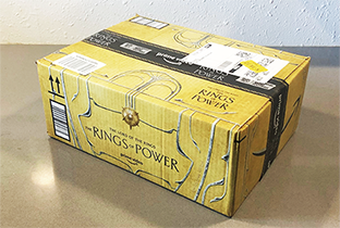
Amazon delivers approximately 1.6 million packages a day, or more than 66 thousand per hour, In 2020, Amazon delivered over 4 billion packages in the US. Many of these boxes are visible on porches, and millions of them are taken into homes. Packages are expected and are awaited with anticipation. Getting a package is a positive experience. By association, the advertiser presents their brand and message in a positive environment.
Advertising exaggeration
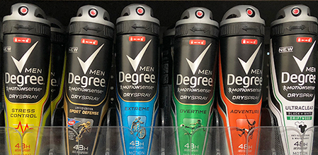
At Walmart, on the shelf were 6 options of Degree deodorant - look at the names of the options. Who wouldn't want an Extreme deodorant? Or one that works Overtime? And a product that can help with Stress Control? Sign me up.
What do these names mean? Sounds like ad copy bullshit. So, I asked the Walmart employee restocking products - she said they referred to the different scents. I asked her "What does Extreme smell like? Is it an overbearing odor?" "When someone works Overtime, don't they start to stink? Why would I wear that?" "Sport Defense?" She smiled feebly and I walked away - she had no idea what the names meant. Nor did I.
I want their best formula deodorant. That's all - just 1 product. Maybe 2 or 3 if they have very clear scent descriptions, like fried bacon or maple glazed donut. Or, maybe Extreme Maple Glaze Bacon.
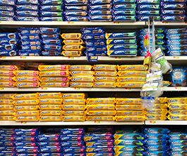
This is becoming quite common - the number of soda flavors available, the number of items (200?) in the Cheesecake Factory menu, and everywhere else you look in the grocery aisles. What do they know - does overwhelming the consumer pay off in increased sales? Are we impressed to the point of wanting to purchase more?
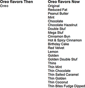
Notice how many Oreo options are available - 22 different varieties of the Oreo Cookie. When I was a kid there were 2 options - Oreo and Oreo dipped in milk.
But, they didn't offer my new favorite - the Oreo Sample Pack - a variety of new flavors so I can try several to determine my favorites.
Please be skeptical of advertising copywriters
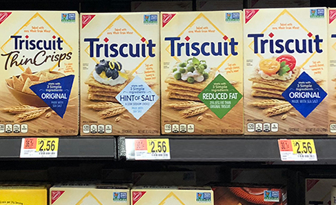
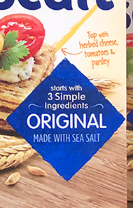
Note the line that catches your eye - 3 Simple Ingredients. That's pretty cool. Not a lot of junk.
Wait, a closer look - It starts with 3 Simple Ingredients. Whoa, there could be many more, including junk. Note that starts with is set in a smaller point size and all lower case - like they're trying to sneak it by us without getting noticed.
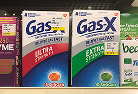
Which is stronger? Here are some dictionary definitions:
• Ultra: beyond what is usual ordinary, excessive, extreme.
• Extra: beyond what is usual, expected, necessary.
In this case, the 'ad copy' doesn't help much - the consumer has to read the ingredients to see if there is a difference in quantity or dosage of the medicine.
I prefer Mega Ultra Extra Strength when using medications.
Misleading, completely inaccurate, article headline
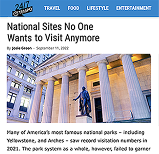
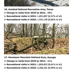
247 Tempo recently published this, National Sites No One Wants to Visit Anymore. The article lists National Sites with both their 2020 and 2021 attendance figures. Of course, due to Covid lockdowns and less travel, attendance figures dropped from '20 to '21. In fact, in 2021, 8 of the sites listed had over 1 million visits each, proving No one wants to visit to be wrong. A more accurate article heading would be something like The Impact of Covid on Visits to National Sites. The incorrect, bait-trapping, headline does disservice to those park sites, the tourism industry in multiple states, and the integrity of journalism.
The serial, Oxford, and Harvard comma
The serial comma (also known as the Oxford comma and the Harvard comma) is the comma used immediately before a grammatical conjunction (usually and, or, and sometimes nor) preceding the final item in a list of three or more items. For example, this three-country list can be punctuated as either Portugal, Spain, and France (with the serial comma) or as Portugal, Spain and France (without the serial comma). To separate words, phrases, or clauses of a series of 3 or more elements, include a comma before the closing and or or. Routine use of the serial comma helps to prevent ambiguity. Graphic Design is all about clear communication and the serial comma helps clarify content. Good designers and copywriters use the serial comma.
The Harvard, Oxford, or serial comma:
• better matches the spoken cadence of sentences
• often reduces ambiguity
• matches practice with other means of separating items in a list (example: when semicolons are used to separate items, a semicolon is consistently included before the last item, even when 'and' or 'or' is present)
The Chicago Manual of Style, Strunk and White's Elements of Style, most authorities on American English and Canadian English, and some authorities on British English recommend the use of the serial comma. Most US college writing handbooks advocate use of the serial comma.
Some newspaper style guides recommend not using the serial comma, possibly for economy of space. In the narrow width of a newspaper column this saving counts for more than elsewhere. But here or anywhere one must question whether the advantage outweighs the confusion caused by the omission. Writers use the comma between all members of a series, including the last two, on the common-sense ground that to do so will minimize ambiguities and annoyances at a negligible cost.
 The guests included two strippers, John Kennedy, and Joseph Stalin.
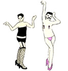 The guests included two strippers, John Kennedy and Joseph Stalin.
Here are some types of sandwiches: pastrami, ham, cream cheese and peanut butter and jelly. With a comma after peanut butter, the kinds of sandwich are these:
• Pastrami
• Ham
• Cream cheese and peanut butter
• Jelly
With a comma after cream cheese, the kinds of sandwich are these:
• Pastrami
• Ham
• Cream cheese
• Peanut butter and jelly
The bottom line
• Omitting the final comma may cause ambiguity or confusion.
• Including the final comma will almost never cause ambiguity or confusion.
• Consistency is key. If you're going to use the serial comma once, then use it every time. The serial comma is necessary in some cases, and consistency then requires it be used in other cases.
Ads for AmericanAirlines on the back cover of The New York Times Magazine
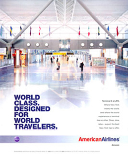

The concept of the ad is apparently that this new terminal at New York's JFK Airport has been designed for a world class experience while traveling. The target market is those who spend more time in airports than the casual traveler. But, traveling has become more of a hassle. American Airlines, according to this full page ad is not countering that hassle.
Take a good look at the photograph: cold, long walkways, no moving sidewalk, no courtesy carts, no gate destination in view. Not a single seated person. We don't even see many inviting seating areas. Each traveler is pulling or carrying luggage, on a polished hard floor.
There is just nothing appealing in this photo that would appeal to a world traveler. In fact, it supports the notion that traveling is now a chore and not as much fun as it used to be.
The copy reads, "Experience a terminal like no other." Thank God. Hopefully, other terminals are better than the one depicted in this ad.
Lesson: all elements in a design piece should support and enhance its basic concept.
Those elements include typography, layout composition, color, photographs, logos. The photograph in the AA ad does not enhance the concept of world class design for travelers.
Assuming the photo was appropriate and did enhance the concept, there is another lesson here:
Align elements to provide greater integration and order within a composition.
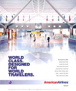
Notice how the flush-left headline below aligns with elements above it in the photograph, but the smaller flush-right text copy does not. The example below on the right has been altered so that the text copy also aligns with photographic elements. A blog reader posted that she even saw a house - conveying the subtle subliminal message that the terminal has the comfort and security of home.

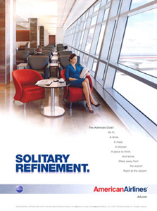

We assume the concept here is to contrast the more refined experience while in an airport lounge to that of the airplane itself. This ad should contrast the experience of sitting in rows on an airplane to the freedom of sitting in a comfortable lounge. The photo, however, shows rigid, monotonous rows, just like on an airplane.
Better: shoot the photograph from an angle that diminishes the alignment of the rows and enhances the openness of the lounge. Maybe more warm colors (like those shown in the background) and less view of an airplane out the window.
A better layout of text copy
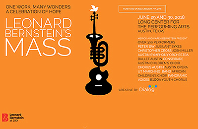
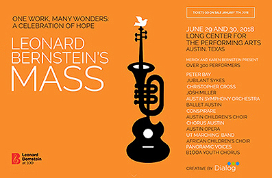
Entire ad is set flush left, except for Leonard Bernstein's Mass. Be consistent.
List of artists is in a paragraph format - if it is a list, put it in a list format.
Move elements away from the edges.
Enlarge elements for better clarity.
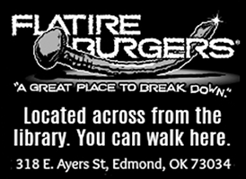
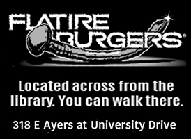
Text has too much info, too busy - delete tag line.
Tighten up letterspacing.
Make address clearer - street number for maps, cross street for placement.
Write from reader's POV - "Can I walk there?" or "Can I walk here?"
Wendys ad campaign
In 1981, Wendy's hamburgers expanded their menu with a greater variety of food items. To communicate the new menu, Wendy's conducted a national ad campaign with the slogan Ain't No Reason (to go anyplace else) with founder Dave Thomas making his first appearance as Wendy's spokesperson (but that's not him below, that's from a different spot for the same tagline).

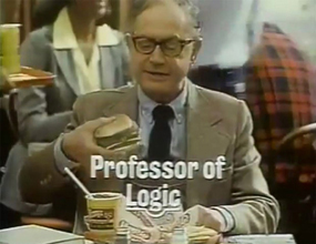
His use of the idiomatic double negative "ain't no" in the television ads generated controversial national attention for the chain. When questioned, Dave Thomas mentioned that he was in the business of selling hamburgers, not educating children. Oops. That attitude disturbed teachers and parents - those who would have to explain the poor use of English to their children. Many teachers boycotted Wendy's (as a result, Wendy's later instituted, and still offers, a discount for teachers). The slogan was replaced with You're Wendy's Kind of People. (The classic line, Where's the Beef? was introduced in 1984.)
Inappropriate Chick-Fil-A ad campaign
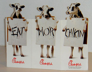
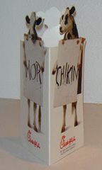
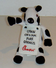
Chick-Fil-A has been running this campaign for a while. One in which some very capable and clever cows plead with the reader to eat less of them and more chicken.

It really does take a village to raise a child. All of us - schools, teachers, friends, parents, families, stores, car dealerships, and companies must take responsibility for the education and healthy growth of children. It is an investment that pays off for all of us.
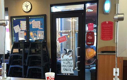

"Playground for little chicken eaters only." And we hope, their accompanying adults.
Here, a kid entering the play area sees words that are unfamiliar and thinks they must be okay - "But, mom, I saw it at Chick-Fil-A." This sign isn't even clever in the cow language. No adult would chuckle or respond with 'How cute'. If they're going to use poor grammar, that should be reserved for advertising (if they must), but it shouldn't be used within the restaurant on materials where the message should be clearly and respectfully communicated and are influencing children.
The Chick-Fil-A campaign
In the current advertising campaign for Chick-Fil-A, cows are shown pleading to the viewer to eat chicken rather than beef - assuming that beef is made of their cousins, grandparents and good friends. The cows (smart enough to stand, wear sandwich boards, and paint letters) have misspelled the common words of 'more' and 'chicken' in the above example of the table tent. Somewhat clever and innovative. However, it is culturally irresponsible:
Why its a big deal
One might react: "lighten up, its a bunch of cows encouraging us to eat chicken, not beef". But it is not trivial. It is important. It does take a village to raise a child. Corporations in America must take a greater role in educating our children with sensitivity and responsibility. Especially a company that claims to uphold Christian values and be family sensitive.
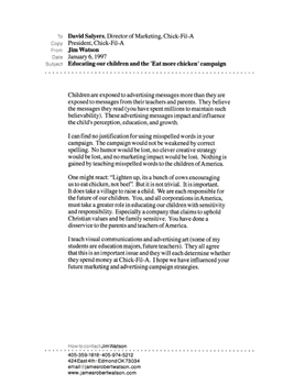
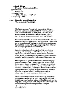
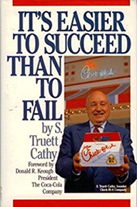
On January 6, 1997, I sent letters to Truett Cathey, President, and David Salyers, Marketing Director, explaining the rationale detailed above. I wanted to appeal to their sensitivity to children and families. The president sent me a copy of his book, It's Easier to Succeed Than to Fail, with a handwritten note in which he agreed that we should all help educate children. But, he said they were quite happy with the ad campaign.
Another reason why Americans sound more stupider
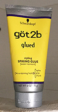

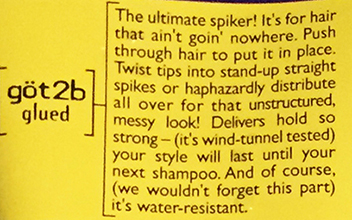
See the second line of copy: It's for hair that ain't goin' nowhere.
This hair spike product is likely bought and used (and sometimes read) by young people. Exposed to ads and their copy more than they are exposed to the teachings of their teachers and parents, they have little reason to doubt that the ad copy would be incorrect. It becomes familiar and accepted. This product and it's corporation has failed in helping make America better; it truly does take a village to educate young people.
Alien advertising copy
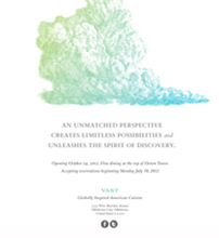

Saw this full page ad in the local newspaper. The ad layout also served as the home page for their website.
So, let's take a look. The image is an engraving of a cloud - it appears to be a storm cloud with the gathering height and the darker bottom. Not sure what it means or its relevance, but its a nice engraving. Below that is the headline. Please read it:

Now, what does that mean? Unmatched perspective? Limitless possibilities? Unleashing a spirit? Pure crap. If you spend some time and use your imagination, you might be able to stretch the meaning to make some sense. But an advertising headline should not require that much work. It should be clear and to the point.
This ad is for a new restraunt on top of the tallest building in Oklahoma. I'm sure there will be a great view of the prairie (or of clouds as in the illustration?). Just like any other high-up view of the prairie, but now from a bit higher up. The objective of the copy is to encourage the reader to consider trying this new restraunt. Of course, the view will be great, but we also should have a desire to eat the food and enjoy the surroundings.
The tagline in this ad, Globally inspired American cuisine, would have made a better headline. It inspires curiosity about this new restraunt. The existing headline (I won't type it again) does not stir any emotion or yearning in the mind of the reader (other than WTF?)
'Where would you like to go for dinner?'
'How about some place where an unmatched perspective creates
limitless possibilities and unleashes the spirit of discovery.'
'Huh? I meant to eat dinner.'
Lesson: Write from the reader's point of view. Use plain language. Nobody on this planet talks like this: An unmatched perspective creates limitless possibilities and unleashes the spirit of discovery.
Tip: Write copy to match the way the target market thinks and talks.
A deceptive ad
The advertising profession has to battle an often-deserved reputation of not being trustworthy. Many polls of trust place ad people down with used car salesmen and politicians. Outrageous claims are part of the reason. Here are a magazine ad and web home page banner with some misleading copy and visuals. The ads are for a travel vest with many pockets to hold your stuff:


The implication
All the stuff on the 'Tourists' in the circle would fit into the vest pockets worn by the 'Travelers' on the right.


Do you believe it? Wouldn't there be bulges from the water bottles and the long lenses on the SLR cameras?

In the list of items shown above, there is no SLR camera even pictured, only two smaller point-and-shoot cameras. So, maybe part of the transformation from Tourist to Traveler includes buying a smaller camera. That has nothing to do with pockets in a vest - the ad makes no mention of having to buy smaller stuff (nor does it mention that you should wear different teeshirts under the vest). The perception (and that's all that really matters) is that by buying this vest, all the touristy stuff can fit into it and you will then be dressed like a 'traveler'. But, that is clearly not true.

This is a clever image concept from an ad in Texas Monthly magazine. A common device used in ad illustrations is to juxtapose the comfortable, familiar, and safe with the new, innovative, and risky. This one, quite simple, yet appropriate, works well at getting the reader's attention (Texans love to see their flag) and conveying the message of a large wine selection. Juxtapose the familiar with the innovative.
Ad with lack of clear information
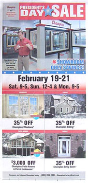
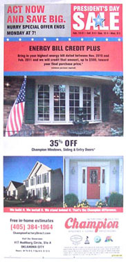
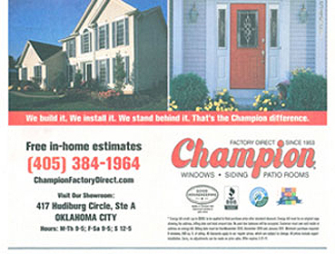
Full page newspaper insert and an enlargement of the contact info.
Once buyers are persuaded to buy a product, they then seek more specific info: Where do I get this? When are they open?
Great design (clear communication of a message) respects the reader enough to make the info easy to spot and understand.
Notice, at the bottom of the enlargements below, the hours for M-Th are the same as those for F-Sa. At a glance, the ad suggests that there are different hours on the weekend. All days with the same hours should be grouped together, M-Sa, as in the example on the right below.


Now look at the address - this ad requires the reader to use some other device to discover where Hudiburg Circle is. Maybe call the phone number or check a map on a computer. But, isn't it rude and inconsiderate to require the reader to do that? Since the client wants the reader to spend money at their store, make it easy. This would be a great place for a simple but appropriate map of the area, including freeway exits.
Lessons:
Great design impacts our lives by allowing us to make decisions more efficiently - easier and quicker.
Great designers consider the reader/viewer/user's point of view.
Tip: Think like the target audience, not the client.
The deceitful advertising enticement of Free shipping
"We offer Free Shipping!"
How does your company get FedEx, UPS, or the
postal service to donate their shipping services?
"They don't. We have to pay those shippers."
Then your company pays for the shipping out of your profits?
"Yes."
Where do you get your profits?
"From selling our products."
So, am I paying for the shipping when I buy your product?
"Yes."
So, if I'm paying for it, its clearly not 'Free Shipping'!
Wouldn't it be more accurate and honest to say: 'Shipping included in price' or 'No extra shipping charges'.
Tweaking the lead image in an ad

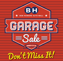
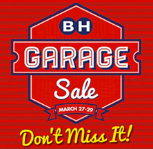

The ad on the left ran in the newspaper and in an email blast. It has a nice overall look. But there are some issues with hierarchy and eye flow, and a bit of clutter busyness in the top image which distract the viewer from being able to focus on the more important words. Revised version above right. Improvements:
Deleted stars and Bob Howard Auto Mall, they're unnecessary and too small.
Lowered the BH letters.
Raised the words Garage and Sale, Sale and the dates were too cramped.
Increased the space between Garage and Sale.
Deleted the sets of 3 parallel lines, unnecessary and distracting.
Enlarged the banner of dates March 27-29, important info that needed more dominance.
Tightened the kerning around the apostrophe in Don't.
Notice how much easier it is to focus on the headline with less crap in the way.

Be aware when laying out a page in a magazine that is perfect bound - the gutter won't open flat and some of the copy will be obscured in the unseen portion. The designer saw the above red page on his/her screen and it looked just fine - text all the way to the edge. But, they didn't consider how it would look once printed. I assume that this editorial layout is for Michael Fassbender, the actor. But, it could be for Dick Assbender, the one-eyed drag queen.
Thoughtful grabbing media placement
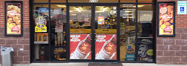
Above: In your face when you enter this c-store is, Grab some Buds, with an enticing picture of an ice-cold beer bottle. This is almost the last possible chance the advertiser has to impact someone's purchase decision - on the door to the store (an ad on the door to the beer fridge is probly the last chance). These are located where you cannot miss them, right by the handle you must grab to enter. The message is short and clear - grab a beer. The double meaning of grab your friends to watch the game or go out also has a positive message. Both are active requests to do something.
Below: As advertisers get more desperate to find new ways to grab a hold of our minds, someone saw the bollard at the front door as a blank canvas - a place to put yet another advertising message. Grab now, enjoy later. There is no longer a limit on what defines an advertising medium.


Muddled focus
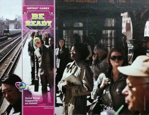
Take a look at this ad from the New York/New Jersey area. It conveys the notion that the Instant Games in the lottery can come at any time - so be ready. In the ad, we see a guy on the train platform with a bunch of commuters. But, he's ready to go scuba diving on vacation in case he wins an Instant Game.
But, this concept relies on the dichotomy between bored commuters and the guy going to take a vacation. For the concept to work - there must be a clear distinction between the two. The snorkel and swim mask are the clues, but notice how easy they are to overlook (as you likely did when you first saw the ad). If the viewer misses them, the concept is lost. It just becomes a photo of commuters on a platform.
There is too much interference between the concept and the viewer's understanding.
Lesson: While contrasts can invite participation from the viewer, they shouldn't be so obscure as to be easily overlooked.
Tip: Increase the dichotomy between the scuba commuter and the others - position the snorkel to be more obvious. Minimize the graphic crap around the frame so the viewer can focus on the scuba commuter.
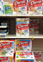
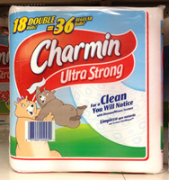
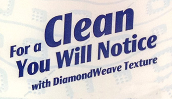
I have questions:
How will I notice it?
What if my butt is not sensitive enough - do I have to feel it with my fingers?
How does my butt cheek know what is clean?
Will my butt really appreciate the DiamondWeave Texture? Does it prefer that over a grid texture?
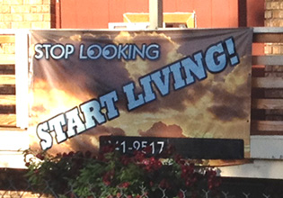
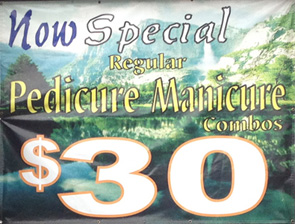
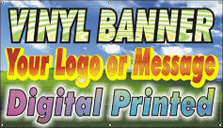
I am seeing this type of banner a lot around town. Some sign shop must be running a special on crap photo art backgrounds. Sign shops rarely employ talented graphic designers. They are technicians who might understand the company software and can flip through a catalog with the client and select pretty pictures. Unfortunately, this may be a trend - placing text (outline fonts, even) over a pretty clip art photo image - and, a pretty image that has nothing to do with the message being communicated. The example at the top at least shows some decent contrast to improve readability.
Lesson: Graphic design is about solving communication problems, not selecting pretty pictures.
Tip: Avoid making type hard to read by putting a non-related image behind it.
$100 over shirt?
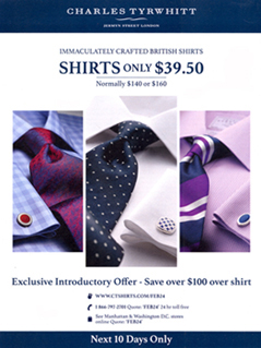

This full-page ad ran in The Week, a major international publication. The ad was probly very expensive. And yet, there are some errors:
How did that even happen? Did spellcheck take letters, maybe oer and change it to over?
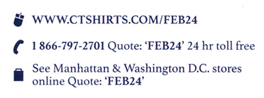
Three ways to order: Online, phone, and in person at a store. On the right: Simpler and clearer text copy
Think how many different people were involved in producing the ad - copywriter, art director, creative director, account executive, client, client's ad team, and more. Yet, it made it all the way through the process with several serious errors.
Tip: Have someone knowledgeable in English grammar proofread your work before it goes to press or online.
Lesson: Work should be designed, proofed, and produced as seen through the eyes of the reader/viewer/target audience.
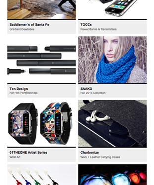
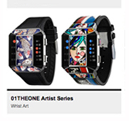
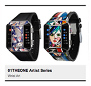
Left: A page from an online catalog. The graphic elements that serve to organize the products and clarify the information are the black bars and the grey rectangles behind the text copy.
We are conditioned to believe that black bars, being more dominant, separate the items. The middle example is the catalog enlarged - the black bar is at the top of the grey rectangle. But, the black bar becomes a divider - a barrier between the image and it's accompanying copy. On the right is the way it ought to be - the dominant black bars separate the items, just as we expected them to, and the image and copy are grouped together - visually connected. Much clearer.
Before & after examples of advertising manipulation

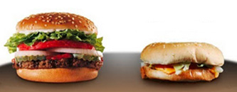
Brand name burgers: ad photo on the left, actual burgers on the right. The photos of the actual burgers were shot from the most flattering angle. I wonder if we consumers will ever get disgusted enough with this that we ask for more honesty in advertising images. Or have we just accepted that it is normal for advertisers to deceive us and we are now just numb to such outrageous claims. The consequence of that is the line of what is acceptable is moved more towards dishonesty.
I have often wanted to order at a fast food place, point to the photo in the menu board overhead, and state, "I want my burger to look exactly like that one!"


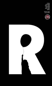
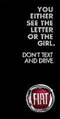
You can see a capital N with bumpy lines along two strokes or you can see a silhouette of a dog in a weird white shape - the letter N or the dog, but not both simultaneously. Of course, since your mind can switch back and forth quite fast; it may appear you are seeing both at once.


The clever Fiat campaign draws its concept philosophy from Rubin's vase (the figure-ground vase), famous two-dimensional forms developed around 1915 by Danish psychologist Edgar Rubin. The viewer sees two shapes, but only one can be understood at a given moment. The same phenomenon also occurs in the old woman-young woman image above right. This one-at-a-time image perception is the Fiat campaign - you can focus either on the conditions outside the car window or on the small screen in your hand; but not both at the same time.
This graphic mark seems to send the wrong message
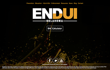
This is from an ad campaign to decrease drinking and driving.


Above: Existing, with the letters filling up with beer (or scotch or whiskey).
Below: Another option, with letters emptying of beer and without those useless horizontal white lines. But, while neither option is appropriate for the message, the one below clearly says to finish your beer before driving.
Important distinction: The appropriate concept should not be about drinking less or finishing your drink. It's about not drinking at all when driving.


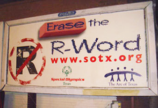
I stood and pondered the message on this billboard photographed in Austin. The only clue I can find to help me answer the question posed is that the sponsor seems to be the Special Olympics. I assume, then, that the 'R-Word' is 'Retarded'. This billboard asks the reader to wonder and figure it out - thereby making the word even more dominant and memorable. The result backfires - instead of encouraging the reader to erase a word, it is reinforcing the word and making it a part of our vernacular. There are also too many image messages - the eraser competes for attention with the prohibited symbol over the R - which is the dominant message? Is the content asking us to erase the word or prohibit the word? Do we really need two messages? A reader typically doesn't have much time to read the message on an outdoor billboard. Is the message conveyed here that the 'R' is prohibited, but the word 'retarded' is okay? Should we replace retarded with the R-Word? Doesn't that seem a bit R-Word?
Weak concept. Weak message. Weak communication of content.
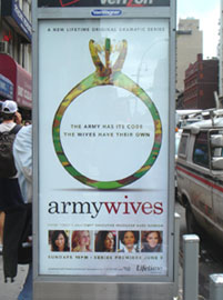
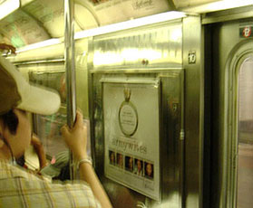


Here's an ad campaign for a show on LifeTime called army wives. The foto in the upper left is of an ad on the side of a bus stop for pedestrians walking by. This ad is okay - it must grab and intrigue people who have only a second or two to scan images they pass. The other fotos are from a subway car. These are weak because the ads do not give us enough information - why should the viewer change his/her schedule to watch this show? Great ads provide benefits for the reader, some reasons why we should change our attitudes - the show is sexy, intriguing, empathetic to interesting people, something to make one go, "Hmm, that might be worth a watch." So much competes for our time and attention today that marketers need to break thru and grab us with some appeal. Because this campaign is on a subway car - LifeTime bought the entire side of the car - these ads have a captive audience: hundreds of people who are searching for something to read, something to occupy their time. These ads should have had full copy - we have the time and desire to read it. Include copy about the characters - describe them in such a way that the reader wants to get to know them better. Copy about the storyline - what neat issues will be addressed, what relationships will be messed up, etc. Anyway, poor attention to the medium and to the reader's needs; an expenditure that was not made the most of.
One reason why so much design today is weak


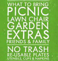
This is a good-looking piece. A nice column of copy, an appropriate color, nice patina in the background. Overall, a very appealing look. But, there are some minor errors:
Tip: Proofread all copy. If in doubt, get a second, or third, opinion.
Tip: Read the copy as the target audience would. Advertising copy shouldn't be confusing.
Tip: Include the day of the week. More info and examples.
But, those aren't the reasons why so much design today is weak.
This poster was displayed on Facebook. There were several comments commending the designer. That's thoughtful and supportive. I assumed that someone would point out at least the misspelled word. Nope. No one did. That is why design today is weak. We are too ignorant or too afraid to monitor our own colleagues and work for the betterment of the design community. The more errors that get published, the lower the bar, and the more numb we get to mediocrity. Much great design is a collaboration, with input from others. The more people that spoke up about the errors in this piece, the better the design would be for the designer and for the event. But, no one spoke up.
Showroom address that begs for a clear map


Once buyers are persuaded to buy a product, they then seek more specific info: Where do I get this? When are they open?
Great design (clear communication of a message) respects the reader enough to make it easy.
Notice, the Hours - the hours for M-Th are the same as those for F-Sa. At a glance, the ad suggests that there are different hours on the weekend. All days with the same hours should be grouped together, M-Sa, as in the example above right. The address in the ad requires the reader to use some other device to discover where Hudiburg Circle is. Maybe call the phone number or check a map on the computer. But, it's rude and inconsiderate to require the reader to do all that. Since the client wants the reader to spend money at their store, make it easy. This would be a great place for a simple but appropriate map of the area, including freeway exits.
Lesson: Great design impacts our lives by allowing us to make decisions more efficiently - easier and quicker. Great designers consider the reader/viewer/user's point of view.
Tip: Think like the target audience, not the client.
Tell us where you are! Adding locators to addresses
I suspect many advertisers and ad designers don't really think about this - in a print ad they just put in their address (sometimes even with a zip code).
Important: an address often doesn't clearly convey where a business is located.
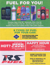
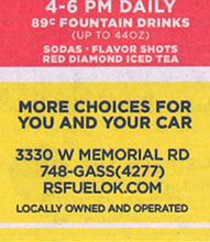
Memorial is a really long street with miles of commercial establishments. The address 3330 doesn't help at all. It is actually between Lake Hefner Parkway and May Avenue, two very major landmark streets in north OKC. There is room in the ad to tell us that.
A more respectful and clearer way
When you tell someone your home address, don't you usually provide a clearer descriptor:
"424 East 4th", "Between University and Main, just south of 2nd Street."
So, simply do the very same for a business:
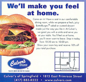
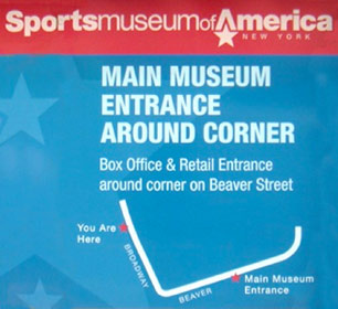
Adding a map is a great idea - the reader can better visualize a location.
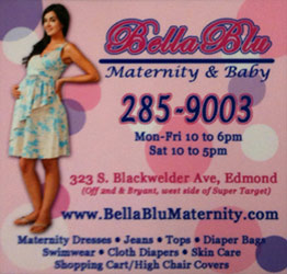
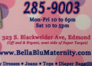
"Off 2nd & Bryant, west side of Super Target" can't be much clearer. Nice.
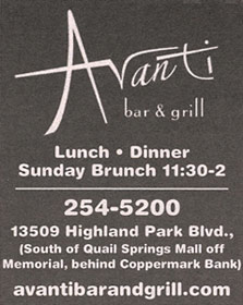

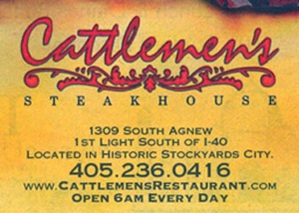
Avanti gives us plenty of info - good for them. Beef gives us the major locator intersections.

The Kamber's ad doesn't even have a postal address - just the intersection.
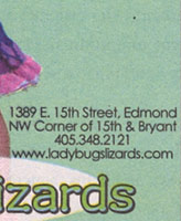
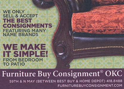
The zards ad even tells us which corner - the northwest. Let major stores serve as landmarks.


This August 2011 ad for Integris Health includes both a text explanation and a map. Very nice.
Design from the POV of the user
The regular user probly doesn't need a complete address, maybe just a reminder. But infrequent and new customers need more info. Be considerate and empathetic of your customer. It is rude to ask a customer to work harder at finding you - check the web, a map, or a phone call? Just provide the info they want/need.
Lesson: create, critique, proofread, edit your work through the eyes of the user.
Tip: Don't just put a postal address in your ad and think that's enough. Provide landmark descriptors.
www.jamesrobertwatson.com/design-advertising.html