
A better map to Jury Duty
In 1995, I was summoned to serve on a jury. The summons is accompanied by a form letter that looks a bit frightening. The recipient is probably already a bit put off - having to serve and not knowing enough details to easily get to the courthouse. I designed a better info piece to accompany the jury summons.
The map includes exits off the nearby interstate highways, locations of parking garages, and nearby sights. The streets and intersections are more clearly delineated.
Lesson: Great design must be for the user, not for the client, and certainly not for the designer. Full story here.

Better map to Juvenile Court
Some people assigned to jury duty are asked to serve on a juvenile case which meets at a different location. Those asked are given a map (below left) to help them get to the Juvenile Courthouse. I was somewhat appalled at the poor design of the map so, of course, I had to redo it (below right). The existing map looked cheap, sloppy, and unprofessional. The original was probably designed by someone who already knew how to get to the Juvenile Court, so it doesn't do a good job of clearly communicating to the novice - and almost everyone who gets the map is a novice on where the Juvenile Court is located.


Improvements
• The streets and intersections are more clearly delineated.
• It includes freeway references with exits denoted.
• There is more landmark identifying information.
• Access to parking is clearly conveyed.

Map to my house and map to a friend's house
Freeways and major roads are shown, the wide grey road outlines are the recommended routes.
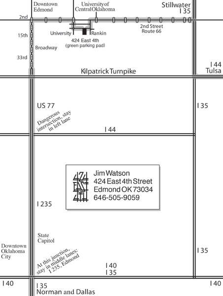

Map to AIGA events
People came from Tulsa, OKC, Norman, and Stillwater. The enlargement provides the exits and parking location.

Martin Nature Center
A nature park with lots of great walking trails for wandering, benches for sitting, and rails for leaning. But, they had no clear instrument to educate people how to get to the site. I prepared this map for my students )I recommended they visit the site for a neurobic experience) that shows the freeways, exit ramps, and major streets.

Dallas Design Districts
A handout and web pdf created for students who planned to visit Dallas.

GuideMaps: New York City
Created for student Study Tours, including streets, landmarks, design sights, and subway entrances.
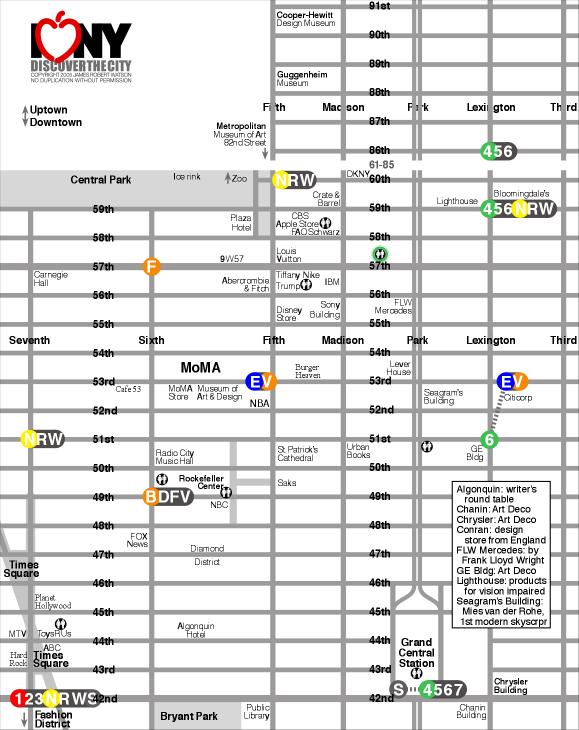

Above left: Midtown and Fifth Avenue. Above right: Design district: Madison & Union Squares.
Below left: SoHo. Above right: Financial District/Lower Manhattan.


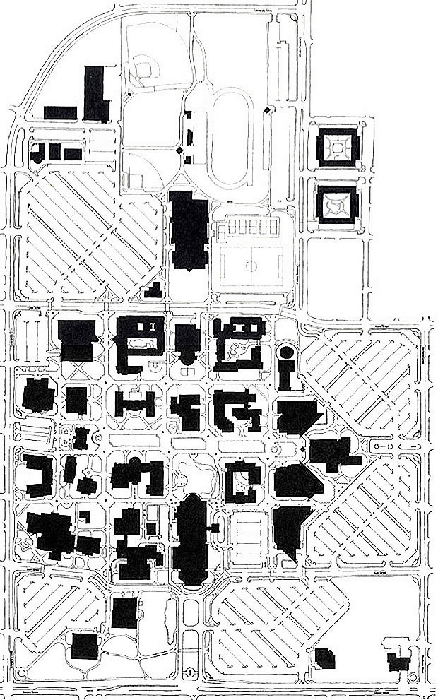
A proposed map for the University of Central Oklahoma

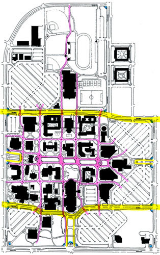
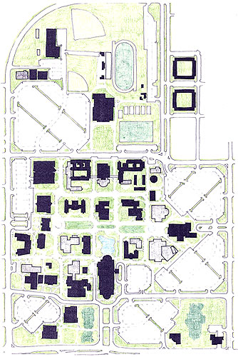
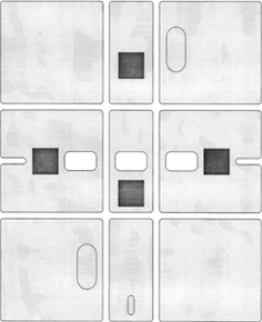
Above left: Existing map. Buildings, athletic fields, and the pond are all the same confusing solid black. Middle: Purple: sidewalks showing the grid and orderly navigation, yellow: major east-west connector streets (Ayers and Main Street) and entry/dropoff loops, and blue: corner entries to the campus. Right: The 'green' areas - ponds, trees, lawns, etc. It is an earlier version so it doesn't show all the proposed buildings.
Target audiences impacted by the map of the campus:
1. Prospective students, parents, and friends.
2. First-time students, faculty, and staff.
3. Repeat students, faculty, and staff.
4. First-time visitors to academic events.
5. First-time visitors to non-academic events.
6. Repeat visitors to campus.
7. Metro citizens using the campus for recreation.
In the map below, notice the orderly grid pattern, the hierarchy of sidewalks, a better sense of order and navigation, the mall focal points, easier-to-maneuver parking lots, and the new buildings.

A better map and screen for NorthPark To-Go
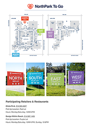
Some stores in NorthPark Center, opened in Dallas in 1965, participate in Texas' retail to go, begun in April 2020. The consumer contacts an individual store to order and pay. The merchant relays the designated pick-up location in one of four color-coded parking lots. Color-coded signs on-site guide drivers into the lot. An employee delivers the purchase to the backseat or trunk of the vehicle. Customers remain in their vehicles and are not allowed inside NorthPark or individual stores.
Target audience
The viewer of the pick-up location map has ordered online or by phone. That person wonders: "Where do I go to pick up my purchase?" They have no need to know where stores are in NorthPark, where the entrances to the center are, what is on each level, where elevators or stairs are, etc. All of that info just clutters the map and makes it more difficult to decipher where to park for pick-up.
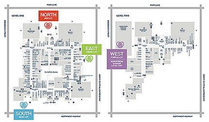

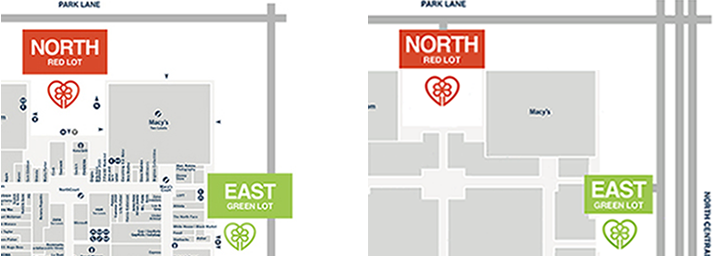
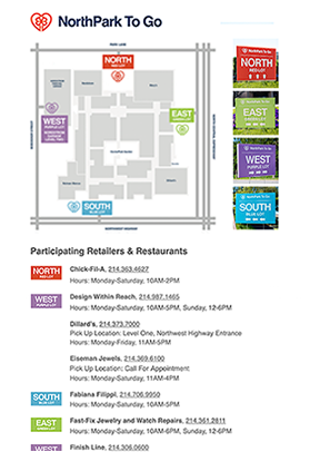
Improvements (Left = Existing, Right = Improved)
The more uncluttered, simple, and clear map is easier to recognize and understand.
All 4 Parking Areas are located on one map.
The anchor stores, masses of stores, and allow easy recognition and confirmation of NorthPark Center.
The image better communicates how to arrive and maneuver to 1 of 4 parking areas, with parking entrances connected to streets and the divided road and Expressway.
App/Web page
More consistent Beck Modern Map improvements
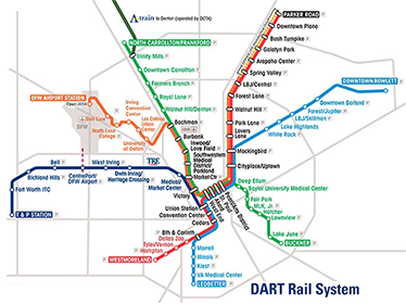

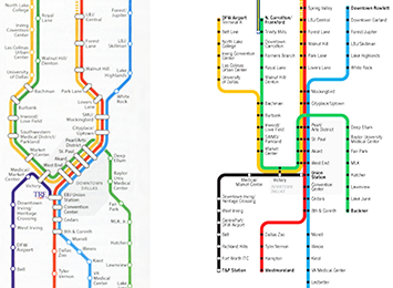
Most of these transit lines are straight and stylized, as popularized by Henry Beck for the London Metro. But, 2 of them are noticeable due to their crooked scraggly depictions.
Improvements
• Straightening line diagrams:
• Orange line towards Northwest
• Green line towards Southeast
• Blue line towards Northeast
• A Train connector to North
• Shorter and more consistent destination names
• Shortening station names
• Overall spacing and improved clarity.
More consistent DART Map improvements
Henry Beck pioneered the stylized transit map for the London Underground. Most global transit systems have adopted the Beck or Modern Map style. The advantages are that the lines are easier to understand. One can route their journey quickly and easily. In the Beck version:
• Lines are color-coded.
• Lines are straightened.
• Map is void of surface detail. The rider doesn't need details - just boarding and destination stations.
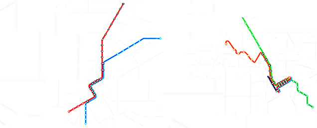
The Dallas Area Rapid Transit, DART, introduced their route map in 1996, and adopted the Beck map style. (above left) When the map was updated, the new lines followed the city streets. (Above right)
The original map and the later map look like they were designed by two different teams. There is little consistency and continuity. The map shows two different systems of route representation; roadmap versus straight line diagram. Mixing the two will likely confuse the reader who is seeing the city map version may assume that they’re all accurate routes.
Above left lines seem to be designed by Team 1. Above right lines seem to be designed by Team 2, unaware of the work by Team 1.


Improvements to the diagram above right
• Straighter line diagrams:
• Orange line towards Northwest
• Green line towards Southeast
• Blue line towards Northeast
• A Train connector to North
• Improved spacing and clarity.
• Shorter and more consistent station names;
North Carrollton/Frankford -> Carrollton
Downtown Rowlett -> Rowlett
DFW Airport Station -> DFW Airport
Baylor University Medical Center -> Baylor Medical
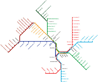
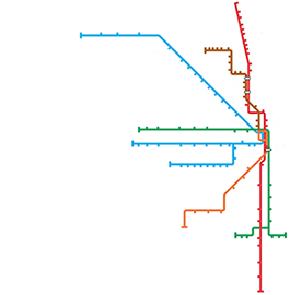
DART graphics use the straight line style:
Below left: DFW rail routes in 2018 (before opening of the Cotton Belt Silver Line). Below right: Chicago Transit.
Improving a Casino Map
The Choctaw Casino near Durant, Oklahoma, is quite impressive. IT reminded me of a Vegas casino, primarily due to its proximity to 8 million people in North Texas. The architecture and interiors were well designed.
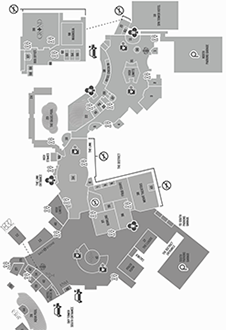
But, not so with the Casino Map: very poor readability, unnecessary color coding, awkward shapes of restaurants and shops, and busy chaotic contents and layout.
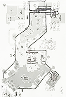
Sketched a proposal for a Casino Guide, not a map. Maps should have detail, accuracy, and information for a wide audience.
Objective of the Guide:
Rapid communication of location of places, to help the user get from where they are to where they want to go.
That's it. Simple.
Target audience:
• Users in the casino seeking how to get somewhere.
• Users that are planning activities for later.
The user is not interested in the building shape of the casino, size of a restaurant, shapes of amenities and restaurants, and parking garages (most will get the guide inside the casino and would have already parked).
They are not seeking details, just a guide of where to go.
Improvements:
• Rotated the casino so that the familiar orientation places 'north' is at the top.
• A more orderly and simple orthogonal orientation - all lines vertical, horizontal, or angled at 45 degrees.
• Conference rooms are not included. The target audience is most likely not going there. There can be notes under the Guide List of amenities: 'All conference rooms are on the Grand Theater level'. Once at that level, signage and wall maps could direct the attendee to the meeting rooms.
• Delete Compass symbol. People often lose their orientation when inside a casino. Concession: with North at the top.
• Simplifying all shapes.
• Arrowheads convey entries (and exits) from hotels and parking.
• Familiar symbols: rest rooms, no smoking
• All text is set larger and with greater contrast to its background. White on light blue does not work in a dimly-lit casino.
* Remove color coding of 3 areas within the casino. Again, very few people care.
Nobody ever complained that something was too easy to read and understand.
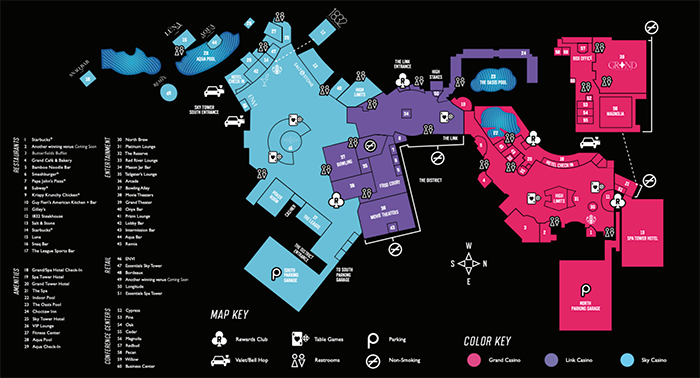

Above draft shows layout concept only. Final Guide might have color, different typefaces, and more symbols (cashier, high limit areas).
Below: Sketches from Chaos to Order.

Unnecessary legends
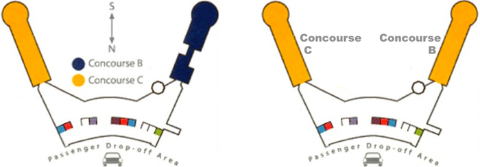
Use a legend only if the map itself cannot convey the necessary entities. Below: There is no need for North/South arrows - nobody knows or cares once they are in the airport. The concourses should be labeled directly - no need for a color-coded legend.
Below: This map for the Modern Art Museum of Ft. Worth does not need a legend at all. Just label the entities or use a familiar symbol. Removing the legend, some of the pond, and some of the building that is off-limits to the visitor allows the map to be enlarged within the same amount of space.


A better museum guide


This small but fascinating Museum of American Finance is dedicated to money and economics. Part of the appeal is that it is located in the grand banking lobby of an early location of the Bank of New York. The old hall and current museum is one flight up from the entry and ticket counter. Museum visitors are handed a one sheet Guide and floor plan of the Museum (left below).


Part of the design process is to understand the user - the reader, viewer; the target audience. The museumgoer is often somewhat overwhelmed with being in a unfamiliar naborhood and entering an unfamiliar museum. Great museum materials help the visitor establish orientation and feel welcomed and comfortable in the space.
Above right: Improvements to the Guide


We are conditioned to expect north at the top. With EXHIBIT GUIDE at the bottom, it serves as the starting point for the user. From the entry in the rotunda, the user moves on up into the museum:


Design and critique work through the eyes of the user, the customer, the reader; not the client, and not the designer.
Map to Art Deco lectures in Tulsa

A more accurate map


On the original map (middle: enlargement), the fireworks stand looks like it is right on I-35. But, it's not and Camp Drive doesn't even intersect with the freeway. 'Exit Seward' was written towards the bottom. The sketch of a better map provides reference (Guthrie, Edmond, OKC), clear entry/exit ramps, and a more accurate location of the stand on Camp Drive.
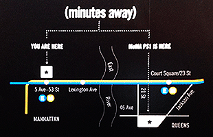

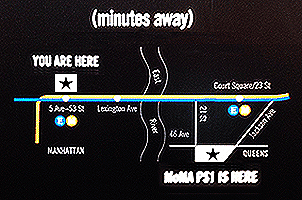
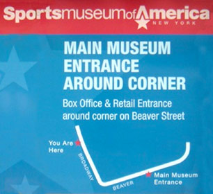
The dotted line that connects the Start and End locations can be misinterpreted as a street or walkway. The map consists of lines to represent city pathways (streets or subways). Adding another line muddles that theme of 'Lines = pathways'. There is no need for the dotted line - it is not a path, it does not help the viewer get to the destination. I repositioned MoMA PS1 and enlarged You are here.
Tip: Include only graphic elements that will help the user understand the desired route or destination.
Showroom address that begs for a clear map



Once buyers are persuaded to buy a product, they then seek more specific info: Where do I get this? When are they open?
Great design (clear communication of a message) respects the reader enough to make it easy.
Notice, the Hours - the hours for M-Th are the same as those for F-Sa. At a glance, the ad suggests that there are different hours on the weekend. All days with the same hours should be grouped together, M-Sa, as in the example above right. The address in the ad requires the reader to use some other device to discover where Hudiburg Circle is. Maybe call the phone number or check a map on the computer. But, it's rude and inconsiderate to require the reader to do all that. Since the client wants the reader to spend money at their store, make it easy. This would be a great place for a simple but appropriate map of the area, including freeway exits.
Lesson: Great design impacts our lives by allowing us to make decisions more efficiently - easier and quicker. Great designers consider the reader/viewer/user's point of view.
Tip: Think like the target audience, not the client.
Ridiculous layout of floors in building
The Student Union at OSU was remodeled. New building maps and directories were posted online - but they had the basement at the top:
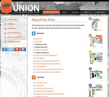
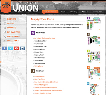
Existing: Above left. Above right: Rearrange floors to be logical and familiar.
Below left: Better: Move maps to left and text legends flush left next to them. Below right: Best: Enlarge maps and place them next to their floor legends.


Lessons
Design decisions are a compromise between the familiar and the innovative.
Design should enhance society and make our lives better, not more make it confusing.
Problems with the guide map to the UN
During May, 2007, I toured the United Nations in New York City. It was fascinating - I learned that it was the UN that mandated all air traffic controllers and pilots on the planet speak and understand English, that red means stop and green means go, and even the expiration date for milk. The logistics of the tour - learning where to go, getting tickets, waiting for a tour - were not conducted well, a bit awkward, confusing, and inefficient. The map handed out was no better:

Here's a map of the United Nations from a brochure that is printed in a multitude of languages for the international visitors. At first glance it looks like a decent map, but here's how this map could be better:
Note: This map is another great example of a piece in which the designer did not design for the user.
Maps that suggest a Hudson Ocean
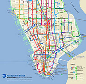
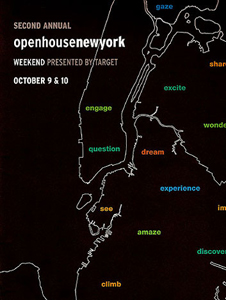
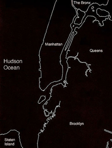
The map above left is from the New York City Metropolitan Transit Authority. It shows downtown Manhattan with the Hudson River (ocean?) on the left and the East River on the right. For some arrogant reason, New York mapmakers, especially those with the MTA, do not like to acknowledge New Jersey. But, many people in New Jersey work, shop, and party in Manhattan.
The purpose of maps is to orient us to our surroundings and guide our journeys. They should. at least, be accurate in their portrayal of the surrounding environment. City limits are no longer accurate divisions of metro areas. Metro areas include numerous towns and cities that are more accurately defined by the the television viewing area, geography, and highways.
This seems to be another example of designers not communicating efficiently to their target audience. Designers must keep in mind the end user and design for those people, not for themselves. The MTA cartographic designer was narrowly thinking of just having to show the routes within Manhattan.
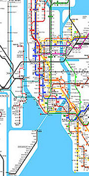

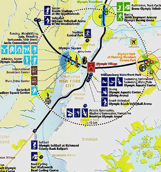
Maps that got it 'right' The maps above are a bit more accurate in that they show the proximity of New Jersey to Manhattan.
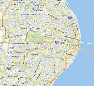
Below: If Missouri had the same disregard for Illinois as New York does for New Jersey and if the New York mapmakers were given the task of a St. Louis map, that city would miraculously be on the ocean - the Mississippi Ocean - with the downtown bridges spanning an expansive body of water.
Showroom address that begs for a clear map


Once buyers are persuaded to buy a product, they then seek more specific info: Where do I get this? When are they open?
Great design (clear communication of a message) respects the reader enough to make it easy.
Notice, the Hours - the hours for M-Th are the same as those for F-Sa. At a glance, the ad suggests that there are different hours on the weekend. All days with the same hours should be grouped together, M-Sa, as in the example above right. The address in the ad requires the reader to use some other device to discover where Hudiburg Circle is. Maybe call the phone number or check a map on the computer. But, it's rude and inconsiderate to require the reader to do all that. Since the client wants the reader to spend money at their store, make it easy. This would be a great place for a simple but appropriate map of the area, including freeway exits.
Lesson: Great design impacts our lives by allowing us to make decisions more efficiently - easier and quicker. Great designers consider the reader/viewer/user's point of view.
Tip: Think like the target audience, not the client.
Tell us where you are! Adding locator maps to addresses
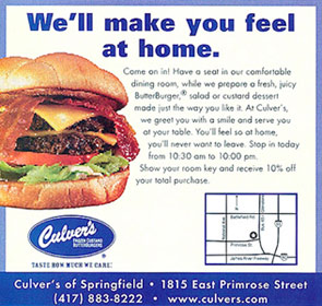
I suspect many advertisers and ad designers don't really think about this - in a print ad they just put in their address (sometimes even with a zip code).
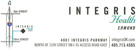
Important: an address often doesn't clearly convey where a business is located. Adding a map helps the reader better visualize a location.

Design from the POV of the user
The regular user probly doesn't need a complete address, maybe just a reminder. But infrequent and new customers need more info. Be considerate and empathetic of your customer. It is rude to ask a customer to work harder at finding you - check the web, a map, or a phone call? Just provide the info they want/need.
Lesson: create, critique, proofread, edit your work through the eyes of the user.
Tip: Don't just put a postal address in your ad and think that's enough. Provide landmark descriptors.
www.jamesrobertwatson.com/design-map.html