
Package Design helps sell products
The first product visual a consumer connects with is often the container that the product comes in. We usually don't buy the product - we are buying the package - we don't buy white laundry detergent, we buy a box of recognizable images, colors, and text that convey Tide (or All, or whatever). Package Design can include boxes, labels, bottles, closures, and add-ons.
It is vitally important to design a product package to:
For Internet shopping, there may be a need for an additional image that is a 'button' or avatar that clearly represents the product. The package design may also need to translate well into a thumbnail icon for the search screen.
Companies know the importance of this 'last chance' to make a sale. This is the actual buying decision - when the consumer reaches for a specific product to put in the shopping cart. Some of these decisions are pre-meditated, others are impulsive depending on a variety of factors at the site of the purchase - price, need, desire, or the label/packaging.
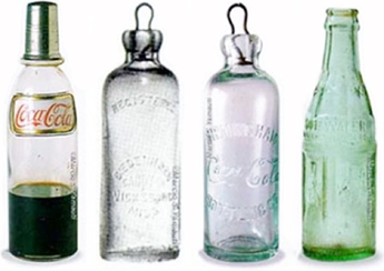
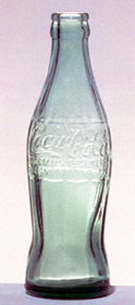
A classic package design
In 1915, the Coca Cola Company wanted users to be able to identify their product by shape only. The design objective was to create a bottle so that it could be recognized in the dark. Inspired by the Hobble Skirt, popular at the time, and the shape of the coca bean pod, glass blower Alexander Samuelson presented the now classic bottle shape.


Nice package design made a bit better


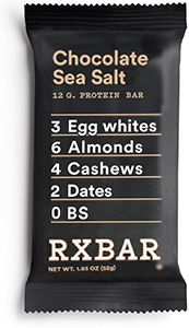
Concept: The ingredients of the protein bar are the focal point of the package label.
The simple, mostly text, package design is refreshing and helps this brand to stand out in a shelf crowded with options.
But, standing in a 7-11, its a bit hard to find and read the flavor - the most important variable a customer is looking for - it is small and at the very bottom. Repeat customers already know the ingredients are few and simple, they are looking for a flavor. To most customers, the flavor is the most important info on the package label. Here are some improvements (shown above right):
Flavor variety is larger, more prominent, and moved to the top.
•12G PROTEIN BAR is on one line in a larger point size.
Ingredient text is slightly smaller, with tighter leading.
The useless line art that accompanies the flavor name is deleted.
Brand logo is larger, but placed at the bottom.
The unnecessary reverse box behind the brand name is gone - reverse the brand.
The No in No B.S. is replaced with a zero - to be consistent with the other items in the list.
Periods after B.S. are deleted. BS represents one word, not two (there is a little bit of bullshit - there are additional chemical flavor ingredients).
Here are the packages from an Oklahoma bar maker:
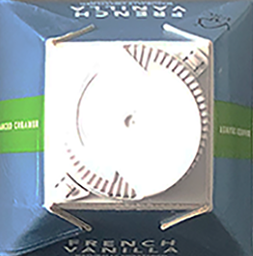
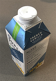
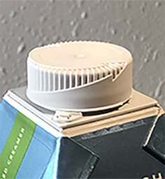
Saw this cap for a non-dairy coffee creamer and noticed the arrows on the cap - what a great way to educate that info. Then, looked at the sides and saw more of the arrow with angled marks that reinforce the concept. No additional cost - just molded in the cap.
A more convenient and user-friendly tea box


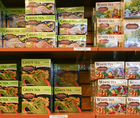
In 2013, I toured the Celestial Seasonings factory in Boulder Colorado. The aromas and selections in the gift shop enticed me to overpurchase boxes of tea (I'm primarily a coffee drinker). After arriving home from a great trip through the mountains of Colorado, and unpacking, I placed all the tea boxes on the counter top. I wanted them to remain open so i could easily access the envelopes of tea bags.
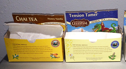

To label each box, I ripped off the top flaps and stuck the title flap down in the back of the box. I noticed that if the box had been designed differently, I could have just folded and tucked the top back into the box. Below is an example of retail display packaging with tuck-in top flaps. Something like that would have been pretty nice for the tea boxes on the counter top.


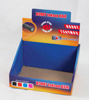
Similar to display packaging on the retail shelf, a tea box display could be useful and convenient in the home. The open top flap can be tucked back into the opening with the title of the contents showing.
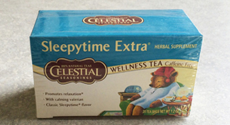

Left: The original box front/top. Right: the redesigned panel with the title name at the bottom so it would still show when folded and tucked in.
The panel with the name of the tea forms a base for the illustration - the image is no longer 'crushed' by the type overhead.
For better visibility, the line of text with the quantity info is moved to the top, and out from obscurity inside the illustration.
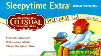


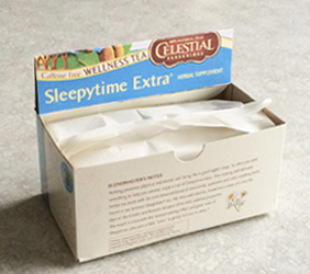
Before and after:


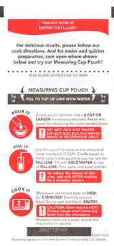
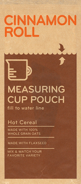
One of the benchmarks of aging is switching from sweetened cereals to Grape-Nuts and then to oatmeal. Yep, oatmeal. I found this brand above left at Target and noticed the convenient 'Measuring Cup Pouch' - the amount of water and/or milk to add was marked right on the envelope package. A great idea.
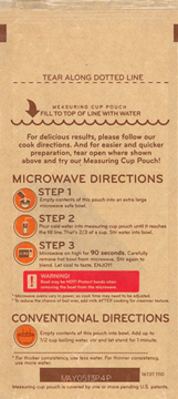
A while later, I noticed new designs for the box and for the envelope packets (on the right). These were even better. Some changes:
The packet info was minimized since much of it was already covered on the outer box and there was no need to repeat it on the packet. The consumer had already made the purchase decision.
The Measuring Cup Pouch is more obvious: moved to the front, larger point size of type, and a more dramatic mass of color. The pouch is unique to this brand and they are wisely exploiting that on the package.
The solid mass of color for the measuring pouch line makes it easier to see the water approaching the line when holding the pouch under the faucet.
Fonts switched to sans serif for easier readability.
Negative: the round Microwave Directions symbols, now in 2 colors (above, on the right), are harder to decipher than in the earlier 1-color version. Reasons: the symbols are smaller, the 2 colors allow misaligned printing registration, and there are more details for the consumer to process in the newer version.
Overall, the Better Oats package is a good example of CPOV, designing from the consumer's point of view - give the user just what is needed in a clear, easily understood execution.
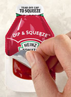
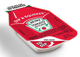
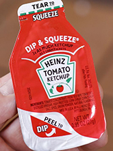
This is absolutely brilliant. The first major ketchup packet design change in 42 years was developed after more than two years of research. It has a top that can be peeled back for easy dipping or a tip torn off to squeeze. Heinz spokesman: "The biggest complaint is there is no way to dip and eat it on-the-go. From dipping nuggets and fries to squeezing ketchup on hamburgers, the new design gives customers more flexibility, so they can enjoy eating ketchup on whatever or wherever they want." The learning curve on this new packet should be very short - within one usage, the user should be able to figure out which end is best for dipping and squeezing.
However, the graphic design of the packet can be clearer. See that white line above the word DIP in DIP & SQUEEZE? I guess its a highlight to convey dimensionality of the ketchup bottle, but, because it is tapered and in stand-out white, it looks like an arrow pointing from Dip to the top. But the top is for squeezing - dipping is at the bottom.
There is no need for the white highlight or the implied arrow. Update: Heinz fixed the graphics and simplified the wording for each use option.


The shelf display looks like a big bowl of ice cream with photo-realistic images of scoops of ice cream on the top of the bowl package. There are slots for the scoops to sit in that support them for display - beneath the photo is a layer of styrofoam. The shopper gets to view the product and see it in 'use'. It is also more eco-friendly since each scoop doesn't need its own box or label. I saw this in an outstanding natural/organic food store in Lawrence, Kansas, the home of the University of Kansas.
Advertising exaggeration
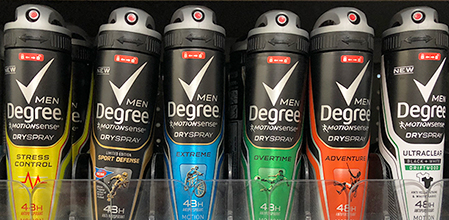
On the shelf at Walmart were 6 options of Degree deodorant - look at the names of the options. Who wouldn't want an Extreme deodorant? Or one that works Overtime? And a product that can help with Stress Control? Sign me up.
What do these names mean? Sounds like ad copy bullshit. So, I asked the Walmart employee restocking products - she said they referred to the different scents. I asked her "What does Extreme smell like? Is it an overbearing odor?" "When someone works Overtime, don't they start to stink? Why would I wear that?" "Sport Defense?" She smiled feebly and I walked away - she had no idea what the names meant. Nor did I.
I want their best formula deodorant. That's all - just 1 product. Maybe 2 or 3 if they have very clear scent descriptions, like fried bacon or maple glazed donut. Or, maybe Extreme Maple Glaze Bacon.
This is becoming quite common - the number of soda flavors available, the number of items (200?) in the Cheesecake Factory menu, and everywhere else you look in the grocery aisles. What do they know - does overwhelming the consumer pay off in increased sales? Are we impressed to the point of wanting to purchase more?
Notice how many Oreo options are available - 22 different varieties of the Oreo Cookie. When I was a kid there were 2 options - Oreo and Oreo dipped in milk.
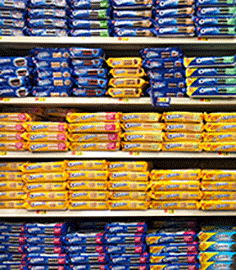
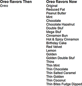
But, they didn't offer my new favorite - the Oreo Sample Pack - a variety of new flavors so I can try several to determine my favorites.
Great idea for prepping daily pills
One of the lifestyle changes one makes upon aging is that the pile of pills taken each day grows to the point of needing some weekly or monthly pill boxes. I take about 10 pills each day - 3 in the morning and the rest with dinner. Soon after I began this new routine, I wished for a service from a drug company in which the customer would submit all pills taken with frequency and dosage. The drug company would then formulate a single pill with all of the necessary ingredients. This one pill would then eliminate the need for numerous pill bottles and pill planners. But, I suspect there are too many regulations and drug ownerships to make the idea feasible.
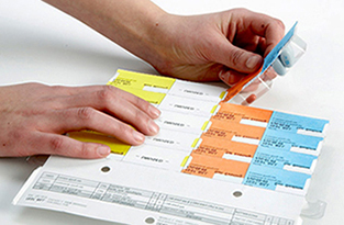
In late 2017, I ran across the system below, an automated compliance strip packaging system, which packages all of a person's prescription and nonprescription medications together in perforated pouches for each time of the day - in sequential order, and each package individually labeled. On Saturday morning you'd tear off the 8a package containing all the necessary pills.

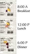
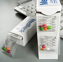
“This system increases compliance, decreases trips to the pharmacy and increases the likelihood that you are getting all the medications you need for the month," Pharmacist Scott Evans said.
It eliminates having to go sort through 10 or 12 bottles while filling a med planner each week.
It takes the guesswork out of which tablet goes where.
The medications are synchronized so they can all be refilled at the same time each month.
The packaging makes for easier traveling - each package meets all labeling requirements and one has to pack only the amount for the time traveling.
Below: another option for the same concept.

A pill box system with visual reminders
Below is the system I currently use to organize and simplify which pills to take at which time of the day. I wanted to make it better than just conveying what day to take. I rearranged the daily boxes in the holder tray so that their position communicated visual clues for the status of the pills - taken already or not yet taken. When the tray is positioned on the shelf, the sightline shows the full box with the label facing dead-on to the viewer, the half full position moves the label away at an angle, and the empty position places the label in a tough to see horizontal position.
Concept: rotate the boxes within the base to convey different statuses of the contents. Visual reminders of pills taken so far that day.
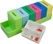


Left to right:
Monday morning: All boxes full, labels facing user.
Friday morning: Mon-Thurs boxes empty, Friday-Sunday boxes full.
Friday afternoon: Mon-Thurs boxes empty, Friday morning pills taken - box rotated halfway up to show half empty.
Saturday morning: Friday box empty, box rotated up all the way, label away from user.
Sunday night: All boxes empty.
Please be skeptical of advertising copywriters
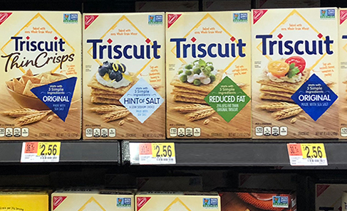
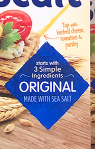
Note the line that catches your eye - 3 Simple Ingredients. That's pretty cool. Not a lot of junk.
Wait, a closer look - It starts with 3 Simple Ingredients. Whoa, there could be many more, including junk. Note that starts with is set in a smaller point size and all lower case - like they're trying to sneak it by us without getting noticed.
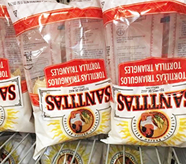


Some guy turned these bags of chips upside down on a store shelf, exposing the package half-full of air. The package designers put solid printing on the top half of the bag to hide the air.
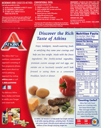

The two above have their instructions buried in blocks of copy, in a small point size, and reversed out of the red background.
Now look at the better brand below. The designer of these packages was considerate of the reader. The heading, Cooking Instructions, is large and easy to find. The most important info (the time) is large, set in a box, and put on a higher contrast background. Users can scan the back of the box easily and quickly find the info they are looking for. Microwave ovens are fast, their instructions should be, also.
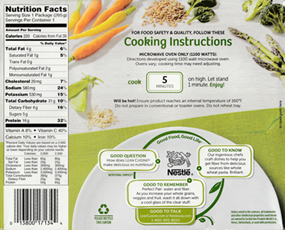
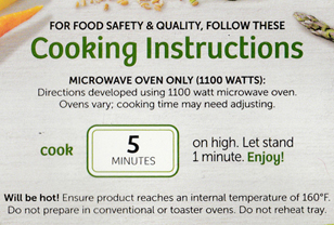
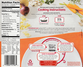
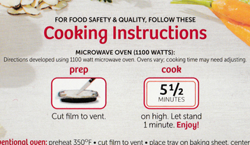
The box above has two important steps - Prep and Cook. Both are very clear at a glance. The prep photo makes sense.
A simpliifed wine label

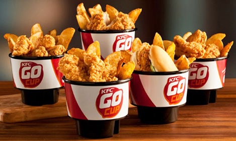
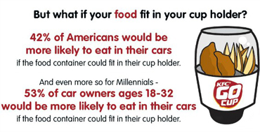
This needs no explanation - the concept is immediately apparent. KFC is acknowledging and responding to our habits of eating while in the car. The GoCup sits stable in your car (no more balancing on your lap or teetering on the console) and has a wide mouth top for easy access to the food. For now, we'll ignore the issues of fast food nutrition, overeating, and distractions while driving. This is a great idea that, as fat and lazy as we are, fits well the modern American lifestyle.
A better way to check out
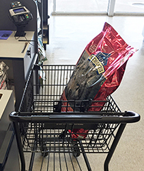
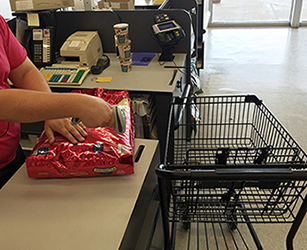
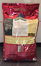
This happens too often, at too many stores - the cashier can't find or reach the UPC code on the package with the scan gun. He/she or the customer has to wrestle the object in position so the gun can reach it to scan the code. In the above example, the code is buried and hidden in the very lower right wrinkles. The cashier has to take the bag out of the cart to access the code.
The solution is so simple
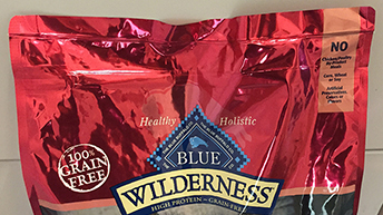
Print 4 UPC codes - one in each upper corner, front and back of the bag. Then, no matter how the customer places the bag in the cart, the cashier can easily find it and the scan gun can reach it.
Negatives: there are none - no additional cost.
Positives: Great additional convenience - faster and easier checkout. Better for the cashier, the customer, and the people in line behind the customer.
Below left: Existing top of the bag. Right: Better.

www.jamesrobertwatson.com/design-package.html