
Symbol design that improves ease and clarity of comprehension
Humans first communicated with sounds: grunts, yells, and moans. Then they began to use physical gestures such as pointing and waving. The first written marks made were simple abstract pictograms marked in soil or sand and on cave walls and later petroglyphs cut into rocks. Only much later were alphabets and text used to facilitate communication.
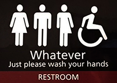
Symbols are pictorial images that communicate an idea quickly, clearly, and without words. Examples: male and female icons on restroom doors and the ring and slash that says no or prohibited.
Symbols can teach, direct, or inform. Most are universal: they break language and cultural barriers. One can travel to a foreign country and figure out where to buy ice cream if the image of a cone is in front of the shop.
Advantages of symbols over text copy
They can be quicker to recognize in a cluttered landscape.
They can take less time to comprehend.
They can be easier to comprehend - we are attracted to images more than we are to text.
They can be easier to remember - the act of deciphering a symbol helps cement it into our cranial memory files.
They are universal - they overcome language barriers.
They can minimize cultural barriers.
Great graphic design: clear, rapid, and memorable communication
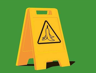
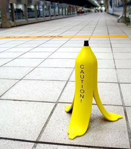
Another example of immediate recognition. We know the phrase 'slip on a banana peel' and we know the caution warning of the yellow plastic signboard. A nice combination to catch our attention and warn us to use caution to avoid slipping.
Guidelines for recycling symbols on collection bins
See the full essay for samples of current shapes, colors, and placement
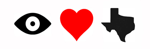
A mark for I ♥ Texas
Complete proposal
Symbols that replace words

In American and Canadian English, this symbol is usually called the number sign or pound sign. The symbol may derive from an abbreviation for pound, the unit of weight. One theory states that printers designed a font containing a special symbol of an "lb" with a line through the verticals so that the lowercase letter "l" would not be mistaken for the numeral "1". Ultimately, the symbol was reduced for clarity as an overlay of two horizontal strokes = across two forward-slash-like strokes //. Outside of North America, the symbol is called hash and the corresponding telephone key is called the hash key. When used in technology, in social networking sites, it is often referred to as hash, such as at the beginning of a word or phrase (a tag) as in #hashtag.

Medieval monks abbreviated the Latin word ad (at, toward, by, about) next to a numeral. The abbreviation saved space and ink. Since thousands of pages of biblical manuscripts were copied onto expensive papyrus, and the words at, toward, by and about repeated millions of times throughout the ages, a considerable amount of resources could be spared.
The at symbol @ was also an accounting abbreviation meaning "at the rate of" (7 widgets @ $2 = $14) or "each at" - the symbol resembling a small "a" inside a small "e".
In recent years, its meaning has grown to include the sense of being "located at" or "directed at". In 1971, Ray Tomlinson introduced the use of @ in email addresses.
Another contemporary use of the @ symbol in American English is adding information about a sporting event. @ conveys at which team's home field the game will be played: Red Sox @ Yankees. Some online forums use @ to denote a reply; for instance: "@Jane" to respond to a comment Jane made. Twitter uses @ before the user name to send publicly readable replies ("@otheruser: Message text here"). The blog and client software can automatically interpret these as links to the user in question.
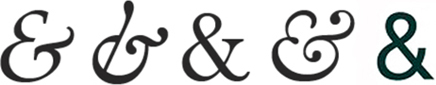
The word ampersand is a corruption of the phrase "and per se and", meaning "and (the symbol &) intrinsically (is the word) and". The ampersand can be traced back to the 1st century BCE and Old Roman cursive, in which the letters E and T occasionally were written together to form a ligature. The ampersand symbol is a ligature of "et" that goes back to the cursive scripts developed during the Renaissance. After the advent of printing in Europe in 1455, printers made extensive use of ampersands.
An excellent shopping cart symbol


Above is the site for pixelivery, a website that sells t-shirts with pixelated images of all 50 states.
I forgot what led me to this site, but when I got there, I immediately noticed and was impressed by the symbol for the shopping cart. It is simple - with few lines and detail - but it clearly communicated and was easy to understand. Websites (and our lives) can get bogged down with too much info and too much clutter. A well designed and thoughtful symbol can help break through the clutter and efficiently communicate a message and convey an attitude.
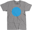
I clicked further into the site because I was curious to see if the shirt with Wyoming would show just a generic rectangle.


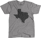
Wyoming and Colorado are the only states that have no unique identifying borders. In the pixelivery shirt samples above, Colorado is on the left and Wyoming is on the right. But without any neighboring context, I might have those reversed. Just can't tell. It is during times like these, that I appreciate being from Texas.
I still wonder if many people would buy the Wyoming shirt that just has a dark rectangle on the front and no other identifying marks. I guess it might appeal to those who love the new logo for USA Today newspaper:

Anyway, back to this great shopping cart symbol. I experimented to see if any lines could be removed.
The only one that seemed redundant and possibly unnecessary was the middle line of the basket. But, removing it diminished the clarity of the cart basket and, therefore, the effectiveness of the message. The result of the experiment was that each line in the mark was necessary.
Great lesson: Primary characteristic of a great symbol.
Each element in the piece has value and purpose. There are no embellishments nor wasted or extemporaneous marks.
Criteria for a shopping cart symbol
• Be easy to understand and remember.
• Contrast with its background for easy recognition and readability.
• Able to maintain clarity even when reduced.
Apply to a variety of applications, web browsers, and monitors.
The design of many symbols is a matter of meeting this mantra: Convey a maximum amount of info with a minimal amount of line.
Other online order symbols
Gleaned from an unscientific survey of online symbols. Notice how few of them efficiently meet the criteria listed above.
Shopping carts facing right in positive image
Shopping carts facing right in reverse image
Shopping carts facing left positive and reverse
Shopping bags and basket
Letter symbols
One of the worst symbols is the cart used on the Amazon site.


If the viewer hadn't been educated by other sites and if the Amazon site didn't label the cart with 'Cart', I doubt we could easily and rapidly decipher that awkward pan, hand, dolly, ladle thingy. We would eventually understand it, but a great mark should be almost instantly comprehensible (and not require an accompanying label).
And, this is a bit weird - more people may click on the Amazon cart symbol than any other website.
New symbol to designate restrooms for transgendered people.
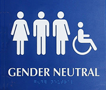
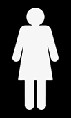
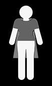
Right: The women symbol was, all along, wearing a superwoman cape.
Symbol with the same but different meaning
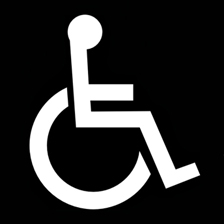
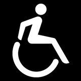

Blacks: Existing symbols for handicapped/disabled.
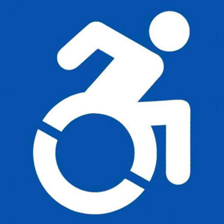
Blue left: A more human android figure in this new symbol that better conveys motion, action, and ability, rather than disability.
Blue right: Improved version - the angle of the blue bar through the white wheel is parallel to the angle of the upper arm, and the racing motion has been softened some by making the front leg parallel to the blue box.
A clever adaptation of a familiar symbol
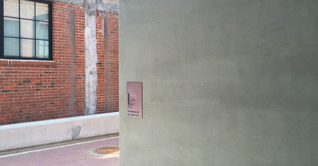
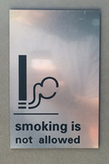
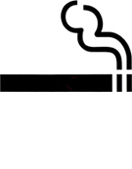
Noticed this in an urban loft development in MidTown OKC. The cigarette symbol is familiar and easily recognizable. But this version was vertical, not horizontal. What? Short pause. Wow - cool. It doesn't say 'No Smoking' - it says 'Put out your cigarette.' Instead of showing the item (a pictogram), it shows the behavior (an ideogram). Ideograms are often more effective because they convey an action, not just an object.


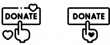
Simpler and cleaer Donate button
Nice adaptation of the Olympic rings
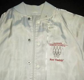

The Bartender Olympics were at TGI Friday's many years ago and I suspect they never got permission to use the trademarked items. The IOC is very protective of the word Olympics and the icon of the 5 rings, Still, a nice concept.
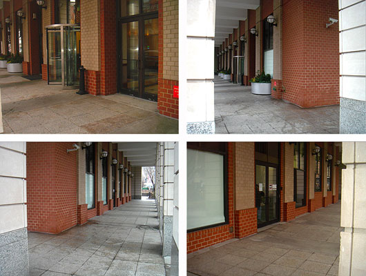
Maybe not this solution to a language barrier

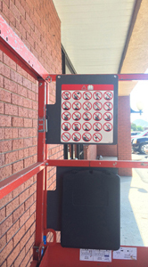
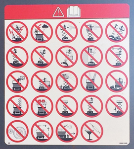
I noticed this lift outside the store and was amazed at the number of pictograms listed. Dang - would anybody really decipher all those? Can they all be deciphered? I suppose the owner felt a need to overcome a language barrier - in this part of the country, many construction workers speak Spanish only. But, printing the regulations and guidelines in English and Spanish might have been better than all these, somewhat obscure and unfamiliar, symbols.
Silly useless symbols
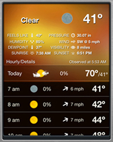


Symbols can ease communication by quickly conveying a message in place of text (like No smoking). But in this weather app, the symbols are:
Poorly designed - can you understand the difference between the 'Feels like' and Dewpoint symbols - the 2 thermometers? Or Sunrise and Sunset? Do the three drops represent rain?
So small that one will simply read the text rather than try to decipher the meaning of the symbol.
White on yellow - the poor contrast of symbols and text on the background impairs readability.
Unnecessary, since there is no language barrier in this app and it is more efficient to read the accompanying labels.
As a result, these symbols are totally useless. Therefore, they become crappified clutter that just gets in the way of communication.
The image on the right shows the same screen with 2 changes: the symbols have been removed and the contrast improved.
Color coding at the Zoo


Saw these signs at the OKC Zoo - an excellent zoo, btw. But the color coding on these wayfinding signs baffles me. Americans are comfortable and confident that red means stop, prohibited, or No - so why were some attractions circled in red?
Colors, and their associated meanings are integral components in graphic design. Great designers understand not only the components of design, but also the knowledge level of the target market. The decision-maker at the zoo (the one who is reading wayfinding and deciding which way to go) is primarily an educated adult. That group of people has accepted and confirmed that red represents stop or no and green means go or okay. The colors as shown in these zoo signs just get in the way of clear communication of the message. The viewer stumbles over the meaning of the color rings. Subconsciously, many readers might head off to the right, because it is okay, not prohibited. (What a great subject for a study on the impact of color-coding in design.) At a glance, these signs clearly say 'Go to the right, not left'.


Lesson: To most people - Red means Stop or Prohibited. Green means Go or Allowed.
Tip: Exploit, rather than contradict, learned color associations to improve communication of wayfinding signs.
Symbols with no clear meaning
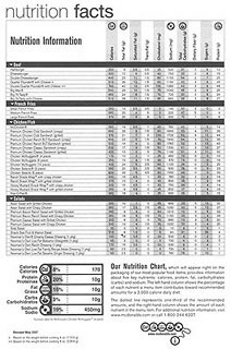
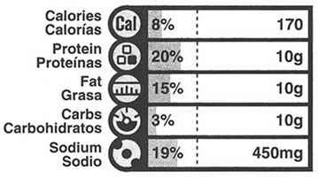
Here are some symbols from a tray liner at McDonalds. What the heck are they? Without the accompanying caption labels, they are too abstract to convey any clear meaning - except for the Cal symbol which is just silly. Since the text must accompany them, the symbols are useless, even negative as they add infoclutter for the viewer to wade through. A good symbol should clarify information content, overcome language barriers, and aid comprehension. These 'symbols' do none of that. The listing of the categories in Spanish is also inefficient since nothing else on the 'nutrition facts' sheet was in Spanish. And, if so, they should abbreviate Carbohidratos to Carbs, as it is in English - I suspect Spanish-language readers would understand what Carbs means. These bad symbols are a symptom of a problem the graphic industry faces - a major corporation paid a design firm or in-house designer to develop this tray liner and, consequently, these symbols - and they are pure crap, useless art. The public becomes numb to bad design, thinking it must be okay and the norm. July
Confusing graphics on YouTube
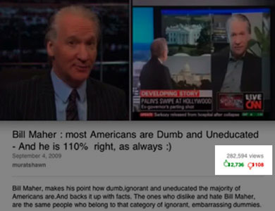
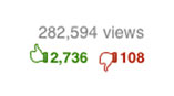
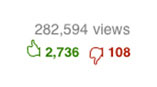
The thick line (I guess its the edge of the shirt cuff) on the thumbs up or down symbol is so close to the numbers that it looks like a '1'. Glance at the example on the left above - looks like 12,736. On the right is a tweaked version - I thinned that thick line - in which the numbers are clearer and easier to read. As we all get used to the medium of online reading, especially on small phone screens, we must adapt to the medium and the user. Users today are less patient and seek info clearly and quickly.
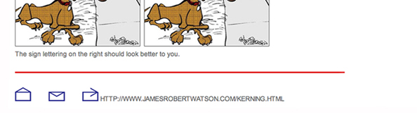
New symbols for page tasks

At the bottom of each page on this website, I had some reader tasks spelled out in text: Home, Email Jim Watson, and Filename to share.
But, for years, I had wanted to explore using a set of symbols to replace the text.
I began sketching. The home and email symbols were easy, the icons are so familiar and recognizable. The chimney, door, and window in the home symbol were unnecessary and, therefore, deleted. The mail symbol did not need the lower flap fold lines, the upper flap alone was enough to communicate.
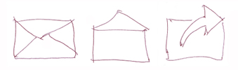
But, the familiar share symbol (below, left) didn't fit well with the others - it had a solid mass, curved lines, and a tapered tail. I explored an outline arrowhead and an open arrow. The final version uses the circular motion of the rectangular box to convey the share motion.
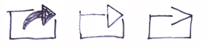

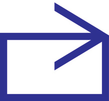
Further refinement resulted in these 3 symbols, with a line weight that matches the JRW logo at the top of most webpages.
Each symbol is made of only these 3 elements and all 3 elements are used in each icon.

Lesson: Symbols within a set should share commonalities and consistency to convey that each is part of a larger set.
Symbol design project
You've been hired to design a symbol or symbols for one of the options listed below (select one that interests you). It/they will be used to inform and direct a variety of users. The symbol may be used alone, with other symbols, or in a variety of applications yet to be determined. Your task as the designer is to communicate clearly and efficiently with a minimum of confusion to a specific group of people to educate and change their minds.
Procedure
Pursue symbol design as you would any design project: state the problem, determine the primary and secondary target markets, and list thorough objectives that the solution should achieve. Conduct exhaustive research: become an authority on the topic, its need for a symbol, possible uses, and ramifications. Clarify your creative strategy (theme, concept, plan, etc).
Sketch thumbnails, brainstorm, sketch some more, and do more research. Explore a variety of concepts. Experiment with a theme to convey an image appropriate to the place and the user. The symbols should communicate the message clearly and quickly.
Become more aware of the vast number of symbols in our global society. Some are loud and bright, others are quiet and subtle. Note the ways in which people, cars, plants, animals, and other objects are portrayed. Refer to symbol sourcebooks in the library. Sketch or photocopy the symbols you want to remember.
Determine the target market that will most benefit by these symbols, how and where the symbols will be used, the scale at which they will be reproduced, the physical environment where the signs will be, manufacturing limitations, and any other ramifications of the symbols or lack of symbols.
Since symbols are simplified pictures, the first consideration may be to determine what image would best represent the message that needs to be conveyed. For example, to represent a gift shop that sells stuffed animals, toys, magazines, and candy; a graphic silhouette of all those objects together might be accurate but it may also be confusing and too busy to be clearly and rapidly understood.
A gift wrapped package might be a good choice because it is generic: it says gifts. Once inside the shop, the variety of gifts would be clarified. But a gift wrapped package may be too vague or obvious. You may want to avoid it in favor of a dollar sign (symbolic of the transaction of money to buy a gift) or a specific item from the store.
If you decide the package is the best symbol for the gift shop, you must then determine the size and shape of the container (a box, a bag; long, short, square, etc.) and the ribbon (long, bowed, wide, etc.) Here's where research and thumbnails come in. Look at gift wraps, packages, boxes, bags, catalogs, and bows. Draw, sketch, doodle, and refine. Remember, the image doesn't need to be realistically accurate; just clear in its perception by the viewer.
Next, turn those thumbnails into roughs that are more finished. Take what was an outline drawing or simple sketch and refine it. Pay close attention to detail: consider all the variables of line, shape, angle, circumference, realism, etc. Retain the detail which makes it understandable and remove the details which confuse or get in the way of clearly communicating the message. Explore the balance and contrast between black and white, positive and negative, thick and thin, organic and geometric, etc.
Edit, simplify, and refine. Test your work by showing the symbols to strangers. Tell them where the symbols will be used and ask them to tell you what the symbol might represent. If they hesitate slightly or do not know, go back to the proverbial drawing board. Strive for clarity of the message content.
The last step is to prepare the comprehensive. Ink a comp of the most effective symbol(s). Translate the freehand lines from your tight roughs into mechanically perfect lines and shapes. Measure and ink accurately: use templates, compass, and ruler. Work large and reduce the comp for the presentation.
Symbol options
___ Straight ahead
To clarify direction in wayfinding signage.
___ Independent party
To be distinct from symbols of other political parties.
___ God/Jehovah/Allah etc.
To not represent any specific creed or religion.
___ Visit, click on, log on
To clarify procedures for accessing information on the web.
___ Suits of cards
Two new suits to join the existing four, creating a deck with six suits.
___ Mail, phones, fax, email, web
To clarify contact options for use on stationery, forms, ads, etc.
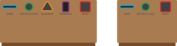
___ Recycle symbols
To clarify 3 slot options in one receptacle: paper, bottles & cans, and trash.
___ Curb your dog
To deter dog pee on buildings.
www.jamesrobertwatson.com/design-symbol.html