
![]()
Information design helps readers better understand a message.
How big is an acre?
Unless one is a farmer, rancher, or realtor, very few of us know. Here's the correct answer:
![]() An acre is the amount of land a yoke of oxen can plow in one day.
An acre is the amount of land a yoke of oxen can plow in one day.
Well, nice, but I still don't know. That may define an acre but it doesn't convey how big it is - how much space it takes up. Okay, here's a more specific answer:
![]() An acre is 43,560 square feet.
An acre is 43,560 square feet.
That is more precise, but how big is that?
![]() An acre is about the size of a football field, minus the end zones:
An acre is about the size of a football field, minus the end zones:

Okay, I can relate to that - now I have some idea how big an acre is.
![]() Making the complex clear - communicating information in a manner that is easy to understand - that is Information Graphics.
Making the complex clear - communicating information in a manner that is easy to understand - that is Information Graphics.
One way to do that is to relate the unknown (acre) to something known (football field) to clarify understanding.
The acre example is from Richard Saul Wurman, the Information Architect, the Guru of Understanding.
Important lesson: Great design is accomplished when seeing the problem through the eyes of the user (reader, viewer).
![]()
Some examples of chart design
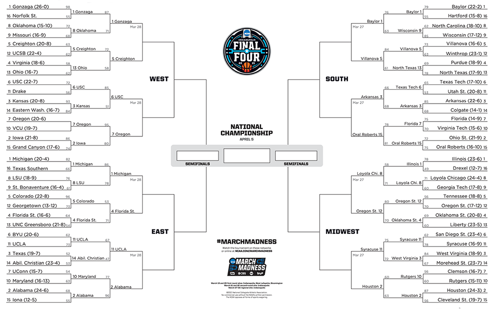
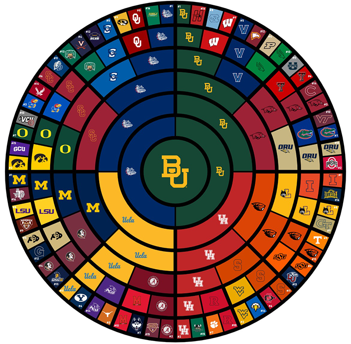
These two charts provide the same info for the NCAA Men's tournament. They are each the same area, but one is easier to read, even at the small size shown. One uses text (and provides additional information) while the other uses team logos. The fan who is checking on their teams will most likely be able to recognize their team brands.
Confusing order of items
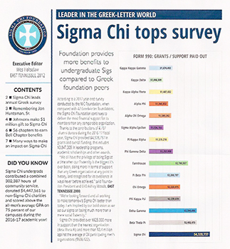
The headline says 'tops survey,' yet the referenced item is at the bottom. Why would anyone do that? Put the Top one at the bottom, instead of at the top? That is more expected, more intuitive, more appropriate, and clearer communication.
The rest of the items are in random order - alphabetical or by decreasing dollar amount would be better for the reader to see a comparison - "Who is in second place?"

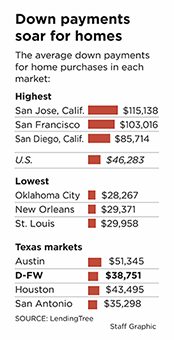
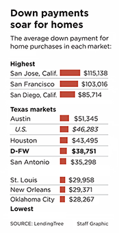
Below: The viewer wants to easily compare Texas cities to other US cities.
In the existing, the Highest markets are in descending order, the Lowest are in ascending order, and the Texas markets are all jumbled. Putting them all in descending order allows better clarity for comparison.
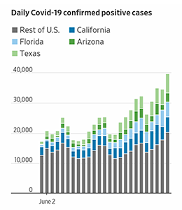
Unnecessary legend: (Just label the items directly)
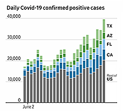
Labels next to their accompanying figures
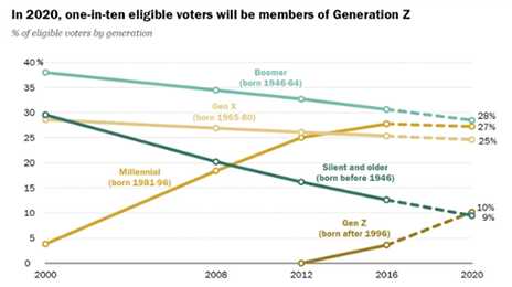
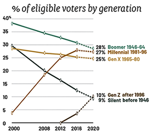

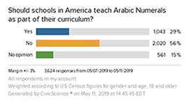
Unnecessary inconsiderate legend:
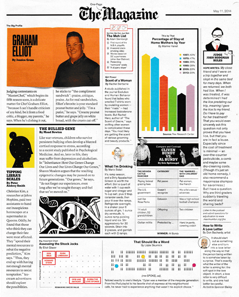
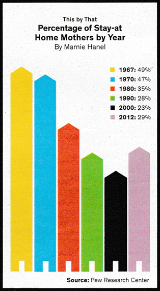
Below: three options to improve clear communication.
Tip: Avoid legends when feasible. Note: it is very often feasible.

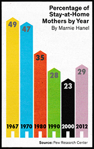
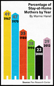
Poor readability: all caps, condensed font, tight kerning, poor contrast, small point size:
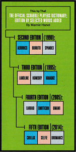
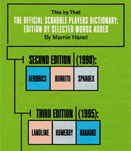
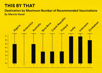
Randomly arranged charts:

Why are the countries arranged in that order? I can't find a reason - it just seems random.
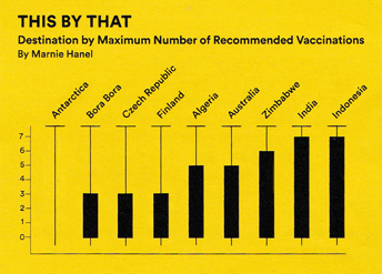
There are two better options:
1. Alphabetical - allows the reader to more easily find a specific country.
2. By amplitude - least to maximum - allows the reader to compare and rank nations.
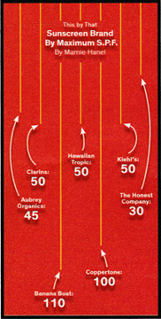
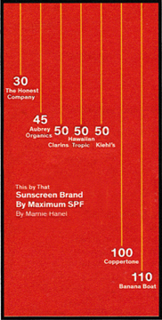
Below: The heading, Brand by Maximum is incorrect - it should be Brand Also, Maximum - as it is not (Arranged) by maximum.
Also, get rid of the confusing unnecessary arrows, move the heading off of the items, and put them in a logical order.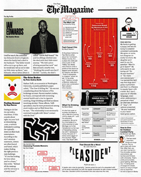
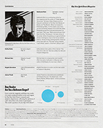
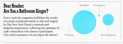
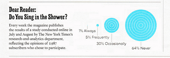
The poll question was Do you sing in the shower? But, that isn't what was in the headline. Why not? If the headline is accurate, there is no need to repeat the question at the end of the body copy. The regular reader knows this feature is results from a poll. I suspect most don't read the copy - they read the question and view the results.
Improvements
Changed the headline to be more accurate and clearer.
Deleted the repeat of the question in the copy.
Reset the text copy with a narrower column width.
Enlarged the result captions to be easier to read.
Put the results in ascending order and aligned, not a random placement.
Pie charts: with a legend and with labeled wedges
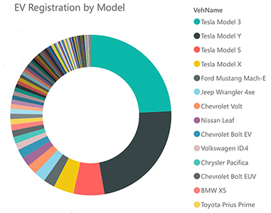
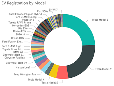
Useless legend that is useless and distracting
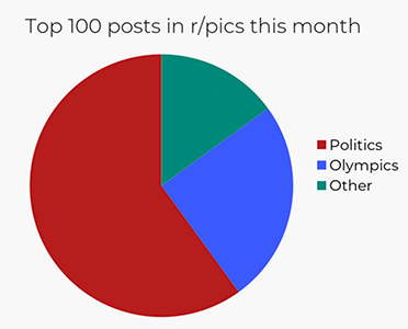
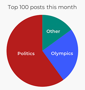
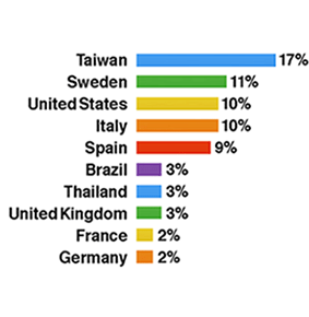
A bar graph might be easier to understand than a pie chart
The legend is not needed and, therefore, the color coding is not really helpful (but it's okay). The Other category is useless, and so it was deleted from the bar chart.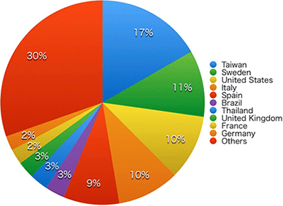
Too busy, too many lines:
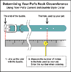

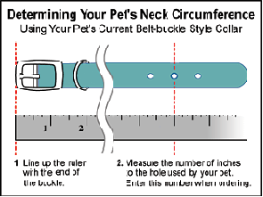
Black, red, and yellow lines all point to the same item. A box around type is not necessary. Too many blank spaces.
h
Arrangement of elements in a list:
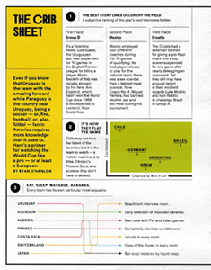
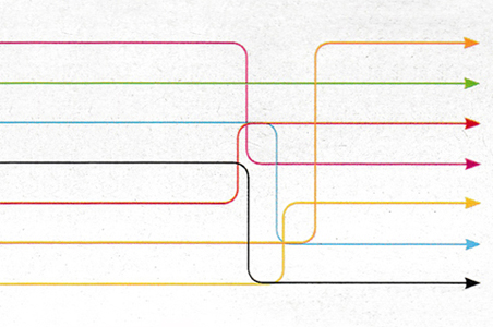
Why the maze to decipher - is this the puzzle page? A test?
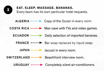
No, it's a chart of information that shows odd requests made by teams of their hotel.
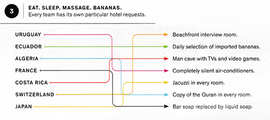
Better options: Below left: improved. Right,
even better:
1. Straight links to clearly communicate the content.
2. Alphabetized list of countries to allow finding a particular one a bit easier.
3. No horizontal and vertical decorative lines - there is no need to separate the black disk from the heading with an overused outdated vertical line. Nor does the line beneath the heading serve any purpose.
Lesson:
If a graphic element serves no purpose, it is just crap - clutter that the reader has to process and then ignore.

Another example of poor arrangement
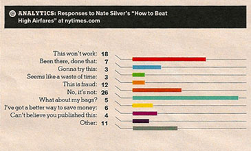
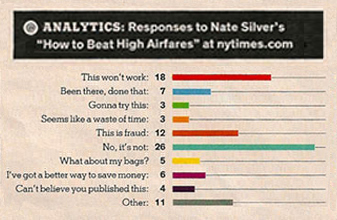
In the original graph on the left - notice the bent lines that lead the eye away from the item being referenced. I can't think of any reason why a designer would think that those angled lines improve comprehension of the message or the aesthetics of the image. They just detract and confuse. The tweaked version on the right is clearer and more appealing. Again, the order is confusingly random. Rearrange the items in descending order.

Above is a chart from Gallup.com. Please read the list of Office locations by country.
I suspect you read down the first column. At some point you may have realized that the list is organized in rows, not columns - we are supposed to read across first, then down. Oops, bad design. We read down for two reasons:
1. We are conditioned to, its more familiar. When we recognize a list (with bullets and aligned in a column) we read down the list, no matter how many columns there are.
2. The designer of this page gave us visual cues to read down. The countries are aligned in vertical columns with a column of bullets next to the country names. The spacing conveys to read Australia first (again, conditioning to start at the top left) and then read the next closest country. That would be Canada, not Belgium.

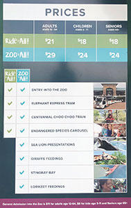
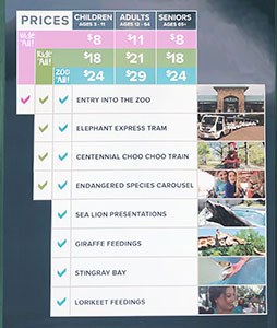
This is an info sign outside the OKC Zoo. It helps the visitor decide which ticket level to purchaser at the booth in a few yards. Great idea to provide this info before approaching the window - it should help speed up the ticket buying process and help the line move faster. However, there are some issues with the layout of this sign - the most egregious is that the General Admission prices are hidden in a different format in the purple band across the very bottom. Easy to overlook and assume that the only pricing options are the ones listed in the chart.
Improvements
Titled General Admission as Walk it All to better match Ride it All and Zoo it All. When the options are to Walk or Ride, that may be an an easy choice for some.
Added Walk it All prices at the top of the chart to better respect the customer.
Clarified the pricing options and the benefits by attaching the colored bands to their respective benefit column.
Arranged the columns in increasing order: Ages 3-11, 12-64, 65+ - Children, Adults, Seniors.
Enlarged the ages row for easier readability.
Narrowed the columns so that all info could be enlarged.
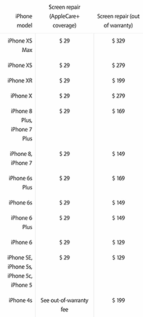
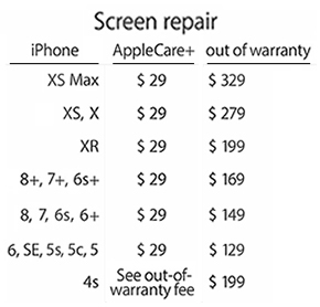
1. There is no no need to repeat 'iPhone' under the heading iPhone.
2. The title Screen Repair needs to be larger and more obvious.
3. Models that have the same price can be grouped together - the reader will scan to their phone model and then check the price.
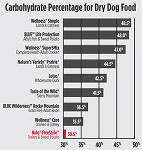
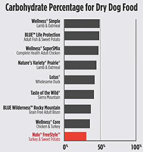
Nulo is a premium dog food that prides itself on healthful, honest ingredients. But, their promo piece is a bit dishonest. Note the visual above left comparing carbohydrate content - it makes Nulo (bottom in red) appear impressive - almost no carbohydrates. On a scale of 30% to 50%, selected out of context to show the red bar more favorably. The company relies on the fact that visuals are more memorable and persuasive than text words. On the right is a fair comparison - using the more accurate scale from 0% to 100% - the complete gamut. Now, the red band is not quite as impressive. The red band and the one above it differ by only 5%, almost negligible. But, the visual on the left makes it appear that there is a huge difference between the two.
Makes me wonder - what are they hiding? Why don't they show the complete chart? I am often skeptical of companies who try to trick the consumer.
![]()
Sale tags that obscure products
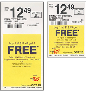
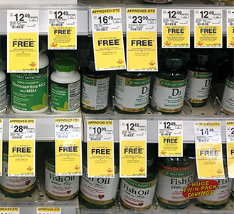
Shopping at major pharmacies is tough enough since supplements and vitamins are organized by brand, not the Vitamin. Then, sale tags hang in front of the products on the row below it. It is probly easier for the store staff to restock, but it makes comparison shopping too inconvenient. But, hey, its just the paying customer.
![]()
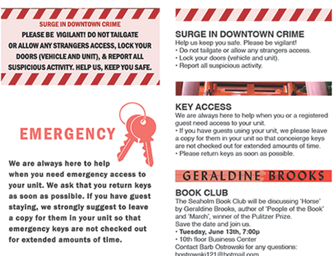
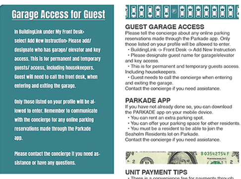
More efficient Newsletter
A weekly email pdf newsletter sent to residents In a condominium.
Target audience
Professional busy people living in a luxury condo building.
Objectives
• Less scrolling.
• More professional, age appropriate, respectful, and considerate of reader.
• Easier to scan: bold headings, date/time callout.
• Clearer separation of current news from past news - two main sections: Current News at the beginning, and Reminders: events and stories from previous issues.
• Use graphics/clipart as dividers between items; to give a hint of what the item is about.
Scrolling distance comparison (shown sideways)

Above: Existing. Below: Proposed

Infographic changes in text copy
![]()
A better Oscar announcement card


Warren Beatty was handed the wrong envelope for Best Picture. If the card inside the envelope were clearer - better typography and logical hierarchy, Beatty (or any person) would have more likely caught the mistake. Designer Brandon Jameson (with additional tweaks from Jim Watson) redesigned the Oscars award card to more reasonable specifications.
The existing card, designed by PricewaterhouseCoopers - the accounting firm that keeps the winners secret, is topped by the Oscars logo, which is a superfluous waste of space - and, it's the biggest element on the page! The winning film is listed below that, centered and in quotes. That's a little too subtle, as the winner is the same size and weight as a long list of names that follows. And the category - Best Picture - is listed in very tiny type at the bottom, underneath a line that looks like a blank waiting to be filled in.

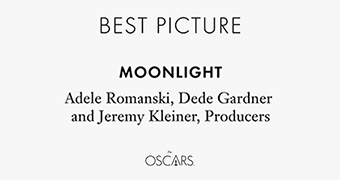
Above right: Better. The category is at the top, in thin sans serif letters. The category in large type at the top assures the presenter they have the correct card and cues them to what they're going to say, but the category type is lighter weight, so it doesn't steal any thunder from the winner's name, which is bolder than anything else on the card.
The text of the winner is bold, larger, and without unnecessary quote marks. To make it even more prominent, all the names beneath are U&lc, ensuring there's less of a chance to blend the two as one block of text. The Oscars logo is at the bottom and smaller.
These changes make the info clearer and more importantly, obvious if you've been handed the wrong card. The Academy Awards illustrate how subtle design changes can help prevent a very specific human error. The people reading these cards are sometimes older, they've probably been drinking, and they're in the spotlight in front of their peers delivering some of the most important industry information of the year - these cards should be bulletproof. And as we now know, if someone makes a mistake, absolutely everyone will notice.
Why didn't they learn from the Miss Universe Pageant?
A few minutes after announcing Miss Colombia as the winner of the pageant, the show's host Steve Harvey walked back on stage. He interrupted Miss Colombia, who waving to the crowd in her new crown and sash with flowers in hand. "Okay folks, uh..." Harvey said. "I have to apologize. The first runner-up is Colombia. Miss Universe 2015 is Philippines!"
After a few awkward minutes, both Miss Colombia and Miss Philippines stood at the front of the stage. Another Miss Universe worker came out, took the crown off Miss Colombia's head (Miss Universe 2015 for 3 minutes) and placed it on Miss Philippines'.

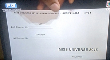
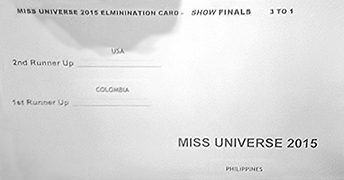
"Folks, let me just take control of this," Harvey tried to explain. "This is exactly what's on the card," he said, holding it up for the cameras. "I will take responsibility for this. It was my mistake. It was on the card. Horrible mistake, but the right thing. I can show it to you right here," he said pointing to the card (with very small print). "The first runner-up is Colombia. Still a great night. Please don't hold this against the ladies. We feel so badly but it's still a great night."
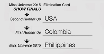
A few simple improvements
• Arrows to guide the reader.
• All 3 levels aligned.
• Larger point sizes.
• Spelled out Second and First to avoid a glance at number 1 or 2.
• Winner name located more prominently - look how far down on the card it was on the original.
![]()
Microwave instructions
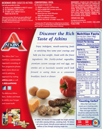

The two above have their instructions buried in blocks of copy, in a small point size, and reversed out of the red background.
Now look at the better brand below. The designer of these packages was considerate of the reader.
The heading, Cooking Instructions, is large and easy to find. The most important info (the time) is large, set in a box, and put on a higher contrast background. Users can scan the back of the box easily and quickly find the info they are looking for. Microwave ovens are fast, their instructions should be, also.
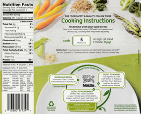
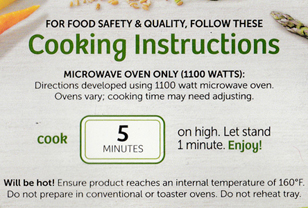
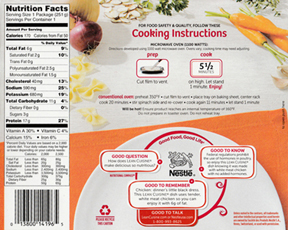
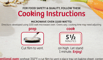
The box above has two important steps - Prep and Cook. Both are very clear at a glance. The prep photo makes sense.
![]()
A better Reader Reply card
A while back, magazine publishers came up with an idea to help their advertisers provide more info for their readers. They printed a code number in the ad, usually at the bottom - For more information, circle 244 on the Reader Reply card or just Circle 244. Then, towards the back of the magazine would be a card to fill in and mark the numbers of the advertisers from which one wanted more info. The card was be pre-addressed to a magazine reply service. It provided another selling point for the magazine and for its advertisers. Most of the reply cards were not well designed. Below is an example. (Now with the abundance of websites listed in magazine ads, the Reader Reply card is obsolete.)

![]()
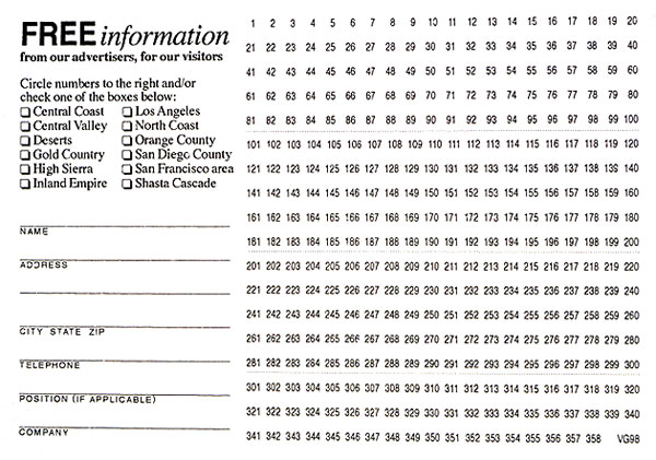
• Target market/user: The magazine reader who desires more information from an advertiser.
• Category headings have no value - the reader just wants to find a number and circle it.
• The columns of numbers are split into two sides of the card.
• The hierarchy layout of numbers doesn't facilitate easy navigation.
Advantages
• Contact info blanks and check-off boxes are grouped together.
• All advertiser numbers are grouped together.
• Advertiser numbers are ordered for easier scanning and navigation.
• Numbers are larger and easier to find and read.
Dates: Observations: long ago; Sketches: late 1980s/early 1990s
www.jamesrobertwatson.com/design-infographic.html
![]()
![]()
![]()
![]()