
Product Design Blog
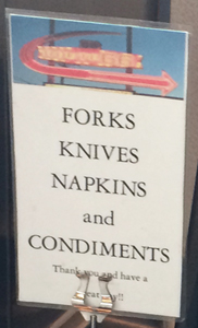
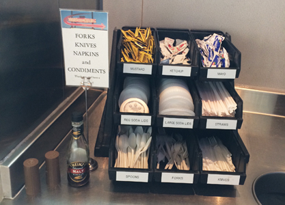
An unnecessary sign (therefore, it's clutter.) Our minds are conditioned to seek out visuals before words. Here, the visuals are so clear and adequate. Do we really need to label a stack of spoons as 'Spoons'.
You have probly walked up to plasticware bins in a restraunt and had to look down into the bin or pull up a utensil in order to see if it was a fork or spoon. The ends are identical - no clue as to what is on the other end - the end that is buried down in the bin with the rest of the herd (I assume plasticware comes in herds).
Below: If the utensils were stored handle-down, recognition would be easy. But health codes don't want customers touching the utile ends so they are pointed down and the handle pointed up.
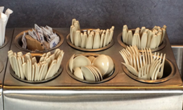

A beautiful solution from Frank Nichols: An identity system incorporating a variety of ways to communicate the utensil usage:
• Different length of utensil.
• Embossed icon at the end of the handle.
• Unique identifying shape of handle ends.


The system also allows sight-impaired customers the opportunity to recognize a utensil by feeling the shape at the end of the handle.
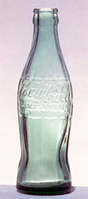
In 1915, another company wanted users to be able to identify their product by shape only. The design objective was to create a bottle so that it could be recognized in the dark. Inspired by the Hobble Skirt, popular at the time, and the shape of the coca bean pod, glass blower Alexander Samuelson presented the now classic bottle shape.
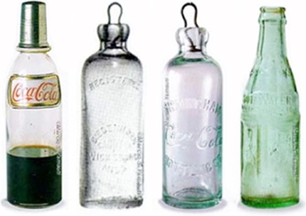


Two options of labelling the containers:


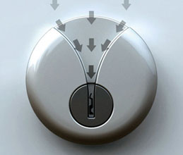


Locking and unlocking the front door when it is well-lit is as simple as stick and twist, but trying to find that little key hole in the dark can be a real pain. This is one of those so-simple-and-obvious designs that you almost have to wonder why no one has thought of it before: not only does it provide a simple channel for sliding your key down into the lock each and every time, but its distinct shape makes the entire lock housing easier to find in the first place while groping around in poor lighting. Inventor: Junjie Zhang.
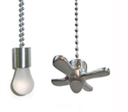

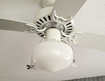

That is a brilliant product - such a simple and clever solution. It is a great example of a message that is so clear that it requires almost no deciphering - their function is obvious and immediate. A ceiling fan often has a light in the center and there are two chain pulls hanging down from the fixture. The chains are identical, so how do you tell which goes to which? You take look at the fan housing to see which comes out at a higher spot - that's probly for the fan. Or, you attach these pulls to the ends of the chains.
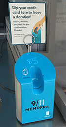
A better way to leave a tip from those who don't carry cash


So many of us no longer carry cash - but how do we leave a tip for street musicians and subway entertainers? Sometimes I stash a dollar or two in my pocket. But, this is a better way. Visa has introduced a 'social experiment' entitled StreetTaps. To display the capabilities of digital payments, the BBDO ad agency installed digital payment terminals allowing street musicians in public parks to accept tips from mobile phones. It can be preset, usually for one dollar - so, a tap charges or debits your account $1.00. StreetTaps is still in the works, but the DipJar is currently being used - just dip your card and $1.00 (or $2, whatever was preset) is deducted. No receipt, no buttons, no input - just dip and go.



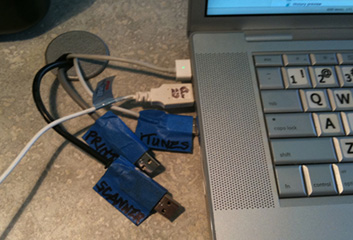
A USB plug that doesn't give the user a clear clue which side is up is inexcusable in this era of 'smart design'. if a product needs a catchy line like, "Doesn't fit, flip it" then there is something wrong with the product design. Well-designed products don't need ad slogans to help them do their job.
I suppose that the USB logo on one side is an attempt to differentiate the two otherwise-identical sides. But, its not enough - many times, its just embossed in the plastic and difficult to see.
One tacky solution: I have marked the plugs. I once used a multiple plug but it impacted the strength of the signals to the devices so, for now, I'm using this system with duct taped plugs.


Note: brilliance is often simple.


Above left: An avocado ripeness sticker. Above right: A crate sticker to verify excess tilting of the crate.
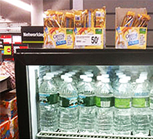
Below left: Hanging packs in 2 overlapping sizes - more product can fit on the hanging rod. Below middle: Magnets on the side of the sodapop machine for munchies. The cans don't take any additional floor space or shelf space and it puts the temptation right by the drinks. Below right: Crystal Light packet is the right size and shape to easily add the powder to a bottle of water. They recognized the fad of bottled water and the potential for sales to people who didn't want to give up flavor for water. A perfect match to what the consumer wants. Staples positioned the boxes of Crystal Light on top of the cooler of bottled waters.


What is that circular depression for?
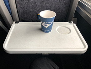


Okay, sure, to denote where to place your cup, bottle, or mug. But lets go deeper - why is it there? Is it necessary? Without it, will the drinker be so confused that it hinders the enjoyment of drinking and eating. Shouldn't designers, engineers, and manufacturers believe that their customers are smart enough to place their drink on the tray in a manner that is convenient, efficiently uses the space, and is somewhat safe and secure.
Notice that the depression can actually make the experience less convenient and secure. Without the dip, there is more usable space - sometimes, there may be so many items that need to fit on the tray that the cup should be placed in a corner, closer to the edge than the depression allows.
Some of Jim's projects in Product Design
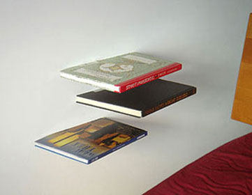
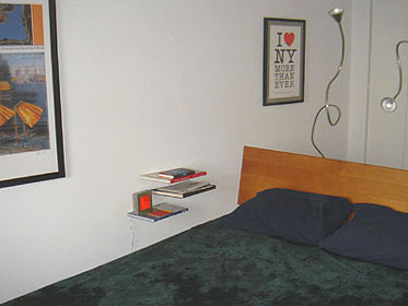
At the ICFF - International Contemporary Furniture Fair - in May 2006 at the NY Convention Center, I saw in the Umbra display, a stack of books sitting on a new product, called the Conceal Shelf. It works with a lip to hold the bottom book cover and a horizontal shelf part hidden inside book. Nice, but I wanted a shelf just for a book or two. The fairly large vertical wall mount area of the Conceal Shelf would show (its a true concealed shelf only if you stack enough books or items on top to conceal the metal support plate). I looked in several stores and saw the brackets that are simply metal rods or dowels sticking out to hold glass shelves. I made the connection: cut a hole inside of book pages and slide the book over the rod. The support rod is completely hidden and the book becomes the shelf - hence the name - Book Shelf. In Home Depot, I was about to buy the brackets when realized this could also replace the nitestand by the bed. A series of Book Shelves mounted on the wall next to the bed. Eureka. I wanted to go home and work this out before buying the brackets.

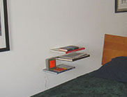
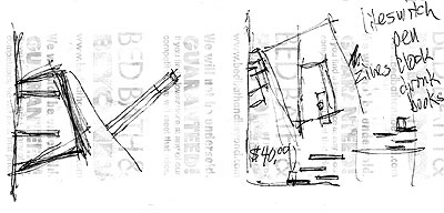
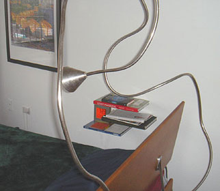
Shelves for books made of books with no visible means of support.
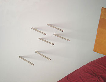
Riding the subway home I got pretty excited about the idea - so, I pulled out the only paper I had - a receipt from Bed Bath & Beyond, and started sketching to get my thoughts down on paper. I started to work out the details - how many books/shelves, the layout arrangement, list of items that will go on the shelves, etc. Maybe a magazine to hold magazines? Maybe cut the books at the angle of the carpet tiles? I had previously experimented with angle cuts on a table top mat and the dog bowl floor mat. I liked the idea of mixing the angles - the book shelves would align with the grid of the carpet yet be cut to be positioned up against the wall. I have a bedside clock that projects the time on the ceiling. I realized this would not allow the shelves to be stacked and aligned vertically because I didn't want the clock to be on the top shelf (too predominant). Placing the clock on a lower shelf necessitated the random asymmetrical layout of the three shelves.
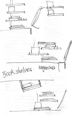
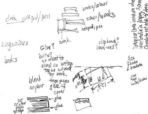
Now to find the right three books. Strand Books is a New York institution - near Union Square, its an old musty book store, crammed with new and old books, people browsing and jostling through the aisles. I was reminded of Strand when I saw their kiosk at Central Park. I remembered the Strand Annex downtown, not too far from the apartment. Once there, I looked thru the dollar books (investing 3 dollars for the shelves would be a great bargain). Alas, I found no books large enough. I had determined three preliminary goals for the book selection: big, cheap, and some relevance. Then in the religion section, I found a large book on The Story of Jesus and it was only $10. I could handle $10. I had accepted that the dollar per book deal was out and I would have to pay to get the effect I wanted. At $10, the total would still be only $30 - cheaper than any shelf at a store. Then nearby I found The History of Islam. What a kick, now if I could find a large book having to do with Hebrews or Judaism, then that could be the theme - the world's major religions, especially as a nitestand for Jim Watson. But I couldn't find a large book with a Jewish theme for less than $20. I wasn't willing to spend quite that much. I also realized that this theme would be fun for a while - quite ironic to have religious books as reading matter, but I would likely tire of looking at those spines day after day. No, I needed something better. So, I kept looking. Maybe a theme of Design. So over to that section. Whoa, too expensive. I did find a large inexpensive book on Frank Lloyd Wright. Cool. After browsing lots of shelves and tabletops, I saw a large book called Stuff and Nonsense. What a great title and a fitting for my apartment. Then the thought - what about a New York theme. Over to that section. There were several coffee table size books, some of them cheap. One was too thin to hold the brackets, however. I also saw a collection of books all in grey covers. Maybe? A consistent color in the shelves. No, that would stray too far from the concept of having it look like three random books protruding from the wall supporting other books and magazines. I went back to what I had already - the book on Frank Lloyd Wright, Stuff and Nonsense, and for the third, a book on New York City. Good assortment. Done.
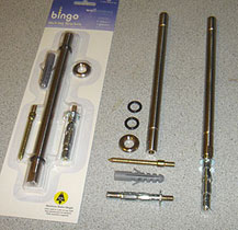


The brackets - or rods as they are used here; the 3 books marked up for cutting; and a book with the pages cut out (to hide the rods), rods shown for placement.
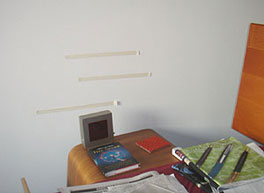
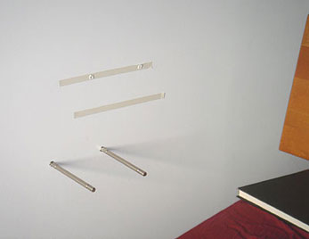
So far, I had the idea pretty solid in my head, a few rough sketches, the brackets, and three books. I bought the bracket/rods at Home Depot. The first step was to cut the books - the angle to respect the carpet grid and the cavity inside to hold the and conceal the support rods. I used stacks of foam mounting tape to hold the bottom of the book up against the book cover and to provide some snugness to embrace the rods. It was a bit weird to cut up books, but I reminded myself that they were bargain books - there were several more if I really wanted to go back and buy a virgin book and they were in the bin of leftovers of books that had been picked over and rejected by many people. I read each of the books (the Stuff and Nonsense book was just, well, nonsense stuff). I had put up three strips of tape in the bedroom to begin to determine placement of the shelves. I knew by this time that the bottom shelf would hold the alarm clock - I wanted to hide its electrical cord as much as possible and this would be the least visible. This bottom shelf would also hold a notepad, pen, and coaster for a glass. Therefore there needed to be space above the left side for the clock and glass.
Inspiration: May, 2006
Store search: June 14-15, 2006
Design: June 16-17
Production: June 18-19

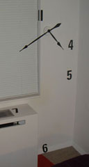
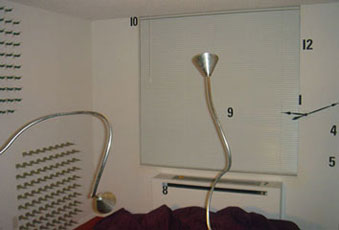
Inspired by the kitsch clock in the Oklahoma house, I designed a clock in NY that embraced the wall at the end of the bedroom. The OK clock allowed me to realize that the face of a clock can be made of just about anything - including the wall the mechanism is mounted on. I explored sketches of cubes and numbers that could be mounted on the walls, ceiling, and the ac unit. But, when I bought the clock mechanism, it came with the 4" sans serif numbers shown above. Great. Sometimes, serendipity works well. I simply applied the numbers to the wall. Each number is located in its correct path but at varying lengths from the clock. The numbers wrap around corners, some are flat, others vertical and the '9' is on the mini-blinds, barely noticeable during the day, but more apparent when the blinds are shut for the evening. The seemingly random chaos of the number placement offsets the structured grid of the statues and buildings on the wall to the left of the clock.


After I moved into a rent house to have a yard for my new puppy, Dallas. She was too obstinate to leave in the house for long periods of time. I needed to get a doghouse for her. I was used to using the Metrowire shelving throughout the house and wondered if I could adapt its components for a doghouse. I knew I would need to build a box and platforms for her to walk on since the wire shelving would not be comfortable for her paws.
While sketching the elements with the box, platforms and roof, it evolved into a De Stijl composition. De Stijl was a Dutch style of art & design popularized by the architect and furniture designer Gerritt Reitveld and the painter Piet Mondrian. I exploited that by painting each wood element a different primary color. The roof part helped protect the opening to the house so the dog could be inside and stay somewhat protected from rain and sun.
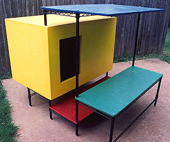
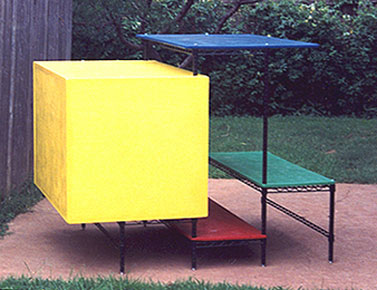
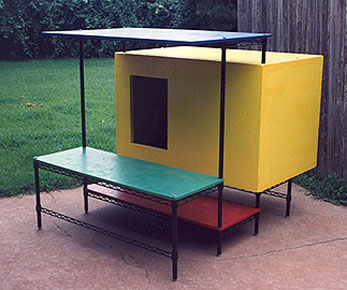

Dallas, the dog, didn't use her fancy De Stijl house too much - she preferred to be inside with me. It was hard to keep her outside (I wanted her with me also). The house did serve its purpose for a few years until I moved into a different house and she had grown out of her obnoxious puppy ways into a better-behaved adult.
Designed and built: 1991. Dismantled: 1995 while moving.

www.jamesrobertwatson.com/design-product.html