
![]()
Some thoughts on park design
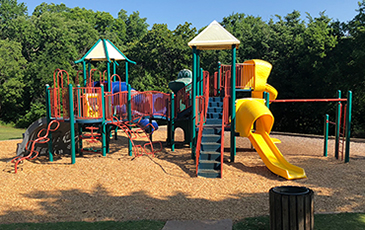
I live (blue) right between 2 city parks. One of them (photos below) is on the Downtown to Arcadia hike/bike trail. I often walk the dogs there in the morning as it is such a nice escape from the city. Because I am always finding ways to make things better, I imagine how the park experience could be improved.

![]() Concept: Replicate, in urban parks, the experience of attending a national park. National parks have a strong sense of place - the park exudes a special identity that is not found elsewhere - in the signs, the roads, structures, path layouts, and maintenance. It's about the experience, the way the user feels while in the park, creating a mindset. An attitude.
Concept: Replicate, in urban parks, the experience of attending a national park. National parks have a strong sense of place - the park exudes a special identity that is not found elsewhere - in the signs, the roads, structures, path layouts, and maintenance. It's about the experience, the way the user feels while in the park, creating a mindset. An attitude.
![]() Target audience: People who want to counter their busy corporate lifestyle, escape, take a mini-vacation, and leave the city behind.
Target audience: People who want to counter their busy corporate lifestyle, escape, take a mini-vacation, and leave the city behind.
![]() Activities: Exercise, walk, jog, ride bikes, have fun, play in the playground, enjoy a picnic.
Activities: Exercise, walk, jog, ride bikes, have fun, play in the playground, enjoy a picnic.
![]() Philosophy: Less visibility of city trappings and an emphasis on nature can have a positive impact on the user's state of mind.
Philosophy: Less visibility of city trappings and an emphasis on nature can have a positive impact on the user's state of mind.
![]() Recommendations
Recommendations
Develop a city parks and trails branding program, one that better fits a national park than an Interstate highway.
Unique signage: brown signs, wood or wood appearance, Earth tones; no road signs or standard city signage. Relate to the native materials: sandstone, wood, grasses.
No yellow stripes in the center of the path or highway signs along the paths.
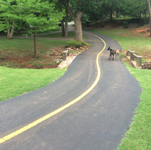
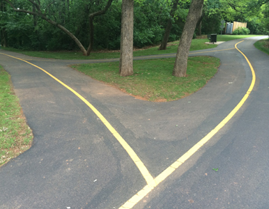
Just useless - Will people run into other people if there is no stripe to delineate proper lane to be in? This is an urban forest with walkways, not a highway.
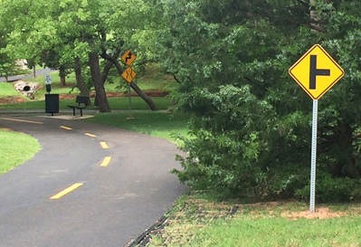
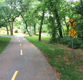
Examples of the inappropriate and inaccurate highway-style signage, and the yellow striped pathway.

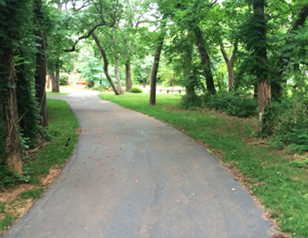
Left: Existing. Right: Proposed. Notice how much better it looks without the highway signs and yellow stripe.

There are 6 signs visible in this picture. Walkers and bikers are not so stupid that they need to have curves in the path pointed out or be told to yield to others on the trail.
Notice how nice it looks below with the signs removed:
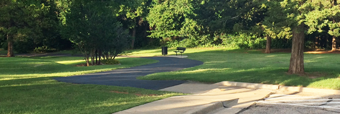
Below: another city park, one in which the walking trails have no yellow center stripe.
So much better.
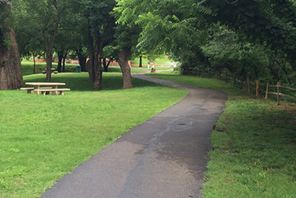

A city parks branding, more like those in national parks, could use native red sandstone (abundant and native to central Oklahoma) for major identity signage.
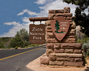

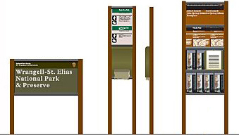
City of Edmond Begins Implementing New Monument Signage in December 2018
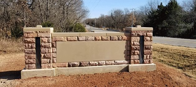
A new style of monument signage is now being implemented in the City of Edmond. The new signage will create a more unified look throughout the community for city entities including parks, city buildings and welcome signage at city limits entry points. The City Council really wants to create more consistency in signage and identification throughout the city. This new design captures both a historic and modern feel for Edmond. The new signs are a scalable, timeless design that features the WPA red sandstone featured in many Edmond landmarks. They will require little maintenance.
![]()
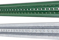
Sign posts and brackets and accessories should be green, not steel silver - this is a park, not a warehouse.
Trash cans should include both Landfill and Recycle receptacles, clearly labeled.


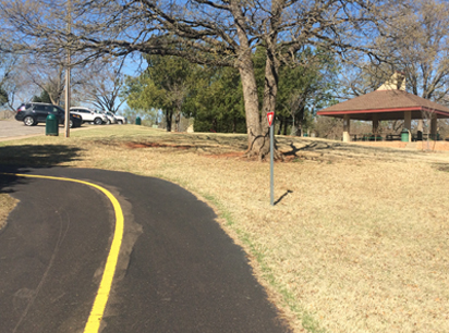
This yield sign baffles me. Who yields? And to whom? Is one to yield once one enters the grassy area? Do they think someone would just run into someone on the grass ("Well, there wasn't a sign telling me not to!") The useless yellow line - do they assume we are so stupid that we would just run into oncoming walkers or bikers if there was no line to separate us?
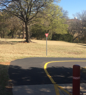
I have attended meetings of the City Council and the Planning Commission - when these types of examples are mentioned, the most common excuse given (it may be the city slogan): We just didn't think about it.
![]()
Integrating art & sculpture into parks and trails
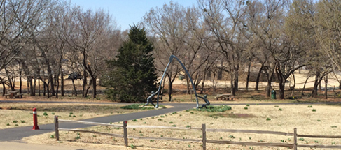
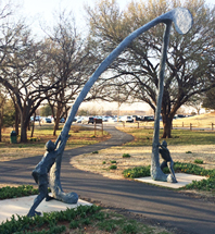
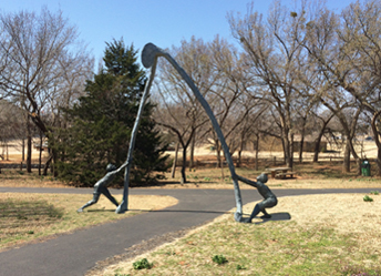
Hafer Park in Edmond is a great park - walking trails, ponds, playgrounds, stages, pavilions, and more. There is even this fun sculpture of two boys trying to tear apart a wishbone to see who gets their wish. I realize this is in Oklahoma, not an art-sophisticated market; most sculpture in this town's public arts program is somewhat amateur. This one is, at least, a fun idea. But, the installation is poor - it does not respect the idea and the aesthetics of the sculpture. The Parks Department poured some large square concrete pads and then planted flowers around the perimeter of the bases. It ruins the effect of the boys wrestling with the wishbone in the park. The bases make the image static.
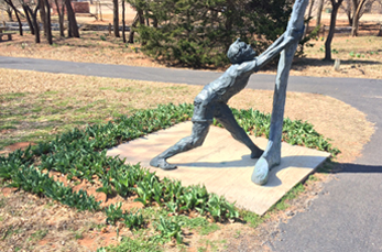
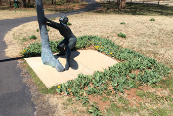
The park visitor should be able to discover, Interact, and walk beneath the sculpture as if it belonged at the site, as if it was organically an extension of the park.
Large, out-of-scale sculptures such as these are very Dada: they take ordinary objects out of their usual context which forces the viewer to experience them in new ways. As in these sculptures by Claes Oldenburg (often with the help of his wife, Coosje van Bruggen):

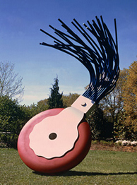

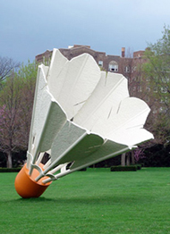
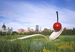
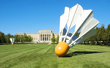
Left to right: Floating Peel, Typewriter Eraser, Plantoir, Shuttlecock
Notice that there is no visible base or means of support, the pieces are sitting as they might if they were in scale, plopped down onto the ground.
The Okie piece is not quite the same as the Oldenburgs, since the Wishbone has figures involved with the sculpture. But, the juxtaposition of a larger-than-life object in the park is similar.
Lesson: Consider, enhance, and respect the surroundings when inserting any entity into an existing environment.
Side-by-side comparisons
So, here, next to the existing, is the sculpture as if it had been mounted more appropriately:
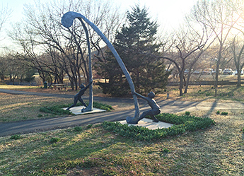
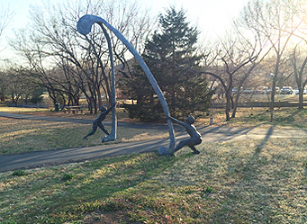
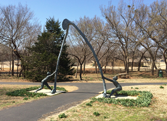
There is greater tension between the boys and the wishbone without the solid concrete bases.
Another example, in the same park
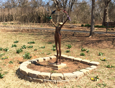
A delightful lively figure on an inappropriate base. This figure needs to be free and unencumbered. As if she was walking in the grass and just stopped to release the birds. Notice what the ugly, poorly constructed planter base does to the freedom of the woman. Stops it cold.
How it could have been - respecting the parkland and expressing the joy of a park, not a display on a pedestal:

Uncommon Ground was a proposal for a new park in Edmond Oklahoma

Insecurity identity crisis
Uncommon Ground is not just a "sculpture" park, it is also includes:
• Playgrounds
• Water play area
• Event lawn
• Event space, indoors
• Dog park
• Sport courts
• Community garden
• Restaurants
• Nature trail
• Pond boardwalk
• Performance stage
• Picnic area
• Birds nest lookout
The sculptures will be interspersed with all the other above activities.
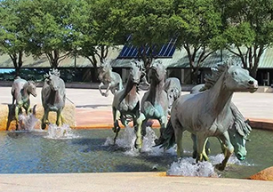
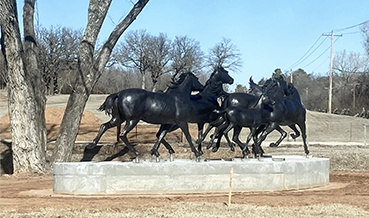
An integral component of a successful sculpture park is how the sculptures are mounted to respect and fit in their immediate environment. This follows the model of existing Edmond public art - sculptures are mounted by office buildings and in the median of a busy street.
At the entrance to the new park, close to two busy roads, the new park in Edmond has a statue (their term) of galloping horses. Here’s why that’s a symptom of why the Edmond Park not be successful. The horses are galloping full speed ahead with apparent energy and motion. But all of that comes to a complete halt when it is sitting a top massive concrete base. A sculpture should be free and unencumbered without plantings and pedestals at the base. If it was away from the road, along the hill slope, one would look up and see the horses galloping across the grass into the woods. But here at the entrance it’s clearly conveyed that this is not a first class sculpture Park. At best it's a new city park with some statues.
Tip: Cities should consult with sculpture specialists before installing artwork.
![]()
The Fink-Hafer Trail map:


![]()

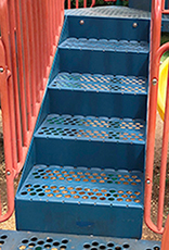
I noticed this upper section of the staircase
had been installed upside down. The top and bottom risers were the wrong dimensions - causing a tripping hazard. The fix was simple - drop that section, flip it over, raise it into place and reattach the 4 bolts. I wrote the Parks Department with pix and rationale. The staircase was corrected the next day.
![]()
A new UCO park
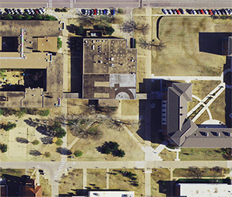
A new cafeteria building opened in fall 2019 and the old building was razed. The President proposed that the resulting vacant land be redeveloped as a new park, a peaceful retreat in the middle of campus
Users: People on campus with time to explore and people passing through on their way to somewhere else.
Activities: Reading, eating, walking, conversations, meeting, gathering - think, work, & rest.
Conceptual ideas
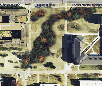
Convey diverse OK terrain: prairie grasses, western/Arbuckle rocks, native trees.
Canopies of trees with open views below. Trees nearer to the edges could be spaced to allow more open sightlines through to a forested mass in the middle.
Winding undulating grove of trees - no hard tree lines. No defined beginning and end to the park but rather an intensified center of natural surroundings that blend into campus.
Berms of wind-blown grasses (adds kinetic motion) - rocks cut across sidewalk paths.
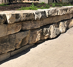
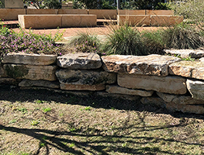
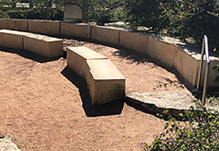
Natural seating of stone, rock, wood - areas where people can gather in a circle hugged by the landscape to give sense of privacy. Maybe WPA-era rock style.
Downlighting or diffused lighting to warm the space below the canopies and protect the night sky for stargazing
Accessible: walkways and paths would be wheelchair accessible. Signs could include braille.
![]()
An unsafe roundabout planter
In 2012, a roundabout was restored to the intersection at 4th and University. There is a lot of student traffic using University. During the phase of getting used to a planter in the middle of the intersection, it was rammed several times late at night, probly by alcohol-impaired drivers.
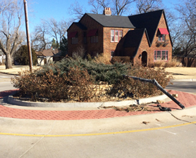
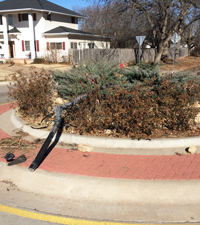
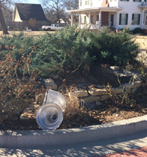
The crash in January 2014 was the worst - it took out some bushes, a portion of the stone wall, and demolished the lamp post. As the Parks Department rebuilds the rock planter again, this would be a good time to consider replanting the roundabout to be more safe.

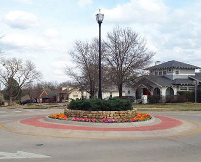
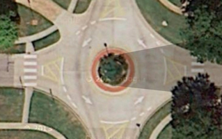
Left: Most of the year, the rose bushes just create a dark mass at the base of the lamp post planter. At night, this dark mass makes the planter almost visually nonexistent. The stone wall was originally very well done - a nice counter to the green plantings. But the rose bushes obscure the stone wall (and subsequent run-ins have altered the wall's appearance).
Suggestion: Remove the rosebushes, replace them with very low flowers or ground cover, and rebuild the stone wall.
Above right photo: This will:
Create a more attractive wedding-cake layer effect.
Add more color.
Decrease the blind spot.
Allow the light rock to be more visible and better convey a forbidding rock barrier (drivers may not be as likely to hit a stone wall if it is more visible and obvious).
The goal is to make the roundabout planter more visible, and, therefore safer.
Additional benefit: The smaller planting footprint will also decrease the blind spot on the opposite side.

I sent the above info and photos to several city administrators. Will post an update if the planter is reconfigured.
Update:In 2019, the lower tier of plants was replaced by some simple yucca plants, thereby opening up the views around the planter. Much better.
![]()
Ideas for a better & greener Dog Park
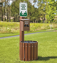
![]() More poop bag dispensers Especially outside the park fence, at the entrances to the walkways. Often, dogs poop on the way in or out and owners don't have a bag with them. In the park, bag dispensers could be mounted on trash cans
so the cans could be moved around to grassy areas.
More poop bag dispensers Especially outside the park fence, at the entrances to the walkways. Often, dogs poop on the way in or out and owners don't have a bag with them. In the park, bag dispensers could be mounted on trash cans
so the cans could be moved around to grassy areas.
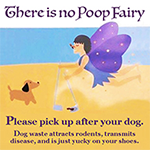
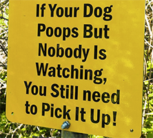
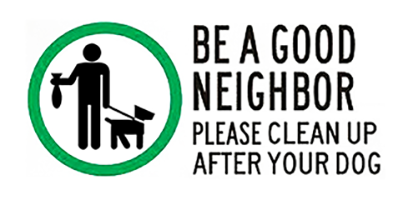
![]() Signs reminding users to pick up their dog poop.
Signs reminding users to pick up their dog poop.

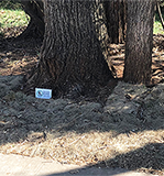
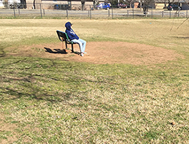
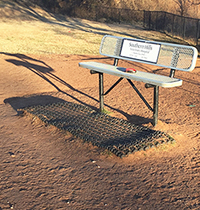
![]() Benches mounted on skids would allow them to be moved to grassy areas as soon as the area around them begins to show worn grass. The permanent benches and bag poles create dust bowl areas making those areas less desirable for sitting, so some benches sit empty. Some of the benches could have canopies for shade.
Benches mounted on skids would allow them to be moved to grassy areas as soon as the area around them begins to show worn grass. The permanent benches and bag poles create dust bowl areas making those areas less desirable for sitting, so some benches sit empty. Some of the benches could have canopies for shade.



![]() Restrooms There are restrooms nearby, but too far away to leave dogs unattended for so long.
Restrooms There are restrooms nearby, but too far away to leave dogs unattended for so long.
![]() More shade shelters July and August in Oklahoma can be brutal.
More shade shelters July and August in Oklahoma can be brutal.
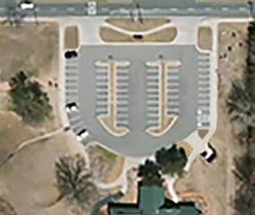
![]() More parking Below: Existing (43 spaces) and improved (60 spaces).
More parking Below: Existing (43 spaces) and improved (60 spaces).

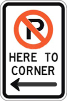
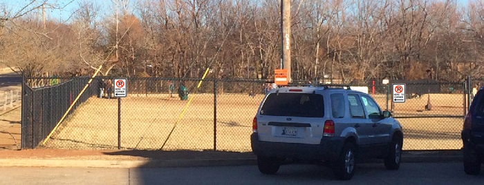
![]() Better No Parking signage in the Mardel lot (see explanations and photos above).
Better No Parking signage in the Mardel lot (see explanations and photos above).
![]()
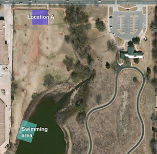
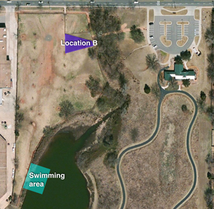
![]() Concession stand Could be a seasonal operation, or daily in summer, weekends in winter. Food truck, ballpark food and drink, or vending machines. Or full service (see Mutts park below). Location A shown below allows easier access to loading and parking. B is more accessible for other park visitors with new entry on the east side.
Concession stand Could be a seasonal operation, or daily in summer, weekends in winter. Food truck, ballpark food and drink, or vending machines. Or full service (see Mutts park below). Location A shown below allows easier access to loading and parking. B is more accessible for other park visitors with new entry on the east side.
![]() Fenced dog swimming area The existing access to the pond lets the dogs out into an unsecured area. A fence could jut out into the lake and enclose enough area for safer swimming.
Fenced dog swimming area The existing access to the pond lets the dogs out into an unsecured area. A fence could jut out into the lake and enclose enough area for safer swimming.
![]() Build a second dog park at Mitch Park. There is ample land and parking, easy access, and away from busy streets. This would alleviate some of the overcrowding and wear on the Rudkin Dog park.
Build a second dog park at Mitch Park. There is ample land and parking, easy access, and away from busy streets. This would alleviate some of the overcrowding and wear on the Rudkin Dog park.


Edmond, Oklahoma, has a very popular and large dog park on 33rd Street, east of Boulevard. It is so large that most dogs stay in one or two areas to socialize and play. And it is so popular that the Parks Department has had a hard time keeping grass growing - it is usually just dirt and, sometimes, mud. Sometimes, there are dust storms in Oklahoma's wind. One effort made has been to periodically fence off a small section that is then seeded and watered.

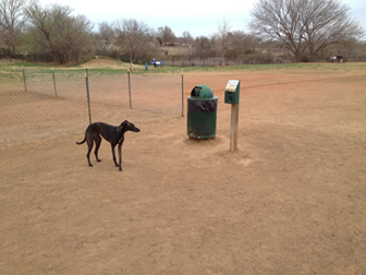
When the fence is removed, there is a small area of fresh grass for a short while. But, the number of dogs running and playing are just too much to allow the grass to thrive. The fresh grass doesn't last long.
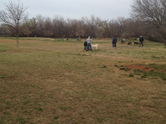
Much of the overly large dog park goes unused:


Here's another solution: Divide the large park into two parks.
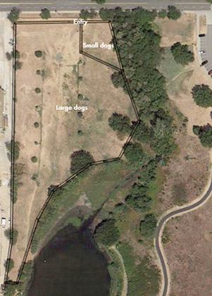


Advantages
One park would be for active use, the other would be closed so that the grass has adequate time, without foot/paw traffic, to root and thrive.
Each park would still be an adequate size.
Each would have large open areas for fetching and plenty of room for the dogs to run.
All 3 parks would have easy access to drinking water.
One park could be occasionally reserved for special events (Easter Egg hunt, training classes, etc.) while the other two would still be available as open parks.
The south side, with access to the pond, could be used in the summer months and the north side in the winter. There would be some initial cost in additional fencing.
People at the dog park with whom I have shared this idea agree - the park is plenty big and, if divided, would still be big enough and it would be nice for the dogs to be able to run on more grass.
The new entry

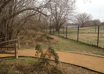
A new entry could be added on the east side to access all 3 parks: Small, Large North, and Large South. This would be more convenient: closer to the park parking lot, more park-like: near the creek bridge, trees, and the path, and safer: away from the busy 33rd Street.


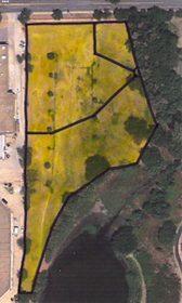
The 3 parks: Above left: Small dogs. Right: Large dogs North. Below: Two views of Large dogs South.

Size comparisons
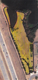


All in the same scale: Edmond, OKC Lake Hefner, OKC Downtown, Midwest City
Below: A drain slab that is higher than the surrounding drainage area. There are often mud pits around the edge of the concrete.
Locations of the fenced swimming area and concessions, restrooms, and playground.
A allows easier access to loading and parking. B is more accessible for other park visitors with new entry on the east side.

Improved entry/exit lane to parking


On the west side of the Edmond dog park is additional parking in the lot of the shopping center. The row of spaces along the side and in back of the building is rarely used by shoppers and it is closer to the park entrance than parking in the parking lot on the east side. The Parks Department acknowledged this when they paved the walkway from the lot to the entrance with a crushed stone composite.
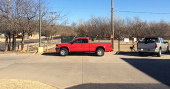
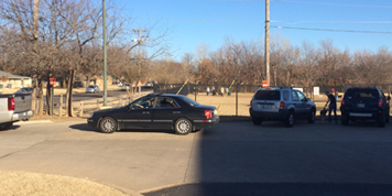
Above right: Of course, there are rude, selfish people that want to park close to the entrance,
even if it means inconveniencing other users by blocking part of the entry/exit to the lot. Someday there will likely be an accident as someone exits while someone else is turning in off of the busy street.

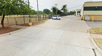
Below left: A pickup truck parked along the curb, narrowing the available space to exit or turn into the lot. Below right: cars lined up to exit the lot.

![]()

There is currently an ineffective sign stating to not block the maintenance access gate.
The solution: Mount some signs on the fence designating the area in front of the fence as No Parking.

www.jamesrobertwatson.com/design-park.html
![]()
![]()
![]()
![]()