
Jim Watson's branding


The name and graphic mark:
Convey the unique selling point - that there are six suits in the deck of cards.
Use colors that are familiar to a deck of cards.
Are written in a typeface that respects the one used on face cards.
Suggest the simple combination of descriptive word and number.
The full story of Deck6.
JustOnePiece

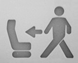
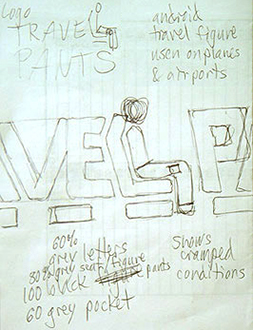
The mark conveys the unique benefit of the TravelPants (the accessible-while-seated leg pocket). To provide quick and easy recognition, the familiar android figure mimics the ones seen in airports, especially the Return to seat icon seen on airplanes. The lettering mimics the android figures and the plane seat with rounded corners and similar masses of form. The P represents the back of the seat in front of the passenger. The letterspacing helps convey the cramped conditions on a plane that make getting into a regular pocket more difficult. A combination of blues helps connect to business attitudes, conveys sky and flight, and emphasizes the pocket in the pants. Link to info about TravelPants.

Sketches and design: May & June, 2005, Trademark search conducted: July, 2005, Mark copyrighted: 2005
Drawn in Dallas, Saturday evening, June 18, 2005:
Lucky Grape was a design consulting service founded by Jim and Sean Cobb (more info here.) The logo was created while sitting at a Starbucks in Edmond. Purposefully avoiding a computer, Jim borrowed a felt-tip pen from the barista and Sean had some paper from his journal. They did some old-fashioned sketching.
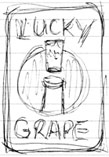
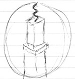
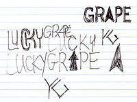

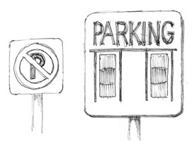
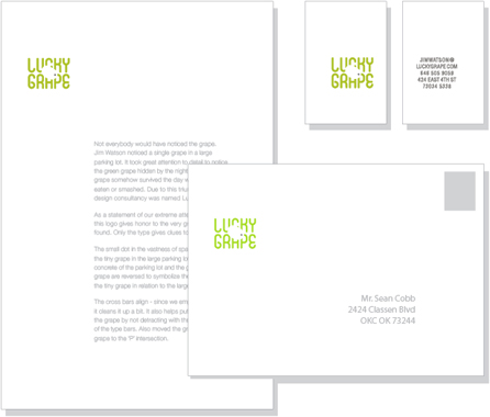
Influenced a bit by Arts & Crafts typography, the type was tweaked to convey a sense of order and clarity. The logo honors the very grape that was found - only the type gives clues to its shape. The small dot in the vastness of space symbolizes the tiny grape in the large parking lot. The gray concrete of the parking lot and the green of the grape are reversed to symbolize the greatness of the tiny grape in relation to the large parking lot. The cross bars align since Lucky Grape emphasizes 'attention to detail'. It also helps put the focus on the grape by not detracting with the randomness of the type bars. Also placed the grape dot at the 'P' intersection.
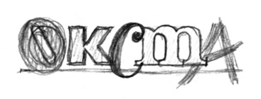
The original Study Tour logo included the line of copy: OKLAHOMA DESIGN. After Jim retired and stopped the study tours, the logo copy was altered to read: DISCOVER THE CITY - a more appropriate and less redundant way to convey a better way to experience New York. In 2013, the format was altered to include a horizontal iteration. Full story of the Study Tour logo.



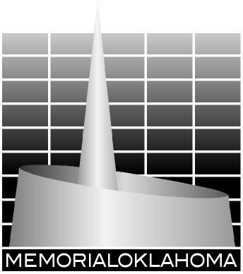
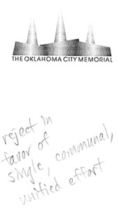
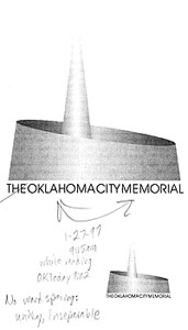
The identity for Memorial Oklahoma is a fitting tribute to the OKC Bombing Memorial proposed by Jim Watson at the site of the 1995 bombing.
Components of the MEMORIALOKLAHOMA identity
Spire of Honor
The symbolic monument is a tapering cone within a circular truncated wall (mimics the nearby steeples). The basic geometric shape is communal, complete, and cyclic; enclosed and enveloping, yet open to the sky and the city.
Grid of the Murrah Building
The background of the logo is a suggestive stylized framework of the Alfred P Murrah Federal Building. That building represents the most recognized and most impactful icon that Americans will make a pilgrimage to see to connect and make the experience personal and impactful. The lacy structures suggest a child's playground jungle gym. The grid is white to represent the purity and innocence of the victims and the selfless sacrifice of the rescuers. Due to world-wide televised images, the Federal Building itself was a strong mental image.
The Name
MEMORIALOKLAHOMA represents the entire state: the victims were from over 20 towns and cities in Oklahoma, not just Oklahoma City. The rescue effort coined the phrase: the Oklahoma Standard. The single unit word conveys unity and strength of purpose. The logo is a stylized rendering of the Spire of Honor in front of the structure of the Federal Building, but the spire rises above the building.
The text type
The name is set in all caps in a sans serif font - it is straightforward, uncluttered, and honest.
Logo design and production: 1997
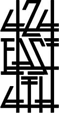


The front facade of the house at 424 East 4th Street is typical ranch house, with one exception - a low brick planter with an angled left slope at the end. The planter is made of roman-style bricks, thinner than standard and pointed to emphasize the horizontal line. This brick was very popular in Frank Lloyd Wright's early work. I exploited that detail and let that dictate the look of the exterior of the house - Art & Crafts style. I call it National Park Arts & Crafts. It has detail from Art & Crafts and the thick column posts from the National Park cabins of the 1920-40s.
The logotype for the house respects the lettering and typography of Arts & Crafts: double horizontal bars and arms in the letterforms, angles that align with other elements, straight horizontal baselines, and individual elements forming a single cohesive unit. The letterforms are created as original elements to respect each other and their position within the rectangle shape. The stacked words allow the 424 at the top to be prominent. The vertical lines align and run through each line of type conveying the unity and strength within the house.

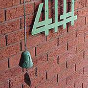
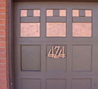

This logomark is a juxtaposition of a diamond and four squares. The four squares are a pattern popularized by the Scottish Art & Crafts designer, Charles Rennie Mackintosh. This pattern is found throughout the house - picture arrangements, bathroom windows, and porch columns. The diamond represents the walls within the house that are turned at a 45 degree angle to the basic house grid. The house is designed on a theme of these two overlapping grids.
The black shapes form 4 arrows spreading out in 4 directions - to represent the open spaces within the house and the fact that one can stand inside the house and look out a window in all four directions.
Logomark design: 1995, Logotype design: 2002

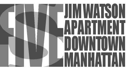

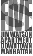
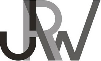
Located in Battery Park City, Jim Watson's apartment 5-S overlooks the Hudson River and serves as a calm respite from the busyness of the city.
The verticality of the condensed geometric letterforms for FIVE represents the skyscrapers of Lower Manhattan. The organic curves of the S represent the Hudson River and Hudson Bay. The overlapping and varying shades of grey convey the somewhat chaotic nature of Manhattan and the layered complexity of experiencing New York City.
The letterforms that spell out Jim Watson Apartment Downtown Manhattan are also condensed for verticality. The lines of type represent the grid of city streets that is common to Manhattan above downtown. 2005
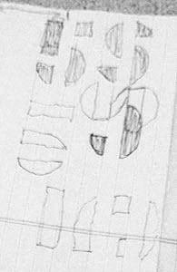
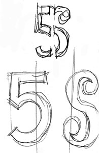


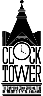


ClockTower Studio was founded in 1988 as the student-staffed design studio at the University of Central Oklahoma. From the beginning, I challenged the students in the group to come up with a better name and create an identity. After a few years of no student submissions, I named it and designed this logo. The name helps tie the studio to the university by recognizing the icon of the campus - Old North - and yet the name, ClockTower, does not specifically state that this is a college group - it could be a professional studio. The clock face serves as the O in Clock. The 4am on the clock hands pays homage to how late students often stayed. The font has a slight industrial look to convey productivity. In the base of the tower is type explaining what ClockTower is. The silhouette is very detailed - you can distinguish individual roof shingles when zoomed in and the hands of the clock have some ornate Victorian details. The stylized silhouette helps keep focus on the text letterforms. The logo is one color to facilitate production and keep costs low. The smaller version, without the subhead type, is used as a mark on posters and projects done by ClockTower students. Named and Logo designed: 1993-94? More about ClockTower Studio.
The owners of The Uniform Shoppe in Oklahoma City wanted to explore updating the identity for their shop in North Oklahoma City. They contacted ClockTower Studio at UCO through a referral. ClockTower's schedule was booked solid, so I took on the project myself.
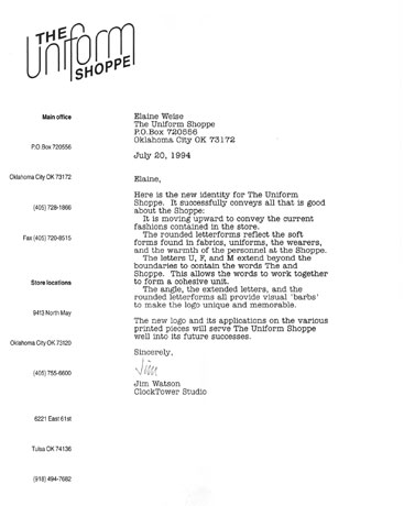
The new identity for The Uniform Shoppe successfully conveys all that is good about the Shoppe:
It is moving upward to convey the current progressive fashions contained in the store.
The rounded letterforms reflect the soft forms found in the fabrics, the uniforms, the wearers, and the warmth of the personnel at the Shoppe.
• The light line weight and curves suggest the forms familiar with clothes hangers.
The letters U, F, and M extend beyond the boundaries to contain the words The and Shoppe. This allows the words to work together to form a cohesive unit.
The angle, the extended letters, and the rounded letterforms all provide visual ‘barbs' to make the logo more unique and memorable.
The new graphics package was presented to the owners of The Uniform Shoppe. One of the two had been skeptical of changing the identity and reprinting the pieces. After the presentation, he enthusiastically agreed to adopt the new look. Pieces were printed and a new sign was produced and installed at the store. Design and production: 1998
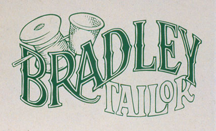
Mrs. Bradley was a self-employed seamstress who came to ClockTower Studio seeking an identity for her new business. While it originated as a ClockTower project, for some reason (that I don't remember), I ended up designing the piece.
She stressed the handmade quality and meticulous stitching in her work. To convey this homey, family emotion, I mimicked a Victorian style graphic. The characteristics of the Victorian era that applied here are, primarily, the undulating baseline on which the letters sit, the decorative outline typeface, the swash on the letter R in Bradley, and the detailed illustration of the thimble, needle, and spool of thread. The word 'Bradley' hangs on the end of the needle to relate the type with the image. I art-directed the piece and do not remember who actually hand rendered the mark. The colors conveyed a natural hand-quality emphasis with the green ink and a warm flecked recycled paper. Date designed: 1990s

One of the clients for ClockTower Studio was a new furniture company in Guthrie with the unusual name of Froggy Bottom. Apparently that was the name given to a particular low-lying area of Guthrie, about 20 miles north of Edmond and Oklahoma City. The shop specialized in original and restored wood furniture. The ClockTower group that semester didn't get to this particular project so I sketched some concepts.
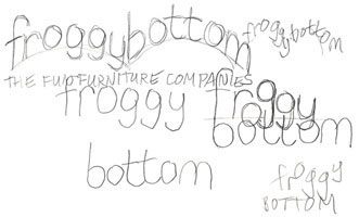
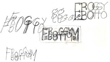
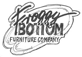
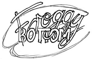


I wanted to avoid the obvious idea of portraying frogs, realistic or cute abstracted, or cartoon ones. I explored those, of course, to see if there was something inherent in those that might be exploited. Didn't find anything. So I explored the connections between frogs, lily pads, ponds, and furniture. The elements of frog feet and lily pads had similarities to the feet on legs of furniture. So the Froggy Bottom letterforms have lily pad frog feet and are arranged on an undulating baseline to provide some hopping motion and organic outdoor asymmetry. There is an implied line designated by the x-height of the Os in the line of type. The strokes of the other letters drop below that implied line as descenders into the depths of a pond, like lily plants hanging suspended in the water. The Furniture Company line of text sits on a straight baseline of sans serif type to provide a base and convey the professional side of the company to counter and offset the playful nature of the Froggy Bottom type. I'm not sure what ever happened to the Froggy Bottom Furniture Company. Below: Sign, Notepad, and Business card. Design & production: fall, 1995
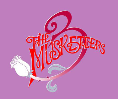
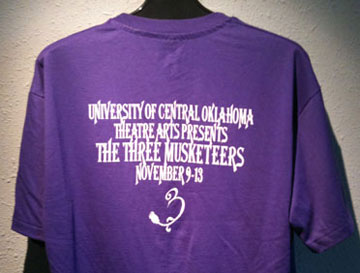
The graphics package for the play, The Three Musketeers, was initially assigned as a project for ClockTower Studios. I stepped in when they were coming up dry. To overcome the creative block, we went to Mazzio's and ate pizza and drank beer. It didn't prompt too many great ideas, but we did have a good time. Eventually, I guided the concept and art directed the piece. The hand-rendered production was by Mitch Baker.
The concept conveys the swashbuckling motion of the Musketeers. The dominant element is the 3 which is enhanced by its stroke evolving into a rose stem with a white rose at the end. The prickly thorn on the stem is offset by the delicate petals of the rose. The magenta background conveys the period richness while the red provides life and action. The poster (below left) for the play was a triangular pennant-shape with the identity filling the top two-thirds with the play info beneath. The pennant is reminiscent of the banners that hung from castles and towns of that era. Designed and produced: 1995
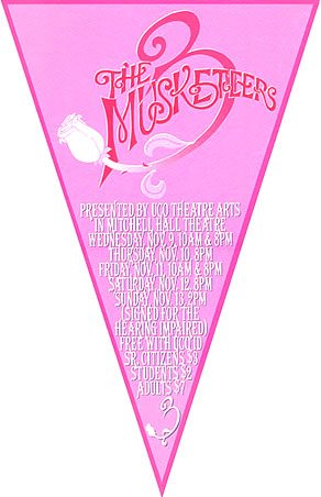
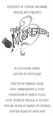
Poster and program cover and title page; t-shirt


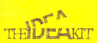
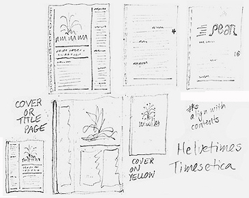
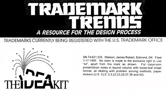
The Idea Kit included information, examples, lists, activities and exercises to help improve creative problem solving skills. It later evolved into a series of essays on this website that addressed the process of creativity and problem solving and the article: 10 tips for better ideas. The identity for The Idea Kit conveys the flow of ideas that spew from the human mind. Freeing and opening the brain allows greater fluency of thoughts and ideas. Design and production: 1993-94. Trademarked: January 17, 1995
Rationale:
• The 10 dots being spewed in the logo represent the 10 major activities that encourage open creative thinking.
• The important word 'idea' is emphasized by setting it in a different font, size, and boldness.
• Idea is set in sans serif for purity and simple uncluttered lines.
• The and Kit are set in a classic serif font to convey the dichotomy of roots (classic serif) and wings (modern sans serif)
• When set in color, vivid green represents positive growth.




In the spring of 1988, the Dean of the College of Liberal Arts requested, from each department, a Ten Year Plan detailing goals and objectives, and needs for the next decade. The faculty of the Department of Art prepared such a plan and during faculty meeting discussions I started doodling a mark for the Plan. I slanted the letters to convey future progress (what the 10 Year Plan was supposed to be about). To create interest and intrigue, I explored a negative shape for the 0 in 10. Then I explored letterform relationships and how they could be rendered as parts or components of a larger phrase to communicate a message just through the type characters. I noticed some unique intersections and ligatures within the words and exploited those in overlapping shapes. The mark ended up as a collection of letterstrokes, lines, and angles that individually retain their identities, yet, when combined into a whole, read as a single title: Ten Year Plan.
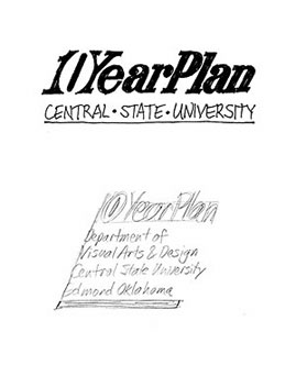

Once I had settled on the single line of ligatured and overlapped letterforms, I began the production sketches. Below is a hand-inked version. The tape is holding paper over an area where I made some changes - the intersection at the top of the T and how the ends of the strokes in the second E should look. Beneath that sketch is the inked mechanical. Prior to computer output, the board was marked up with dimensions and lines inked, areas filled in, and finally, the overlines were painted out with graphic white paint. Then a stat was shot on a POS-1 camera. That image was added to the layout boards with the text type and ruled lines for the completed covers. Design and production: spring 1988





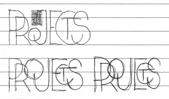
FunEd offers noncredit classes for life enrichment - cooking, personal growth, yoga, marketing, entrepreneurship, etc. They had a contest to select a new logo. The existing one was cliché with a lamp of knowledge and bad type. Using an image was tough since they had classes in a wide variety of subjects, they appealed to a very diverse audience, and class locations were all over Dallas. Instead, I explored manipulating type to from a memorable image. Left: The negative slash visually separates the words yet allows them to remain very close (this was before the FedEx logo). Right: Ruled lines as on a notebook paper and positive and negative space. Well, neither was selected for use, but the judges were so impressed with the marks that they awarded me free tuition in their classes. I took one class on how to become self-employed and took some others just for fun. Designed: 1985

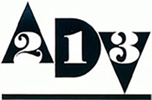
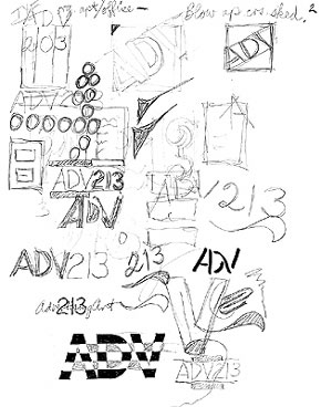
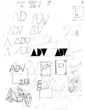
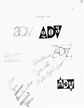
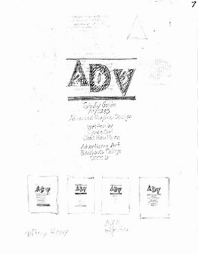
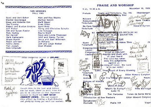
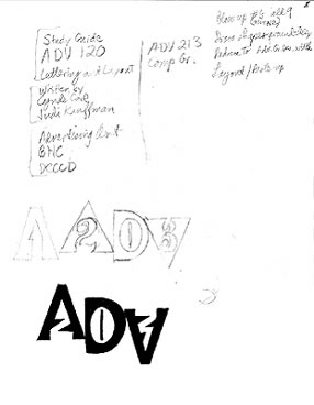
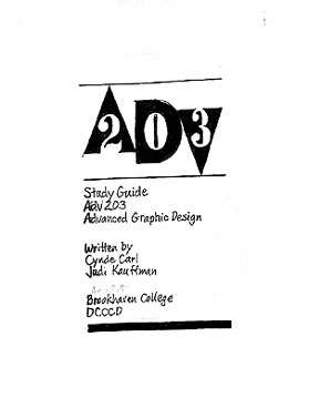
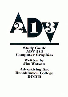
I taught in the Advertising Art program at Brookhaven, one of 7 community colleges in the Dallas area. Brookhaven had the only extensive program in advertising and graphic design. For an identity for course materials, I explored ways to render the prefix ADV, filling the counter of the D at one point. Then I explored solid masses for the letters - they still read okay. Then I combined the sketches of the solid geometric shaped mass with the course numbers inside the letters. That was working but the course numbers looked awkward. I aligned the numbers on a horizontal baseline which offset the ADV letters. I offset the stark geometric shapes with a very pronounced organic curvilinear thick&thin font for the numbers. The tension of balancing on the V was sorta nice. The line beneath provides a stable base for the figures. The identity was used on course materials handed to students in class and available in the college bookstore. It consists of three major components - three stylized contemporary shapes that spell ADV, classic typography with thick and thin forms that spell out the specific course number, and a horizontal line beneath those elements to provide stability and continuity. The combination of the classic numbers and the abstracted letters conveys the breadth of the subject matter and the dichotomy often found in advertising and design.
For the final mechanical I inked the letters and added the typeset numbers, then shot a reverse/negative of that on a Pos-I camera to get the positive image. Design and production: 1985







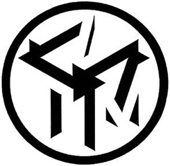
Mensa is an international organization of smart people. To become a member, one had to have an IQ in the top 2% of the population, or to put it another way - to be classified as a genius. A genius is defined as someone who has an IQ of 140 (or 145 - I'm not sure) or above. Just as idiot and moron refer to those with an IQ of 0-25 and 25-50 (again, I'm not sure which is an idiot and which is a moron). Average IQ is 100. Mensa means table in Latin. The national Mensa logo represents a table with a globe above. The Dallas chapter, North Texas Mensa, did not have a graphic identity.
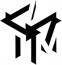
The target audience is sharp, clever, and bores easily. I sketched options that required some deciphering - a puzzle to entice and intrigue the membership. I exploited the initials NTM for North Texas Mensa, even though I later acknowledged the weakness of using just initials in an identity. I arranged the three letters as the faces of a cube - the cube representing a table - and forming a connection to the national logo. Sketching the letterforms showed some common strokes rotating around the corner of the cube closest to the viewer. Pretty cool. The face of each letter was not shown - only the side surfaces of three dimensional letters. This provided the intrigue and puzzle - figuring out meaning to fit these weird black shapes. I explored placing the letter cube within a circle. The circle flattened the mark, made it more two-dimensional. This made it more difficult to see the cube and decipher the letters. I showed the new mark to the club - they were baffled at first, then they started to get it - to decipher the three letters. That excited them - they liked the mark. Design and production: 1979-80



During the backgammon craze in the early 1970s, I designed a round backgammon board that addresses some of the weaknesses inherent in the typical rectangular board. The full story here. The dominant element of the new board was its round shape. That drives this logo. I selected and manipulated a typeface that was quite skinny in its letter widths and in its letterstrokes. That allowed the letter O to stand out. Inside that O I rendered a shadow to convey the depth of the dice well. Inside this well are two dice to help immediately place the identity to the game of backgammon (a dice game). The actual and implied horizontal line running along the top (thru the crossbars of the G and As) respected the mass of the shadow inside the O and drew the viewer's eye to that O. Original design and production: 1976 or 1977,
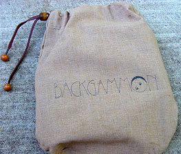
Logo on the bag that holds the pieces, dice, and dice cups. Below: Revised logo for the Ultimate Backgammon Board, July 2012:


Between my junior and senior years of college, I interned in the advertising department at the Dallas Times Herald newspaper. It was a great experience that I thoroughly enjoyed (I was even honored as the Outstanding Advertising Intern for the State of Texas). As I called on accounts, I would often volunteer to redesign their logo or ad. Arnold & Morgan was a locally famous music store in Garland, a suburb of Dallas. They carried instruments, sheet music, and equipment. They had an outdated logo so I offered to present a new identity to them.
The full name of the store was the Arnold & Morgan Music Company. Because that was so wordy, everyone just referred to them as Arnold & Morgan. They were so well known that that is all it took to signify the store. I explored how to include both names in one identity - I used an outline font and a solid font of the same typeface. The solid type carried the weight of the more familiar name while the outline font added the missing parts of the full name. I explored all the icons for music - a staff, notes, a guitar, etc. Most were cheesy and if I was to use some, I might have to use all - to fully convey their offerings. The treble clef serves as a generic music icon and I used it in place of the ampersand to provide a barb, a hook to grab the reader and provide a unique treatment of the letterforms. I also redesigned the format for their newspaper ads to help introduce a new look.
I had made my offer to the manager and promised to show him something the very next day so that, if he liked it, the new logo could run in their next ad, which had a fast approaching deadline. I did the mental assessment and some ideation while driving home and began sketching concepts as soon as I got home. Later in the evening I prepared a comp using rub-on letters, the normal way to comp type in the 1970s. I mounted the original art (Kinko's didn't yet exist nor did computers) on a board and presented it to them the next day. They loved it and used the new identity until they went out of business many years later (probably due to Best Buy or Walmart). Design and production: summer 1973. More info on the internship.

Arnold & Morgan had been a regular advertiser in the Dallas paper but their ads were typical electronic schlock - lots of stuff, no hierarchy or eye flow, and a chaotic arrangement of elements. The layout was typically all the merchandise taking up the bulk of the space and the store name and disorganized contact info and address along the bottom. I explored a new format: putting the major sale items at the top and aligning the lesser items in a row along the bottom of the ad. The logo was in the lower center with the contact info on either side. Flush columns, rules, and white space helped organize the info and provide order and hierarchy.

Pearl was the monthly magazine supplement to the student newspaper at the University of Texas in Austin in 1971. A contest was held to name the new magazine. My roommate, Tom White, won that contest. Very much a music fan, he submitted the name Pearl with rationale: it honors Austin native Janis Joplin, it suggests that pearl would be the 'jewel' of student publications, and that it would contain 'pearls of wisdom'. The new magazine now needed a flag and identity. I had been hired to be an ad sales rep for the new magazine (based on my experience as an intern with the Dallas Times Herald newspaper) and I was asked if I could design the identity.
While the name partly stood for Janis, I didn't want it to convey just her or music, and illustrating pearls of wisdom or jewels would be tough and maybe sorta cheesy. I concentrated on the letterforms and the word. I discovered the round counters in the p, e, and a; that a lower case e upside down is a lower case a; and that lower and upper case letterforms could be mixed without sacrificing legibility of the word. I aligned the free ends of the e and a to visually fill the gap. The letterform relationships create enough intrigue to pull the viewer in to decipher a bit. The curved letterforms were based on a round pearl and the tops of the letters resemble the silhouette outline of a pearl necklace. The new identity was well received by the pearl staff. I even designed the cover for the first issue (hand-rendered comp below). However, now it looks dated - very seventies - with the thick border and the curved corners. Designed: 1971


The University of Texas in Austin has long been associated with its longhorn mascot. While doodling the letters UT and overlapping them, I noticed that they formed the abstract shape of a longhorn head, from the front. One can also perceive the 'Hook 'em Horns' sign and football goalposts. Its probably not appropriate for a collegiate logo but it was a fun exercise. Design: sometime between 1996 and 2002

The School of Communication at the University of Texas in Austin was established in 1972. The school consisted of the Departments of Advertising, Journalism, Radio-Television-Film, and Speech Communication. The new school held a contest for a logo, an identity that could represent the School. One of the Advertising classes I was in assigned a project to enter that contest. I relished the opportunity to make a mark (pun?) on the UT campus. I went through the usual research of communication devices, icons for the departments, and type treatments expressing communication and journalism. Nothing was quite working. I could not find an element to represent each department that could be part of a cohesive identity.
Purging those concepts left me with the realization that the identity should represent the one commonality shared by all entities in the school - the definition of communication. I researched that and sketched ways to graphically show the process of communication. I broke it down into components. Waves of intensity moving back and forth, arrows showing sender and receiver, and other arrows in a circular motion showing the cycle of communication. I refined the sketches into a simple, yet complex mark. The typography that effectively respected the mark is a font called Microgramma. The letterforms have a squared shape that relate to the mark and to the architectural themes of the new building that housed the school.
My proposal, submitted to the Dean's staff, was selected. It received praise for being contemporary, grounded in meaning - there was solid rationale for the design decisions, and appropriate for the School of Communication. The mark was used on handouts, programs, posters and other printed materials throughout the school and university. I doubt it is still in use today at the university. Concept, design, and production: 1974


The concept: The definition of communication represented by:
1. Waves: message, information
2. White arrows: sender, receiver; back and forth
3. Black arrows: the cycle of continuous communication
The shape of the mark and the text was inspired by the mass and the shape of the windows in the new Communications building.
Below are sketches showing exploration of arrows and type. I don't recall what inspired the eureka aha moment of the arrows and the wave lines to represent communication.


Sketches
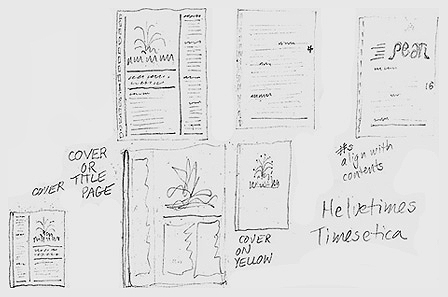
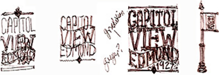

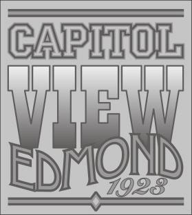
Capitol View was the second major housing development in early Edmond, a suburb of Oklahoma City. The naberhood has houses with character, large mature trees, and is convenient to work, shopping, and highways. At a naberhood association meeting, boredom set in and whop, I started sketching. The concept - a Wood Type Poster layout of a variety of stacked period typefaces - came to mind almost immediately. It seemed to provide the necessary character that one can find in the eclectic mix of architectural styles in the naborhood. The layout is stacked bands of type reminiscent of the Wood Type Poster style that was prevalent in Oklahoma during the time of the 1889 Land Run. The top band CAPITOL represents the university with a collegiate-style typeface, familiar thru its use on letter jackets and team names. The word VIEW is a blocky slab serif font with a Victorian-era gradation within the letters to convey the vista, sunset, and the Oklahoma sky. EDMOND is set in an Arts & Crafts typeface like those popular from 1880 to 1920. The baseline of the line of type undulates, another graphic element from Victorian experimental designers. The rise in the top represents the fact that this area is the highest point between Guthrie and Oklahoma City. beneath the hump is a space for the date that denotes when the area was established as a housing addition. Design and production: November/December, 2006
