
Typography
Semester Calendar (tentative, subject to change)
pdf of Syllabus
In-class
• Discuss people
Review class roster: preferred names
Get email addresses
Discuss the course
Philosophy
Peruse webpages Activities
Review course objectives
Review course expectations
Discuss/explain syllabus
CA magazine
Discuss Weekly Activity Forms
Assignment
Prepare Self-assessment/Autobiographies presentations
Emphases
Overcoming fear
• Speaking up in class
Asking the right questions
Assignment
Read home/design blog
Mind games handout
Essay resources
Affirmations
See if you are eccentric
Assess/examine your life
How to be more intelligent
The design process
Critiquing design
Definitions
Grow as designer
Idea Journal
Learning
Neurobics
Tribute WTC logo
Due
WAF pdf form to print editable pdf form to print
If you haven't yet, email Watson so he'll have your preferred email address
Mind games handout
In class
Discuss WAF activities
• Discuss the mind games handout
Lecture/images on typography
Assignments
• Typography sampler project Info pdf version
• Mind game sheet
Due
• Mind game sheet
In class
• Discuss mind game sheet
Images and lecture
Assignment
• Typography sampler project Info
Due
Neurobics form
Mind games sheet
In-Class
Discuss: Is there a parking problem at the OSU Stillwater campus?
Discuss Neurobic activities
• Discuss the mind games handout
Lecture/images on typography
• Discuss Sampler Project pdf list of items
Essay resources
Affirmations
See if you are eccentric
Assess/examine your life
Design blog
Common sense and a quiz
The design process
Critiquing design
Definitions
Grow as designer
Idea Journal
How to be more intelligent
The Process book
Learning
Tribute WTC logo
The Oklahoma City Thunder OKC logo
Assignments
• Typography Sampler Project pdf list of items
Due
WAF pdf form to print editable pdf form to print
Mind game sheet - Double Dealer
Typography Sampler
In class
Present and discuss Samplers
Discuss Letterform Relationships project
View project images
Assignment
Letterform Relationships project sketches
Due
WAF
Letterform Relationships sketches Info
In class
Present and discuss Letterform Relationships sketches
Discuss the faculty show
Assignment
Letterform Relationships roughs
Due
Letterform Relationships roughs
In class
Sketch and discuss Letterform Relationships roughs
• Select the 1 or 2 best, enlarge them and post them on the board
Present and discuss those roughs
Assignments
Letterform Relationships comp: center the mark on 11" x 8.5" white paper, unmounted
• Mind Game sheet: Dead Letter
Due
Letterform Relationships comp: center the mark on 11" x 8.5" white paper, unmounted
• Results of your letterform mark readability survey - just for your info and input - I may ask about the results, but there is nothing to turn in.
Reminders
Show the mark to as many people as you can - you are too biased to fairly judge readability
Avoid a mark in which 3 letters have simply been grouped together
Avoid being able to replace one of your letters with any of the other 25 letters
Seek a mark that clearly communicates yet requires a little participation from the viewer
Include in the mark some wit, cleverness, intrigue, barb, and memorability
Seek a high level of attention to detail: alignment, neatness, relationships, order
Strive for consistency in stroke weight (if appropriate), point size, pattern, rhythm, gaps, baseline, angles
Inking tips
• Use permanent ink felt/plastic tip markers
Use a ruler or straightedge for even lines
Use pencil or grey markers for tints of black
Sometimes it helps to ink large and reduce on a copy machine (or scan and print) slight imperfections are then minimized
In class
Return/discuss mind game handout
Present Letterform Relationships comps
Discuss the Ambigram project and view samples
Assignment
Select ambigram name, word, or phrase - if not your own name email Watson for approval
Sketch numerous options exploring letterform ambigrammatically
Mind game sheet
Due
Neurobics form
In class
• Determine a symbol for the Neurobics Form
Discuss Typography Sampler project pdf list of items
Lecture/images on typography
Discuss Letterform Relationships project
View project images
Select project letters
Assignment
• Typography Sampler
Letterform Relationships project sketches
Essay resources
The design process
Critiquing design
Definitions
Grow as designer
Idea Journal
How to be more intelligent
The Process book
Learning
Due
Neurobics form
Mind Games handout
Typography Sampler
In-Class
Present and discuss Samplers
Discuss Letterform Relationships project
View project images
Select project letters
Assignment
Letterform Relationships sketches
Due
Sketches of Letterform Relationships
In-Class
Discuss neurobics
Return and discuss Mind Game handouts
Return and discuss Typography Samplers
Review Letterform Relationships sketches
Read ambigrams
Assignments
Letterform Relationships rough sketches
Mind Game handout
Due
Letterform Relationships comp: center the mark on 11" x 8.5" white paper, unmounted
• Results of your letterform mark readability survey - just for your info and input - I may ask about the results, but there is nothing to turn in.
Reminders
Show the mark to as many people as you can - you are too biased to fairly judge readability
Avoid a mark in which 3 letters have simply been grouped together
Avoid being able to replace one of your letters with any of the other 25 letters
Seek a mark that clearly communicates yet requires a little participation from the viewer
Include in the mark some wit, cleverness, intrigue, barb, and memorability
Seek a high level of attention to detail: alignment, neatness, relationships, order
Strive for consistency in stroke weight (if appropriate), point size, pattern, rhythm, gaps, baseline, angles
Inking tips
• Use permanent ink felt/plastic tip markers
Use a ruler or straightedge for even lines
Use pencil or grey markers for tints of black
Sometimes it helps to ink large and reduce on a copy machine (or scan and print) slight imperfections are then minimized
In class
Return/discuss mind game handout
Present Letterform Relationships comps
Discuss the Ambigram project and view samples
Due
Neurobics form
Puzzle mind game #1: present evidence of the solution (photo, photocopy, or puzzle in solved position)
Selected ambigram name, word, or phrase
Sketches of numerous options exploring ambigrams
In class
Present and discuss ambigram sketches
Check out Puzzle mind game 2
Due
Ambigrams rough: inked in black, on 1 sheet of paper, to mount on bulletin board, if more than 1, put each on a separate page
In-class
Return/discuss letterform relationship projects
Present and discuss ambigram rough
Due
Neurobics form
Puzzle mind game #2
Mind game handout
Ambigrams comps: computer printout or inked in black, on one sheet of paper, 11 x 8.5, unmounted
If the word becomes a different word when upside down, turn in a comp for each word.
In class
Present and discuss ambigram comps
Check out puzzle mind game 3
WordPix project Project notes
Due
Sketches of 16 WordPix images
In class
Present, discuss, and refine sketches of WordPix images
WordPix exercise
Due
Final Neurobics form
No more neurobics forms are due for the rest of the semester. Continue to participate in neurobics,
they should become part of your lifestyle until you die. All forms will be due at that time.
Puzzle mind game #3
Mind game handouts
Rough sketches of 8 phenomenal WordPix images, 3-4 per page.
Write the word/phrase depicted on the back only.
In-class
Post rough sketches on the board for discussion and refinement
WordPix exercise
Check out puzzle mind game 4
Due
Comp output of 4 WordPix
In-class
Present WordPix
Due
Puzzle mind game 4
In class
Discuss the Type in the Environment project
Discuss the Pretzel project
Watch the film Helvetica
Due
Pretzel project
In-class
Present and discuss the Pretzel project
Optional help session, computer lab: Photoshop for downloading and cropping photos and poster composition
Due
Type in the Environment posters
Print info
The maximum print size in the computer lab is 11 x 17. These posters need to be larger than that so you will need to take your file off-campus or to the CHES print center (pdf to print out).
Staples can print 18 x 24 for about $20. Allow ample time in case they are backed up so you don't miss the 9:30 deadline. You must save your file as a pdf or a jpg for Staples to open it. Take a flash drive or cd to Staples or submit it online.
In class
Present and discuss Type in the Environment posters
• Discuss Geometric font project
Review Illustrator tutorials
Overview
Drawing tools
Pen tool
Image tracing
Masking
pdf files to print
Selection tools
Drawing tools
Transform tools
Utility tools
Graphing tools
Scanning
In-class
Work on Geometric font project
Bring a flash drive to class to save and store your files
Have a great summer.
Pick up posters in room 305, flat file, top drawer.
Typography
Administration
Discuss Ambigram Project
Email Watson so he'll have your preferred email address
Discuss Ambigram Project and samples
Take Assessment Test over GD1 & Type 1
Conduct more surveys: show rough to people who don't know you to see if the words are communicating clearly. The more input you get, the better your work will be.
Present Ambigram: tight rough or loose comp (whichever phrase you prefer). Consider: line weight, letterstroke width, consistency, baseline(s), stroke angles, etc.
Work on continuity of letterforms to form a cohesive unified ambigram. The more finished your work is on Wensday, the 4th, the better your finished comp will be on the 9th.
Notes on sketching
• Sketches that are obvious - like setting a literal basketball on top of a twister/outlaw/scissortail with type under or next to it - are mandatory at the thumbnail stage. You need to go through the simple and obvious ones - they deserve rendering and consideration. But now you should push your work to go past the obvious. Strive to communicate the message with more sophistication, wit, cleverness, and viewer participation. Avoid work that looks like what a junior high kid would doodle in Algebra class.
Continue to work at integrating type and image. Avoid the 'design-by-committee' look (elements that don't relate) or the look that says, "Oh shoot, I forgot to add the type."
• Explore communicating the team logo by using type only (or primarily type) like Mother & Child, Families, dialog, individual, eclipse, etc. You may not conclude it but you gotta try it. At the least, it may prompt a new direction or an element that might work in a more finished rendered identity.
• Explore how to communicate a basketball using the fewest number of lines or shapes. Many of you will explore including a basketball in the logo - give it a new twist and longer shelf-life by not having a literal rendering of the ball. Sketch ways to make it more abstract and stylized - maybe just a few lines or shapes. Explore how many lines are needed for a viewer to finally get that its a basketball. Provide just enough, no more. More lines than are necessary become clutter, often detract from the focus, and minimize the strength of the message.
Notes on decision making
I realize it may be frustrating, but if you show me a bunch of thumbnails, I'm not likely to tell you which ones are working or which ones have merit. Some students respond with, "well, you're no help" (what they mean is - "I'm too stupid and/or lazy to decide and I want you to do it for me"). I believe that I help you by not telling you which ones are the best. It helps you become a more intelligent, assertive, and confident decision-maker. Becoming a better designer is about becoming a better decision maker, and therefore, a better creative problem solver. If I decide which ones are good, I deprive you of the process of understanding, analyzing, debating, and concluding. You have probably been conditioned to 'please the teacher', but if you ever tell an interviewer or client, "This one works because my teacher said so," you may brand yourself an idiot. If becoming a successful idiot is your career goal, then tell me so I can make it easier on both of us and make all your design decisions for you.
Decide if you wish to be fair, good, or great. "To be good is not enough if you dream of being great".
Rough sketches
Remember it is at the rough stage of the process that all design decisions are made. Thumbnails are for non-judgmental exploration sketches and the comp is simply preparing the most successful rough sketch into presentable form. While you should avoid judgment at thumbnails, at the rough stage you must pass judgment and make decisions, based on the list of objectives. Review the target market(s), the list of objectives, and the results desired to help you determine which thumbnail ideas will be the most effective solution to the problem. The rough sketches serve to help you refine all elements - color, composition, font, point size, format, style, etc.
Bartlett Signage project
Assessment:
Target audiences
Objectives
Emphases: font selection, layout, composition, kerning, and appropriateness, clarity, and effectiveness of message
Areas to address
East stair foyer
West stair foyer
VRL foyer
Stairwells: East and West
Hallways, Award wall
Office door in Gallery
West Exterior door
North Exterior door
Components
Entry directories
Wayfinding signs
Information signs
Room designation signs
Bulletin boards
Recycle bins
Bartlett Signage project
1. Concept/theme/direction
2. What attitudes, feelings, and/or impressions the new look should convey to the building user
3. Color, type, layout
Team schedule
1:00-1:20 Wingdings
1:20-1:40 ERR:
1:40-2:00 JEL
2:00-2:20 Dramatic Pause
2:20-2:40 Pencil 2 Paper
2:40-3:00 Dirty Turtle
Bartlett Signage project
Concept statements
Production decisions: layout, type, symbols, colors
Team schedule
Bartlett Signage project
Production, output, finalize design decisions
Draft of specs for future signs (typeface, pt sizes, colors, materials, composition)
Team schedule
1:00-1:20 Wingdings
1:20-1:40 ERR:
1:40-2:00 JEL
2:00-2:20 Dramatic Pause
2:20-2:40 Pencil 2 Paper
2:40-3:00 Dirty Turtle
Return/discuss ambigram projects
Discuss Bartlett Signage presentation formats
Team work time
Review/critique Bartlett Signage presentations:
Bring draft (or finished) printouts of each component to prepare presentation compositions
Discuss next project
Team work time
Text block info
Somewhere on the board, place a block of info that includes the title, the concept statement, any explanatory rationale, and the specs. The look of this text should respect and enhance the elements in the project (use the same primary or secondary typeface, colors, layout, etc.) Sample info:
Bartlett Center Signage
The concept for the new program of wayfinding and informational graphics is _____.
The directory provides a quick glance _____.
Each floor is color coded to enhance _____.
The symbols are hand-rendered _____.
The typeface mimics a robotic style of organic gardening _____.
Project Specs
(Color palette)
Materials:
Primary typeface:
Secondary typeface:
Layout composition: 2" symbols with text copy set centered beneath
Presentation display
Mount projects in the display case by 2:00pm. Class will not meet until 2 in case you need the hour from 1:00-2:00 for mounting. The cases are open now and will be available all weekend if you want to check the size or mounting capabilities. There are 3 cases, 2 projects per case. Allow about 4-6" between the two projects in the case. The height of the space available is 54" and the width available is 30" You do not need to use all of that space, just don't go larger than 30 x 54. As part of your text, list the students in your team. You do not need to list the team name you came up with - just the student names.
Class 2:00
Informal discussion presentations of Bartlett Signage proposals:
Theme, concept, unifiers
Rationale for major design decisions
Discuss next project: book cover design
Text manipulation project
Most information messages are communicated through text, often large blocks of text. These blocks/groups become visual elements whose layout contributes to the effectiveness of a piece. Designers manipulate text for two main reasons:
1. Enhance the visual appeal of the piece
2. Improve readability.
Learn to see blocks of type as a mass to be molded and formed into shapes. Manipulate copy blocks to enhance the comprehension of the message.
Open the file Text block - fact sheet and manipulate the copy to meet the two main objectives listed above. Assume the information will be used as an response to inquiries about the Department of Design. Create an appropriate layout composition.
Column width, Hyphens, Margins, Line breaks, Format, Widows, Point size, Condense/extend, Letter & word spacing, Tracking
Use only the text provided.
Size of piece: 81/2 x11 or 11x81/2
Thoroughness of manipulation.
Attention to detail.
Turned in on time.
Practice improving readability.
Break information into logical units.
Improve your eye for attention to detail.
Sampler project 1
Typography (‘writing with type') is the study or science of manipulating alphabetic characters. Even though visual symbols are becoming more popular, prevalent, and necessary, most of the information humans receive is still in the form of the written word. Sophistication in type literacy is especially necessary due to the greater variety of options available in desktop publishing. Designers manipulate letterforms to create a more efficient understanding of a message. Designers need to understand the many nuances of typography to better manipulate letterforms, words, and paragraphs to create a more efficient understanding of a message.
“Great text typography doesn't get noticed because the reader is too busy reading the message."
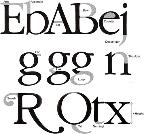
alignment, arm, leg, ascender, bar, baseline, bowl, bracket, cap height, condensed, counter, descender, diminuendo, drop cap, em-dash, en-dash, extended, family, flourish, font, hanging punctuation, hot type/cold type, hyphenation, indent, initial cap, italic, justified, kerning, leading, legibility, letterspacing, ligature, oblique, oldstyle figures, orphan/widow, parenthesis/brackets, point size, raised cap, reverse, serif, shoulder, small caps, smart quotes, stress, stroke, swash, tail, terminal, thick/thin, tracking, typo, weight, word spacing, x-height.
1. Roman serif
2. Egyptian serif (slab or block serif)
3. Sans serif
4. Script (cursive)
5. Decorative (miscellaneous)
1. Serif ends
2. Brackets
3. Letterstroke width
Weight: light to bold or heavy
Width: extended to condensed
Read first: headline or display
Read next: subhead
Read next: body copy or text
Point: typefaces, 72 pts = 1"
Picas: line length and column width, 6 picas = 1"
Inch: column height
Maintain character identity but relate as a unit.
View sideways or upside down to test.
Kerning, letterspacing
Word spacing
Leading
Ligature
1. Justified
2. Flush left, ragged right
3. Flush right, ragged left
4. Centered
5. Asymmetrical
6. Wraparound
7. Image shape
ALL CAPS
CAPS/SMALL CAPS
all lower case
First letter of first word only
First Letter of Major Words
First Letter Of All Words
Improving comprehension
Guideline suggestions:
Black on white (or yellow)
U&lc
Large x-height
FLRR setting
Medium weight
No extreme thick and thin
Serif fonts
Line length: 39 characters
Tight letter and word spacing
Layout orderly, aligned, and sequential
Type and typography appropriate for reader, message, and medium
Sampler project 2
Study the typography of headlines and body copy to see letters and the setting of type as elements for communication. Find a clear sample for as many of the items in the Search List as you can. One ad or editorial layout may contain several items from the list. Mount them all neatly on paper. You may mount several samples on one page. Clearly label each sample. Design the presentation to most effectively communicate the samples.
Page size, paper color, paper weight, layout composition, labeling format, and binding: reasonably appropriate.
Samples must be from a newspaper or magazine ad or editorial (no textbooks, phone books, catalogs, nor design books).
Show entire ad or article, not just a portion.
Samples must be from copy or text. Logos do not count.
Lists do not count as samples of centered or justified.
All specs met precisely.
Project turned in on time.
Grade 1, quantity:
Each correct item is worth 3.5 points (105 total, find 26 of 30 for an A).
Grade 2, presentation:
Neat mounting and binding.
Well designed page layout composition, title page/cover.
Labeling shows efficient and clear communication of the intended message.
Understand terms and concepts of typography.
Understand design elements of typography and setting type.
Organize information for effective communication.
Critique good and bad typography.
Provide inspiration and influence.
__ Roman serif display face
__ Egyptian serif headline
__ Sans serif display type
__ Cursive display
__ Decorative headline
__ Body copy set justified: less than 12 pica column width
__ Justified body copy: set in 24 or more picas
__ Flush left, ragged right block of text
__ Flush right, ragged left body copy
__ Body copy set centered
__ Text set asymmetrical
__ Text: at least one side set wraparound
__ Text: image shape
__ Body copy set with very loose leading
__ Text copy with leading set very tight
__ Tight letterspaced display type
__ Loose letterspaced display type
__ Headline in an extended face
__ Condensed face headline
__ Display: caps/small caps, 6+ words
__ All upper case headline, 6+ words
__ All lower case headline, 6+ words
__ 6+ word headline with only the first letter of the first word capitalized
__ 6+ word headline with the first letter of all major words capitalized
__ 6+ word headline with first letter of every word capitalized
__ Ampersand
__ Any face set bold
__ Any type set in italics (not cursive)
__ Display type set in reverse
__ Distinct designed ligature
Sampler project 3
Great designers constantly hone their skills and design sense by analyzing, critiquing, and improving the world of type around them. Practice analyzing with a critical eye to spot inappropriate and improper uses/abuses of typography.
Search newspapers, magazines, flyers, web pages, and posters. Collect numerous examples of poor typographic decisions from the search list below. Group them together and label their offense.
widows, rivers of white, poor letterspacing, bad word spacing, bad line breaks, inappropriate font selection, poor use of font set in reverse, poor use of case, poor contrast between type and background, misspelled words, incorrect punctuation, poor use of copy set justified, Macrapified type, any other abuses of typography
Improve your critical eye.
Practice proofreading.
Improve attention to detail. Evaluation
Quantity of found items found from list.
Quantity of samples from each item on list
Clarity of samples found.
Neatness of presentation.
Turned in on time.
A pretzel font
New typeface fonts are designed and put into circulation every day. Designing a new typeface often requires the use of a computer to refine the elements. This project requires you to design a new font using only natural materials - in this case, ordinary pretzel snacks.
Create and present a complete font of characters using only commercial pretzels. Peruse the bag of pretzels to find the basic shapes that best convey letterforms. Design the layout composition and securely mount the pretzels on any size or color of mat board.
Use only store-bought pretzels, salted or unsalted - they do not have to be name brand pretzels.
The pretzel size can range from small to the size from Auntie Anne's in the mall.
Use only one pretzel piece per character.
You can chew or cut parts of a pretzel away to form the character.
Do not rearrange any parts of the pretzel piece.
You cannot add to or embellish, in any way, a pretzel piece.
If a piece breaks, you may glue it back together.
• Each of the above specs met
Each character clearly communicated
Effective presentation: consistency of font components, well-designed layout composition on board
Execution: neatness, craftsmanship, little glue showing
See typographic possibilities in ordinary objects and products.
Discover unique ways to communicate font characters.
Enjoy a salted snack, guilt-free, as a class assignment. Maybe even eat a pizza or drink a beer with the pretzels.



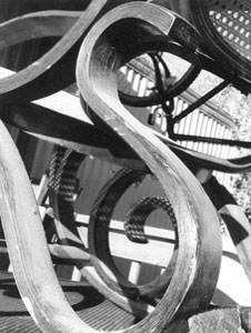
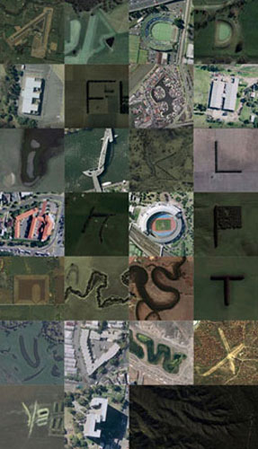
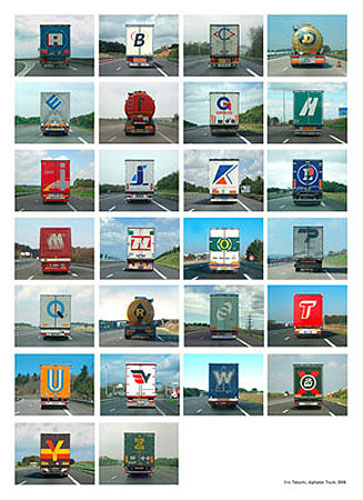
Type in the environment project
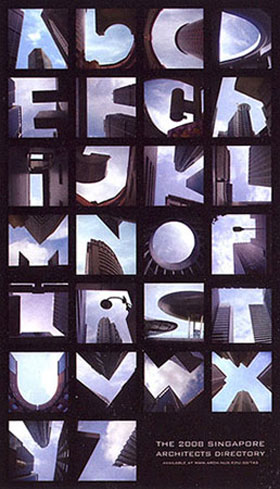
The 26 letterforms of the Roman alphabet and and 10 Hindu-Arabic numbers have become icons in their own right. Each is totally familiar and can be rendered in almost an infinite number of ways. Observant designers often spot how natural and man-made structures can communicate enough visual cues for the viewer to recognize an alphabetic letterform. This project is to develop a collection of photographs of letters as found in nature and in man-made structures. It is an exercise in observing the environment and seeing possibilities.
Seek or notice how letterform cues can be found in environments that were not intended to convey letterforms. Explore what elements are necessary to convey a letter - shape, line, angle, composition. Look at negative spaces, shadows, patterns, texture, and architectural elements for letterforms. Photograph those that clearly convey a letter (a high resolution camera will provide better images - you can check one out from the VRL). Develop a complete set of the alphabet from images found in nature and in manufactured structures. Mount them all neatly in a poster layout or download them and compose the poster on a computer. Compose the presentation to most effectively communicate the images. Include a thematic appropriate title for the poster.
Do not arrange objects to make a letter or number. The characters must be formed without your input.
No image can be of an intended letterform or number.
Do not use the same visual image for more than 1 character (like the M and W).
Do not rotate or change the orientation of an image. If necessary, you may rotate it slightly to improve alignment.
You can crop the images, but don't stretch or manipulate them in Photoshop.
Color of photographs: open - B&W or full color.
Poster size: 18" x 24".
• Paper color, paper weight, layout composition, title format: open and reasonably appropriate.
The maximum print size in the computer lab is 11 x 17. These posters need to be larger than that so you will need to take your file off-campus.
Staples can print 18 x 24 for about $20. Allow 2 hours in case they are backed up so you don't miss the deadline of 3:30 on Monday. You must save your file as a pdf or a jpg for Staples to open it. Take a flash drive or cd.
Each of 26 letterforms and 10 numerals clearly conveyed
Unique and unusual sources for the letters
Consistent theme, composition, or content in the photos
• Neat and well-designed poster presentation
Understand visual cues of alphabetic characters
Learn to see and observe design elements in the environment
See the world with a new perspective
Practice producing professional presentations
Provide inspiration and influence
Letter-Photo website
Alphabet Pix website



Images by Clinton Fields, 2006
Note: The layout does not have to mimic the following - they're just examples.


Letterform Relationships project
Typography is often used to create a memorable image in design. This project requires you to study 3 selected letters and develop a mark that clearly communicates the 3 letters in the proper order and cleverly acknowledges their letterform relationships. The simpler a mark is the more easily and efficiently it can be understood. A touch of wit or a unique image can help prolong its shelf life. Sometimes, it is good to provide a bit of controlled annoyance or discomfort to involve the viewer who must then participate to understand the mark.
Explore numerous design options to develop a great mark for the letters selected. Sketch numerous thumbnails. Analyze and explore thoroughly each letterform: what actually defines it, how is it recognized, what makes it unique, etc. See the letters as shapes made of different elements. Explore thoroughly each letter.
Sketch the letters in many varieties of categories, families, and typefaces: weights, widths, caps, lower case, serifs, swashes, italics, etc. Look for unique counters, bars, arms, and thick and thins (all of these will differ with each face you explore). Look for coinciding angles, lines, and curves. Manipulate the letters in a variety of arrangements. Strive for some clever innovation. Draw concepts: exhaust all possibilities of arranging the letterforms (40-80 thumbnails).
Develop the best sketches into roughs. Refine all design decisions: faces, relationships, negative space, weight, placement, spacing, etc.
Ink a finished comp. It may be easier to ink it large and reduce it on a copy machine. Trim the copy or mount the comp neatly on a board in a well designed layout composition.
1. All three letters must be correctly read in their proper order
2. The mark should cleverly exploit the unique relationship inherent in the 3 letterforms to aid memorability.
Specs followed precisely.
Finished comp turned in on time.
Concept: memorable, intriguing, innovative, and witty interplay of letterforms.
Communication: letters easy to understand.
Execution: strong presentation composition of marks; crisp inked corners and curves, consistent line widths, etc.
Size of mark: about 6"
Image/ink color: black
Color of background: white
Become more familiar with typefaces.
Explore letterform relationships: see letters as shapes to be manipulated and not just as alphabetic letters to be read.
Appreciate the complexity of fonts and alphabet letterforms.
Clearly communicate the message with little confusion.
Practice inking letterforms.
Improve attention to detail.
ascenders
calligraphic
capitals
counters
curved lines
descenders
diagonals
dimensionality, 3D
geometric shapes
horizontal rows
horizontal strokes
letter impregnation
ligatures
lower case
mirror imaging
mixed families and faces
negative space
overlapping
perspective
positive space
repetitions
reverses
sequential
serif and sans serif
script
skewed
stairstep
stress and emphasis
stroke widths
swashes
thick & thins
variety of fonts
vertical strokes
vertical stack
weights
x-height
WordPix project
A WordPix is a typographic illustration of a word or phrase. The meaning (message content) of the word or phrase is clearly communicated through the type and the clever manipulation of the letterforms.
Create, develop, comp, and print some impressive WordPix roughs for a variety of phrases. You may add some minor illustrative elements to a letterform, but do not rely on the illustrations to achieve clear communication. The type should be the main vehicle for communication. Strive for some clever humor: wit, puns, gags, etc. Test them on non-design majors to determine which ones most clearly communicate the intended message. Select the most effective and render a finished comp. Use a legitimate typeface and render it accurately (except for the letterforms that are altered or manipulated). Design an effective and appropriate layout composition. Write, on the back only, the word or phrase depicted. The WordPix will be read in class.
Size of paper: 11" x 8.5" or 8.5" x 11"
Size of WordPix: reasonable
Color and composition format: open
Active participation in critiques: proper grammar and vocabulary; assertive, positive, confident, and enthusiastic.
Turned in on time.
Concept
Original and unique WordPix.
Not dull, boring, nor obvious.
Thorough exploration of options.
Intriguing, clever, and witty interplay of letterforms and typographic image.
Communication
Typeface appropriate to content.
Legible, readable, and understandable.
Very clear typographic communication: little or no illustration.
Communicate using only manipulated typography.
Appropriate letter and word spacing.
Intelligent use of design principles.
Execution
Specs followed precisely.
Appropriate materials and size.
Neat inking: crisp, smooth, aligned, consistent.
Pleasing composition of mark on paper.
Neat and clean presentation.
Become more familiar with individual typefaces.
Practice selecting appropriate fonts and altering letterforms to clearly convey a message.
Enhance skills in clear communication,with little confusion.
Enhance creative problem solving skills.
Explore letterform manipulation.
Appreciate the complexity of alphabet letterforms.
Determine appropriate and pleasing layout compositions.
Practice inking letters.
Provide a portfolio piece for the Proficiency Review.

Answers to the above samples
Musically inclined
Blood is thicker than water
One in a million
Split pea soup
Tea for Two
Last, but not least
Space Invaders
Geometric font project
Designing a new font encourages the designer to pay attention to what lines and arcs are necessary to clearly communicate a letterform.
Design, build, and print a font that meets the specs below. The font should consist of 26 letters and 10 numerals (do not include punctuation).
Arrange the alphabet in a well-designed composition and print out the paper, unmounted, to turn in.

Use only the 6 lines as shown above
Each line must have a thickness of 4 points
Line ends may be any shape
Horizontal and vertical lines must be 1/2" long
Arcs must be from a circle with a 3/4" diameter
You may use multiple lines per letter
You may overlap line elements
Do not rotate any line
Do not delete any part of any line element
MacLab procedures
__ Access to the lab
__ Booting up, logging off
__ Clearing desktop, saving files
Operation functions:
__ Intro to the software
__ Creating a new file
__ Opening files
__ Saving files, 'Save as'
__ Printing a document
Work environment
__ Menu bar
__ Toolbox palette
__ Artboard, live area
__ Undo, redo
__ Format options: preview, outline
__ Magnification
__ Cut, copy, paste; clone; duplicate
__ Group & Ungroup
__ Grid, Snap to Grid
Rendering functions:
__ Creating a path, pen tool
__ Creating an arc
__ Anchor points
__ Size of line: width, length
__ Setting guidelines
__ Snap to guide
__ Ends of lines
__ Drawing true circles
__ Grid alignment
Communicate letterforms within restrictions
Design a unique font
Use design principles of alignment, consistency, and uniformity
Practice layout composition
Practice operating Illustrator software
Practice using rendering functions in Illustrator
Easy readability of letterforms
All specs met
Neatness of presentation
Appropriate and well-designed layout composition
Demonstrated proficiency in Illustrator
Turned in on time
New character project
The common Roman alphabet began as a set of marks that represented objects of value. People learned to associate the mark with a letter and group those symbols into units called words. Soon, this set of symbols was adopted by societies as the primary marking medium to communicate thoughts. The number of characters fluctuated depending on the culture in power and its needs. The alphabet is still evolving. There is no reason to assume it has stopped with 26 characters.
Analyze and refine the Roman alphabet: delete any letters that are unnecessary. Determine a new character (or characters) that should be added to the alphabet. The added letters must solve a communication problem for use in writing and ease of reading. Determine where in the sequence of letters (a-z) the new letter belongs. The new character should fit in with the existing alphabet. Consider stroke widths, counters, serifs. Produce a letter-size page showing only the new character. Develop, refine, produce, and print out three complete alphabets (with the new character) in at least one font of each of the following categories:
1. Garamond, Bookman, or Times Roman
2. Futura, Helvetica, or Universe
3. Any script font
Size and orientation of character paper: 81/2 x11
Size of alphabet presentation: open
Orientation of alphabet presentation: open
Explore alphabetic letterform symbols.
Assess the strengths and weaknesses of the current Roman alphabet.
Develop a character(s) that is appropriate for the existing alphabet.
Thorough assessment of the alphabet.
Appropriateness of the new character.
Well designed letterform character.
Pleasing layout composition.
Thurman Thomas
Krismas
ghoti = fish (laugh = f, women = i, action = sh)
Do we need the letter 'x'? (eks, or z)
Spacing project
To efficiently communicate a message, typographers and graphic designers see and manipulate letters as design elements; analyze letterform characteristics to determine how they relate to each other and to other design elements; understand letters as symbols for communication. This project includes turning in two printouts with 3 lines of text on each page - in different faces, settings, and sizes.
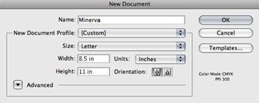
Set up 'New' pages according to the specs below.
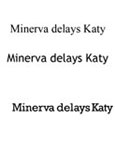
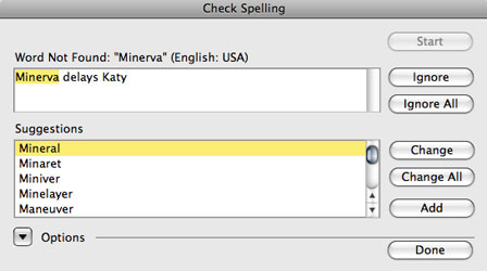
Set text of two different headlines - Minerva delays Katy and Two for one sale. Create and set all type in one text block. Repeat each line of copy on 3 parallel baselines according to the specs below. If a particular specification is not stated, then you may use your best judgment. Design the composition and space the letters and words for maximum comprehension.
Paper size: 14"x8"
Paper color: white
Ink color: black
Text line 1: Helvetica bold, 72pt, UC
Text line 2: a cursive font, 48pt
Text line 3: slab serif font, 54pt, all caps
Leading: 140 points

Paper size: 8.5"x11"
Paper color: white
Ink color: black
Text line 1: 56 point Times New Roman bold, U&lc
Text line 2: a decorative font, any point size
Text line 3: sans serif font, 48pt, all caps
Leading: 200 points
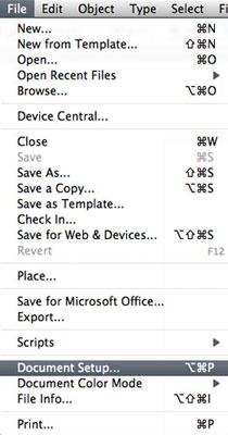
__ Document setup
__ Font selection
__ Point size
__ Leading
__ Kerning
__ Tracking
__ Baseline shift
__ 'Option + arrow key' kerning
__ 'Create Outlines': manipulate letterforms
__ Spell check
__ Grid, Snap to Grid
__ Grid alignment
File - Document setup Window - Type - Character Type - Create outlines
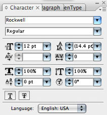
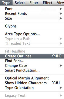
Edit - Check Spelling

Appreciate the complexity of alphabet letterforms
Create appropriate letter and word spacing relationships
Practice design principles of alignment, consistency, and uniformity
Create a well-designed layout composition
Practice using Illustrator software
Acknowledge and adhere to specs
All specs precisely followed
Clarity of legibility and readability
Correctly spelled copy
Appropriate kerning, word spacing, and leading
Neatness of presentation
Appropriate layout composition
Demonstrated proficiency in Illustrator
Turned in on time
Type quote poster
One of the oldest advertising media, the poster grew in popularity during the Victorian era as new printing technologies allowed for mass production of larger handbills, fliers and posters. It rapidly became an effective way to communicate to a wide audience. The poster again hit a peak in popularity in the early 1900s as Art Nouveau flourished and again in the 1960s-70s. Even with the variety of media available today, the poster can still be a viable and effective means of conveying a specific message.
This project requires you to do research about words of type wisdom; and develop an effective poster that communicates a specific message or philosophy about design as stated by a nationally known figure. The poster will be aimed at college-age design majors.
Read and be inspired by words of wisdom.
Practice effective layout composition.
Make appropriate font selection decisions.
Find and study significant quotations about design from nationally known figures.
Assess the topic - set objectives the poster should achieve; all posters should achieve these three objectives (and usually in this order):
Get attention
Convey information
Incite action (in this case - to educate and inspire the reader)
Conduct the Input/Research step of the Design Process: check the internet, go to the library, read your design texts (except Type Rules!), and look through CA and Print. Find a quotation from someone, preferably a designer, that relates to some bit of wisdom about type, the design of type, the use of type, or communicating a message. Research the author, the medium of posters, and the intended audience as thoroughly as possible.
Note: if your mind begins to conceptualize ideas - let it. Jot those thoughts down or sketch them. While your brain may not have all the information yet, avoid allowing barriers to intervene in your creative process. Sketch concepts for a poster that use only type or manipulated type to enhance the message.
Finalize design decisions while rendering rough sketches. Develop a composition for the designer's quote that respects and enhances the content of the message. You may use illustrations, photography, and other images if they help convey the meaning of the quotation, but images are not required nor necessary. Select a font, colors, and layout composition that respect the content of the message. Include the designer's name on the poster. Organize the information, the text words and optional images, into a strong visual presentation. Create a poster that would be appropriate and good enough to post in the graphic design room in this building. The quote and your layout and typography treatment should serve to inspire future designers about type.
Create a finished comp for presentation.
Link to some quotations relating to design, creativity, problem solving, and typography (do not use any of the quotes from Watson). You are not limited to using only this one resource.
There are many ways for a poster to get attention - type, color, shape, size, image, words, etc.
Avoid locking into a strictly 'standard' size and shape of poster.
Consider the POV of the poster reader.
Craft the layout of the words for efficient & impactful clarity.
Lay out the info: consider contrast, alignment, proximity, repetition, relationships, eye-flow.
Pay attention to detail: kerning, baselines, font selection, image.
Explore effective powerful text specs to grab the reader, shake them up, and persuade them.
Experiment with how to break through the clutter of mundane numbing messages (pretend you're at a club where the music is loud - someone walks by and you have to scream a message so powerful that they have no choice but to stop and take notice; the bulletin board full of fliers and posters is the 'noise' of the club and your poster must do the screaming.)
The quote should have impact, be enlightening and inspirational, and help educate students of design
Size of poster: no larger than 11" x 17"
Orientation: landscape (horizontal) or portrait (vertical)
• Color, typeface, layout format: open
Images: use type only
Dress somewhat professional - look nice
Write out and rehearse what you want to say
Avoid 'uhm', passive language, and negative comments
Suggested agenda
Pin the poster to the wall, read the quote
Give brief details about the author
Discuss the quote
Why you selected it
Why the quote is significant
Why the message is inspirational to design majors
Discuss/justify each design decision:
Font choice
Font color
Case
Point size
Spacing
Type manipulation
Layout composition
Images (if any): rendering style, colors, etc.
Conclusions
How design decisions are appropriate to the quote
How design decisions are appropriate to author
Clarity of communication - Appropriate use of typography to enhance the communication of a message.
Inspirational content message and layout
Appropriate typeface(s), point sizes, and case.
Depth of exploration
Well designed layout composition.
Appropriate kerning, word spacing, and leading.
Presentation materials neatly executed and presented.
All deadlines met.
Analyze, state, and solve a design problem
Create an effective graphic communication solution
Develop type and images that clearly communicate
Practice and refine comp preparation skills
Play poster project
Some posters for performing arts events just announce the show info, others go beyond that and entice. This project is to design a poster to entice - to encourage attendance through intriguing text copy and images; provide a strong reason(s) why someone should buy a ticket to see the play.
Some people will not go see a play no matter what message is communicated on a poster (unless its offers of money or threats on the reader's family), others will go no matter what the poster conveys - they are the fanatic theatergoers. This poster is to persuade the large group in the middle to consider entertainment options and purchase a ticket to spend an evening (or afternoon matinee) at the theater.
You may add additional information to help persuade the poster viewer to buy a ticket.
Title of play: either Doubt or The Farnsworth Invention (pick one)
Author
Locations, dates, & times
Seretean Center, Stillwater
May 14-16, 8:00pm
May 17, 2:00pm
Brady Theatre, Tulsa
May 21-23, 8:00pm
May 24, 2:00pm
Plaza Theatre, Oklahoma City
May 28-30, 8:00pm
May 31, 2:00pm
John Denney Playhouse, Lawton
June 5-6, 7:30pm
June 7, 2:00pm
Tickets: $20 - one price for each seat and for each patron
Purchase options
Call (800)-OKIEREP (654-3747)
www.oklahomarep.com
At theater box office prior to performance
A disclaimer advising the potential theater-goer that the play contains adult subject matter
Sponsor logos
Bank of Oklahoma
Chesapeake Energy
Tulsa World
The Oklahoman
Presented by Oklahoma Rep
Oklahoma Repertory Theater is dedicated to presenting recent Broadway plays in Oklahoma
Size: no larger than 11" x 17", either landscape (horizontal) or portrait (vertical) orientation
Colors: Full color
Quantity: 500
The Cheese Monkeys book cover project
Inks: 4-colors +2
Size: front and back: 5.125" x 7.5", spine: .75" x 7.5"
Paper stock: open
Front cover contents
"National Best Seller"
Title and subtitle
Author
Back cover contents
ISBN info box: category, ISBN numbers, bar codes with UPC numbers, USA and Canada prices
Publisher logo
Publisher web address
Spine contents
Title
Author
Publisher
Somewhere on front, back, or spine
At least 8 reviews with sources credited
Cover design credits
The Book Design Review
Covers
Wikipedia
Google Book Search
Book design By Andrew Haslam - Good info in the preview
By Its Cover By Ned Drew, Paul Sternberger, Paul Spencer Sternberger
Test review items
ampersand, arm, ascender, bar, baseline, bowl, bracket, cap height, counter, descender, flourish, font, italic, reverse, shoulder, small caps, stroke, swash, tail, terminal, thick/thin, tracking, typo,typography, x-height.
1. Roman serif
2. Egyptian serif (slab or block serif)
3. Sans serif
4. Script (cursive)
5. Decorative (miscellaneous)
1. Serif ends
2. Brackets
3. Letterstroke width
Weight: light to bold or heavy
Width: extended to condensed
Read first: headline or display
Read next: subhead
Read next: body copy or text
Point: typefaces, 72 pts = 1"
Picas: line length and column width, 6 picas = 1"
Inch: column height
Maintain character identity but relate as a unit.
View sideways or upside down to test.
Kerning, letterspacing
Word spacing
Leading
Ligature
1. Justified
2. Flush left, ragged right
3. Flush right, ragged left
4. Centered
5. Asymmetrical
6. Wraparound
7. Image shape
The test here may include some mind games to solve. They will be simple to solve during the test time.
www.jamesrobertwatson.com/typographycourse.html