
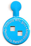
Poor logos for the Tribute WTC Visitor Center and Project Rebirth
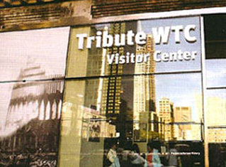
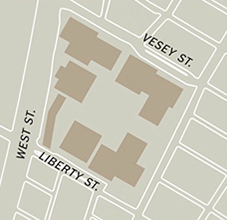
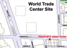
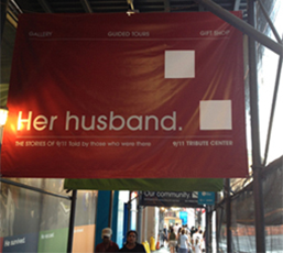
Visitors have been flocking to the site of the World Trade Center since soon after 9/11. We have a need to connect to a historic site by seeing it firsthand - to learn, to remind us of what happened, and to leave something behind. A private organization, September 11th Families Association, opened the Tribute WTC Visitor Center across the street from where the South Tower stood. They have done a good job of presenting the timeline using quotes, pictures, and a few artifacts. There is video and wall text displaying all the victim's names. There are boxes of tissues scattered around and a room where the visitor can write comments and share stories. They even offer walking tours around the site conducted by survivors with stories to tell.

However, the logo for the Tribute WTC Visitors Center is weak. While parts of the logo identity are good - white squares representing purity and a void or a loss; light blue conveying peace and serenity; and text type encircling the squares for security, protection, and an eternal cycle. The intent was for two white squares to represent the footprint patterns of the two WTC towers (as confirmed by a Tribute WTC official). But, the orientation of the two towers is inaccurate. The only way to see the tower footprints as depicted in the logo would be to lie on the ground and look up (like a person in a grave looking up - that's the inappropriate part). This is not a good image to portray for the tragedy and sorrow of 9/11.
The correct tower orientation
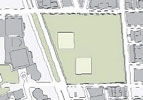
1. Before construction. 2. The WTC campus. 3. The current 9/11 Memorial, Museum, and office towers.
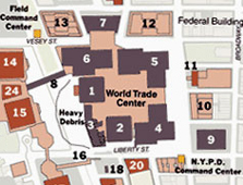
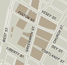
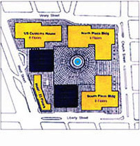
Left: On the brochure from the Tribute WTC is a map showing the correct locations of the towers. Right: Map showing towers 1 and 2 (3 was the Marriott Hotel; 4, 5, 6 were the 9-story black buildings; and 7 was the tall tower that fell in the afternoon.)
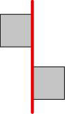
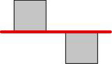
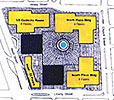
Comparisons of logo accuracy
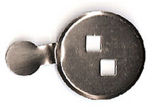

As in most museums, the visitor gets a button so the guards can see that he/she has paid to enter. I didn't realize until talking to a museum rep that the button was die-cut - the two squares are cut out of the metal. This allowed me to turn it over and show him that the correct arrangement could be seen only by looking from the ground up.

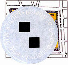
Left: Original WTC site plan showing accurate orientation of tower footprints. Middle: Logo superimposed over the site plan showing logo doesn't align with tower footprints. Right: Reverse of logo superimposed over the site plan showing logo now aligns with tower footprints.
Below: Aerial views:
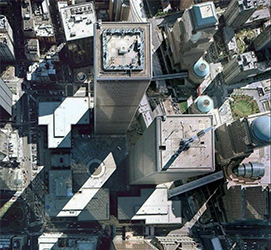
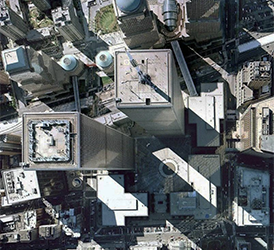
Left: Orientation of towers as they were on the site. Right: Orientation of towers as depicted in the logo.
(Renderings thanks to Maria, a blog poster from Argentina)
Another incorrect logo
This one is from Project Rebirth, an organization dedicated to recording the redevelopment of the WTC site. Below right: my redesigned logo with the towers in their correct orientation (and without the unnecessary lines).


Comparisons
The inaccurate and incorrect:

The accurate and correct:


Why these errors should be corrected
The error does matter - though it may seem a minor detail, we can, and must, do better in how we treat the WTC site.
October 2006: I emailed the Tribute center with maps and photos of the site to show the orientation and pointed out that the logo was inaccurate and that it sent an inappropriately macabre message. Two months later, I had yet to hear from them.
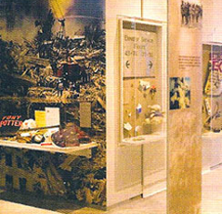
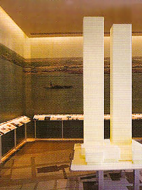
December 2006: I visited the Tribute WTC Visitor Center. I spoke to a Tribute rep about the logo. He confirmed that the two squares represent the top view of the tower footprints but he contended that the arrangement is correct. We walked to the model on display (photo above) and I showed him the footprint pattern and how it fit the logo only if it was upside down. He acknowledged that the logo and the model showed different building placement and orientations - his comment was that maybe the model was wrong.
January 2007: I emailed the link to this essay and received a reply from the President of the Tribute WTC Visitor Center. An excerpt from that response: "I have had the opportutinity to read both you note and essay and am sorry you are unable to understand our logo. You are wrong in your assumption that the logo is wrong. As the spokesperson for the World Trade Center for 13 years as a senior management official in the Port Authority of New York and New Jersey I can assure you the positioning of the towers as depicted in the Tribute logo is correct. The North Tower is north of the South Tower. It is correct as depicted on the logo. Sorry you can't seem to see it." Complete transcript of his letter below.
Spring 2007: A design blog in Argentina, DSNO Tendencias en diseno, arte, fotografia, arquitectura y tecnologia, picked up this essay and posted it on their site. Posters on that site have encouraged me to pursue correcting the logo.
I emailed the design firm responsible for the logo identity and asked what the rationale was for the upside-down tower footprint orientation. I never heard from them.
January 2010: At the new 9/11 Memorial Preview Center and gift shop, I noticed the brochure for Project Rebirth, also with an inappropriate logo. I wrote them and sent this essay. They responded with a courteous, but, non-committal reply.
Great news: they fixed their logo!
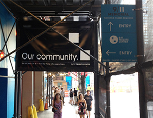
I was walking back to the apartment on Sunday night, August 12, 2012, and in front of the Tribute Center I immediately noticed the revised logo.
I started chuckling out loud. Yes! They finally did the right thing.
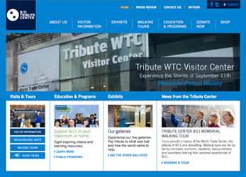
When I got back to the apt to watch the Olympics Closing Ceremony, I went to the Tribute website. There it was - the corrected logo:
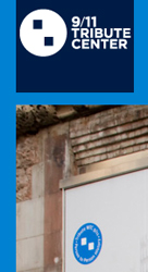


Improvements
1. Of course, the inappropriate orientation was corrected.
2. The name was changed from Tribute WTC 9/11 to 9/11 Tribute Center. Much better.
3. The text was taken out of the circle, enlarged, and placed flush left next to the circle mark.
4. The mark of the tower footprints (without text) can now stand on its own.
5. The color palette was enlarged with a darker blue, a light blue, and other colors for use in collateral materials.
The new look is more professional, clearer, and, fortunately - after almost 10 years - more accurate and respectful.
What a relief - an embarrassing episode in the history of graphic design has been rectified.
Complete transcript of correspondence
Between the Tribute WTC Visitor Center and Jim Watson
(including grammar and spelling errors)
Sunday, February 18, 2007, at 04:15 pm, Lynn Tierney wrote:
I am sorry we didn't get back to you before this. I have had the opportutinity to read both you note and essay and am sorry you are unable to understand our logo.
You are wrong in your assumption that the logo is wrong. As the spokesperson for the World Trade Center for 13 years as a senior management official in the Port Authority of New York and New Jersey I can assure you the positioning of the towers as depicted in the Tribute logo is correct. The North Tower is north of the South Tower. It is correct as depicted on the logo. Sorry you can't seem to see it.
The logo was designed by Peter Arnell, one of the great branding designers in the country who gave us the DKNY logo and the Reebok logo among others. Peter is an architect and photographer as well and in addition to the simple depiction of the footprints provided us with a fully developed brand identity relating to Tribute and to the towers. Peter has given hundreds and millions of dollars of pro bono work to the FDNY and NYPD as well as many global causes and he is fully capable of thinking through and executing all elements of brand architecture. We were privileged to have him on board on this project. Peters design was enhanced by Lance Wyman, one of the great graphic designers of our time and the man generally considered the "father" of wayfinding design. Lance has designed logos for the Olympics, for products, cities around the world, and we at Tribute were fortunate enough to have his help on our logo.
I hope you can find another topic to discuss on in your blog, as currently you are misinforming people about our logo, the intent, and application.
I also think the essence of the footprints, the void, that is filled every day through the personal interaction that takes place between the more than 100,000 visitors who have come through Tribute so far since our opening September 18th, and the 160 volunteers who have ushered people around the site is of more note than your protestations about our logo. Today we hosted 160 reservists who will be deployed to Afghanistan in 2 weeks. Their guides; family members, survivors, volunteers who spent months at the site, rescue workers and residents were all proud to help these brave men and women understand the events of 9/11 and the personal nature of the aftermath. They are the essence of why Tribute was created and what it is all about.
I would suggest that the next time you are in Tribute, you make prior arrangements to meet wit me, you now have my contact information, and I will show you around personally. I was the Deputy Commissioner of the FDNY on 9/11, was in the towers, was nearly killed and lost 343 of my own men that day. I wrote 100 eulogies for them and then built Tribute to honor them and the other 2700 people killed that day. I take full responsibility and stand behind our mission, design, logo, back-story and I sleep comfortably at night knowing I have done all I can to honor those I loved and lost.
One last thing. I thought your remarks about the Tribute staff member who seemed uninformed were a real cheap shot. Please don't pick on some kid on my staff then mock him out on your web site. If you want to spend precious moments of your life railing about our logo then go ahead, but if you'd like the real story or want to take on someone, you can speak to me directly.
Lynn Tierney
President
Tribute WTC Visitor Center
50 Broad Street Suite 1937
New York, New York 10004
work (212) 422-3520 ex 112
ltierney@tributenyc.org
From: Jim Watson <email@jamesrobertwatson.com>
Date: February 18, 2007 4:31:23 PM CST
To: Lynn Tierney <ltierney@tributenyc.org>
Subject: Re: logo
Lynn
Thank you for your thoughtful response. I appreciate the time you dedicated to explaining the logo. (FYI: the staff member I spoke with was an older distinguished gentleman that was supervising the staff the day I was there.)
I would love to meet with you the next time I am in New York.
Thanks again. Take care,
Jim Watson
www.jamesrobertwatson.com/tribute.html