
Why the Oklahoma City Museum of Art is not ready for the major leagues
The art museum in downtown Oklahoma City does have some excellent shows, and the facility is a huge improvement over the former museum on the state fairgrounds. But they still need to work on some things:
1. Weak logo.
2. Thoughtless graphic materials.
3. Incorrectly mounted exhibit work.
4. Exhibit installations: Requiring museum guests to exit a major exhibit through a single fire exit door is just tacky. The exhibits need to be laid out so that the viewer can return to the main exhibit entrance and exit back through the double doors. It may get a bit crowded there but that's better than having art patrons leave through an emergency exit door.
The weak logo
Enjoying art is about an experience - a connection that impacts the mind with images that are both familiar and innovative. Experiencing art can sometimes result in chaos, but, most often, it results in a feeling of enlightenment, inspiration, and joy. Sometimes chaos in logo design is appropriate, like in Punk and Deconstructivist work, where it can be a good fit for that specific audience. But, usually, design is about creating order to better communicate a message. The target audience for a major Art Museum is typically people with money who desire an aesthetic experience and inspiration. Granted, logos for art museums are tough - how to best represent the diversity of art and distinguish the museum from others. Often, designers will turn to the name, relying on typography and letterform relationships. But that puts a huge burden on the type treatment to be memorable, unique, appropriate, and accurately represent the art experience.
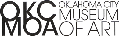
The OKCMOA logo consists of two parts sitting side by side - the initials stacked on 2 lines and the full name stacked on 3 lines. The logotype for the full name is quite strong - the lines of type changing in point size can symbolize motion and growth as each line gets larger, the line containing the word ART is the largest, and the mark is orderly and organized with the justified margins. While it still needs some professional tweaking in its alignment and word spacing, it works quite well.
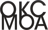
But the mark of initials - not so good:

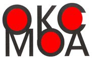
Tip: alignment and consistency help create order. Order, not chaos, most often clarifies understanding of a mark's meaning.
Lesson: a logo is an identity that should convey the qualities, attitudes, and user experience of its company.
Some other museum logos with full names

Museum logos with stacked text:


Suggestion: drop the initial portion of the logo - use just the stacked words.
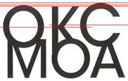
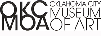
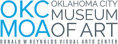
Good news: the OKC MOA logo has been improved.
Saw the new version (below right) in the fall of 2015 - it has been tweaked a bit. No more awkward K nor annoying spacing. The kerning has been improved and Museum of Art is slightly bolder.
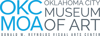
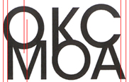
Below right: I tweaked it a bit more - made the Os and the C more consistent, improved alignment, removed the unnecessary period after W, and enlarged the baseline of text.
Thoughtless graphic materials
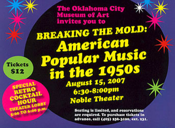
I got this invitation in the mail - what fun - 50s music at the Art Museum, with cocktails. It sounds like a great time. I want to go. When is it? August 15? When is that - a Thursday, a Saturday? Why didn't they tell me so I could mentally plan my schedule? I (like most of us) plan my schedule in days of the week rather than dates. More info.
I had to change my password.
On the Oklahoma City Museum of Art website, this dialog box came up, asking how I could be reached:
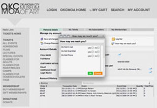
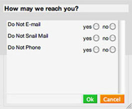
How may we reach you? Yes, do not e-mail or No, Do Not E-mail. (?)
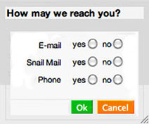
Better solution:
Design criteria to consider:
Convey a positive attitude, not a negative one.
Align the baselines of the media and the options.
Align the media to a flush right margin, closer to the options.
Remove white space from within the box - tighten up the info.
Lessons
Strive to convey positive requests and information, rather than emphasizing the negative.
Design should be user-friendly. Consider the user when making design decisions.
Error in exhibit installation
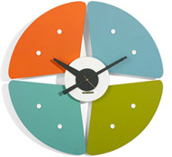
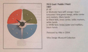
This is Leaf/Paddle/Petal, one of George Nelson's innovative 1950s-era clocks. He designed clocks so that the hour markings would be oriented in a familiar orientation: the 12 and 6 formed a vertical line and the 3 and 9 formed a horizontal line, as shown in the catalog entry above.
When I visited the Nelson exhibit at the OKCMOA, I noticed immediately that two of the clocks were mounted incorrectly. The photo below shows how Leaf/Paddle/Petal was mounted incorrectly. Other clocks were also mounted incorrectly, but Leaf/Paddle/Petal was the most obvious error.

To address the error, I asked a curator at the museum and was abruptly told that I had to contact the exhibit owner, the Vitra Design Museum in Germany; the OKC Museum of Art could do nothing about the mistake. So, I contacted Vitra in Germany and received a response (copied to the museum) that the clocks should have been mounted as shown in the catalog. Major league museums pay better attention to detail when mounting shows.
Lesson: The museum, as the repository and archive of art and design for central Oklahoma, has an obligation to accurately portray designers' intents. The general public, scholars, researchers, and art historians need to be able to trust that the institution will exhibit artifacts correctly.