
The design of www.jamesrobertwatson.com
By the late 1970s, I had developed several products and was seeking a way to market them and to publicize them. I was influenced by U&lc magazine, a catalog of new typefaces from ITC and disguised inside of a magazine that was distributed by free subscription. It was a huge hit among design students while I was in college. Mostly due to it's art director, Herb Lubalin. We students idolized the philosophy and work of Lubalin. I had the idea to produce a catalog that would showcase my products and include essays and articles.

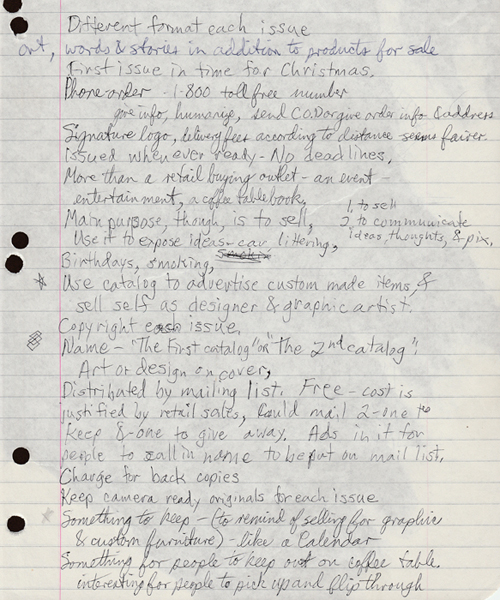
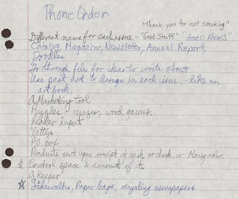
I made some notes in Cleveland, April 1978 (while in Mayfield Heights to open a new TGIFriday's restaurant): Not just a marketing tool, but makes a contribution through ideas, thoughts & suggestions. A powerful tool of persuasion. Retail items are just an excuse to put out a thought-provoking catalog. That catalog notion fermented for decades. With the advent of the internet and the WorldWideWeb, I realized a website might be the best medium to achieve my objectives.
Initial website design and layout Fall and Winter, 2000-01
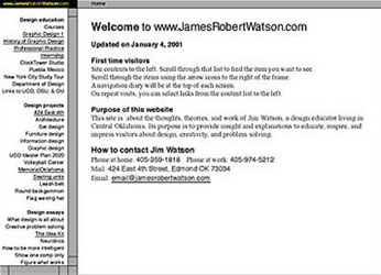
The site - emphasizing rational and logical thinking in design and culture - is about the ideas, thoughts, theories, and work of Jim Watson, a designer and educator from North Texas, now living in Oklahoma, New York City, and Austin. Its purpose is to provide insight and explanations to educate, motivate, and inspire readers about design, creativity, and problem solving. This work-in-progress site will never be finished. That is what is so great about Weblishing - info can be updated and changed easily. It is interactive: as readers email suggestions and questions, I can respond and clarify by altering the information. The cycle created by the interaction of the reader and the author keeps the site current and dynamic.
Seekers: someone accessing specific information
Users: someone specifically exploring this site
Browsers: surfers accidentally hitting site
Inspire readers about design, creativity, and problem solving.
Allow search engines to easily find essays through descriptions and keywords.
Provide resources for people seeking info.
Content over trendy design.
Ease of use.
Rewarding ideas.
Education of reader (not financial or commercial impact).
The yellow page was an early home page with contents. It evolved to the contents menu on the left so that the menu would remain open no matter what page one went to. The content menus are always in sidebars on the left. Because there are so many files (over 500 essays, stories, critiques, and ideas; with almost 5,000 images), the extensive menus help the reader access info by category heading.
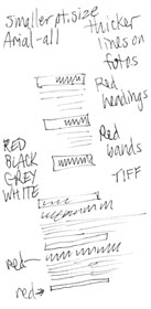
Single font, Arial/Helvetica - no serifs (too busy on screen).
Red graphic elements - for power and clarity.
Flush left text and photos - fewer wraparounds of images.
Purity: primary color, sans serif, basic shapes.
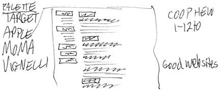
MoMA interiors/graphics
Target ads/graphics
Apple stores/products
Before & After magazine and website
Vignetting purity
Frank Lloyd Wright's logo
Tom Peters books and website
iPhone simplicity
December 13, 1999
jrw.com 1.0 January 2001


jrw.com 1.1 2004


jrw.com 1.2 2010

WordPress • 2011
I sbuilt a Word Press blog: WensdayDesignBlog. I wanted it to be a source for design lessons and visually separate it from the jrw culture blog since culture included some controversial essays on politics and religion. But, it was a chore to transfer this jrw.com site to Word Press - this .com site has over 600 essay files and over 5,000 images. And there were other issues with Word Press, so after a few weeks, I forwarded the wensdaydesignblog.com domain over to jamesrobertwatson.com and returned to just one website. I saw the combined site anew and reordered the contents menus and the home page. I wanted the emphasis to be on logical rational thinking and thoughtfulness. To keep it positive and educational, I included Lessons, Tips, Recommendations, and Suggestions.
jrw.com 2.0 2011
Since January, 2001, I have received emails from Europe, Asia, and South America (that I know of) and the site has been referenced on other design blogs. The essays on the poor logo at the World Trade Center site, que lines, and the Thunder logo are very popular. As a result, I got several requests for an RSS feed so people could subscribe and be informed when new posts were uploaded. Another feature I had long wanted was a search engine button since the site was growing with so many files and essays.

I have long been fascinated with word origins and spellings. Like why do we still spell February with an R that very few people pronounce? And Wednesday. Who says Wed Nes Day? Most of us shorten it to Wens Day (or Wins Day). We have already respelled the original name: Woden's Day. Woden, like some other day names, was a Teutonic God.
We have been altering words since the moment they were created. God be with ye evolved into goodbye. Streamlining spellings is a common and natural step to clarify and ease communication.
So, I had this favorite word, Wensday, and thought this would be a significant way to represent the blog. The unique spelling provides some intrigue to attract the curious browser. Improving the spelling of Wednesday represents my desire to make things better, easier, and more clear. I needed a deadline to provide a structure and motivation to upload new information. But, which day. Hump day, the middle of the week is a nice time to take a break from routine and check out the site.
jrw.com 2.1 2011

3 words in my name matched by 3 words in the weblog title. To transition the text type into the page background, each word in the title decreases in darkness and letterstroke width.

jrw.com 2.2 Spring 2012


jrw.com 2.3 2013

WensdayDesignCulture was replaced by my title as a Consultant and my philosophy slogan.
Replaced dateline with "Inspiration from rational thinking".

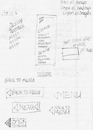
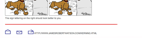
At the bottom of each page on this website, I had some reader tasks spelled out in text: Home, Email Jim Watson, and Filename to share.
But, for years, I had wanted to explore using a set of symbols to replace the text.
I began sketching. The home and email symbols were easy, the icons are so familiar and recognizable. The chimney, door, and window in the home symbol were unnecessary and, therefore, deleted. The mail symbol did not need the lower flap fold lines, the upper flap alone was enough to communicate.
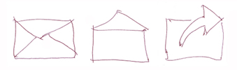
But, the familiar share symbol (below, left) didn't fit well with the others - it had a solid mass, curved lines, and a tapered tail. I explored an outline arrowhead and an open arrow. The final version uses the circular motion of the rectangular box to convey the share motion.
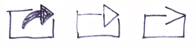

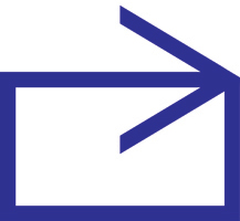
Further refinement resulted in these 3 symbols, with a line weight that matches the JRW logo at the top of most webpages.
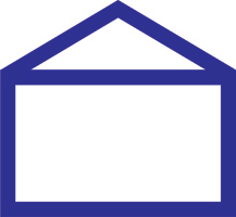


Each symbol is made of only 3 elements, a box and 2 diagonal lines, and all 3 elements are used in each icon.

Lesson: Symbols within a set should share commonalities and consistency to convey that each is part of a larger set.
I decided after retirement to delete links to other websites. When I was still teaching design, I would link resources to my online essays - for the student's/reader's benefit. I no longer have those same needs or desires. Now I rely on more sophisticated search engines to help inquiring students and practitioners of design to find articles about design.
Some of the issues:
Which articles or sites to link with?
How many links? Will they bog down the essay?
Will the link imply an endorsement by me of the linked info?
Links take readers away from my site.
jrw.com 2.4 2018
I added a symbol to take the reader directly to the page of Great Ideas.

jrw.com 3.0 2018
There used to be spikes in visits after the beginning of each semester and throughout the semester. When I changed from classroom teacher to consultant the website had a different audience and different needs and objectives. After retirement, the target audience changed. From students exploring and visiting sites primarily related to class topics and projects to visitors hitting a page directed from a topic search. Prior, visitors started on the home page blog and linked to essays. Now readers are starting at an essay page and linking to the home page and other essays.
Emphasize role as proponent for a better way.
Improve exposure to the best ideas.
Improve navigation to ideas and access to other essays
Increase hits.
Make more consistent throughout the site.
Positive, empathetic.
Page top banner links to homepage.
On page bottoms, new symbol links to ideas.
Symbols at page bottoms are labeled with text.
Top banner emphasize ‘Jim Watson & better way’
Put consistent banner on every page.
Homepage & designideas combined into designblog.
Designblog was purged to just better design ideas
New home page navigation emphasizes popular idea links.
Reduce number of files: combine, merge, delete.
1. Assessment
2. Research, case study examples
3. Objectives
4. Sketches and proposals, testing
5. Recommendations, examples “Better”
Labels that were clearer and more specific. Removed the symbols (they didn't add much to the clarity).


Bottom of each page, make it very clear how to get to the rest of the site - get reader from every article to the homepage, to Great Ideas, and to email me.
1. Homepage links reader to Great Ideas, Design Blog, popular essays, issues, and contents menu.
2. Content menu is more specific by category.
3. Site index is list of everything - every essay, every page

Deleted all link symbols. Added JRW logo and text to the 3 main links. Deleted the link for sharing the page - placed page address at bottom of each page.
Febuary 11, 2020: Added an SSL Certificate to make the site secure.

jrw.com 3.2 • 2021
• Easy for the viewer to read a great idea essay and easy access to more.
Home: Design blog. Great ideas. Good ideas.
Essays: Cultural, Design, minimalism.
Personal. Bio, resume, portfolio, courses, travel, spaces.
Simpler homepage.
Fewer Contents menu.
Other websites
justonepiece.us
travelpants.info
pushpullstickers.com
luckygrape.com
www.jamesrobertwatson.com/websitedesign.html