


What Clay Bennett and the Thunder owners have done for Oklahoma is very exciting. Realizing the potential of Oklahomans to support a mjor league team as evidenced by the enthusiastic support for the displaced New Orleans Hornets (now the Pelicans), he bought a team that he suspected would be fairly easy to move to Oklahoma. After some hassles with the city of Seattle, the NBA, and the former owners of the Sonics, the team was on its way southeast. The new name and branding identity for the Oklahoma City NBA team was introduced on September 3, 2008.
The logo is a poor identity for the Oklahoma City Thunder
There is no distinct relation to Oklahoma - every NBA city has sunsets, suns, and basketballs.
There is no relation to thunder - no dark cloud, no lightning, no rain, no thundering herd.
The typography is poor - the typeface doesn't relate to the image, the fonts do not respect each other, the skinny, weak, fragile, and unstable Thunder font does not convey power, motion, action, or energy. The letterspacing is inconsistent in Thunder.
There is a poor integration of elements - the Thunder type doesn't relate well to the shield, the stripes don't relate to any other element.
The colors are inappropriate - they are not powerful, bold, or competitive (baby blue, yellow) - light blue is from the state flag of Oklahoma, red-orange represents the sunset and the yellow, the sun (but its usually tough to see the sun or a sunset when there is a thunderstorm).
It is neither unique nor distinctive - any team name can be paired with the logo and it will be just as effective.
It doesn't convey professionalism, aggressiveness, dynamic athletics.
There is no intrigue or cleverness for the viewer to mentally grasp to aid memorability.
The frustration
1. The way a city presents itself to the nation through design is a key part of being seen as a Major League City. Many in Oklahoma were excited that a major league team was coming to town. We could now show the world the great things going on in Oklahoma City. This would be our chance to raise the stature of Oklahoma to a world-class level. But then the logo was unveiled and we realized the opportunity to convey excellence was lost.
2. Unfortunately, the more bad design the public sees, the more numb the public gets to bad design. The average person doesn't understand nor discriminate enough without the guidance of corporations, cities, and the design community. If the corporate and design communities accept work such as the Thunder logo, then, heck, anyone can become a designer. One doesn't even need much training or a design sense. Due to repeated exposure, we have accepted the weak logo as the team's identity. It is no longer an issue of good or bad design. Accepting mediocrity (as we have done) weakens the impact that design should make and confirms that Oklahoma is not at the forefront of design. Example: some fans state that since the team does well and the souvenirs sell well, that the logo can't be bad. To use that same shallow nonsense reasoning, it seems clear that if the Thunder had a better logo, they would be national champs every year; and even more souvenirs would be sold.
3. More Oklahomans, designers and non-designers, need to be courageous enough to demand quality work - to be activists in order to prevent the continued erosion of quality design. When questioned, almost all Oklahoma designers agreed that its an awful logo but were unwilling to do anything about it. Mantras in Oklahoma include If it ain't broke, don't fix it, Let sleeping dogs lie, Don't rock the boat, Don't make waves, Its good enough. All of these attitudes result in low standards of design. Maybe we got exactly what we deserved.
Parties involved in the logo
A logo, good or bad, is often a result of collaboration among many people. The Thunder logo is not the fault of any single entity; each of these played a part:
The frustrated designer for not being more persuasive in presenting the original solution and rationale.
The advertising agency for not aggressively supporting the designer and the original concept.
The team owners for meddling with the designer and the agency.
The NBA for not demanding higher standards of effective branding.
The Oklahoma public for tolerating and embracing a low standard of design.
Reactions and responses to the Thunder logo


If a design firm designed a logo that was the sorriest in the league (Maxim magazine), received a 19% approval rating (Yahoo Sports), and an 'F' from its own audience (OKC Channel 5); wouldn't it be likely to revise the mark? Wouldn't the client ask for a new solution?
Some of the many sites that have blog comments - hundreds of them from all over the country, almost all of them disparaging the Thunder logo.

Above: The brilliant assessment and notes came from someone in Denver. Below: At a sporting goods store across from the Barclay's Center in Brooklyn, the jerseys had team logos on them - except for the Thunder, no logo.


It's not significant that somebody critiqued theThunder logo as the worst - that's pretty much common knowledge.
What is significant is that the Thunder's hometown newspaper, The Oklahoman, ran this story as one of the lead articles in the Sports section of the newspaper in 2015


Thunder logo ranked worst in NBA, from The Oklahoman, September 9, 2015, edited for length
Zach Lowe of Grantland.com ranked all 30 teams by their logos and the Thunder came in dead last (Chicago Bulls ranked no.1). “It might be the best D-League logo ever made," said the NBA's first creative director and a branding consultant. Thunder higher-ups hoped fans would think of two (completely different) things when they heard the name - storms and rampaging bison - but they didn't want to commit visually in either direction. Straddling the fence resulted in this vanilla mishmash. Team officials say the shield hints at a leader charging into battle, and that the upward rising 'bolts' (which don't look like bolts at all) symbolize a young franchise growing up." Like, what is this? No team has worse art, top to bottom, and Nike will push for an overhaul once it replaces Adidas as the league's apparel partner in 2017. Nike and the Thunder are already talking, and the Thunder “haven't ruled out" a more explicit weather-related secondary mark.
Bad news from the Thunder: “To some extent, we are committed to the idea we have. But we would not dismiss good feedback, particularly from Nike. We're open to modernizing the logo, but we don't have an appetite to overhaul it."

The Oklahoma City Thunder logo has been a disaster since it was first unveiled in 2008. It says nothing about Oklahoma or Oklahoma City, reflects nothing about thunder or any meteorological event, nor the native bison the "thunder of the herd" is supposed to reflect. But while the shield-style logo is here to stay, Grantland reports that the team could be making a move for a new style in the near future.


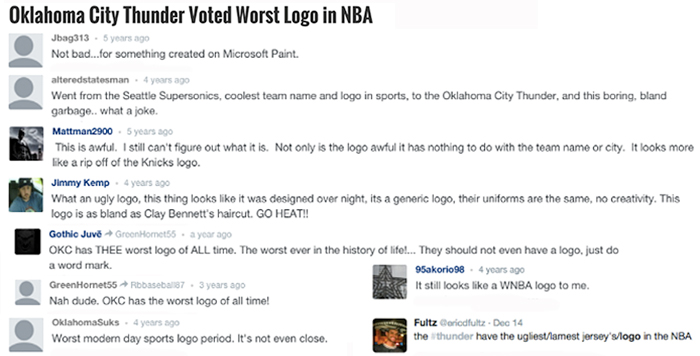
The name of the team
Oklahoma had an opportunity to unify and raise the stature of the state by naming the team 'Oklahoma' rather than 'Oklahoma City'. Although the voters of Oklahoma City passed the temporary tax vote, season ticket holders and fans will be from Moore, Norman, Edmond, Yukon, even Tulsa (OKC will reap the benefits of the penny tax through the increased hotel, restaurant, and parking revenues). Including the Tulsa market would have raised the national ranking of the Oklahoma NBA television market. For broadcasters, fans, and logo graphics, 'Oklahoma Thunder' would have been easier to say and write than 'Oklahoma City Thunder'.
Pro sports teams named after their state or region
States with two major nearby cities, similar to Oklahoma (Oklahoma City and Tulsa), use their state or area name: Arizona (Phoenix and Tucson), Colorado (Denver and Colorado Springs), Minnesota (Minneapolis and St. Paul), and Tampa Bay (Tampa and St. Petersburg). A list of examples (excluding teams such as the Dallas Cowboys who haven't played, trained, nor officed in Dallas in several decades):

The NBA logos
Many are poor identities, but that's no excuse for a new team to add one more bad one.
Sources of the Oklahoma City Thunder OKC logo elements
Thunder typeface: Hornets, TrailBlazers, and Rockets
Shield: Nets and Mavericks
OKC type: Jazz and Warriors
Angled swash strokes: Wizards
Basketball: Pacers, Lakers, Heat, Nets, Knicks, Magic, 76ers, Suns, Cavaliers, Mavericks, Pistons, and Warriors.

Other teams named Thunder and their logos
Which one of these logos conveys a dynamic team and better meets the objectives of a strong sports identity?


Other Thunder marks


Left: The logo for the Thunder Girls. Online comments:
Anyone ever notice that the Thunder Girls logo is actually better than the Thunder's?
The Thunder Girls' logo was designed in-house by the Thunder creative team, while the team's logo was done externally by Ackerman McQueen. I'll leave it up to you to decide who would've been the better choice.
Above right: A t-shirt from the Thunder in-house design team.
The Oklahoma City Blue, D-League franchise, relocated from Tulsa in 2014. It is a much better logo and shows the Thunder management is willing to make improvements. The other two marks show adaptations that give the mark some depth and movement with added dimensionality and gradation.


Far right: The NHU logo is used on teeshirts sold on a third-party website for the National Hispanic University in San Jose, California. It is clearly a blatant rip-off. Who would have thought that someone would deem the Thunder logo worthy of copying? (Or did the Thunder copy the University mark?) The NHU text, however, is set better than the OKC text. I saw the image in New York City on a teeshirt worn by someone who works with NHU and bought it in San Jose. I tracked it down to a MySpace page: Smashed Inc Clothing.
Exploring a new logo for the Oklahoma Thunder
The logo for the OKC Thunder is generally regarded as one of the weakest identities in the NBA. The Thunder needs a fresh identity needs by a reputable and creative design firm, maybe one specializing in athletic team brands. The rough sketch below is an option that keeps most of the elements and feel of the existing mark, but tweaks it to serve as transition until a new logo can be introduced.
Biggest weaknesses of the existing logo: the Thunder font and layout, the two swooshes, the awkward distorted OKC, and the lack of anything relating to Oklahoma, or thunder.


T-shirt shops, printers, and the fans created numerous versions of the cheer Thunder Up. Not real sure what Thunder Up means, but with an image of a lightning bolt, it caught on. I guess with the connection that lightning causes thunder. These are a small sample of Thunder Up bolts that have been developed. it is a strong graphic; I wonder if it could be integrated into an improved Thunder logo.


I explored a typeface that had a bit more character. The slab serifs suggested a western wood type font and the high crossbars are from the Arts & Crafts era - both appropriate to Oklahoma. Below right: I tried a version with ligatures.


Below left: the first sketch on a newspaper ad Middle: Altering the swooshes to lightning bolts. Right: making the bolt vertical, not horizontal. The bolt changed from the pointed top to the more familiar Thunder Up version with a flat top.


Production


Retained
The general shape
The layout - shield with text on top
The basketball image
Limited color palette - red orange and yellow for Oklahoma sunset; light blue and dark blue for sky and thunder
Deleted
Awkward distorted rendering of OKC
The two swooshes
Replaced
Typeface with a bit more Western character and personality.
Oklahoma (instead of Oklahoma City), to broaden to the entire state and sound better on broadcast media.
More recognizable shield shape
Added
Lightning bolt from fans Thunder Up images.
More depth and dimensionality
It certainly needs much more work and revision (a fatter lightning bolt, better color and value choices), but the concept is an improvement.
Concept and sketches: November-January, 2015-16.
Years after the Thunder introduced their logo, designers are still proposing other solutions:

Above: A very well-thought proposal - worth a read.


Dick Sakahara, a California designer who consulted with the Thunder during the team's creation submitted plenty of nice bison illustrations. I have a lot of bison that never got to be, Sakahara says.


Above: Two proposals from a designer. Middle: The concept is simple, following the league-standard choice of including a basketball. Wrapping around the ball is lightning, most famous for its role as the atmospheric electrostatic discharge preceding thunder.


Left: a designer applied the text style from the Thunder Girls logo to his proposed Thunder logo.
Middle: From Chicago, 2011: The Thunder's current logo means nothing, signifies nothing and doesn't come close to evoking Oklahoma or thunder. It is a complete and utter failure.
The current logo is a random basketball, a buttload of colors, two bizarre streaks and an 'OKC' that is so oddly placed it's a surprise it's actually a part of the logo. None of that works, none of that screams Oklahoma City and none of that epitomizes or even symbolizes thunder.
I thought about the thundering herds of bison that used to roam Oklahoma and the west. Herds so large, they would kick up clouds of dust. I kept the Thunder font and three out of the four colors they currently use (sorry yellow, there were just too many colors). The buffalo head incorporates the theme of lightning bolts and the eyes are the orange/red of the team colors.

Above Middle and Right: By Sean McCarthy, Graphic Designer, 2016. The Thunder has struggled to match the identity with their locale or their nickname. The word "Thunder" conveys feelings of power, tremendous sound and force. Their primary logo is curiously absent of any of these emotions and has had sports fans scratching their heads since its unveiling.
My concept attempts to align the Thunder brand with a strong icon, tie-in with the local market, and simplify the color scheme while retaining the elements that the team has successfully cultivated since becoming part of the NBA.
Below left: From South Texas, 2012 (4 years after the initial introduction): It's an abstract concept - a native American theme, dreamcatcher/Oklahoma state flag, and the sun gives it a Midwestern feel.
Online responses to this proposal:
• I thought a blank space was superior to what they currently have.
• Not exactly the greatest of concepts, but, it's STILL 1000 times better than the crap they have now.
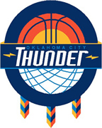


Below: A proposal incorporating the lightning bolt in the typography.

From the designer: Originally being from the great state of Oklahoma, I was greatly disappointed with the OKC branding (uninspired and generic). So I figured it was time to step up and rep OK properly.
Response comments:
These are amazing. Vibrant, fresh and a major upgrade over what they're wearing now.
It's infinitely better than the current.
This should be their primary logo. Right now.
That's looks amazing, better than their current logos.
The Thunder logo with two other team logos in Oklahoma City.


Tweaking the OKC Dodgers logo: Enlarged and aligned Oklahoma City, Enlarged Dodgers, and made the top row of bricks more consistent with the other rows.
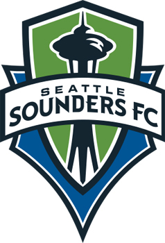


After the OKC Energy FC (Football Club) soccer team introduced their new logo, a blog poster noticed that the Energy logo had similar elements to the Seattle Sounders FC logo:
• Banner containing the team name
• Object above the banner name: top of space needle and OKC
• Letterform serifs (see the Rs above right)
• Shield with straight-line top: convex and concave
It seems that the Seattle logo (April 2008) inspired or influenced the OKC logo (November 2013).
Someone actually made the Thunder logo even worse
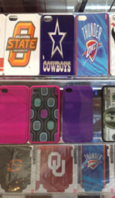


Wandering through the mall, I came across a kiosk of phone skins where I immediately spotted the squished Thunder logo (and Cowboys logos). That looks horrible. The kiosk operator looked confused at my comment. You ruined the logo. You squished it. "But, I had to make it fit!" You could have just made it smaller - like this one (I pointed to the Thunder logo two rows beneath - it fits and its unsquished, like those on the right). I do give this guy some credit for staying somewhat calm - I was berating him in the mall for the crap he was producing. One of the reasons we see so much design crap today is because there is not enough public flogging. I remember when the Thunder logo was first introduced, the Oklahoma AIGA chapter refused to make any statement or comment about the weak logo. The very organization dedicated to improving design in Oklahoma was too afraid to rock a boat or ruffle feathers.
Lesson: We often get what we deserve.
Actually, the kiosk guy and I had a good civilized chat. After my initial reaction, I talked to him about logo identities and the importance of consistency in reinforcing brand awareness. He agreed and we parted on good terms - he even allowed me to take the photos for this blog. So, why do people do this? How do we educate them that there are more options for 'fitting' than grabbing a corner handle on a computer screen and moving it to the 'correct' shape? Sometimes the abundance of crap is overwhelming and it seems hopeless that we might ever overcome it. One option is to speak up and discuss design with those who need it.
The newest NBA logo
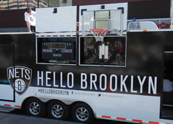
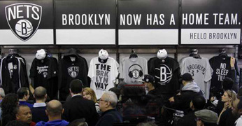
Yo! The Brooklyn Nets developed a new identity when they moved from New Jersey to their new home, the Barclay's Center in Brooklyn.
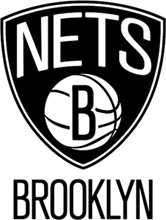


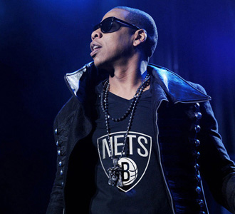
The identity includes two logos. The primary, is in the all-too-common shield silhouette and the other is a circular emblem. Created in part by the team's minority owner, Jay-Z, both logos, as well as the team's colors, will be in a black and white scheme, which adheres to Jay-Z's motto of "All Black, Everything". The colors and the style of the text lettering pay homage to the old New York Subway signage system.
Shawn Carter (Jay-Z) is one of the most financially successful hip hop artists and entrepreneurs in America, having sold approximately 50 million albums worldwide, while receiving fourteen Grammy Awards. "The Brooklyn Nets logo is another step we've made to usher the organization into a new era," he said. "The boldness of the designs demonstrate the confidence we have in our new direction. Along with our move to Brooklyn and a state-of-the-art arena, the colors and logos are examples of our commitment to update and refine all aspects of the team."
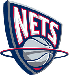


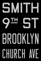
Some observations
• Shield, name placement, and moving ball reflect much of the feel of the New Jersey logo - to maintain a bit of consistency between the old and new and to aid branding in the consciousness of the fans - keeping team look but adapting it to its new naborhood.
• Kerning is awkward in NETS - the tight space between the N and E does not respect the air and room between the E & T & S.
• The word Brooklyn is a nice match to the Subway signage.
• The condensed type is well done - designed as a condensed font rather than manipulating a font on the screen.
Lesson: Specify a condensed font, do not condense a font with the mouse.
• Capital B over the ball cancels out the dimensionality created by the detail lines in the round basketball.
• Colors, black & white (only team in the league with those colors) is okay - might work. Much of the philosophy given for the logo and the team is to relate to old-school Brooklyn athletics. Some Brooklynites have never accepted the insulting loss of the Brooklyn Dodgers. One of the logos for the Dodgers was the capital B inside of a circle (below), apparently inspiring the Nets' B in the circle of the ball.



Other NBA balls in motion: None of these balls have a flat letterform placed over them, stopping their dramatic motion.
Lesson: While this is not a 'bad' logo, it is certainly not an example of excellent design. The numbing of the American design consciousness continues on its downward slide.
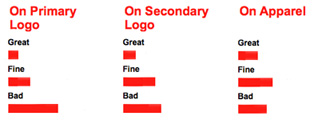
Below: results of an online poll.
Speaking of the Dodgers
Established in 1883, that team originated in Brooklyn. In the 1891 season, the team moved to a ballpark which was bordered on two sides by street car tracks. That's when the team was first called the Brooklyn Trolley Dodgers, soon shortened to Brooklyn Dodgers. The team is noted for signing Jackie Robinson in 1947 as the first black player in the major leagues. The team moved to Los Angeles for the 1958 season.
www.jamesrobertwatson.com/thunderlogo.html