
A few art & design projects done while in school
George B. Dealey Elementary School 1958-63
I attended Preston Hollow Elementary High School in Dallas from 1956 to spring 1958 for 1st and 2nd grades. It was here that i learned about alphabetic letterforms and typography. The family then moved about a mile north and into another school boundary - George B. Dealey for grades 3 through 6; fall 1958 until 1962.
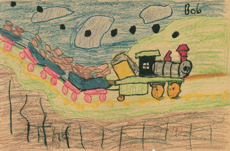
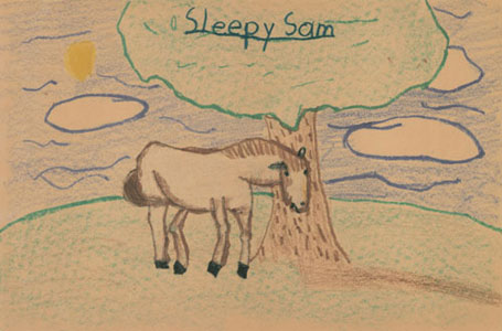

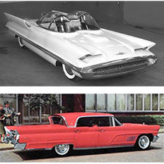
Partial inspiration: 1960 Lincoln Continental Mark V.
Benjamin Franklin Junior High School 1963-1965
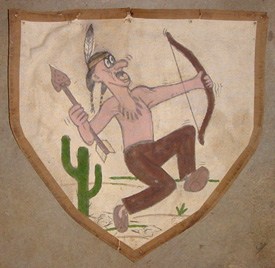
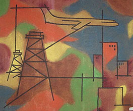
The flag for the Warriors Boy Scout patrol. Below: A couple of miscellaneous paintings for my father and mother. Each showed images relevant to their lives. I 'm not sure why i painted them, there was some blank material in the groj and i just sketched lines and added colors.

Hillcrest High School 1965-68
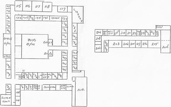
I attended Hillcrest High School in Dallas from 1966 to 1968. I took art classes from Ms. Margaret Hudson who graduated from SMU with a degree in Advertising Art. She assigned a few graphic design projects in the art curriculum - unusual for high school art - and significant in introducing me to design. Ms. Hudson was a major influence on my life and career - a true mentor and role model. I designed stage sets and served as President of the Art Service Club. Those high school years were lots of fun, a great time, and a great experience.

Advice from Ms. Hudson. I adopted the suggestions for my own teaching philosophy.
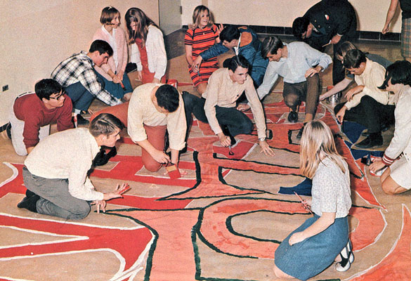
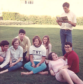
The Art Service Club was responsible for painting all the spirit posters for hanging around the school and for the pep assemblies. A few of the people: Betsy Brown, Barbara Smith, Laird MacDonald, Becky Kennedy, Jeff Wincek, Glenn Normile, Larry, Cathy Selman, Holly Poole.
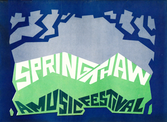

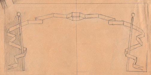
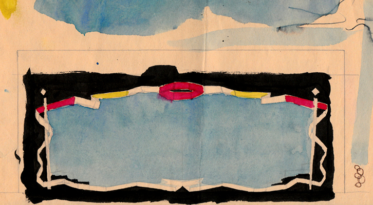
Program cover (front & back) for the spring musical festival. Hand rendered with reproduction guidance from Ms. Hudson. The design mimicked the stage set that the audience would see a few minutes after getting the program.
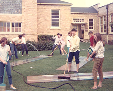
Washing the flats/backdrops in the gymnasium courtyard





Set design models
Gypsy Trouble
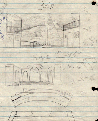
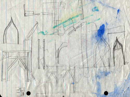
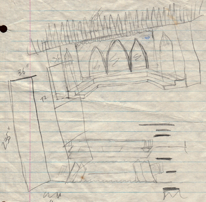
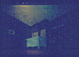
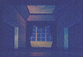
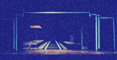
I wrote a simple storyline about gypsies and royalty and cross-class love. These are some of the set models I made when I was 15-16 years old in 1966.


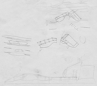
Opening scene at sunrise at the mill.
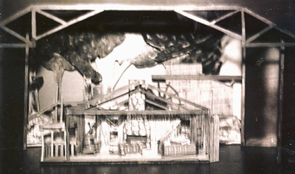
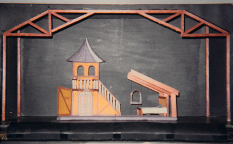
A cabin. The Queen's bedroom.
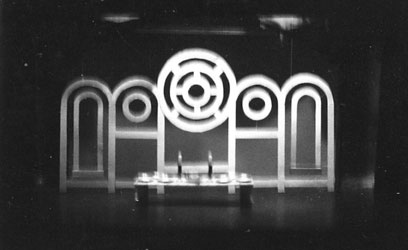
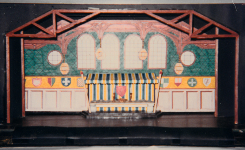
Two versions of the dining room. The stylized one wasn't consistent with the look of the show.
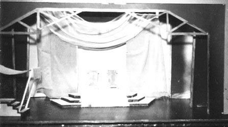

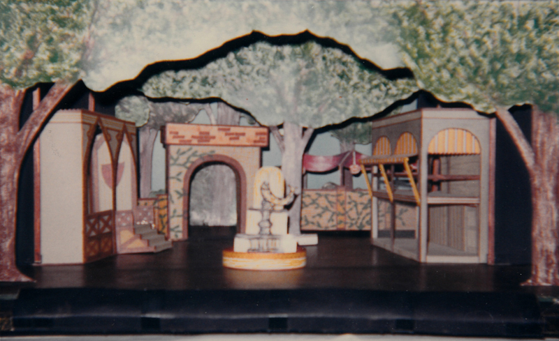

The courtyard. The wine cellar.

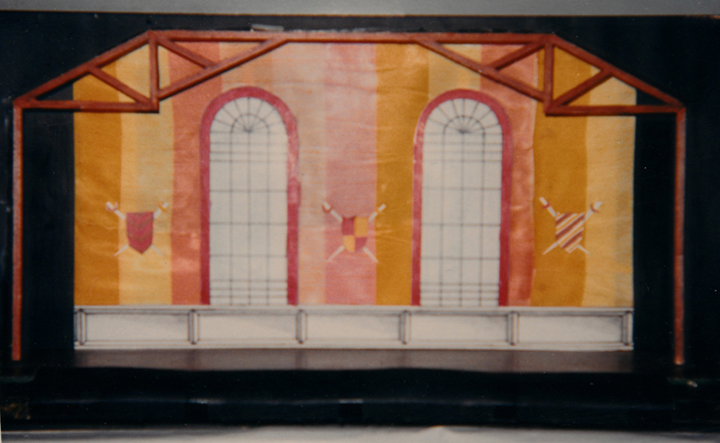
A corridor.


Outside the Great Hall. The Great Hall.
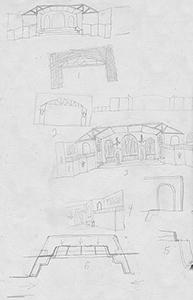
New Orleans Bound
This story was about some stranger arriving in New Orleans and feeling smitten by a slave woman about to be sold - he buys her (WTF was I thinking? This was about 1966, but, still.)It opened in a forest riverbank with a levee and a mill. A paddleboat came across the back of the stage with people and cargo on board.

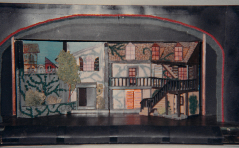
The living room. The courtyard of the home.
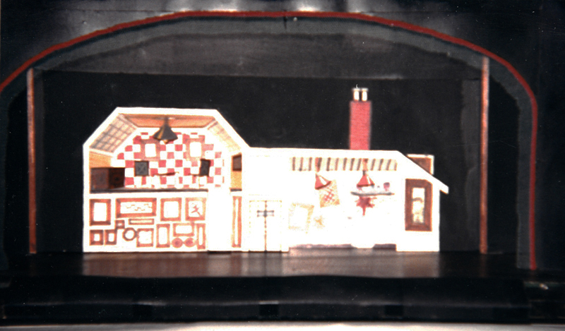
The Studio.
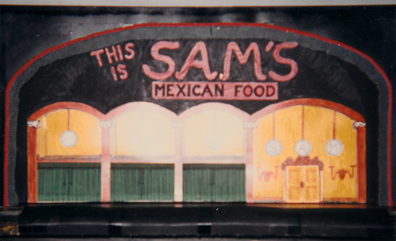
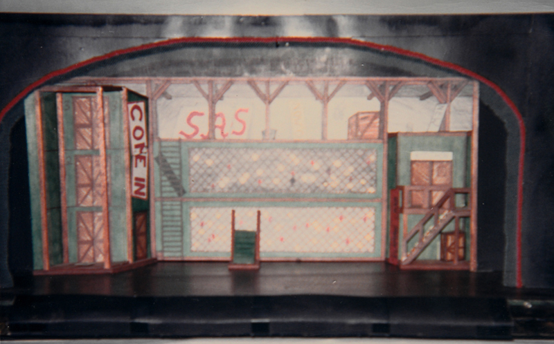
Sam's Restaurant with curtained booths. Pantry of Sam's.


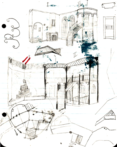
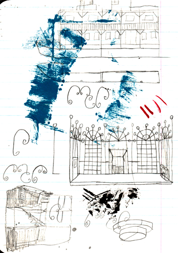
Set designs at Hillcrest High School
When I got to high school, I joined the Art Service Club since that group was responsible for the scenery for all school plays, pep rallies, and assemblies. The faculty sponsor was Ms. Hudson who gave us leeway to work but kept an eye on us to guide us in the right direction. I became the lead set designer and worked with a crew that became my best friends: Laird McDonald, Barbara Smith, Becky Kennedy, Chris Chernoff, Abe Frishman, Allen Smoot, Joe Chapman, and Ann Kilby (daughter of Jack who invented the transistor at Texas Instruments). We would work during lunch periods and after school. We had a great time, in and out of school. The experience encouraged me to major in set design at the University of Texas, although I switched majors after my freshman year. Below are some of the shows and productions we worked on.
The King and I
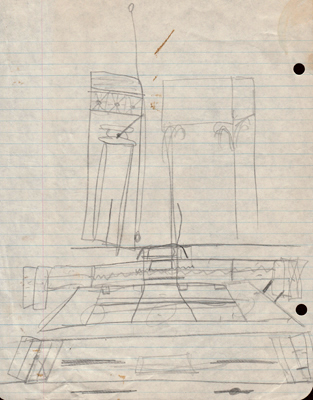
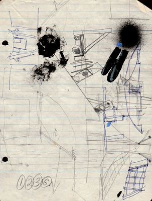
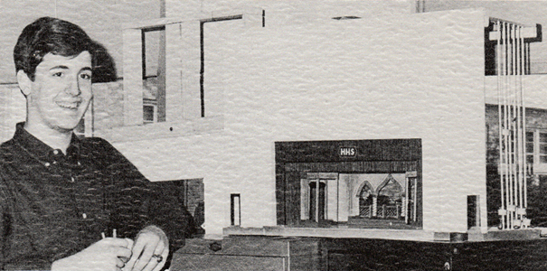
This Rogers and Hammerstein classic was the annual spring musical in 1967. It was my first production to design - I spent many a late nite researching and sketching.
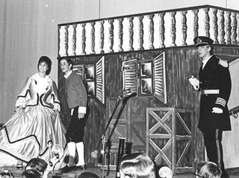


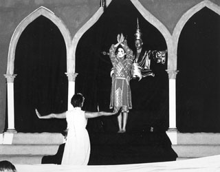
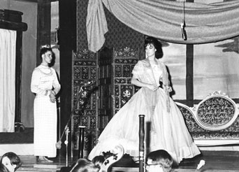
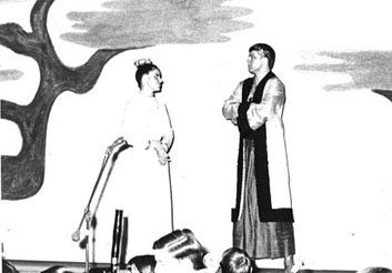
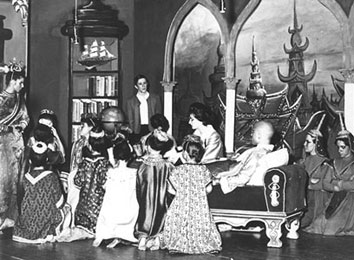
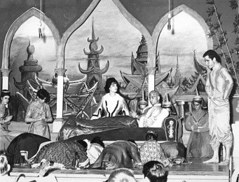
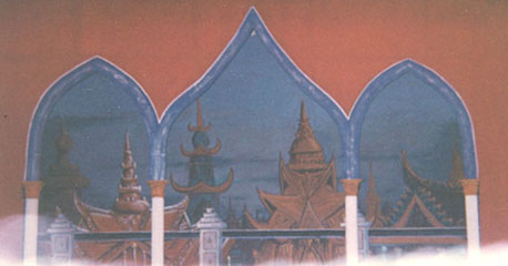
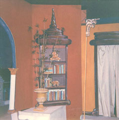
The only color photos I have. Real Musgrave designed and painted the backdrop of the Bangkok cityscape.
Below: backstage shots
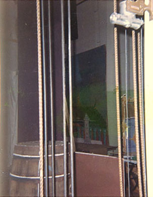
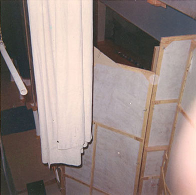






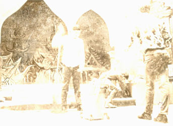

Me standing, the backside of Allen Smoot, and Lars Lundahl kneeling. Some more crew: me, Bobby Rohloff, Abe Frishman, and John Bookhout.
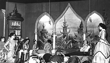
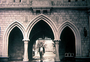
The inspiration for the King's Palace set may have come from Cinderella's Castle in Disneyland. My family and I had visited Disneyland in 1956 and I suspect I had seen this classic foto of Walt walking through the arch the morning before the park opened for the first time in 1955. I don't think I consciously referenced it when designing the King and I sets, but it was probably seared in my brain somewhere.
The Girls in 509
A comedy set in an old high-rise apartment building.
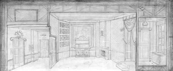

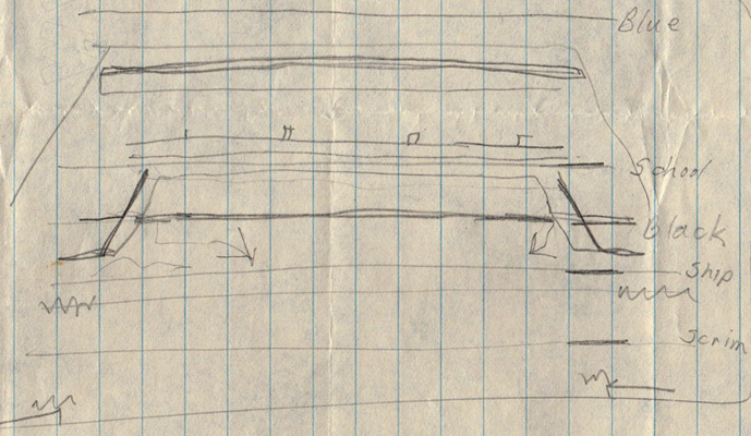
Sketches of the set, foto of actual built set below.

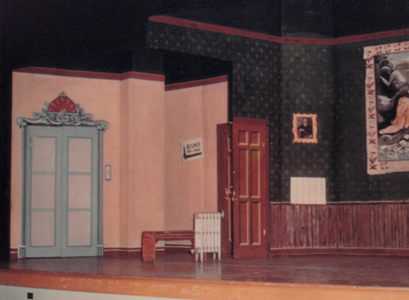
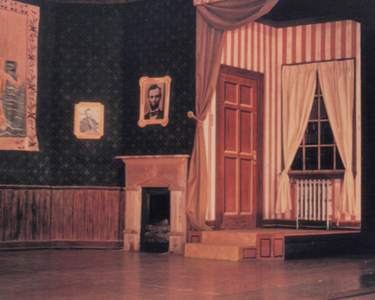


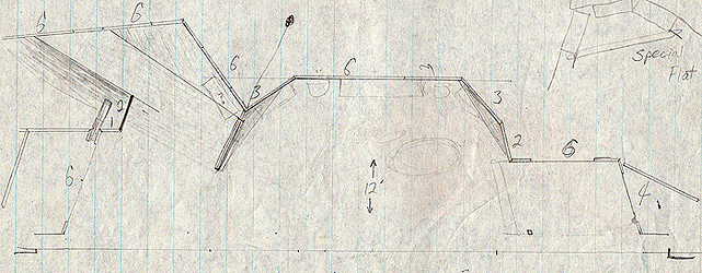


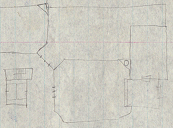
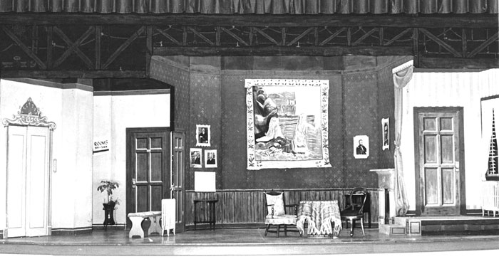
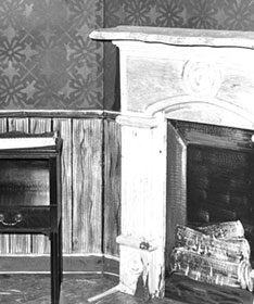
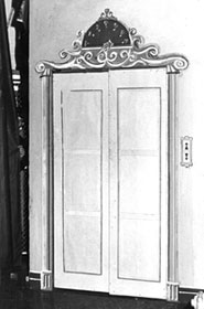

We stenciled the wallpaper pattern. The panels in the elevator doors were cut out and covered with tracing paper. We rigged a system to raise a dark curtain behind that so the light coming through would rise up as if the elevator was ascending to that floor. The effect worked great.
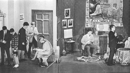
Spring Thaw
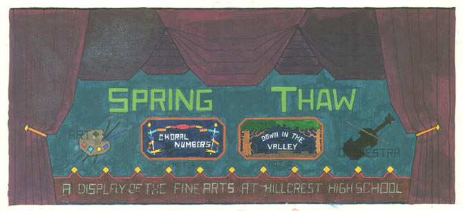
The previous year, the art and music programs spent too much money on The King and I so the administration wanted a spring musical that would be cheap to produce, hence Spring Thaw, an evening of a one-act musical, Down in the Valley, and choral and symphony performances.
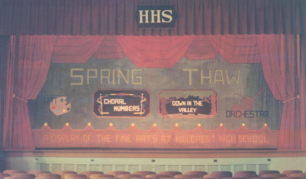
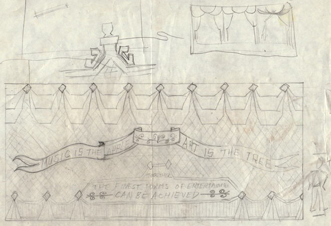
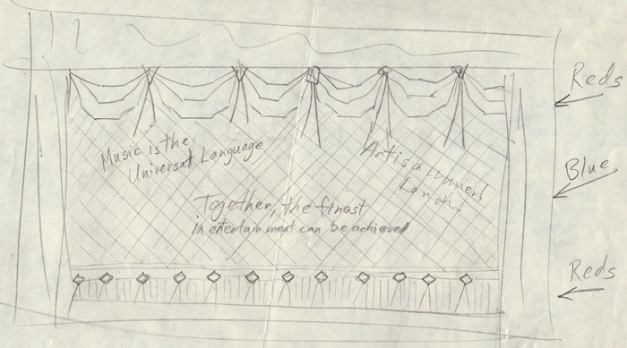
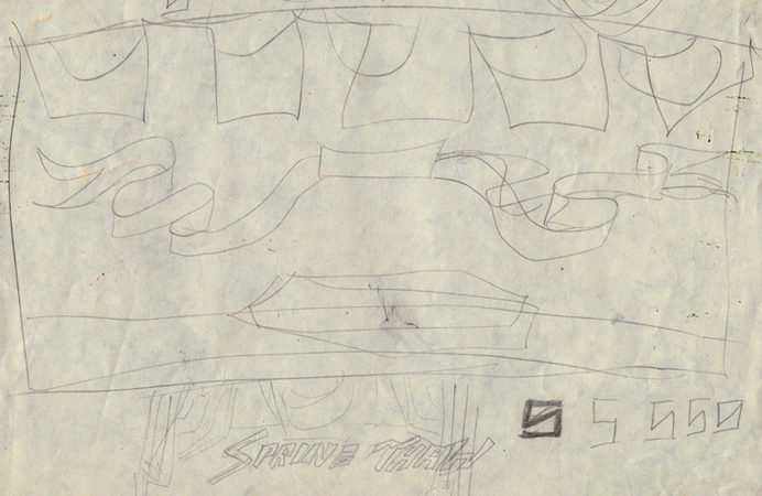
The show curtain that was seen as the audience entered, during the overture, and between acts.

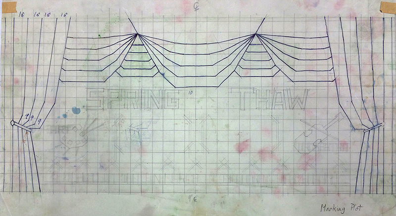
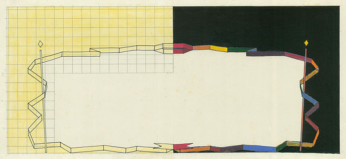
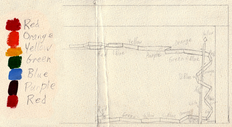
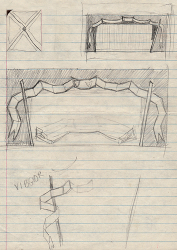

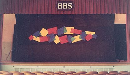


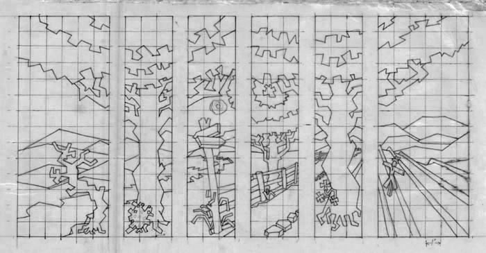
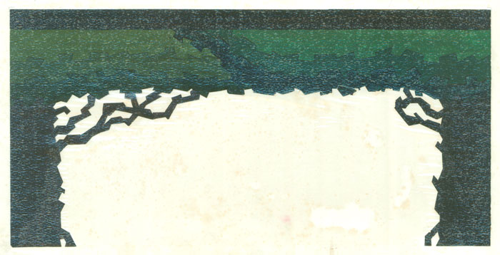
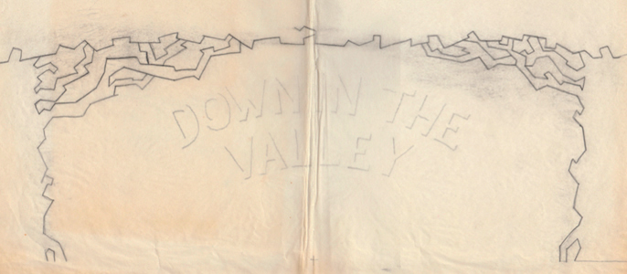

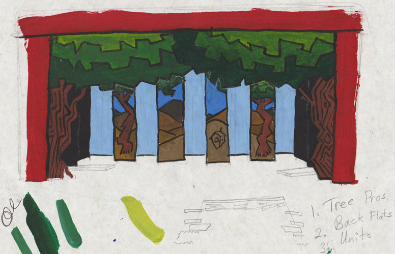

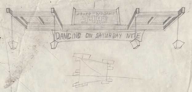

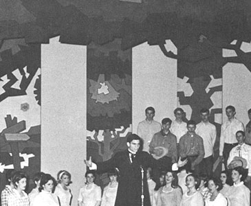

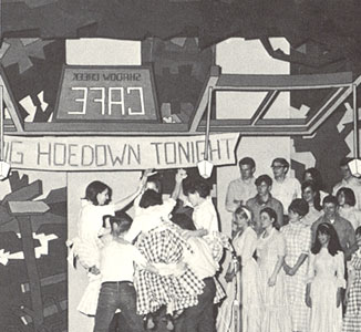
Fotos from the show. Each scene was represented by a different type of window. Top left: the house window was on a track and glided in from the wings. Bottom right: the Cafe Hoedown skylight window flew in from above. The word Cafe is backwards to convey that is the sign and we are on the back side, or inside the cafe, of the sign.
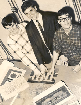
Below left: The design and construction team. Laird McDonald, Watson, and Jeff Wincek. Laird helped with the implementation and construction. Jeff developed the background multi-panel concept - a series of painted canvas stage flats. We are pointing to the rendering (seen above in fotos). I don't think I ever gave him the credit he deserved.
Below right: the front and back of the program cover.
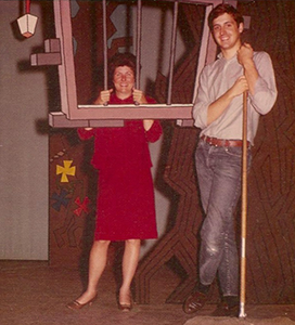

Washing the flats/backdrops in the gymnasium courtyard


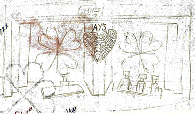
The Dating Game

The stage set for Allied Youth's version of the Dating Game, Febuary 9, 1968. The black flats in the middle jutted out far enough so the contestants couldn't see their potential dates.

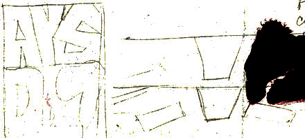

Spirit poster

The Art Service Club was responsible for painting all the spirit posters for hanging around the school and for the pep assemblies. A few of the people: Betsy Brown, Barbara Smith, Laird MacDonald, Becky Kennedy, Jeff Wincek, Glenn Normile, Larry, Cathy Selman, Holly Poole.
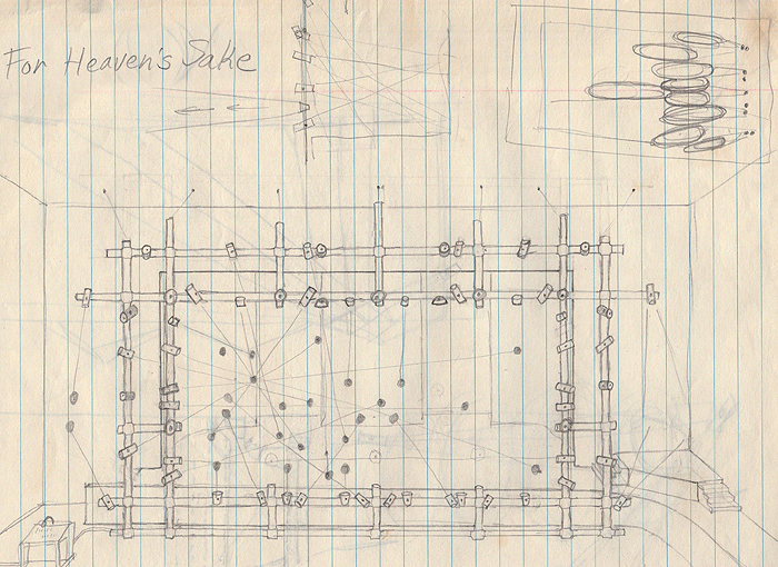
For Heaven's Sake
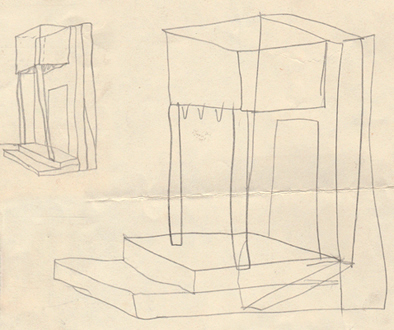
Preston Hollow Presbyterian Church had an active performing arts group. The set for this show consisted of 5 structures that were rotated and rearranged to make a variety of settings. The back of each 'box' was painted black so it looked like just a framework in front of the black backdrop. On the back side were painted scenes that were exposed when the box was rotated. The final scene had the cast attach pieces to the boxes to build a church.

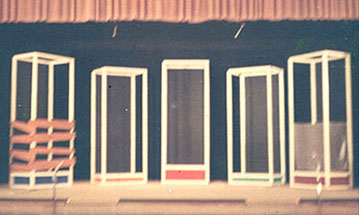
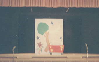
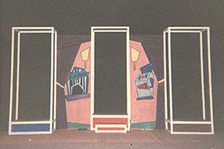

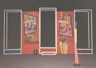
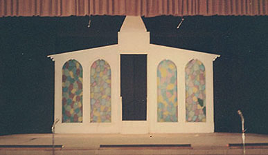


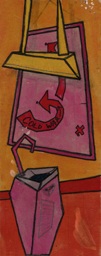
Below: shots taken during rehearsal, the backdrop has yet to be painted black.


The set crew: Laird McDonald, Chris Chernoff, Barbara Smith, Rick Poole
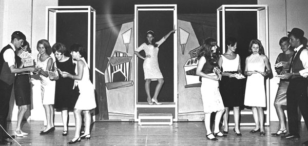


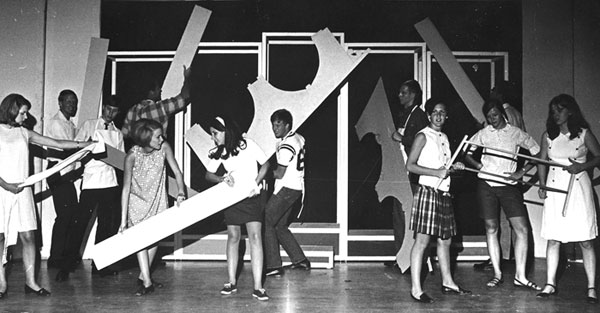
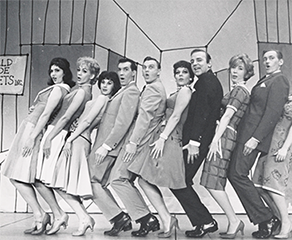
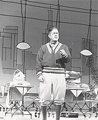
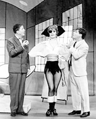
Above: How to Succeed musical I saw in 1963 may have influenced this design in 1967.
In 2010, 44 years later, my niece built a model and designed a set for the same stage. Below is a photo of the set she designed for a contemporary version of Godspell. She had no idea that I had designed sets for that stage. Notice the similarities in the set pieces.


The Drunkard
During the summer before leaving for college, I designed the ttheater and stage set for the melodrama, The Drunkard. It was in a strip shopping center at Northwest Highway between Marsh Lane and Webb Chapel, in Dallas.
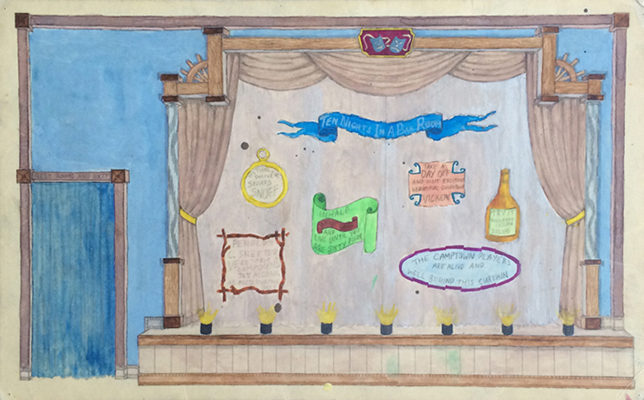


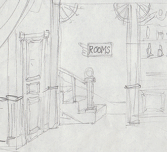
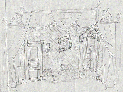
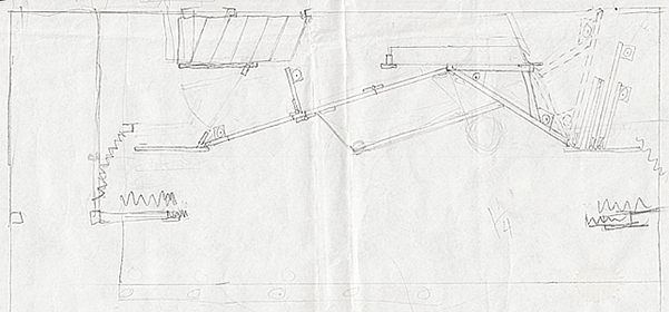
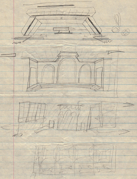
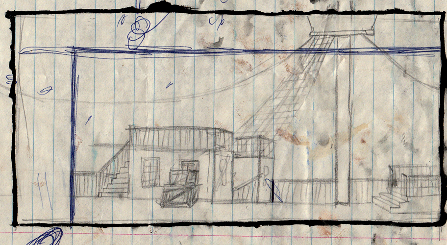
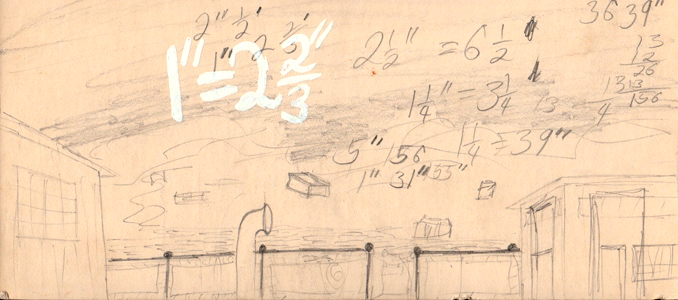
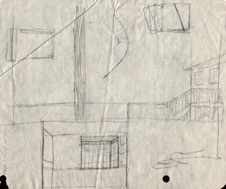
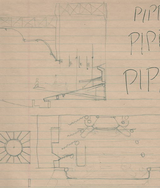
Sketches from a forgotten show
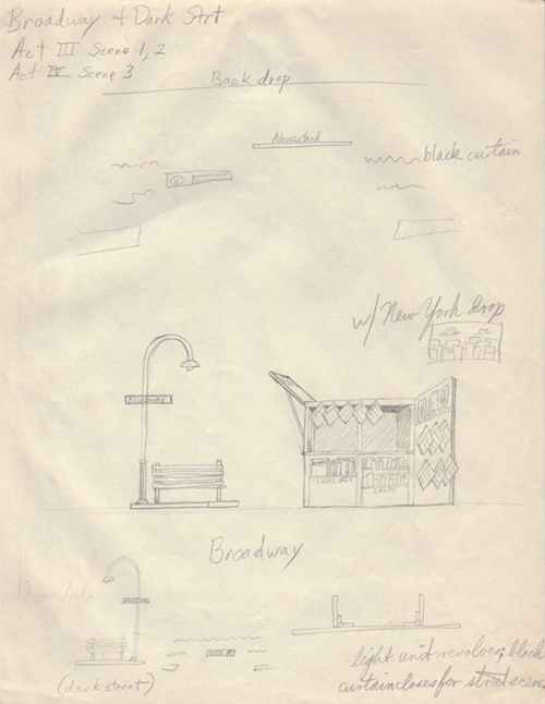
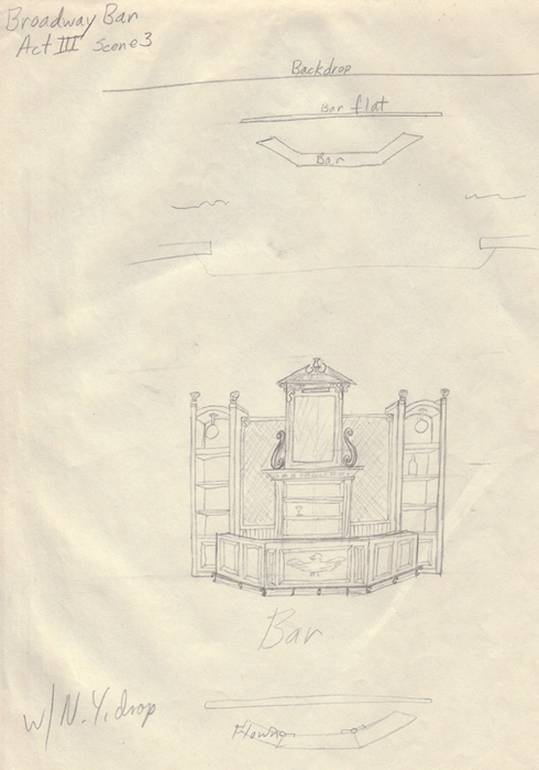


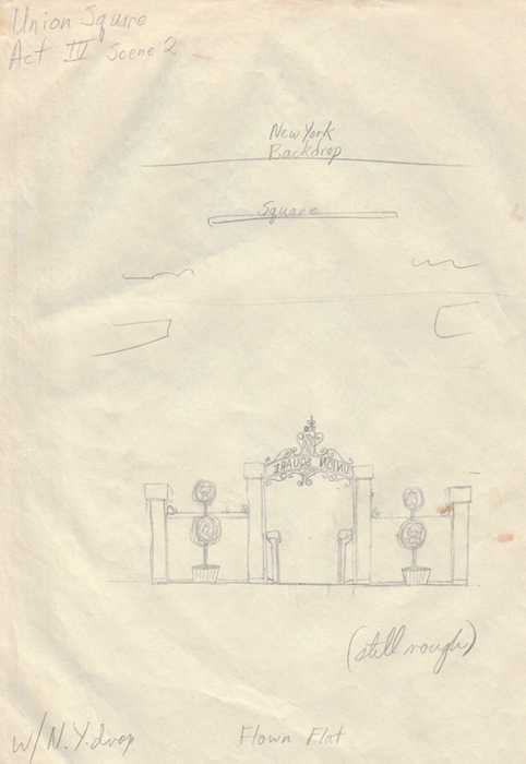
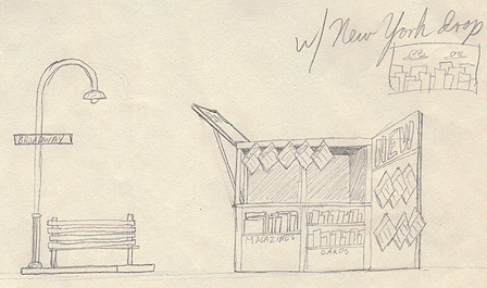

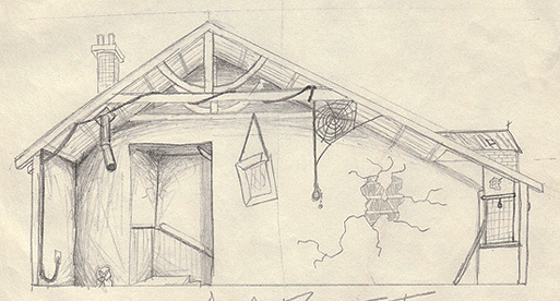
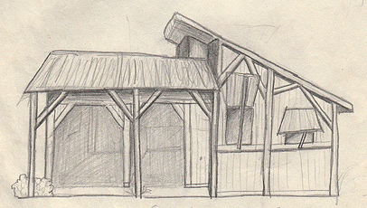
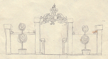
West Side Story
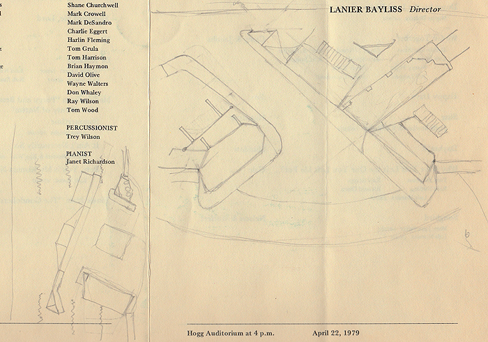
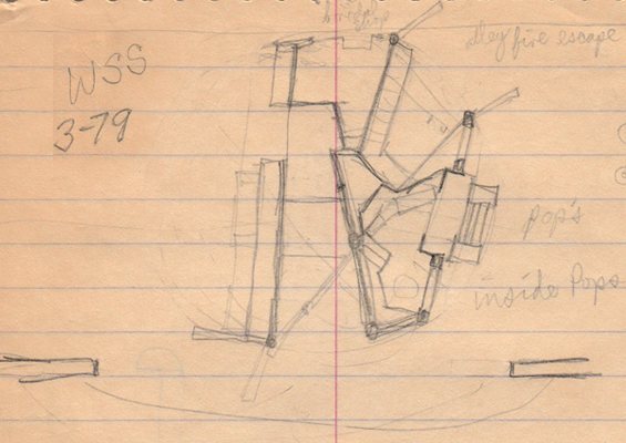
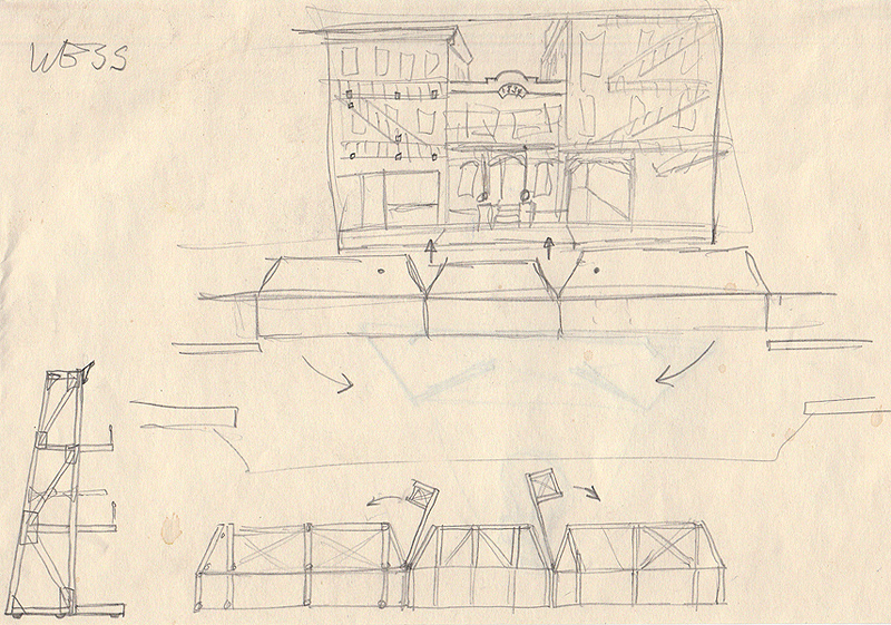


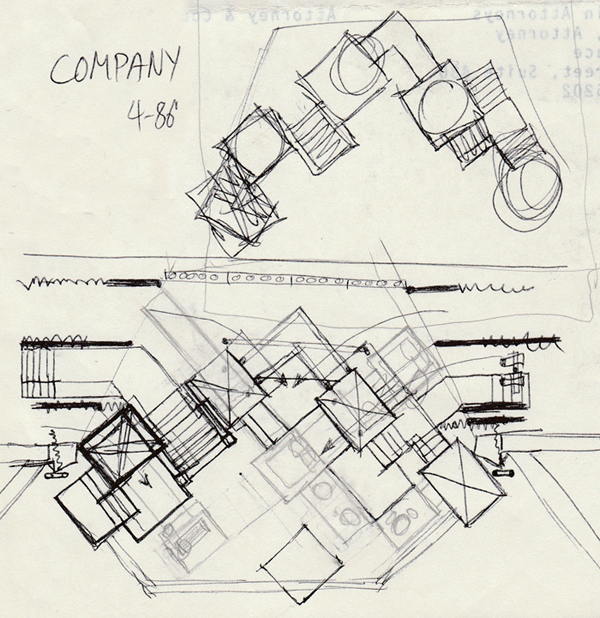

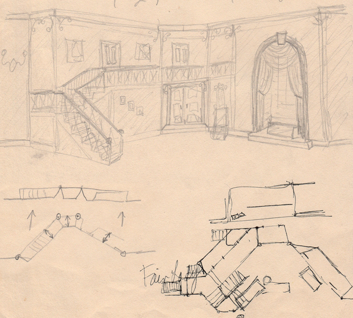
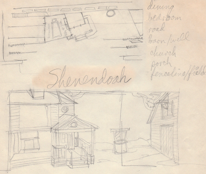
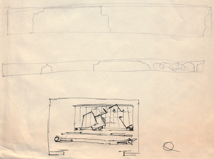
Above left: The Glass Menagerie. Above right: My Fair Lady. Below: Shenandoah
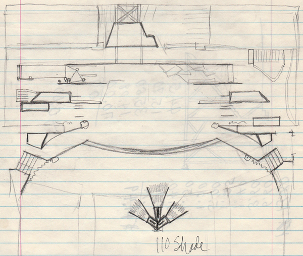
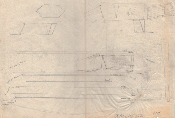
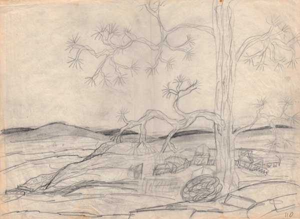
110 In The Shade


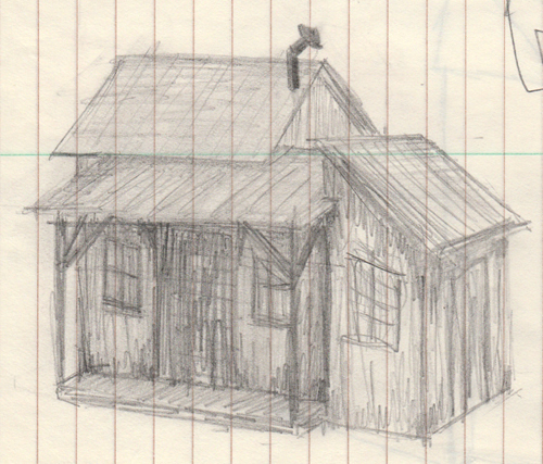
Dates
Mexican Folklore Dances: 1964
For Heaven's Sake, PHPC: July 1967
The Girls in 509, Hillcrest: December 1967
Spring Thaw, Hillcrest: Spring 1968
The Drunkard, Camptown Theater, Summer 1968
Sweetheart Presentation, UT: 1970
Yes, No & Yellow, 1976
The Crucible, BTWHSV&PA: 1980
Under the Gaslight, BTWHSV&PA: 1980
The Matchmaker, BTWHSV&PA: 1981
Yes, No and Yellow set design
This play was written by Tom White in 1973. The play revolves around a main character in a wheelchair who can communicate only through pressing buttons to operate an old stoplight - colors representing yes, no, and sorta maybe. His wife and her lover are able to manipulate him some because of his need to rely on them and the stoplight.
The play was presented at the Direct Theatre in New York City on March 5, 1976. Tom, his family, and some of his friends - Ed Baxter, myself, Toni White, and April Rapier - attended the premiere. This was one of Tom's first plays to be produced. A publisher bought the rights and needed a set design to include in the published script. Tom asked me to prepare a rendering and plan - he knew that I had come to the University of Texas majoring in set design.
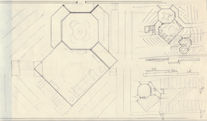
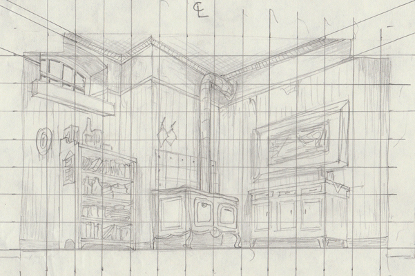
Tom was a college roommate and fraternity brother. One of our favorite activities was spending the afternoon at Lake Travis, near Austin. Tom and I discussed the play and his vision for the set. While floating on an air raft on the lake, I started imagining the design - two walls, prominent ceiling beams, and very eclectic furnishings. Eclecticism, a balanced mixture of styles, worked with the characters who collected various pieces of furniture and accessories. A corner siting of the walls positioned the front entrance upstage and the necessarily prominent stoplight in the upstage corner where it looks over the entire room. Design: 1975, Austin, Texas

Above: Rendering. Below: Sketch and Floor plan.


Teaching design at the Arts Magnet High School
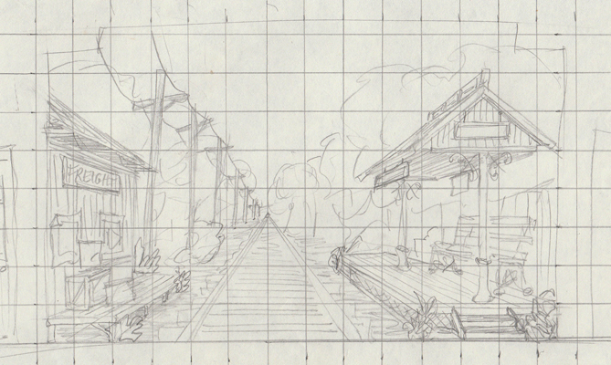
I had read about the Arts Magnet High School in downtown Dallas. Full name: Booker T. Washington High School for the Visual and Performing Arts. I called the school and, after some connections and discussions, I was asked to help out in the Design area as a Teaching Assistant. I was still in graduate school and thought this would be a good gig while in school. I was hired full-time for the next fall, 1979 and taught for two years, 1979-81. I was hired by two departments - Art and Theater. I taught art classes, Basic Design and Drawing, in the morning and theater classes, Prop Design and Set Design, in the afternoon. It was fun because I got to know students in 2 of the school's 4 departments (the others were Dance and Music). I also helped out the Stagecraft teacher, Roger Richards. We worked together in that I and my students designed the sets and he and his students built the sets. I designed stage sets in high school and college and it was fun to get back in the shop and create the magic that happens on the stage of live theater. I loved teaching high school. It was very satisfying to serve as a role model for these young kids.
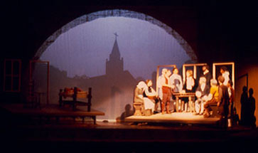
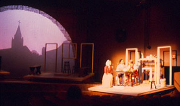
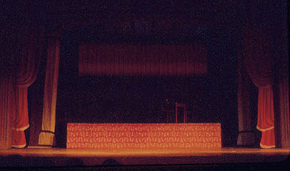
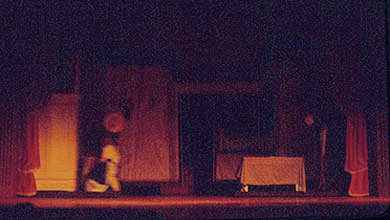
The Crucible
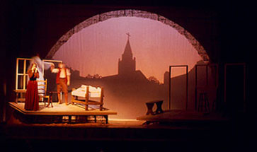
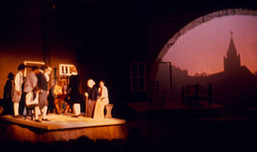
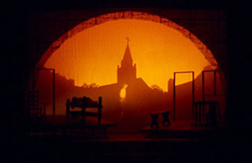
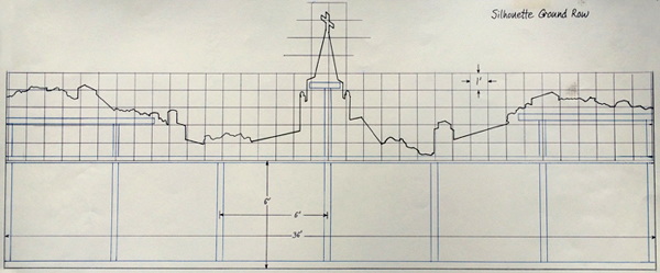
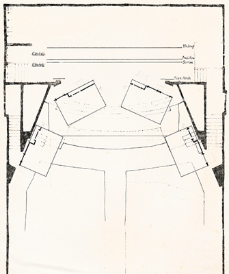
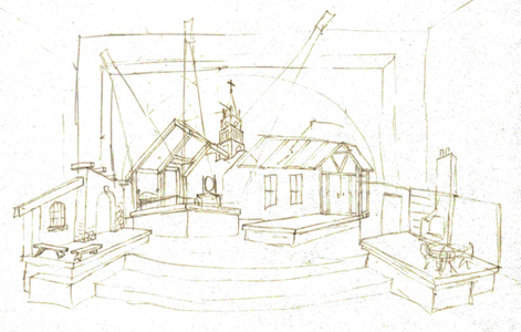
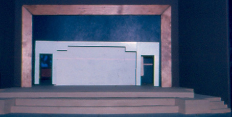
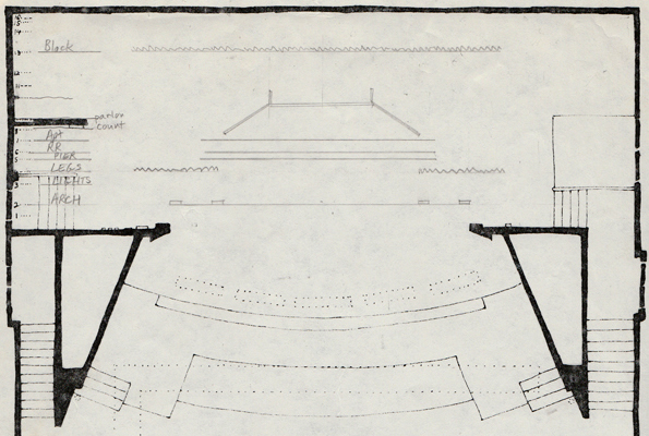
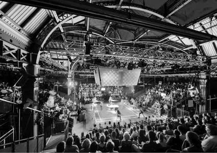
This classic drama by Arthur Miller is the story of the Salem witch trials makes a statement about the Communist witch hunt of the 1950s. The floating platforms formed a semicircle with the end tow platforms jutting out into the theater seats. The arch theme was repeated in the proscenium arch that framed a silhouette of a town with the church steeple dominating the scene.

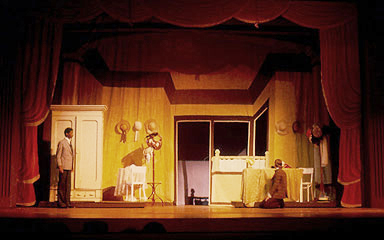
The Matchmaker
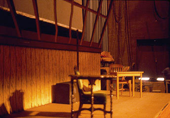
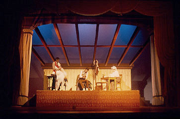
The play that was adapted into the Broadway musical Hello Dolly.



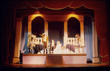

The Inspector General, class production

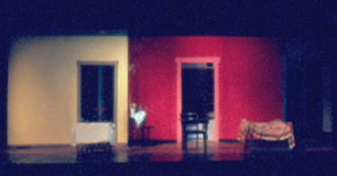
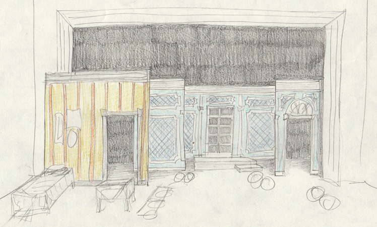
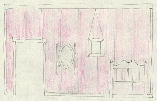
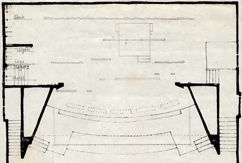
Under the Gaslight, a melodrama


Dates
Mexican Folklore Dances: 1964
For Heaven's Sake, PHPC: July 1967
The Girls in 509, Hillcrest: December 1967
Spring Thaw, Hillcrest: Spring 1968
The Drunkard, Camptown Theater, Summer 1968
Sweetheart Presentation, UT: 1970
Yes, No & Yellow, 1976
The Crucible, BTWHSV&PA: 1980
Under the Gaslight, BTWHSV&PA: 1980
The Matchmaker, BTWHSV&PA: 1981

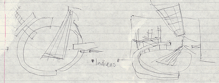
Magazine ad, I don't remember what this was for. Some class assignment, maybe for a museum exhibit or a cover.
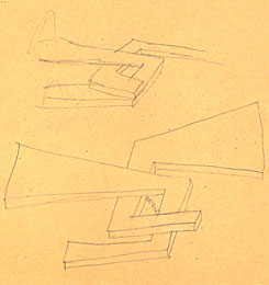
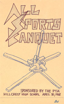
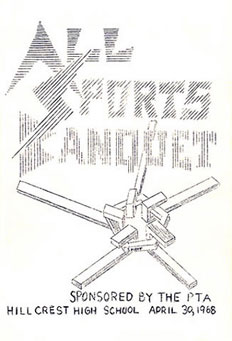
Sketches and finished art for a cover for copying on a 1968 mimeograph machine (remember the purple ink and that great smell?). I wanted to show a variety of elements (the j-shaped prongs) being tied together by 'spirit' as in school spirit. The finished reproduction didn't turn out as well as the sketch.
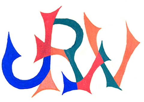
Above: JRW initial logo for an assignment in art class. Below: the way it looks now:

www.jamesrobertwatson.com/workHHS.html