A better bag for WhichWich


(From its website) Frustrated by the lack of great sandwiches available in quick service restaurants and bored by the domination of burned-out brands, Jeff Sinelli created a fresh concept for a sandwich restaurant featuring just superior sandwiches. No soups. No salads. Just the best possible 'wiches' served in an edgy yet inviting environment.
WhichWich created a revolutionary ordering system that simplifies the process. The customer uses a red Sharpie pen to mark selected items from a pre-printed menu on the sandwich bag. The same bag is used to deliver the sandwich to the customer. All wiches are customized to the customer's specifications and are all the same price. The system creates efficiency and customer satisfaction.
The ordering bag
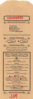
However, the design and layout of the menu items on the existing bag (below, on the left) is jumbled chaos. A better bag layout would help meet these objectives:
Allow ease of understanding and use: legible, readable, comfortable, clear instructions
Require minimal speed: easy scanning, comfortable alignment
Convey that the restaurant cares about the customer in both the ordering experience and in the restaurant experience
Some concerns
The options are arranged two ways - in rows reading left to right and in columns reading top to bottom. There is no alignment of the elements, making it tougher to scan the items to see what options are available and then to easily mark them.
Lines separate the headings from their accompanying info. Arrows in circles have been added to clarify that the heading above the line goes with the items below the line.
Since the bread illustrations are both identical, they don't visually distinguish white from wheat. The shape of the illustration does not match the actual shape of the bread used in the WhichWich.
The word 'Worked' seems inappropriate. The meats and cheeses are worked also. Customers probably don't care if the sandwich is worked - they just want a good customized sandwich.
The heavy black boxes don't serve any function, they just add to the chaos of elements.


A better bag
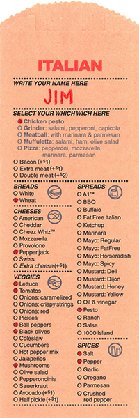
The area to write one's name is at the top:
a. It is harder to overlook (when a customer forgets to write his/her name, the cashier has to write it in).
b. The category and name are next to each other - easier for the sandwich maker to call out, "An Italian for Jim".
c. Writing my name first, at the top of the bag, confirms that this is my sandwich. This sandwich is being customized just for me.
To allow easy scanning of options, the items are listed in vertical columns - a familiar way to organize information.
Items are listed either in alphabetical order or with popular items listed first and the rest in alphabetical order. If I know I want Cheddar cheese, its easy to scan down the alphabetized list to find Cheddar.
Horizontal lines help separate and organize the categories. The lines are actually rows of dots, to respect the circular theme in the interior design of the restaurant.
The illustrative icons help the customer scan and easily understand each heading. They match the theme of crisp circular graphics in the restaurant.
Text copy is larger for easier readability.

The column format is more consistent with the existing format on the restaurant menu boards (above).
The long list of items in the columns, while easy to scan, appears impressive - WhichWich provides numerous options for customizing a sandwich.
The word Sauces is deleted - the heading of Spreads is adequate.
Mayo and Mustard are listed under the Spreads heading and Onions are listed under Veggies - where they belong - reducing and simplifying the number of categories for the customer. While the existing order of items might help the sandwich maker, that shouldn't take precedence over the convenience and ease of use for the customer. It should be easy for the sandwich maker to adapt - to easily follow the order of the items.
The bottom line
The new layout is visually more inviting and immediately appears less cumbersome to fill out. It better respects the order, clarity, and cleanliness of the restaurant; and it better meets the objectives and mission of WhichWich: efficiency and customer satisfaction.
Dates
Inspiration and concept: Wensday, September 2, 2009
Designed and produced: September 7-18, 2009
Submitted to WhichWich: Monday, September 21, 2009
Non-committal response from WhichWich: A few days later