
How to make the new Met logo even better

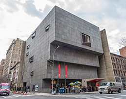
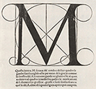

Above: The former logo for The Metropolitan Museum of Art (everybody refers to it as the Met) in New York City featured a drafting rendered letter M, adapted from the 1509 book De divina proportione by Luca Pacioli. But, as The Met moved its modern art collection into the former Whitney Museum building - a Brutalist classic by Marcel Breuer - now called The Met Breuer, the former logo would no longer be appropriate. There needed to be a new brand to better convey the new Met. A logo with images would be tough - how could they represent such a vast collection spanning thousands of years and hundreds of styles and genres of art with just one or a few visuals?
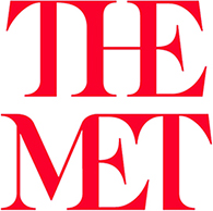
In early 2016, The Met introduced a new logo - conjoined letters that "connect the past with the future." The museum's VP of Marketing says, “The Met represents over 5,000 years of art, from all over the world; at Fifth Avenue, the Breuer, and the Cloisters. This notion of trying to make the connections - it was what drove the look of the logo." The conjoined letters connect the past with the future. But, that concept could/should be carried a step farther - to not only connect the letters horizontally, but also vertically. Connecting the past with future in a linear timeline and connecting the depth of the collection into a single entity.

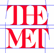
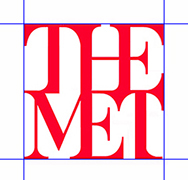
Improvements
• Letters touch vertically as well as horizontally.
The thick stroke of the H aligns above the thick stroke of the lower E.
Serifs are vertical, not slanted or skewed to respect the verticality of the thick letter strokes.
Thin lines in the font are a bit thicker to better relate to the thick strokes and provide more strength to the logo.
The 'barbs' of the missing serifs on the Ts remain for increased memorability.
The left and right margins align, forming a better frame; as art is framed and highlighted.
The revised mark is more orderly, more cohesive, and more connected (which is the main design concept).
Lesson: Figure out the strength of the piece, exploit that and minimize the rest.
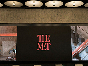
Some applications


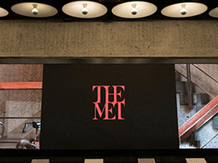
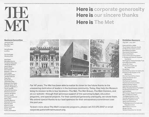
Below: In 2017, TheMet adopted some of the better concept - the kissing lines of type. Now just one step further to the brand:
Dates
Concept and sketches: 2016
www.jamesrobertwatson.com/themetlogo.html