
Supplies
Materials
__ Drafting tape
__ Pencils for sketching
__ Black marker, fine point, felt/plastic tip
__ Black markers, medium - fat
__ Color markers as needed by project
Substrates
__ Sketchpad or sketch book
__ 8.5" x 11" (or larger) tracing paper
__ Bristol board, smooth surface, 11" x 17"
Tools
__ T-square, 24" metal
__ C-Thru ruler, picas and inches
__ 30/60 Triangle
__ X-acto knife #11 blades
Presentation
__ 2-3 sheets 20" x 30" solid black mat board
__ 3M Spray Mount
Graphic Design 1
Graphic Design 2
Graphic Design Studio
Neurobic activities project
Procedure
Download, print, and cut in half the Neurobics form. Fill it out and turn it in at the beginning of each Monday's class between now and the end of the semester. You won't have to make an oral presentation. Enjoy the activity, don't worry about taking notes.
Instructions for the form
Print the name, place, and date of each neurobic event; a thorough explanation of how or why this event qualifies as a neurobic event (never done it before, afraid of doing this, etc); and an explanation of your response to the event: how you grew, what you learned, or how it will affect you.
Specs
• Use only the form provided, 4.25" x 11"
• Print clear explanations only on the front of the form.
• Proofread for correct spelling and grammar.
• Meet each deadline.
• Each neurobic activity must:
1. Have occurred during the week before turning in the form.
2. Be self initiated. You decide to change your life.
3.Be significant and impactful.
Evaluation
Follow the specs and you will earn 85 points. You will earn more points if the neurobic activity is particularly noteworthy, announced in class, design oriented, high culture, or extra special. You will lose points for misspelled words or poor grammar, if its not impactful, and if you did not initiate the neurobic.
The designer's curse: Scratch the itch
Creative people see things in new ways, transfer information from one problem to another, and make connections where none existed. George Bernard Shaw (and later, Robert Kennedy) once said something like,
Some people see things as they are and ask: Why?
I see things as they could be and ask: Why not?
Designers (creative problem solvers) see connections that did not previously exist, transfer information from one problem to another, see possibilities that are not immediately obvious, and are constantly honing their analytical ability to solve problems. Though we are all bothered by the little annoyances caused by products or systems that we know could be done better, designers are the ones who respond with "there must be a better way". They then set out to find such a solution, sometimes just in their own minds and sometimes for actual production. Good designers are constantly redesigning their environment. They hone their problem solving skills by practicing, often subconsciously, the process of design wherever and whenever they seek problems.
Your more sophisticated sense of aesthetics, sequential order, and efficient communication of information sets you apart from non-designers. This project allows you to practice your problem solving skills by responding to the designer's curse: that innate desire to make things better, find a better answer, or produce a better solution. Sometime recently you were probably somewhere and felt a bit uncomfortable about the design solution to a product or process. That itch should be slightly annoying. As a problem solving designer, have the courage to do something about that itch: redesign the product, place, or procedure. Make it better.
Procedure
Analyze the itches that bother your sense of design, practicality, and inconvenience. There should be plenty. If there are not, practice being more analytical and more aware of products and systems that could be done better. Create a new product (or products) or develop a new system that satisfies a need in the marketplace, makes something better, and benefits a segment of society. The new product or system must be original/novel and practical/useful. If it is not original then it is not a way to make something better. If it is not practical then it will be too hard to promote in the marketplace. Use the worksheet as a guide: conduct background assessment, develop the product or system, and formulate a promotion and marketing plan.
Assessment
Recall where the itch last struck or now be aware of when the itch strikes. Visit the place: restaurant, store, office, school, etc. Analyze the current situation. Determine the specific design problem. What objectives were achieved (or should have been). What are the primary and secondary target markets.
Feed/input
Learn about the situation and the place: observe the users, take notes, and conduct research. Critique all aspects of the problem: materials used, arrangement of elements, information communication, use of space, architecture, interior, traffic flow, graphics, etc.
Incubation
Allow your mind to explore, create, and solve.
Retrieve/output
Thumbnails, ideas, concepts, brainstorming, roughs, design decisions, compromises, fine tuning,and final decisions.
Presentation
Make an oral presentation describing how you soothed the itch. Include a critique of the existing design solution (why does it not work?), and recommendations to make it work better. Be thorough and specific. You may use maps, charts, photos, renderings, models, or anything else that will help communicate clearly your improved solution.
• Experience, appreciate, and enjoy the designer's curse.
• Practice scratching the itch.
• Become more aware of the surrounding environment.
• Objectively critique design quality and execution.
• Develop assertiveness and courage to feel comfortable reworking someone else's design solutions.
• Work through the steps of creating a product: assessment, research, concept, sketches, comp, and presentation.
• Practice communicating a concept and solution with clarity and ease of comprehension.
• Grow as a problem seeking and problem solving designer.
The Cheese Monkeys book cover project
• Inks: 4-colors +2
• Size: front and back: 5.125" x 7.5", spine: .75" x 7.5"
• Paper stock: open
Front cover contents
• "National Best Seller"
• Title and subtitle
• Author
Back cover contents
• ISBN info box: category, ISBN numbers, bar codes with UPC numbers, USA and Canada prices
• Publisher logo
• Publisher web address
Spine contents
• Title
• Author
• Publisher
Somewhere on front, back, or spine
• At least 8 reviews with sources credited
• Cover design credits
The Book Design Review
Covers
Wikipedia
Google Book Search
Book design By Andrew Haslam - Good info in the preview
By Its Cover By Ned Drew, Paul Sternberger, Paul Spencer Sternberger
Symbol design project
You've been hired to design a symbol or symbols for one of the options listed below (select one that interests you). It/they will be used to inform and direct a variety of users. The symbol may be used alone, with other symbols, or in a variety of applications yet to be determined. Your task as the designer is to communicate clearly and efficiently with a minimum of confusion to a specific group of people to educate and change their minds.
Pursue symbol design as you would any design project: state the problem, determine the primary and secondary target markets, and list thorough objectives that the solution should achieve. Conduct exhaustive research: become an authority on the topic, its need for a symbol, possible uses, and ramifications. Clarify your creative strategy (theme, concept, plan, etc).
Sketch thumbnails, brainstorm, sketch some more, and do more research. Explore a variety of concepts. Experiment with a theme to convey an image appropriate to the place and the user. The symbols should communicate the message clearly and quickly.
Become more aware of the vast number of symbols in our global society. Some are loud and bright, others are quiet and subtle. Note the ways in which people, cars, plants, animals, and other objects are portrayed. Refer to symbol sourcebooks in the library. Sketch or photocopy the symbols you want to remember.
Determine the target market that will most benefit by these symbols, how and where the symbols will be used, the scale at which they will be reproduced, the physical environment where the signs will be, manufacturing limitations, and any other ramifications of the symbols or lack of symbols.
Since symbols are simplified pictures, the first consideration may be to determine what image would best represent the message that needs to be conveyed. For example, to represent a gift shop that sells stuffed animals, toys, magazines, and candy; a graphic silhouette of all those objects together might be accurate but it may also be confusing and too busy to be clearly and rapidly understood.
A gift wrapped package might be a good choice because it is generic: it says gifts. Once inside the shop, the variety of gifts would be clarified. But a gift wrapped package may be too vague or obvious. You may want to avoid it in favor of a dollar sign (symbolic of the transaction of money to buy a gift) or a specific item from the store.
If you decide the package is the best symbol for the gift shop, you must then determine the size and shape of the container (a box, a bag; long, short, square, etc.) and the ribbon (long, bowed, wide, etc.) Here's where research and thumbnails come in. Look at gift wraps, packages, boxes, bags, catalogs, and bows. Draw, sketch, doodle, and refine. Remember, the image doesn't need to be realistically accurate; just clear in its perception by the viewer.
Next, turn those thumbnails into roughs that are more finished. Take what was an outline drawing or simple sketch and refine it. Pay close attention to detail: consider all the variables of line, shape, angle, circumference, realism, etc. Retain the detail which makes it understandable and remove the details which confuse or get in the way of clearly communicating the message. Explore the balance and contrast between black and white, positive and negative, thick and thin, organic and geometric, etc.
Edit, simplify, and refine. Test your work by showing the symbols to strangers. Tell them where the symbols will be used and ask them to tell you what the symbol might represent. If they hesitate slightly or do not know, go back to the proverbial drawing board. Strive for clarity of the message content.
The last step is to prepare the comprehensive. Ink a comp of the most effective symbol(s). Translate the freehand lines from your tight roughs into mechanically perfect lines and shapes. Measure and ink accurately: use templates, compass, and ruler. Work large and reduce the comp for the presentation.
___ Straight ahead
To clarify direction in wayfinding signage.
___ Independent party
To be distinct from symbols of other political parties.
___ God/Jehovah/Allah etc.
To not represent any specific creed or religion.
___ Visit, click on, log on
To clarify procedures for accessing information on the web.
___ Suits of cards
Two new suits to join the existing four, creating a deck with six suits.
___ Mail, phones, fax, email, web
To clarify contact options for use on stationery, forms, ads, etc.
___ Recycle symbols
To clarify 3 slot options in one receptacle: paper, bottles & cans, and trash.
___ Curb your dog
To deter dog pee on buildings.
Rebus design project

A rebus is a series of pictographs or symbols that clearly communicates a word or phrase.
The word rebus comes from the Latin ‘raybus' which means ‘by things'. A good rebus is usually simple, clever, and easy to understand. Below is a rebus that Paul Rand designed for IBM in 1981 (he had earlier designed the now-classic logo for IBM):

Word rebus examples
• Law Sand Jealous
• She Ever Lay
• Age Happen He Scar
Procedure
Consider a variety of common phrases, cliches, titles, and slogans. Determine which best lend themselves to being communicated visually (use phrases that are object oriented). Clearly communicate the phrase using only simple renderings or symbols: no words nor letters may be used. Try to see your work objectively: what you think is being said may not be what the viewer perceives. A symbol for lake might be easily perceived as pond, sea, ocean, water, waves, etc. How can one clearly communicate a body of water to be a lake? Does the heart shape now mean ‘love' to everyone or could it still mean heart? Test your renderings on non-design majors. Design the page layout composition. Refine the visuals and ink them neatly. Write out the phrase on the back only. They will be passed around in class for deciphering.
If you do more than one, put each on a separate page.
Specs
• Black ink on 11x8.5 white paper
Evaluation
• All specs followed precisely.
• Degree of complexity of the rebus phrase.
• Drawings that communicate clearly with little confusion.
• Thorough use of symbols and pictographs (little or no text).
• Pictographs rendered neatly.
• Pleasing page layout composition.
Purpose
To make decisions regarding appropriate phrases and selection of symbols to clearly communicate a phrase, with minimal confusion, so others can easily understand the information.
A few rebus puzzles created by students in Graphic Design at UCO. Answers


Answers
Logo design that improves comprehension and retention
A logo is a graphic signature and helps create a strong visual image to establish company or product identity and recognition.
First created by Chinese calligraphers in about 2000BCE, logograms were calligraphic characters that represented a sound or word (such as the ' &'). Today the design and production of corporate identity programs is big business. Great logos are appropriate to their task, clearly convey the intended message, have meanings behind the symbolism, integrate the text and image, and have thorough rationale supporting each design element in the piece.

Above left: In English, the word chaos requires 5 separate symbols. The Chinese had so many characters in their alphabet that, around 1,800BCE (a really long time ago), they developed single calligraphic characters that stood for words - the mark, above right, is for chaos. The single mark was more efficient: easier and quicker to render. It was called a logogram, meaning written word - written = gram, word = logo. The term stuck and, today, we still refer to marks of identity as logograms, or more commonly, shortened to just logo. Some people also clarify the type of logo with these terms:
• logomark - a logo that is primarily image-based
• logotype - a logo that is primarily text-based
• logogram - a general term for an identity mark
• logo - same as above, but with fewer letters in the term
Synonyms
Common: identity, logotype, trademark, symbol, mark
Less common: logogram, icon, pictogram, logomark, isotype
A logo can be unaltered type, manipulated type, a symbol or visual, or a combination of type and visual. If a logo/identity consists of both type and visual/image, the two should be integrated to allow easier comprehension and memorability. A company's name is often part of their logo; an ad slogan or address is not.
Great logos convey the essence of what the company/entity is about. usually, they're not literal images of products, but more of the feeling one gets or the attributes associated with the company. A restaurant logo will likely not show food, but it will convey cleanliness, sophistication, tastefulness, etc. A logo for an insurance company won't show a paper policy to fill out but will convey professionalism, trust, integrity, etc.
It is quite common for design students and poor designers to design a logo that emphasizes the initials of the client's company. A logo should be something that the viewer will identify with that company. If the company isn't known by its initials, then do not create an identity of its initials - communicate the correct name of the company - what people will say, not a cute acronym nor initials. There are no great logos of initials only. IBM, UPS, AT&T want us to know them by those names. Those are the new company names - they are no longer initials.
If one has doubts about the effectiveness of a logo sketch/rough - show the options to a bunch of people and get their responses. Try to show people that match the target audience and avoid leading them to a certain answer. It can help to get a fresh perspective - one can get too close to one's work to remain unbiased.
Logo/identity critique checklist
A great effective logo should meet many of these criteria:
Readable, legible, and easy to comprehend.
Suitable for the company's audience and purpose.
Impacts a strong lasting impression.
Unique from marks of other businesses.
Will last over time and not be dated to one trend.
Professional quality production.
Adapts to a variety of uses, surfaces, and media.
Retains clarity in a variety of sizes and applications.
The bottom line
• A great logo is a brief but effective identity, not an advertisement.
• A great logo has type and image that are integrated (unless it is image only or text only).
• A great logo conveys a message/feeling/essence clearly.
• A great logo requires slight participation from the viewer to decipher.
Identity design project worksheet
Working on a design project can be made tougher because of the assessment and research required before the mind begins to sketch thumbnail options. Below is a worksheet guide that can help a designer organize and easify this assessment process.
• Name of designer
• Client/company name
• Description of company/entity
Brief yet complete explanation of the primary function of the client's company.
• Project components
Identity, Front sign, Stationery, Gift certificate, brochure, website
• Statement of the design problem
What weakness, miscommunication, marketing failure needs to be addressed.
• Mission statement
"Create and produce an identity, signage, and graphics package that conveys the warmth and personal service of a new hair salon, while helping to overcome a poor entrance and awkward location." or "To overcome/introduce/help communicate . . ."
• Target markets
Consider primary, secondary, tertiary audiences. Be very, very specific.
• Purpose/goal of logo
What the new logo will accomplish. "This logo will . . ."
• Research conducted
State specifically what you did to learn more about the company, the audience, the marketing needs, etc.
• Competition
Companies that share share a similar product or service, audience, and market objectives
• What you did to get fluid ideas
The 'silly' stuff you did to open your mind, get inspiration, explore, pursue options; the more off-the-wall, the better.
• Adjectives the solution should convey
Qualities and attributes that ought to be communicated.
• Objectives the solution should achieve
List and clarify what should be accomplished. "The new logo should be minimally offensive, easy to remember, easy to reproduce, . . ."
• The call-to-action
The response or action desired of the target audience, reader, user
• Concept statement
The big idea, the key message, a description of the theme that drives the entire piece.
• Time frame for completion
• Life expectancy
• Budget
Name logo exercise
Develop 8 logos for a variety of companies that use your last name.
• Use your name (first, middle, and/or last)
• Clearly communicate the essence of a business
Print your name in a variety of fonts and cases. Explore hand-rendered letterforms, ligatures, and letterform relationships. Become an authority on how your name can be typographically manipulated.
Explore unique ways your name can communicate a company or entity.
Consider numerous entities that could be somewhat legitimate businesses. Some suggestions are below if you need a jumpstart but you are not limited on the types of companies to explore. They do not have to actual companies nor totally legitimate.
Seek clever ways to integrate a graphic element conveying the company into your name. You may add minor elements but strive to use the elements inherent in the letterforms of your name. Manipulate the letterforms to communicate the message.
Produce many sketches of possibilities. Refine the best 8 into tight roughs. Include the name or function of the company/entity or label the mark with the name.
• Size: each mark about 6"-8" mass
• Color: open
• Pages: each of the 8 should be on a separate page
• Comps composed on the page in a well-designed format
• Final comps unmounted
• Piano, house, or appliance movers
• Funeral parlor
• Demolition experts
• Cupcakery or cookie bakery
• Accident insurance
• French bistro
• Pizza parlor
• Web design services
• Soccer team
• Composters
• Pickle emporium
• Travel agency
• Casino
• Meth lab



Logo design: Dasani branding
The bottled water category has been an incredible success. The competition is stiff and Dasani does not sell as well as Aquafina. The Coca-Cola Company is exploring the option of rebranding Dasani with a new name and new logo identity. You have been hired to explore new names, propose a recommended name and new identity. Coke executives believe that it may have been a mistake to not integrate the Coke or Coca-Cola name in the new product - maybe Coke Free (free of added flavors, caffeine, sugar, etc.)
Phase 1
Complete the following 5 tasks, produce on paper, any format, and bring to class:
1. Research Dasani to become educated about the product and its marketing philosophy. List all the ways you researched the current Dasani brand. You don't need to detail what you discovered or the results of your research, just what you did.
2. Explore a variety of new names, at least one of which to include the words Coke or Coca-Cola. Submit several name options.
3. Determine which of those names from part 2 holds the most promise of marketing success. Submit detailed supporting rationale as to why the proposed name is the right one.
4. Determine the Primary Target Market and the Secondary Target Market for the rebranded Dasani. These markets do not necessarily have to match the current target audiences. Submit these two target markets. Remember that target markets should be very very specific - age group, economic background, ethnicity, gender, educational background, likes, dislikes, etc.
5. List and submit adjectives/descriptors that the new brand should convey (refreshing, thirst-quenching, etc).
Be prepared to discuss your submissions for Phase 1 in class. You may have to turn in a hard copy so plan ahead.
Phase 2
The design process of developing the visuals for the new brand.
OKC NBA team logo design project
The OKC metro area is becoming a major league city as the Seattle Sonics will be moving to central Oklahoma within two years. Undecided, so far, are the name, colors, and logo identity for the team. The marks shown below are from students in Graphic Design 2 at UCO, spring 2008. The design project included conducting research on NBA team identities, Oklahoma heritage, and statewide icons; determining an appropriate name; sketching logo concepts; composing the layout for stationery - letterhead, business card, and envelope; and visual and oral presentations of the finished pieces.
The new name of the team
The class decided, and I agree completely, that Oklahoma now has an opportunity to unify and raise the stature of the state by naming the team 'Oklahoma' rather than 'Oklahoma City' (like Texas Rangers, Utah Jazz, New England Patriots, Tampa Bay Bucs). Although the voters of Oklahoma City passed the tax vote, season ticket holders and fans will be from Moore, Norman, Edmond, Yukon, even Tulsa (OKC will reap the benefits of the penny tax through the increased hotel, restaurant, and parking revenues). Including the Tulsa market will raise the national ranking of the Oklahoma NBA television market. For broadcasters, fans, and logo graphics, 'Oklahoma Team' is easier to say and write than 'Oklahoma City Team'.
Notes on the target market
Basketball fans/sports fans
Residents of central Oklahoma
Involved in sports
Seeking entertainment
Social, like being with people
Age: 20-40
Primary: males, Secondary: parents
A few objectives for the name and logo
Convey a sense of Oklahoma
Sense of basketball
Energetic, motion, and action
Appeal to fans and the target market
Easy to pronounce and remember
Unique from other teams
Fan appropriate
Require minimal education
Be minimally offensive
Able to adapt to a variety of media and sizes







Stationery design project
Stationery is one component of a corporate identity program that may include a logo, signage, packaging, product labels, uniforms, trucks, etc. Stationery is most often used to conduct business with vendors, other companies, and, sometimes, the public. The target market may be slightly different from the audience for the other items in the corporate identity. A stationery package traditionally consists of at least 3 pieces:
1. Letterhead for general correspondence
2. Envelope (sometimes in more than 1 size)
3. Business cards - usually one for each major employee of the company.
Optional: invoice sheet size, note paper size, and note size envelope
It is somewhat common for mediocre designers to misspell stationery. Stationary means 'not moving'. Stationery is printed pieces for correspondence. Memory aid: the word letter ends in er, the word stationery includes er. There can be stationary stationery, but make sure you show your intelligence by using the proper spelling in the appropriate context. Remember - no matter how much you push the envelope, it will still be stationery.

The above sign in an office supply store got it wrong. Very wrong - the images behind the words were animated - they were not even stationary.
Review the notes, objectives, and descriptors for the logo. Determine a specific target market for the stationery package. The logo/identity should 'drive' the layout composition of the 3 pieces - all pieces should respect & enhance the logo - the concept of the identity should be the driving force in the stationery. The layout of each piece should convey similar adjective descriptors and meet similar objectives as those established for the logo. Consider which information belongs on each piece. Sketch layouts that enhance the concept. Consider the orientation (landscape or portrait) of each piece, paper stock, cuts and folds, colors, etc. On the letterhead, include a letter. No one (other than some award categories) will ever see a blank letterhead. The target recipient will see a letter - in fact, the letter is the most important element on the page, everything else is secondary. With most companies now printing letters on their office desktop systems, the designer can recommend and justify the specs for the letter - the font, point size, layout format, margin width, leading, and starting point of the letter. Write a letter that includes the design objectives so the client will have a document with all your intelligent rationale.
Letterhead: . 8.5" x 11" or 11" x 8.5"
Card: . 3.5" x 2" or 2" x 3.5"
Envelope, #10: . 9.5" x 4.125"
These sizes are the norm, but sometimes, the designer wants to make a statement that is not clearly conveyed by the 'norm'. To determine the most appropriate size, consider the audience, the content, how often the items will be used, budget/cost restrictions, filing and storing requirements, and mailing restrictions.
http://www.belightsoft.com/products/companion/paper/envelopes.php
http://www.littlebit.com/general_info/envelopesize.htm
http://en.wikipedia.org/wiki/ISO_269
Business cards and checklist
Build a presentation comp that includes the 4 major components - the 3 print pieces and the letter. Turn in a finished comp exactly as you would present to the client. Specs on color, size, paper weight, and printing will be dictated by the assumed (or actual) budget, project objectives, and target audience. On the envelope, indicate the address and a neutral stamp. On the letterhead, include the letter. All elements should be aligned with consistent spacing of the gaps between pieces. Suggested layouts:


Ambigram project


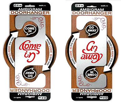
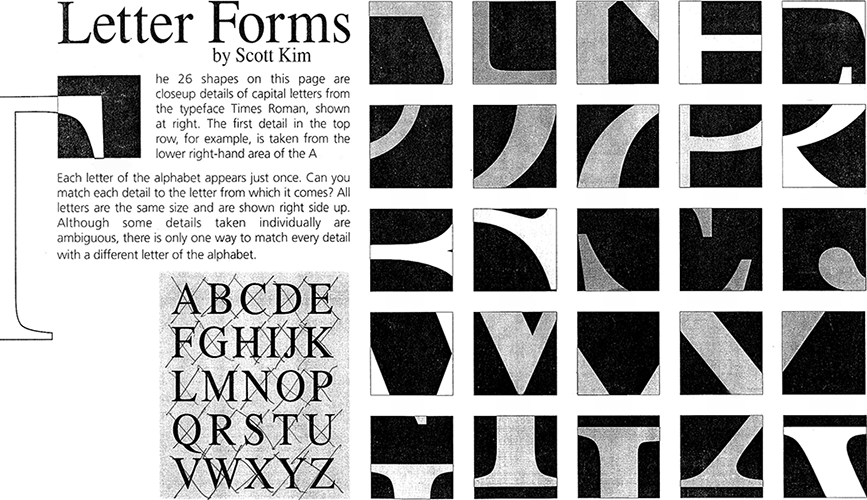
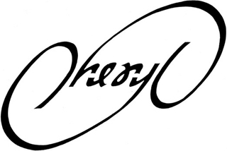
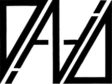
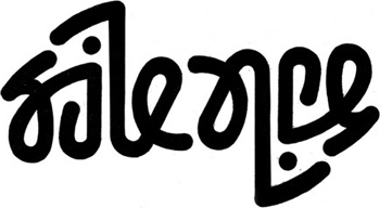
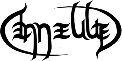
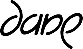
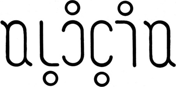
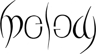
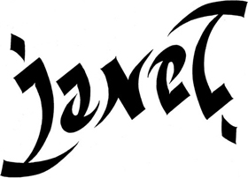
An ambigram is a word image that can be read the same right side up as upside down or as a left and right mirror image. It can be of the same word both ways or one word one way and another word the other way. Above right: The doorhanger is a great application of an ambigram - even the package design is an ambigram. No matter how the store stocks the products on the shelf rack, they will be oriented correctly. A brilliant way to communicate how it works.
Procedure
• Review the resources below to get a better idea of what ambigrams are and how to create them.
• Study the letters in your name (full name or part of your name) and develop an ambigram that clearly communicates and cleverly acknowledges its letterform relationships. If you have an obscure or hard-to-guess name, you may substitute other words (with instructor approval). Explore and analyze thoroughly each letter: what defines it and what makes it unique.
• Sketch thumbnails. See the letters as shapes and discover ways they can communicate in two orientation directions. Peruse the resources listed below. Render letters in various type families and cases. Turn the paper over to see what elements can be used to form other letters. Some letter pairs are automatic ambigrams: a & e, b & q, d & p, A & V, M & W; while some letters read both ways: H, I, O, S, X. Avoid these as they may not convey enough exploration and cleverness.
• Test the ambigram by showing it to strangers (your friends are too biased) and listening. Some confusion in the viewer's mind is okay if the vast majority of test subjects conclude the correct name. Show it to more people. And yet even more. This project will be evaluated on two main factors: comprehension by people who don't know the name being communicated and the clever interplay of letterforms.
• Refine to the centimeter all graphic elements: line ends, line weights, curve radii, baselines, etc. A successful ambigram is a ‘game of inches'.
Design decisions are compromises: seek efficient comprehension in both directions. Conclude all decisions at the tight rough stage.
• Ink the final version using a straightedge and templates (or use a computer). It may help to ink it large and reduce it on a copy machine or computer. Trim and turn in that copy in a well-designed composition.
Resources
John Langdon's ambigram gallery.
Advice on learning to create ambigrams, from John Langdon.
Inversions, by Scott Kim.
Ambigrams by nagfa.
Purpose
• Enhance creative problem solving skills.
• Explore letterform relationships: see letterforms as shapes to be manipulated and abused.
• Appreciate the complexity of alphabet letterforms.
• Determine appropriate and pleasing layout compositions.
• Practice inking letters.
• Provide a portfolio piece.
Specs
• Name/word must contain at least 7 letters
• Size of ambigram: reasonable
• Color of ambigram: black
• Color of background: white
• Paper size and color: open
• Layout composition: open
Evaluation
1. Comprehension by people who don't know the name being communicated.
2. Clever interplay of letterforms.
• Active participation in critiques: proper grammar and vocabulary; assertive, positive, confident, and enthusiastic.
• All work turned in on time.
Concept and Communication
• Thorough exploration of options.
• Legible, readable, and understandable.
• Intriguing and clever interplay of letterforms and typographic image.
• Appropriate letter and word spacing.
• Intelligent use of design principles.
Execution
• Specs followed precisely.
• Neat inking: crisp, smooth, consistent.
• Pleasing composition of mark on paper.
• Neat clean presentation.
• Appropriate materials and size.
Samples of student work
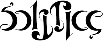
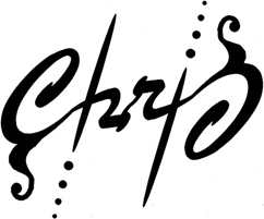
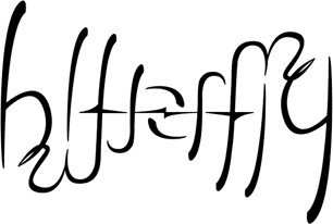
These are some of the pieces students in Graphic Design 1 completed for this project. Each was hand-inked - the computer was not allowed (the emphasis was on thinking, creativity, and problem solving - the computer becomes a limiting crutch at that early stage). Some are left/right mirrorgrams, some are rotational, some form a different word when inverted. Not all the above project specs applied in each of the semesters represented below. Each piece is owned by the student designer. No reproduction without permission. Thanks.




























Poster design project
One of the oldest advertising media, the poster grew in popularity during the Victorian era as new printing technologies allowed for mass production of larger handbills, fliers and posters. It rapidly became an effective way to communicate to a wide audience. The poster again hit a peak in popularity in the early 1900s as Art Nouveau flourished and again in the 1960s-70s. Even with the variety of media available today, the poster can still be a viable and effective means of conveying a specific message.
Develop an effective poster that communicates a specific social message to a specific college-age target market to achieve a specific purpose.

1. Start by choosing a significant topic of social responsibility. While there may be apathy towards some issues, many college students are beginning to explore issues that impact their world, their environment, and their morals, and their beliefs. Choose an issue of social importance that you feel strongly about - one for which you have a great deal of passion. The topic should also be current, impact a culture, and appropriate for a poster. The poster should 'light a fire' in the mind of the reader.
2. Assess the topic - state the specific design problem, determine the target reader, and set objectives the poster should achieve. Include objectives that are specific to this problem and the target market you want to reach; all posters should achieve these three objectives (and usually in this order):
Get attention
Convey information
Incite action
3. Conduct the Input/Research step of the Design Process. Research the medium and the intended audience as thoroughly as possible. Learn as much as you can about both sides of the issue much like you would to prepare for a debate. You should become an authority on all aspects of the topic: its historical origins, its audience, its actions, and its impact. There are a few reasons why college students will be curious enough to check into a specific cause or issue. Your task is to gather enough input from that audience so you can better understand what that elusive quality is. Once you have a handle on that, then that entity can drive the concept for the poster. The more info you amass, the easier it will be to develop a strong concept.
Note: if your mind begins to conceptualize images, slogans, copy, etc - let it. Jot those thoughts down or sketch them. While your brain may not have all the information yet, avoid allowing barriers to intervene in your creative process.
4. Build a strong concept. Make a statement - state a case and make it convincing. The poster should change one's attitude on the issue. The concise concept statement becomes the main driving force behind the piece. Great design work is concept-driven - design decisions are based on how well they support the clarity of communicating that concept.
5. Write the copy - words that are well-crafted to reach the audience and make an impact. Consider a headline, subhead, body copy, and a slogan or tag line.
6. Finalize design decisions while rendering rough sketches. Find or render an illustration/photograph and organize the information, the words and images, into a strong visual presentation.
7. Create a finished comp for presentation.
8. Prepare an oral presentation. Look professional, be thorough but brief and appear polished and rehearsed. State the problem and objectives and give strong rationale for:
a. Objectives
b. Specific target market
c. Concept/theme/slogan/copy
d. Use of color
e. Typeface selections
f. Layout
g. Illustration/photography style and any other unique elements
• There are many ways for a poster to get attention - type, color, shape, size, image, words, etc. The concept can be image only, text only, or a combination.
• Avoid locking into a strictly 'standard' size and shape of poster.
• Consider the POV of the poster reader.
• Craft the words for efficient & impactful clarity.
• Layout: contrast, alignment, proximity, repetition, relationships, eye-flow.
• Attention to detail: kerning, baselines, font selection, image.
• Explore effective powerful images and words to grab the reader, shake them up, and persuade them.
• Experiment with how to break through the clutter of mundane numbing messages (pretend you're at a club where the music is loud - someone walks by and you have to scream a message so powerful that they have no choice but to stop and take notice; the bulletin board full of fliers and posters is the 'noise' of the club and your poster must do the screaming.)
• Link to powerful movie posters
• Clear concept statement and strong supporting rationale.
• Finished comp size: 11x17 or 17x11 up to 34x22 or 22x34 inches.
• Color, shape, add-ons, type, and images: all open
• Analyze, state, and solve a design problem
• Create an effective graphic communication solution
• Establish a position on an important topic
• Develop type and images that are very persuasive
• Practice and refine comp preparation skills
• Refine and practice oral presentation skills
The iPhone name class project
iPhone, just didn't seem like an appropriate name for a product that is a mini-computer, music player, map machine, camera, email checker, and web browser. Once it was announced that Apple would be introducing the iPhone, but before it was unveiled, I assigned a graphic design class to develop a better name. They conducted research and talked with friends about some options.
Note: the 'i' stood for Internet when the original iMac was introduced as a truly user-friendly model for those who were still a bit afraid to use a computer. It was very simple to set up and operate. The prefix of the i became so connected to Apple Computer that they adopted it as a prefix for a variety of products, no longer representing 'Internet' but serving as an icon for Apple. This project was completed before the iPhone came out and now that it has become the new standard for such devices, the name is irrelevant. We have accepted the name, as inappropriate as it might be, and put it into our collective vernacular.
• Generic - Apple or Android
• Easy to spell, say, pronounce, remember
• Appropriate
• Clear - convey device, make sense
• Graphic adaptability
• Legal availability.
iCon - the product would be icon-driven
iCom or iComm - it will be a tremendous communication tool
iPhone - we have already redefined the word phone to include cameras and texting
Telecom, iConnect
MicroMac, MiniMac
PocketMac, PocketCom, Pocket Computer
Handtop, Palmtop (desktop, laptop)
Compette: (disk, diskette)
ComputerPod, PodPuter, Telepod, TriPod
SmartFone, Fone: New meaning to familiar name, funky + phone,
Restaurant menu design project
Menus are vehicles a restaurant owner uses to communicate specific product information to a hungry target market. The target market is usually, as seated diners, a very captive and interested audience. A menu may also be a selling tool for the restaurant. It is an integral part of and can enhance the restaurant's overall ambience, image and reputation. Currently, menus cost $3-$10 each to design and produce. Some cost less: photocopied or handwritten sheets; some cost more: real leather covers, hand calligraphy, or expensive materials. The price of the menu should be determined by the location, price of items, interior ambience, character and style, and quality of food preparation.
Good info about menus Also, peruse the 'In this section' menu on the right.
A stock template for a menu Don't let your menu look like this.
A poorly designed menu Don't do this either.
From Chuck Green's Idea Book:
Just for fun, let's start off with how NOT to design a menu
The Psychology of Menu Design from Restaurant Resource Group
The Ten-Minute Manager's Guide to Menu Design from R&I
A short article about menu engineer Gregg Rapp from Time Magazine
A full concept design for South St. Burger Co. by Jump Branding & Design Inc.
A case study from Restaurant Startup & Growth
Select a restaurant that currently uses or should use a menu. There are no other limitations on the type of restaurant, but since you will eat there, pick one convenient to you with food you enjoy eating. Determine the specific problem or problems to be solved, set the objectives, and define the target market. Eat there: several times, different items, different times. You will become an authority on the restaurant, its food, clientele, service, decor, locations, etc. Consider the character and personality of the inside, exterior, parking lot, signage and surrounding naborhood. Define the type of restaurant: casual, formal, deli, diner, family, high end. Look at the patrons eating there. They will make up much of your target market. Obtain an existing menu (beg, borrow, buy) for reference and study it thoroughly. Determine any design limitations that will affect a new menu (lighting, table space, number of food items, storage, etc.) Determine the atmosphere or image conveyed to the diner. This information should help you select type, color, shape, visuals, etc. Explore numerous clever creative concepts. They should be appropriate to the place, clearly communicate the food items, be organized neatly by food category (appetizers, salads, entrees, desserts, etc.) and have a good physical feel in the customers' hands. After sufficient research, use traditional design methods: sketch numerous thumbnails, refine the concept and its sketches, and develop roughs in which you determine and finalize all of the design decisions.
Compile a process book for this project that contains information, notes, and samples.
Build a presentation comp that addresses all aspects of the project, including type, photography/illustration, color and paper choice. Turn in a finished comp exactly as you would present to the owner of the restaurant. Specs on color, size, binding, printing will be dictated by the assumed (or actual) budget, storage capabilities, usage patterns, etc.
Creative concept: appropriate, enhancing, appetizing
Effective communication: type selection, layout, color, graphic elements, physical feel
Execution: neatness, thoroughness, craftsmanship
Presentation: rehearsed, brief, thorough, energetic, enthusiastic, confident
Process Book Menu design project
• Restaurant full name and any nicknames
• Description of the restaurant company
• Category of restaurant - casual, high-end, buffet, diner, deli, etc; location of the home office; other restaurant locations;
• Competition: Restaurants in the area with similar menu items, audience, and market objectives
• Description of the restaurant exterior: Themes, colors, materials, styles, parking, street curbside appeal, signage, surrounding buildings and streets, location in the city
• Description of the restaurant interior design: Themes, colors, materials, lighting, signage, traffic flow, table arrangements, styles, bus stands, host/hostess stand, ambience, atmosphere
• Description of the food and drink: Categories, specialties, unique items, most popular items, kids items, desserts,
• Description of the service style: Attentive, casual, formal,
• Average ticket price: Include drinks, appetizers, etc; for both lunch and dinner
• Marketing: Logo and identity, samples of marketing and advertising, slogans, media
• The ADP: Determine the specific Average Diner Profile: frequency of visit, age, marital status, socio-economic, education,
• Other target markets: Specific secondary and tertiary audiences
• Assessment of the existing menu: Cover, typefaces, layout, images/photos, materials, colors, sequence,
• Assessment of competitor's menus: Strengths and weaknesses - what works and what doesn't,
• Life expectancy: How long the menu is used before being replaced for new items or a change in prices
• Budget: How much money will the restaurant invest in new menus
• Research conducted: State specifically what you did to learn more about the restaurant, the audience, the food, the competition, the marketing needs,
• List what you did to get fluid ideas: The 'silly' stuff you did to open your mind, get inspiration, explore, pursue options - the more off-the-wall, the better;
• List adjectives the menu should convey: Qualities and attributes that should be communicated
• Objectives the design of the menu should achieve: List and clarify what should be accomplished to be successful
• Concept statement: The big idea, the key message, a description of the theme that drives the entire piece
Useless products
Develop ideas and descriptions for several new consumer products that are legitimate enough to be produced and promoted but are certain to fail miserably in the marketplace. Examples:
• Inflatable dartboard
• Silicone hip implants
• Fire alarm with snooze bar
• Nuclear hand grenades
• Jarvik-7 artificial appendix
• Salted bandages
• Dyslexics edition of Scrabble
• Mobius strip toilet paper
• Lobster Helper
• Pocket Wasp & Hornet Teaser
• Spray on mildew
• Flavored ear drops
• Hookless fishing lures
Inventing a new product
Creative people see in new ways. George Bernard Shaw once said something like,
Some people see things as they are and ask: Why?
Creative people see things as they could be and ask: Why not?
Designers (creative problem solvers) see connections that didn't previously exist, transfer information from one problem to another, see possibilities that are not immediately obvious, and are constantly honing their analytical ability to solve problems. Though we are all bothered by the little annoyances caused by products or systems that we know could be done better, designers are the ones who respond with “there must be a better way". They then set out to find such a solution, sometimes just in their own minds and sometimes for actual production.

Good designers are constantly redesigning their environment. They hone their problem solving skills by practicing, often subconsciously, the process of design wherever and whenever they seek problems. And great designers do seek problems - they don't just wait for them to present themselves. Sam Walton strove to make something better every day. Henry Beck scratched the itch by redesigning the diagram for the London subway system. Great designers have passion about problem solving and they have the courage to do something about it.
Sometime recently you were probably somewhere and felt a bit uncomfortable about the design solution to a product or process. That itch should be slightly annoying. Your more sophisticated sense of aesthetics, sequential order, and efficient communication of information sets you apart from non-designers. This project allows you to practice your creative problem solving skills by responding to the designer's curse: that desire to make things better, find a better answer, or produce a better solution.
Analyze the itches that bother your sense of design, practicality, and convenience (if there are none, practice being more analytical and more aware of products and systems that could be done better). Create a new product (or products) or develop a new system that satisfies a need in the marketplace, makes something better, and benefits a segment of society. The product or system must be original/novel and practical/useful. If it is not original then it is not a way to make something better. If it is not practical then it will be too hard to promote in the marketplace. Use the worksheet as a guide: conduct background assessment, develop the product or system, and formulate a promotion and marketing plan.
Assessment: recall where the itch last struck or now be aware of when the itch strikes. Visit the object or place: store, restaurant, office, school, etc. Analyze the current situation. Determine the specific design problem. What objectives were achieved (or should have been). What are the primary and secondary target markets.
Feed/input: learn about the situation and the place: observe the users, take notes, and conduct research. Assess all aspects of the problem: materials used, arrangement of elements, information communication, interior use of space, architecture, traffic flow, etc.
Incubation: let your mind explore, create, and solve.
Retrieve/output: sketches, ideas, brainstorming, concepts, roughs, design decisions, compromises, fine tuning, and final decisions.
Presentation: make a presentation board that includes a critique of the existing design(why does it not work?) and recommendations to make it work better. Be thorough and specific. You may use maps, charts, photos, renderings, models, or anything else that will help communicate clearly your improved solution.
All specs are open: do whatever it takes to clearly and appropriately communicate your improved design solution of a new consumer product or system.
• Thorough critique of a consumer item or system.
• Valid, thorough, and specific recommendations to make the design more successful.
• Effective, useful and innovative solutions explored, clearly communicated, and presented.
• Presentation materials neatly executed and presented.
• All deadlines met.
• Experience and enjoy the designer's curse.
• Practice scratching the itch.
• Become more aware of the environment.
• Objectively critique design quality and execution.
• Develop the courage to feel comfortable reworking someone else's design solutions.
• Work through the steps of creating a product: assessment, research, sketches, concept, and comp.
• Practice communicating a concept and solution with clarity and ease of comprehension.
• Grow as a problem seeker and problem solver.
Problem, Invention, Art
Package design: wine label/bottle
Labels are one medium by which a company communicates product information and image to the purchaser. Companies know the importance of this 'last chance' to make a sale. This is the actual buying decision - when the consumer reaches for a specific product to put in the shopping cart or basket. Some of these decisions are pre-meditated, others are impulsive depending on a variety of factors at the site of the purchase - the label/packaging, price, need, desire, etc. Therefore, it is important for retail labels to attract attention, communicate a positive image, be appropriate to the contents inside, provide information to help the purchaser make an informed decision. and encourage the desired attitude in the consumer's mind.
Woodbridge wines (www.woodbridgewines.com) is currently unhappy with the sales and stagnant growth in the marketplace. They are willing to invest in a new look for their line of wines, including labels, bottles, closures, and add-ons. They have hired you to develop and propose a complete rebranding of Woodbridge wines. Your presentation, however, will concentrate on 2 labels in the Woodbridge line: a white and a red (varietals of your choosing).
• History, philosophy, and product line of Woodbridge wines.
• The impact of package design on perception and sales.
• Different bottle shapes for different varietals of wine.
• The variety of existing labels and packages in liquor stores.
• Criteria consumers consider when making a wine purchase decision.
• Manufacturing and production methods of bottles, labels, and packaging.
• Legal requirements
• Label requirements
• Concept, theme, and overall image.
• Continuity among varieties of Woodbridge: individual labels or unified as a group.
• Emphasis and visual dominance of Robert Mondavi or RM.
• Inclusion, placement, and manipulation of the RM bullet mark.
• Visual hierarchy of information: importance and eye flow.
• Attention to detail in production and comp/model presentations.
• Legibility, readability, and comprehension.
• Type used/rendered and manipulated.
• Image (photograph or illustration) style and attitude.
• Colors and how they respect/enhance the wine, cap, and glass colors.
• Rationale of each design decision.
Comp: one board with samples of at least 2 complete labels in the Woodbridge line; samples in actual size and in color.
Model: complete, literal, actual finishes and materials for at least 2 varietals - one white and one red.
• Assessment: thorough well-written project assessment.
• Research, thorough and inclusive: the company, wine stores, sales staff, and consumers.
• Concepts and themes: original and appropriate.
• Thumbnails and rough sketches: evidence of through exploration of ideas and production methods.
• Comps and models: well executed and accurate.
• Presentation: rehearsed, smooth, positive, and persuasive.
• All deadlines met.
• Practice conducting efficient and thorough research.
• Develop skills in assessment and critical thinking.
• Become familiar with the diversity of retail labels.
• Build professional quality comps and models.
• Practice making persuasive oral presentations of your work.
• Shoot professional quality photographs of work for portfolio presentation.



The CLE project (Computer Lab Experience)
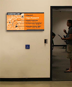
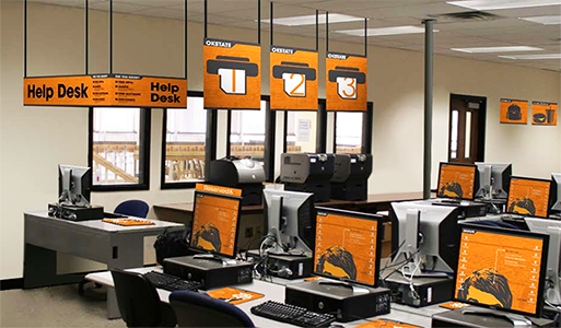
The problem statement will have something to do with the notion that the Information Technology office on campus is dissatisfied with the appearance of its 5 computer labs and the experience a student has while using an IT lab. They feel there may be a problem with how efficiently and clearly information is disseminated. They acknowledge the problem of cheap-looking signs, inconsistent graphics, and some potential confusion among users.
This project is much more than just environmental graphics. That will be one component, but the project is really about enhancing the overall experience of using an IT computer lab on the OSU Stillwater campus - the CLE. Do not limit yourself to graphic design. You are creative problem solvers - you know design - you should make recommendations on any aspect that your team determines can improve the experience.
• Entry/doorway/hallway signage: greetings, schedules, policies, procedures,
• Interior informational signage: printing, logging in/out, policies, procedures,
• Interior educational signage: info about IT, usage tips,
• Room decor and interior design: arrangement, furniture, clocks, bookcases, monitor stations,
• Others? ___________________
At first, it may seem that the market is OSU students. Nope, too broad, not all students use the labs. Okay, how about OSU students who use computer labs? Still too broad. TMs should be very specific. Some students that use the labs use it so often they know everything you need to tell them - they know the hours, where the printers are, how to log out, etc. Your work won't really be speaking to them primarily. The primary target market may be something more like this:
• Primary TM: Infrequent users or first-time visitors to any of 5 IT computer labs at OSU-Stillwater.
These are the people that have a need to learn info about the lab. Digging deeper into this market, we will likely discover that some of them feel threatened or uncomfortable entering a lab for the first time. They know that there are geeks in there who know more than they do (this realization will lead us to add some objectives for the design recommendations and solution - to be friendly, welcoming, and non-threatening). This market might also lead you to minimize technical jargon in the wording of signs - so this group feels comfortable and not alienated.
• Secondary TM: Regular or frequent users of any of 5 IT computer labs at OSU-Stillwater.
This group may not need the entry signage, but they might be the audience for the educational signage and the interior design that impacts and enhances their experience while using a lab.
• Tertiary TM: Faculty, staff, administration.
This group needs to also have their lab experience enhanced and be impressed by the computer labs. Impressing this group may result in increased funding and respect for the IT department. The client would love that. While its only a tertiary market, it could be a valuable one and one that you should still consider.
These target audiences are suggestions - you may deviate from these as you learn more about the problem. I list them to illustrate how specific a TM can be and how your work will need to reach distinctly different groups of people.
• Enable students to feel good about how their technology fee money is being spent, to feel good about selecting OSU as their university, to feel a sense of consideration to their needs and wishes relating to computer use - that OSU cares about their experience while a college student.
• TMs should feel confident,capable, and empowered while in the labs.
• The design recommendations should convey respect for the target users. Minimize blatant cold demands, maximize consideration, education, and feelings. This is about an experience.
• The graphics and interior should convey a sense that the labs are friendly, welcoming, and non-threatening places to do work.
• The solution should look custom-made for OSU and these 5 labs - they shouldn't work as well on any other campus. Consider this - anytime you print something on a letter-size, 8.5 x 11, sheet that it may look like a flyer, often a cheap flyer. You might consider a non-standard size (cutting 8.5 x 11 to an 8.5" square, for example) that will already convey a custom, non clip-art printout. Strive to maintain production specs that will keep costs reasonable.
• Cost effective: reasonable, but appropriate for the project.
• Easy to produce, manufacture, and install.
• There are more, discuss as a team and add to this list.
Labtastic, laborific, labulous, labadocious, labawesome, labsolutely wonderful, labomania, labalicious,
• The tour of the campus computer labs was a great opportunity to ask questions of Kristen that you formulated during the assessment phase of the project. Avoid making suggestions or telling her the direction the group is considering, unless you have already finalized most design decisions. If you suggest something like the concept of creating a party atmosphere, a kegger, in the labs; she may respond with, 'I love it.' Oops, now you're stuck - the client has an expectation and it will be hard for you to dissuade her if your team decides to go a different direction. Or she may respond with 'Oh, I'm not so sure about that, I don't really see that working.' Now you've limited further exploration of this idea. So, avoid suggestions and teasing the client with possibilities. This tour and meeting with Kristen is still primarily to gather information, take notes, and seek inspiration while in the labs. Afterwards,it would be beneficial for the group to sit somewhere (Union, library, grassy lawn on campus, poolside at a resort in Las Vegas, the beach in Cancun) and while it is still fresh in your minds, discuss the tour and any conclusions made about the labs, the users, and the existing lab experience.
• Sit in a lab, maybe take some work to do, and observe the users. Watch expressions and movements of people as they enter the lab, notice the popular places to sit, see how attentive the monitors are, etc.
• Interview the lab monitors - they are great resources to discover what works and what doesn't; frustrations, suggestions.
• Interview people outside the labs. Ask fellow students if they use the lab - what is their impression, did they know where they were located on campus, if so, how did they learn that (you may discover that IT needs to better address educating OSU students about the labs), did they ever have a bad experience in a lab, if so, get details. Dig deep and discover the why behind their answer.
• People take their laptops into Aspen Coffee, Panera Bread, Starbucks, and Hastings. Why? What is significant about the coffeehouse mentality? What is it about those places that is so attractive? (Other than one can get food and drink there). Is there a greater sense of comfort? Can that visual ambience be transferred to the computer labs? Can you bring that coffeehouse feeling onto campus?
Remember, the research stage is where a designer often finds the connection to a solution, the key element that can make the design effective. The more research you conduct, the easier finding a solution becomes.
Even though you might be working in the research phase, if you begin to get ideas, jot them down. Avoid inhibiting your brain from free-thought exploration of ideas. The design process doesn't often happen in nice neat steps. Each step of the process will be accomplished but not necessarily in sequence. So, if your brain starts churning out concepts - great, let 'em flow.
This will be an excellent project to impress interviewers and supervisors - it is authentic, it is current and impactful, it is comprehensive - showing your design ability in more than just graphics (interiors, traffic flow, informational graphics, respectful design). It demonstrates that you are able to work in a group setting - making compromises, respecting the opinions of others, being assertive with your ideas and thoughts.
• Establish some intermediate deadlines to provide a structure and some motivation. This project is too massive to procrastinate much. Break the project into manageable bits that can be accomplished a step at a time.
• Delegate tasks: use your time efficiently - not everyone needs to take fotos of existing signage in labs, for example. Delegate that task. Someone else could research online or in books for other environmental graphics programs. Later, discuss those as a group - see what might fit in this project. Several students could observe behaviors in the labs - send a different team member to a different lab and compare notes later. Each team member should conduct interviews. The more of those you have, the more reliable and beneficial the information will be.
• Remember to keep records of all conceptual ideas, thoughts, rationale, influences, and inspirations. These will come in handy as you prepare the boards and text for the oral presentation.
• Have fun with your team meetings - meet at Eskimo Joe's, Aspen Coffee, etc. Get out of the Art Building where you live. Enjoy the experience of working in a collaborative environment with your fellow students.
Each team will make an oral presentation in which they present boards or make a Keynote/Powerpoint presentation. Each team member will have a part. We'll discuss the format and agenda in class. Probable topics will include Intro and assessment, Concept and theme, Signage applications,Interior ambiance, and Closure and wrap-up.
Light rail transit system for central Oklahoma
As the Oklahoma City metro area grows and there is more concern about traffic, air pollution, and the efficient movement of large numbers of people; several cities in central Oklahoma will consider the development of a mass transit system including surface rail, buses, and/or subway routes. This project is the development of a graphics package for the transit system.
Branding
• Name of transit system
• Logo/identity for transit system
• Stationery: letterhead, envelope, business card
System usage
• Route map: Master Plan of rail lines and stations
• Rider card for use in stations or on trains
• Signage: station and wayfinding
Promotion
• Slogan
• Advertisement, full page, in the Oklahoma Gazette
• Website home page
• All cities and towns in central Oklahoma have approved funding the system.
• Funding is adequate to implement the system in phases.
• The route lines and general station locations have been predetermined.
A light rail transit system will provide reliable, convenient, eco-friendly, fast, safe, comfortable, and affordable transportation that connects people to their destinations throughout central Oklahoma.
People in central Oklahoma who do not depend on their car to do their jobs and who want to:
• 1. Save money on gas, maintenance, parking, and insurance;
• 2. Help the environment; and/or
• 3. Better utilize their time in transit.
• To develop an efficient way to move the most people
• To make the lives of central Oklahomans easier
• Make a minimal negative impact on the environment
• Provide easy access and movement within the system
The elements - symbols, images, words, colors, typography, and layout composition - should:
• Be easy to understand
• Convey speed, motion, and efficiency
• Respect the icons and heritage of Oklahoma
• Convey the future and a progressive metro area
• Be minimally offensive
• Require minimal education to comprehend
• Be easy to pronounce
• Be easy to remember
• Be non-gender specific and non-ethnic specific
• Be consistent and unify all pieces in the package
• Be unique from other transit systems
• Allow rapid recognition and comprehension of information
• Be trendscendent, work well in 2020 and 2040
• Be easy to manufacture and produce
• Communicate effectively in a variety of media
• Single ride: $1.00
Child/Student/Senior: $0.50
• Day Pass: $3.00
• Monthly pass: $30.00
Child/Student/Senior: $15.00
Note: Child under 12, High School and College Student, Senior Citizens over 65
See where it takes you.
Where Life takes you.
Go Metro
2008 - Thursday, May 8: Present proposals
2010 - Begin design and engineering work
2012 - Begin purchase of rail right-of-way and station land
2016 - Begin construction of Phase 1
2023 - December: Begin introductory promotion campaign
2024 - Complete Phase 1 of system
2024 - Friday, April 22, 12noon (135th anniversary): Inaugural ride for dignitaries
2024 - Friday, April 22, 2pm: System begins regular operations, free rides thru the weekend
2024 - Monday, April 25, 2pm: System begins paid operations
2040 - Phase 2/3: line extensions and additional lines
Intro: brief history, assessment, targets, objectives
Branding: name, identity, stationery
System Plan: map of routes and station locations, rider card, signs
Promotion: slogan, magazine ad, website
Conclusion: wrap-up, closure, questions
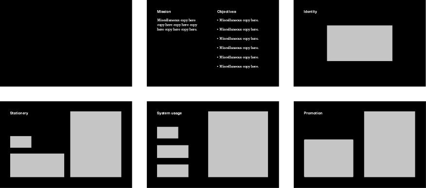
1. Blank cover
2. Mission & Objectives
3. Logo/identity
4. Stationery: letterhead, envelope, business card
5. Usage: route map, rider card, signage
6. Promotion: full page ad, website home page
Proposed names and logos by UCO students

Jeanelle Echols, Monica Hall, Sarah Bailey, Zach Burch

Justin Barr, Kyle Gandy, Lauren West

Ed Russell, Jake Stotler, Rachel Morgan

Glori Fuller, Jenny Shangguan, Kim Nona, Leo Mingee

Heath Woloszyn, Lauren Judah, Melissa Perry
Proposed Master Plan route map
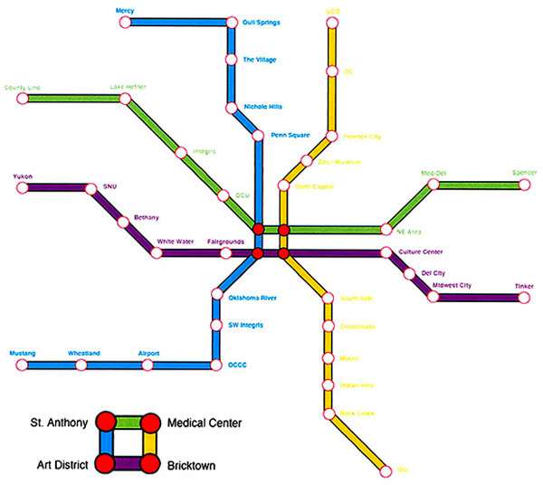

Exhibit Design for the Round Barn
The Round Barn in Arcadia is a unique and historical tourist destination on Route 66 and has an opportunity to educate and entertain travelers, local citizens, and special event attendees while increasing revenue.
1. People passing through Arcadia on Route 66 who have some interest in local history, Route 66, or round barns.
2. People in the Edmond and Arcadia area who have some interest in local history, Route 66, or round barns.
3. Anyone who enters the barn as a guest.
accessible, accurate, appropriate, engaging, entertaining, focused, historical, informative, innovative, interesting, nostalgic, organized, pertinent, professional, relevant, respectful, understandable, unique
The solution to the problem will:
• Follow ADA guidelines where feasible.
• Be appropriate to the target audiences.
• Allow visitors to experience an earlier era in Arcadia and Route 66.
• Develop a connection between the visitor and the history of Arcadia and Rt 66.
• Create an environment that provides a submersive and cohesive experience.
• Establish an efficient and appropriate traffic flow to allow easy access to exhibit information and easily handle mutiple visitors in a single area.
• Convey information in an easy-to-understand format; and be an accurate depiction of historical information, images and objects
• Develop an efficient and effective use of the given space.
• Be timeless - it will not become outdated.
• Honor the aesthetics and structural integrity of the barn.
• Invite the visitor into the exhibit space and accompanying gift shop.
• Inspire and enhance the existing gift shop; increase traffic in the gift shop.
• Be cost effective in development, production, and implementation.
• Be conducive to advertising and marketing of Arcadia and the Round Barn.
• Create a desire to return to the barn and to tell others about the barn/exhibits.
• Criteria: persuasive, function, feasible, cost-effective, appropriate
Text copy
Headings, info
Font, size, placement
Images: photos & sketches
Borders, frames, color,
Objects
Mounting, hands-on, wall or pedestal
Tuesday, Oct, 4th: Present research on the round barn and concept ideas
Thursday, Oct, 6th: Discuss problem, targets, and objectives
Tuesday, Oct, 11th: Discuss concepts, content, and layout
Thursday, Oct, 13th: Discuss presentation components, review sketches
Tuesday, Oct, 18th: Present rough sketches: overview, panel detail, floor plan
Thursday, Oct, 20th: Fall Break: No class
Tuesday, Oct, 25th: Tight roughs of all components; presentation outline
Thursday, Oct, 27th: Walk the Talk: No class
Tuesday, Nov, 1st: Oral presentations
• Introduction
• Problem statement; Target markets; Objectives
• Rendering: overview, concept, environment
• Floor plan; Visitor traffic flow; Exhibit locations: panels, objects
• Panels; Sections; Headings,; Timeline
• Model of one section; Detail; Construction materials
• Visual: font, images
• Conclusion: wrap-up
1. Daniel
2. Jerri
Semester Calendar
In-class
Solve Mind Game
Discuss people
Review class roster: preferred names
Get email addresses
Break hilites
Discuss the course
Peruse webpages
Review course objectives
Review course expectations
Discuss/explain syllabus
Submit grading ballots
CA magazine, Before & After magazine
Discuss Weekly Activity Forms
Class Exercises
Take assessment test
Review definitions of terms
Where was the 'Remove sunglasses' sign?
Assignment
Read home/design blog
Develop your personal motto (in Latin & English) Examples:
Leonardo da Vinci: Saper Vedere = knowing how to see; Ostinato Rigore = persistent rigor
US Marine Corps: Semper Fidelis = Always Faithful
Olympics: Citius, Altius, Fortius = Faster, Higher, Stronger
Oklahoma: Labor Omnia Vincit = Labor conquers all things
USA: E Pluribus Unum = Out of Many, One
Prepare self-assessment presentation
Emphases
Overcoming fear
• Speaking up in class
Asking the right questions
Essay resources
Essay resources
Affirmations
See if you are eccentric
Assess/examine your life
How to be more intelligent
Common sense and a quiz
Critiquing design
Definitions
Grow as designer
Idea Journal
Learning
Neurobics
In class
Self-assessment presentations
Emphases
Overcoming fear
Asking the right questions
Honest, introspective assessment of self
Clarity of communication in presentation content
Attention to detail: content, visual aids, speech, vocabulary
Active participation in discussions with depth and objectivity
Assignments
Mind games handout
Develop the assessment for a new brand for Dasani water.
Study web essays:
The design process
Logo design
Due
WAF
Mind games handout
If you haven't yet, email Watson so he'll have your preferred email address
Develop the assessment for a new brand for Dasani water
In class
Discuss WAF activities
• Discuss the mind games handout
Discuss web essays
Discuss/present the Dasani assessment
View/discuss logo images & samples
Assignment
Dasani logo sketches and concept statements
Short video worth watching
In class
View/discuss logo images & samples
Discuss/present the Dasani names, concepts, and sketches
Assignment
Dasani logo roughs and comps
Due by email link
1. The new BottleWater name.
2. Description of specific target markets.
3. List of objectives the new name should achieve.
4. List of adjectives that the name (and probably the logo) should convey.
5. Thorough rationale to justify why the proposed name is excellent - be very clear and persuasive. Avoid "I feel" "I believe" "I think" - talk only about the name and what makes it so appropriate for the target audience and how well it meets the objectives and conveys the adjective descriptors.
Weekend suggestions
Show people the proposed name(s). Record or remember their responses - do they look confused, do they pause trying to figure it out, do they pronounce it as you intended. Remember, not everyone has to get it - only enough to justify investing in production of the rebranded product - at least 75%, preferably 85-90%.
Ask those people what product they think the name might apply to.
Use the new name in conversations with your friends - how does it sound, does it 'roll off the tongue' easily, does it seem awkward or cumbersome to pronounce.
Due
WAF
Mind game sheet - Double Dealer
Rough sketches of the new logo for BottleWater. Over the weekend, continue with non-judgmental thumbnails, review objectives the logo should achieve, and then develop 1-3 of the most promising concept sketches into rough sketches. The 'rough' stage is when all design decisions are made. Thumbnails are for exploration of numerous options. Roughs are to help you narrow the chaos into more order and this is when you determine the most appropriate color, typeface, composition, rendering style, point size, baseline, type case, etc. Every element should be considered, debated (based on the lists of objectives and descriptor adjectives), and concluded to be the most effective way to enhance the communication of the identity.
In-class
Review the Double Dealer mind game
Critique/discuss Nude Assani logo sketches
Emphases
Understanding of the design process
• Practice using the given criteria to assess logos
Active participation in discussions with depth and objectivity
Assignment
Produce a finished comp of the water identity.
• Prepare a paper addressing the name, the rationale for the name, the concept statement for the identity, and rationale of all design decisions for the identity.
Due
WAF
Dasani comp presentations essay to read
1. A finished comp of the BottleWater identity, about a 6"- 8" mass. This can be as simple as a paper printout, but pay attention to composition on the page, neatness, and presentation of the identity.
2. A paper that includes these items:
a. The new name
b. The rationale for the name
c. A reduced version of the logo
d. The concept statement for the identity
e. Rationale for each design decision in the identity
There will be no formal oral presentation, but be prepared to provide answers in class that are persuasive, logical, and convincing.
The rationale for the name should be based on the objectives, the adjectives, and why the name is appropriate for the TM and for meeting the needs of The Coca-Cola Company. The concept statement of the identity can be as simple as,
"The new identity for BottleWater is a frisky lovable alligator perched on the edge of a drinking fountain with the name, BottleWater, in blue type swirling above its head in a freestyle rendering."
It is a brief statement that describes an overview of the logo and its main driving element so you and the client will be on the 'same page'. The most crucial section of the paper is the rationale for the design decisions. Strive to cover every element: case, font, color, rendering style, integrations, relationships, layout composition, and on and on. Address the elements that aid memorability, that allow easy readability, and convey positive emotions. Anticipate any questions or concerns and address those in the paper. The tone should be concise yet clear, positive, present tense, active language, and persuasive.
That's a lot of work to complete by Monday. This is quite realistic - at work, you will be faced with abrupt deadlines that come up at inconvenient times (when you still have lots of other stuff to do). This may help separate those who are committed to doing great work and those who wish to just get by. Manage time efficiently and avoid procrastination. Affirm that you are capable and competent and will make it happen.
In-class
Present logo comps
Discuss the faculty show
Discuss name logo exercise
Assignment
Sketches for name logo project Info
No more Weekly Activity Forms due for the rest of the semester. Continue to participate in neurobics and continue to critique design. These exercises should become part of your lifestyle until you die. All forms will be due at that time.
Due
Tight sketches of 8 name logo exercises Info
In-class
Share hilites from the Kyle Cooper presentation: what you learned, what impressed you, how you were inspired
Critique tight sketches of name logo exercise, select best 4 for reproduction
Discuss the poster project Info
Assignments
Maintain a process book of all elements that affect the poster project Info
Assessment for poster project Info
Due
Email to Watson:
1. Poster topic, clearly stated, with brief explanation if necessary
2. Target market, very specific, primary and secondary, if appropriate
3. Objectives the poster should achieve
4. Results desired, what action you want the TM to take
5. Brief description of research conducted - not what you learned, just what you did
No class: Work on the concept and thumbnail sketches for the poster project
Notes on sketching
• Sketches that are obvious - like setting a literal basketball on top of a twister/outlaw/scissortail with type under or next to it - are mandatory at the thumbnail stage. You need to go through the simple and obvious ones - they deserve rendering and consideration. But now you should push your work to go past the obvious. Strive to communicate the message with more sophistication, wit, cleverness, and viewer participation. Avoid work that looks like what a junior high kid would doodle in Algebra class.
Continue to work at integrating type and image. Avoid the 'design-by-committee' look (elements that don't relate) or the look that says, "Oh shoot, I forgot to add the type."
• Explore communicating the team logo by using type only (or primarily type) like Mother & Child, Families, dialog, individual, eclipse, etc. You may not conclude it but you gotta try it. At the least, it may prompt a new direction or an element that might work in a more finished rendered identity.
• Explore how to communicate a basketball using the fewest number of lines or shapes. Many of you will explore including a basketball in the logo - give it a new twist and longer shelf-life by not having a literal rendering of the ball. Sketch ways to make it more abstract and stylized - maybe just a few lines or shapes. Explore how many lines are needed for a viewer to finally get that its a basketball. Provide just enough, no more. More lines than are necessary become clutter, often detract from the focus, and minimize the strength of the message.
Notes on decision making
I realize it may be frustrating, but if you show me a bunch of thumbnails, I'm not likely to tell you which ones are working or which ones have merit. Some students respond with, "well, you're no help" (what they mean is - "I'm too stupid and/or lazy to decide and I want you to do it for me"). I believe that I help you by not telling you which ones are the best. It helps you become a more intelligent, assertive, and confident decision-maker. Becoming a better designer is about becoming a better decision maker, and therefore, a better creative problem solver. If I decide which ones are good, I deprive you of the process of understanding, analyzing, debating, and concluding. You have probably been conditioned to 'please the teacher', but if you ever tell an interviewer or client, "This one works because my teacher said so," you may brand yourself an idiot. If becoming a successful idiot is your career goal, then tell me so I can make it easier on both of us and make all your design decisions for you.
Decide if you wish to be fair, good, or great. "To be good is not enough if you dream of being great".
Rough sketches
Remember it is at the rough stage of the process that all design decisions are made. Thumbnails are for non-judgmental exploration sketches and the comp is simply preparing the most successful rough sketch into presentable form. While you should avoid judgment at thumbnails, at the rough stage you must pass judgment and make decisions, based on the list of objectives. Review the target market(s), the list of objectives, and the results desired to help you determine which thumbnail ideas will be the most effective solution to the problem. The rough sketches serve to help you refine all elements - color, composition, font, point size, format, style, etc.
Due
Refined sketches (quantity: few-some) that show the most promise of effectively & efficiently meeting the objectives
General direction (or specific direction, if you are already there) of the guiding concept
In-class
Discuss the significant WAFs
Discuss How to Grow as a Designer
Critique/discuss sketches
Discuss/clarify concept statements
Assignment
Refine the concept and rough sketches, begin to finalize design decisions
Due
WAF: with impeccable grammar and even deeper and more thorough analysis on the Design critique
1-2 tight roughs for the logo.
In-class
Discuss final concept statements
Critique/discuss tight roughs - discuss rationale for each element in the piece. If you can't justify an element adequately, you should delete or alter that element - if it doesn't enhance value, it becomes clutter for the viewer.
Review oral presentations
Assignment
Prep comp and oral presentation
Due
Something to share with the class that is both chocolate and edible (with or without hearts)
Logo comp
Rehearsed presentations - more info
In-class
Review presentation tips
Eat chocolate
Present NBA logos
Introduction/overview
Target market
Objectives
Logo with rationale for every design element
Conclusion
Reminders
Avoid 'um' 'you know' 'like'
Use language that is active, not passive; positive, not negative; and present, not past tense
Anticipate questions and address them in the presentation
Practice persuasive speaking with correct grammar
Discuss stationery design (letterhead, envelope, and business card)
Assignment
Develop a stationery package for the OKC NBA team:
1. Conduct research on standard size and format of each piece; postal regulations for envelopes; and styles, textures, and weights of paper.
2. Sketch several layout options for a stationery package for the OKC NBA team. Consider paper orientation, paper stock, cuts and folds, colors, etc. The logo/identity should 'drive' the layout composition of the 3 pieces - all pieces should respect & enhance the logo. The layout of each piece should convey similar adjective descriptors and meet similar objectives as those established for the logo.
Figure out what's working in the piece (the dominant logo element); exploit that and minimize the rest.
Due
Logo comp: presentation size and reduced version
Thoroughly rehearsed presentations. Practice to at least 4 of these 5 groups - to others in your household, apartment building, or dorm wing; to yourself in the mirror; to your dog, cat, or goldfish; to strangers at the mall; or to the person sitting next to you in church or at the movies (before the previews begin). Insert classic old joke here: "Excuse me, how do I get to Carnegie Hall?" Answer: "Practice, practice, practice."
In-class
Present NBA logos. This is an opportunity to move from good to great - to improve and enhance the logo to one that is well thought out and effectively meets the objectives and also to improve the oral presentation. Your goal is to 'knock our socks off' and overwhelm the audience with your confidence, intelligence, enthusiasm, creativity, problem solving ability, and understanding of effective communication design.
Discuss significant Weekly Activities
Turn in mind game puzzles
Discuss stationery design (letterhead, envelope, and business card)
Infractions which will lower your NBA logo concept and/or communication grade
Not showing the logo in at least 2 sizes - presentation size and reduced print size
Not mounting the main piece on black mat board
Not paying attention to size and orientation of the logo background and the mat board
Not showing the logo in accurate colors
Not meeting these objectives, even though they seem contradictory: the new identity must fit in with the existing body of NBA logos yet stand apart and be unique from the existing NBA logos
Infractions which will lower your presentation grade
Not looking at Watson during the introduction. Making eye contact with your audience during the opening introduction helps establish you as being in control and confident. It helps make a connection between you and the client.
Looking at the blank board or the wall before you present the identity - the audience will follow your gaze and you don't want them to focus on a blank wall.
• Saying 'Um' or 'Uh' (or anything similar) more than 3 times - makes you sound unprepared, hesitant, and not confident.
Saying 'kinda', 'sorta', or any other wimpy descriptor more than once - use statements that are firm and demonstrative. It does or it doesn't - it shouldn't kinda/sorta do something. But it is okay to say an element is 'subtle' or an image or feeling is 'implied' - those sound better than 'sorta'.
Saying 'was used' or any other language that is past tense - speak in the here & now.
Saying 'was used' or 'is used to' or any other words that are passive, rather than active - passive is not confident, persuasive, nor impressive.
Not having nouns and verbs or modifiers and subjects agree - like 'objectives is', 'objective are, 'target markets is' or 'target market are'.
Discussing elements which did not work or elements from other identities. Keep your rationale positive and focused on what is working in the piece, don't lead the audience astray by introducing elements or descriptions that take focus away from the piece.
Order of presentations
1. Glori
Assignment
Develop a stationery package for the OKC NBA team:
Read about stationery here
Conduct research on standard size and format of each piece; postal regulations for envelopes; and styles, textures, and weights of paper.
Sketch several layout options for all 3 pieces of the NBA stationery package
Due
Rough sketches for all 3 pieces of the NBA stationery package
In-class
Discuss NBA logo projects and grades
Critique concepts and layouts for the stationery
Assignment
Comp printout of all 3 pieces of the NBA stationery package
Due
Mind Games sheets
Comps of the NBA stationery package
In-class
Discuss the solutions to the 2 mind game sheets
Discuss/critique the stationery package
Discuss the poster project and the assessment stage
Assignment
Assessment of the poster topic
Determine the issue to be communicated and the action desired
Begin to develop the content message to be communicated
Due
Poster project topic issue and general thoughts on the message content direction
Specific target audiences, goal desired, and objectives
In-class
Discuss poster issues, target audiences, goal desired, objectives, and content
Assignments
• Final Weekly Activity Form (no more WAFs will be due this semester)
Complete the assessment step of the Design Process for the poster project
1. State the problem to be solved
2. Determine primary and secondary target markets
3. List objectives that the poster should achieve
4. State the result desired from the reader
Continue to conduct research - become an authority on the topic, the audience, and the medium
Write the headline, subhead and body copy, and slogan/tag line (if applicable)
In-class
Review the mind game sheet
Share and discuss poster project assessments
Submit/discuss the headline, subhead, body copy, and slogan/tag line
Assignment
Finalize the words
Sketch images and layout options
Due
Research findings from transit systems in other cities
Find the mission, cost per ride, name of the system, demographics, logos, route map, promotional materials, rider cards, etc. Become an authority on the public transit system in your selected city:
San Francisco - Chicago - London - Seattle - Portland - Paris - Miami - Toronto/Montreal - New York City - Washington DC - Beijing - Los Angeles - Tokyo
Check this link for the Dallas system
In-class
Discuss research findings
• Discuss naming the transit system
Team Time tasks
• Develop a To Do List
• Prioritize tasks
• Delegate tasks
Name the team
• Brainstorm name for the system
• Discuss route designations: names/numbers/colors
Words of wisdom
"The best way to kill a good idea is to insist that its all yours."
Progress meetings with Watson
12:00 - 12:45 Team 1: Glori, Jenny, Kim, Leo
12:45 - 21:30 Team 2: Kelly, Rebecca, Ricardo
21:30 - 22:15 Team 3: Cheryl, Jared, Jennifer, Khusroo
22:15 - 23:00 Team 4: Heath, Lauren, Melissa
Due
Team name
Transit system name and thorough rationale
Concepts and sketches for name identity
Layout, copy, and optional name for the Rider Card
Route map showing paths of the train lines - consider how to designate those lines: color, name (letter, number, or just the color - Ex: A train, Line 4, Blue route, Airport/Capitol route, etc.)
Notes/sketches of any other items in the package
Link for the Dallas system
In-class
Return & discuss menus
Discuss transit progress: branding, system usage
Determine station names - bring a hardcopy of the map to write in the names
• Discuss the Beck map, Environmental Graphic Design signage, web design
• Discuss promotion campaign: web domain name, web home page, magazine ad
Determine the links that should be on the website home page
Develop an outline draft for the oral presentation
Team Time
Strive to meet a 3:00p deadline of having these items:
System name and sketch of the logo
• Corporate colors - lines and logo colors
• Typefaces for map, signage, website, and ads
• List of slogan options with finalists
Progress meetings with Watson
12:00 - 12:45 Trainscendent Design
12:45 - 21:30 Missing Link
21:30 - 22:15 Quad Squad
22:15 - 23:00 Team Caboose
Due
Refined theme/concept that 'drives' the entire project
Refined Branding: logo, stationery - graphic elements, layout, colors, typefaces
Refined System Usage: card, map with colored line designations, signage
Concepts & sketches of promotion items: slogan, magazine ad, web home page
Due
Printout drafts of each piece in the package:
1. Logo/identity
2. Stationery: letterhead, envelope, business card
3. Rider card
4. Route map
5. Signage: station and wayfinding
6. Advertisement, full page, Oklahoma Gazette
7. Website home page
• Rationale for all concepts, design decisions, and each component
In-class
• Discuss presentation format - outline, roles, format: digital/boards
• Critique all pieces with Watson
12:15 - 12:45 Trainscendent Design
Team Time
Optional team progress meetings
Sign up by email or in person if you want your team to meet with Watson at one of the times listed below.
11:00-11:400 ____________________
11:40-12:200 ____________________
12:20-1:0000 ____________________
01:00-1:4000 ____________________
Prep presentation pieces
Print out all pieces of presentation
Buy and cut boards
Write draft of oral presentation, determine roles
Rehearse presentation: confident, enthusiastic, thorough/brief
Finalize all pieces, print and mount
Presentation outline (suggested, you may deviate from this)
Intro: brief history, assessment, targets, objectives
Branding: name, identity, stationery
System Plan: map of routes and station locations, rider card, signs
Promotion: slogan, magazine ad, website
Conclusion: wrap-up, closure, questions
Boards (suggested, you may deviate from this)
1. Blank cover
2. Mission & Objectives
3.Logo/identity
4. Stationery: letterhead, envelope, business card
5. Usage: route map, rider card, signage
6. Promotion: full page ad, website home page

Place
METRO Transit Board Room
Union Station, 300 SW 7th, south of I-40, map
Download pdf of maps of area and exit ramps
Client representatives
Mr. Rick Cain, METRO Transit/Central Oklahoma
Transportation and Parking Authority Administrator
Ms. Davan Gardner, Marketing Specialist/Interim Marketing Manager, METRO Transit
Mr. Ken LaRue, Oklahoma Department of Transportation
Mr. Sean Cobb, Owner/Creative Director, Funnel Design Group
Presentation schedule
11:50-12:00 Set up room, all 3 groups
12:05-12:20 Ed, Jake, Rachel
12:20-12:35 Justin, Kyle, Lauren
12:35-12:50 Jeanelle, Monica, Sarah, Zach
1:00-2:00 Presentations: Melton Gallery Seminar Room
OTEAM: Angela, Caleb, Cole, Eric
DF2 Design: Jeff, Sean, Victor
GAPS: Glenna, Sam, Mike, Robbie
Roundtable lunch discussions
Scenario
A working business lunch where you discuss your current project and get feedback from colleagues.
Place
Lakeside Fish Grill: Lake Hefner Parkway at Britton.
Presentation/discussion items
1. Finished comp of the logo, large enough to be seen by all at a large or long table. Provide rationale for the name and each graphic element in the identity - colors, type treatment, layout, etc. Not a formal presentation, select one or two to provide the rationale but anyone on the team can help out.
Note Please bring either a copy of the logo that is smaller than letter size or a digital copy on a flash drive to transfer to my laptop. I may put some of the logos up on my website. Thanks.
2. Roughs of each of the other pieces in the package and thoughts behind the design decisions:
Stationery: letterhead, envelope, business card
Rider card
Route map
Signage samples
Advertisement, full page, Oklahoma Gazette
Website home page
3. Dessert topics (as a class, not necessarily as teams):
What were the advantages and challenges of working as a team (other than
scheduling meetings) - leadership roles, assertiveness, input, compromises?
Should central Oklahoma invest in a light rail system? Or better and more highways?
What are some ways, other than light rail, to address the growing traffic problems and environmental issues?
If there is a MAPS3, what should the city spend money on that would improve the quality of life?
Have a great holiday and semester break.
Due
Notes of thorough input on the following:
1. Notes of research on Major League Soccer: teams, logos, philosophies, marketing/promotions, colors, names, etc.
2. Persuasive and convincing rationale for the name Oklahoma Wind, Oklahoma City Wind, or any other name.
3. Convincing persuasive rationale for where the soccer stadium should be located.
4. List of objectives the logo should achieve: easy to reproduce, adaptable to a variety of media, appropriate for the TM, etc.
5. List of adjective descriptors the logo should convey: fun, action, excitement, etc.
6. Determination of the specific primary, secondary, and tertiary target markets.
Great rationale as discussed in class: economics (the owners of this new team want to make money - from tickets, concessions, merchandise, endorsements, etc), pride in Oklahoma (national tv coverage, bragging rights, winners, etc), entertainment (more stuff to do in OK, joy of group cheers, etc), and others.
Emphases
Dynamite portfolio-quality logo of which you are very proud.
Smooth rehearsed impressive presentation.
Anticipate questions and address them in the presentation.
Practice persuasive speaking with correct grammar.
Assignments
Maintain a process book of all elements that affect the poster project
The poster project
Due
Comps of final four name logos, 1 logo per page, unmounted
Poster concept statement and sketches
In-class
Read Typography projects
Critique name logos
Discuss poster issues, target audiences, results desired, objectives, and message content
Present and discuss poster concepts and sketches
Check out mind game puzzle 1
Assignments
Continue to conduct research - become an authority on the topic, the sponsoring organization, the audience, and the medium
Develop the most effective thumbnail ideas into rough sketches
Refine the headline, subhead and body copy, and slogan/tag line (if applicable)
Link to Process book
Link to poster project
Due
Poster assessment paper to turn in:
Topic
Client and their contact info as it will be stated on the poster
Target markets: Primary, Secondary, and Tertiary (if applicable), avoid the dreaded "Too broad" response.
Objectives: at least 12 but no more than 46
Results desired: very specific and measurable
Numerous exploratory sketches of various directions the message/content could go
In-class
Turn in assessment papers
Present and discuss poster sketches and content directions
Assignments
Continue to conduct research - become an authority on the topic, the sponsoring organization, the audience, and the medium
Develop the most effective direction sketches into a tight rough sketch(es)
Refine the headline, subhead and body copy, and slogan/tag line (if applicable)
Link to Process book
Link to poster project
Due
Read the essay on the Design Process
Paper with:
1. Poster topic
2. Precise concept statement Please reread this info
Tight rough printout of the poster - actual size, in color, unmounted
In-class
Turn in and discuss the concept statements
Present and discuss poster tight roughs
Assignments
Refine the image, layout, headline, subhead and body copy, and slogan/tag line (if applicable); composition; colors
Prepare and print the poster comp
Rehearse an oral presentation
Due
Finished comp of the poster (actual size, in color, and unmounted)
In-class
Oral presentations of posters Info on oral presentations
Address all the reasons why the poster is effective.
Return and discuss name logos
Concepts
Sophistication
Pushing further
Assignments
Nada
Due
Brief list of improvements that should be made to the poster
In-class
Discuss poster improvements
Return and discuss name logos
Concepts
Sophistication
Pushing further
Discuss the menu project
View samples of menus
Assignments
Select a restaurant in need of a better menu
Collect menu samples from the selected restaurant: food, drink, specials, table cards, etc.
Due
Bring samples of selected restaurant menus (food, drink, specials) and other table cards to class
In-class
Discuss design
Discuss restaurants, assessments, and menus and table cards: effectiveness, appropriateness, durability, cost, materials, comfort, binding, content, clarity of info (items, descriptions, nutrition, price), etc.
Emphasis
Active participation in discussions and assessments with depth, objectivity, and from the diner's point of view.
Assignments
Begin the assessment and research stages of the design process.
Complete the About the restaurant section of the Menu design Process Book.
Reminders
Your task as the designer is to easify the life of the diner.
As you get a few minutes spare (?) time, type in the menu items to take care of that task. You can manipulate and make the typography decisions later.
Menu project notes
Selected restaurants
Alberto: Tokyo
Due
Response to the essays Grow as designer and Learning & growth
Wacky, bizarre, crazy, out-there proposals for menus
Note: Avoid barriers, negative affirmations, and any thoughts or attitudes that prevent you from being your true creative, inventive, and innovative self
In class
Share your notes, inspirations, and musings on wacky and bizarre ideas
Share a few of the barriers that you allow to inhibit your growth as a designer
Discuss menu concepts and how to make them appropriate and feasible
Emphasis
Convey clear communication of strong design concept
Strive to convey what an intellectual and creative thinker you are
Assignments
Continue to fill in the gaps in the Menu design Process Book
Explore how to clearly communicate the Big Idea with rough sketches
Studio time in class to further develop rough sketches
Due
Process Book with updated inserts
Tite ruff of menu design. Preferable: model in actual size and in color.
Optional: menu text copy for critique. You can include it on the model or indicate the copy position on the model and present a separate sheet of the text copy - whichever is most efficient.
In class
Discuss ruffs individually with Watson: concept, layout composition, typography
Proofreading opportunity: Watson will proof your menu copy and tell you how many errors he finds (there may be more). Bring the existing menu for cross-referencing.
Studio time in class to further develop rough sketches
Due
• Menu comp and oral presentation
In class
Present menu comps
Presentation outline
Brief statement about the restaurant
Show and 'walk-thru' the menu
State the theme/concept
Give the rationale for the major design decisions
Emphases
Enthusiastic, rehearsed, and interesting presentations
Correct spelling and well thought-out copy composition
Strong craftsmanship and detail of finished model/comp
Infractions which will lower your presentation grade
Not looking at Watson during the introduction. Making eye contact with your audience during the opening introduction helps establish you as being in control and confident. It helps make a connection between you and the client.
Looking at the blank board or the wall before you present the menu - the audience will follow your gaze and you don't want them to focus on a blank wall.
• Saying 'Um' or 'Uh' (or anything similar) more than 3 times - makes you sound unprepared, hesitant, and not confident.
Saying 'kinda', 'sorta', or any other wimpy descriptor more than once - use statements that are firm and demonstrative. It does or it doesn't - it shouldn't kinda/sorta do something. But it is okay to say an element is 'subtle' or an image or feeling is 'implied' - those sound better than 'sorta'.
Saying 'was used' or any other language that is past tense - speak in the here & now.
Saying 'was used' or 'is used to' or any other words that are passive, rather than active - passive is not confident, persuasive, nor impressive.
Not having nouns and verbs or modifiers and subjects agree - like 'objectives is', 'objective are, 'target markets is' or 'target market are'.
Discussing elements which did not work or elements from other menus. Keep your rationale positive and focused on what is working in the piece, don't lead the audience astray by introducing elements or descriptions that take focus away from the piece.
Order of presentations
1. Kalyn
Open studio
• Work on New Product project
• Optional: bring in any semester coursework for individual input
Due
Useless Products project ideasheet: Illustrator version or pdf version
Sketches for the New Product project
In-class
Present new useless products
Discuss New Product sketches
No class: Thanksgiving holiday
Due
New Product project worksheet: Illustrator version or pdf version
New Product sketches, models, materials, etc.
In-class
Open studio time: New Products
Due
New Products
In-class
New Product presentations
Problem addressed: assessment of the current situation
Target audience: who will benefit from the new product
Proposed new product
Explanation of what makes it so worthy of production and marketing
Wine label project: To make up for lost time, we'll discuss three elements:
1. The concept, theme, and direction; with rationale behind the ideas.
2. The bottle: bring to class the bottle and stopper/cap you will be proposing.
3. The visual look - sketches that convey decisions on paper texture and weight, colors, fonts, copy, layout composition, image/illustration, materials, etc.
Meet with client for the next project: logo and applications for FOLIO
NOTE: We will meet the client in room 104 at 3:30. Bring something to take notes with and on.
Wine label project: optional final rough comp
Wine label project: Oral presentations
Intro self
Statement about Mondavi & Woodbridge
Show bottles
Discuss theme/concept & communication of theme: type, image, composition, color
Wrap-up
FOLIO identity: Assessment paper due
Mission statement
Statement of the design/marketing problem
List project components
Target markets (remember to be specific)
Objectives the solution should achieve
Research conducted so far
Studio work day:
Concept statements
Thumbnail sketches
• Rough sketches: identity, stationery layout
• Discuss website, newsletter, and brochure content and layout
• Discuss presentation format
Discuss/select next project
• Present comps:
1. Identity: printout on one page of 11 x 8.5
2. Stationery printouts:
a. Letterhead with letter on it, addressed to Karen - include the concept statement,
paragraph explaining the rationale behind the design, closing paragraph about
meeting objectives, and sign it from you as the Graphic Designer.
b. Envelope addressed to Karen with grey rectangle to show position of stamp.
c. Business card (will update this with info as soon as I hear from Karen).
• Presentation of boards
Informal discussion presentations of FOLIO proposals:
Theme, concept, unifiers
Rationale for major design decisions
• Discuss/select next project
Presentation board specs and sample layouts

Due: Project proposal form
Project info
Take advantage of this opportunity to have some control over the work that you complete to meet the personal objectives you have. Conduct a career assessment and use that to help you determine your final 2 projects. Example: if you want to work as a Graphic Designer or Art Director in an advertising agency, you should do some projects that involve advertising - coming up with images, headlines, copy, and taglines. Or if you want to work for a corporate design firm, do some work in corporate design (brochures, newsletters, promotions, etc.). If you want to do atypical design work, propose that - products, systems, etc.
Fill out the form describing both projects. Propose a calendar of due dates for each. You may not find it necessary to attend class for each of the remaining class periods - you could choose to give yourself a free day somewhere in your proposed calendar.
Bring a hard copy of the form to class for discussion and approval.
Info to put on the form
Brief description: what the project will entail (Ex: An advertising campaign aimed at teens to increase participation on Facebook)
Client, product, or service: the entity that will approve and accept your proposed design project (Ex: Facebook)
Project components: the media that will be used in the project (Ex: Web banner ads, Facebook pop-ups, email blasts, 20-second spots on MTV and Southpark)
Calendar, fill in the blanks to show what you plan to have ready by that date. Sample tasks:
Assessment
Research
Thumbnail sketches
Concept statement
Rough sketches
Comp presentation
Oral presentation (April 6 for Project 1 and April 29 for Project 2)
Graphic Design Studio
In class
Discuss Holiday Card project, meet with client, discuss assessment
Essay resources/assignments
Affirmations
See if you are eccentric
Assess/examine your life
How to be more intelligent
Common sense and a quiz
The design process
Due
If you haven't yet, email Watson so he'll have your preferred email address
GPO
During the thumbnail/concept exploration phase, push yourself to go past the obvious. The obvious is Santa's sleigh flying over Boone Pickens Stadium, Pistol Pete in a Santa hat, the campus under a blanket of snow, etc. You should think about those things - even sketch them in your journal or sketchbook - they are valid, they might lead you to a new direction, and you need to get them out of your system. But then go farther (or is it further?) Interviewers and art directors don't want to see that you can do the obvious, they want more than that. Do not settle for good enough. Show the initiative, confidence, creativity, and intelligence to go past the obvious to the outstanding.
• Explore the unexpected for a card - maybe consider emotions - the way the holidays make us feel, not necessarily how they look. OSU is about pride and spirit, maybe there's a connection there with the spirit of the holiday season.
• Cynical but maybe valid approach - the holiday season is now mainly about shopping, excessive consumerism, and outbuying our friends and relatives. Secondarily its about food and parties.
• Explore options that don't rely on standard card stock printed and folded.
In class
Discuss and critique assessment, research, and thumbnails
• Develop and refine concept statements
Assignment
Finalize concept statements
Rough sketches
Short video worth watching
Due
Email:
1. Concept statement - if you haven't yet settled on one final concept, email all the concepts (no more than 3) that have the most potential for success
2. Brief explanation of production details - if unique size, fold, material, tab, etc - describe those
3. Attached jpg sketches of thumbnails and/or roughs
Due
Holiday Card: numerous rough sketches with actual size tight rough of 1-3 of the most successful
In class
Discuss and critique tight roughs
Survey portfolio contents - suggested items:
5+ logos/identities
Stationery package
Multi-page: newsletter, brochure, magazine spread
Poster
Package design: label, object
Menu
CD cover
Advertisements: newspaper, magazine, outdoor
Campaign: multi-media
Website home page, format
Other
Assignment
Card comps
Essay resources
Affirmations
Assess/examine your life
How to be more intelligent
The design process
Ideation tips
The Idea Kit - Introduction
The Idea Kit - Information
The Idea Kit - Building roots
The Idea Kit - Giving wings
A few lessons
• Explore the unexpected for a card - maybe consider emotions - the way the holidays make us feel, not necessarily how they look. OSU is about pride and spirit, maybe there's a connection there with the spirit of the holiday season.
Avoid proposing a card that could be sold at Walmart for general purpose use. The President's Office can just go buy those. They want something special that will be unique to OSU.
Due
Email:
1. Final concept statement
2. Rationale behind all design decisions
3. Attached jpg of comp
Due
Holiday Card: finished comps, actual size, in color, trimmed to size
Do not mount the card - just bring in the model/dummy/comp
In class
Discuss and critique comps
Determine mounting format: material, size, model
Discuss and prepare oral presentations: concepts, unique attributes
Assignment
Comp mounted on black board
Rehearse rationale for the design decisions in case questions are asked of you. Those with additional expenses (die-cuts, lasercuts, inserts, etc) have a ballpark figure of the additional cost in case asked.
Note
Please dress business casual on Tuesday. You will be presenting to the President's wife and other members of the President's Office and meeting with a new client after that. We want to impress clients with how professional we are in Graphic Design. Men: slacks and dress shirt, tie is optional - not necessary, but you may, if you wish. Ladies: pants/skirt & nice blouse or dress. Avoid wearing anything that detracts from or competes with the work. As with any presentation, your attire should visually respect and enhance the work.
Due
Holiday Card printed, actual size, accurate colors, neat trims. You are welcome to email Watson revisions to your card if you need additional input.
Black mat board prepared with acetate pocket. Board has been ordered and is at Campus Art Supply. Acetate is available there, also.
Rehearse rationale for the design decisions in case questions are asked of you. Those with additional expenses (die-cuts, lasercuts, inserts, etc) should have a ballpark figure of the additional cost in case asked.
Board format
Center the card on the board.
Acetate pocket should cover the bottom two-thirds of the card.
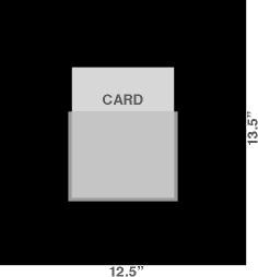
9:00-9:30a
Post boards in the Gardner Gallery in the Bartlett Center. Watson will have velcro to attach to the back of the boards.
The deadline for the Holiday Card is Tuesday, September 16, 9:30am. If you miss the 9:30 deadline, your card will not be shown. Plan ahead.
10:00a Gallery
Visitors from President's Office peruse the cards displayed in the Gallery
Be available to answer questions and/or provide rationale
11:15a CLB 402 Conference Room
New client: OSU IT. Project: environmental graphics for computer labs.
Initial meeting with client - initial client meetings have 3 objectives:
1. Gather information
2. Discuss graphic materials desired
3. Get client contact information
Initial meetings are not for brainstorming, ideation, suggestions - just gathering information.
• Take notepad and pen
Assignment
Determine teams of 3 people each
Research and complete assessment of the environmental graphics project: audience, objectives, production
10:00a Math/Science building computer lab, north end of building
Tour 4 campus computer labs, conclude at Union
Group work time
Due, 1:00p
Email team name and rationale for the name to Watson
Link to project notes
Due
Rough drafts of each of the following:
Statement of overall theme: bring draft, we will refine on Tuesday
Graphic theme/elements: icon/branding,
• Media used to disseminate info: signs, screens, etc.
Color palette: dominant, secondary, etc.
Style manual: fonts, primary and secondary; bold/light, colors, treatment, size, FLRR, etc.
List of non-graphic recommendations: interior changes, colors, lighting, furniture placement, etc.
Additional items as discussed for your team
Team times - Room 104
9:30-10:00 Curly Fries
10:00-10:30 Design Curve
10:30-11:00 Lab Junkies
11:00-11:30 Plum Group
You only need to meet with Watson during your 30 minute designated team time. Use the rest of the morning for working with your team.
The time between now and the 14th will be precious (I guess all time is precious) - this is the week in which your team should finalize all design decisions. Every element. Every decision. Delegate and use time wisely. Remember, we make time for everything that is important to us. You will likely need to prioritize your classes, homework, meals, entertainment, leisure time, work, and Facebook time to insure that you devote adequate time to your team. This is the crucial week that will help determine the success of your proposal. The following week will be spent on final printouts, mounting, and rehearsing the presentation.
Due
Outline of presentation script, divided into speaking parts Info on presentations
Printouts of tight roughs of all pieces, unmounted
Class schedule
9:30 Meet as a class, room 104
Discuss CLE oral presentations
Team schedule
10:00-10:20 Curly Fries
10:20-10:40 Design Curve
10:40-11:00 Lab Junkies
11:20-11:40 Plum Group
Final design refinements
Organize and prep oral presentations
Client meeting at the OSU 'Insect Adventure'. This will be a comprehensive project including a logo/identity brand, an exterior sign, and a brochure; and possibly a website, uniforms, display labels, stickers, and booth signs. We will discuss if you wish this to be a team project (with teams different than the CLE project), individual projects, or a combination of either individuals or pairs.
Meet at the 'Insect Zoo' building - on the map below, the yellow star on the south side of Virginia, west of Western. There is no sign marking the building (until you design it) but Watson will park his silver Dodge Nitro facing Virginia - park in that lot by the white building. As with any client meeting, plan your schedule so that you arrive at least 5 minutes early. If you arrive at the building after 10:00am do not bother coming inside.
• Finished printout of comp of branding logo identity
Layout for the branding stationery
Sketches for the corporate identity program, color palette, and typefaces
• Logo - finished comp
Stationery
• Page showing components of the graphic theme
Draft of brochure - dummy showing construction, layout, application of theme elements
Sketch of bus graphic options
Sketch of exterior sign options
Sketches for web home page
Note: Include a letter on the stationery letterhead. The TM never sees a blank letterhead - it is the most crucial and important element on the page. Design the page layout with it as a component. Sneaky tip: The letter should be the rationale for the logo and the graphics package. This way, the client has a written copy of the rationale to refer to or show others.
Critique/review printouts of each piece
Write accompanying text statement
Prep presentation boards
Printout info
CHES Duplicating
Location: HES Building, Basement, exterior stairway at northeast corner of building
Phone for info: 744-7237
Hours: M-F 8:00a-5:00p (allow at least 30 minutes for printing - arrive by at least 4:30)
Paper size: 36" x unlimited length
Live print area: 34" (need 1" allowance on each side)
Format: pdf file, on a flash drive
Price: $5.00 per linear foot (36"x 24" piece = $10)
Payment: cash or charge to Bursar Acct
Note: If printing on Monday, December 1, have file to HES counter by 2:00pm to allow ample time.
Tips
Put contact info on bus - either the web address or the phone number
The concept of the logo/identity should 'drive' the layout of the stationery.
Materials for the public should convey fun, bugs, energy, motion, intrigue, etc; materials for business (vendors, donors) should convey fun plus a sense of professionalism.
• Website home page: provide info for visitors (map, hours, activities, etc.)
We decided as a class that Andrine should buy either of the domain names below. She may not, but lets all propose them to show how much better it reads. You may use either option:
www.insectadventure.com
www.insectadventure.okstate.edu
(the www is probably optional now - decide which works better in your composition.)
The street address for the Adventure building is 3003 West Virginia Avenue. But, we google mapped it and discovered the 3003 is unnecessary. If you put West Virginia on your map, that should give adequate info for someone to locate it on a map search engine. Which is good since two physical mailing addresses could be confusing. And Andrine says the location address isn't even marked at the building site.
The brochure target is primarily for potential visitors - group leaders, camp counselors, teachers, etc. That will make a better -presentation. She can write the donor info on her new letterhead or request a donor-specific brochure later.
• Remember to put the line 'Oklahoma Cooperative Extension Service' somewhere on the brochure. They are the primary funders.
• On the letterhead letter, include a brief opening paragraph from you to her and the overall concept and theme of the new graphics package, a paragraph with the important explanatory rationale - items you would have mentioned in an oral presentation and items you want Andrine to have to refer to later, a closing paragraph, and room for your signature with this info below your signature:
Student name
Graphic Designer
student@email.address
FON-ENU-MBER
There is probably no need for parentheses around the area code - callers will be from different area codes anyway - 646-505-9059 often looks better than (646) 505-9059. FYI: many cities, like Dallas, require all 10 digits to be dialed so the parentheses may become obsolete soon.
Build an acetate pocket for the brochure or you could mount the cover, inside, and back. Then you wouldn't need the pocket - either one is fine. Do the method that is most appropriate and most impressive.
Presentation board
To make a consistent showing, put all elements on one board that is 24" x 34". You may build a large file and print it all out on one sheet (with a black background) or you may print out each element and mount them on a black board.
Arrange all elements to fit within a live area of 21" x 31". How you arrange the elements within that space is up to you.
The letterhead, envelope, business card, and brochure should be actual size. Reason: clients and the public are less visual thinkers than designers and if any of those items are reduced, they may think you are proposing them at that size. The other items are not size specific and can be reduced to fit on the board.
Sample layouts for board:
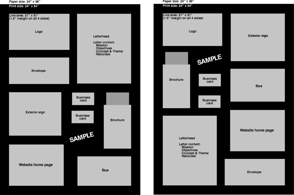
Project components - Required
Branding
Logo/identity
Stationery
Visual theme components: colors, type, characters, graphic elements
Exterior sign
Bus design/graphics
Promotion
Brochure, pamphlet, handout
Website home page and page template
Project components - Optional
Uniform
Discovery Walk map & signs
Display labels, stickers, and booth signs
Building exterior design
Interior renovations
10:00-10:50
Mount boards on glass wall, Department of Entomology and Plant Pathology, northwest wing of the NRC
Text/call Watson if you get lost: 646-505-9059
Watson will have mounting tape for the back of your board
11:00-12noon
Reception with faculty and staff of the DEPP
Individual discussions with Watson
Have a great holiday and semester break.
www.jamesrobertwatson.com/studiocourse.html