
Jim's faculty offices, department office, and classrooms
Fall 1987 UCO 1 semester
I brought office furniture with me from my apartment in Dallas. Some of it was furniture I had designed and built years before for a home office. I bought a few other pieces to outfit my first professional faculty office. At the community college, my office had built-in furniture, so I didn't have to add any pieces. At UCO, I used this furniture only for one semester, as I had already begun planning a better layout.
Spring 1987 - Summer 1998 UCO 11 years

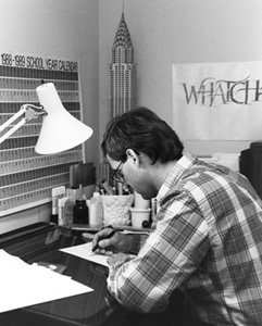
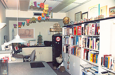
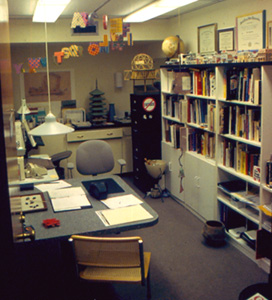
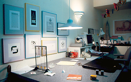
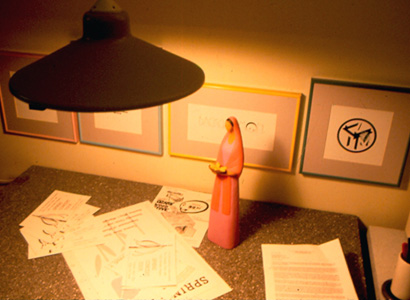
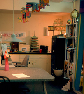
During the Thanksgiving and winter breaks in 1987-88, I renovated the office. I had the desk tops custom made in Dallas and bought the shelving units at Storehouse. I never really liked the idea of a desk separating me from students and visitors - just too cold, formal, and condescending. Sometimes, people use it as a way to express their position and power. I had no need to do that. The use of the large square table and chairs on two adjacent sides worked well and allowed me to better interact with students, especially while we looked at their work or discussed advising on their degree plan.
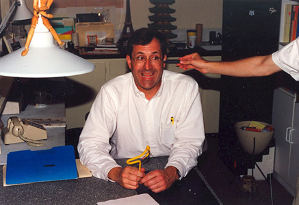
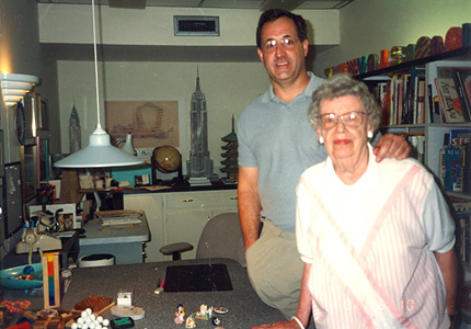
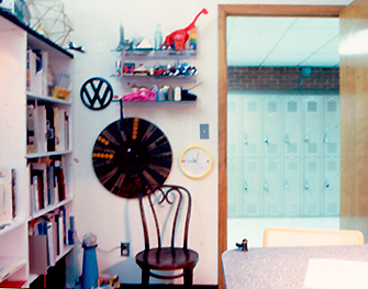
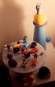
This office went through many variations. At one time, it was stuffed full of models, knick-knacks, and geegaws that I had collected. For a while, a duct tube and a slinky hung under the corners of the large desk as 'table legs' - one even ended inside an old shoe. Alphabet models hung from the ceiling. There was a large collection of paper models: Victorian street, Wild West town, Chrysler Building, Empire State Building, Eiffel Tower, and Chinese pagoda.

Fall 1998 - Fall 2002 UCO 4 years
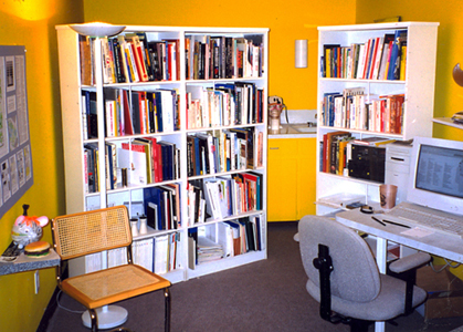
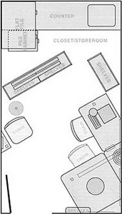
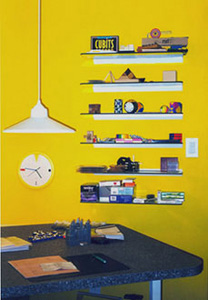
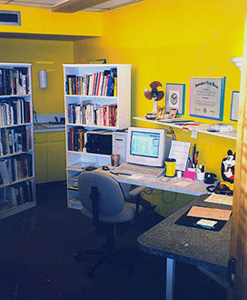
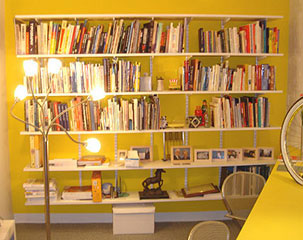
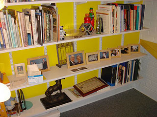
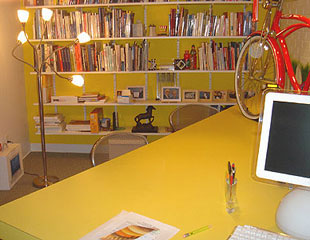
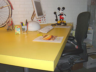
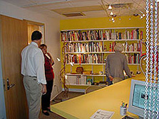
I remodeled the office to an even simpler layout, although much brighter. Yellow wavelengths of light promote creativity and energy. It seems they can also replace caffeine. I created a 'closet' by arranging the white shelf units to form a barrier wall. Offices typically become a storeroom for lots of stuff - samples to show in class, past student projects, etc. I wanted to hide that out of view.
Fall 2002 - Spring 2006 UCO 5 years
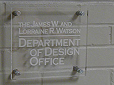
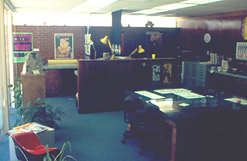
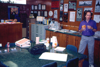
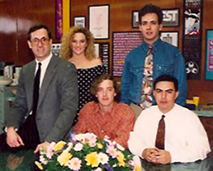
The James W and Lorraine R Watson Department of Design Office
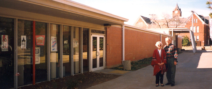
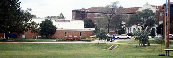
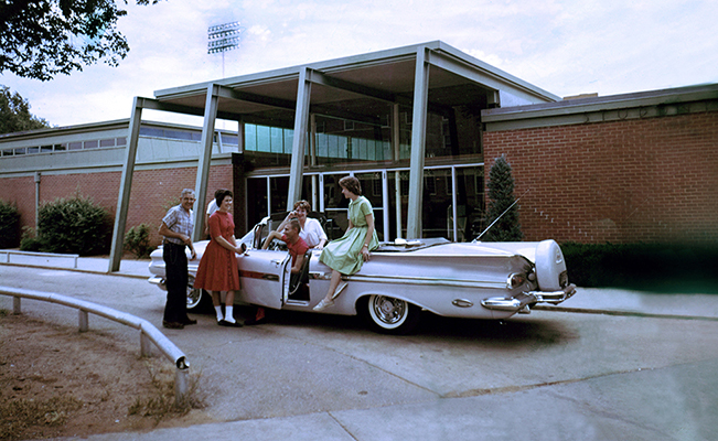
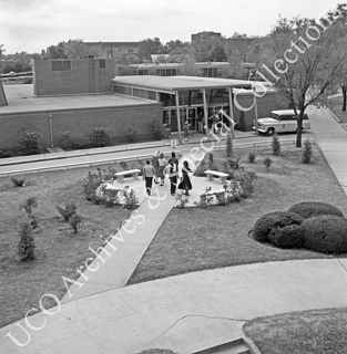
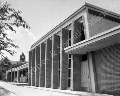
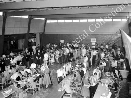
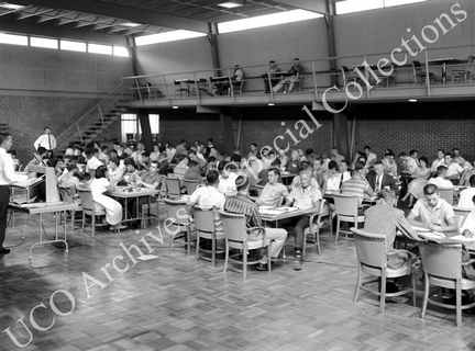
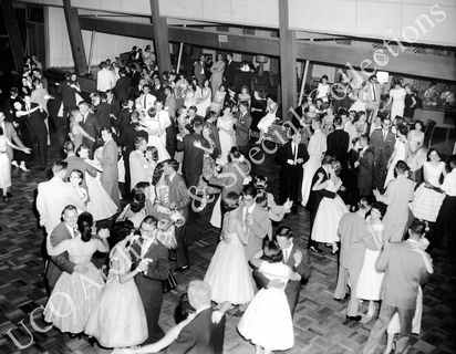
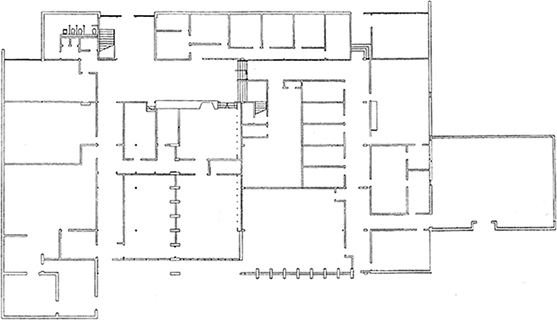
The Art & Design Building was originally built as the Student Union for Central State College. It was between the school's cafeteria in the basement of Murdaugh Hall (a WPA structure from the 1930s) and the football field and stadium. The football field is now occupied by Broncho Lake and the HES Building. The stadium was along the north side, about where the sidewalk is along the lake. The Union had a snack bar (now the Jewelry Studio), game room (now Ceramics), and bookstore (now the Art Department office). Where the Graphic Design room and Painting studio are now was a large ballroom. The Design office, ClockTower Studio, and the MacLab were meeting rooms.
In 1968, the school built a brand new College Center (now named the Nigh University Center) and the old Union was vacated. Art faculty redesigned the Union spaces to serve as studios, classrooms, and offices for the Department of Art. Most art classes had been held in the basement of Evans Hall (where Interior Design classes meet now).
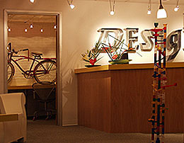
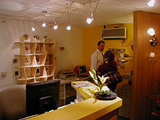
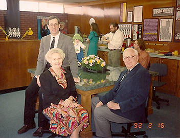
The Department of Design shared an office and a secretary with the Department of Art for over a year. A seldom-used classroom in the Art & Design building was cleared and gutted and construction began in the summer of 2002 to create a new office suite for the Department of Design. Jim Watson, Chair of the department, sought input, did a needs assessment, and designed the layout and interior of the new office. The department saved and put aside $15,000 for the new office. But the school administration took all the money in every department's accounts to cover some shortfall in the university budget. We lost the entire $15,000. Soon after, I was hiking in Red Rock Canyon outside of Las Vegas with beautiful weather and great scenery. Realizing that our new office would be just a used desk and chair in an otherwise empty room, I decided that we would still get our new office - I would pay for it myself. I later called my parents and they agreed to match my donation. We each donated $20,000 for a total of $40,000 to pay for the construction and furnishings in the new office. The university didn't pay a cent towards the new Department of Design office. The office was constructed by Warden Construction of Oklahoma City. It was named the James W. and Lorraine R. Watson Department of Design Office in recognition of the generous donation from James and Lorraine Watson of Dallas. The new office for the Department of Design had its grand opening on Friday, October 11, 2002.
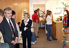
I was asked to give tours and discuss the design concept and rationale for leadership groups and student and faculty groups. The design office became a stop on the prospective student campus tour route. After I stopped serving as chair and moved out of the office, however, some changes were made that didn't quite adhere to the design concepts.
Goals and objectives
Overcome dark spaces, no windows - seek lightness
Use contemporary materials and furnishings
Create a smooth flow from the hall into the office waiting area
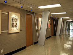
Exploit the angled columns in hall as a unique architectural feature.
Not look academic
Be unique from all other offices on campus
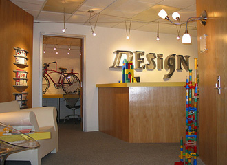
Exude design, identify the department visually
Serve as an example of good design: appropriate for the user, attention to detail
Themes throughout the office
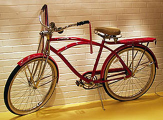
Toys and puzzles. Fun stuff to remind us of childlike awe, wonder, and curiosity. Senses we lose as adults but need as designers.
Angle of 30 degrees - standard angle from drafting triangles.
Materials - aluminum, wood, white walls, yellow accent walls and countertops.
Door handles are lever style for easier operation, especially when hands are full.
Electrical outlets and switches are the flat Decora style.
Colors
White walls, neutral, light.
Aluminum - industrial tech. exploits the angled steel columns in the gallery.
Light wood - white oak or maple
Yellow is cheerful, the color of intellect and used for mental stimulation. It helps the viewer think more quickly. Good for clearing a foggy head.
Dates
Design: April 2002
Construction: June 2002
Grand opening: Friday, October 11, 2002
Move out: May, 2006
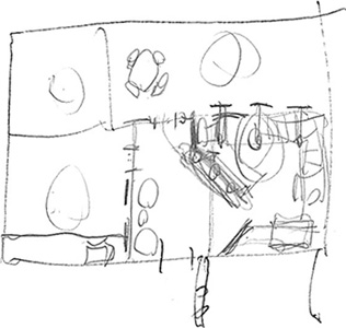
An early sketch that shows the beginning of the room-within-a-room at an angle idea. This angle is a result of thinking that the secretary, as the first contact greeter, should face the people entering the office. That necessitated turning the desk at an angle in order to face the doorway. That entry room needed to include space for guest chairs, secretary desk, copy machine, faculty mailboxes, and a work area. I didn't want the copy machine or work area to be readily visible from the guest entry area yet still be convenient to faculty in the office. The Chair's Office at the back of the suite was a given - its walls were existing from a previous remodel. Turning the desk at an angle became the driving point of unity that permeated the entire suite. It led to creating a rectangular room within the suite whose walls were at a 30 degree angle. Another objective was to hide most of the day-to-day office crap behind a low counter wall. That countertop provided a surface for information and additional toy/puzzles.
Initially, I didn't design the Chair's Office, I was just going to move my existing office furniture into the space. An adjunct faculty, viewing the plans, commented that it would be silly to invest in a new office and not include the Chair's Office. The entire suite should be designed to be impressive, not just part of it. He was right. I designed the office to respect the outer office.

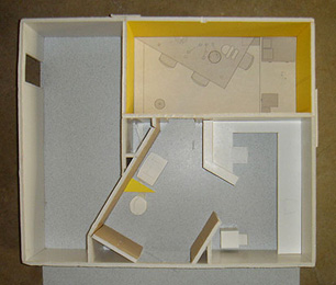
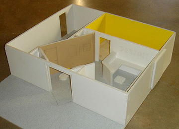
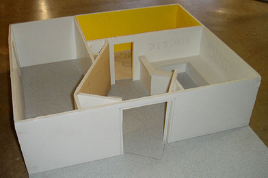
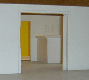
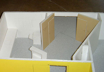
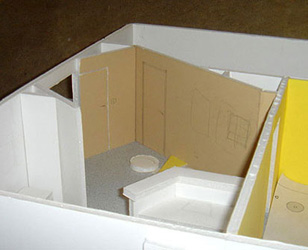
I built this simple model out of foam core to help visualize the interior masses, traffic flow, and views from the hallway.
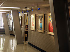
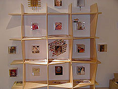
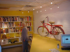

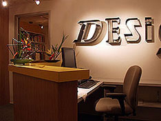
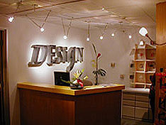

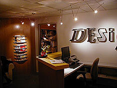
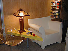
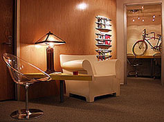
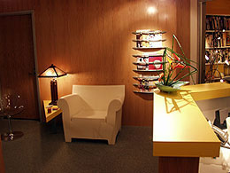
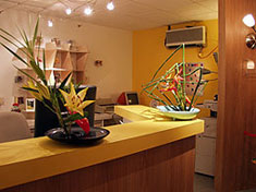

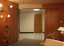

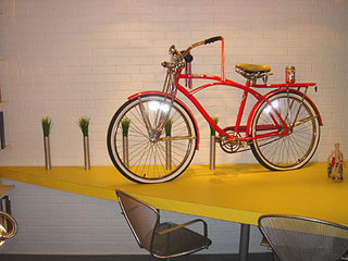
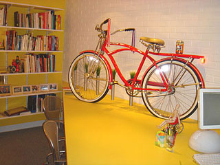
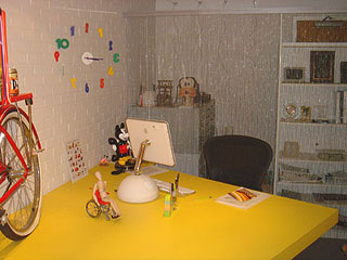
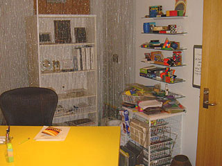

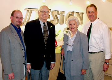
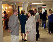
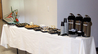
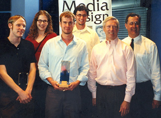
Left: the Conference Room. Right: The opening of the new office
Dr. Christopher Markwood, Dean of the College of Arts, Media & Design
Mr. & Mrs. J.W. Watson, Donors to the Department of Design
Dr. Jim Watson, Donor and Chair of the Department of Design
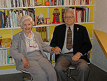
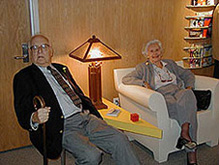


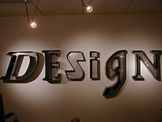
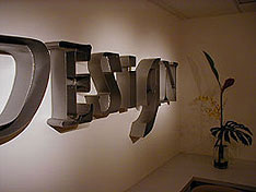
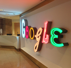
Above: Design Office lettersign designed in 2002. Below: Google's NYC office, 2012.

Fall 2006 - Spring 2008 UCO 2 years
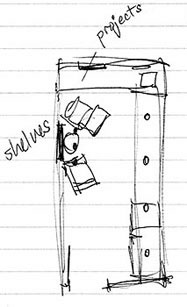
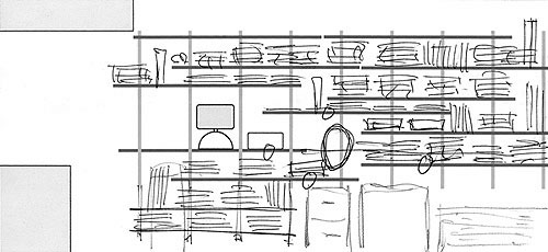
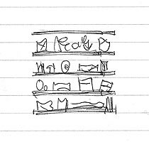
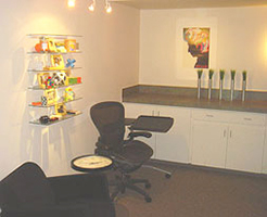
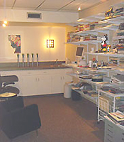
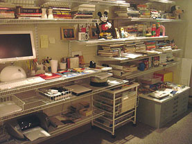
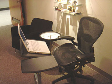
Due to a faculty resignation, I had the opportunity to return to my former office (see above). None of the furniture that I had in there before was saved so I had to start from scratch. I took advantage of this and experimented with a couple of concepts.
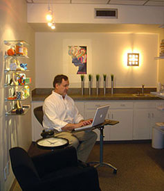
Fall 2008 - Spring 2009 OSU 1 year
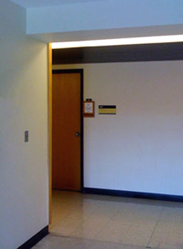
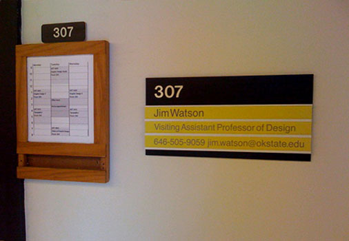

I retired from teaching at UCO in May, 2008 and had moved all my office stuff to my home office. After conducting my final UCO study tour to New York, I returned to NY for the summer. I was loving retirement when I got a phone call from the head of the art department at OSU - she made an offer for me to come teach full time for 1 year (fall and spring semesters). I thought about it and called her back to accept the position. I was given an office in the Bartlett Center. It has two windows - this is the first time in 24 years of teaching that I have had an office with a window. Windows are a great invention.
Concept
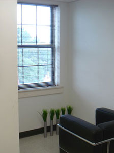
The layout and look of the office was inspired by the dominant architectural element - the mass of the walls that intruded into the room between the windows. That mass suggested that the furniture also be massive and positioned along the same grid alignment. The traditional desk was fine, it was massive and solid. I secured a large shelving unit from OSU surplus and brought the Corbusier Petite chair from my home office. It respected the concept of blocky masses.
Zones, from left to right:
1. Conference/consultation: meet with students to review work.
2. Work: desk, computer, printer/scanner, files, bookshelf.
3. Relax: comfy chair, ponder the view
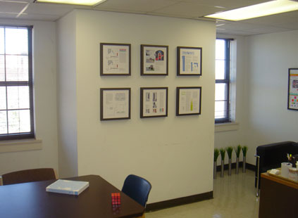
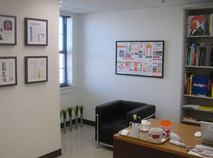
6 framed pieces by Watson that were in the 2008 OSU Faculty Art Show. Poster of the 1984 LA Olympics graphics by Deborah Sussman.
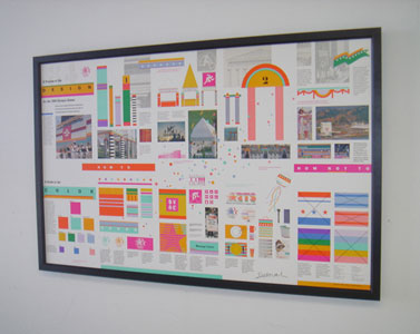
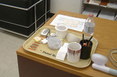
Sussman's graphics program poster, signed by her. An old tray from the cafeteria in the Student Union, rescued from campus surplus.

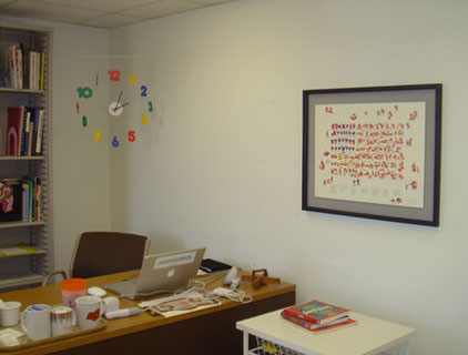
Desk, bookshelf, and fun hanging clock. Print of poster for the San Francisco Symphony by Clement Mok, signed by him.
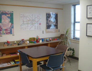
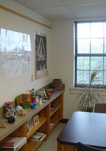
Poster designers: Seymour Chwast of Push Pin Studios, Henry Beck's London Underground, Marcel Duchamp's The Fountain.
Studio classrooms
UCO 102
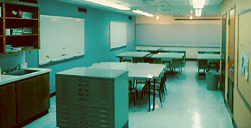
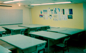
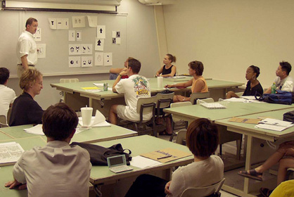
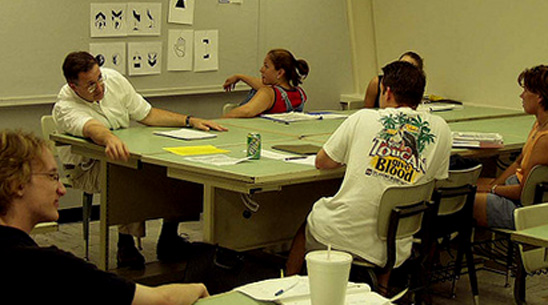
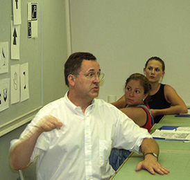
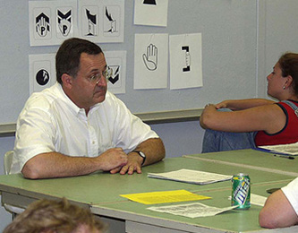
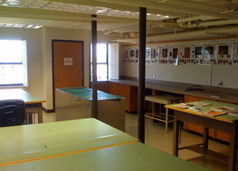
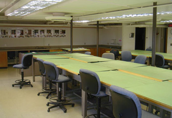
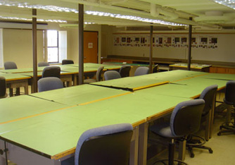
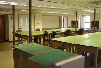
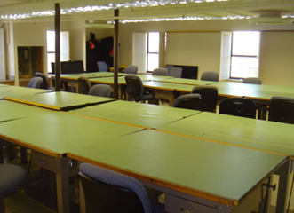
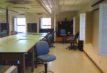
In 1987, there were 10 hefty professional drafting desks and a few standard wooden classroom tables. I got approval to buy another 10 identical drafting desks (the class was designed to cap at 20 students). We bought 5 each year due to the high expense. I kept 2 of the wooden tables in the smaller part of the classroom to serve as a seminar table for small group discussions, presentations, faculty meetings, and overflow for more than 20 students. That worked fine, but I wished that the tables could be reconfigured into a variety of arrangements for different uses. Later, when updating the room, I designed four triangular tables that could be arranged into a large square for seminars, individual desks, or for presentations. The university's carpentry shop built the table tops and covered them with formica and we used plumbing pipe for the legs.

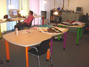
Years later, when redesigning ClockTower Studio with all movable furniture, the same concept was applied and I ordered four tables that nested into each other for a large seminar or individual workstations:

UCO ClockTower Studio 103
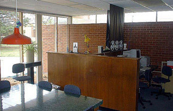
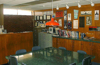
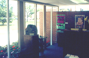
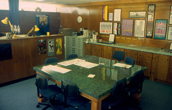
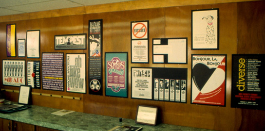
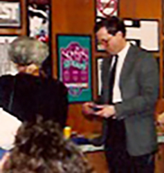
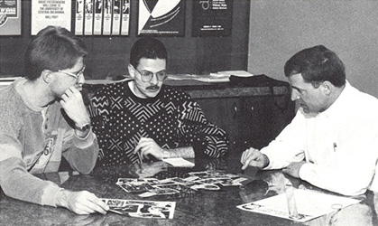
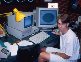
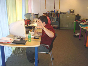
After the remodeling in 2004 - a more flexible space.


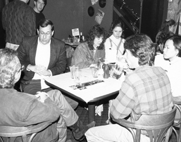
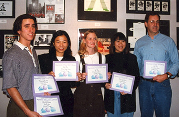
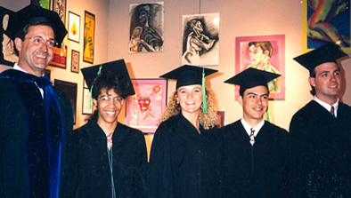
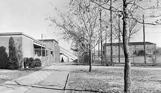
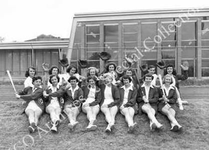
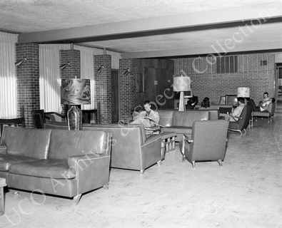
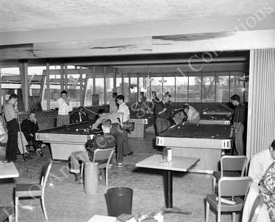
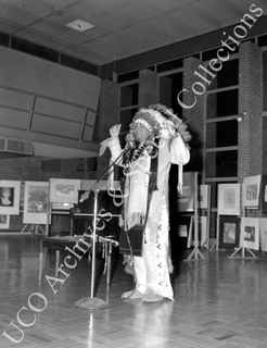
The Art & Design Building was once the Student Union
OSU design classroom
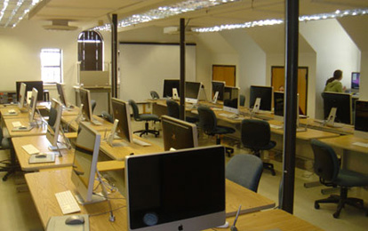
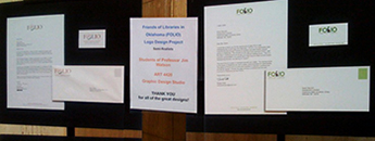
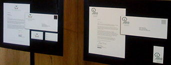
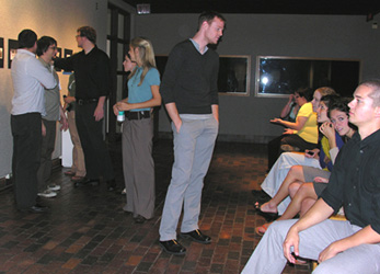
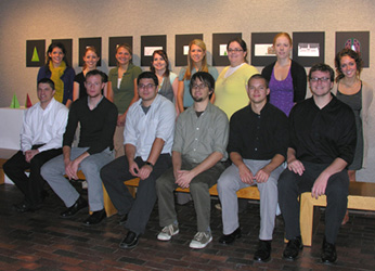
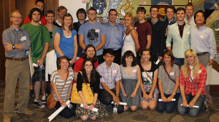
The senior class with their Christmas card projects. Below: OSU group at OKC AIGA:
Lecture Halls
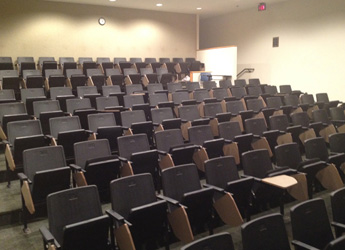
UCO Communications Bldg 104
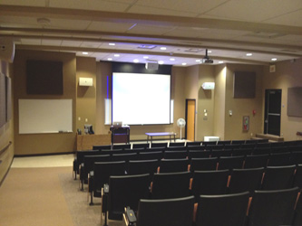
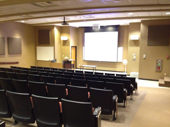
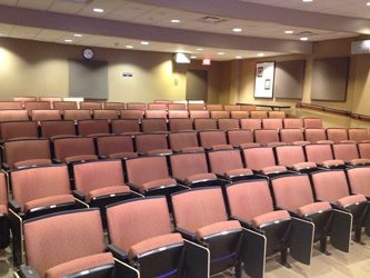
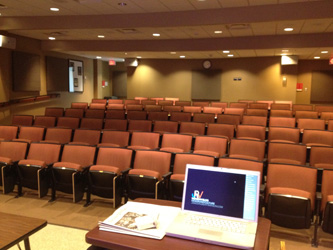
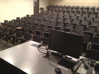
OSU Bartlett 109
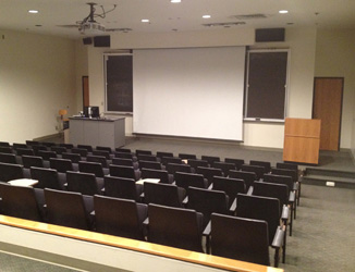
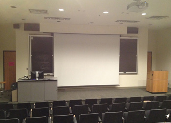
Proposal for a Design Lab
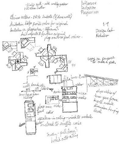
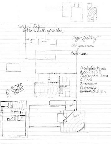
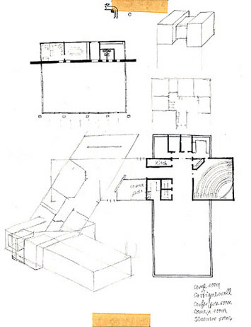
Graphic Design is a very young academic discipline. The industry gained popular recognition in the 1940s and achieved rapid growth in the 1950s - after the war when companies accepted the value design could add to their products and marketing. Design education didn't fit into existing disciplines. At the time, it was closest to study in art, so Commercial Art was added to Art Departments, with classes often being taught by painters, renderers, or printmakers. As design evolved it became clear it was separate and distinct from art - it was a communications medium. Most art classrooms were not equipped to adequately address teaching design. I doodled some notes and sketches on the development of a Design Lab - a place dedicated to design education.
1. Flexible space, multi-use: no interior columns (like Mies IIT)
2. Adapt to different sized classes.
3. Accommodate changing technology, equipment' materials.
4. Exposed ceiling trusses for flexible cables, lighting, vents
5. Live floor with outlets
6. Wireless capability
Office
Seminar
Restrooms
Storage
Workroom, copier, sink, break room
Production
Desks, flat top
Desks, drafting top
Worktables
Study carrels
Presentation
Projector pedestal
Large-screen monitors
Display panels
Bulletin board
Whiteboard
Storage
Storage lockers
File cabinets
Flat files
Bookshelves
Shelves, deep, project storage
Shelves, magazines
Operations
Coat rack
Planters
Partitions
Lounge chairs
End tables
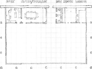
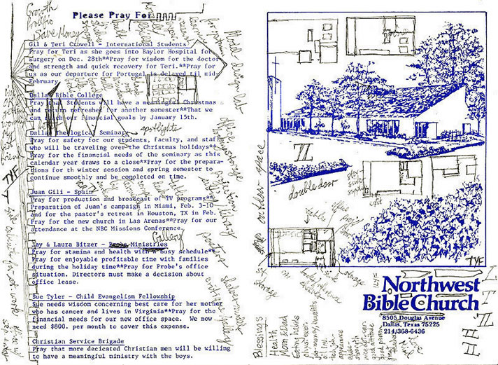
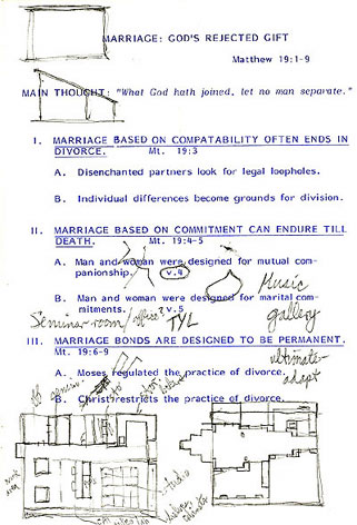
The sketches below show a variety of options for the space and for student workstations. I often sketched on church bulletins. The usher gave me free drawing paper (the bulletin) and the preacher gave me time and inspiration.

www.jamesrobertwatson.com/offices.html