
New table cards for MoMA's Cafe2
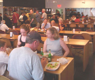
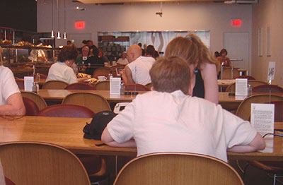
One afternoon in the fall of 2005, I was at the Museum of Modern Art, hereafter referred to as MoMA, pronounced with a long O, not like momma. I had ordered lunch in Cafe2 (its the cafe on the second floor) and went and sat next to an older woman. As we were waiting for our food to arrive, we got to talking about the food delivery system, hereafter referred to as FDS.

An explanation of the FDS
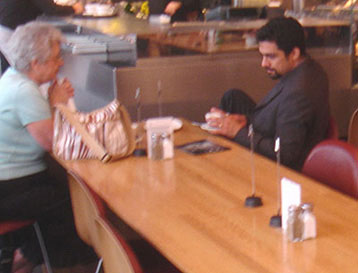
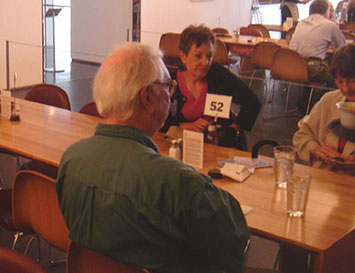
Sometimes (not consistently) a host hands you a card, like the one above, that explains the procedure at Cafe2. When you order at the counter, the cashier hands you a laminated card with a number on it and she (they were all women) types that number into your order on the machine. Once you find a seat, you are supposed to place your numbered card into the alligator clip mounted at the top of a wire stand. Guys (they were all men) later pick up the order and check the ticket for the number that the cashier typed in. The guys then have to scan the entire room until they find the card with the number that they seek.
Okay, back to the story: This woman wisely suggested that they could color code the numbers. Brilliant idea. I told her so. She flushed a bit and we discussed it a bit further, enjoyed our lunch, then parted ways amicably.
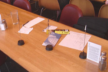
A few months later, Sean and I are sitting in about the same area in the same cafe. I told Sean about the discussion I had with the lady. We further refined the concept - 3 or 4 different colors. And different shapes. Color coding the numbers and using different shapes would reduce the amount of cards the guys would have to scan. If the guy was looking for 'Red round 44' he would only have to peruse the round red cards until he found number 44. Also, Cafe2 at MoMA was very minimally furnished - simple tables and chairs, white walls with white framed white art on them. We felt the splashes of accent colors on the table tops would add a nice aesthetic touch to the space. Especially since it was in a museum. We made a few sketches and notes (our work space shown at left). Sean took some pictures and we refined our notes and the images over the next few weeks.
Design concept
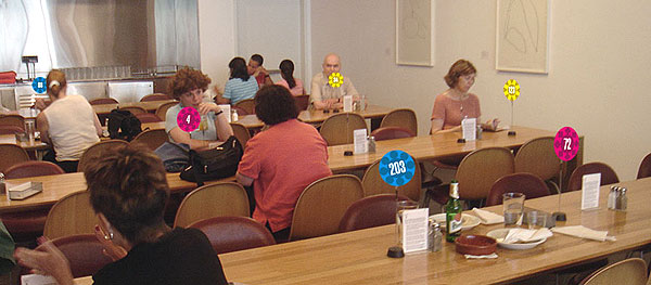
The proposed new FDS consists of colorful unique floral shapes that uniquely denote food order numbers and provide an innovative and fun aesthetic element within Cafe2 at MoMA.
The new cards also serve as 'centerpieces' on the table. Centerpieces remind us of having guests over, decorating the table, and providing a special sense of comfort and care for our guests. The floral shapes offset the rigid geometry of the architectural features in the space and become, themselves, abstract works of art - art that is functional and enhances the Cafe2 dining experience.

Some of Sean's rough sketches of the cards. On the left - flowers and shapes. On the right - refined roughs of all flowers.

Objectives/criteria/advantages
The proposed FDS table cards:
1. Enhance the efficiency of delivery of food. It is easier and quicker to spot a particular number. The basic concept already in place with black & white, is now carried even further.
2 Add a fun layer of aesthetics to the cafe. The spots of colors and shapes become focal points that help unify the room and provide a sense of whimsy and fun for the tired and hungry museumgoer.
3 Continue to show how MoMA pays attention to detail and impresses the visitor with innovative graphics and systems for operation. The proposed solution meets the objectives of improving the FDS and adding a fun element of focal aesthetics to the museum cafe.
Presentation booklet cover
Sean Cobb designed a leave-behind presentation that included diagrams, sample cards, sketches, and thorough rationale.

Rationale
In addition to improving the efficiency of the FDS and enhancing the aesthetics of the space, the new shapes offset the rigid geometry of the architectural features in the cafe and become themselves, abstract works of art - art that is functional and enhances the dining experience for the MoMA guest.
Before and after
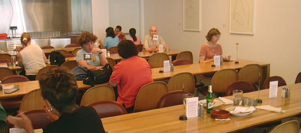
Above: the existing FDS in Cafe2. Below, the proposed FDS in Cafe2.
The Cafe2 Coasters
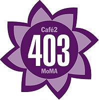

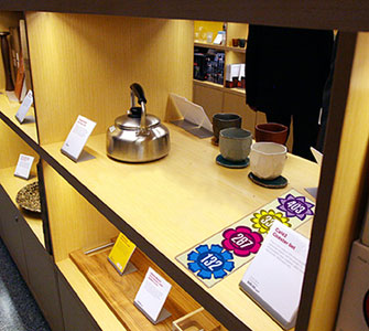
The new shapes and colors used in Cafe2 lend themselves appropriately to a set of coasters that can be sold in the MoMA Design Store. The museum visitor can now take a bit of their experience home with them. Each flower shape has the additional copy of Cafe2 and MoMA to help reinforce the brand image of the museum. The coasters are sold in a flat pack of 4. The simple clear package allows the coasters and MoMA brand to be easily seen while sitting on the shelf in the store. Shoppers can buy multiple sets if they need more than 4 coasters.
Dates
Design concept: Jim Watson, Sean Cobb, and some anonymous woman
Initial discussion: Fall 2005
Concept refinements: July 2, 2006
Notes and photos: July 2, 2006
Sketches and fotos: July 2006
Preparation of submission packet: September & October 2006
Submission to MoMA: October 20, 2006
Update

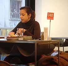
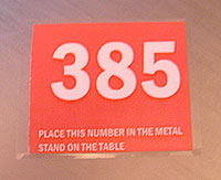
Cafe2 was remodeled in November of 2006. A visit after it reopened showed that they are now using three colors - black, white, and red. Each card has instructions printed on it.

In 2009, I noticed a new pattern on the napkins - these geometric shapes would be perfect on the table cards. These patterns were designed by Ivan Chermayeff in the 1960s for use on sugar packets at the MoMA Cafe. The three basic chspaes - circle, square, triangle - would be perfect for the table cards.
The slightly blurry foto below is of brgr, an excellent hamburger restaurant on 7th Avenue in NYC that uses a similar system of colored flag cards.
