
Some improvements to the Oklahoma History Center
The Oklahoma History Center across from the state Capital, is a self-guided exploration of Oklahoma - past to present. Within are five galleries of more than 200 hands-on activities; outside are a walking tour of the Red River Valley and an outdoor oilfield exhibit. A noble effort, but there are some issues that are hampering the success of the Center.
Improvements
1. New logo identity.
2. New visitor guide and map.
3. Enhanced exterior elevations.
4. Better gallery entries.
Target markets
First-time and infrequent museum visitors, tourists.
Repeat visitors.
People doing research.
People doing business.
New identity
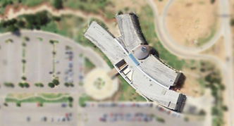
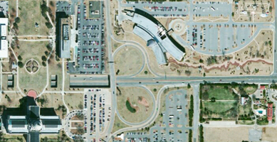
Notice how the swoopy lines in the logo mirror the building plan shown below (from an upside-down aerial view, something the museumgoer would never see). This is a symptom that the logo was designed by the architectural firm. No one else is so enamored with the somewhat ugly building that warrants it becoming part of the identity. The focus of the identity should be on content and experience, not the building shapes.
The History Center needs a new marketing plan that includes a fresh identity that is appropriate for the experience of visiting the museum.

New guide map
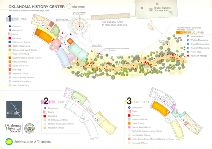
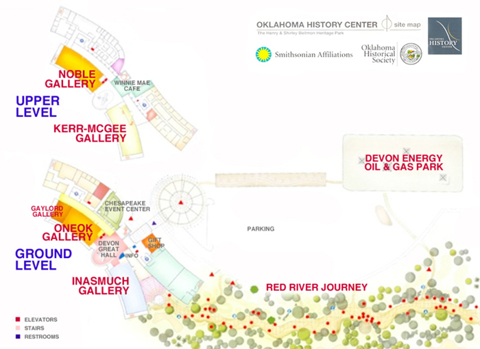
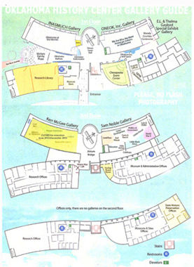
The visitor guidemap (top image), like the logo, appears to be designed by the architectural firm. It includes all interior spaces, even those that have no connection to the visitor - rooms that the visitor has no need to ever know about, like the boardroom and offices.
Lesson: Great design is from the visitor's point-of-view, not the designer or architect.
The History Center visitor needs guidance to the exhibit galleries, cafe, gift shop, and restrooms. There is no need for much else on the map. Remove all info not pertinent to the guest experience.
Lesson: Avoid legends - just label the map. Don't make the guest decipher color coding.
The visitor accesses only two levels - Ground and Upper. The former Level 2 can be the new Mezzanine - it does not need to be included on the map. Putting less info on the map frees up space and allows the two levels to be enlarged on the map.
Hierarchy of info on the map
Most important: 2 Levels.
Second important: 4 permanent galleries, Special Exhibit gallery, Oil & Gas park, Red River Journey.
Third important: Gift Shop, cafe, info, event center.
Not important: Outreach office, Administrative offices, Research offices, Boardroom, Archives, Library.


Better exterior elevations
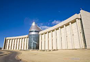
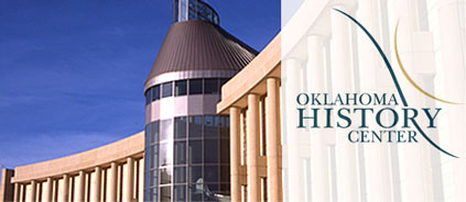
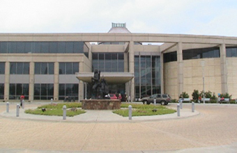
The foreboding prison-like facade (solid blank walls, minimal windows, and a watch tower) faces the capital building and the roads leading to the museum. It is not a welcoming friendly sight. Notice how Inappropriate and misleading it is when exploited in this early logo:


Facade improvements
Better landscaping to soften the harshness of the building.
Colorful banners hanging between the columns to liven up the drabness.
Below: The entry facade is a little better, even though it looks more like a corporate office building than a museum alive with history and activities.

Gallery entries

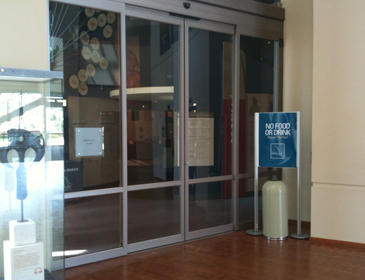
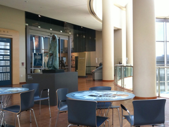
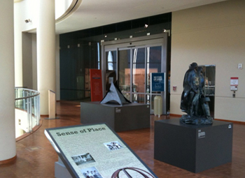
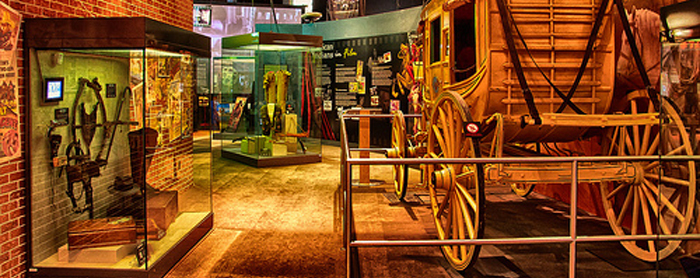
The central rotunda has a nice view of the state capitol building, but notice that each gallery is behind closed doors. There is no sense of welcoming into the galleries. The greeting text to the gallery above is even negative - No Food, No Drink - not very welcoming or friendly. There is not much that visually attracts the visitor.
Gallery entry improvements
Better arrangement of items in front of the doors.
More dramatic signage.
Brighter background wall colors.
More focused warm lighting.
Update
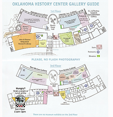
The museum has printed new guidemaps that are a bit better. They still convey too much information and too much detail - like the room specific office wall locations. Almost nobody visiting the museum is going to go to one of those offices nor need to know where the walls are. The most recent (right) deletes the 2nd Floor and adds the line at the bottom There are no museum exhibits on the 2nd Floor.
www.jamesrobertwatson.com/historycenter.html