
Brookhaven College 1984-87
Faculty: Judi Kaufman, Carolyn Krugman, Lisa Erich, Don Taylor, Charles MacAdams, Donna Adams
University of Central Oklahoma 1984-87
Faculty: Bill Wallo, Larry Hefner, Keith Webb, Melinda Lyon, Laci, MaryKay McElroy, Bob Palmer, Gayle Singer, Joann Adams
Some work while at UCO 1987-2007
UCO 2020: A clear vision master plan for the university
The University of Central Oklahoma is one of the oldest universities in the state. Begun as the Territorial Normal School before Oklahoma was a state, the name morphed to Central State Teachers College Central State College, Central State University, and finally, University of Central Oklahoma. The campus plan and layout was just as discombobulated. Major construction in 1968 (Library and Student Union) and rapid growth in the 1990s added new buildings. There were many poor decisions made during the 90s and the campus was in need of a cohesive Master Plan.
Benefits
The design (architecture, landscaping, and layout) of a university campus provides important intangible benefits:
Pride in the visual environment.
An affirmation of one's decision to attend or visit the university.
Order and organization that provide cohesive continuity to a collection of structures, activities, and uses.
A sense of identity unique to the campus.
Comfortable and pleasurable feelings of design aesthetics and beauty.
Target market
People impacted by the design of the campus environment:
1. Prospective students, parents, and friends.
2. First-time students, faculty, and staff.
3. Repeat students, faculty, and staff.
4. First-time visitors to academic events.
5. First-time visitors to non-academic events.
6. Repeat visitors to campus.
7. Edmond and metro citizens using the campus for recreation.
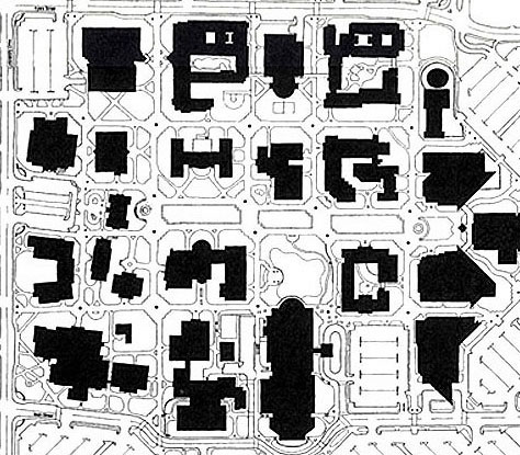
Before and after maps
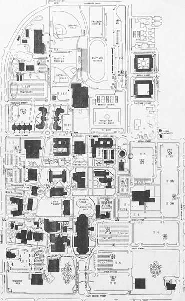


Objectives
The design of the UCO campus should meet these objectives:
Empathy - base all design decisions on the impact on the users. See each element from the users POV.
Convey a professional environment.
Respect and enhance the heritage of the university's historical architecture.
Create a sense of place, that lets one know he/she has arrived on the campus.
Establish efficient pedestrian and vehicular access, parking and traffic flow to allow easy navigation and access.
Organize building and sidewalk layout that facilitates wayfinding and direction.
Provide visual consistency to create a unique campus identity.
Develop more urban activity on the west side, in cooperation with Edmond retail, restaurant, and housing development.
Integrate the campus into the fabric of the city of Edmond.
Provide adequate open space for scenic vistas.
Encourage a greater diversity of campus life and activity.
Work with the city of Edmond to improve traffic flow, intersection layout, and campus perimeter development.
Recommendations
To accomplish those objectives, these should be implemented:
1. Planning and organization
Create a Design Advisory Board to determine long-range architectural planning needs and assure intelligent design with greater attention to detail.
Develop a true long-range Master Plan.
2. Remedial (to correct some of the poor decisions made in the last few years)
Remove the crumbling Greek columns. The columns were a poor decision and a mistake that are now an embarrassing and negative blight on the campus.
Stucco the Education Building. One reason that building is so ugly is the garish contrasts between materials, shapes, and colors. Stuccoing the light part to match the darker part will create more of a solid visual mass (the walls will need to be refinished anyway when the columns are removed).
Remove the confusing one-way street designation on Main Street to create campus drives at Ayers and Main.
Develop a nature area at Blake's Creek. Remove undergrowth and add sidewalks and a pedestrian bridge across the creek.
Remove or paint over the Land Run mural on the Communications building. It does not convey professional university-level quality.
Upgrade the University Center: paint over the childish purple wall waves, install professional signage, rearrange store layouts, and change the name. University Center is too cumbersome to use comfortably. Bronco Union might work (and uses the more common and preferred spelling of Bronco).
3. Buildings
Construct new buildings for Music, Art, Design, Theater Arts, a Performing Arts Center, Public Safety and Student Health Center, and a Day Care Center.
Build additions for Mathematics and Science, Business Administration, Education, Thatcher Hall, and dormitories.
Renovate Old North into a public space housing a visitor's center, Art Museum, and History Museum.
4. Parking, sidewalks, and landscaping
Develop and landscape the Central Mall between Old North and Liberal Arts.
Pave sidewalks in a 2-tier system: wide geometric for major arteries and organic fluid for secondary arteries.
Install information kiosks with signage, directories, and activity notices.
Improve parking allotments, quantity, access, and safety.
Build entry peninsulas with signs, drop-off lanes, and visitor parking.
Encourage the city to stripe two-lane turn lanes on Second at Godfrey and on Baumann at Second, and install a new signal light at Ayers and University.
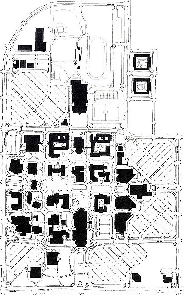
In the map above, notice the orderly grid pattern, the hierarchy of sidewalks, a better sense of order and navigation, the mall focal points, easier-to-maneuver parking lots, and the new buildings.
Dates
Designed: Fall 1997
Drawings and plans: January-Febuary 1998


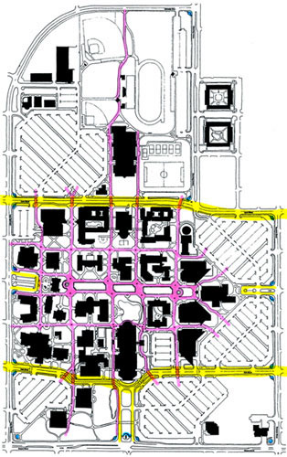
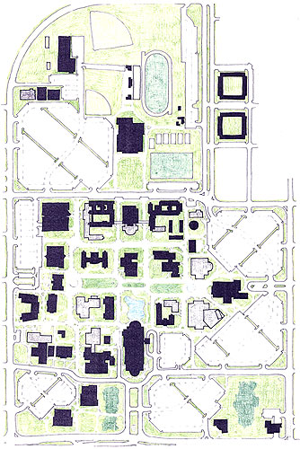
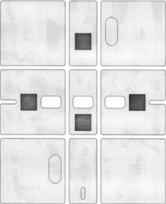
Above left: Article in the student paper. Right: Another Master Plan from a proposal in the late 1970s
Appropriate sidewalks
Brick & Mortar facilities should exploit what makes them special and conducive to educating students - the face-to-face interaction. There should be numerous gathering places with seats and benches arranged at a right angle to encourage and facilitate conversation and sharing. Sidewalks should allow pairs or groups of people to pass oncoming students with ease. They could be of 3 defining widths:
Primary walks: Room for groups of people to pass other groups of people. Main arteries and visual connections on campus.
Secondary walks: Room for two people to walk abreast and a third in the opposite direction.
Tertiary walks: Connecting shortcut walks. Room for a person to easily pass another person.


Above left: Primary walk and seating bench. Right: Tertiary walk. Below: Too many confining fences for an educational environment that should exude open, exploratory, and free discussion and inspiration.


Corner Gateways
The corner of campus at University & Second is a major visual entry to the campus. Unfortunately, the row of trees behind the low brick wall forms a barrier that shields the view to the campus. Opening that up with a ceremonial walkway from the corner entry to the campus would help the University embrace and visually include the neighborhood.


Update: After a discussion with the President in Feb/March 2020, the backdrop hedge was removed and the vista was opened up:

Notice these sidewalks at the intersection of University & Ayers - laid out in arrangements that no human follows naturally. Sidewalks should respect the user, not force the user to accommodate unusual walking patterns.


Below right: Crosswalk that is too narrow - not enough room for two walkers to pass.


A new UCO park
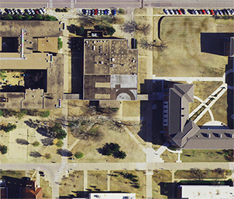
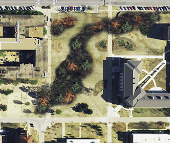
A new cafeteria building opened in fall 2019 and the old building was razed. The President proposed that the resulting vacant land be redeveloped as a new park, a peaceful retreat in the middle of campus
Users: People on campus with time to explore and people passing through on their way to somewhere else.
Activities: Reading, eating, walking, conversations, meeting, gathering - think, work, & rest.
Conceptual ideas
Convey diverse OK terrain: prairie grasses, western/Arbuckle rocks, native trees.
Canopies of trees with open views below. Trees nearer to the edges could be spaced to allow more open sightlines through to a forested mass in the middle.
Winding undulating grove of trees - no hard tree lines. No defined beginning and end to the park but rather an intensified center of natural surroundings that blend into campus.
Berms of wind-blown grasses (adds kinetic motion) - rocks cut across sidewalk paths.
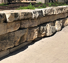
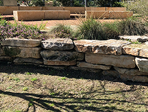
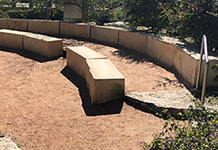
Natural seating of stone, rock, wood - areas where people can gather in a circle hugged by the landscape to give sense of privacy. Maybe WPA-era rock style.
Downlighting or diffused lighting to warm the space below the canopies and protect the night sky for stargazing
Accessible: walkways and paths would be wheelchair accessible. Signs could include braille.
Some ways to improve parking on campus
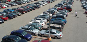

Are you crazy?! YES! Of course, there is!
These were typical of the responses I would get when I asked, "Is there a parking problem on campus?"
Graphic Design 1 addressed the steps of the creative problem solving process. A major component of the process is 'Stating the Problem' and stating it correctly and clearly. In class, I would fill the board with what student's thought the problem was. We would then discuss each and reluctantly conclude that the complains weren't really valid. There is not a Parking Problem on campus - there is only a perception of a problem.
What students really want
To be able to park at the building of their first class, and, while in class, have someone move their car to the building of their last class.
Students had to admit that, instead of a parking problem, there was a Laziness Problem among students. This being America, they are conditioned to complain, whine, and claim to be victims of an unfair system.
In 1999, I chaired the Parking and Traffic Advisory Board at UCO. It included 12 other reps from administration, faculty, staff, and students. Based on our discussions, I prepared this information:
Mission Statement
The UCO Parking and Traffic Advisory Board will assess and make recommendations that will impact and improve these areas within the university environment:
Automobile access, navigation, and traffic flow.
Parking, waiting, and loading/unloading.
Pedestrian flow and user treatment.
Bicycle, skateboard, and rollerblade accommodations.
Mass transit, on and off campus.
Communication: signage, brochures, and fliers.
Objectives/criteria for recommendations
Encourage an easy intuitive navigation of streets, campus entries, parking lots, and sidewalks.
Integrate the campus into the fabric of the city of Edmond and the downtown Edmond Master Plan.
Respect the diversity of the UCO student: working, older than average, and part-time.
Respect the university mission to prepare students to become responsible, self-sufficient, problem-solving citizens.
Respect the intelligence of the user to make responsible decisions.
Enhance the aesthetics of the campus: vistas, signage, and landscaping.
Improve the perceived image of the University and its parking.
Convey an attitude of UCO being service oriented; sensitive to the needs and requirements of the users.
Be eco-conscious: consider pollution, materials, recycling, and waste.
Create an environment that, within reason, feels safe and secure.
Establish a sense of entry and identity for the university.
Be sensitive to the needs of users with disabilities.
Be considerate of financial limitations within the university and Parking Services.
Users/stakeholders for parking and traffic
1. First-time or infrequent visitors to campus
Prospective students and those accompanying them.
Incoming students.
Newly hired faculty and staff.
Infrequent attendees of events on campus.
Visitors: family and friends of students, faculty, and staff.
Alumni and retired employees.
2. Seasoned or regular user of campus facilities
Returning students.
Faculty, staff, and administration.
Frequent attendees of events on campus.
3. Other
Emergency vehicles.
Vendors, contractors, and those with business relations with the University.
A few ideas and recommendations
Main was first turned into a one-way street for one block by the Science Building. Numerous students and visitors ignored or didn't see the signs and went the other way (a clear indication that they want or need to go that way.) Here's the problem: a one-way street that people violate by going the wrong way is more dangerous than a two-way street. This is dangerous - these drivers have no stop sign at pedestrian crosswalks and pedestrians may not think to look both ways at a one-way street. Making it two way will require all drivers to obey traffic signs and yield right-of-way to pedestrians. Visitors entering the campus at what appears to be its main entrance would logically expect to be able to turn left to access other campus buildings, but they cannot. With several stop signs along Main Street and the pedestrian crosswalks traffic won't be very fast-moving and there will not be heavy volumes of cross traffic.
Let's assume students are responsible enough to handle crossing a street. There will be a stop sign at each Ped Xing. The mission of the university is to help students become responsible thinking citizens and prepare them for work environments. Most of them will go to work at a place where they will have to cross a street safely. There is no need to assume the students are incompetent.
The same logic above applies to Ayers Street, the only east-west access connecting Broadway/Boulevard to Bryant and between Second and Danforth (1 mile each way). Closing Ayers insulates the university from the fabric of its host city.


There is no need for 2 lanes in each direction as only one lane is available to turn onto Main. Adding the dedicated turn lanes will improve the traffic flow.

There are numerous side streets and parking lots - people turning left into those back up the left lane. There are also stop signs or stoplights at almost every cross street to slow down traffic and allow pedestrian crossing (this is one of the busy perimeters of the campus). There is no need for 2 lanes in each direction. One lane with dedicated left turn lanes would improve the traffic flow.
The Parking recommendations were made in the summer of 1999. In 2014, the city of Edmond restriped the street to add a bike lane in each direction. Below: The new striping after the addition of bike lanes in each direction and a center left turn lane.

So, a good move for drivers in the area. But, there are 2 areas that could be better.
Lesson: Things can always be made better.
Below: on this morning, the traffic to turn left onto 2nd was backed up to the stoplight at Main St, 2 blocks away.

1. In the intersection shown below left: there is no pedestrian crosswalk and the left turn lane is too far away from the intersection. Below right: Improved version.
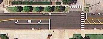

2. The traffic to turn at Second Street can back up during the campus rush hours. There was an opportunity here to create more lanes to hold more cars. In the photo below, notice the wasted areas in the yellow-striped islands. There is enough room to extend a lane (bottom photo).


This is a dangerous intersection with the water tower and hill westbound on Ayers obstructing some view from Baumann northbound. Traffic flow will be improved if those coming from Baumann to Ayers can have some right-of-way. Traffic flow on Ayers should not be impeded since there are existing stop signs a block in either direction.
Update: the stop signs were installed by the City of Edmond a few years after this recommendation.
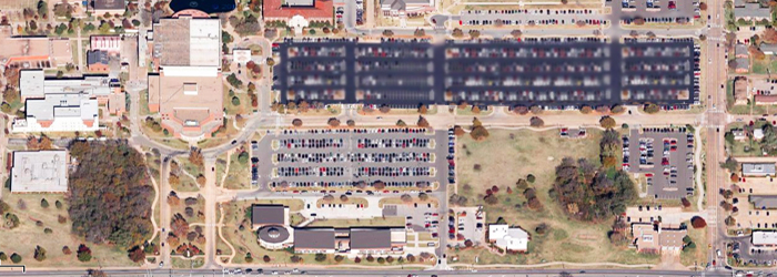
The lots that stretch from the UC to Baumann are in terrain that will allow a deck over the releveled surface lots (the dark lot pictured below). Access to the covered lower deck will be from several entry/exits along Main Street, on the south side of the lot. Access to the upper deck will be along Hurd Street, on the north side of the lot. There will be no need to build ramps nor an elevator. There would be direct covered access to the lower level of the UC. There should be a higher charge or Permit Fee for the covered parking (protection from August heat, rain,and snow).
A multi-story garage will be more expensive and get clogged up during campus rush hours (9:00a, noon, 3:00p)
It now sits right off of Main Street. If a second car pulls up to enter the lot, it will stick out onto Main - and it gets worse if more cars try to line up from both directions. Moving the booth away from the street will allow cars to queue up with less interference to the traffic flow on Main Street.
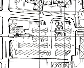
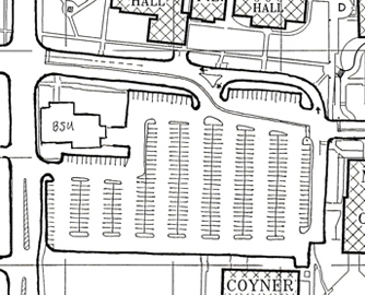
This is one of the most awkwardly striped lots on campus and it is one of the lots most used by the public for performances in Mitchell Theater. Currently there are parallel aisles running down the center separated by concrete wheel stops. Parallel aisles are redundant and a waste of space. The lot orientation should be changed from east-west to north-south. Studies show it is safer for pedestrians to walk along parked cars rather than between them.
The islands at the end of the rows have concrete barriers, presumably to keep students from parking in the island. Ticketing can take care of that issue.
Update: right after the recommendation was made, I escorted the VP Administration (who was over Parking Services) to this lot and pointed out all the scrapes across the tops of the wheel stops and told him each scrape represented a pissed off driver. Parking Services should be helping students, not angering them. He immediately ordered the removal of all the wheel stops in the islands.
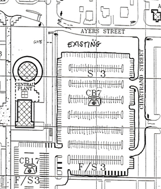
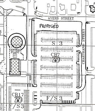
This lot has poor access - all traffic must enter/exit from and to Chartrand which backs up during peak hours. Students exit onto Ayers and it's difficult to turn left onto Ayers which has the right-of-way. The new outlet would use the underused service drive to the Central Plant and direct traffic to the existing four way stop intersection. The exit lane is long to allow cars to queue up without interfering with cars in the lot.
Update: the university cut this access through about 10 years later.
Conduct an assessment of use throughout the day to determine where the needs are greatest. Some offices have moved and new lots have opened since the signs were originally installed. There should be continual regular assessments of all parking usage to determine the most efficient allotment of spaces per permit designation. Example: There are about 6 Handicapped spaces at each of the 3 entrances to the LA Building. However, only the north side has easily accessible wheelchair access. Increase the handicap spaces there and decrease them at the other entrances.

This will make available more parking for students arriving early for evening classes or going to the library or the student union. Faculty and staff should be back in their offices from lunch by 3pm. Faculty leaving between 3 and 5 would open up parking spaces for students. This will convey a willingness to better accommodate student parkers.
Update: the permit time was changed from 5pm to 4pm a few years after this recommendation.
These materials should be easy to read and understand. Very few students read the fine print - move that to the end and make it smaller. Highlight the important bits, use photos, and a map that focuses on parking and accessibility only. Consider adding kiosks and redesigning the posted signs for permit designations and wayfinding.
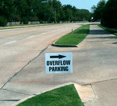
When school began in fall 2012, some signs were posted to guide students to lots on the north side (foto below left). They stated 'Overflow Parking'. But those words only serve to reinforce a negative parking image: "The lots are full, I had to park out there in overflow." "Yeah, I'm way out in the overflow lot."
We often believe that overflow lots are used only when regular lots fill up and often overflow parking is in fields, out away from our destination. This isn't true at Central, but that is what the signs convey.
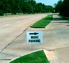
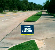
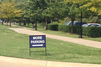
Recommendation: Replace them with signs that say 'More Parking' (photoshopped foto in middle). 'More parking' is a positive statement - "Wow, there's even more parking." Signs around campus stating that there is more parking will create a better perception of parking at UCO.
Better: Design the signs to complement the graphics standards used on campus (photoshopped foto on right).
I wrote the VP Administration and the Director of Parking Services and got positive and enthusiastic responses. They agreed the proposed wording was more appropriate and accurate.
Update: This recommendation was made in 2012. When I drove by the same area in 2013, I saw these signs:

The walkways at Ohio State were paved based on the students' Desired Paths


Below left: Technical University Delft, Netherlands paved all desire paths.


Below left: This college put sod on the worn path and put up a sign. Students obeyed the sign and wore a new path next to the sod. Below right: This university expected students to accommodate the design, rather than having the design accommodate the students. "Please use the purpose made paved path provided"


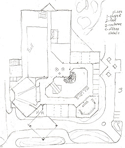
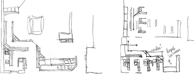
Sketches, student union
Concept of the shopping mall - with multiple services, food, stores.
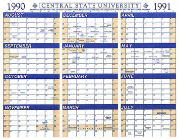
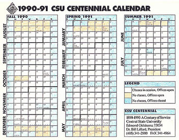
A better Faculty/Staff Calendar
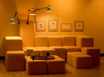
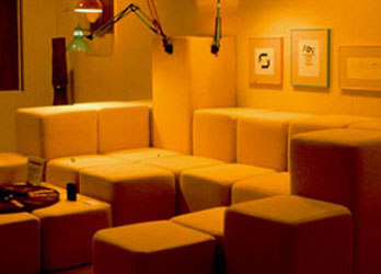
HotType typography exhibit
Somewhere, I don't remember where, I saw info about a symposium being held at TCU - The Medium and Message of Typographic Design. It was a day of speakers and presentations and an accompanying exhibit of work by 55 national graphic designers. I contacted TCU about hosting the exhibit at UCO - they were agreeable and supportive. Bill Wallo was the Director of the Museum of Art at UCO (then called CSU); so he, his wife, and I made a weekend of it and drove to Ft. Worth for the Symposium. It was a great symposium. I even got Philip Meggs to autograph my copy of The History of Graphic Design textbook. While there, we verified the content and technical display specifications of the exhibit and finalized the details with the curators at TCU. Later, the pieces were packed up and shipped to the UCO Museum.

The title, HotType, is a play on the old method of pouring hot molten lead into molds to form the type characters and also that these designers and their work were popular, or hot, at that time. The colors enhanced the heat of the title. I mixed the two most popular typefaces, Helvetica and Times New Roman, even using both in the title. In the subhead, which was the original title of the symposium at TCU, I replaced the 'and' with an ampersand so the two lines of type would justify with more consistent letter and word spacing. The light grey bars provided some cool counter and contrast to the warm colors and helped to unify the columns of information. The postcard invitation/announcement (below) detailed the two typefaces and their designers.
Poster for Carmina Burana


Carmina Burana is a dramatic piece of music by Carl Orff. In 1992, the UCO Choral Division performed the concert in an Edmond Church sanctuary. The promo pieces combine an ornate Rococo style border with simple geometric type reminiscent of Avant Garde by Herb Lubalin. The border alluded to the era of the classical music. As in Medieval manuscripts, the first initial is larger with the somewhat intriguing large black counter within the letterform to demand a focus and starting point for the reader. The dichotomy of the ornate border and the modern minimal typeface provided interest and conveyed a look for a contemporary audience. The title words were broken into syllables to allow stacking within the border. The gap between the two words was filled with the body copy of info about the concert. This began as a project for ClockTower Studio, but after the group was stumped, I stepped in and provided the concept and art direction. Designed: 1995
The Art Department sponsored a high school art festival each year. But, it had gotten tired and unorganized. I renamed it, High Arts, to convey high school art and getting high on art and prepared this booklet of information. The booklet included all the rules of the contests, tour and demo schedules, and maps:


The gallery tags for an exhibit of student work of a new identity for the department. Sketches for a redesign of the student newspaper.


An informational brochure about the 3 disciplines, including the new program in Graphic Design, in the department of Art & Design. Logo for ClockTower Studio. My Christmas card for 1988.


In 1987, soon after I was hired at UCO, I participated in an Art Exhibit in the Art Gallery. It showcased 6 of my recent projects; I produced this handout brochure to describe each project on display.


The cover and inside spread of maps for a guide to introduce the new Graphic Design program.
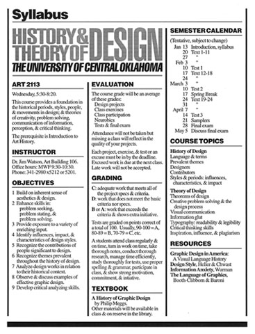
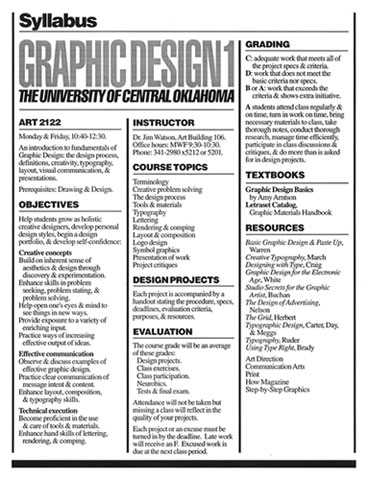
A layout for course syllabi. I sketched this format during lunch at the Design Museum in London. All course handouts followed this same format.


Layout for a newsletter for Sigma Tau Gamma fraternity. The chapter at UCO was the Beta Zeta chapter so I exploited that alliteration and created the name, Beta Zeta Data.
Redesign of the UCO Course Catalog
The office of Academic Affairs realized that the UCO Course Catalog, one of the most important and crucial documents at a university, needed updating, in both content and layout. Before catalogs and course schedules went online, each university would print booklets listing all the semester course offerings and their meeting days and times. I was asked to serve on the Catalog Committee. Of course, just sitting on the committee was not enough - I also needed to assess, research, and propose a better catalog. I mocked up the front and back cover and several representative interior pages and bound them as if in the catalog with corresponding 'before' pages marked in the current catalog. I explained the rationale to the committee - making the information more user-friendly and easier to navigate and access. The committee liked the changes and implemented them in the catalog. Once it came out, the new catalog was well received across campus.
Target audiences
Primary: current students looking at degree plans and course descriptions so they could enroll.
Secondary: prospective students and parents looking at degree options and general info about UCO.
Tertiary: faculty, advisors, administrators, and staff seeking info.
Changes made to the catalog
List contents on the back cover and inside back cover.
Replace single column format with 2 columns.
Set all copy flush left, rather than justified.
• A more legible font for headings.
• Setting course titles in upper and lower case instead of all caps.
Putting index titles at the top of each course description page.
Aligning titles and names better.
Reducing the number of pages of introductory copy.

Concept: a navigation device (a list, index, etc.) that was easy to find, use, and access. As a child, I remember reading Reader's Digest. Their covers were redesigned to include the contents right on the front. No flipping through the magazine past the ads to get to it. That smart concept stuck with me. While working at Richland College, I had developed a catalog cover that included pertinent information.


That college didn't adopt the idea, but maybe it could work here to ease navigation. Research showed that most (maybe all) users of the catalog flipped to the index at the back to find what they needed. The idea was to place the categories of content on the back cover so one would not need to find the index. We are conditioned to believe that the front and back covers are decorative - a way to label the item. But, why can't either page be more functional for the user.
I determined a list of contents, even moving some sections and grouping others together. I listed those on the back with dark index tabs printed on each page in the book to coincide with the mark on the back. One could then bend the book slightly and see the black marks denoting the section they were looking for. Design and production: fall and spring, 2000-01


Three other layout options for the back cover. Below right: An option for the inside back cover.


Sample Before & After pages


Since nobody, no frequent user, used the existing Table of Contents (they all used the more extensive index in the back of the book), that was deleted. Catalog contents were listed on the back cover.


The personnel above were grouped to fit onto a single page. The alignment format was easier to read.


There is no need to repeat University of Central Oklahoma in the page heading:


Page index headings at the top for easier searching, all copy set flush left, text in U&lc, rather than all caps:


Page numbers to the left of the item:


The MFA in Design Fall 2003
Designers are professionals who are innovative problem solvers who process information and user needs to improve communication and environments. Developments in technology, information processing, and materials have affected design practice and education. New challenges confront the designer and the design educator. The variety and complexity of design issues has expanded. The resulting challenge is the need for a more advanced balance between human beings and their sociocultural, natural, and built environment. These challenges emphasize the need for UCO to provide advanced study in design through its MFA terminal degree.
Department Mission Statement
The Department of Design at UCO administers undergraduate (BFA) degree options in Graphic Design and Interior Design and a graduate (MFA) degree in Design that are pre-professional career preparation programs committed to providing the necessary facilities, technology, theories, information, and skills to help students excel in:
Developing unique, innovative, and effective solutions to design problems.
Clearly communicating concepts, solutions, and implementations.
Understanding philosophies, theories, and terminology of design.
Rendering, executing, and producing of design.
Presenting concepts and solutions orally and in writing.
Developing high standards of professional practice.
Philosophies
The UCO MFA in Design will be a student-centered and a learning-centered environment which will better enable students to experiment and develop their own potential beyond academic programs. Design graduate study and research should:
Increase the production of design knowledge in order to enhance design performance
Prepare students for change
Foster innovative thinkers
Allow/encourage independent and interdisciplinary projects
Network with design community: local, national, and global
Add significantly to the ‘body of knowledge’
Make positive contributions to society
Provide professional career preparation
Prospective students
The UCO MFA in Design will attract students interested in further study in:
Design education
Teaching and classroom instruction methodology
Design research
Advanced research and study in design
Design proficiency
Additional skills in creative problem solving
Computer proficiency
Additional skills in design technology
Plan of Study and Thesis Committees
Each MFA candidate’s committee for the plan of study, oral exam, thesis proposal, and thesis/project presentation will be comprised of full-time faculty in the Department of Design and a member from the UCO Graduate Council.
About the Department of Design at the University of Central Oklahoma
Introduction and history
The Department of Design was inaugurated in 2001 as a component of the new College of Fine Arts & Design. As design disciplines have grown, it has become necessary to provide for design students an environment in which they can develop their skills, knowledge, and identities as designers. UCO is the first university in the region to house its design programs in their own Department of Design.
The new department offers programs in two areas - Graphic Design and Interior Design.
Department accomplishments
The Department of Design is the largest department in the UCO College of Fine Arts & Design and has one of the largest enrollments of design majors in the region.
There are more students in one section of History of Graphic Design than are in any other major in the college, except Graphic Design.
Numerous awards have been earned by students, graduates, and faculty.
Design students and faculty are active in
AIGA (American Institute of Graphic Arts),
ASID (American Society of Interior Designers),
IIDA (International Interior Design Association).
The programs enjoy excellent working relationships with design firms in central Oklahoma through internships, gallery exhibits, guest lectures, and study tours.
The programs have excellent hiring records with graduates working in the Oklahoma City metro area, Tulsa, Dallas, Kansas City, and other major national markets.
Majors, degrees, and programs (figures from spring 2003 enrollment)
150 Bachelor of Fine Arts - Graphic Design
89 Bachelor of Fine Arts - Interior Design
13 Master of Fine Arts - Design
252 Department total
Professional practice
The reputation and success of the UCO Design programs has perpetuated their strength in placing good students in good jobs as:
Graphic Designers
Art Directors
Illustrators
New Media and Web Designers
Pre-Press/Production Artists
Residential Interior Designers
Commercial Interior Designers
Furniture Designers
Space Planners
Graduates work in design firms, corporate design departments, architectural offices, design support industries, and many are successfully self-employed.
Faculty in the Department of Design
6 full time faculty
9 part time faculty
All Design faculty are professional designers. The part time faculty are full time designers.
A logo concept


The President of the University set out to improve the on-campus environment and activities. He commissioned many new dorms and apartments, a new stadium, and a wellness center. He also sought to create a new identity for the university. UCO had never really had a strong identity. Several attempts had been made over the years, but nothing that truly conveyed the proper attitude for the university. The new logo became a ClockTower project (which didn't work out) and then Abdullah Syed and I discussed the project and sketched a few ideas. We had agreed to spell Broncos in the more familiar and traditional way (the official spelling at the school is Broncho - an archaic rare alternative spelling).
We decided on the logos shown above, concepted and rendered by Abdullah. The stylized Bronco head surges thru the collegiate text that is then skewed by the force of the movement.
Motion, power, and energy are expressed through the typeface, the skewed lines, and the swoosh lines from the bronco head. The school colors are a given - the bronco looked sorta silly in blue and the 'bronze' gave it more organic life and energy. The text in the professional blue countered the freeform bronco and conveyed the more serious side. The letterforms had the angled corners reminiscent of familiar athletic jacket letters. These logos are primarily for athletic teams. The versions below are examples of how the identity could work in its various parts. Design: 2002


The logo that the President adopted, designed by an OKC ad agency/design firm. Despite the 'evil horse' facing left, this one better met the objectives as defined by the President of the university.
Some student work
Critiquing student comps for a magazine ad project:


Mimic projects The left half is from a magazine, the right half is rendered by the student.


Below left: UCO Art Faculty, my first semester, 1987. Right: Years later, in my office.

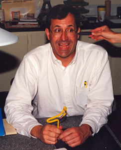
Retirement from teaching at UCO


30 years of teaching (21 at UCO) - of being right where I most wanted to be.
Said in the Graphic Design studio classroom, in response to a student's question:
"There is no place on the planet I would rather be than right here, right now. In this very classroom
with all of you. Not Walt Disney World, not Las Vegas, not lying in bed. Right here. Right now."
Professor Emeritus
Emeritus is an honorary title given to those who have retired while at the rank of Professor. I completed 21 years of teaching at the University of Central Oklahoma in May 2008 and 1 year of full-time teaching at Oklahoma State University in May 2009.
I believe the professions of teaching and health care are the most noble and most important professions in a society (the cultivation and distribution of food and the construction of shelter are close behind). It has been a pleasure to help young people find and explore their passion for design, develop their knowledge and skills, and see them improve their sense of well-being. Teaching was a wonderful roller coaster ride - impacting many minds, helping build academic programs, developing a new department, and designing new offices. I have begun a new chapter of designing, writing, consulting, enjoying travel, and a less stressful lifestyle.
Some numbers
5 Universities: UCO, OSU, OU, OC, UPAEP
2 Years at the Visual & Performing Arts High School, Dallas
3 Years at BrookHaven Community College, Dallas
4 Years at OU, Norman
2 Years at UPAEP, Puebla, Mexico
14 Years at OSU, Stillwater
21 Years at UCO, Edmond
7 Awards for outstanding teaching
4 Fellowships
52 Commencement ceremonies
24 Committees, task forces, boards
364 Committee meetings (give or take 45 either way)
11 Leadership roles: Chairman, President, Director
4 Years as Chair, Department of Design (4 years, 3 months)
7 Years as Director, Graphic Design Program
8 Years GCS/AIGA President or Director
11 Presentations or keynote speeches given
10 Conferences attended
22 Back-to-school meetings attended
0 9-hour Back-to-school meeting attended
3 Television appearances (OETA, HGTV, and Fox/OK)
34 Performances seen in Mitchell Hall
6 Football games attended at OSU Boone Pickens Stadium
1 Football game attended at OU Memorial Stadium
2 Partial football games attended at UCO Wantland Stadium
5 Faculty/department offices designed and implemented
4 Other campus offices designed
8 Parking tickets received
0 Parking tickets paid
20 Courses taught
19 Syllabi prepared
9 New courses developed
390 Classes conducted
31 Classrooms: 5 AMHS; 3 BHC; 12 UCO; 2 OU; 4 OSU; 5 UPAEP
3,306 Cups of coffee or cans/bottles of Diet Coke & Diet Dr Pepper
4,686 Students taught (give or take 12 either way)
156 ClockTower students
320 ClockTower clients
12 Department Chairs, 4 at UCO, 6 at OSU, 1 at OU, 1 at UPAEP
6 Deans, 4 at UCO, 2 at OSU
3 Vice Presidents, Academic Affairs
3 UCO Presidents (Lillard, Nigh, Webb)
1 Scholarship endowed
1 Scholarship funded for 1 year
1 Office construction my parents and I paid for
74,900 Dollars personally donated to UCO (office, scholarships, apartment)
25,450 Additional funds raised for UCO
100,350 Total dollars raised and donated to UCO
Classrooms
AMHS: Hallway lobby, Portable, Experimental Theater, Auditorium, Stagecraft
BHC: Lecture room, Advertising Art Studio, Gallery
UCO: Art & Design 102, 103, 105, 109; Liberal Arts: 4 rooms; Business: Lecture Hall, Seminar; Communication: Lecture Hall, seminar
OSU: 3 Lecture Halls, Design Studio, Seminar, Computer Lab
OU: 2 Lecture rooms
UPAEP: 5 classrooms
Teaching career dates
Graduate School: 1979-1987
Teach High School: 1979-1981
Teach Community College: 1984-1987
Earn PhD: Febuary 1987
Interview UCO: Summer 1987
Teach at UCO: Fall 1987-Spring 2008
Director, Graphic Design Program: Fall 1988-Spring 1993
Tenure and Promotion to Associate Professor: Spring 1991
Promotion to Professor: Spring 1995
Director, Graphic Design Program: Fall 1999-Fall 2000
Chair, Department of Design: Spring 2001-Spring 2005
Teach at OC: 1990
Teach at OSU: 1998-2016
Teach at UPAEP: Summers 2000-2001
Teach at OU: 2000-2003
Retirement events, spring 2008
Submit letter of retirement: April 10, 2007
Sitting on a bench in Puebla, Mexico: March 29
College awards evening: April 11
Dance presentation: April 16
Submit notice to not teach as an adjunct: April 16
Surprise party: April 17
Move out of faculty office: April 20
AIGA Fellow presentation: April 24
Final lecture presentation at UCO: April 30
College reception: May 1
Design faculty dinner: May 1
Department of Design gift presentation: May 5
Graphic Design 2 lunch: May 8
Final graduation commencement: May 9
Final New York City Study Tour: May 12-17
Turn in ID & office key and submit exit paperwork: May 21 & 27
Complete two semesters of full-time teaching at OSU: May 8, 2009
Surprise retirement party


Above: Shock of seeing people at the party, with Greg, a host. Jill's back, the other host. Below: Most of the gang. Jim serving dessert and coffee.


Terry, Susan, and Sean at dinner. The dinner portrait.


Jim and Ruki point out where the cake is. The top of the cake. Greg built the image from photos on this website.


Jamie and Sean. Ruki and Melinda.


Resoluton from the Oklahoma Board of Regents. Notice about the reception on campus. The AIGA Fellow certificate.


The AIGA Fellow medal. Jasper, the retired guy on The Simpsons, a gift from the Dept of Design.


The gift from the design faculty, wrapped entirely in Post-It notes. The gift unwrapped.
Below left: Adrienne, Charity, Gary, Craig. Below right: David, Mitch, Jeff.


Faculty colleagues (in alphabetical order)
UCO Department of Design 2000-2008
Amy Jacobson-Peters
Amy Johnson
Cheryl Myers
Galen Nichols
Keith Webb
Laci Lackey
Larry Hefner
Lisa Howard
Melinda Lyon
Robert Smith
Ruki Ravikumar
Shelly Moody
Valerie Settles
Admin assistants
Linda Willowbrook
Pam Forrester
UCO Department of Art 1987-2000
Bill Hommel
Bill Wallo
Bob Palmer
Cletus Smith
Dean Hyde
Frank Simons
Gael Sloop
Gayle Singer
JoAnn Adams
Kathryn Kunc
Mark Moilanen
Mary Kay McElroy
Norma Miller
Michael Bachi
Robert Smith
Wallace Owens
Admin assistants
Barbara Brown
Carrie Dolan
Jo Fleharty/Bachi
Letitia Head
Sonya
UCO Campus
Bill Radke
Darrell Gilliland
Dave Harris
Donna Guinn
Fred Grosz
Greg Scott
Jamie Jacobson
Julie Byer
Lon Dehnert
Mike Shirley
Roberta Sloan
Terry Clark
OU Department of Art & Art History 2000-2003
David Hissey
Eric Anderson
Karen Hayes-Thumann
OSU Department of Art, Graphic Design and Art History 1998-2016
Carey Hissey
Chris Ramsay
Jeff Price
Justin Renyer
Nick Bormann
Sallie McCorkle
Teresa Holder
Phil Choo
Admin assistants
Diane Cave
Vina Dean
Sandy Runowski
Vina Spickler
The story
In Febuary 1987, I finished graduate school and defended my dissertation Teaching Design in the Year 2000: A Modified Delphi Study of the Perceptions of Design Educators. I earned a PhD and was ready and eager to begin a college teaching career. It was so late in the semester, there weren't many job openings to choose from. I saw an ad in the Dallas newspaper for a job teaching Graphic Advertising Design at Central State University in a suburb of Oklahoma City. CSU had been without a design teacher for a full year. I applied. I drove to Edmond to visit the campus, talk to some faculty, and check out the facilities. By that time, it was July 4th so no classes were in session and half of the Art Building was shrouded in plastic - a crew was removing asbestos from the building. I did meet the department chair and we went to lunch with the college dean at Greystone, a very nice restaurant on Second Street at I-35. At that meeting, they told me that the program in design was not very good and they wanted me to revamp the program. That was a challenge I couldn't resist - I accepted their offer. I returned to sign the contract and complete the paperwork on my birthday, July 27. I saw my future office - one I would occupy for 17 of the next 21 years.
The first step in developing the new design program was to conduct research and assessment of other design programs in the area. I traveled and met with program directors at Oklahoma State University, University of Oklahoma, Oklahoma Christian University, University of Tulsa, OSU Tech-Okmulgee, Southwestern State University, University of Kansas, and Kansas State University. I was already familiar with the programs at the University of North Texas, Southern Methodist University, and the University of Texas in Austin. I synthesized all the info, adapted some good ideas (like ClockTower Studio from The Arts at KU and FineLine Graphics at UNT), and developed a new curriculum of courses, course content, and requirements for graduation. The proposal included retaining 2 courses, changing 5 courses, and adding 6 new courses. Here's the curriculum that was in use in 1987 (on the left) and the curriculum implemented in fall 1988:

I also proposed changing the name of the program from Graphic Advertising Design to Graphic Design and the name of the department from Department of Art to Department of Art & Design. I designed and produced multiple packets of info titled, Graphic Design at CSU. I presented the proposals to the Art Faculty. Two revisions were recommended and implemented. The proposal packets were then sent to Academic Affairs. I accompanied the packets to the committee meetings since the recommendations were so extensive and I wanted to be able to explain and answer questions. All went well - the new graphic design program was approved and implemented.
The student-staffed graphic design studio at UCO, ClockTower Studio, was created to provide a resource for clients in central Oklahoma and to provide a work experience for students. The proposed name in 1987 was CSU Graphics. When CSU became the University of Central Oklahoma, CSU Graphics became UCO Studio. After a few years of no student submissions, I finally named it and designed the logo. Students often say that working in ClockTower provided them with the most valuable experience of their college career. For the first 4 or 5 years ClockTower met in room 102, a typical studio classroom (all computer production was done in the computer lab in the Liberal Arts Building). But, room 103 in the Art & Design Building was used for only one class that met only twice a week, a total of about 6 hours per week. The next semester, ClockTower Studio was scheduled in that room. The college Dean donated several thousand dollars for furnishings and computer equipment. I served as the Director of ClockTower for 20 years, 1987-2008. More about ClockTower.
In 2000, a task force was established to assess and make recommendations about creating a new college of fine arts. Part of their discussion was about creating a new department to house the design programs. A former Dean of Liberal Arts had proposed this in the 1990s but was met with some resistance from the Art Department, so he dropped the proposal. It was now back on the table. During the development meetings, I was invited to lunch - for the purpose of asking if I would chair a new Department of Design Technologies. I replied that I would be interested in serving as chair, but not if it was going to be called Design Technologies. I explained that we have a problem with students and the public thinking design is all about computer use rather than a way of creative problem solving and thinking. The task force agreed to propose the name Department of Design. The new Dean appointed me chair of the department. I was later elected to a 4-year term.
The first few years of chairing the new department were exciting, challenging, and fun. I loved it. I told the design faculty at our first faculty meeting two guiding principles - the brand new department has no baggage so we get to develop our own heritage and reputation and we will set the standard for the college. We did lots of great things: developing UCO's first terminal degree - the MFA in Design, renovating parts of the Art & Design Building, and implementing new curricula.
But then, within a few months in 2002-03, both of my parents died. They had been married for 60 years. I spent a lot of time in Dallas taking care of my father at home and in an assisted living center. Experiencing hospital intensive care units, and the loss of friends and loved ones impacted my philosophy and outlook on life. I saw the world differently. No longer were evaluating colleagues and writing numerous reports and administrative forms very important. Life was too precious and fragile to invest much time with bureaucratic inefficiency. Being chair of the department was no longer as much fun. I wanted my life to be about more than administrative duties. I served another year and a half - for a total of 4 years and 3 months - and then transitioned back to full-time teaching.
For the first year of the new department we shared an office and secretary with the Department of Art. A room that was unused was available. I designed a new departmental office. The department saved and put aside $15,000 for the new office. But the administration took all the money in every department's accounts to cover some shortfall in the university budget. We lost the entire $15,000. Soon after, I was hiking in Red Rock Canyon outside of Las Vegas with beautiful weather and great scenery. Realizing that our new office would be just a used desk and chair in an otherwise empty room, I decided that we would still get our new office - I would pay for it myself. I later called my parents and they agreed to match my donation. We each donated $20,000 for a total of $40,000 to pay for the construction and furnishings in the new office. The university didn't pay a cent towards the new Department of Design office. Unfortunately, after I stopped serving as chair and moved out of the department office, some changes were made that didn't quite adhere to the original design concepts. More on the department office and my faculty offices.
When the department was created, it inherited a 36-hour Master of Science with the Interior Design program from the College of Education. We recommended changing the name to Master of Arts to better fit the mission of the department. The university's Board of Regents, however, recommended instead, a 60-hour Master of Fine Arts, a terminal degree. Offering an MFA program is a valuable asset and a sign of playing major league ball in academia. They asked if we would accept their recommendation. Without too much discussion, we said, 'Yes'. To secure an MFA program through normal channels would have taken a minimum of two years and required vast amounts of time and energy conducting research and assessment and preparing a lengthy detailed proposal. This MFA happened with one phone call. I assigned a faculty member to head up a committee to develop the curriculum and course content. After a while, nothing had been done and time was running short, so I wrote a draft of the new degree and presented it to the faculty for input and discussion. We tweaked and refined it and finally developed the program philosophies, curriculum, sequence, admission standards, and degree requirements. It was all approved by the Graduate Council and soon implemented into the department.
The retirement decision
Influential factors
I had thought I'd teach for another 10 years, thinking that teaching was my identity and what would I do after a few months of retirement.
But several factors got me thinking of a different plan:
Learning that retirement pay and benefits would be more than I was expecting.
Death of parents taught me to stress less, be more positive, and live life better.
Students work ethic has changed over the years.
The focus and mission of the Department of Design had changed.
Teaching as an adjunct allows me to inspire people, but without the reviews, committees, and meetings.
There's lots of crap in academia bureaucracy.
Realizing what I will be able to do with more free time: design, invent, write, travel.
I am excited - a new chapter of being a designer, innovator, writer, consultant, and Professor Emeritus, an adjunct teacher.
Pros
More time to design, invent, market products, ideate, write, travel.
Less stress - no evaluations, reports, committees, task forces; no bureaucracy.
Lazier lifestyle - read the paper, eat out, travel, sightsee.
Teaching as an adjunct at OSU and my website allow me to continue to inspire people.
Won't have to deal with toxic people for whom I have little respect.
Will be able to combine offices into one efficient work space.
Cons
Less contact with student's minds.
Change identity from teacher to retiree.
Less money.
I submitted a Letter of Retirement in April of 2007 in order to give the department plenty of time to advertise the position and interview candidates. It turns out that the early notice wasn't necessary since the university didn't act on it for several months. But the full year did allow me to adjust and adapt to the change of identity. I went through some sadness dealing with such a major change, but was able to temper the losses with the potential gains. I originally had planned to continue to teach as an adjunct at UCO. But sitting on a bench in the town plaza of Puebla, Mexico, I started digesting the notion of not teaching at all anymore at UCO.
Future plans and activities
Work on numerous design projects and products.
Write short stories.
Spend more time in New York City.
Travel more.
Teach at Oklahoma State University in Stillwater.
Mentor and consult with designers and teachers.
Volunteer with area organizations.
Consider moving back to Dallas in a few years.
Write and post essays and blogs on my website.
Read the newspaper and work the crossword puzzle and sudoku while drinking my morning coffee.
Some cherished memories
Playing volleyball with faculty in Wantland Hall.
Helping mount exhibits in the campus Museum of Art.
Attending design conferences in New Orleans, New York City, and Las Vegas.
Presenting a lecture and workshop and later teaching in Mexico.
Working with many great people across the campus.
• The crying times: the death of Conor, a student in Graphic Design I; the OKC Murrah Bombing; and 9/11.
Sharing the energy and inspiration of New York City with students.
• Witnessing many corporate boards and clients applaud and cheer after a ClockTower presentation.
Enjoying many excellent performances of musicals and plays in Mitchell Hall.
• Renovating classrooms, hallways, and offices to better convey 'design'.
Participating at OSU: football games, Homecoming judge
• Exploring Oklahoma: the 1989 land run celebrations, Remington Park, Penn Square renovations, Route 66, the Interurban railroad.
Laughing in class. Often.
• Inspiring hundreds of students and pushing them to become better thinkers, creators, and problem solvers.
www.jamesrobertwatson.com/workUCO.html