
The WhichWich Better Bag


June, 2014, Midtown Manhattan.
I had just sat down under a shade tree in the Sculpture Garden at the Museum of Modern Art. I had been wandering around MoMA when I realized I had entered into museum overload, so I went outside to take a break. Buzz. It was a call from a 214 area code. Dallas. Better answer it; I grew up there and it might be important. Some guy said he was with WhichWich, "Are you in New York or Oklahoma?" New York - I'm in the sculpture garden at MoMA. He referenced the essay I wrote about the WhichWich bag in 2009 and suggested we meet in Dallas to discuss the design. I agreed and we set a date. I didn't get his name, he had me on speakerphone and came through garbled. When I got back to my apartment, there was an email from Which WIch? Superior Sandwiches. The person who had called was Jeff, the founder and CEO of the company.

It had been 5 years since I had checked out a new sandwich shop in my naberhood (spelling) in Edmond, Oklahoma - it was called Which Wich? I parked, went in, and noticed to the right was a large menu board up on the wall.


On two columns were racks of skinny bags, each with a number and heading on it. I selected one, Italian, and figured out I was to fill in the bubbles. The idea was good - fill out a sandwich order form right on the very bag that the sandwich would be delivered in - but Holy Shit!, the options listed on the bag were so jumbled and poorly laid out, I was just overwhelmed. I worked at deciphering the awkward headings and the chaotic jumble of items and finally was satisfied that I had ordered a good sandwich. At the cashier where I turned in my bag, I was asked for my name - there was a space for it, but I had missed it since I was focused on deciphering and the space for my name wasn't logically positioned.
Anything can be made better
Certainly this bag can be redesigned to make it easier for the first-time user. There's not much we can all agree on, but most of us like a sense of order and a sense of control. I got a blank bag, turned it over, and began sketching and making notes on how to redesign the bag so it made more sense and was easier to figure out. My name was called and I went and got my sandwich. Dang, it was good. So, this place made good sandwiches, but the ordering process needed help.
Over the next few days, I went back into the store to watch customers decipher the bag and I continued to refine the design. I developed an essay on the new bag, with renderings and rationale, and posted it on this site. I sent a link to the essay to WW headquarters and promptly received a reply:
Thanks for loving our Wiches. There are some procedures behind the counter that affect the bag layout that you are not aware of. We're happy with our bag.
(That original 2009 essay is here.)
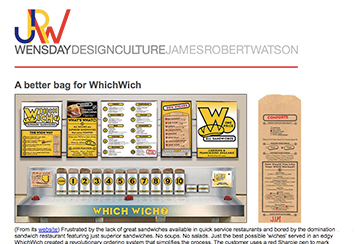
That proposal for a better bag floated around cyberspace for five years until someone at a convention in Las Vegas mentioned to Jeff, the founder, that there was a story online about a new WhichWich bag. Jeff said 'We don't have a new bag.' At the next break at the convention, Jeff rushed to his hotel room, went online, read the 2009 essay, and made that call to me in the MoMA Sculpture Garden.
In July, I drove south from central Oklahoma and we met at the headquarters in downtown Dallas. We spent a full day discussing how a better bag would enhance the user experience and improve the speed of service.


Left: Conference room used for our first Idea Session. Right and below: The room for Idea Session 2.


Some of the gifts from WhichWich to help conduct research:

The WhichWich design team tweaked the bag layout, tested prototypes, and introduced the new WhichWich Better Bag at a Franchisee Conference in Dallas in January, 2015. Below are some pages from the conference magazine:


In September 2015, the bags were in some of the stores. In October, an image of the new bag appeared on Facebook:


Third and final consulting session with WhichWich
In mid-March, 2016, I did a little bit more consulting with a committee at the office in Dallas - we worked on a new menu board to address some of the issues we discussed in 2014 & 2015 and also proposed some bag revisions (both detailed below). This was easier now that there were design guidelines established by the new bag. The CEO charged us with making it more user-friendly for the first-time customer. Maybe a Welcome Intro panel that outlines the steps for ordering. And maybe a section of wiches that were favorites that could be selected if one didn't want to work at creating their own sandwich.
However, after this workshop, I bowed out of any further work with WhichWich. It was a great experience, especially the trips to Dallas to work with the CEO. I hope I helped educate some of them on the value of good design, clear communication, and seeing through the user's eyes. I am glad I was able to influence the design culture at WhichWich.
Dates
September 2: Edmond OK: Inspiration and concept for a better bag.
September 7-18: Designed and produced comps and web essay.
September 21: Submitted web essay to WhichWich.
September, a few days later: Response from WhichWich.
June 17, 11:03a, MoMA, NYC: 5 minute phone call from Jeff at WhichWich.
July 3-9, Edmond OK: Worked on the better bag; tweaked the name, logo, menu board, and collateral materials.
July 10, Dallas: Presentation and Idea Session at WhichWich headquarters.
August 7, Dallas: Presentation and Work Session.
August/September, Edmond OK: Continued to work on bag design, menu boards; brand refinements.
January: The WhichWich Better Bag was introduced to the franchisees.
June: Tweaked the bag design - entree options.
September: The WhichWich Better Bag was in the stores.
December: Concept sketches for the menu Welcome Board.
December: Colorado suggestions and tweaks to the Better Bag.
March/April: Develop new Menu board.
April 11-12, Dallas: Menu Board committee meetings.
May: Review menu and bag, submit revisions and rationale.
June: Completed all work with WhichWich.
The WhichWich Better Bag
Some concerns with the existing bag
The options are arranged two ways - in rows reading left to right and in columns reading top to bottom. There is no alignment of the elements, making it tougher to scan the items to see what options are available and then to easily mark them.


• Too many graphic elements: Lines. Circles, Arrows. Arrows in circles.
Redundant categories: Mustards. Mayos. Spreads & Sauces. Oils; Onions. Veggies (aren't onions veggies?)
Lines separate the headings from their accompanying info. Arrows in circles have been added to clarify that the heading above the line goes with the items below the line.
Since the bread illustrations are both identical, they don't visually distinguish white from wheat. The shape of the illustration does not match the actual shape of the bread used in the WhichWich.
The heading WORK YOUR WICH!' seems inappropriate. The meats and cheeses are worked also. People go out to eat partly because they don't want to have to work. We want to be taken care of. I don't want to read that I must work my Wich - I want the store to do it.
The heavy black boxes don't serve any function, they just add to the chaos of elements.
A better bag layout would help meet these objectives:
Allow ease of understanding and use: legible, readable, comfortable, clear instructions.
Require minimal time: easy scanning, comfortable alignment.
Convey that the restaurant cares about the customer in both the ordering experience and in the restaurant experience.
The Better Bag
Left: Existing 2009. Middle: 2009 proposal and 2014 revised proposal. Right: Final 2015


a. It is harder to overlook (when a customer forgets to write his/her name, the cashier has to write it in).
b. The category and name are next to each other - easier for the sandwich maker to call out, "An Italian for Jim".
c. Writing my name first, at the top of the bag, confirms that this is my sandwich. This sandwich is being customized just for me.




The heading TYPE is awkward with the options White and Wheat.
WICH capitalized for the 7" size looks out of place and inconsistent.
The Sizes and Hot/Cold refer only to the White and Wheat Wiches. So, those should be right beneath those headings. Instead of being separated by Bowlwich and Lettucewich.
The illustrations from the existing bag convey at a glance and clarify the 3 entree options.
There is no need to state ‘One size' after Bowlwich and Lettucewich since those are now below the bread sizes.
To the infrequent customer, the option on the right is clearer. It was adopted for the print run of the bag.
Left: Existing bag. Middle: Suggested Colorado bag. Right: Improved version.

Aligning items in a vertical column rather than horizontal rows is more consistent with the rest of the bag.
Listing bread type and size first may speed up the assembly process.
Connecting either/or options (White or Wheat, hot or cold, sizes) with a vertical line between the bubbles helps convey to the customer to select one of the set. This idea of connecting the Either/Or items was another game changer - it makes those options clearer.
Enlarged illustrations help convey the 3 entrée options.
Moving the ‘EXTRAS' below the options groups it with the CHEESES and VEGGIES options.
Increased spacing between the items in Extras aids clarity.
The 2016 committee Bag


The 2016 committee had developed the above bags. I received one by email with a request for input - I wrote the CEO: This new bag is going backwards, not forwards. It is more complex, not more simple; and it is more overwhelming, not less.
1. Too many categories (approaching chaos again). Using only major categories simplifies the process and allows the user to scan the alphabetized list easily. What is the reason for pulling some Veggies out of the Veggies category or Mayo & Mustard from Dressings? Is increasing the clutter worth whatever reason that is?
2. Items should be alphabetized within a category to make it easier for the novice to scan and find preferences.
3. Like items should be grouped together in a category: all mustards, all mayos, all peppers, all onions.
With fewer categories there is more space available and the bag looks more open, easier to follow, and less overwhelming. If you show the two versions to a first-time customer, which one do you think they would pick?
Lesson: All graphics should strive to improve the customer experience first, the operational experience second.
The ultimate WhichWich bag


This bag incorporates:
Previous improvements detailed in this essay.
Each category is in 2 columns so all category headings are aligned on the left side - this suggestion came from a franchisee.
The connector between bubbles.
• Sizes of the sandwiches are denoted along the right margin (so the customer can more easily visualize the sizes).
The options of sandwich, salad, or wrap.
A more complete Make it a Meal section.
Draft proposals for some of the other bags


Several other sandwich shops used the concept of aligned columns, bold headings, and alphabetized lists of items. One example: HEB is a major grocery chain based in San Antonio. A designer friend was working in their design office in late 2012 when they were considering a WhichWich type of sandwich shop. He showed the design team my WhichWich Better Bag web essay. They developed the ordering sheet below in January 2013. As of summer, 2014, the sandwich shop had yet to be implemented in their stores.


Better menu boards
First-time users need a bit of instruction on the process - the Welcome Board. The cashier is supposed to serve as a guide, but he/she is often busy with cashier duties. A simple board, placed in an obvious location, can describe the steps.


Above: WhichWich, Top That Pizza, and the HEB concept.

The value of proximity - visually grouping related items together. I tweaked the above info to better group related info into a clearer unit of text and image (below). Above, there is not much distinction between the 3 groups of info. The reader needs some visual cues to know where to pause.

But, this new Welcome board relates to the old chaotic bag format, not the new orderly clear format. I sketched the option below - making it more consistent and, therefore, more clear and easy to understand. I submitted this sketch to the headquarters office.


Below: The chaos of info on the menu board and bag racks:


A lesson in the Design Component of Proximity: put the Bowlwich panel next to the Bowlwich list and price:


By the time the menu audience (first-time-user and the rookie) gets to the menu listings, and then the bag, they have already experienced the vibe environment - they have likely seen signage, the interior, the wall graphics, hanging bag art, the prep line, and the welcome and promo graphics. At the menu, they are ready to easily and quickly get their meal. By then, the environment is not as important as clarity of the menu items and the ordering process.
Below left: Existing. Middle: Improvement. Right: Proposed:


Improvements
Readability - improved with larger fonts.
Scannability - the customer, especially the first-time-user, can find categories and wiches of interest.
Alignment and fonts - consistent with the better bag layout.
Bubbles - do not add clarity or logic to the menu, so they are reserved for filling out the bag.
Categories - color-coded: Wiches, Specialties: R&D and ChefWiches, and Bowls. Changed the R&D and ExpressWiches from red to orange for a more readable contrast.
Better alignment of elements
Instead of justified columns with lines of dots to connect the items (below left), a central margin places the items next to their prices for quicker comprehension (right).


A new menu board 2016

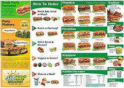
Above: The current 2015-16 menu board. Below: A proposal from WhichWich and a board from Subway:


Above right: Sketches. Below: a better board conceptual proposal.

Text copy for the Welcome board:
A superior sandwich Starts right here.
1. Pick one of our most popular favorites (FaveWich) or build your own (CustomWich). Any CustomWich can be a sandwich, salad, or a wrap.
2. Select the FaveWich Bag or the item number of a CustomWich Bag.
3. Grab a red Sharpie and fill out the Bag with as many toppings as you wish (some have an extra charge). Make it a meal - add chips, cookies, shakes, and drinks.
4. Hand your bag to the cashier, get a drink, have a seat. Your name will be called by the Wich maker. Enjoy

Above is the page I submitted to the committee for consideration. This was the included rationale:
The WhichWich ordering process is fairly simple, but, the menu board graphics are a bit too complex, noisy, and chaotic for the1st-time visitor.
Objectives for the menu graphics
Clarify, simplify, and enhance the ordering experience, especially for the 1st-time customer. Customers prefer easy and simple.
Be inviting, easy to follow, and easy to understand.
Use the existing board frames.
Concept
An orderly, intuitive, and familiar arrangement that respects the Better Bag graphics and layout.
Menu boards
1. Welcome: user's guide
2. FaveWich: popular favorites
3. CustomWich: build-your-own in bread, bowl, or wrap
4. Make it a Meal: sides
5. Promotions
Boards are simple, clear, and enhance the ordering experience.
Name rationale
Consistent with other Wich names
Help exploit the Wich brand.
• FaveWich shows customer empathy - signature and specialty are from the owner's point of view, favorites is from the customer's pov.
• CustomWich: build-your-own implies the customer has to do work. Custom suggests personalized and individual.
• SpecialWich: “Breakfast special" “Special of the day" means temporary, inventive, and unique. R&D and Bag 8 have little meaning to the 1st-time customer.
Board layout
• The Welcome board is first so new customers don't have to search. Returning customers can easily ignore and go to Fave/Custom or pick a bag.
• Darker Welcome and Promo boards frame each end, the WW mainstay, CustomWich, is in the middle.
• Prices are easy to find next to their items.
Fewer graphic elements (lines, arrows, circles, capsules) minimize clutter.
Rows of Vibe dots underline headings and provide continuity across the tops of the boards.
During the 2-day workshop, we developed a simpler menu with fewer items. After seeing the committee proposal, I suggested a yellow band across top to unify the disparate panels. It could represent the steel line that stretched across the work area on which the bags slid along the line.


Weeks later, I saw this master image (above right) from a PowerPoint presentation they used. It shows the steel line at the top and a yellow banner stripe.
Below: My revised version with a few improvements:

Objectives
1. Be designed from the customer's point of view.
2. Convey respect and empathy, especially for the first time customer.
3. Improve clarity with better alignment, consistency, simplicity, and order.
4. Help improve speed of service by easing and clarifying the ordering process.
The menu board
1. The menu is still not welcoming or instructional enough for the first time user. There could be a better connection between the menu board and the bag - that bag is one of the main things that makes WhichWich unique. That should be exploited; the menu board doesn't mention the bag at all, and it might help if it did. At a minimum, it could tell which bag to select with a line beneath each heading (suggested copy only):
Favorites
Select the bag labeled Favorites and mark your preference.
Wicked
(beneath the ingredient copy) Pick the bag with the W at the top.
Build your own
Pick the bag with the number of your Wich and mark your toppings.
These lines of text take up very little space but may help the first-timer feel less overwhelmed and uncomfortable with a new ordering process.
Note: on the menu board rendering, I show where that line of copy could go, but not the actual wording.
2. Visual hierarchy.
Thicker yellow band at the top - more unifying, more consistent with the mass of the headings font.
The yellow band could represent the line across the wich makers.
Added a band on the Wicked panel - band should be on all panels as a unifying element.
3. Consistency among the panels. Headings across the top are the same point size.
4. Spacing of elements for more ‘breathing room' and better readability.
Moved headings down.
Less space between Favorites descriptions.
Moved copy up from bottom on several panels.
Moved BYO 5-9 column to the left.
Moved Drinks, Chips, and Real to the right.
5. Aligned elements for improved order and clarity.
6. Removed graphic elements that did not enhance clarity.
7. Replaced “Some of our favorite wiches" with “Some of your favorite wiches." The customer is probably more comfortable knowing what others like rather than what the company likes. Confused customers often ask, ‘What is the most popular item?' not ‘What is the most profitable item?'
The designer did make a few revisions, but it was still lacking attention to detail and finesse:


Photo of the adopted new menu board in a store, 2017. Much much better. The info is aligned left in a nice consistent margin. Note: WhichWich, like all restraunts, now has to include calorie counts for each size - lots of additional text to fit into the same sized spaces. The band of black across the top is nice. It helps unify the separate boards and organizes the info.
Better: the black band should continue across all boards - the board on the right could have a band with the heading of More - detailing the sides, drinks, and desserts (that info is there now, hidden behind the kiosk display piece.)
Better branding for WhichWich
I focused on three areas
Three primary objectives


I compiled and sent this page of notes, ideas, and suggestions based on our first full-day meeting in Dallas. Triple-J refers to Jeff, James, and Jim.
Brand identity
1. The brand should convey these objectives: cleanliness, order, clarity, ease of use, caring, and cheerfulness.
2. Drop the question mark. Reserve it for use on 'WhichWich?' at the point of ordering at the menu boards and during interpersonal relationships from the Host/Cashier: "Would you like chips with that?" "Would you like a drink?" The brand that is seared into the customer's mind has no question mark and the customer doesn't ask a question when saying, "Let's go to WhichWich!" "I love WhichWich." From their viewpoint, there is no need and it becomes slightly confusing.
3. WICH is more important than WHICH - that should be conveyed graphically. Example: move the bun from Which to Wich.
4. Simplify the brand mark to clarify its communication. Align elements. Delete the heavy boxes (the 3d text image is diminished by the 2d box).
Bag layout
1. Enhance the order of info with the intuitive and familiar logic of arranging items in aligned lists.
2. All design decisions should follow consistent order. If using round bubbles, don't switch to squares. If copy is set centered, don't flip to flush-left, and then back again to centered.
3. Reduce the number of graphic elements (lines, arrows, circles, question marks) Any element that doesn't enhance the message, clarify communication or make it easier on the reader is just crap, it's clutter that the reader has to deal with - and they do not want to have to do that.
4. Allow the reader to easily scan item headings.
5. Drop the R&D crossed knife mark - it has too little value to the person who just wants to try a new sandwich. It becomes another element to process and deal with. The word 'New' is more attention-getting, appropriate, and positive than the word 'Test'.
5. If the bag layout is efficient, logical, and easy to understand the staff should adapt fairly fast.
6. An improved bag layout design will positively impact the speed of service, interpersonal relationships, and the customer experience.
Typography
1. Avoid placing text over images. If you want the reader to easily read the copy, don't put crap behind it. If you want the reader to see an image, don't put text in front of it.
2. Fonts used in a small point size on the porous brown paper bag should have a large x-height for enhanced clarity and readability.
3. Capitalizing every word in a menu item description reads choppy and staccato - Like This Example. Capitalize the first word only - that reads more like a conversation - friendly and familiar.
Menu boards
1. Explore the addition or return of the Welcome Intro Board to educate the first-time customer with brief written and visual steps to a superior sandwich. Separate from the rectangular menu boards, maybe round to stand apart. The repeat customer will quickly learn to ignore this board - the first-timer needs it.
2. Arrange like items together. Put the BowlWich photo next to the BowlWich price listing (and add a LettuceWich photo, and maybe even a Wich photo.)
General design vibe philosophy
1. Empathize through the eyes of the customers: first-time, rookie, and veteran.
2. Graphic pieces should reflect the quality, caring, and vibe of the company. Clarify the communication of all messages, often by simplifying.
3. We humanoids like a sense of order - it gives our chaotic lives some balance and comfort.
4. Don't make the customer work harder than they need to. Write and arrange elements and information in an easy-to-follow and easy-to-understand format.
5. Worth repeating: Any graphic element, word or image, that doesn't enhance the message, clarify communication, or make it easier on the reader is just crap, it's clutter that the reader has to deal with - and they do not want to have to do that.
6. Our lives are often more hectic than ever. We go out to eat partly for food but partly because we want to be taken care of. We want to be served. We want someone else to do the work and deal with the hassle and stress. We want it simple and easy.
Corporate colors
Logos rarely literally represent what a company does - McD's logo has no connection to food, FedEX logo does not convey shipping. Instead, great logos convey the essence of a company. The WW identity, like many restaurants, should convey cleanliness since it deals with food and food preparation - white is probably the best color to communicate cleanliness.
Suggestion: Add white as a Corporate Vibe Color:


A better brand
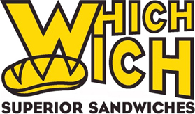
The existing mark (below left) is too busy, clumsy, and disparate; it should convey these objectives: cleanliness, order, clarity, ease of use, caring, and cheerfulness. Improvements:
Delete the question mark. Reserve it for use on 'Which wich?' at the point of ordering at the menu boards and during interpersonal relationships from the Host/Cashier: "Would you like chips with that?" "Would you like a drink?" The brand that is seared into the customer's mind has no question mark and the customer doesn't ask a question when saying, "Let's go to WhichWich!" "I love WhichWich." From their viewpoint, there is no need to question and it becomes slightly confusing. And, all design decisions should be made from the customer's pov.
Delete the rectangular box (the 3d text image is diminished by the 2d box) and the capsule shape.
Align the elements to form an implied rectangle.
Improve the consistency of the letterstroke widths.
Tighten up some of the awkward letter spacing.

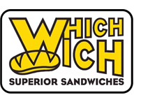
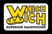
Below: the refined logo with border treatments. A rectangle with rounded corners respects the round vibes and capsules and allows the letters to remain Wich yellow. The border is a thinner line than the existing logo (now about the same visual thickness as the letter strokes) - to be more subtle, to not detract from the text, and to be more consistent.

A better single line mark

Set WhichWich as a single word to reinforce, respect, and be consistent with the other single words prevalent at WhichWich.
Delete the question mark.
Delete the shadow.
Move the bun - emphasize the Wich, not the Which.
Improve consistency of the letterstroke widths.
A better W initial mark
Refine the letterstroke widths.



Better brand applications on collateral materials




Above: The single W app avatar. Left: Existing. Right: the better W and without the background circle.
Below: A second app with the better logo on the avatar and on an app screen.


Better signage with the new better brand


Below - backgrounds should be white, rather than orange or gray. The logo floats (with no box) in the white space.


Another ordering sheet that needed help.
Tough to decipher and read on the left. Middle: sketch. Right: Better version.


www.jamesrobertwatson.com/whichwich.html