
Some tips for better typographic design

Tips for better kerning and letterspacing
There are three typographic relationships that good designers thoughtfully consider:
Kerning is a visual assessment of the negative space between pairs of letters.
There is no mathematical formula nor shortcut system to determine proper spacing. It is an inherent or developed design sense - what looks good. Making decisions about kerning provide the only opportunity in the process of producing design solutions in which the justification, 'because it looks good' is acceptable - all other decisions require solid rationale based on logic and meeting the objectives of the design problem.
The goal of good kerning is for the text copy to achieve an even visual greyness, a consistent volume of mass between each letter pair. One must also consider the counters within letters, the point size, the weight of the font, and the condensed or extended letterforms, and the width of the letterstrokes. There should be a perceived similar volume of space within each kerning pair.
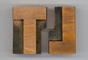
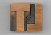
During the days of hand typesetting, the act of kerning meant to cut away parts of the wood or metal type so that letters could be set closer together. In the example below, the A and T in Math can't physically get any closer together, creating inconsistent spacing compared to the gaps between the M & A and T & H. Once parts of the type are kerned, the A and T can be spaced more consistent with the other letter pairs.




Originally, the term meant only to tighten the space between letters. Then the term fell out of use. It was reincarnated with the popularity of computer software and typesetting. But, when reintroduced, it then meant both to tighten and loosen the space between letters, a synonym for letterspacing.
A few examples
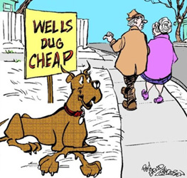

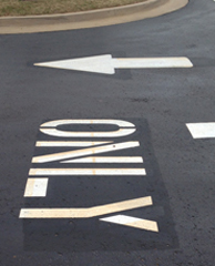
The sign lettering on the right should look better to you.
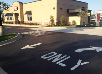
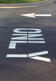
Poor ONL Y kerning at a restaurant drive-thru.
Tip: To assess kerning, view the piece from the side or upside down. Often, the kerning gaps are more obvious.
This example is so extreme, there's no need for such tips, but its a good one to remember for future use.
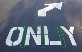

Apparently, in this case, the painter spaced each letter equidistantly. But, that is not how letters should be kerned. The space between pairs of letters should simply be a more consistent visual mass, not an accurate measurement.


Existing and improved.
Lesson: A typeset word should read as a single cohesive unit, not a collection of individual letters. We do not read letter by letter but by taking a retinal picture of several words at one time. Inconsistent kerning disrupts the smooth flow of reading.
Update: A few months later, I noticed that new symbols had been painted on the asphalt. You can spot the original letters beneath the new. While the kerning is still not great, it is better.

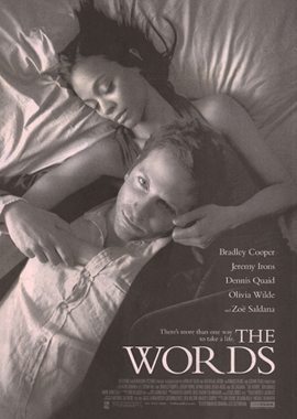

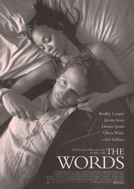
In the original ad on the left, the movie title WORDS is awkwardly spaced - too much between the RD pair and not enough between the DS pair and on either side of the O. The leg of the R is pushing the DS away. The rest of the word needed more air to better respect the large counters inside the O and the D. On the right is a version with better kerning.
Lesson: Kerning is not always tightening space (even though that was its original definition), it can also be loosening space. Consider the counters of letters, serifs, and unique strokes. Kerning should achieve an even 'greyness' among the letters within a word.
Tip: Sometimes it helps to turn the text upside down - this allows the right brain to see shapes and not read the word; the awkward spaces can become more obvious:


Kerning is not mechanical, measured, dimensionally consistent, or evenly spaced. It is visually consistent grey-mass negative space.




 F AMIL Y & F RIENDS


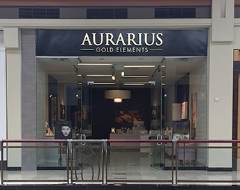
I had to go the Aurarius website to verify that it wasn't supposed to be Aur Arius.


The classic rock band Fleetwood Mac has embraced some pretty decent type treatments on their album covers. However, I saw the ad below for their 2014 tour and the word Fleetwood is not kerned with the same attention to detail. Condensed fonts such as this one require some delicate kerning adjustment (letter spacing). The designer should consider not only the space between letters, but also the space within the counters of the individual letters. This FLEETWOOD appears to be mechanically spaced - the same amount of space between each letter pair. Successful kerning is achieved optically - does it look good.
Note: this is just about the only time when it is okay for a designer to justify a design decision just because it looks good.
The letters in Fleet each have only a single vertical stroke while each letter in Wood and Mac have two or more vertical strokes. This reads as F L E E T WOOD MAC:

Remember the tip: turn your work sideways or upside down to better see shapes, not letters, to make the kerning more obvious:


Below left: the existing. Below right: proposed. The FLEET has been tightened up and the WOOD MAC has been loosened. The objective of kerning is to achieve an even 'greyness'. If you squint your eyes or blur an image, the positive and negative space appears in a more consistent mass with few glaring light or dark spots.


Notice in the enlargements below:
1. I extended the triangular points farther into the W - this helps reduce some of the mass formed when two letter strokes converge.
2. I shortened the arms of the Es (and the F and L)


It may be easier to see the differences when reduced:


Compare existing and improved. Of course, I had to go ahead and justify the two lines of copy:



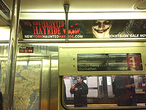


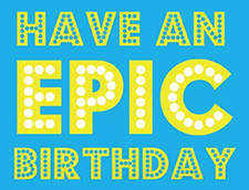
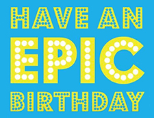
HA VE AN EPIC BIR THD A Y


Reminder: Good kerning is similar optical visual masses, not consistent mechanical measured gaps.
Please consider not mixing serif and sans serif letters in one line.

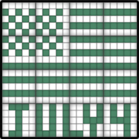

Some of my favorite mind games are the ones where you fill in squares according to a grid of number clues. The one above is from an iPad app called Pixelogic. The solved puzzle, in the middle, Has a capital J with serifs at the top of the letterstroke while the other letters are sans serif. On the right is how that J should look - sans serif to match the letters in the rest of the word.
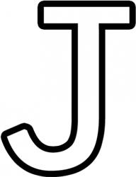

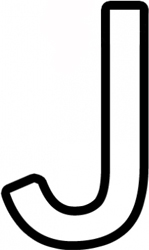
A serif is a 'foot' or cross piece at the end of a letterstroke. Serifs probly became popular in the Roman Empire when stone carvers cut perpendicular strokes into the rock thinking it might help prevent the rock from cracking along the stroke. Although that's just a theory - we'll never know for sure why serifs, which are unnecessary appendages, were added to the letterstrokes.

How did this silly J happen?
1. Often the J and the I have those horizontal bars to fill up space. Some fonts are designed as fixed-width fonts - that is, each letter has the same amount of space to fill and those skinny letters need additional strokes to fill out their given allotment. Numbers are often fixed-width (hence the cross bar at the base of the number 1) so that when arrayed in an accounting of figures, they would align in consistent columns. However, with the manipulation qualities inherent in digital fonts, there is little need for fixed-width fonts anymore. And the fixed-width reason is still no excuse for designers today to specify a J or an I with serifs if the rest of the font has none.
2. Some writing teachers taught kids to render a J that way, no good reason, probly because they were themselves taught that way. It may go all the way back to one school teacher in Boston or Philadelphia in the early 1700s.
I may have done something similar at Preston Hollow Elementary School. The teacher was demonstrating how to draw individual letters. We started with the letter A (natch). I drew the circle portion first (per instructions) and then, instead of drawing the vertical stroke through the right side of the circle, I drew it a small distance away. Realizing my mistake, I added a horizontal line to connect the two, simply as a reminder to me later to combine the two strokes into a single letter. However, the student behind me leaned in and admitted she didn't get it and she copied what I had drawn - affirming that it was a correct letter A. No, no, I protested - that's just my code. And I showed her an accurate A. But, imagine if I hadn't corrected her - she would have sworn a lower case A had three lines - a circle, a vertical stroke, and a connector.

The origin of the J with the top crossbar may be just as random.
Lesson: Make design decisions based on what works most efficiently and what enhances the message most clearly, not just on what comes up on the computer screen. Avoid mixing serif and sans serif letters.
Tip: To be more consistent and appropriate, avoid fixed-width fonts or fonts that mix serif and sans serif letters.
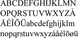
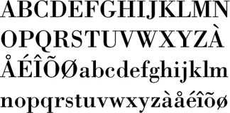


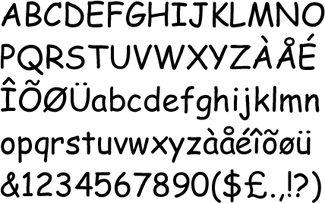

Note: Please do not write tirades about the use of Comic Sans. Hating a typeface (or a color or shape) is a symptom of a poor designer. Great designers pass judgment on design elements only based on how they might relate to the solution of the communication problem. Biased hatred, while often prevalent, has no positive value in design.
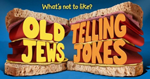
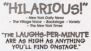
Before & After examples in a newspaper ad for an Off-Broadway play
A bikeshare logo
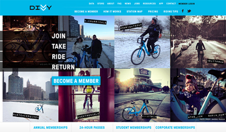
DIVVY is Chicago's new bike sharing system with 3,000 bikes and 300 stations across the city. Providing Chicagoans with an additional transportation option for getting around the city, DIVVY is fun, easy, and affordable.
The Big Idea - the concept that drives the logo and the branding is stacking the Vs in the name DIVVY to form arrows that convey motion. That is pretty nice - exploiting characters inherent in the name to convey the identity.

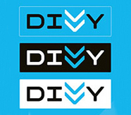
But the serifs on the I (or is that a sideways H?) distract from the main idea - the concept is weakened by using a serif letter within a sans serif name. Here is the word DIVVY in Futura, Helvetica, Myriad, and Comic Sans:

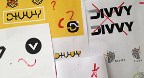
And here are some of the exploratory sketches from the original design showing the I with no serifs:



An improved version


Without those out-of-place serifs, the mark more clearly conveys the concept. There is less clutter and less competition for a barb in the reader's mind.


This serifed I is problematic because the logo is often seen at an angle that makes the H even more obvious.


More examples

I saw this banner in a sports clinic. Including an I with serifs in a line with no other serifed letters is inappropriate and looks awkward. Below, I photoshopped those dang serifs out of there. Not only does it work better, it better respects the condensed Futura font, the original NIKE type treatment with the swoosh.


Compare the smaller versions:





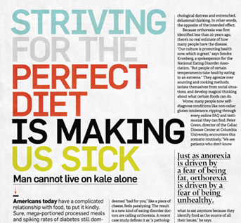
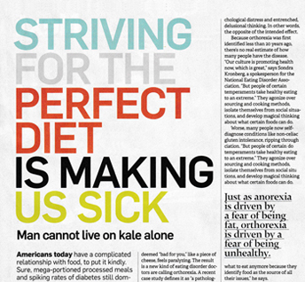
Avoid mixing case (upper & lower) within a word

This Homecoming spirit sign is supposed to read Iba Hall, not Iba Haii or Lba Hall


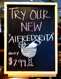
Trying a new restaurant for a fix of Margarita and Tex-Mex, I saw this blackboard at the hostess counter. It clearly reads AIFREDORITA (enlargement below). Seems like it should have said ALFREDITA - a Margarita from Alfredo's. I pointed this out to a couple of the seaters - they just responded with blank stares. I tried to explain to them the difference between an L and an I, but gave up when I realized they just didn't care. And, BTW: the quote marks are useless and inappropriate.


Please state the day of the week when stating a date. Thank you.
Added the day of the week to the date.
Deleted the misleading useless vertical line after the date.
'Leaving for OKC' is redundant - the headline says 'goes to OKC'. 'Leaving OSU' is more appropriate and easier to understand.
Enriched the green a bit for greater contrast and readability.
Changed the arrangement of the text blocks to read in a more logical, clearer order.
Tightened the word spacing in the headline.
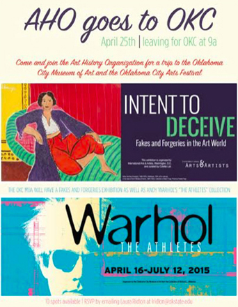

More examples and rationale for adding the day of the week to a date.

An unusual mark - the letter H with a dot. Yet, your brain recognized enough clues to conclude the mark reads Hi. Our mind fills in gaps and makes connections, even when there is missing information.
A better way to align a list

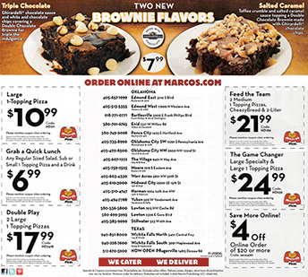
This was a newspaper insert for a pizza chain. The list of locations in the center wasted lots of space and was a bit tough to use effectively. Improvements:
Phone numbers closer to location
Larger point size for better readability
Fewer unnecessary marks: ( " .
Less info in locations - deleted W, St, Ave.
More consistent setting of Oklahoma City SW & NW
Better spacing within coupons
Larger logos inside couponsA better way to lay out a list


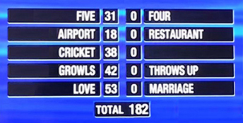
A better way to align answers on Family Feud
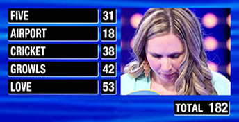

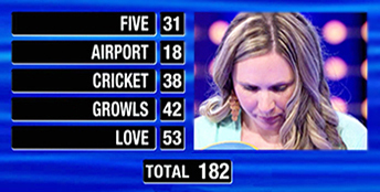
Above: Copy set in the traditional flush left layout. And, yes, her husband got 182 points out of 200. She only needed to get 18 points to win the jackpot, but her answers were so off that she didn't earn any additional points. So sad for her. Below: setting the copy so the answers respect their points earned by aligning to a central margin:
A better way to organize info
The OSU Museum of Art opened an exhibit of a Frank Lloyd Wright house and sponsored four programs:
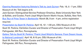
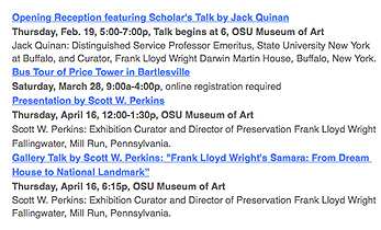
The text of the program details were in prose form - one paragraph per, and it wasn't easy to find the important info.
Improvements:
• Add the day of the week.
• Add a line break after the title and after the time & place.
• Bold the important info.
A better way to compare figures


It is much easier to understand the point being made - that more money goes to Corporate Subsidies
than to any of the other expenses shown. Improvements:
• Aligned the decimal points so that the dollar amounts line up and can be more easily compared.
Arranged the items in increasing dollar amounts.
• Decreased the leading - allows a larger point size without taking up any more height.
• No need for bullets.
• No need for the repeated dollar sign.
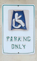
Weathered decals form a unique font


Font selection

In some print media, there is ink spread - the ink on an absorbent paper can ooze past its intended boundary. Notice how the gap in the 'i' in Credit and Corinthia has filled in, making the letter look like an L, rather than an I. In this case, most readers will still read the correct words, but sometimes the ink spread can alter readability.


A different typeface (on the right above) would have clarified these letterforms in this instance.

Garamond is a beautiful typeface. The original face by Claude Garamond has inspired numerous current faces. However, the letter 'h' becomes a 'b' when italicized. It reads okay in the sample below, primarily because of the large point size and its within a common word - The.
Tip: Be careful selecting/specifying Garamond if there will be an Italic 'h' in the copy.

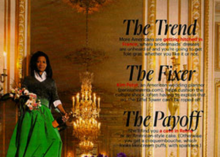
Placing text over image
Rarely does this work. The dimensionality of the image is flattened by placing text on top. Contrast and clarity is usually impaired
Tip: If you want the image to be seen, don't put text over it. If you want the text to be read, don't put an image behind.
Be careful when setting type with thin letter strokes

They often just drop out and are very tough to read. Saw the promo card above in a coffee shop. Even closer, it is still hard to read.


Outline fonts rarely work well on signs or in print.

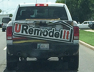
Notice how those triangles of black along the bottoms of the letters are a bit annoying? Or they should be. Designers can now easily improve the clarity of the typography - there is no longer a reason to ever say, "That's the way it came back from the typesetter." (That was a common excuse in the old days).
Setting type in outline fonts requires a bit of extra finesse - it is up to the designer to check for those pesky captured blobs and take care of them. Fill in the captured spaces or explore different point sizes for the fill and the stroke.
An example of a better sign that has an outline font
This is at an entrance to a hospital, often where frantic worried people are looking for help. Notice that the most important word on the sign below is the hardest to read. At least it's in red.


A better sign below right and some of the issues that have been addressed:
Set the copy flush left for items that direct to the left and flush right for directing to the right.
Moved arrows to the flush margin of each side. Now they visually help communicate direction.
Removed the stems on the arrows (info is conveyed by the arrowhead, not the stem).
Enlarged the arrows.
Tightened the leading for locations that take up 2 lines to improve proximity and clarity.
Enlarged point size and increased the kerning of the outline font.
More examples and suggestions at Sign Design.


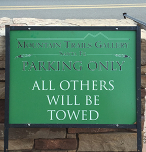

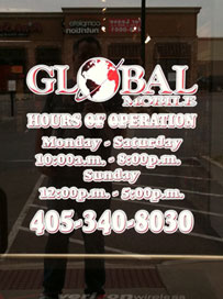
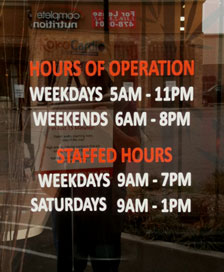
The outlined serif hours listed on the door above left are illegible - even from up close. The sans serif hours on the right are much easier to read.
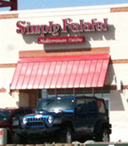
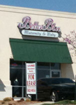
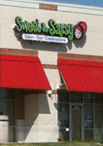
Below, notice how much harder it is to read the store names set in outline fonts, while the solid fonts, Tao Cafe and Sweet & Sassy are easier to read.



When driving by this sign at the Gold Dome building in OKC, I ask passengers to read the line above TeemCo - the one just beneath the LED video screen. Most don't even recognize it as a line of text - just a graphic element. No one has been able to read it.


Outline fonts have multiple lines and increased busyness. Counters within letterforms often fill in and the thicker-lined letters bleed into each other and form awkward and clumsy shapes. There are other ways to improve contrast and readability - consider changing the font, color, or point size.


Left: The Lego logo used from 1973-1998 with outline fonts. Then, the mark was tweaked - the slant of the italic was decreased, the captured spaces in the counters were filled in, and outline line weights increased.
Break lines of copy at logical pauses

This is a classic saying, tough to achieve, but a great goal to work on. The person that posted it was probly not a great designer - a great designer groups together the words that form the thought. When we read and get to the end of a line, there is a pause as the brain and eye move down and back to the left to start the next line. That pause is just like the pause from a comma or period.
Look at the second line - minds discuss events; small

How it could be better
The line breaks allow each thought to be contained on one line (and the semi-colons are replaced by less-obnoxious commas):

Below, the lines are arranged so that the 'minds discuss' stack up, allowing the reader to see 'Great, average, and small' and connect those to 'ideas, events, people.' thereby further emphasizing the differences.

Compare these 2 to see which enhances clarity, communication, and comprehension.


Justified versus flush left copy


Notice what sets this piece apart - the ragged edges surrounding the perimeter of the block of photos. There is a slight Warhol motif to the grid blocks of colors, but it is the ragged edges that are unique.
Tip: Figure out what's working in the piece - exploit that and minimize the rest.
Now notice the block of copy - it is set justified, both margins are evenly aligned. But the layout of the copy does not respect the piece. The flush right margin does not respect the photos directly above with their ragged side. The flush left margin is fine - it mimics the straight edges that are aligned directly above. Also, whenever setting copy justified, awkward inconsistent gaps are created in the word spacing. Obvious solution: the copy should be set with a ragged right margin that would relate better to the photos' ragged edges.
Other improvements
1. The row of dots separating the copy into two sections is unnecessary and ignores everything else about the piece. The photos are separated only by some dark space. The two blocks of copy should be separated by the same graphic element, a dark space.
2. The 'th' following the dates are unnecessary. Get rid of them.
Lesson: General guideline for better design - get rid of everything that is unnecessary. Unneeded stuff is just clutter that often gets in the way of clear communication.
3. Set last two lines of copy in lower case to respect the format established in the upper block of copy - heading in all caps, supporting copy in U&lc.
4. Rewrite the copy so the last line is longer and better fills out that corner.
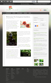
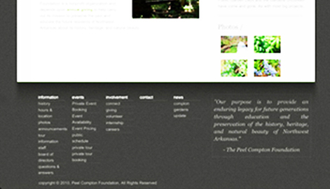
Notice the block of text copy in the lower right of the page, enlarged above and below:


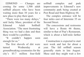
On the left: The body copy as originally set. Copy that is set justified (both margins aligned) creates inconsistent letterspacing and word spacing - notice the line:
through education and the
Those differing gaps annoy the brain and slow down readability. Above, on the right: How it would look if it was set flush left, ragged right. Now, there are no inconsistent gaps - all letter and word spacing is the same, providing a more comfortable flow for the brain to read efficiently.

Even better: Copy block set FLRR but with the margins manipulated so the lines are of a more consistent width. The punctuation also hangs outside the margin - notice how much better the left margin looks when the quote marks are not inside the margin.

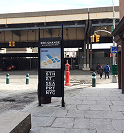
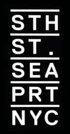

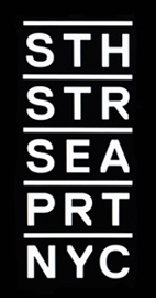
Whoa - there is something in this type treatment that should bother you.
• All lines are set justified except one.
• There is a lone period.
• One line has fewer letters than the others.
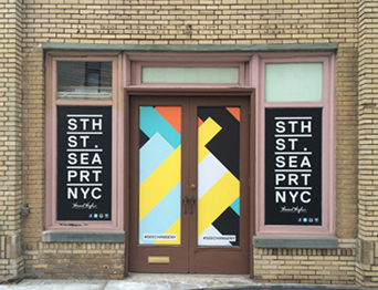
The Howard Hughes Corporation of Texas has bought much of the property that makes up Manhattan's South Street Seaport. This logo is the new brand for the new development. To the right is my revised mark. A simple fix - just be consistent. STR may be a bit unfamiliar (so is STH and PRT) but, the compromise of gaining a unified block of text outweighs the minimal education required to read STR as Street. Below, Side-by-side: Existing and revised:


Latter Day Saint text alignment

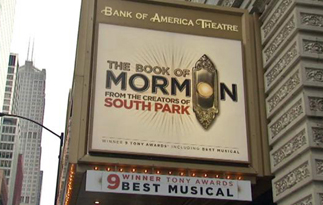
The Book of Mormon is a smash hit on Broadway. It is a hilarious tale of deceiving needy gullible people and encouraging them to join a church. The Mormon church is noted for its missionary teams who, clad in white shirts, dark slacks, and black tie, ring doorbells to discuss the American Jesus. The doorbell also plays a major role in one of the opening numbers. In the logo, the doorbell button serves also as the letter O in the word Mormon. The text then is aligned in orderly rows. Notice the alignment among the lines of text. Very well done. All lines are set flush left and also flush right along the margin created by the doorbell backplate.

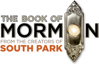


Combining the mark with a photo illustration necessitates tweaking the logo to better respect the angled leg. In the version on the left above, notice that the 2 subhead lines are indented, but still aligned with the right leg of the letter M. If those 2 lines hadn't been indented (middle) it would have created some awkward spacing by the leg or required moving the text too far away from the figure. On the right is a version with the text tucked in tighter to and embraced by the dancing figure. But, it's a bit too close - that figure needs some 'air' in which to move. The figure shows action and the implied motion of kicking or leaping needs to complete it's movement in the viewer's mind. The original version on the left works well.
Appropriate image formed by text letters only


Masters of Sex is a new series on Showtime about the pioneers of the science of human sexuality, William Masters and Virginia Johnson, whose research touched off the sexual revolution and took them from a teaching hospital in St. Louis to the cover of Time magazine. Above right is an ad showing the logomark for the title.
The type treatment of the word SEX works due to the simple act of rotating the E letterform. Now the E forms an image that fits the subject matter. Note: no lines or images were added. The(slightly manipulated) letter was just rotated. So simple.
Also notice that the word SEX is still easily read. The brain takes pictures of words and makes sense of the jumbled letters. Sex is one of the most recognizable words in American English, along with Free, Sale, and a person's name. All those words are so common, often-used, and important to us that they can be set in exotic ways and still be comprehended.
Tip: See the world just a bit differently. Recognize connections, meanings, subtleties. That's a tough skill, but very valuable.

The Showtime logo was designed by Chermayeff & Geismar (Chase, Mobil, and countless other classics).
Why you shouldn't italicize the font Garamond
Please notice how distorted the letter h is when italicized:

It looks like a b in body copy and the right leg looks broken - it has folded in on itself. Ouch. Instead of italicizing Garamond, try another classic Roman serif font.
Stacking letters from familiar logos rarely works well.
Try reducing the logo to fit - stay true to the branding.

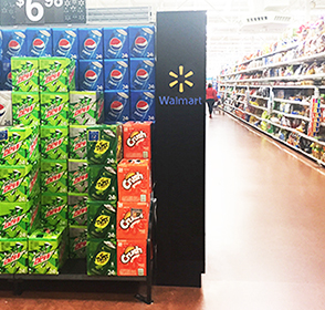
Be careful setting type in a vertical format:
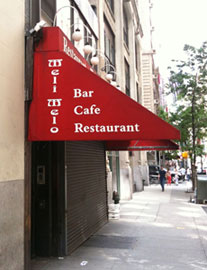

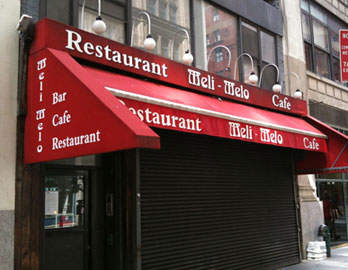
As I approached the side of the awning (as most people will do, coming up the sidewalk), the name of this Bar Cafe Restaurant was very tough to read.
Lesson: When working with non-English or uncommon words, consider type specs (font, point size, color, format, weight) that will enhance clarity, not decrease it.
And Ea Wy
Target discontinued its Merona label and much of its Mossimo line to make room for a series of new in-house brands. Launched in August, A New Day features apparel, shoes, and accessories, all priced under $50; and size inclusive - from XS to 4X.
Below left: Reader Mitch submitted this store graphic as an example of poor typographic layout. Although almost all of us will read the word and across the top - the designers meant for us to read down in columns, not across in rows. But,
1. We are accustomed to reading left to right, then top to bottom.
2. The dots in the first line help guide us to read across that line as a•n•d.
3. The word and in the top line is a very familiar word that we focus on immediately and unconsciously.

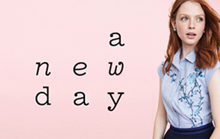
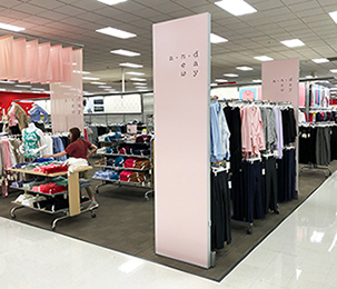
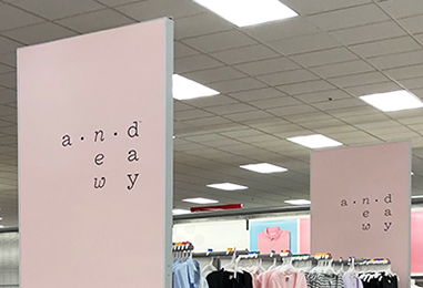
Confusing part: what is gained in readability, memorability, or comprehension by setting the words in columns? When set in rows (right) it reads better and nothing is lost in the design and layout. The reader should be encouraged to focus on the clothes and the Target brand, not on an unusual and poor way of arranging type.
Lesson: Make design decisions through the eyes of the reader/user, not the client or designer. Empathize.
Thoughtless
This appears to be another case of a small business owner who goes to a sign shop and flips through a catalog or on-screen menu of typefaces and background images. He picks his favorites. The sign shop employee may have even made suggestions based on what he/she likes. Or thinks is 'pretty'. And, voila, a sign. A sign that is poorly designed. It is graphic art, but not design - it is not a solution that clearly communicates a specific message to a specific group of people to achieve a specific purpose.


Let's look at the design problem as a thoughtful designer might. This company provides remodeling service for both commercial and residential clients. They specialize in fine millwork and craftsmanship.
The potential customer (the target audience, the sign reader) is seeking quality, reliability, service, intelligence, honesty, and work that is appropriate to their needs, modern and contemporary. Now, take a look at the above sign - does it convey the attributes that are impressive and convincing?
Issues
Poor font selection: condensed all-caps sans serif decreases readability and personality.
Poor contrast: the color palette is too limited and analogous.
• Millwork suggests custom made and fine craftsmanship. See if that is conveyed in this sign.
Crooked phone number - not a good symptom for a wood craftsman.
Poor background image - old weathered wood. A client may want old weathered materials in their project, but the identity for a company shouldn't reflect obscure materials.
Tip: See thru eyes of potential customers - what are they looking for - and provide a solution that 'talks' to those people.
Lesson: All design decisions should support the concept. The concept should fit the company.
Design that tries to be 'cool' but fails as good design


The designer convinced the airline that a light font set in light grey on greybeige would be trendy and cool. No one thought to see it as the passenger would - it is tough to find and even tougher to read. I witnessed 2 people plop down in the wrong seat and numerous people pause to decipher their seat location. Remember, this is while boarding (usually after delays and airport chaos) and while the airline is desperately telling passengers to hurry up and find their seat. The design firm slowed down the boarding process because they failed to design from the user's point of view.

ALL THE TRiMmINGS


Ransom note typography - mixing a variety of fonts within a word or sentence (like those ransom notes you've seen in the movies) can be an effective way to convey a punk attitude or represent multiple meanings. But, in this example from a Panera cup, there is not enough mixture of fonts - basically just 2: a sans serif, condensed, all-caps style and a slab serif used for an I and M. Successful eclecticism (which ransom note type is) requires a balance of elements. Because the mixture here is a ratio of 7:2, there is a dominant style - the serifed I and M look like they don't belong. If the ratio was 4:5 or 3:3:3 or 2:3:4, there would have been a more pleasing balance and a more successful type treatment.


The logo for the new Star Wars film includes the familiar original wordmark with the installment title sandwiched between. But, notice the awkward ragged margin lines with the T and S sticking out.
Below: 2 options to address that overhang. Left: decrease kerning and enlarge the point size to stay within the implied box boundary. 2: Exploit the idea that the letters are shooting out past the boundary.
Bottom: all 3 versions: existing, box, shooting.


Poor use of condensed letterforms
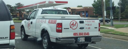
The vinyl decal serif letters on the back of the truck are set normal and the sans serif phone numbers below are set in a condensed font. It works okay, not great, on the tailgate since the viewer is most often directly behind the truck. But on the side of the truck, all the letters and numbers are set in condensed. The letters were manipulated by the computer operator to be more condensed (a design no-no), we assume to make the letters larger and the same height as the phone number. But, notice how much tougher the word 'Electric' is to read. Many viewers will see it a similar angle as in the photo, making it appear even more condensed. Rarely, is there a need for a word to be set condensed. It takes a meticulous designer to handle condensed type appropriately. This is an example where there is no need for any condensed letters nor numbers.

Bonus lesson: Notice how the sans serif numbers read so much better than the serif letters.
The component of proximity
Proximity refers to grouping bits of information or elements close enough to form an association. This grouping provides some comfort through familiarity. We humans like change but only if we can experience it from a foundation of something comfortable. Grouping like elements also aids clarity of understanding of information by creating a hierarchy of information.
From the essay, Design Components

The graphic elements of a bar, rule, or line can serve as an organizer to separate disparate images and text. We are conditioned to seeing lines as separators. But, in the above example, the lines are in the wrong places. Lost Your Serial Number? is separated from its accompanying text. The text copy, "If you already purchased . . ." is closer to the heading Need Help Getting Started than to Lost Your Serial Number?
Below is the improved version - the line separates the two sections of different thoughts. Each heading and its accompanying copy are in closer proximity. making it easier for the reader to comprehend.

Lesson: Group together associated elements (text, images) to create a single visual unit.


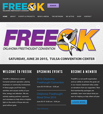
Of course, the ad needs the day of the week. Why do "designers" continue to disrespect their audience by not including the day? Can't figure it out. Is it ignorance? Apathy?
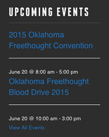
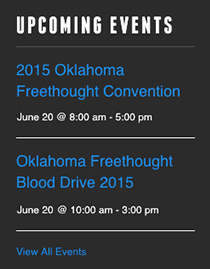
Also, notice below left, where the horizontal white lines are - they separate the event title from the date and time of that event. They push the date and time closer in proximity to the event title below. On the right is how it could have been to read more clearly (I also brightened the blue a bit). The lines should separate events, not separate events from their accompanying info.

https://www.jamesrobertwatson.com/typographicdesign.html